Windows 10 dark mode sucks compared to the new one in macOS Mojave
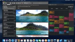
Apple's upcoming macOS Mojave has a new dark mode that is more consistent than the one in Windows, and it is applied everywhere.

Windows 10 has had a dark mode since the Anniversary Update was released in 2016. In typical Apple fashion, macOS is only just adding such a feature, and the company seems to have nailed it on the first go. The first developer preview of macOS Mojave has a dark mode that's super consistent across in-box apps, using the same shade of dark and being applied basically everywhere.
It's been two years since Windows 10 got its own dark mode, and things aren't as peachy. (macOS Mojave isn't expected to be widely released until this coming fall.)
Windows vs. Mac dark mode

Unlike the new dark mode on macOS, Windows 10's dark mode is inconsistent across all the areas that it is applied. It's also not even fully universal, with a couple of in-box apps not switching to dark mode by default or not supporting it at all. For example, switching to dark mode in the Settings app on Windows 10 will make all the in-box apps switch to it ... except for Edge. Microsoft Edge, for some reason, has its own theming switch that doesn't listen to the system option.
And in the current version of Windows 10, dark mode doesn't get applied everywhere. File Explorer is still blindingly white when dark mode is enabled, as are context menus, but only in some areas. Context menus on the taskbar are dark, but context menus on the desktop are light. This issue is being resolved with Redstone 5, coming later this year, but there are other issues with dark mode that need to be addressed.
The consistency of the shade of dark you use is important. macOS Mojave nails this by using the same shade of darkness across all its in-box apps. It makes for a pleasing user experience more than anything else. But on Windows 10, every in-box app has its own idea of what it thinks dark mode should be. In some apps, it's OLED black. In others, it's a dark gray. Why can't in-box apps share the same shade of dark for a more consistent experience? Why do some apps need to do it differently?
Windows 10 light mode is part of the problem

The biggest issue I have with dark mode actually has nothing to do with dark mode, but rather, the light mode. Windows 10, by default, is set to light mode (see above image).
You wouldn't think this was a "light mode" would you? Well, it is. And the light mode is even worse than the dark mode when it comes to consistency. System elements such as the taskbar, Start menu, and Action Center simply ignore light mode. They're permanently dark. So, in light mode, you get a rather consistent light mode in apps, which clashes with the Windows Shell because it is dark all the time. But in dark mode, you get an inconsistent dark app experience, that matches the rest of the Windows Shell.
Get the Windows Central Newsletter
All the latest news, reviews, and guides for Windows and Xbox diehards.
In a perfect world, the light mode would make all UI areas light, including the most prominent, always-on screen parts of the experience, or the Windows Shell. In this same perfect world, dark mode would be consistent across in-box apps and available in all of them rather than "most of them." Microsoft is currently working on implementing a new design language in Windows 10 called Fluent Design, which should hopefully see a lot of UI elements align with consistency.
We also know that Microsoft is working on CShell, which will feature light mode in areas such as the taskbar, and Start menu. Right now, though, CShell is pretty far away from hitting desktop devices, meaning for now we're stuck with this inconsistent experience.
Some people may not care about all this, but as someone with an eye for design, this stuff really gets to me and it's one of the reasons why Windows 10 always feel unfinished. The elegance and consistency of macOS Mojave make it all the more noticeable.

