Alleged photo reveals early build of Windows Phone 8.1 Blue, notification center
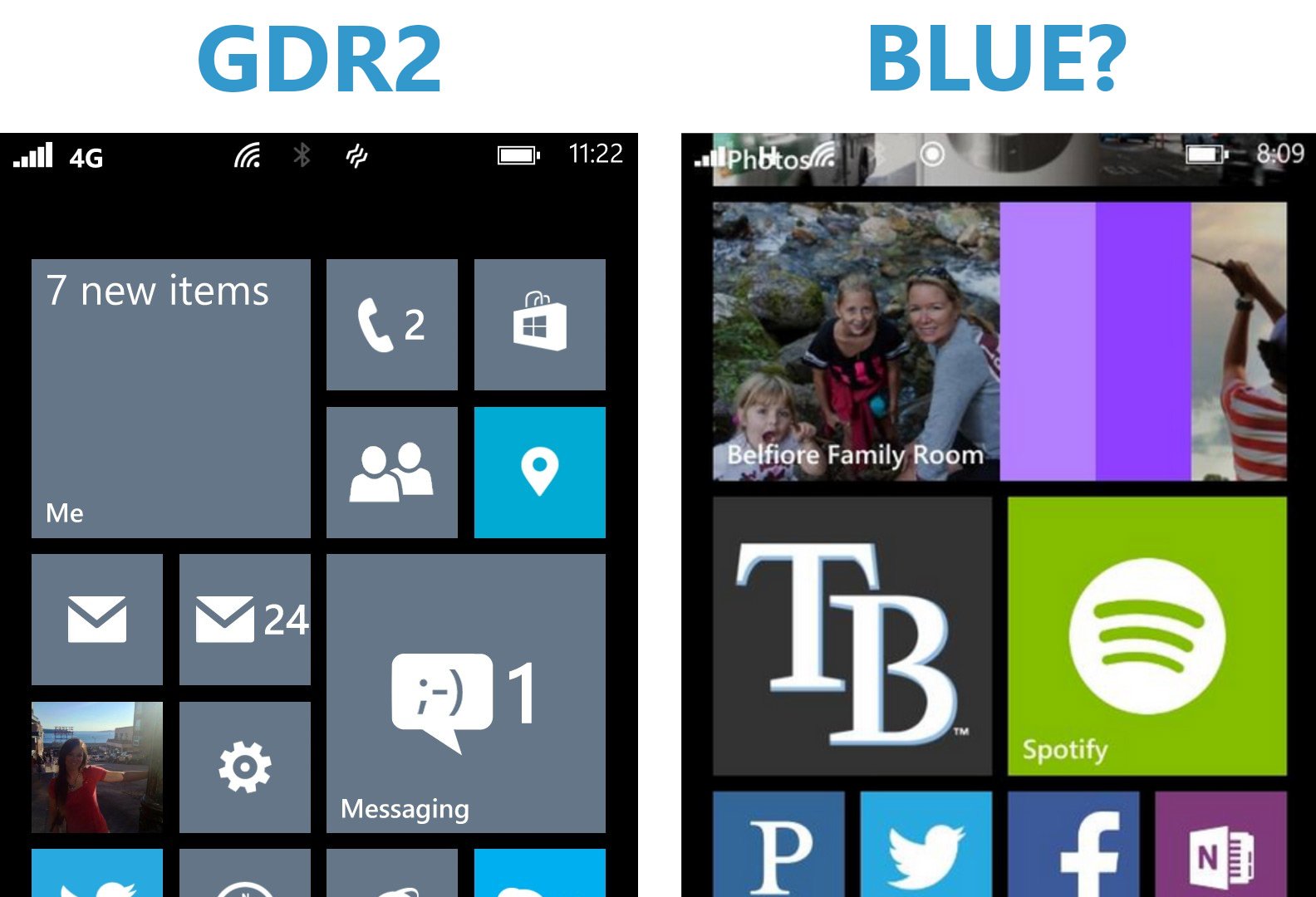
In early 2014, Microsoft is expected to release Windows Phone 8.1 “Blue”, a true OS upgrade for current Windows Phone 8 users that will bring along with it numerous design changes. One of the big features that many users expect is a notification center, and early reports, including ones from our own sources, have confirmed that this feature will be included.
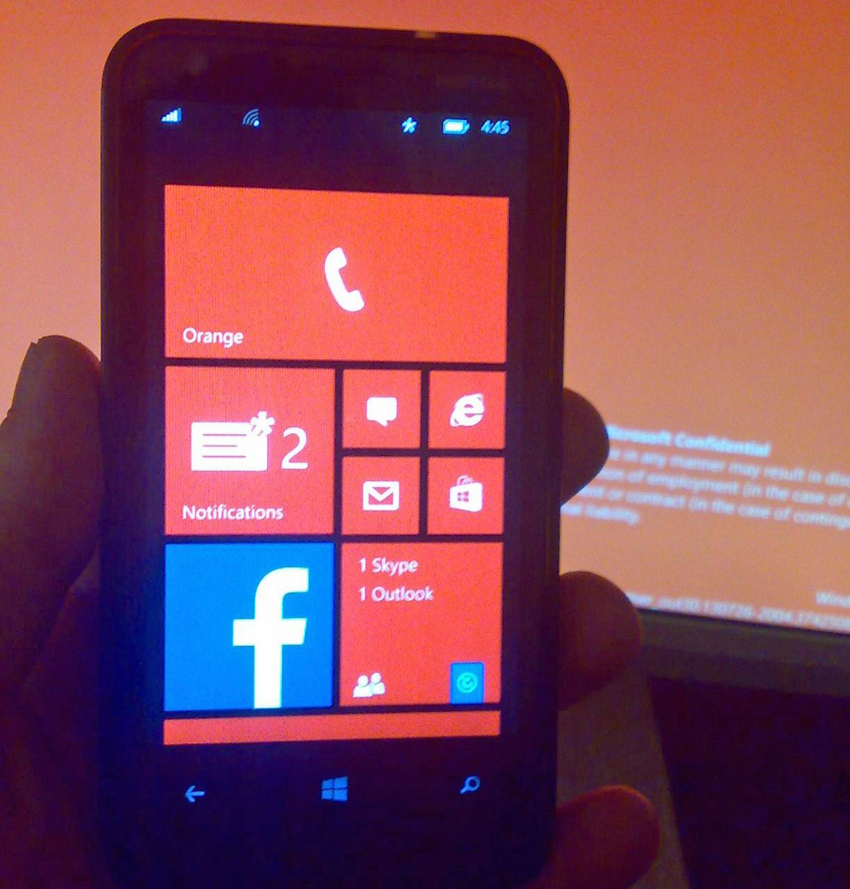
Today, a photo has appeared on the XDA forums posted by user ‘When I’m gone’ that allegedly reveals Windows Phone 8.1 Blue on a Nokia Lumia 620. The photo was almost unbelievably “found on an SD Card”, which is either a poor source story or casts doubt on the authenticity.
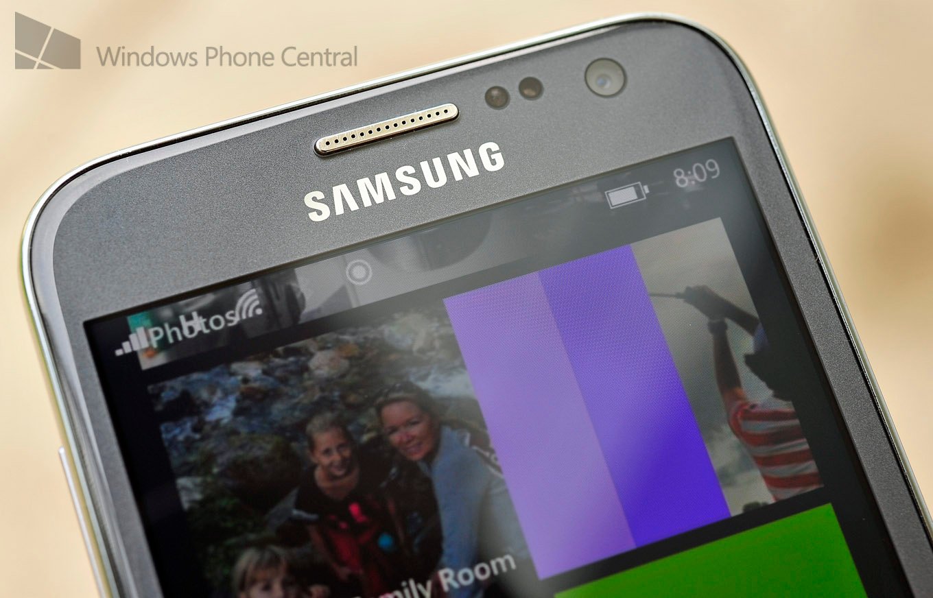
Screenshot taken by Joe Belfiore reveals new task bar layout
In the photo, we can see a Notification tile with an ‘*’ used along with a counter. The same ‘*’ is used in the task bar to correspond to the alert. Speaking of the task bar, it has been updated with icons moved slightly and nicely matches the screenshot Microsoft’s Joe Belfiore posted earlier, also thought to be Windows Phone 8.1 Blue. If this is a spoof, detail is being adhered too.
We also see what appears to be a unified inbox that includes Outlook but also Skype. Skype on Windows 8.1 destktop is supposed to get deeper integration with the OS and it would make sense that the same would happen on Windows Phone 8.1—this could be the first sign of it, were this photo to be accurate.
Finally, the background reveals what appears to be a “Microsoft Confidential” notice, perhaps related to the flashing of the phone and a warning.
Back in June, a Lumia 920 developer device was bought that contained an early build of Windows Phone 8.1. It too had a notification center, though we've heard that version has since been scraped for a different layout.
Windows Phone Central cannot verify the authenticity of the image, but like this weekend’s massive GDR3 leak, the information in the photo does match reports of features found in 8.1. Windows Phone 8.1 is in late stages of development.
We can add that notifications for the Center could optionally be "ghosts", meaning they won't cause Toast notifications or alerts on the device, but instead will show up in the Center. This will evidently be a developer option, part of thew new SDK and it will be used for more common notifications, ones that are not deemed urgent.
Source: XDA; Thanks, Fraggy, for the tip
Windows Central Newsletter
Get the best of Windows Central in your inbox, every day!
Daniel Rubino is the Editor-in-chief of Windows Central, head reviewer, podcast co-host, and analyst. He has been covering Microsoft since 2007 when this site was called WMExperts (and later Windows Phone Central). His interests include Windows, laptops, next-gen computing, and for some reason, watches. Before all this tech stuff, he worked on a Ph.D. in linguistics, watched people sleep (for medical purposes!), and ran the projectors at movie theaters because it was fun.
-
Who is going to complain first?
-
Me.
-
A fucking tile really , when they know everyone wants it on the left side or the me tile , no just another tile , bit I guess crap is better than nothing .
-
Lol
-
lol no, we want it to slide down from the top of the screen, pushing the tiles off screen like in a video shown a while ago
-
As I recall, people ranted about how crappy that was too.
These are leaks of a development build people, remember that.
This picture tells us hardly anything about how it works. -
It seems like you're usually the only one with sense..
-
Well, I want it to be slide from the left in the main screen, but yes, crap is better than nothing.
-
WHat if that IS the Me tile renamed and merged with the new center?
-
That would actaully be kinda cool. The Me tile is kinda underused these days, and integrating a notification center of sorts would be nice indeed.
-
LIKE
-
My bet is that this will merge with the People tile instead just like how it is on Windows 8.
-
What would a MY Battery notification have to do with the people hub❔
-
It would be awesome, but it don't think it is. In the first video posted yesterday you clearly see a me tile on top. Unless it goes from "Me" to "notifications" when it's notifiying you of something. That would be cool.
-
ok
-
Why not on the multitasking screen? Hold the back button and swipe to the unused space to the right of the current app.
-
Ever thought they will give you the option to pin it like almost everything on the OS.
-
Everyone?! I don't want it at all!
-
Fuck having it in the ME tile or on the left. No. I want it to work just like it does in Android, from the top of the screen available everywhere, not having to go back to the damn home screen and THEN the notification center.
-
I have always thought the notification centre should be in the volume box that appears when you press the volume keys. You pull down that and all your notification appear, also with some controls such as brightness, orientation lock and the music player that was originally in there.
But I guess that's just a dream. -
To me the notification center should be accessible from anywhere in the phone not just the main screen even if it is deep inside the app space (except in full screen app (Games)). So this will be impossible if it is as a tile or a flick left in the start screen (both this case user have to come to start screen).
This leave us with the other options of pulling down from the top (mimicking droid) or do as @mmodimo has suggested in the post.
Wp8 already have a mini notification center which allows interacting with it even if we are in an app or even if the phone is locked. The volume control which pops out when the volume buttons are activated or pressed. Simply extend this to the notification center and everything will be fine even if the screen is locked. Lock button to wake the phone and volume button will get the notification (you can also make it read-only under lock screen) and any one of the volume buttons when the phone is unlocked (definitely clickable/touchable) -
And you have to change the volume to check notifications? Genius.
-
Check again,single touch will not change the volume,if you have a wp8 phone of course.
-
And you have to change the volume to check notifications? Genius.
-
if you ever even used windows phone, hitting either the volume up or down buttons a single time doesnt change the volume at all, it only brings up the volume bar at the top. tapping the buttons further changes the volume.
-
I do own a red Lumia 920, and it does change my volume when i tap the buttons.
-
It shouldn't be changing the volume after one tap. If it is you should get that checked out...
-
in my Lumia 620, it doesn't :) Tapping either the Volume up or down once doesn't change the volume.
-
Just like Android❔ WP always finds a better way..
-
That's a really good point I hadn't even considered. I suppose pulling it down from the top would be the most efficient way of having it.
-
Yeah, let's just copy CrapDroid to make the WP OS more like that cheap peace of crap found on almost every crappy plastic fantastic Samsung phone. Let me tell you: NO
-
Please stop cursing on a public forum.
-
Please stop trying to censor people in a free on line society.
-
Why? It is offensive to the reading public. I am surprised that WP Central allows it.
-
What's to complain about? This will finally stop everyone whining about it!
-
People will always find something else to whine about.
-
Like how ATT still hasn't given me my GDR2 update?!
-
Koodo as well
-
That's ATTs problem!
-
ummm...no. If the user is unhappy, That is Microsoft's problem. The user will simply get another brand of phone that meets his needs better next upgrade time.
-
hahah that user better not go to android, they way they update their devices is HORRIBLE! 47% of all androids are running 4.0 btw android is up to 4.3 sooooo stay away android.
-
I know, I don't want to lose the Google Sync.
-
Don't get me started on at&t.
WP community have left so many messages on @attcustomercare about the GDR2 but all they do is ignores us. -
LOL❕... I'm patient,, but want is taking so long❔
-
I wanted it in the ME tile. So I'll start :P
-
Well MS is making it quite easy.
-
This....and cheese.
-
+620. Especially for things that they hate.
-
No sh!t!! Preach it!!!
-
my bet is that the next complaint will be about settings toggles. i've noticed now that notication, rotation lock, and custom ringtones will soon be addressed with gdr3 and 8.1, the android fans are posting about the setting toggles, as if you change those settings so often that it is an important feature. i have settings shortcuts for bluetooth and wifi and those serve me fine.
-
I toggle my rotation lock all the time on my Galaxy Note 2. WiFi and bluetooth toggles are also incredibly useful. The MOST useful toggle is flashlight. Yeah, quick toggles ARE important. I want the notification center to slide in from the top just as in Android and also to have toggles in it also just as in Android.
-
How about this? I'll be super pissed if Notifications are only accessible through a Live Tile. You should be able to access these at anytime. Plus, I'm already having a hard time pinning everything toward the top of my home screen that I want to see first.
-
feel similarily except just a little annoyed instead, i think this going to be one of those scrpped ideas, still a better choice if they just shove it in the multitasking screen
-
I mean you're right. And I agree. But when we get a whole new column of tiles, we will be able to fit a lot more *important* tiles up top. Also perhaps we can tap the asterisk at the top and it takes us to the notification center
-
a whole new column of tiles IF you have a Lumia 1520 or a phone with full HD screen, no current phones will be able to have a 3rd colum.
-
I use my Start Screen as my notification center. That IS where I personally have the things I want to see first.. Just sayin..
-
Just agreein :)
-
Yeah, the 4 tiles you can use before live tiles start dying and never update. If they scrapped the idea of a notification center and just made background tasks actually reliable, I'd be a happy person. Also Notifications, just make them reliable.
-
People need to understand that MS notification is the counters over each tiles!
I like that idea from the beginning, no copy of android ir IOS! -
Except it is incredibly lacking compared to a real notification center and requires you to leave your app to get to. I'd much prefer a real notification center sliding in from the top thank you very much.
-
This is true. I gues it would actually clear up a lot of tiles from the top of my Start screen. I'm good with that.
-
How about having a notification center when you swype to the right? Are there actually people using the kids corner anyway?
-
Um...yeah...every time I hand my phone to my kids I use Kids Corner.
-
Oh well, I guess MicroNokia will find a better solution then. Lol
-
Umm swipe from the left isn't taken at the moment.
-
I believe swiping to the left activates Kid's Corner, so swiping to the right is still an option.
-
The wpcentral tile, which IMO is one of the best designed live tiles, only shows the top 3 news. I rely on the start screen too for my notifications, but the fact that i can see only the latest mail, or the latest message, or the latest missed call is unacceptable to me. I'd like the live tile to be a bit more lively, and perhaps have a way to show me all the unread mails, so that i get the gist of it. I agree launching the app and checking isn't that difficult, but a glance at the notification center is easier. Shouldn't a smart phone make our lives easier..? Symbian, IMHO, was a true blooded, pure smart mobile OS. i miss my n8, just for the stuff it could do, even if with a lack of finesse, smoother transitions, and subpar screen.. *sigh*
-
-925. Who are you people? You're going to get the feature, and still you whine and cry. Some people refuse to be happy about anything.
-
Next time I see you post a complain about something, I won't be there to tell you are wrong about your opinion.
-
I'm fine with people having opinions. What irks me is people whining about a feature that Microsoft is still finalizing. We don't know what the final interface will be, and yet people are having fits. It could end up as a swipe to a page left of the start page. It could be a tile as shown in the pic. It could end up integrated in the Me title. It could be something altogether different. Who knows? But why the constant stream of outright hate over an unfinished feature?
-
Well, I just want it come soon. Now I have not receive any updates for the GDR2. I have been waiting so looong so that!
-
Why is this a problem? Click on start and then the tile. Whatever app you where using is suspended and you can go back to it through the multitasking screen. I would think most people check notifications after they are done working with an app and not right in the middle of their work. This would also solve your pinning issue. You can now pin just your most used apps since you will have a central center for notification. A swiping gesture to get to a notification center looks better, but functionally a tile would work too. I personally liked the WP mock up where the notification was accessed with a swipe in the multitasking screen because that would eliminate accidentally opening the notifications which happens to me all the time in ios and android.
-
Someone else just mentioned this. I agree, it will actually help quite a bit.
-
I have no problem with that. I keep doing this already on my phone when I want to access other apps so it will be a natural thing for me to do.
-
On the 1520, getting things "above the fold" on the Start Screen will be easier, at least. Would you be satisfied if they do a Live Tile notification centre this build, but announce plans to make it always accessible in the next update?
-
i'm not one of those who badly need a notification center, but a tile is ridiculous. Why even bother then?! Build it on the fucking left of the homescreen. Swipe right to access it. Just the opposite of the app list.
Geez Microsoft... -
I would say the "bother" is having a notification center (even as a tile) is better than none at all. I swear people complained about there not being one and when there is one, they complain about "how" it's being given to them. While I don't think a live tile is the best implementation, "at least" there will be one, when Microsoft could've just continued ignoring it thinking there was no need for it.
-
The reason people get annoyed is because Windows Phone takes pride in implementing everything perfectly, in the best possible way and this and the leaked gdr 3 update make it look like microsoft is slipping and have given up on windows phone by implementing stuff half arsed and not in the best way possible which will make windows phone low quality junk
-
I never asked why people are annoyed....but I will say, it does seem unreasonable to be annoyed about rumors or unfinished products that are at least 6 months out.
-
That's the problem. MS thinks it knows what people want and need, and that we don't know what we need. Just give what the people desire MS. We aren't asking for a Rolls Royce each to all the customers around. It is feasible i reckon.
-
Actually, MS has been doing a pretty good job lately of (mostly) giving people what they want- changes to Windows 8 with 8.1, rumored changes to the Surface, reversals in Xbox One, and adding features to WP. I will say, they need a better focus group so that they make the adjustments before things start to leak, and they need to scramble to make changes.
-
Why create a TITLE for Notification Center? Just swap main screen to the right like when we search for all installed apps.
And please when to be necessary to close an App in the Active Tasks just scroll it down. We are talking about a mobile device and it isn't easy try to find, read or touch a small button when we're on the go.
Microsoft keep it simple, clean and FINGER FRIENDLY... or try to learn something with Nokia and THEIR MOBILE EXPERTISE!!! -
You mean swipe to the LEFT, I assume.
But yeah, I like that idea more, just put a notification shortcut in the top of the App list. -
Geez Sumit8... Both a tile and a swipe right to access notifications are are ridiculous. Why should you need to be on the home screen to access notifications?
-
A tile still has the advantage of being able to notify you of toast notifications regarding apps you don't have pinned to the start screen. There are apps I would un-pin if a notification tile was available, so this would be really useful for me. Similarly to how you can use the Games hub to see turn notifications in turn-based games, so that you don't have to pin them all to know that it's your turn. It may not go all the way to satisfying you, but it would be a definite improvement nonetheless.
-
They might want to save the "swipe right" motion for something else. Personally, I'd much rather see them use this for slide-show like content on large tiles.
-
how about a File-Manager.
One of the most demanded feature and more imortant than notification. -
I hardly think a file manager is the most demanded feature from all users. If they added more options to pull files from Skydrive and share via email and other places I believe that would be more worthwhile.
-
Ah yes, SkyDrive is way underused. Skype as well is sort half ***ed. It seems like areas where MS can shine often fall flat. I'm not whining either. Just offering the constructive criticism of a experienced software developer and product manager. Things should be better than they are.
-
a File Manager is actually the second most requested feature.
Vote for File Manager:
http://windowsphone.uservoice.com/forums/101801-feature-suggestions/suggestions/3365632-add-file-manager-to-windows-phone -
They still need quick actions like those that iOS 7 is finally getting where Bluetooth and WiFi can quickly be turned off without even going to settings (and particularly without the inaccurate live tile options that exist for that currently, unless you remember to back out instead of hitting Home). Granted, Android has had that (and the notification center) for a long time, but I would rather go to iOS than Android. I really hope that the notification center is not just a live tile as well, rather it is something that one swipe's opposite of the app list to get too.
-
I do agree with this. Bluetooth and Wi-Fi are my most used options in Settings, and there really should be quick options for at least those two things.
-
Hopefully, and most likely they'll integrate the notification center somewhere else. It might be a swipe somewhere when multi-tasking or something on the home screen, but I'm sure they won't spend a lot of time doing something they'll have to change again.
-
Even Symbian had swipe from top to access some quick options like WiFi, Bluetooth etc
-
Indeed many people will always complain
-
Why do people whine about people whining?
-
just another live tile when u can pin the live tile that has its own notification. how redundant
-
You have no evidence that is the extent of the feature.
-
Well, you're pinning one instead of 50. Doesn't seem redundant at all
-
Agreed. Though it's not exactly ideal, I'd like more details than to just crap on it for now.
-
Maybe that is how they were going to implement it and realized that it sucked and went back to the drawing board.
-
Not at all. It lets me keep apps pinned that give me frequent notifications, and un-pin apps that I rarely use and/or that give me infrequent notifications.
-
Would a slide out menu or swiping to the right to reveal a notification center be better than another icon? Is that complaining? I'm just asking.
-
Seriously!? A notification center as a TILE??! That would be the worst notification center in any mobile platform..
-
I disagree about the notification tile as the worst. In fact i prefer that on a big screen because I can pin it close to my thumb for easy access on a one-handed operation. I dislike the pull-down and pull-up most, although I could probably get used to the swipe-to-the-right, but I want the tile best of all the methods.
-
Anything other than an exact copy of the latest Android notification center would make it the worse notification center on any current mobile platform. On my Note 2 I just slide in from the top and see all my notifications and have quick toggles all at once.
-
Why can't it make my coffee? Why does it not have swipe right to make toast...
-
Better yet, an omelet bar when you swipe to the right!! Complete with a chef in one of those tall hats!!!!
-
Seriously, MS would corner the market for omelet connoisseurs if they implemented that.
-
If its not one thing it'll be another thing people will complain about. I'm not surprised. The whole thing about windows phone is LIVE TILES. The most obvious live tile would be the notifications center. I can't believe people are surprised.
-
I'm not complaining because I actually prefer the notification tile so I can pin it close to my thumb for one-handed operation, as compared to the pull-down, pull-up, and swipe-to-the-right. I particularly want the notification tile when I switch to a phablet later on.
-
.....i am going to be upset if this isnt disBle-able. Consider the fatal flaw in a Windows Phone notification center is that it requires more devs to start implementing notifications alongside live tiles (look at what happened to unification), and the fact that one reason i love windows phone is the fact that notifications are NOT saved in some center to clog up and bog down my phone, im kind of saddened by this. lets hope microsoft doesnt keep this.
In all homestly, i can think of one way MS could do things that could at least try to appease those asking for an NC, if not outright destroy their argument about not wanting certain tiles pinned: Live Tiles in the app list. We already have small tiles which are the same size as the app icons in the app list that can show basic live information (such as mail showing a number by it for unread count and Kik having a asterisk on its logo for a new message indicator). Microsoft could have an (optional) setting that allows one to enable live tiles in the app list, so any app that supports a small live tile can show information.
(pardon any spelling errors. WPCentals text input disables autocorrect, and my screen is cracked so i cant really see mistakes in some areas.) -
No no! Microsoft sux!
-
You have no life. You ignorant troll.
-
Comments like these are when I wish WP Central would apply forum rules to article comments.
-
Appears pretty legit - concept wise. Solid thinking.
-
I have vs2013 with wp8 SDK...i could make tiles that look like that in 5 minutes and load it onto my phone. If I then take a blurry pic and PhotoShop a star icon on the status bar can I have my pic be on an article?
-
You can make of course. But most peoples concepts would be pretty sucky.
-
Why are they always blurry. In 2013. It's like big foot, or UFOs.
-
Who knows...guess they don't have a 920 or 1020! Edit: just thought of it. Its a lot easier to blend things into a photo when its blurry with PhotoShop.
-
That is awesome! With a new column of tiles on new higher resolution devices, a grouping folder is what I was guessing for too.
-
I'd prefer to the grouping concept that was found in Windows 8. It's pretty useful as Windows Phone has the vertical-scrolling gesture basis.
-
I'm seeing 0 innovation with these updates. Everything looks the exact same, even uglier sometimes. We need a UI polish
-
I don't know what you're talking about. A huge reason why I use WP because of the way it looks. I'd be happy to see UI/UX improvements/enhancements, but not an overhaul.
-
I agree.
-
A polish isn't an overhaul. The new Bing apps look more polished than the other Microsoft apps for example. If they can make a notification centre that looks as nice as the Bing apps then I'm happy. Xbox music needs a polish as well
-
Xbox music is getting an overhaul. idk when its release date is, but be comforted that there is an overhaul coming
-
Xbox music definitely needs a polish, maybe even an overhaul.
-
You know what they say about polishing a turd but the stink stays... A Major Overhaul from the tile to most of its functions is still needed for Xbox Music in my very humble and way to patient opinion...
-
How about a delete and create something useful for adults, if one wants games get a Game Boy
Xbox -
Read again, I said the XBOX "Music" app, not the XBOX games app. Though I don't blame you since Microsoft pretty much slaps the xbox name on everything these days. Brand fail.
-
XBox Music is a crap too -creates double and triple songs in Music on Lumias and deletes albums if you "Connect with Xbox Music".
-
+920. Same here. Good Wishes, Salams...
-
Agreed. I did want to see the enhancements via the UI tweaking, sort of, like implementing Modern concept to the start screen (it's already, but like I said before, it needs tweaking).
He's half right, half wrong. Half right because the UI is looked too basic, honestly, and I do prefer to the UI like Windows 8.1. I hope in the next iteration the update will bring the start screen background, or motion background. I'm using Lumia 620, and until now, its user experience is great while it does have only the dual-core CPU (so does the iPhone), unlike the Android.Half wrong because he said, "I'm seeing 0 innovation with these updates." I disagree with him as Windows Phone DOES bring the innovation with its live tiles and simple UI (among iOS and Android), yet gives the great experience while using less power. -
Isn't early to be smoking crack and posting?
-
Nice :)
-
The 'Microsoft Confidential' watermark is from a pre-release version of Windows. Perhaps a Microsoft Employee took this photo? I believe a handful of MS employees can gain access to MS CorpNet where in-development Windows builds are kept
Although it's possible that the MS confidential watermark is from one of the publically leaked pre-release Windows builds. -
The build behind is the leaked 9471, fbl_partner_out30, I thought you would recognize it, you're from MDL :p
-
I couldnt read it lol, was too blurry for me :P
-
Now i find this story my interesting than the snail pace of gdr2 and 3. A guy just showed me a beta of ios7 abd even though it is still not ready it is looking slick which MS would give themselves a kick up the backside lack of features 12 months on is still annoyingly frustrating
-
Ios is a yearly update and is the first in 7 years that has an options menu. Gdr2 and 3 are within 4 months of each other and 8.1 to follow in another few months. Get a calendar
-
1.Do you class GDR2 & 3 as adding many features to the OS, as most people recognise that this is not the case, therefore by the time 12 minths has elasped you'll find that many features will not have been added to WP8. Hence my comment
2. How do you know that 8.1 will follow in a few months? Present logic (as mentioned by WPCentral) suggests that 8.1 will land sometime next year.
3. My comment that IO7 looks slick is of course an opinion which I hope this site allows me to do.
4. Was it really neccesary to be so rude? Sometimes I hate the interweb, littered with Douchebags!!!
Kellzea please learn some manners when commenting, you may find people who respond may respond more politely... -
1. Your first point is your opinion. Particularly your "therefore..." is an opinion which has no basis in fact since you're talking of the future.
2. And how do you know WP8.1 will not follow in a few months! WPC says it will follow in the first half of 2014, which will actually be a few months from GDR3. It will be less than a year from now so even if you reckon from Sept. 2013, it will still be a few months.
3. Your third point is also your own opinion. My opinion is that WP8 is slicker, more polished, more sophisticated compared to iOS7.
4. Your fourth point is also your own personal opinion. Have read and re-read Kellzea's response and couldn't see rudeness. Or did you expect to post here your personal opinion about the iPhone and iOS and everybody would just bow and say Amen? Actually, it's you I find rude. -
My first point is not an opinion it is fact.
How can you say that 8.1 will be released in a few months? No evidence I'm afraid.
I said my 3rd point was an opinion is that a problem? I find you quite arrogant if I can state that opinion... -
I hope you're blind since you're saying iOS 7 looks "slick". It's one of the biggest eyesores design has ever seen.
-
I'm no fan of iOS but in action the 7th iteration actually looks okay. It's not a patch on WP naturally, but it's a massive step forward over the rotten skewmorphic one from the last six years. If this is the notification centre than MS should be ashamed of themselves. Biggest software company in the world and this is the best they can come up with?
-
Actually I prefer the notification tile, particularly in phablets (LOVE AND WANT THE 1520!!!), because I can pin it close to my thumb in a one-handed operation. It would be a coup de grace to actually implement the notification center as a tile!
-
Quite frankly iOS 6 is slicker than iOS 7
-
iOS 7 looks washed-out and faded to me compared to iOS 6.
-
A notification tile? No thanks, this is not how it should be done. Microsoft needs to take some ideas from the community made concepts related to a notification centre.
-
Agreed. This would not be a good solution at all.
-
I like the idea of it in the ME tile as its already does for FB Twitter LinkedIn or do a drop down like iOS & Android as people coming from them would find it familiar. Or even better have the option for both so users can have the way they want. Just my 2 cents
-
Now how am gonna access it from inside an go to the homescreen you cant be serious -.-
-
Exactly, that's what I mean by polished. All of the concepts look so clean maybe its the lack of 1080p displays but still. Microsoft should really take the concepts into consideration
-
:)
-
A year and a half for a major upgrade......ouch shut up and ship where are you....
-
When I was on Android the updates came just as slow but mostly didn't fix the problem at hand. I'd rather it take time and be done right. All updates from MS have been good from what I've seen on WP8.
-
Incremental updates quarterly (that I agree are super minor) but a year and a bit for a major update seems fair enough.
-
"start screen innovation" FY13-14 Lets add a new tile for the notification center !
-
Revolutionary!
-
The image of apple's product presentation comes to my mind
-
To quote Apple, Magical!!!
-
It'd be cool if we could swipe in the opposite direction on the home screen to reveal the notification center. Just a thought.
-
And probably the 50th time that exact thought has been brought up. Would be nice but it seems Microsoft has their own plan. I'm sure either way it will be better than what we have now
-
Yeah I guess something is better than nothing.
-
That is what everyone is yelling here!!
-
Same thought here. It will be really nice.
-
It boggles the mind why they don't do exactly that. That's been my "solution" idea since notification center became a hot button topic. Simple, accessible and keeping with the modern/metro ui. Someone at Microsoft is really dropping the ball.
-
Well hopefully it fails miserably and the start listening to the consumers
-
We still don't know yet if that's what they're doing, but I think they want to keep it really, really simple for the people who are new to smartphones. They don't want a whole lot of gestures, that to most of us here are huge improvements, but to a lot of people who don't follow technology are just a hassle.
-
That's a very good point.
-
Personally, I prefer a notification tile where I can pin it close to my thumb where it's accessible in a one-handed operation, particularly in a phablet (my next phone). But you've mentioned a good point, and I think the notification tile is more self-evident to a first-time user than an added gesture of swiping-right or pulling-down and pulling-up.
-
As much as I love the live tiles. I would like to have Notification centre on the left side of the start screen it just feels right
-
That's an idea.
-
What if it is both? Notification center to the left, with an option of a live tile and an icon in the "task bar".
Also add a pull down quick settings menu to that task bar and the OS is complete. IMO -
Yeah that would be perfect! As long as its balanced and not overdone :P
-
I am starting to lose my faith in Microsoft. Perhaps it would have been better if microsoft would have been sold under the NOKIA!
-
That would never have happened. What's wrong with Microsoft anyway? I can't find anything I'd call wrong. There's nothing to lose my "faith" over.
-
That's you not us dumbass
-
Name calling? Take it elsewhere
-
All of his comments are like that, probably a troll.
-
TROLL!
-
Please don't make everything into a tile.
-
Suggest you change platforms then.
-
I did. From iOS to Windows Phone. And I like Windows Phone.
-
It may be optional. In the photo it looks like there's two notification tiles. Who knows..
-
I suggest you get a brain
-
Stop attacking every opinion that doesn't jive with your own stupid f#ck.
-
TROLL!
-
Damn it! Hopefulyl this isn't true.
The whole idea of notification center is to get those things away from tiles and have fastly accessible notficaition center. If this is true, you suck MS. People are pinning Blue to finally get WP anywhere near iOS and Android usability and features. -
I'd like to see a notification center on the left, but tiles are about as "fastly accessible" as it comes.
-
Lots of small leaks lately. Signs if good news. Loving it! jejeje
-
Ahh yes, I shall forever call this leak weekend. Loving these leaks and cant wait to see more
I truly hope windows 8.1 has as man changes as mango once did. That was a magical time -
I see on the photo, it's Lumia 620 was using the prototype of WP8.1. Finally, my phone!
-
I couldn't care less if there was a notifications centre. Its not exactly gonna make or break Windows Phone. The OS is perfectly fine without it.
-
Maybe it is, but with that attitude, will anybody care about the OS in 2 years time? It's a bit perplexing that the "old OS's" move faster than the challenger.
-
You forgot to add " for me"......
-
A notification tile and some top icons moved slightly. Am I missing something?
-
Microsoft needs to swallow their pride and pull an Apple. Just copy the Android notification system. It shouldn't be a freaking live tile... you should be able to swipe down and get to it from *ANYWHERE*. That's the beauty of the way Android handles notifications and kudos to Apple for basically swallowing their pride and doing what's best for the *user*. Another live tile isn't needed... a way to see/respond to/dismiss all your notifications from anywhere is what's needed.
-
I agree.
-
+1 the swipe from the top is just natural and really the best place for a notification centre. I don't see the point in having it in the same place as your other tiles with notifications already shown on them
-
Isn't the whole point in choosing Windows Phone 8 over the rest is to be different? Every OS has their problems and if they all copied each other, what would set them apart? Windows Phone 8 is about tiles, thought everyone would be used to it by now?
-
No! This is a horrible solution as we make larger phones, making it hard to reach the top of the display with one hand. It needs to either be: swipe up from the bottom, or from the multitasking screen.
-
Agreed. Android has already perfected the notification system, so why not just copy it?
-
Wait, so the notifications centre will be a tile? Pardon me asking, but what's the use of that when we already have the other live tiles pinned?
I don't have any use for a notification centre with live tiles, honestly, but thinking from the pov of someone who wants one...that approach doesn't seem to make too much sense...wouldn't something like swipe from the left be more practical and useful? -
+1
-
Logically WP doesn't need a notification center, but in practice, some devs fail at life and don't use live tiles, which means you can miss toasts. The notification center tile ideally is just a tile that covers up the holes left by bad devs. Or if you just don't want to pin a certain tile. The NC logically should not show notifications from already pinned tiles. Who knows if the actual product will be so smart though- I fear tiles will be redundant otherwise.
-
I won't hold my breath on any of this.
-
Phone shows a lumia 620 i think
-
Do you want a notification tile or plainly swipe to the right to get all your notifications?
-
Both.
-
If it's just a tile, why is there also an asterisk on the task bar? It seems to me that, if this is real, they're simply aiming to provide multiple ways to access the notification centre. I'll bet that there's some kind of pull-down menu too. Otherwise, why bother putting anything on the task bar?
-
Precisely.
-
Yes, I hope there are options to the notification center. A page to the left of the start menu or a pull down from top list plus a live tile and lockscreen notifications.
I would rather see the the pull down from the task bar as a quick settings menu though. -
Exactly but everybody is hopping on Microsoft's shaft before thinking
-
That sounds like something Rodney would do.
-
We have already saw the last photo about 2 months ago at Joe Belfiores twitter account.
-
They mention that
-
I'm more interested in file management tweaks than in notification center but it's too early to start launching heavy attacks on Microsoft. A tile is just a shortcut to something else. It's probably easier to work with a tile in the beginning and then move the entire thing to left, right, up or down swipe in the final stages of development. What's more important is the fact that a center probably exists. ;)
-
Thank you! :)
-
And this is why people are stupid. We see one screenshot hinting at one bit of functionality, and half get pissed because they assume they know everything about the feature. Let me play Devil's Advocate for a moment and pose the question... How is it "simpler" or "better" to need to swipe into an environment to see notices than to have a customizable tile-- always visible-- that summarizes that content and lets you tap (vs swipe) into for details? Or perhaps this is an indicator of a modular design in which apps can be updated by store instead of big OS update. A swipe mechanism requiring an OS update, mind you. Pull your heads out of your rears and think things through before reacting. We don't know the extent of this feature. It's merely a hint. Also possible, this is could just be a hoax.
-
So if I'm I'm the browser or an app I can see the tile? A tile on the home screen isn't always visible but if we could swipe from the top we could get to notifications without having to go back home.
-
If you're in the browser, you're looking at the screen and see the notifications as they come in... why need a center? ;)
But sarcasm aside, and taking your idea with merit, you have a point. It's good to have an alternative entry into the NC. But see my point? We have one screenshot and no details behind how it works. See the * in the taskbar? Maybe it does something! *gasp*
Maybe we should be thankful that the functionality is coming in ANY form and wait for details of HOW it works before we get our panties all bunched up. -
Yea that's what I was thinking. If that * could do the same thing as tapping the tile then I have 0 complaints. And it also wouldn't be copying other OS'
-
I don't really see a way for them to do an always accessible (via gesture) notification center. You can't swipe from the sides because most apps use that for navigation, you cant swipe from the top because that is already used, and you cant swipe from the bottom because you'd probably accidently press the capacitive keys.
I think we're just going to have to live with needed to return to the home screen to check for notifications. -
If it's edge based like in Windows 8, it could work just fine, actually. :)
-
Nicely said...I too don't understand why everyone complains and compare with other OS...they needed a change so moved to WP and after coming here why are you comparing things. MS is trying to ne unique and make the OS lot more easier for all. I like the idea of tiles because you cannot pin all the apps to the start screen, so this seems to be easy way.
-
Quite honestly, if WP8 becomes a blatant copycat of Android and iOS, I might as well just use them instead. The whole idea was to think things through and be different. That's what I like about Microsoft's approach. :)
-
being different for the sake of just being different is retarded. why fix something thats not broken? if a car manufacturer change the doors of a car to be on the top instead of the side good just because its different?
Im getting sick of people trying to find a different approach to something just because it HAS to be different and not because its better. -
screw blue, i still dont even have gdr2 and i have a 920
-
For notification center I like a swipe from left to the right.
-
"I can't believe MS didn't even give us a notification center waaa waaa waaa" ...
"I can't believe MS gave us a tile instead of swiping waaa waaa waaa"
-
Yep. And we don't even know there's no swiping. Clearly a single screenshot means EVERYBODY KNOWS EVERYTHING.
-
Since the asterisk is in the top menu maybe there will be both a pull down menu and a live tile for notifications.
-
cool!
-
Nice one......."kill yourself"
-
What's with all the trolls on here?
-
Seems like a decent solution but like others are saying id rather have a swipe to the left type of deal. Make them accessible at all times and not to mention, show more on the lock screen! I guess if the notifications actually pop up and and are more organized in this tile then its a start.
-
I don't get it , wp8 was about swipe swipe swipe and now its just tap tap tap :s a notification tile? You open it like a app? X to close multitask? I don't get it?
-
Seriously? What part of WP8 is swipe swipe swipe? What part of constant swiping is efficient? Taps are quicker and the tile approach gives you an at-a-glance summary BEFORE tapping/swiping into it for details. How is that a bad thing?
The fact is, everyone here is all in a tizzy about one screenshot as if "OMG! We know everything about this feature!" -
Knowing Microsoft lately i do believe that's gonna be the new shitty notification center
-
I get the impression that people don't care about efficiency and just want "innovation" to show off to their Android and iOS friends.
If you are using your phone and you get a notification you will see it on the top bar as you normally would.
If you are just picking your phone up or taking it out of your pocket you go to the start screen and see the notification tile stating you have X number of notifications. -
Why the background of homscreen Is still black !! Coooomn, make some color for this os its sux.!!
-
Its just one screenshot of a large update.
-
I'm assuming this is sarcasm.
-
Who ?
-
Who did I reply to? Ah yes, kazemYK.
-
Wow, humans are greedy.
We bought windows phone KNOWING all the lacking features, and now that they're all coming, you are complaining? I don't know about you guys but I feel windows phone is doing great progress, at a perfectly reasonable pace. Great times are coming, people. -
Pls don't. I have to come to the home screen to see all notifications ? Who is working at MS design ?
-
What if you had the notifications centre count on the glance screen or lock screen as well? Saves having to go to the home screen.
-
Probably a bunch of idiots,they don't realise that they are losing milions of new customers over a damn swipe,they can get people from android that have low cost laggy phones but hey"the notification center has limited accesibility",there is no swipe.I like wp and love nokia but this is not about being diffrent it is just being uniquely stupid
-
That live tile sucks and I hope that's not a legitimate picture, or its a really early version under development.
-
But isn't Todd taking the car on Tuesday when he visits Margaret?
-
No, he's going to walk...
-
Ok, that's enough spoilers for thi s month!
-
We need MOAR!
-
No! I don't want the surprise to be ruined.
-
I know so many people who never use the notification shade on Android. I understand people wanting the feature but lets not act like its impairing enjoyment of our phones.
-
Why wouldn't it show toasts or messages on the lock screen?
-
I really don't care about the notifications, not a need for me. With that said, I can see people complaining about "another tile"...should just build on Me tile. Either way doesn't bother me, any features we get are good in general.
-
Further proof that a NC tile is just redundant. Actually the whole NC idea is redundant but that's just me.
-
It´s funny how the windows keys are blue.
-
windows phone is doing great progress? When we get working notifications? i have been waiting for 2 years...
-
Dissapointing.Zero innovation with this.Better have it on the left side.Its the best solution with notifications that can be implimented in WP.
-
No matter how the notification center is accessed, it makes perfect sense for it to have a live tile. Why should you keep checking the notification center non stop when they can just have an icon on the home screen that tells you whether you need to check it or not?
Also, the suggestion of putting it to the left of the homescreen isn't really anymore efficient than if it was just an app. Both would require you to return to the home screen, one would just require a swipe and the other one a press... -
This. I also wonder if the NC time could just have those notifications of apps that aren't pinned to start.
-
If they put music & setting toggles in the live tile then I wouldn't mind. But having those options by swiping left to right would be nicer
-
Exactly. We know exactly nothing about this feature except that it offers a live tile.
Personally, I wasn't interested in the feature at all until I saw this screenshot. Having 1 tile to rule them all? Count me in! -
Probably a deliberate leak in order to gauge user feedback/opinions?
-
http://i.imgur.com/R2Gniv1.gif
-
You win the internetz for today.
-
http://25.media.tumblr.com/tumblr_m9fp7bVfJ11qk72exo1_500.gif
-
So much for Liquid Daffodil who kept telling us that there will be no notifications center on Windows Phone.
-
Here's an idea - keep the notification centre open. Then use the multi-tasking view to access it from wherever you want. Problem solved!
-
Whaaaaaaaaat?! That's crazy talk!!! Users using features in a way that makes sense? Ludicrous!
-
I'm actually surprised! :) LOL
-
There's white as well but yeah more color options and especially for the themes. Maybe have a color gradiant chart and customize your own colors. As far as everything else, I'm good with it. Although my 928 doesn't seem to have the read back text option like my 920 did or am I missing something?
-
Lack of innovation! Why don't you just use a gestures like Windows8? Swipe to Left for notification center and quick setting maybe..
-
This is an early build, and hopefully the swipe down will be added.
-
Well I'm happy MS isn't taking the bad advice from these "i wish I didn't get rid of my android/ios" whiners. Provided you can exclude apps that already have a live tile pinned, a tile notification center is the only logical, efficient solution that's keeping in the theme while not undermining the ENTIRE PURPOSE of this operating system.
For you morons wanting a more traditional center- the point of windows phone is live tiles. Not "redundant overlapping interfaces".
Good day. -
Excellent, I agree. Most WP users miss the point of the whole OS.
Also fed up with the rude comments when I don't agree that WP needs to be turned into Android.. -
I wonder if notification center the way we want it done isn't possible. Perhaps there are patents Microsoft has to work around. I want to swipe left for notifications!
-
I don't get it with people wanting a notification center. Having one and also having live tiles is overkill. The point of this OS is to keep things simple. Adding a NC would give you two notifications to look at. I'm doing fine w/o one and never gave a damn about one with an older device from another platform.
But like someone mentioned above that's just me.... Just seems unnecessary. The notifications mainly will be messages, emails, weather, tweets...those are all on my start screen already and im not lazy enough to think scrolling down a second or two is a hassle... -
Another bullseye... Seems a lot of WP users still don't get the point of the whole OS design. Plus most of the Notification Centre advocates can't or won't learn to use the OS correctly. Most don't even realise there are loads of hidden options. Tap and hold for more options being just one of them. I'm sure I'll get a nasty or whiny reply saying I don't know what I'm talking about.....
Unfortunately.. I do!!!! -
What do you mean by "tap and hold for more options"?
-
RTFM....
-
Thank you so much for answering it in a nice way. You're so kind.
-
The problem is you can't pin every app to get live tile information. Some people have just too many apps and live tiles have so many limitations. Updating in 30 minutes is pretty much useless for a messaging app, toast notifications can be missed and they tend to not work for so many apps for some reason. Some of these may not be Microsofts' fault but they are there.
-
As I've posted repeatedly... you have NO IDEA what other improvements/functions are coming with WP8.1. NC might have several entry points and you seem to misunderstand how the live tiles work... a counter increases immediately, not 30 minutes the way live tile feeds work.
-
Ok then most of my apps aren't working correctly. Because I definitely don't see that immediate increase with battery apps, let's say.
-
You mean we don't need a notification center within a notification center which needs to be accessed by swiping to the right to look at another start screen which has the exact same information we get from tiles on the main start screen?
-
One thing iIU would like to point out. This is most likely a MSFT employee that is on the development team becasue that is a prototype version of windows in the background. Another thing I would Like to point out is that employee either just just got fired or is about to becasue the windows build string in the background is not blacked out. Lastly, does anyone know what phone this is, either a Lumia 920 as thats used the most or a htc 8x because out the otterbox case. Thanks!
-
Laughable attempt if true. I wont be getting a new WP when my contracts up of this is true n
-
Ehhhh, I'll be happy for a notification centre whatever form it eventually takes but I hope they maintain some consistency with their current UX and the more mature Metro UX that's appearing in Windows 8.1.
I would much prefer a swipe to the left from the Start screen along with access from the multi-tasking view though.
Still, there's lots going on for the Windows Phone team right now, they just got merged with the Windows team and now with Nokia too. I can't imagine what's going on there...
Hopefully they get themselves together fairly quickly and we'll get some solid announcements on WP 8.1 around Christmas. -
+1 especially about the mature metro UX in Windows 8.1
-
i wish its just GDR3 and it may be. If its Blue then? i will comment only when its released.
-
Wtf just a tile? I expected a true notification center like Apple n Android..
-
Yes me too!
-
Get one of those then!
-
As someone who tests all platforms including WP8, you've got to admit a notification center is a glaring big honking hole in WP versus the other 2 platforms you might personally not like. That said, you wonder why marketshare is low on WP platform?? This one ranks high up there on the complaint list. Apple's notification system got a little better, but Android has had it perfect right from the start, and implementing a right slide similar option seems WAY better than the current and possible leaked versions.
So getting one of those? Seems there might be many who end up doing so, which for WP8, is not a good thing now don'tcha think? -
Forget everyone that want a me tile or another app for notifications! It needs to be accessed with ease not a f-Ing tile!
-
Is consistent app updates for marketplace live tile coming in gdr3 or blue? Or is it still a cluster update once a day?
-
Ok Microsoft, if the notification center is s live title that's it for me for, I want a notification center like ios or Android cause I need to access all my info from the lock screen without unlocking my phone , i will wait until October and see what happen , my next device will be the iPhone if Microsoft don't give us a big update
-
I'm with you 100%
-
Bye
-
Shut the door on the way out...
-
Until october? 8.1 is supposed t be early 2014 (January/Faburary)
-
I can guarantee you that it's not coming in October, so goodbye.
-
Hahaha. You people are funny, complaining on leaked photo. I bet my phone, it will look totally different when released.
Iam sure MS will not do top of screen nc in droid/apple style. If you like it, then wp is not for you i'm afraid. :) -
Knowing Microsoft it will be worse. Just like that silly X to close app. That must have taken them years to come up with that non imaginative way to close apps.
-
You dont need to close apps on wp, so whats the point in having x or not?
-
Okay then. Don't get a Windows Phone.
-
All these leaks are soooo boring so far. They won't be exciting anyone.
-
Given the star, and the space around it, I will assume (hope) that a swipe brings down the status bar and tapping on the bat opens the notification app, which can also be accessed through the live tile. In the app, you could have the settings for what apps it apps attention to unifying notifications, nit not trumping live tiles. Win win.
-
is that a " turn off live tile " logo on the " Outlook , skype " tile ? :\
-
it looks more like refresh icon dont you think?
they could be working on interactive tiles :o -
about GDR2.. yesterday the amber update was available for lumia 620, unlocked, SEA (specifically, Indonesia). the update includes glance, lumia color profile, datasense, call blocking, flip to silence, etc (which means i forgot what else). good luck for everyone who haven't got it, i guess..
-
Just hope to get it soon, whatever it is. I've been waiting 2.5 years for a notification center. Having one is a must because some apps are terrible with notifications, like the dictionary.com app, which lags and notifies me about the new word of the day from three days ago every night.
-
We already have pop up notifications when in the browser or a app,but a notification tile or intergraded into the Me tile would be prefect.
-
I dont believe that you have to use the live tile to get to the notification center. I believe that you can swipe down from the top. The live tile must just be a quick way to check notifications without going to the notification center or give the most recent ones. lastly,
PEOPLE GROW UP! YOU GET WHAT YOU GET AND IF YOU DONT LIKE IT POST WHAT YOU THINK ON
windowsphone.uservoice.com
That website is ran by MSFT
-
What the hell is that asterisk???
-
To let you know of messages in the notification center.
-
they should use the buttons on phone to acces the notifcation centre like double pressing the home button,or the back button will bring a hole new interface for notificatins like we get in multitasking bar,just swipe away any direction to remove the notification.
-
it should also notify about the Updates for the third party apps that are installed in the phone.
-
I can't wait until my contract is up with AT&T. I'm going to give them the finger and sign up with a carrier who pushes updates in a timely manner.
-
Thank God finally!
-
I actually don't care to much about the notification center, however of they are going to put it on a live tile I wish it was with the me tile, at least its all together... Also I like some of the ideas of swiping left. What I really want is for Skype to be better...
-
No just No !!!!!!!!!!
-
This is what gets me about WP8, i love the OS (i had a LG Optimus 7 and now i own a Lumia 920) but its really annoying that we have to wait so much freaking time for this simple things to come. Notification Center, Orientation Lock, Quick Access to Wifi, Bluetooth is not like they are amazing and revolutionary features...
I own the Lumia 920 and still no GDR2 update for me. Im seriosly thinking on going back to IOS it almost seems like the Windows Phone OS is just not Microsoft's Priority (or their customers).
-
Are there any former Windows Mobile users here than can answer this for me...In Windows Mobile, was there a Notification Center? If so, was it similar to what is on the current platforms (i.e. iOS or Android)? What did it look like?
I had a notification center, of sorts, with my N8, it was a 'pull down' type of center; I didn't use it much, but I could appreciate why some want and/or need it. -
No notification center in WM.
-
The best thing I can conclude from this is that 512MB RAM devices will also get it
-
WP is loosing its elegance as its evolving. 1st came that horrible X to close apps and now this tile, give me a break, Atleast I want to see Windows Phone keep its elegant nature intact.
1) Give me swipe down to close app instead of X
2) Notification attached to glance is nice from Nokia's point of view but freaking tile, really Microsoft can't come with more elegant way? If it can't then what's the point of having so many engineers and designers in-house. All I'm trying to say is give a notification center on the left side of the home like slide to see what notification needs my response.
I like WP and have Nokia lumia 920 but it lacks many things. Yes they are improving but not fast enough, especially when competition is evolving so fast and even when they decide to update they seem to be making half baked job of it.
-
The left side of the home screen is a great place for other features but not a notification center. You should be able to access your notifications from everywhere, maybe a swipe from the bottom or just stick with what is already used in other platforms. Don't be worse just to be different MSFT.
-
I agree but I believe this is a very early build where the back end people add the features and then hand it to the front end UX (user experience) people to work their magic on implementing it the best way possible. the gdr3 videos posted a day or 2 ago completely match screenshots posted months ago here...
http://www.wpcentral.com/windows-phone-blue-revealed-81-lumia-920 and also the notifications icon in the screenshot in this article match the one in the screenshots on that same link from months ago, proving it is an extremely early build! -
The point of a notification centre is so that anyone can access it from any app, menu, or settings page. What's the point of having one if you need to exit whatever you are doing, just to click a tile on the home screen. A company as innovative as Microsoft can't think of anything better? Why not swipe up from the bottom of the screen; that way its different from IOS and android (don't care if IOS 7 has a control center by pulling up from the bottom of the screen)
-
I think swiping from the bottom or sides would interfere with how apps already work, ie scrolling up & down in IE and scrolling left to right in a panoramic app.
Pulling from the top after tapping and selecting the "task bar" would work, but some apps disable the "task bar" so that would be a problem too.
Remember that this a small leak that doesn't really show us much of how it actually works or the options of how it works... and it's a development build and unlikely the final build. -
Seriously, let's hope they rethink it or the Tile is just a extra feature of the center because if it isn't this is the WORST implemention of a notification center.
Would like to see with 8.1 swipe down for Action Center (seriously, put more here instead of just notifications) and swipe from the left edge to switch App (like on W8). -
Yes! Exactly my feelings. Implementing it as a tile will be useful to less people than a swipe-in notification centre.
-
I'm sure that the notfication tile is probably optional and keeps a log of all your notfications but you wiill still be able to access it more easily like a swipe. I hope. -__-
-
I don't understand merging the Skype and outlook tiles. That doesn't even make sense. I'm hoping for more Skype integration, but not with tiles that have noting to do with Skype.
-
Well, simply seeing a new tile doesn't tell us much about the integration of Skype - same with the notification tile. It kind of does make sense integrating Skype with Outlook because are already doing that with Outlook on Windows 8 and the web.
Also, remember that this is a leak of a build that is unlikely the final build. -
Well its the people hub, so it looks like it showing more than one notification for a specific user, like the group tiles do now, but from more than one source. Just my guess.
-
A freaking tile? Really? Microsoft's adding features but adding them like they would be implemented years ago.
-
lol quit getting all uprate...Microsoft confirmed ages ago that that implementation of the notification centre was scrapped.
-
While it certainly isn't a feature I've desired... I guess a notification center should work out well enough for people who see it as a make or break.
-
Why can't they use that extra row for icons to just have a fixed pane either on the right or left of the screen, where some of the essential tiles, including the notification tile, can be pinned. This pane remains where it is irrespective of how much you scroll the homescreen up or down. Either this, or as so many people have pointed out, have the notifications and a quick setting menu when one swipes the home screen from the right edge.
-
Come on people.
That is all. -
The slow pace of MSFT causes this. You can't ask for people patient when you're not open to share what is really happening. I'm sure that if MSFT had a blog sharing their thoughts for the platform with frequent updates that would calm everybody down. WP team has a track of bad updates, you can't overlook that.
-
I don't know, we all know what updates are coming and when to expect them.
Ranting and raving about unconfirmed leaks and unfinished builds is pretty pointless.
Particularly on something as small a picture of a tile, we have no idea about it's options or how it works. -
Stop embarrassing yourself MSFT. I wish WP had enough users like Xbox so every time MSFT came with those half baked ideas we would make so much noise that they would backpedal like they did with the Xbox One.
-
I wish some on here would stop embarrassing themselves by making assumptions about a single picture of an unconfirmed, unfinished build that doesn't really tell us much about how it works.
-
That's what everybody said about Xbox and all came out to be true and MSFT had to backpedal. There's always some truth behind those leaks or WPC wouldn't even report it. Complacency ain't help here.
-
What leaks from Xbox?
...
Like I said, this is simply a picture with no real information. Yet everyone wants to jump to conclusions. -
Hopefully it will be built into the os and you just have the option to pin a particular notification to the screen. I don't need any more tiles on my start screen...
-
Hey WOAH... have you noticed that in this screenshot the notifications tile icon matches that of the screenshots posted months ago here http://www.wpcentral.com/windows-phone-blue-revealed-81-lumia-920 and the close app with the 'X' shown in the recent videos of gdr3 also match the screenshots from months ago on that same link...
-
Exactly this ^
-
Who cares, we ain't going to see anything for months and months, in at&t's case years so why start anticipating now.
-
A tile?
This isn't a notification center lol. It has to be accessible from anywhere on the phone. Unless Microsoft plans to have this notification center ALWAYS show up on the multitasking ribbon when you press and hold back. Maybe that's what they're thinking? Even then, Idk.
I'm not going to bash Microsoft for this yet, though. We still have a long time until Blue (I'm guessing we won't get it until Spring 2014) so they might change this. -
I TRIED really hard to reply to my own comment but failed because suddenly I'm suppose to press the worlds tiniest button (is it a button? I don't know?) I have to guess my way forward in this darn ui
-
Can you say multiple personalities
-
Oh shit how did I even end up reply to you?!
-
Goodthings: ok look at ie regular iPhone app where all an apps "category's" or "sections" are like tabs on the button just to tap them. Like the clock app or contacts app, where in wp8 (and some in later android) there is swipe to the sides to change section..i just thought wp8 was about the fluidity of swipes?
Now I tap an X and tap a tile.
Gestures you know? Like on actual windows ? I've said it before but android is actual similar and more consistent to my desktop experience then my wp8 device is.
My vision of what wp8 would become is just not matching my expectations! I see wp8 as swipedisyswipe with swype keyboard and swipe to home and NC etc. I'm not saying "BU THIS SUCKS WHO WOULD WANT THIS?!"
I struggle with settings because wp8 UI is suppose to be texty and not throw icons at users etc but when it comes to multitask there is an X icon and so on. Crap I suck at explaining myself in English . Sorry, keep on going nothing more to see -
I TRIED really hard to reply to my own comment but failed because suddenly I'm suppose to press the worlds tiniest button (is it a button? I don't know?) I have to guess my way forward in this darn ui
-
No I tried pressing the dots in the right corner and pressed "SUPERCLOSE-EVERYTHING-EMERGENCYKILL-BING" button, hallelujah
-
notifications in a tile??? What a crap implementation. They could have made that change a long while ago... Here's hoping to some os gesture support to bring it up
-
Status bar should stay always visible (no more info desapearing after some seconds) and the notification center should be a swipe down from the status bar (like android and ios). It's the only way you will always have access to it. If it is a live tile you will always have to go the start screen first to see your notification center. Same if it is a swipe right in the start screen. Other OSs have it right (even symbian had), why not just do the same? They copy some of your stuff, you copy some of their stuff. Simple!
-
I HATE the idea of having a permanent status bar. What do I need that for? Let developers choose to include it or not, like it is now.
-
Maybe the tile is in addition to the swipe left feature...
-
This is my concept of a notification center for wp8
pbs.twimg.com/media/BTqVNaHIUAAC6EN.jpg -
Ironically, antoxs, you've struck on one of the things that most frustrates me about the
WP8 ui, it doesn't recognise urls and automatically make them into links. Basic things like that are so lacking in this OS, I can't see how M$ are going to compete. -
Why not? I wish. Looks really intuitive and easy to get notifications, but anything looks better than a tile really.
-
I hope that tile is not the final look for unification it needs to be on the left come on Nokia come on Microsoft!
-
am I the only one who noticed that the 3 soft keys have a blue backlight?
-
Wait so long for so little. How much patience does Microsoft expect ppl to have? Are they deluded?
-
I'm sure what they eventually release will be great and we'll all love it. More importantly - they need to fix the crap background agent infrastructure, that 99% of live tiles are updated by. Users complaining about apps that stop updating live tiles, is due to an OS problem with background agents, that the app can do nothing about. Added to that, too many agents just randomly cause them to stop running. And apps that are not opened for 2 weeks have their agents blocked, which the user does not understand. Then starting the app is supposed to start the agent again, but that is not stable since many users have to re-install to get things working again. This whole experience is pitifully designed and buggy. It brings down the quality of windows phone and gives a bad perception of the apps. They have had so much time to fix this stuff, I doubt now they ever will.
-
To come out from a one digit market share WP8's features should be equal to android & iOS phones or better.
If MS & Nokia think that limited syncing ability (no wifi syncing), a limited office app, a limited SkyDrive option where 99.9% of business users will not put their sensitive files there, a limited use of music app (streaming shouldn't be the only option), a limited notification system, a limited hardware use (FM radio debacle) will give them an edge then they must be mad. -
Why does Joe Belfiore run Blue before GDR3 is out? Wouldn't it be more likely that he is running GDR3?
-
Please be more than a Tile
-
Keep the Me tile and allow toasts to stagger and bounce (subtlety) into view from the top down. J.D.
-
A tile for notifications is weak. Should be a shade that slides up from the bottom or down from the top
-
My guess, seeing as this is in all likelyhood an extremely early build, is that they are testing ways to integrate a notification centre. This could be it as the "1 Skype" and "1 Outlook" would show as two notifications on the noification tile. One using the People Hub, interestingly the photo shows the tile having the icon from Windows 8, with notifications listed on the tile and the other using a notification tile.
-
The problem with using a tile as the notification center is you have to always go back to the home screen to access it. I want to check notifications from anywhere. This is why using a drop down menu is best to me. Another reason a drop down "shade" is best is because of familiarity. If you are trying to convert those people from android and iphone, familiarity is key. Most smart phone users know about this feature and to not offer the same thing is a mistake to me.
-
We don't know if this screenshot is authentic and if so, how old it is. I thought WP 8.1 would get a new UI, similar to windows RT and that's the reason for the delay.
-
Well, its an early build, and I'm still gonna stay to buy whatever the new Windows Phone is. That concept video though.. Was gorgeous..
-
Please just make it a slide from then left to the right Microsoft. No more tiles.
-
Why is there such big empty space between top of the screen and the first tile ?!? :-(
-
If every Windows Phone from every manufacturer is able to multitouch at least 5 points, why not pinch-in with 5 fingers from every app to get to the notification center, and pinch-out to get back to app. Don't know, that could work.
-
Maybe with the notification center they will fix notifications!
-
So, GDR3 = Blue = 8.1??? Just little confusing for me..
-
GDR3 = General Distribution Release 3 - The best way I can describe it is a Service Pack for Windows Phone 8. 8.1 = Blue - The next major version of Windows Phone.
-
Tiles and more tiles. Even simple tasks like seeing notifications require a tile. C'mon we are running out of screen space for pinning too many tiles. Scrolling up and down to start something is not really an enjoyment at all.
-
I have always thought the notification centre should be in the volume box that appears when you press the volume keys. You pull down that and all your notification appear, also with some controls such as brightness, orientation lock and the music player that was originally in there.
But I guess that's just a dream. -
Why is everyone surprised, it's exactly in the philosophy of the OS, a notification center. 'Oh, I want to access it from anywhere...blah, blah', get real, the number of toast notifications you miss makes a complex feature irrelevant. Remember it's not for missed calls, missed texts, missed facebook posts, etc. It's for missed toast notifications, so pull your panties out of your crack and move on with life.
-
First there were the complaints about the alleged X to close apps and it should be like android, now its complaints that the rumoured notification center doesn't swipe down from the top like android. Ever consider you are using the wrong OS?
-
I was going to switch on 2014 because i thought they will have a normal notification center, for fucks sake this is stupid, goodbye microsoft, hello iphone 5
-
lol wouldn't you then just be bored by iphone5 and come right back haha
-
I love Android 4.3 notificationand quick toggles. MS should just copy that and be done with it. Enough of this "let's be different for the heck of it".
Different' and 'new' is relatively easy. Doing something that's genuinely better is very hard.
Jonathan Ive
Read more at http://www.brainyquote.com/quotes/authors/j/jonathan_ive.html#pyf81C91rFBcZzAg.99 -
The tile icon with * and recent leaks about closing the app by x matches with the video that surfaced back in June. http://www.wpcentral.com/windows-phone-blue-revealed-81-lumia-920
-
This really seems like a non-issue. I'd prefer not to have Android style UI on my Windows Phone.
-
I still don't get how the live tiles aren't the notification center on WP8. And don't tell me about this "Well, if you have 50 apps with notifications....." BS, because no one uses 50 apps that gives them notifications, (I don't even know if there are 50 apps that do that), and even if they did, a NC on the left side still wouldn't help them, as that also can't display 50 notifications.
-
So, no Background wallpaper for WP8.1?
-
Anything short of an edge swipe allowing the notification centre to be accessed from anywhere within the OS will be useless to me.
If i get a series of notifications from different apps (say facebook, skype, messaging, email) and am too busy to access them as they appear as toasts, I want to be able to quickly peek at all of them to see whether they are important or whether I can ignore them. I want to do this with as few button presses as possible. That means not having to leave the current app and go to the start screen, then open another app (the notifications app), glancing at them, then tabbing back to the original app. It would be more efficient and user friendly if i could just get a quick overview of notifications with a top-edge swipe.
The only problem the tile implementation fixes is having to go through all your live tiles (if the particular apps responsible for the notification are pinned), finding which one/s the notification came from and opening the app/s to view the notification/s. This is a significant improvement, because if you have multiple notifications from multiple apps it could be really time consuming to go into each of the apps just to view the notification (I know some apps have wide tiles but these are not adequate if you are getting a lot of notifications over multiple apps over a short space of time).
Unfortunately it does not solve the problem of having to leave your current app, and it does not improve the efficiency of performing toggles on basic settings like wifi, flashlight, bluetooth, driving mode, screen lock, etc, all of which could be included in a edge-swipe notification centre.
I am yet to hear a good reason why the tile idea or having the notification centre permanently to the left of the start screen is better than the more efficient edge-swipe idea. Just like a tile, people could turn it off or not use it if they don't want it. I don't see why this wouldn't be the best implementation of a notification centre. -
I think it's true, phone 8.1 is near, look at the time of picture two: 8.09 - it could be a hint for a intern Version of Windows phone - 8.09 is close to 8.10.
-
I hope this is not true.
Voice your displeasure, even if it isn't official: www.windowsphone.com > scroll to the bottom > click on "feedback" > select "News" as your drop down option > let them have it. -
A tile. That's bad solution.
-
So what about adding the charms bar? Swipe in from the rights, you get the bar with the apps in the middle, notifcations on top and settings on the buttom. It'll also help unify the gestures between WP8 and W8. Maybe also add the multi-tasking gestures.
-
Will Windows Phone 8.1 be available for L920?
-
I had suggested in the Suggestion Box that they simply add a press and hold on the search key to open up a notification centre that'll run over currently open apps, like a phone dialer does so you won't have to leave what you're doing to check a notification.
-
Alleged photo? This is not really a photo?
-
Notifications and shortcuts to screen lock, flightmode, BT e.t.c should of course be reachable without leaving the current application context. The delay for getting this supernatural functionality done really freaks me out and if Microsoft can't figure out how to implement it the right way I will leave the platform and my app-development also.
-
You complainers have used Android too much.
-
Really Microsoft? this is your " notification center"? SUUUUUCKS!
-
A Notification Tile would be awesome.
Which can be moved to a convinient position
If the tile can be a freezed tile so that other tiles can scroll under it and if the tile is
small and elongated from edge to edge horizontal/vertical and freezed.
it will be a cool system tray. where in other OS the system tray cannot moved to different positions -
I actually hope that NC changes a bit when 8.1 officially comes out. Example: I'm messaging via whatsapp and they send let's say 5 messages. Instead of showing me just the last one with their names and tapping on it will erase it from the center, it shows a number of notifications as messages you had. So let's say "Paula" messages me 5 times, I will have 5 notifications and if I tap on just 1 to get in the conversation it will erase just that, making me have to swipe down again, and then swipe right to erase everything. It's pretty annoying but I hope it's because this is a preview.