


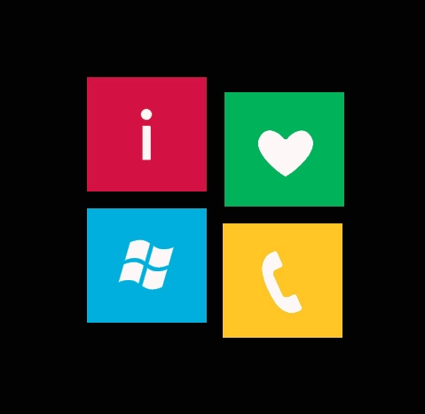
In a neat little historical post over at the site Project Metro, the origins of the Metro UI design language are given some detail. What makes it interesting is the information came from a Microsoft presentation on the topic at an early "Behind the Tiles" event.
We won't steal all of their thunder from the fun little read, so we'll just tease you with a bit of it:
"The whole idea started with the Swiss Movement in the 1960′s. They wanted a way to communicate to people through design, while being different yet direct. What was born from this movement was the font, Helvetica. It was the first simplistic yet sophisticated design font that delivered a clear and precise message. Microsoft knew with the rise of Apple and Android that they needed to make a change. They needed to be different but also wanted a clearer way to deliver its message..."
Very interesting stuff, especially about the use of Helvetica and Segoe fonts (Windows Phone uses a slight variation called Segoe WP). Personally, we'd like someday to see a detailed history of the evolution of Metro UI through Microsoft (we've seen some early iterations in Media Center, then through Zune to Windows Mobile 6.5 and up to Windows Phone 7).

Source: Project Metro

