Apple unveils Liquid Glass at WWDC, but all I see is a sorry version of Aero Glass
I watched Apple unveil its new Liquid Glass design language for its software platform, but I can't stop thinking about how much nicer Microsoft's Aero Glass from Windows Vista was.

Apple has just unveiled Liquid Glass at WWDC 2025, its new design language for Apple platforms launching later this year, starting with iOS 16, iPadOS 26, and macOS 26. The first developer beta is available now, giving the world a first look at this new design ethos from Apple, and I'm shocked at how much it reminds me of Windows Vista's Aero Glass.
Don't get me wrong, Apple is no stranger to copying and stealing features and ideas from other platforms. In the very same event, Apple lifted Call Screening and Direct My Call from Google Pixel straight onto the iPhone, and last year, it finally implemented its version of Windows Snap on macOS.
I often find Apple's copying is always late, and generally worse than the competition. But with Liquid Glass, I can't not be reminded about how much nicer Aero Glass was (and is.) Microsoft first unveiled Aero Glass in 2006, which first shipped with Windows Vista that same year.
Article continues belowAero Glass came after Apple's Aqua design language debuted with Mac OS X, but Aero Glass was different enough that it's clear Microsoft took initiative and went in its own direction. With the new Liquid Glass, it just seems like a worse version of Aero Glass.
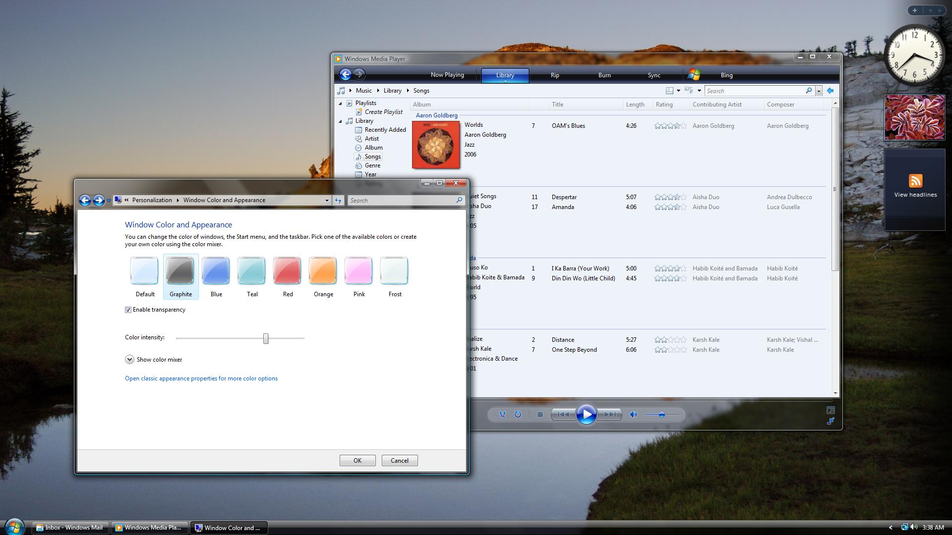
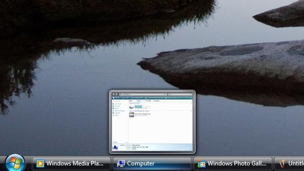
While Windows Vista itself was received rather poorly, nobody ever denied that the OS looked good. It was the first to introduce blurred glass effects across the entire desktop interface, including the Taskbar, Start Menu, and app window titlebars. For the time, it was very futuristic, so much so that most PCs couldn't even run it properly.
This design language was carried forward with Windows 7, which only improved upon it with more glass panes, glow, and blur effects across the board. It was a perfect blend between old and new Windows interfaces, as even the older interfaces didn't really look that out of place alongside Aero Glass.
I loved Aero Glass and was sorry to see it go with the debut of Windows 8 in 2012, which set the stage for a decade of flat design ethos, which was also copied by Apple with iOS 7 in 2013. iOS 7 was also poorly received by users, and it seems the same is happening here with Liquid Glass.
All the latest news, reviews, and guides for Windows and Xbox diehards.
So far, the biggest problem with Liquid Glass appears to be contrast, or a lack thereof. A lot of areas of the OS that are relying on blurred glassy aesthetics don't separate themselves well enough, causing text to become hard to read in front of whatever interface is behind it.
So Apple is throwing accessibility to the wind with their liquid glass design? None of this looks easy to read especially for people like me with learning disabilities, specifically Dyslexia. What happened to universal design? #WWDC25 #WWDC2025 #UniversalDesign pic.twitter.com/v6APOLTdUnJune 9, 2025
Aero Glass solved this by simply ensuring the blurred, glassy effects were strong enough so that objects behind it were barely visible. This ensured that the user could always read the text at the top level of the interface, making it easy and accessible for most people.
Apple looks to have missed that memo, as there are multiple cases where the glass effects are too translucent. The new control center, for example, is a barely blurred sheet of glass, meaning you can read large text straight through it. That's a terrible design that's going to cause headaches for a lot of people.
Liquid Glass does make some interesting UI choices that Aero Glass never did, made possible because computers and phones today are way more powerful than they were in 2007. The glass materials have more realistic aspects to them, bending light around edges like real curved glass does.
The morphing at the edge of the glass is really distracting. pic.twitter.com/k4CQ9fYI7xJune 9, 2025
On paper, this does sound like a really cool idea. In practice, however, it looks dreadful, introducing more noise than necessary to interfaces that simply don't need it. It kind of makes everything look like a virtual bubble, rather than realistic glass.
And I think that's the main problem with Apple's new design language. It's trying too hard to be realistic, and that's a problem for software design. Microsoft struck the perfect balance between realism and digital design with Aero Glass, mainly because that's what PCs could handle back in the day.
Now, Apple is unrestricted in just how realistic it can make these interfaces look, and it's becoming clear that this doesn't really translate well in software. I think Liquid Glass needs to be significantly dialled back if Apple wants users to like it. On paper, I think it's a great idea, but in practice, it needs a lot of fine-tuning.
I really love how Windows Vista and Windows 7 found an excellent balance with effects like glow and light. You could only really find it in certain places, like window controls and app icons on the Taskbar, and it was used to signify that you were currently hovering or highlighting a clickable item.
Some elements of the system had faux light effects, like the Taskbar, which looks like it's lit from above, with a blue light appearing underneath app icons when you hover over them. Of course, this effect was built-in, not rendered in real time, but it still looks great even today.
Ultimately, it feels like Liquid Glass is Apple trying to one-up Aero Glass and fumbling it during the process. Of course, this is still developer beta 1, and I'm certain Apple will fine-tune this design language as testing progresses. Just like with iOS 7 in 2013, Apple will address people's biggest complaints with Liquid Glass.
They'll just do so quietly and never admit they were wrong, because that's Apple for you.

You must confirm your public display name before commenting
Please logout and then login again, you will then be prompted to enter your display name.

 Windows Central Insider


