


This week, Microsoft debuted a new logo for Microsoft Edge, which has been rebuilt from the ground up to use Chromium for greater compatibility with the modern web.
The new Edge logo will debut when the browser goes public in early 2020 and was discovered through a series of puzzles in the Insider builds.
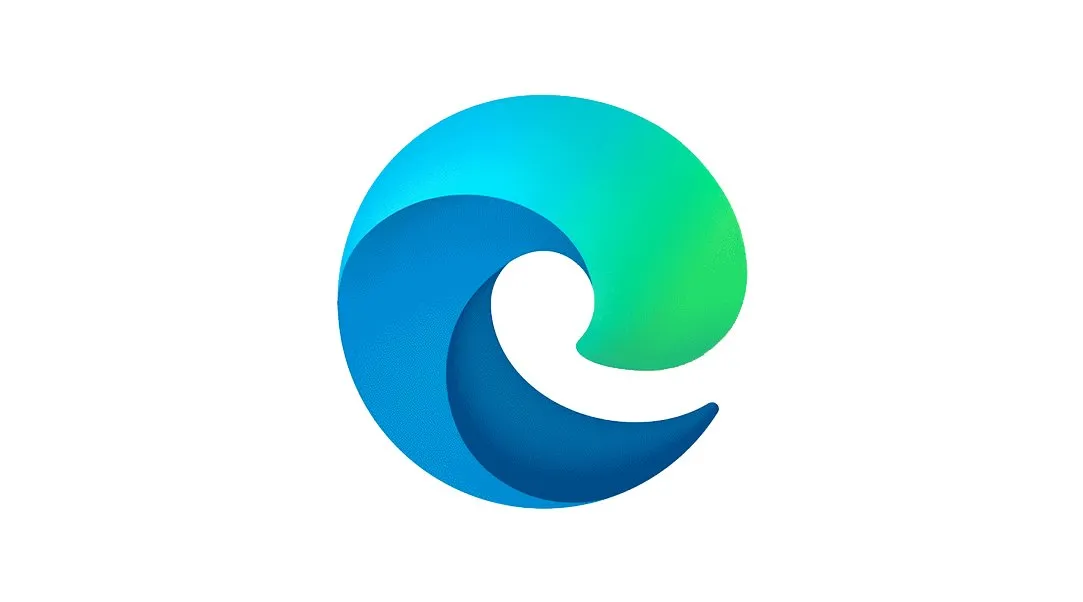
What do you think of the new @MicrosoftEdge logo? 😮🌊 pic.twitter.com/VeXDKEfIZKWhat do you think of the new @MicrosoftEdge logo? 😮🌊 pic.twitter.com/VeXDKEfIZK— Windows Central (@windowscentral) November 4, 2019November 4, 2019
The new Edge logo has shades of the Internet Explorer blue of yesteryear but ditches the "E" that has become synonymous with Internet Explorer, which was left in the dust by the modern web. The "E" carries a huge amount of negative stigma, and the new logo gives Microsoft a chance to turn the page and build something fresh for the modern era. However, reactions to the logo itself seem to have been a bit mixed so far.

So ultimately, we'd like to ask you, faithful readers, what you think of the new Microsoft Edge logo. How would you change or improve it, or is it perfect as is? Hit the comments, vote in our poll, and let us know!

