Microsoft Edge gets a new logo that looks less like Internet Explorer's
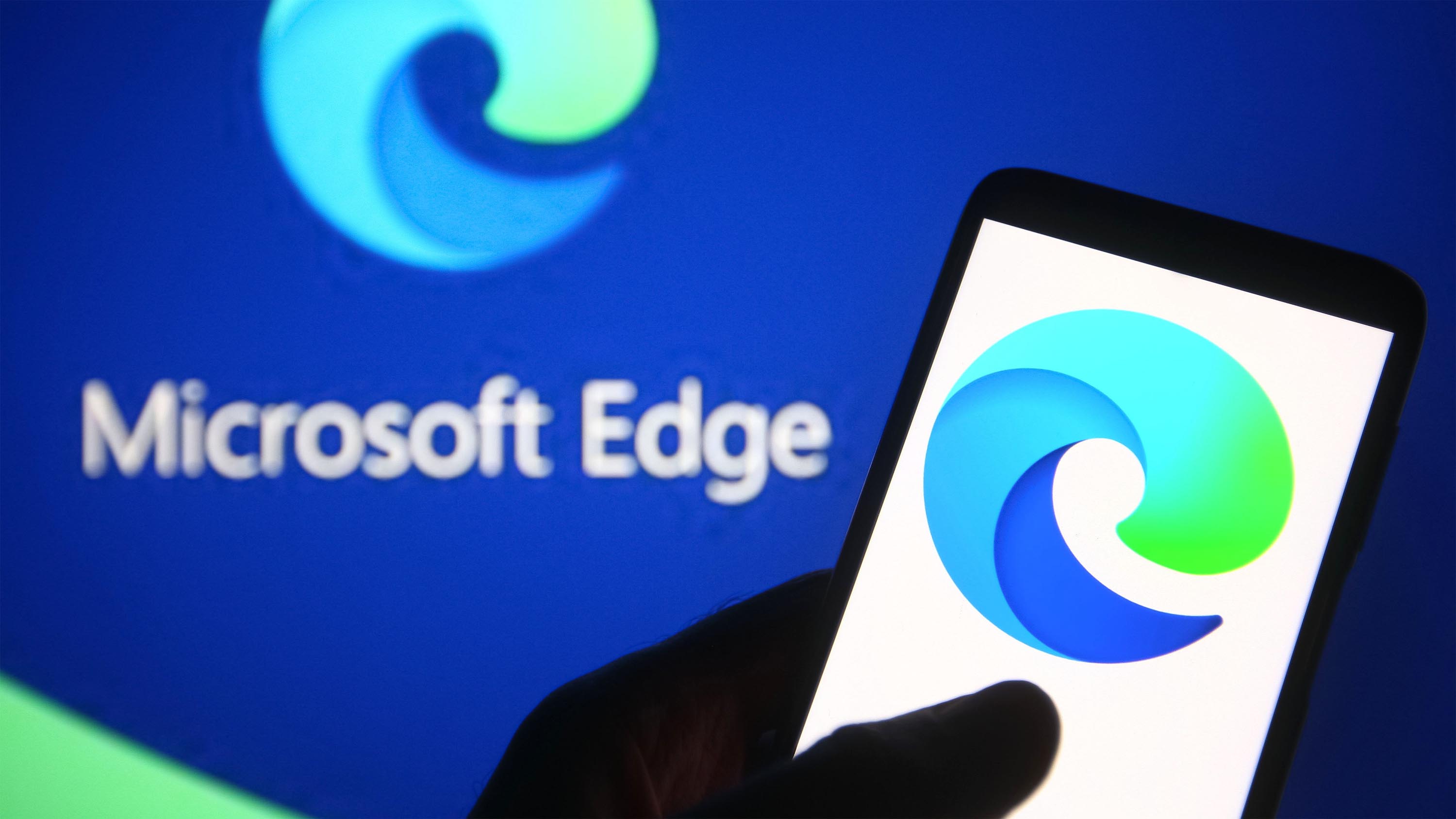
The new Chromium-based Microsoft Edge comes with a new logo.

All the latest news, reviews, and guides for Windows and Xbox diehards.
You are now subscribed
Your newsletter sign-up was successful
Join the club
Get full access to premium articles, exclusive features and a growing list of member rewards.

What you need to know
- Microsoft revealed a new logo for Microsoft Edge.
- The new logo looks less like Internet Explorer's logo than the old Microsoft Edge logo.
- Microsoft revealed the new logo as part of a puzzle for fans.
Updated November 4, 2019: Microsoft announced that the new Microsoft Edge launches for Windows an macOS on January 15, 2020.
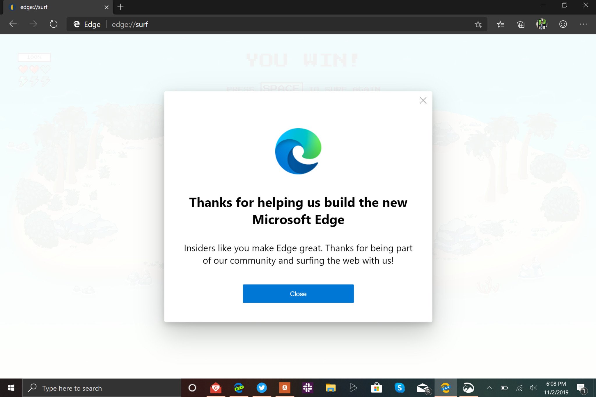
People will confuse Microsoft Edge with Internet Explorer less frequently thanks to a new Microsoft Edge logo. Microsoft revealed a new logo for the Chromium-based Microsoft Edge over the weekend through a fun puzzle for fans (via The Verge). The new logo features Fluent Design elements and looks less like the logo for Internet Explorer.
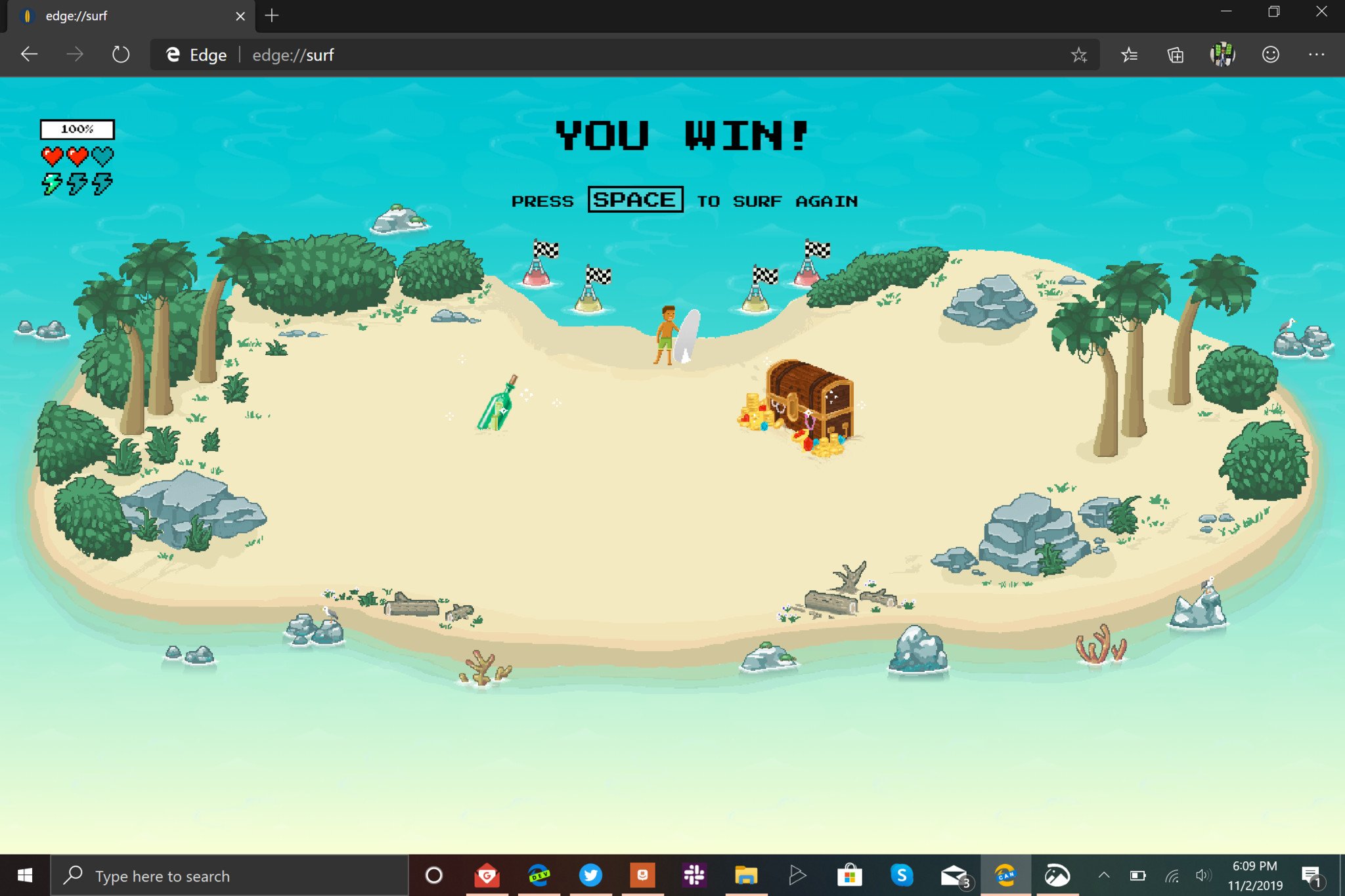
Microsoft's Edge team spread a puzzle out for fans over the second half of last week. Fans around the web uncovered the secret meanings of pictograms, numerical codes, and other hints to find the new Microsoft Edge logo. One of the puzzles included rendering an Edge icon from OBJ model code. The end of the puzzle is a secret surfing game, surf being a pun because the new logo looks like a wave.
William Devereux, senior project manager of Microsoft Edge, shared how to unlock edge://surf on Twitter.
To unlock edge://surf, create a Collection named "Microsoft Edge" and add four items that spell "S.U.R.F." This currently only works in the Canary channel.
The new Microsoft Edge logo looks less like the logo of Internet Explorer. Some people confuse Microsoft Edge with Internet Explorer due to the apps' similar icons. This icon refresh will likely distinguish the browsers a bit more for people.
The Chromium version of Microsoft Edge has been in testing for several months, including Canary, Dev, and Beta versions of the browser. There is no release date for the new version of Microsoft Edge, but the new logo suggests that a public release could arrive in the near future.
All the latest news, reviews, and guides for Windows and Xbox diehards.

Sean Endicott is a news writer and apps editor for Windows Central with 11+ years of experience. A Nottingham Trent journalism graduate, Sean has covered the industry’s arc from the Lumia era to the launch of Windows 11 and generative AI. Having started at Thrifter, he uses his expertise in price tracking to help readers find genuine hardware value.
Beyond tech news, Sean is a UK sports media pioneer. In 2017, he became one of the first to stream via smartphone and is an expert in AP Capture systems. A tech-forward coach, he was named 2024 BAFA Youth Coach of the Year. He is focused on using technology—from AI to Clipchamp—to gain a practical edge.
 Windows Central Insider


