Windows Phone
Latest about Windows Phone
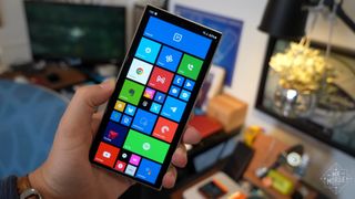
The dream lives: fan project Windows Astria shows the perfect Windows Phone
By Kevin Okemwa published
WINDOWS PHONE A breathtaking fan concept, Windows Astria, resurrects Windows Phone by merging Windows 11 Fluent Design, beloved Live Tiles, and native Android app support. it’s the Microsoft mobile OS that should have been.
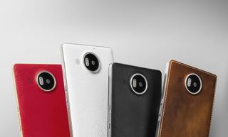
When the Lumia 950 and 950 XL were threatened by Surface's success
By Jason Ward published
Flashback Will the Surface's success cause fans to pass on the Lumias 950 and 950 XL during the critical launch of a new OS? Time and how these devices sell will tell.
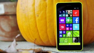
When Windows 10 Mobile was on nearly 6 percent of all Windows Phones
By Daniel Rubino published
Flashback From the archives: Things were looking bright for Windows 10 Mobile as proved "by the numbers" on a Wednesday in 2015.
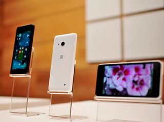
When Windows Mobile still had a pulse, and concept phones promised a reboot that never came.
By Daniel Rubino published
Flashback From the archives: Back in 2015, when Windows Phone was fighting for relevance, we dreamed of bold reboots and concept phones. A look back at where Microsoft was — and where our community’s imagination took us.
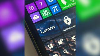
Windows Phone just got its first AI ChatGPT-style app. No, really.
By Jez Corden published
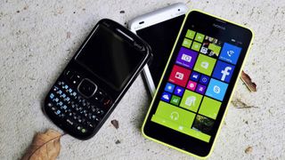
Windows Phone Homebrew developers keeping Windows Phone 8.1 alive from beyond the grave are working hard to keep the platform in line with the times.
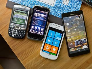
The Microsoft Store on Windows 10 Mobile finally stops working
By Zac Bowden published
Windows Phone Someone must have finally pulled the plug, as five years after support officially ended, the Microsoft Store on Windows 10 Mobile has stopped working properly.
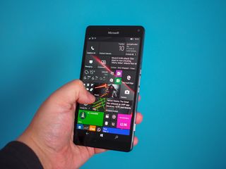
The director of one of 2025's best games was a Windows Phone fan, showcasing good taste
By Jez Corden published
Windows Phone Daniel Vávra of Warhorse Studios fame was a Windows Phone fan, showcasing good taste. He also had a similar experience that I did upon visiting Microsoft HQ.
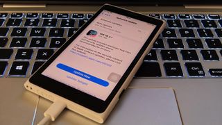
Windows Phone revived: Lumia 1020 "upgraded" with full-fledged iOS and 5G
By Sean Endicott published
Phones A tech enthusiast turned a Lumia 1020 Windows Phone into an iPhone. The resulting device is gorgeous but makes us wonder what could have been.
All the latest news, reviews, and guides for Windows and Xbox diehards.
