Bing has a new, curvier logo
Bing isn't being left behind in Microsoft's journey to add more Fluent Design to its icons and logos.

What you need to know
- Bing has a new logo.
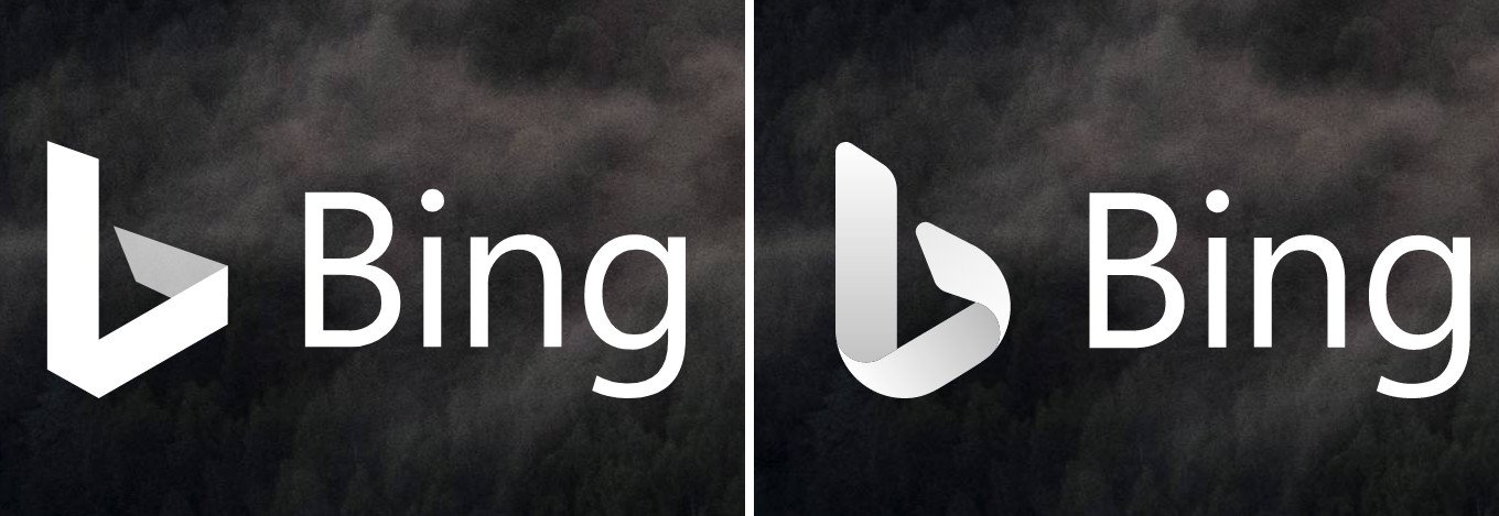
- The new logo has a curvier look compared to the old one.
- This logo doesn't appear to be available for everyone yet, but it's rolling out.
Microsoft has been on a roll in revamping its icons across its Windows and mobile apps recently, and it looks like Bing is getting in on the action, too. The new logo still sticks to the same lowercase "b" that Microsoft has used for ages, but it adds some new curves that weren't present on the old logo. The overall aesthetic feels more in line with Microsoft's Fluent Design ethos as well.

Microsoft first detailed a large-scale effort to overhaul its icons last year, and it's been on a gradual pace of pushing them out across Windows, Android, and iOS since. With a Fluent Design bent, Microsoft is leaning more on depth and subtle visual cues. In a recent blog post, Microsoft emphasized that the goal is to make the icons feel as though they were cut from the same cloth.
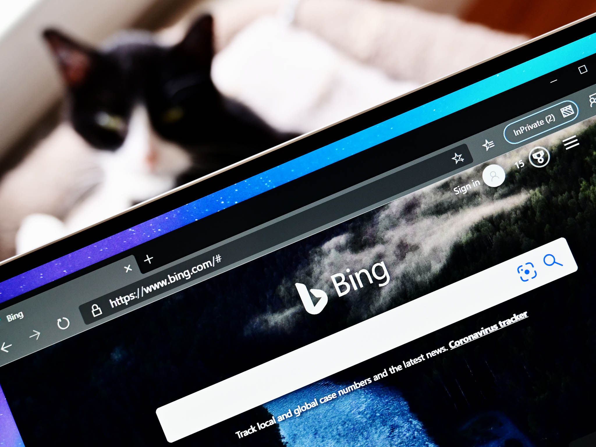
As for the new Bing logo, it doesn't appear to be available for everyone just yet. We were able to get it to show up on at least one PC by viewing Bing in a private tab, but your mileage may vary. Presumably, it will roll out to everyone over time.
Article continues belowThanks for the tip, Nicholas!
All the latest news, reviews, and guides for Windows and Xbox diehards.

Dan Thorp-Lancaster is the former Editor-in-Chief of Windows Central. He began working with Windows Central, Android Central, and iMore as a news writer in 2014 and is obsessed with tech of all sorts. You can follow Dan on Twitter @DthorpL and Instagram @heyitsdtl.

 Windows Central Insider


