Microsoft appears to be testing a new Movies & TV interface for Insiders

It looks like Microsoft has a fairly big UI revamp in the works for the Movies & TV app on Windows 10. First spotted by Twitter user Aaron Hall (via MSPU), the revamp makes a couple of sweeping changes to how you navigate the app.
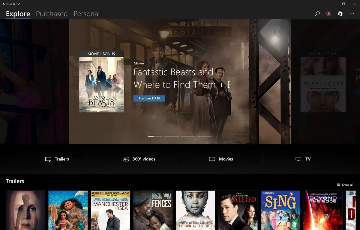
The first big change of note is the removal of the hamburger menu in favor of a tabbed interface. The old Movies, TV and Video navigation options have also been replaced with "Explore," "Purchased," and "Personal." The first features a broad overview of content to check out, split into different categories. Meanwhile, Purchased aggregates all of your purchases in one tab, while personal simply acts as another space for your own personal videos.
Microsoft hasn't announced anything concerning a revamp, so it's not clear just how extensively this new look has rolled out to Insiders and it could just be a test of some sort. Regardless, if you're an Insider, you might want to check for the redesign on your machine.
Download Movies & TV from the Windows Store (opens in new tab)
Windows Central Newsletter
Get the best of Windows Central in your inbox, every day!
Dan Thorp-Lancaster is the former Editor-in-Chief of Windows Central. He began working with Windows Central, Android Central, and iMore as a news writer in 2014 and is obsessed with tech of all sorts. You can follow Dan on Twitter @DthorpL and Instagram @heyitsdtl.
-
Does overlay feature enabled?? Now can we use overlay.
-
Yes that has already happened for insiders
-
I'm insider :( fast don't know how to use.
-
click on the new icon under the progress bar
-
Can't get the update still!
-
Cool. Looks like Microsoft is starting to build it's own identity again. I was never really opposed to the adoption of hamburger menus because they freed up more real estate, but it did feel like Microsoft was just doing what was popular.
-
I hate the hamburger menus, and how on every Microsoft App that uses them (except for Groove, thankfully), including the Start menu itself, I have to click that stupid thing just to temporarily show what should already be shown: menu text instead of dozens of unidentifiable heiroglyphics.
-
You'll get used to it. In the long run, it's better to mark everything with symbols, just like road signs etc. Means that people that don't speak the language or dyslexic people can easily identify what's what. It makes it more accessible to a lot more people. It's not like the icons are really ambiguous or anything.
-
Looks similar to the Groove interace on XBox now. Not sure if it's rolled out to everyone, but I've had it for about a week.
-
I want it now. :P
-
Do they have to make those tabs that big and ugly though?
-
i think that looks really nice! Just like in the photos-app. :)
but it still needs some polish so that the layout and fonts are the same size like in photos... -
I like the new categories, but I'd rather have the hamburger menu over this tabbed layout. It looks ugly in those screenshots. MSFT needs to bring back the in-app store, just like it's hinted here. As an avid Groove user it pisses me off when something is purchase-only and I need to search for it again in the Store app.
-
Always hated the hamberger menu. Tabs look so much better and should work easier on phone.
-
It also means swiping actions too. 😊
-
This interface showed up in Groove on Xbox, FYI
-
Woah what when?
-
Nice! It would be awesome if they could bring back the "watch list" that used to be in the Xbox version. Add a fourth tab/pivot for it and make it available across the ecosystem!
-
I wish they keep this consistency and add some Animations (obviously).
-
Will it finally handle our personally owned movies and TV shows as movies and TV shows? Or will it still be an amateurish mess of everything thrown under a messy pile in personal? I cant believe we went from Zune to this garbage and it is over a decade now.
-
I hope it'll start showing content from OneDrive. Just like Groove does with music
-
That would be awesome. Good call. Also desperately need to be able to permanently delete free pilot episodes we try and hate. I am so sick of those coming back over and over.
-
I am on the latest build and still do not have the overlay function nor do I have this new version. Guess i will have to contineu waiting...
-
Neat
-
look like it would fit better on xbox but it like cool still
-
We are waiting