Microsoft reimagines the cubicle with futuristic focus pod
The future of hybrid work could include open pods that allow people to focus in hybrid workspaces.
All the latest news, reviews, and guides for Windows and Xbox diehards.
You are now subscribed
Your newsletter sign-up was successful
Join the club
Get full access to premium articles, exclusive features and a growing list of member rewards.
What you need to know
- A concept by the Microsoft Office Envisioning Team won a Red Dot award for the Flowspace Pod.
- The design presents an open chamber that would help people focus within a hybrid work environment.
- A computer within a mockup of the Flowspace Pod appears similar to the display of the Surface Studio.
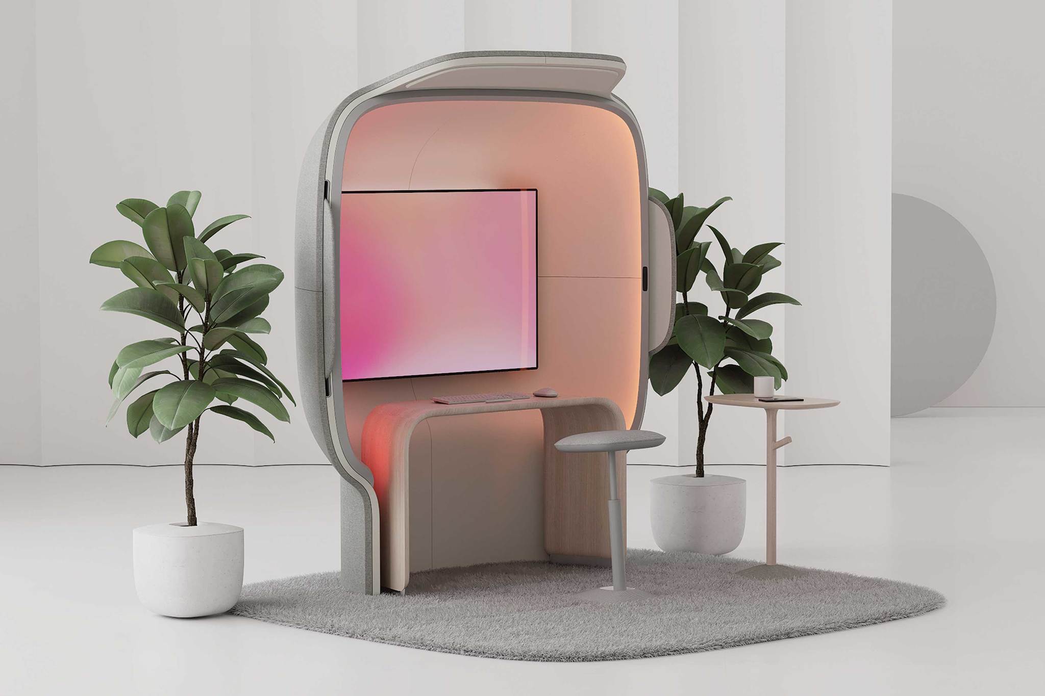
A concept from Microsoft won an award from Red Dot, which declares the idea among "the best of the best in 2021." It's called the Flowspace Pod, and it takes a new approach to compartmentalized working. Rather than completely enclosing someone within a cubicle or blocked off environment, the Flowspace Pod has an open concept that still allows people to focus.
The Microsoft Office Envisioning Team came up with the idea for hybrid workplaces. The Flowspace Pod features a computer that appears to be heavily inspired by the Surface Studio. A video of the concept shows a PC screen with then bezels tilting down and back up. Later in the video, speakers pop out of the sides of the pod.
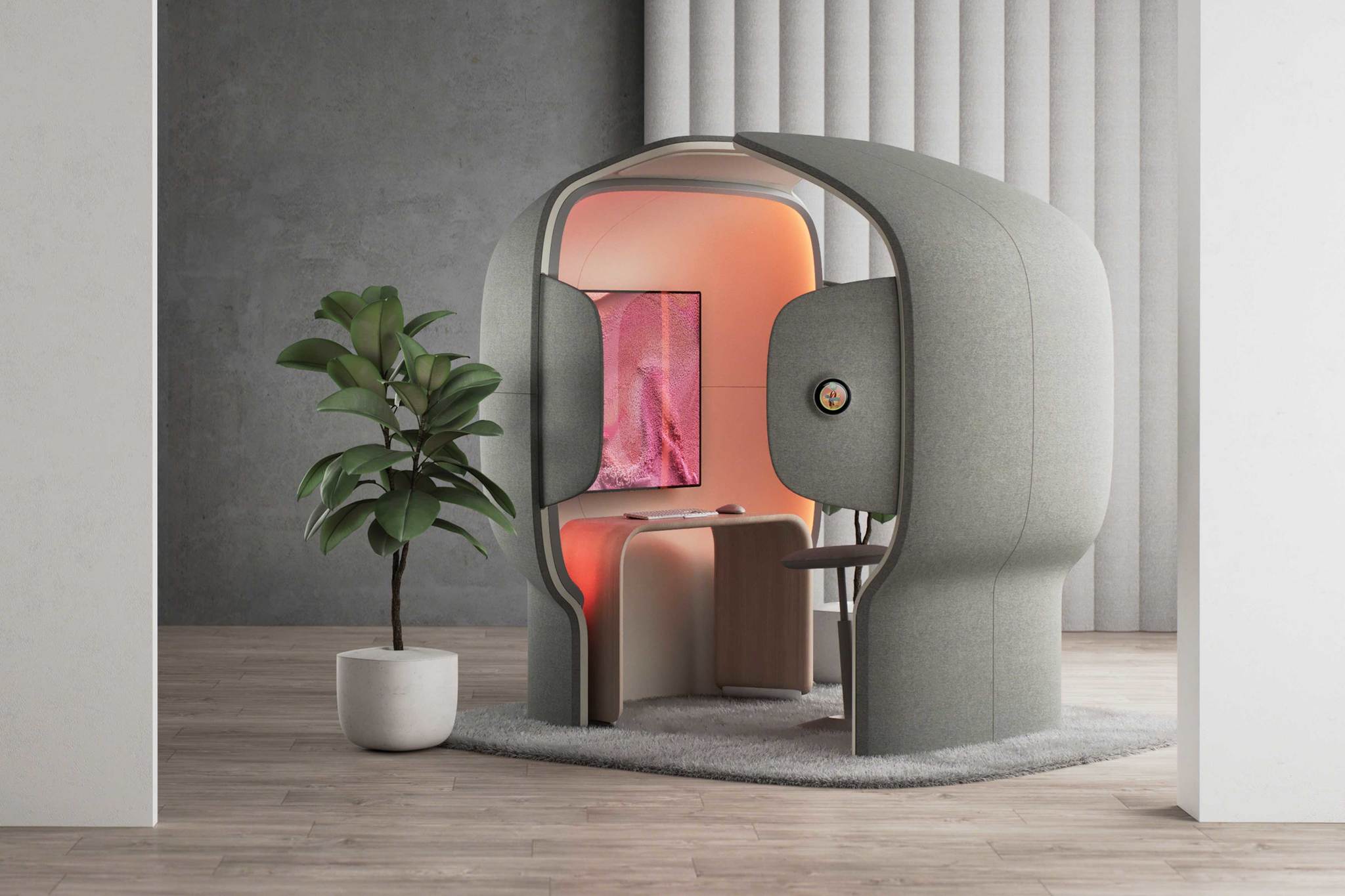
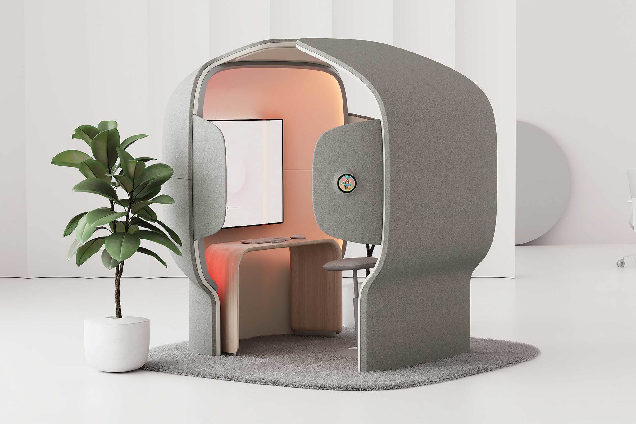
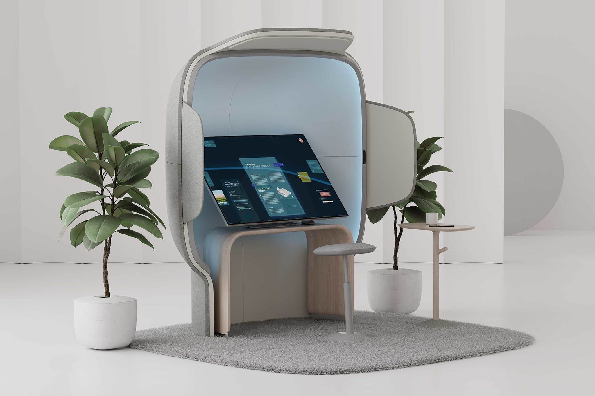
The Flowspace Pod looks a bit like a cubicle redesigned for modern hybrid work. It has open sides that would allow people to easily work without feeling trapped in a box. Mockups of the setup show versions with and without the back.
Article continues below"The Flowspace Pod is a vision for the new normal, a sanctuary for focus and deep work in highly collaborative hybrid workplaces where solo work time will become more precious," reads the description of the idea on the Red Dot award page.
At least for now, the Flowspace Pod is only a concept. If you'd like to immerse yourself in your work and lower distractions, you'll have to resort to a pair of the best noise-canceling headphones.
All the latest news, reviews, and guides for Windows and Xbox diehards.

Sean Endicott is a news writer and apps editor for Windows Central with 11+ years of experience. A Nottingham Trent journalism graduate, Sean has covered the industry’s arc from the Lumia era to the launch of Windows 11 and generative AI. Having started at Thrifter, he uses his expertise in price tracking to help readers find genuine hardware value.
Beyond tech news, Sean is a UK sports media pioneer. In 2017, he became one of the first to stream via smartphone and is an expert in AP Capture systems. A tech-forward coach, he was named 2024 BAFA Youth Coach of the Year. He is focused on using technology—from AI to Clipchamp—to gain a practical edge.
 Windows Central Insider


