Skype ditches 'Highlights' in design shift to 'simplicity and familiarity'
Skype is saying "goodbye" to its Snapchat clone, Highlights, as Microsoft shifts towards a "simplicity and familiarity" in its design.

To say Microsoft took some heat for its Skype redesign, which first landed last summer, would be an understatement. The biggest criticism levied at the overhaul was that it felt like it was trying too hard to imitate Snapchat, from its colorful design language to the "Highlights" feature, which is basically a clone of Snapchat Stories.
Following a torrent of negative feedback, the Skype team said it was listening to users, eventually leading to the promised return of missing features and a rethinking of Skype's design language. And, yes, that includes the removal of Highlights.
In a new blog post, Microsoft's director of design for Skype and Outlook, Peter Skillman, says that the team has taken a step back to focus the on "simplicity and familiarity" at the core of Skype's design. From Skillman:


As Skype functionality has expanded, so too has its complexity. As with any feature rich product, maintaining simplicity while enhancing functionality is critical to usability. This past year we explored some design changes and heard from customers that we overcomplicated some of our core scenarios. Calling became harder to execute and Highlights didn't resonate with a majority of users. We needed to take a step back and simplify!
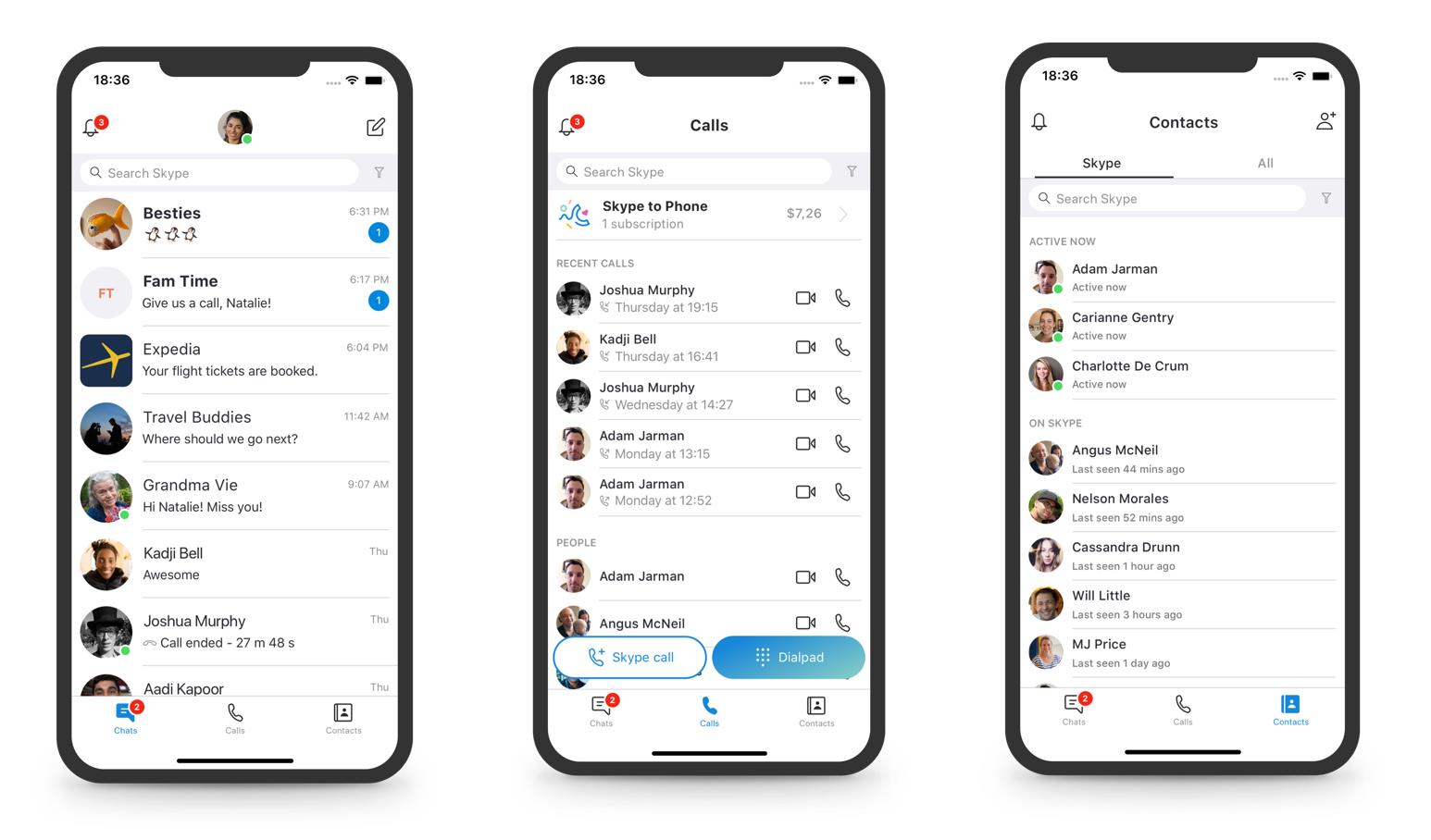
Skillman first highlights the changes to its mobile apps, noting that it is focusing on decluttering the UI and moving to three buttons at the bottom of the app: Chats, Calls, and Contacts. As part of the shift, the Highlights feature is has gone out the metaphorical window.

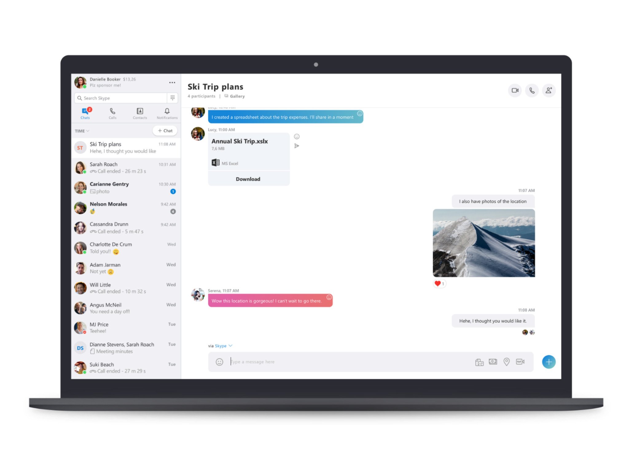
On the desktop side of things, Skillman focuses on changes to the design to make things easier for those coming from the classic Skype experience. While the modern look is still here to stay, Microsoft has moved the four main navigation buttons to the top-left portion of the window, just above your chats. "Decorative elements," such as the squiggle shape cutout for notifications, have also been removed for a more conservative design. That's in addition to both light and dark themes, along with a Skype "Classic" blue theme, Microsoft says.
"We are listening to your feedback and are wholly committed to improving the Skype experience based on what you are telling us," Skillman says. "We hope this updated design makes Skype easier to use and provides a better Skype experience." While Microsoft is still addressing feedback, you can contribute your own ideas and vote on others at the Skype UserVoice site.
The blog post comes after Microsoft decided to backtrack on plans to retire the classic Skype desktop app on September 1 in order to implement highly requested missing features in Skype version 8. Some of the features currently in the works include split view, improved privacy settings, and the ability to search for a message in a chat. In the meantime, classic Skype users will continue to be able to use the app for the forseeable future.
All the latest news, reviews, and guides for Windows and Xbox diehards.

Dan Thorp-Lancaster is the former Editor-in-Chief of Windows Central. He began working with Windows Central, Android Central, and iMore as a news writer in 2014 and is obsessed with tech of all sorts. You can follow Dan on Twitter @DthorpL and Instagram @heyitsdtl.

 Windows Central Insider


