Spotify for Windows Phone updated with an iOS-esque visual revamp
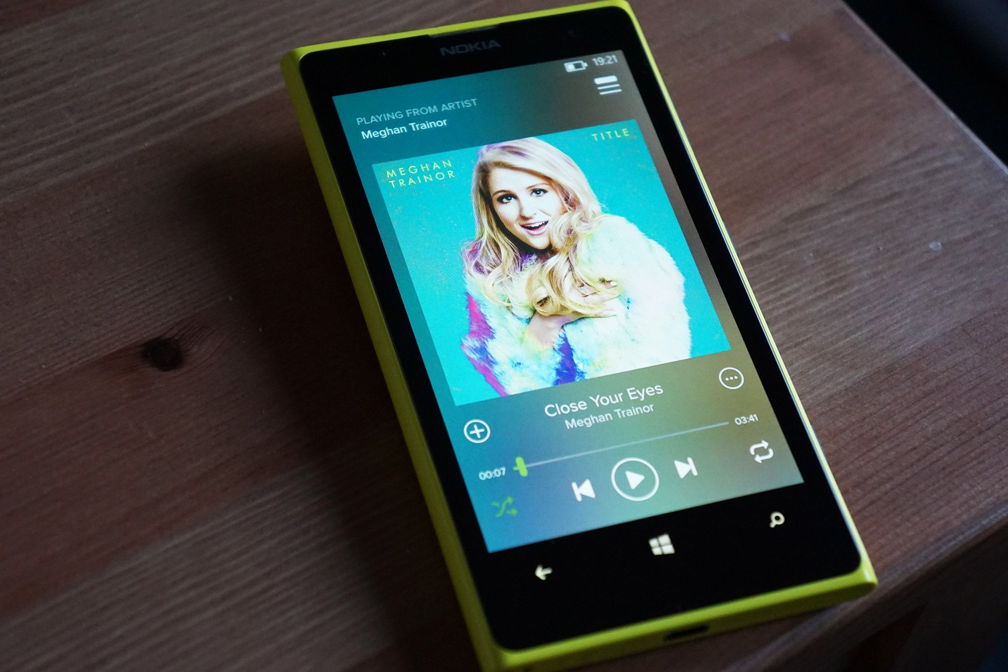
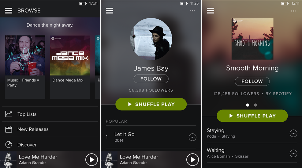
Spotify has released an update for Windows Phone to bring its app on par with its Android and iOS offering. The latest release - version 5.0 - includes a UI revamp that provides subscribers with an iOS-esque interface, deploying transparency and other visual features. While the new Spotify does not strictly follow Microsoft's Modern UI, the new look is actually rather nice.
According to the Windows Phone Store listing for Spotify, version 5.0 brings to the table:
- Spotify has a bold and beautiful new look: playing your favourite music has never looked so good.
- Your Music on Windows Phone: helps you save, organize and browse your music collection.
- Updated Browse feature: delivering even more relevant and localized content.
It was only last year when Spotify last updated its Windows Phone app to implement a new design. Hit the download link below (or manually check on your phone for updates) to grab the latest release and see what you think of the new look.

Thanks to everyone who tipped us!
Windows Central Newsletter
Get the best of Windows Central in your inbox, every day!
Rich Edmonds was formerly a Senior Editor of PC hardware at Windows Central, covering everything related to PC components and NAS. He's been involved in technology for more than a decade and knows a thing or two about the magic inside a PC chassis. You can follow him on Twitter at @RichEdmonds.
-
I m not able to register nor login! :| anyone facing the same problem?
-
My Spotify is also.can not play on free.why?it can play before updated.always informed me offline.buy network is ok.
-
Yup !!! Same problem in my Lumia 820.
-
We also got "Repeat Track"! http://i.imgur.com/Dld3lGB.jpg
-
This I why I can overlook the iOS design lol.
-
This^^
-
Well, ios stole the modern design from Microsoft anyway.
-
Stole? No. Took elements of it and modified it? Yes. We all know there is a difference between Windows Phone Modern and iOS Modern. I own a Lumia 930 and i'm deeply rooted into the microsoft ecosystem (in case anyone plays the apple fanboy card)
-
Nicer! and faster!
-
Agree, sure it looks kinda like an iOS app, but they improved the performance and added some features. Seems like a good trade off.
Anyway it looks way better than the previous version -
Spotify unifying its look and features isn't a bad thing. Hopefully it means the Windows Phone app stays on par with the other platforms since it had begun to fall behind.
-
They have one unified design for ios, android, and windows now. Great update.
-
Really...we can't lie to ourselves. The old app was pretty bad... 1-when resuming the now playing was gone. You had to click the now playing at the bottom and wait for it to respond...not fun to want to change the music while driving. 2-No my collection. I had to make a playlist of all my songs. 3-Slower performance. 4-Didn't match Spotify. 5-No one track repeat...again I made a stupid playlist. 6-No browse feature...so certain playlists I couldn't find because I only saw them on browse on the computer and didn't remember the exact name.
-
Pretty weird really, I was never a fan of the ios 7 look, good to see updates regardless.
-
Yeah, nice
-
So Microsoft bother and reject VLC because they don't follow metro guidelines, but it's ok for their own OneDrive (corrected since then) or Spotify? Double standards, meh.
-
What are you talking about..
-
Ur source? I don't think it was rejected for not following Metro design guidelines!
-
I doubt it was rejected because it didn't follow metroUI guidelines but more likely because the app wasn't running to a standard acceptable for not only submission but from a dev like videolabs.
-
Spotify had the same menu before this update. Unless you didn't update last. :)
-
"bother and reject"?
-
He's right, initial close beta was rejected because it did not conform to guidelines. Spotify looks nothing like a WP app.
-
What in this do you think doesn't conform to the Modern UI guidelines though?
-
There's no Taylor swift song on Spotify??
-
There was a reason she doesn't want her music on there. Don't remember it. * money*
-
You mean she wants to get paid for her work. Blashpemy.
-
http://time.com/3554468/why-taylor-swift-spotify/ Apparently musicians get next to nothing from streaming services.
-
Spotify said she made millions. Anyway, 15million Spotify subscribers at $10 a month. That's $1.8billion a year they have to pay artists. There's a reason nearly every artist ever is on it.
-
At least they're getting something....
I understand it's hard work to get exposure and to pay for shoots and videos and tours and such, but considering the work that other artists are putting in that surpass the level of work she puts in her music, but still make less than half of what she's earning with her pointless lyrics..........she should appreciate that she's on top. -
IF you have a shitty record label.
-
I consider that a plus !
-
finally it has support for your collection. still no spotify connect though :/
-
+920
-
+920
-
No transparent tile :(
-
JAJAJA this is like so funny, that's the first thing they should do and they do it in the hole App but the tile.
-
I remember reading there are policy violations when it comes to making album artwork transparent. Or something like that.
-
iOS doesnt have transparent tiles.
-
I hate transparent tiles
-
transparent/untransparent tile should always be an option, always
-
Kinda like it however something's are now more complicated to do eg pin to start
-
These companies are so lazy when it comes to Windows Phone!
-
Mind to elaborate?
-
Really? Most say"fuck WP" just pull that shit from the store rather than update an app.
-
Transparent tiles for one. But I think he means most official apps, like tumblr or instagram, are not very well done and are treated as low priority.
-
FYI, You can get a transparent Spotify tile with this app:
http://www.windowsphone.com/s?appid=f4125e62-a88b-4f7d-b8f6-3cd60069f105 -
That and they're designed to look like their iOS or Android counterparts instead of given a Modern UI look, which just indicates little effort from the developers into their Windows Phone apps. It's as if they're just tired of WP users complaining about the lack of their app on the platform so they just get fed up with it and port their iOS/Android app over just to shut them up and say "there, you have an app now, happy?" So in a way I understand what OP was saying about developers being lazy, but its even lazier that most developers just pass or give up on the platform instead because "they can't make their 99 cents from it." Maybe if they were to put more effort into their apps they would see more profit. It has to be Rudy Huyn quality though lol.
-
What about it do you think isn't a Modern UI look though? The Modern UI guidelines underline some principles while giving a lot of freedom to how an app can look so that brands can still create a brand identity with their app while conforming to the UI guidelines. Going though some of the guidelines: Does it follow a grid layout? Yes Do fonts make a hierarchy? Yes Content over chrome? Yes. Apart from some icons these no other neadless chrome Space over clutter? Yes Authentically digital? Yes. Nothing looks like real world stuff Thats basically all the design principles in the guidelines. There's nothing in the guidelines that say you must use a Pivot or a Panorama, thats just MS's implementation and they have said since WP7 that you don't need them in an app. The origional dev tools didn't even include controls for them. What's really happend is as Android and iOS have updated they've shifted their designs to something that actually conforms to the Morder UI guidelines. Guidelines are here http://msdn.microsoft.com/library/windows/apps/hh781237.aspx
-
You're mistaken. Instagram, Twitter, snapchat, IMDb are lazy. At least Spotify brings updates.
-
This^^
-
In a way I agree with you. They are pretty lazy with designing a new interface to make it look like the Modern UI and make Windows Phone stand out. They'd rather just make a port of their iOS/Android apps because its faster to do. However, you have to remember that a lot of these developers are ignorantly passing or giving up on Windows Phone, so be thankful that you at least still have ones that update their apps on it and commit to the platform somewhat.
-
Personally, I like the new UI better than the previous one. It makes more sense navigating it, and feels more fluid too. People are complaining about the hamburger icon, but it also works swiping to the right. No need to stretch your finger al the way to the corner to access the menu. I don't think of is just a port. I think they may just want a similar experience for their users no matter what platform they are using it on. A few things unique to Windows Phone would be nice, but I still do like what they did. Now Instagram.... Yes, they are really lazy when it comes to WP.
-
Oh I'm not saying its a bad UI by any means. If it works then it works. Yeah some developers probably do it intentionally because they want a similar experience across all devices, but there's a lot of developers out there as well that do it just for the sake of being lazy. Hell you can email some developers about why their app isn't on Windows Phone or why it hasn't been updated in over a year, or if you kindly ask them if they would make an app for Windows Phone/ consider it and they can give you pretty rude emails back. Some of them give you replies like "I will never make anything for Windows Phone" or "There's no way we will ever consider making apps for it" or whatever. Anyways that's going slightly off topic lol.
-
I just want spotify Connect!! :D
-
I want Spotify on Xbox One
-
I would switch to Spotify I'd there was a Xbox one app.
-
+920 Please!!!
-
Great no problem on my Lumia 930 (cyan) looks sweet !
-
Looks right here too! 930 w/Cyan
-
It crashes every time I try to access my playlists...
-
+1 Every time I go to "Your Music", it crashes to Start on my 1520. Annoying, as I only use Spotify for music, and can't access all my offline songs.
-
Feels kinda Zune-esque actually
-
Good
-
I like it! Going back to premium
-
Nice one
-
Still no support for Spotify Connect! FAIL :P
-
At least nowadays it seems like Spotify actually tries with their app.
-
Its about time we pack the idealistic windows design language argument away and take anything we can get I think! Updates are good!
-
I have to agree. Insisting on a Metro/Modern UI design language will get us nowhere if the apps are lacking in respect to their iOs / Android counterparts.
-
Yes but to know how much extra work it takes to get an app to behave differently than the metro design is supposed deliver out of the box? We didn't get a quality app because they decided to use a design that mimics iOS. This would have actually made developing the app harder because they had to highly customize the XAML in order to break from the standard look and feel. At this point why do we even have the Windows phone if developers are going to just start doing their own thing. If I wanted an iOS experience, I would have purchased a damn iPhone.
-
I'm guessing its the same on Android too. Services are more interested in creating an single, unified look that is consistent to there service than allowing each OS to have its own unique feel. I wish it wasnt like this, but I can see why it is.
-
well.. microsoft is not bothered to much with their own design language anymore so why should we give a f***, right
-
Agreed, I'd rather have a complete app that annoys metro design than a lacking app that follows metro design.
-
While it would be nice to see more Modern UI apps, I agree with you. At this point developers have ignored the platform long enough to where we should be thankful for anything we get as far as new apps or updates go. Maybe if Microsoft takes off with Windows 10 developers will eventually update their current apps to be more Modern UI like. But for now, having an app is better than having none at all.
-
Yeah, at least until there's like a 10-15% marketshare. I'd be happy with servcies just releasing the same app for all platforms in a timely fashion at this point. If WP gets more users, and users who spend money, it will get more attention.
-
I use Deezer and the app works fine and gets updated regulary
-
I like the new UI. Will test out at the gym
-
Not sure if this is a Spotify issue or Windows phone issue with Spotify but in on the free version and everytime I go to a album and shuffle that album it plays like 4 or so songs off that album then shuffles to songs not on that album and never goes back to the album I shuffled. Why is this happening?
-
Because that's what the free version does on mobile. It shuffles more than just your own stuff. Or at least that's what it's done for me on the other platforms since it first arrived.
-
That's normal on every platform.. If you don't want that to happen, maybe you should get the premium version..
-
Isn't it works in India,am not able to sign up
-
Spotify is not for India, like xbox Music isn't. You cannot use services that are not available to your country.
-
Omg, I was just fuckin with him, lol!
-
The update has not fully rolled out to India yet. Hang in there.
-
And if we change our region to U.S.A? Can the Xbox music services be available for us then? Just a query.
-
Changing your region won't help you. Neither for Spotify or Xbox Music. Spotify can only be played by ip region lock (the freemium version) and xbox music is only available by subscription, they removed the free option.
-
Don't misinform users. However, is their fault also, cause they can easily check. I will repeat, spotify and xbox music aren't available in India. See below. https://support.spotify.com/uk/learn-more/faq/#!/article/Availability-in-overseas-territories
-
If you are replying to me, I made it infinitely clear I was joking. Good Monday morning to you.
-
I think you have an odd way of making things "infinitely clear". You should work on that, else you'll end up with "infinitely clear" misunderstandings jn life:)
-
Ok, I understand low comprehension rates. Under your comment above, "Spotify is not for India," what did I write? "I was just fucking with him," is that not clear enough?
-
Last.fm integration please.
-
This. They update their app quite regularly and still no Last.fm integration.
-
Seriously still none? I used Rdio when I was on WP as they've had scrobbling since day one. Hopefully foobar2000 will bring local music last.fm support too.
-
Have been using the iOS version for iPod for a couple of days, and it sure is unintuitive as hell. But, anyways, kudos to devs for giving some love to WP, though the native OS's look and feel is what we cherish the most.
-
I love beautiful apps
-
At this point, I really don't give a shit how it looks, as long as it works. So far so good, thanks a lot, devs!
-
Love the new look ^^
-
It's really not that different from the prior version (Hamburger style was in the previous version too, so don't freak out too much). If anything they took cues from the latest RDIO update which gave us the matching background fog/glass for the now playing and the side scrolling album ticker upon entry. It works way better than it ever did.
-
Sorry Xbox music, moving over to Spotify again, looks really polished and a ton more features :)
-
Stay with Xbox music if you want a unified experience throughout your phone. The "polish" is only superficial. When you use it for over an hour, you will find it cumbersome and useless compared to everything else you do on your phone.
-
Getting all the tracks from Spotify to my Xbox music account would cost a fortune. Move every track on Spotify to my Lumia as Mp3:s would take up, well terabytes(?) of storage.
-
The polish is what kept me in Xbox music, it's a beautiful app. But the lack of curated playlists, awkward music search and weirdly implemented wifi sync is just annoying. If they get their act together, I'll move back.
-
Exactly my thoughts as well
-
L625 here no update at the moment
-
These music apps are not in my region. ...
-
WhyTF does everybody implement this burger icon crap? WP has a fantastic app bar which can hold 5 icons plus an expandable view for lots of other functionality. Don't developers get it that this is way easier to access with one-hand usage?!
-
Completely agree!
-
This! They hire devs that barely even use windows phones...
-
It's actually probably easier (from a business perspective) for Spotify to implement one design and put it on all the platforms. Like they have done. Pretty sure a redesign such as this must be along this path seeing as it's such a big one.
-
Agreed. It really depends what platform you first invested in that determines how it will be designed. For instance, Rudy Huyn makes pretty much nothing but Windows Phone apps, so it's easier for him to design a Modern UI experience because he's been invested in it, whereas devs like Spotify have been invested in iOS and Android for so long that it would just cost them more to do a complete redesign just for one platform, so they stick with the same UI for everything. It may be considered "lazy", but from a financial perspective its understandable as to why they use the same UI. Maybe in the future if Windows 10 takes off and gains popularity more devs will consider using the Modern UI language more often.
-
Considering they had to completely redo the XAML file to get the UI to look the same, it was a wasted effort. I still don't buy the argument of having one UI across all devices. Why not taylor to the UX/UI of the platform. Its just lazyness on the dev part. Either there has to by only one UI standard where its universal across all devices, which at that point what the hell is the point of a one OS over the other, or devs need to actually invest time into designing the app to work best within the platform they are releasing for. Otherwise what the hell is the point of each platform having a UI/UX DESIGN LANGUAGE if they aren't going to follow it for that particular platform? The key thing is having a dev environment that easily translates UI elements across the platforms. Meaning that: Burger = AppBar Setttings list = AppBar list Where things fall apart is how an application functions. The app would be faster and easier to use as a panorama or pivot. Swiping left from start to finish could be: Browse -> Your Music -> etc. Everything else moved to appbar as needed (with some thought put into it). Recovering screen space that is lost to the top burger bar that stays there as you scroll. Either way its just still lazyness on the devs for not actually investing or caring about the UX/UI on a platform but rather, "Its easy for me to program and maintain this now, cause I don't have to think about anything. Its super easy for me to do my job now" instead of "How can I make a users experience better given the platform they are using?" Its just frustrating, but I guess its better to go with the masses and "At least we have an app" than demand a proper app with their experience in mind. This is android/ios apps on Windows [Phone]. This is what you get. /rant On that note anyone know of a good 3rd party spotify client that has UX in mind so i can give my money to that dev?
-
In a way I do agree with some of your points. It is lazyness from the devs on some levels, especially if they've had a Modern UI prior to this update. As far as the point of choosing one OS over the other with the same app UI, it just boils down to functionality and user preference. I would much rather choose a Windows Phone over an Android any day because its simpler, and outperforms it. Also you have to remember that devs aren't creating apps because "its fun" or "they want to find ways to please the consumer." Its just another job to them, just like working on cars is another job to me. Eventually they're not gonna be happy doing it, and they're gonna find ways to make it easier for them, even if it means having to be lazy and stick with a common interface across different platforms. Apparently them having to create Windows Phone apps is like a fast food worker having to scrub toilets. They don't wanna do it, but they know it should be done, and they'll do anything, even the most half assed or laziest job at it just to get it done. Anyways, is it disappointing that most devs are going this route currently? Sure, but at least they've actually done something instead of ignore the platform like all of the other devs are ignorantly doing. Yes its frustrating, but it is what it is. It's just one of those things where you have to say "shit happens" and just deal with it. Hopefully if Windows 10 takes off maybe developers will come to their senses and create/update existing apps to a UI that matches the platform they're designing it for.
-
What people here call lazy, Spotify might consider a waste of resources. These people are here to make money, maybe this is the most cost effective way for them to update the Windows Phone app. Business always comes first. No matter how much complaining is done. We all got to get paid.
-
That's a good point as well. But in all reality it all depends on the dev. Some devs like Spotify may do it for financial or resourceful reasons, but another dev may have the resources and budget to back creating a more fitting UI, but they do it for the sake of being lazy. Also another guy on here was pointing out that some devs may do it because they want a consistent UX of their service across all platforms. Like I said earlier, it all really depends on the dev and their intentions. But if we start to see more and more popular apps come to the Windows Store all with the same UI as their iOS/Android counterpart then it can be safe to assume that a lot of them are all doing it for the same exact reason.
-
Not just easier, but services like this want a consistent, recognizble look across platforms, so you identify with the service, not the OS. Not sure why they would direct rip the default iOS style when creating their own look, but whatever...
-
People call it the iOS style because this is the style that 90 percent of devs use on their apps. It's not to identify with their individual app or service. What identifies them is their logo. I can look at an app's logo across all three platforms and instantly identify it, regardless of the UX, as long as the service does what it was intended to do. If there were no logos present, you could take two similar services, lets say Pandora Radio and Spotify just for shits and giggles, and compare them side by side. They have a similar UX, both have the hamburger menus, pause/play media controls, etc. If you were to show somebody who's never used both apps let alone even heard of them without revealing the logos, they wouldn't really know what one was what unless the logos were shown. So the UX doesn't truly identify a service if its the same consistent one across all platforms, since its easily comparable to competitive services' similar UX.
-
Spotify devs, next up scrobbling please! Thanks for this update!
-
Ughh apple style fuck
-
The last design didn't work good at all.
-
Beautiful!
-
They just lost 3 Spotify Premium subscription for doing this silly re-design. If I wanted iOS look, I would have purchased an iPhone. They've ruined Modern UI. I mean, they even freaking made an extra effort to move three dot menu from right near my thumb all the way to top right of the screen. Is this a joke? I appreciate apps coming to Windows phone, but not at the cost of my experience with my phone. I don't want my thumbs to be dragged around on a 930 or 1520 all the way to top just for this one app, when everything else I do on my phone, just swipe and tap literally at my finger tips!
-
There's never been Modern UI there.
-
There was a design language. Go to messaging, videos, internet - everywhere you get 3 dot menu within your reach. Now go to Spotiy - where is it? It broke user experience. App before update, had those options.
-
You actually preferred the last design before this one? It was clunky and not very good at all. And ending three subscriptions because of the look and not the functionality? Lol.
-
What functionality? Now if I want to share a song, I need to hold my phone in one hand, tap three dots with another. That is functional to you? If I want to add a song to playlist, I have to do the same chore. Previously, I could easily use on thumb to do this all even on a 1520. Now its just a nightmare. Yes, that's functionality more than just look. If they changed colours around, I would be fine. They changed functional menus around and buried everything under hamburger menu and elsewhere. Modern UI already has option to put 5 buttons under neath and then with three dots, plenty more options - why? So that anyone can easily one handedly use all the favourite functionalities. Now..?
-
Sorry for you man. I'm able to easily share/add a music with one hand (5" display).
-
Bullshit
-
I do wonder, why no one, or how it got started, for people to say BS instead of cat shit, rabbit shit, donkey shit, etc. The important questions of life.
-
Same here. Not a big problem no. But then I have a L930 and not a ridoncolous 1520.
-
About bloody time! That last "big update" was a joke! Lol
-
Finally!! It was so bad I actually started importing my Mp3:s to my Lumia instead of using Spotify. I put my trust in this one.
-
Eugh, well an update is an update... Just hope it doesn't take almost a year for the next one.
-
Why can't I share music as easily as on the iOS app or computer? I have to share through SMS or facebook rather than the in-app message function. Very frustrating, it's my favorite aspect of Spotify.
-
Your Music on Windows Phone: helps you save, organize and browse your music collection. FK yeah :D Good bye Xbox Music, at least for now.
-
Lol I was thinking the same
-
This is great! I hope they also fixed bugs and improved the performance because the last version was running rather meh on my 930...
-
seems faster. I mean it. :)
-
Really?! You could have picked any song to display, but you picked that? xD
-
Close your eyes! and feel your souL!
-
Great ! The only thing that's missing from Window Phone's Spotify is the ability to synchronize local files. (I guess that's only possible with Apple devices like iPhone so Android users don't have that possibility either)
-
I don't care what this app looks like as long as it looks good and it's working. Which it does both.
-
God! Those horrible iOS Ovals look like a menu from a Comcast DVR.
No one using WinPhone should be subjected to such abominations! -
Says someone who would rather keep major apps like this AWAY from the platform, then?
-
Not supported in Bangladesh! Fuck that
-
So users are complaining that company updated their app, idiots .
-
Nope complaining that they "updated" to make it look like iOS and Android. Not like WP app. You want to see how beautiful a Windows Phone app can be? Have a look at Cocktail Flow.
-
Windows have limitation in decorating app. On Android nothing like this. So, creativity does count on Android Apps. You shut up
-
Great update. Still no last.fm integration, though.
-
works great on 920
-
Not available in India :(
-
UI is just fine. What's the problem with all of you?
-
It is not following design language. You want heart & soul of WP design in your apps? Or exactly same thing as on iOS? If so just buy an iPhone, you will get a better experience.
-
It takes 2 clicks to start the playlist that spotify wants me to listen to (their playlist), and 5 clicks to get to my playlist of choice. This app is like that guy at the party that keeps insisting on their own playlist. Awesome!
-
I don't use Spotify but am here to say fuck IOS
-
I love how we are so desperate for updates nothing matters anymore haha. So sad really...
-
Finally Now it looks good on the 1520, before it looked it it was made for people who were almost blind. Everything was HUUUUUUUUUUUUUUUUUGE before.
-
Their design is universal. I don't understand why people complain about the "new" UI. Both iOS & Android share the exact UX. I guess "we" expected Spotify to give us our own UI lol. We **should** be thankful they consider updating apps, unlike **TWITTER, TUMBLR, VINE, INSTAGRAM** etc.
-
THANKS! That's it.
-
And its not like iOS looks radically different from WP since iOS7 lol
-
Exactly.
-
This is a very interesting time in the mobile OS world.
-
Great but I think apps are slowly forgetting about the whole Modern UI experience focused on typography. I made a project about the redesign of the Spotify WP app trying to blend both design languages: http://cargocollective.com/luizcruz/UX-UI
-
Hm. Looks actually pretty good. Not sure about the usability part though (I'm a designer myself). But yes, it is definitely more wp ;)
-
Love this new update, runs smoother and faster. Hopefully I dont run into any bumps
-
It's slower than the other app.
-
Finally! Now the app is great!
-
No Spotify Connect????
-
I like the old way better. The playlists had a play button on them. Now I gotta click it then click shuffle. Its twice the work now.
-
Forget the aesthetics, have they fixed the bugs? Do I still have to tell it everything twice because it exits to the main menu the first time I try anything? Can it finally remember what I was doing when I open it back up after turning my phone off for five minutes? The answer to that last one is "no". I listened to a song at home, paused it and drove to work. when I turned my phone back on and opened Spotify, it just started over as if I hadn't been listening to anything at all. Ugh... priorities.
-
Spotify updated [+]
IOS UI [-] -
Overall [meh] I'm sticking with XBox music.
-
What's so special about this app, I still think it's garbage along with the service. I have to say MixRadio is better, I will uninstall...I rather make my own mix with YouTube videos into tracks.
-
The android version would look so much better just saying
Update: After using the app I'm not complaining -
am I missing how to star a track now or was it taken out?
-
Finally
-
Well I'm from India and can't use Spotify, nor can I use Pandora for that matter, does anyone have any suggestions about an app which gives me original songs from the artists for free and not just soundcloud tracks,music+ used to work just fine a couple of days ago,ie. before it stopped showing original tracks and went full soundcloud.
-
Gaana
? -
No... Just no... They have to follow the UI guidelines that's what they're there for. It looks so outta place, like it's the IOS version just ported over. I'm really tired of Spotify and their refusal to make a decent app for Windows phone... But I don't care anyways, I went with Xbox music on all my devices when it were stable enough, not going back to "eyesore-ify" ever....
-
I say if the app looks good, works and works well, I say not following some guidelines (which don't seem to be fazing MS all that much) isn't that big of a deal
-
Cant login, no internet connection error, but internet works...
-
Saying the same for me
-
People complaining about the design being like that of the IOS version. Really? Then complaining about hamberger menus. If you all haven't noticed, Microsoft itself is changing the UI of its apps. Swiping left and right is going away slowly. It's clearly the reason why they added tabs at the top of OneDrive even though you can still swipe. First some people complain about being marginalized and developers not paying attention to our platfrom by not offering updates, But when we get a nice update we complain. I call it progress.
-
I agree, I don't even mind the iOS look of the app
-
The same way that Microsoft gave back the Start Menu in Windows 10 that everyone complained about for years, but users are still finding reasons to complain about the new OS such as the flat colors, live tiles still being inplemented, etc. even when it isn't released yet? (go to some windows 10 videos on YouTube and you'll see what I mean.) The human race is such a petty and unsatisfied breed, that's what the problem truly is lol.
-
Finally, playlists pinned to the homescreen work now.
-
#Lame....
-
Shouldn't it be iOesque? ;)
-
Actually I'm surprised, the app works much more smoother than the previous one. I love Metro design but I'm not a purist, I really like this new version of Spotify.
-
We should be thankful and just take anything we can get at this point lol. While it sucks that it isn't the Modern UI design, at least Windows Phone is stable and smooth enough to make the app perform well, unlike a budget android device.
-
Windows 10 UI Confirmed lel
-
Very very nice and smooth, 850
-
Installed the update. I couldn't open the app so I tried to uninstall and install it again but it didn't work. HELP!
-
Scrobble support? Otherwise it's not on par with iPhone.
-
Nice layout.
-
Here you can vote against the Hamburger Menu https://windowsphone.uservoice.com/forums/101801-feature-suggestions/sug...
-
Vote against hamberger menu? Protests are out of control.
-
I swear, people around this site complain, just to complain...........how about we all be happy that the developers support our tiny market share with updated apps that match other platforms in their look, and features. Spotify is one of the good guys in this - and I commend them for bringing a fully featured app to Windows Phone - my Lumia Icon thanks you. Now, only if other developers supported the platform the same way...............HERES TO HOPING THAT THIS APP BECOMES UNIVERSAL FOR W8.1-10.
-
I just got this update but haven't launched it yet. Just goes to show, some develpers take pride in their product by keeping it frest ( Spotify ) and those that could care less (TuneIn radio - last updated on Windows December 15th 2013)
-
Works om my Lumia 735...
-
Does one need to have radio on their phone to install and use Spotify?
-
No. You need to have a Spotify account.
-
It says that the app is not available for your device. Maybe because my phone (Lumia 620) does not has radio.
-
Still says i need a premium acc. Wasnt it free like android ios but not ad free ? Cant seem to log in forever.Turkey
-
If you people are complaining so much, switch to Xbox music.
-
Yay.......
-
i really was not fond of the old design, thus didn't use spotify on my phone at all, but now it's resplendant! maybe will even buy the premium subscription c:
-
Oh please add Spotify connect! If spotify adds that, i'll stop complaining
-
When is it going to be available on Windows 8.1/RT?????
-
Finally! Still the Hamburger, but I can live with that. Seems much faster than the version before. And there are more features, thanks!
-
If I'd bought a Lumia, it's not to have the horrible UI of iOS... So for me, goodbye Spotify and welcome Deezer. And the app drain the battery of my 930 faster than a game like Asphalt O_o
-
"Your Music" only lets me browse my online collection, which is overkill; I have 14,000+ songs there. I can't find anyway to only browse/play the 600 MP3s I have stored on my Lumia 830. Major FAIL, uninstalled.
-
So which is worse? Developers that bring other platforms into their app design or developers that simply grab a UI template and decide that's good enough?
-
Just loaded it up. Spotify is flat out beautiful. They did a great job with the UI
-
Im still sort of bothered by this. Not only did they take so long, we dont know if they are going to continue the updates or not. Past suggests they will not.
-
Guys. Im not able to Login nor Register. Please help.
-
Haven't used Spotify for a while but downloaded update and liking it.
-
No more "This app walks like a dinosaur".
-
Better then last design but I use Xbox Music for the design of windows phone apps. Plus it has the service I like.