Does the third row of tiles make your Windows Phone 8.1 Start Screen too small?
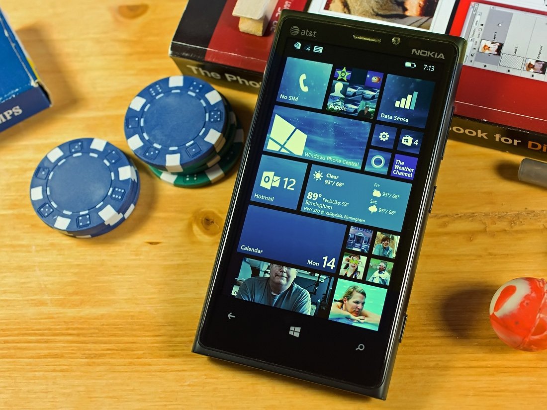
One of the many features of Windows Phone 8.1 is the ability to add a third row of tiles to your Windows Phone Start Screen. We’ve already gotten used to seeing the third row in action on the larger screened Nokia Lumia 1520 but how is it performing on the smaller screened devices?
WPCentral member nexialbinding has started this discussion in the forums asking just that. Nexialbinding updated a Lumia 920 and is a little put off on how terrible things look with the extra row added.
Others have a mixed reaction to the new third row.
Raghave94 writes,
“It looks extremely small and bad on my HTC 8x”
On the other hand, Franceso Savioni has Lumia 720 and thinks the extra row looks fantastic. Several Lumia 1020 owners note similar positive results as well.
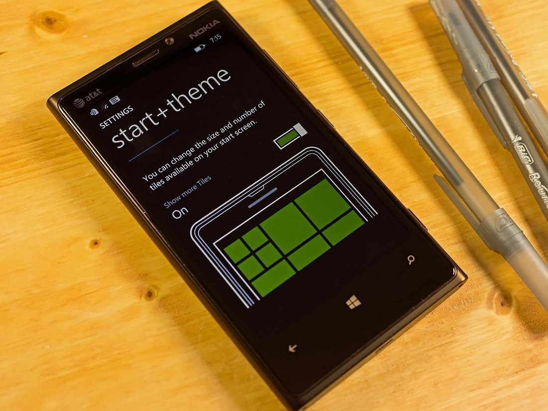
So how do you throw the switch and add that third row of Live Tiles on Windows Phone 8.1? It's simple.
- Go to your Windows Phone Settings
- Choose the Start + Theme setting
- Scroll to the bottom of the Start + Theme page to turn on the option to show more tiles
Easy as pie.
Personally, with my aging eyesight the third row is way too small for my Lumia 520 but not too shabby on the Lumia 1020. But what say you?
If you’ve updated your Windows Phone to the Windows Phone 8.1 Preview for Developers, jump on over to this WPCentral Forums discussion and let us know what you think of the new third row feature.
Windows Central Newsletter
Get the best of Windows Central in your inbox, every day!
George is the Reviews Editor at Windows Central, concentrating on Windows 10 PC and Mobile apps. He's been a supporter of the platform since the days of Windows CE and uses his current Windows 10 Mobile phone daily to keep up with life and enjoy a game during down time.
-
on 920 its too small...
-
I have the opposite opinion :P I love it on my lumia920 and because of the third column I can add more normal-sized tiles instead of small tiles without scrolling too much.
-
This....
Love it on my 925. Everything I need is on the screen, no scrolling needed -
Yes, the medium translucent tiles look awesome on my 925 in the three column view!
-
/signed The "small tiles" are way too small on Lumia 920 ... but the medium sized tile is just awesome :)
-
I like the small tiles on my 928. But they are small. If you think they are too small, don't use the small tiles. I think having 3 medium tiles instead of only 2 is great. Being able to have a wide tile next to a medium is great too. It is definitely great having the option. You don't need to enable the setting if you don't want to.
-
yes +925 +1020 +1520 !!!
-
How to enable it?
-
Yes, no scrolling needed but then the start screen background looks really good when there is something to scroll. Also, Live Tile text on a few apps like WPCentral's is very small and almost unreadable. Maybe a bigger font with the next update and I'll be very happy with the extra column.
-
I find nothing wrong with the small tiles on my 920
-
I'm using it on a 925 as well & like it. The small tiles are definitely small, so it's better to use apps with no live tile for those. BTW... I think WPC should have a "Post Your Home Screen" thread so we can all get ideas on how others are organizing things. It might help some people organize their own home screens. :)
-
Same for me. I added/changed a lot of the tiles to wide to make use of the extra space. The start screen looks a lot more LIVE now :)
-
Exactly! More medium sized tiles... More life!
-
I'm lvin d third row on my 720 it looks like corporate nd HD elegance ..!!!
Srsly -
Yes, I had a lot of tiles in the small size to save space, but I compromised on live tiles as a result. With the third row I now have far more live tiles on my 925s home screen. I think it's great. The small tiles are a little too small, but time will tell if they are difficult to read and tap, but my hunch is that I'll adjust pretty quickly.
-
Agreed. I now have more medium sized tiles and I love it.
-
Exactly my thoughts. I just can't imagine going to a two column layout now. :)
-
+1020 I love it although ab extra large live tile would be great
-
+920
-
Agree, did the same on my 920. Not going back to 2 columns :) And having a pic as background works great too!
-
Yeah, I love that I can now have the full/large-sized tiles for all of my apps and STILL see more on the homescreen than before.
-
agreed. I like it on my Lumia 920 as well. I definitely bumped up the size of more of my apps that used to be small or medium. And I'm liking the new background picture option. Definitely gives a freshness to the operating system on a phone that is already two years old. I'm also liking that fact that even with a significant OS upgrade it is not causing any slowness in older hardware (unlike some other smartphones I've had in the past *cough* apple *cough*.
-
I also love it
-
It depends from your style - i'm using to be comfortable, f.eg. notes from calendar, many digits etc. Somebofy using more for quick access - it's totally different style of use. In my style - icons too small - reading is not comfortable.
-
That's absolutely true, this is one of the many good things that happened to my Lumia 920 after the update
-
1520 was wayyyyyy to big, now I have the perfect phone, really great
-
agreed, but the moment when I swipe right on my 920 to get into the app list, the difference in text size across the UI is very glaring. I wish they would have normalised the text size if the 3rd column is chosen Edit: My reply was meant to be the post regarding 920, well WPC
-
Totally agree..am using 920 as well and love the extra column of live tiles on it.
-
Me too. Have more of normal sized tiles, looks much better.
Simply loving it! -
I agree. I wish the large tile would stretch all the way across.
-
+1
-
That's my only gripe as well. The larger tile doesn't stretch all the way across. I'm quite OCD so it bothers me quite a bit (I guess a large tile in the middle and then 4 small tiles on each side would work) But thinking about it, I guess some images, like the ones displayed on the photos live tile, would proably look too stretched out. I would like a collum tile, eventually.
-
Hmmm, I might try having the large tile in the middle...i would think if they do make it stretch, it would be up to devs to adjust the live tile image to look proper.
-
+1020 I would LOVE a column tile too!
-
Yes totally needed
-
and with Lumia 620, it goes smaller. ;)
-
Same here.
wrote by windows phone swipe keyboard -
just used the medium size and large size tile more often.. problem solved.
-
I really love this three column feature! Information on Live Tiles are still visible for me, and I dont need to scroll too much anymore and I can put lots of apps on my start screen now.
-
I love it on my 920. The screen looks fully utilized.
-
I also love it on my 920, but I have always been one to set my computer resolution as high as possible. The more I can fit on the screen the better.
-
This. I wanted to upgrade my 920 for a bigger screen, but now it feels really larger! Love it!
-
Just use more medium tiles.
-
It is a tad small on the 920, but i think more tiles with small 1x1 tiles is a fair trade compared to the old version.
-
I love it on my 928.
-
+928 !!!
-
It took me a day to get used to it but now I don't think I could go back. I also wish more tiles utilised the clear option now to increase the visibility of the background image. The bing apps especially should.
-
I love it on my 920. :)
-
Just perfect on 920
-
They should add an option to have the empty space back on the right hand side if you don't want the third row of tiles.
-
Download 'tile gap', it allows you to put an 'empty' transparent tile of any of the 3 sizes on your home screen ;)
-
Looks great on my 920... you must be blind
-
Love it on my 1020... Need the extra real estate with all the apps I like to pin. The thing is that if you think the small tiles are too small then just use the medium you would still have almost as much room with the extra row, or just roll it back to the elementary way it was before. Options are good ;)
-
Yeah, small is clearly subjective to people. I helped my friend install 8.1 and I wish still had my 920. Too bad I want a higher resolution device. 1520 will do for now.
-
I can imagine with 480x800 resolution I might be hard to read, but on the 920 its fine
-
If on a 920 is too small try that on a 620. Tiles suited for ants.
-
What's wrong with ants? :D I like how the third row looks on my 620, I can use more medium and wide tiles now.
-
likewise i have the 620, while they are small i dont have trouble with them and havent hit a wrong tile/window as of yet.
-
Disagree! I love it! More wide tiles now. With some mediums, made less important tiles gap fillers. Works great on my L920. :)
-
Love it on my 920.
-
Love it on my 920. Never going back to 2 tiles
-
The icons are small, but I like it on my Lumia 920. Text on news tiles like NBC News are not difficult to read. I like to keep relevant apps on the same row. The new tile column does make it a challenge. I want to fill in the gaps, but at the same time, I don't want to clutter up the Start Screen.
-
I disagree, I think it's fine. However, the background image thing sucks because Microsoft didn't make the Music and Games apps capable of cooperating with it, so it leaves a big chunk of the picture unfilled. It makes the whole thing look stupid, so I turned it off.
-
I love it on my 920.
-
The small tile is definitely too small. The other sizes it's a question of getting used to it, I hope.
-
Not necessarily - I switched to show more tiles but I'm using all of them in medium and large sizes. This way I get an in-between small and medium amount of tiles on screen: more than just mediums, less than all small, so I effectively have 3 columns of medium tiles that are easy to see with live info. Personally I'm pretty happy with how my 920 looks now.
-
On 920, it is very small. I tend not to use small tiles now. I am using the wide tile for the first time. Loving it!
-
Teeny tiny on my 620 haha
-
I love it on my 920. Made quite a few apps larger, but a lot of apps I need frequent access to while only needing a number notification I can make tiny.
https://onedrive.live.com/redir?resid=789F6FE4D691A311!12379&authkey=!AK... -
Perfect on my Lumia +1020!
-
but its optional man & three square tile is looking awesome man.
-
I have a Lumia 820 and when I first turned on the third column I also thought "too small." But after living with it for a day, the whole "too small" thing went away. Basically, it was a change and it took a little while for it to seem normal. Now that I'm used to it, wouldn't go back.
-
The 930. In the US and in cyan AND on any carrier. And no, not the gimpy Icon.
-
It doesn't look bad on my 720...
-
At first it looked too small on my 620, but before my day was over I was used to it. It makes the phone look like it has a higher resolution screen. The same way a higher resolution screen makes your desktop icons smaller.
-
that is excatly how i feel but yeah it does take time getting used to ......glad the screen sze is small can easily pull down the action centre .....1520 people will have a hard time pulling it in one hand though.....
-
I have no problem pulling it with one hand... buh dum tsss
-
Exactly! I love this new start screen too. Very useful
-
Same here, I'm also using 3 tiles setting on my Lumia 620, I mainly t use medium n large size tiles
-
Interesting concept, will try it out
-
+720
-
Yes, is hard to read the text on the tiles.
-
Seems perfect on my 1520... :)
-
On my 1520 it looks as though there are now two black spaces at the edges which weren't there before? Did it look like that before? I don't like it, I want the tiles to reach the edges. But I do like the new smaller keyboard, text and buttons
-
The tiles never filled the whole screen till the edges, well, at least since WP 8
-
We're both right, I just checked side by side screenshots of my home screen, you're right that they didn't go all the way to the edges, but they were a lot closer. It's because the gaps between the apps are smaller, so it pulls in from the sides. It used to be nice and even, gaps at the side and in between apps, now it looks odd and disjointed. Plus because the background is black is makes it look like I has a really skinny but tall iphone5 style screen. I do like the way they've moved the apps up a bit, I didn't like the big gap at the top before.
-
On my 1520 it's perfect. Just a bit too much space on the edges of the Home Screen though.
-
At first i thought it look ugly but after setting background image i am liking it.
-
If you keep all your tiles small, of course third row will make them even smaller. I'm fine with two rows.
-
Looks awesome on my 4,3" 8X! People who don't like it need to get glasses or turn it off again!
-
Yeah it does look bad with my awesome Lumia 520
-
I feel the opposite with mine. :)
-
Ya.it looks great in my 520. My eyes not aged as George as I'm only 18.
-
Really, is it available for Lumia 520?, i heard that they were dumping this feature on 520 & 620 because of their 4" screen size
-
It looks awesome on even 520..
-
I also have a 520 and it definitely does have the feature. The small tiles look to small and i don't think the phone is powerful enough to handle the animations well. It looks like the animations are cut short for speed. That isn't necessarily all bad. I use small tiles for minor apps like the calculator, calendar, etc. and the ones i originally had as small tiles are now upgraded to normal sized tiles. Tile fonts are too small but it still is a welcomed feature despite it's issues.
-
Could you maybe upload a screenshot somewhere??
-
Tried it on my 920 and went back. Just too small for a 4.5 screen IMO. My next phone should be a 5 incher.
-
The extra wide black gutter doesn't help either. I wish the screen went edge to edge.
-
+1
-
The border is for usability, it helps prevent users gripping their phone from accidentally opening Apps.
-
Exactly. If you hold a phone one handed your fingers natually curl around onto the screen (unless you have a phablet). Why is it so hard for people to grok usability is the reason behind "arbitrary" UI decisions?
-
I use my phone with only one hand all the time and I call bs for that excuse. It's a phone, it's not a boob that you wrap your hands around. Put the phone in one hand and look at it. You never even get close to the borders of the screen.
-
Indeed! Why is there so much black space on the sides? Any functional reasons for it?
-
+1... Unfortunatly they need to keep the margins for people using white background, it would look odd without white space on the edges.
-
The border plus the gutter is about the width of a small tile. I would prefer to see it more on par with what the HTC m8 and Samsung does which is edge to edge. That would be MAJOR for our OS.
-
+925. That's the way to go. Get a bigger screen, no whinging.
-
Love it on my 925. Resized some tiles larger, but love the extra space.
-
There's always the option to turn it off. There isn't much to complain about honestly. On a small screen cramming more information means everything gets smaller. Its called physics. Lol.
-
Actually, it's more like "called geometry" than "called physics".
-
Lol
-
Yea, but I'm waiting on the phone that uses physics in its UI, Now that's the future ;)
-
^
-
On 625 is ok!
-
No it doesn't make small...it looks awesome in parallelax effect
-
Yes. They are too small for my taste, I switched back to the large tiles, But I still love having the option.
-
On 920 it's way too small
-
you must be blind then
-
Well that's your opinion
-
Perfect on my ativ s
-
I want WP8.1 too on my Ativ S so i can use third column :(
-
So... install it... ;)
-
dont wait man. you'll be waiting at least 2 months...just man up and sign up for the developers preview!
-
I guess it should be fixed. It looks small but I use it on 820.
-
920 here, I like it and it has actually let me take advantage of certain live tiles more. The ones I don't need info from I am able to make very small which then gives me more room for the live tiles with useful information.
-
I love it on my 8x.
-
After using 3rd row on my 925 for a day switching back makes mw phone seem silly. Everything so large makes it look like a toy.
-
I know that's right, makes it look clunky to me...
-
No... It's awesome. Have more real estate to use larger tiles on more apps.
-
Lumia 1020, btw...
-
on my lumia 620 looks so small, i dont like it but on bigger resolution i like
-
+520
-
Loving it! My 1020 screen looks bigger and nicer!
-
Awesome on my 1020. It actually puts the outer edges of the outer tiles further out, i.e. It reduces the black margin slightly and makes better use of the screen. The only issue i have is that i now have everything on my start screen and hardly need to scroll and see the nice parallax effect.. :|
-
Waaay too small on my 520. Have held off on my 928. Will probably wait quite awhile to see if they actually keep tweaking things or if they just ship. Doesn't help that they shrunk it in on the sides...
-
Took a bit getting used to on the 1020, but looks nice
-
I have a 822 and so far it works for me. It's handy having more apps available in one touch.
-
looks good with tile of medium and large size on my lumia 520
-
Size-wise it's ok, but seems kinda slow with a background image applied...
-
I'm getting use to it, :)) lumia 521
-
Using 1020. At first I thought small but after a day or so I've got used to it. Its nice not scrolling down as far now. Ideally the phone would be 5in, will have to wait for a 1030 maybe...
-
Not a fan of the small tiles
-
I already use a combination of small, medium and large tiles matching on both my 520 and 928 and fit pretty much everything I want already...
-
Just fine on my Icon. But if not, I appreciate Microsoft giving us a choice. BTW typed with word flow!
-
Can you do both tile sizes on the Icon?
-
Yes I sure can
-
But why to keep small tile at all? We can have 3 medium or one wide with one medium time in row... For my L720 it's great... Even small tiles rock!
-
Exactly. I have this combination of tiles on my L521 and its just fine.
-
I'm torn over if I'm going to use it or not, but it's nice to have the option for those that do want it.
-
Absolutely, it's eye strain city for me on my Lumia 1020, would prefer it on a bigger screen.
-
Perfect on my Ativ. Using it for months through a registry tweak and it would have been hard for me to go back to a standard layout. By the way, I hate the big font in messaging and applications list, hope to find a way to get smaller text soon.
People, try it for some days before telling you hate it :-) -
Looks good on my L820
-
With the 3rd row, the small tiles are quite small on my 4.3" 822, but they're very usable. I couldn't go back to 2 rows of tiles if I tried. I'm loving the 3 rows.
-
I enjoy the extra column on my 820; the smallest tiles are simply shortcuts to things like my flashlight, and the text on the other size tiles is large enough for my eyes.
-
It looks wack on my Lumia 521
-
Yeah that's a small ass phone doe...
-
925 love it not too small! But it doesn't load the tiles to well when sliding...fix that!
-
At first i didn't quite like it on my 925, but after 2 minutes it grew on me. I don't see myself going back to two rows after seeing how awesome it looks with the third row enabled.
-
Seems faster
-
So what if it looks small? I like the way it looks on my HTC 8X
-
I like my large tiles to expand across the screen on my 920. With the extra row, it doesn't now. So I'll stick with the regular setup. But, whatever floats your boat yo.
-
The smallest tile setting is too small, but now I just make most of my tiles the medium size. I like being able to haev 3 of them across the screen, it seems like the perfect size. I have some wide tiles, but like some people have mentioned, it would be nice if those went all the way across still.
-
It's amazing on my L928. I can actually use the wide tiles without using a sixth of the screen... :P Also the text size etc... Everything was too big before (though I didn't really know until I could change it).
-
İ love it on my l720. looks more beautiful than 2 columns.
-
It looks too damn small on my Lumia 820
-
It's fine enough on my 625, although the words are a little blurry.
-
Yaah damn small..I refer old
-
Love it on my 928. Keep in mind, I have VERY good eyesight though (20/10).
-
I definitely like I on my 8X, but text can be small and a bit blurred on tiles. Not sure if a 1080p 5" screen will help?
-
Too small for me on the 1020. I wish they had one more size larger for the tiles though. I want my calendar tile all the way across on top, not buried.
-
I love the new customisation for the start screen.... The third route of tiles is very helpful n plus the dozing is also good..... Really a big improvement to the start screen....
-
nitpick: It's a column, not a row
-
More of this please
-
It's a row.
-
Try that in Excel and see how far you get
-
Thank you. Was going to say the same thing.
-
I like it on my 1020. But it is going against the design guidelines for good touch target sizing and spacing. Just like how start backgrounds go against the clarity of content design guidelines. Looks like MS is giving in to the pressure of user demands despite compromising some of their initial (and great) design by guidelines
-
How is it giving in ? You dont have to enable 3 rows and you dont have to enable the background picture. Choice is better for everyone.
-
I was confused at first, but then realized we're talking about the third column, right? I know this will be ironic to write in a comment, but would it make sense for WPC to disable comments in articles when trying to encourage discussion in a forum topic? It seems that the discussion ends up taking place in the comments every time.
-
Many are confused about rows and columns, luckily you are not.
-
Right..its the third column..not row
-
Fifth and sixth columns actually.
-
Thnk abt 620 thn.....
-
I wonder if the people complaining that it's "too small" are the same people who were upset when it was originally announced that the 'extra row' was intended for larger screened devices. MS listened to peoples feedback, included an OPTION to have an extra row, and now people are going to complain all over again? I'm not saying people who claim the tiles are "too small" are complaining, but there are certainly some folks out there who are.
-
Microsoft gave everyone a third row and more in Windows Phone 7 Series
-
On my 1520 it's amazing...;-) I'll try on my 920 later!
-
I like them very much on my 920... after modifying the layout of my start screen. Said that I also feel that now MS should add a fourth size for tiles adding an extra wide one allowing me to have, for example, a tile occupying the entire width of the screen for the calendar.
-
520 and works fine.
-
920 fantastic. Love it.
-
Works pretty impressive on my Nokia Lumia 920! Maybe a bit smaller for some. But this is one feature i always wanted so that i can have a whole on the screen. :)
-
Doesn't look good on my Nokia Lumia 820. It's too small.
-
Not bad on my 925. However it would be nice to keep the double wide tiles the same size, or bigger than what they are with the 3rd row added. Also decreasing the space between the top row of tiles and the battery/cellular info was an awesome touch. Makes the screen look fuller :)
-
Look another one, its a column, a third column
-
Look another one, its a row, a third row.
-
Whatever helps you sleep at night
-
Only three rows of tiles? Must be a new phone. As you find more apps, you'll fill up that screen in no time! I have 16 rows of apps.
-
N i have 9 rows
-
I don't think it looks too small on 520, I think its just the right size for me :)
-
Looks fine on my Lumia 925. When you first turn it on it's a little jaring because the tiles do shrink down quiet a bit but you do get used to the new tile size and even the small tiles are easy enough to tap and not miss. I just like being able to squeeze more information on my screen and reducing the amount of scrolling I need to do to reach lesser used apps lower down my start screen.
-
Even on my 5" Icon the smallest of the three tiles is too small, imo. Most of what I have are the middle and large tiles. And I still wish there was an option to have a tile span the entire screen like I had on my 928. But overall it's a very minor inconvienence.
-
I guess that option would be called "extra double wide" or something, lol.
-
Because of this, i wanna upgrade my phone.. Sssssss
-
First I thought it was too small but now I use mainly middle sized tiles and I love it :D
-
AWEEESOMMMEEEE 1520!
-
Love it on Lumia 928
-
At first it seemed really small bcz I wasn't used to it but after some time I kinda like it!
-Lumia 925 btw -
The smallest tile size on my 620 is far too small, but since its a media (mostly music) device, I'm using it with medium tiles, and now I can pin all of my artists on one page, and its perfect
-
Fantastic on a 1020!
-
Wide tiles can be beautiful. The extra row takes away from that. Now, if they gave us a larger tile size, that would change things.
-
I hate scrolling and my daily app use is rising everyday , so I don't mind sacrificing the size for the number of apps on the screen
-
I do like the third row on my Lumia 620
-
How about each new row you get when you pin a new tile to the start screen, do you like those too. Rows are horizontal yo.
-
It must be my eye sight but I didn't like the third row on my 925, switched back to two rows
-
No you didn't, you switched back to two columns because columns are vertical
-
Love it on my Lumia 920.. Initially didn't like much.. Once I started using it, I can never go back!
-
At first, it looked a bit small on my 925, but after I used to it, it looks great! I will keep it that way. :)
-
I love the 3rd row on ma HTC 8X ☺
-
Not a row but a column
-
I love the third column. I now only use medium and wide tiles. My 925 look more elegant.
-
This guy said it right, its a column.
-
Yes...it would be better if my sight was good. But its not. So I switch back
-
It depends on the amount of tiles you have I think. I have a smaller amount so I made most of my small tiles into medium tiles. It'll take some getting used to. Oh, L920.
-
Looks great on the 1020
-
Yes but great to have the option. It's more that I couldn't be bothered going through the hassle of trying it and not liking it and then trying to remember exactly how I had it.
-
3rd row is Good. Love it Also.
-
3rd column
-
On 920. I tried it and it seemed small. But I made more of my medium tiles into wide ones and the small became medium. Now I can't imagine going back. Previously small times now show more info as they are medium size and I scroll less. As some have already mentioned, it feels like a higher res screen now since everything is smaller.
-
I have a 925, and I think it looks great! The small tiles are, well, small but it hasn't created any issues.
-
Not really. Wp8.1 is awesome. I keep on using Cortana. She is sooooo sweet.
-
Too small
-
Guys, it's a third *column*. I know it's the internet and nobody uses language properly, but still...
-
OMG thank you
-
It's a row.
-
Please explain
-
Its a column, man
-
And now you guys are having a row.
-
It's a column.
Column = top to bottom
Row = left to right
'nuff said! -
It is a column...
-
I'm loving it on my 822. Fine text suffers from the low screen resolution , but its all good.
-
I love it on my 822. Smaller tiles give me more room and options. I've put a pic of the Marvel logo on the background and with the transparent tiles the logo flows with my scrolling...great effect!
-
Totally surprised, I thought it was only a feature for 5+ screens, I enabled it on my 820 and I will never go back.
-
For me yes on 920
-
Man who cares about size when u get something extra.
-
Looks great on the 8X. Everything was too large before.
-
How did you get your wpcentral tile to be transparent? Mine still sticks to my color theme even though I chose a picture.
-
"...row..." --> "...column..."
-
THIS^2
-
I'm happy with the extra space, I'm using only the two largest tile sizes - more info displayed
-
Love it on my 1020 :)
-
I knew it was a terrible idea on screens with less than 5", I said it was a terrible idea and I think I was right. Small tiles are just too damn small. But hey, if a few will be happy, so be it. I'd like Microsoft to release some numbers of adoption of the third column of tiles in smaller screens though... just out of curiosity
-
Third column
-
Corrected. Thanks. (I was influenced by George).
-
That's why it is an option. Just turn it off and enjoy your 2 column layout. I don't mind them being a bit smaller because I can still see everything with no problem.
-
Before on the 920 the double tiles were too big. But now its perfect
-
It's a god send on the 1520.
-
Fine on my 920... Means I have a lot more medium tiles that used to be small so I get more info now.... Really want a tick box to choose if games show in all apps or not though :)
-
FFS IT IS NOT A THIRD ROW, IT IS A THIRD COLUMN. ROWS ARE HORIZONTAL AND YOU CAN HAVE AN UNLIMITED AMOUNT OF THEM. COLUMNS ON THE OTHER HAND ARE RESTRICTED TO THREE. Yes that's three, three vertical columns of medium tiles from left to right or right to left. Can we all act like we are a little more educated around here please. Now to recap, rows are horizontal and are unlimited. Columns are vertical and there is now a third column we can all use.
-
Hey hey. Calm down. I feel the same. It is a column. But what can we do? Just explain that it is a column and let people decide if they care. -- Sorry if I am mean, I just dislike mean people! --
-
And I dislike ignorant people and doing my part to help educate the ignorant. It would be better to help out instead.
-
I don't like em either. Don't get me wrong, but you're gonna get yelled at. And then a fights gonna break out during this momentous occasion >< don't worry. Enough have seen your comment that it is freaking column... Not a row. Again, either they will take it, or they won't care. Can't really influence their not caring. -- Sorry if I am mean, I just dislike mean people! --
-
And hopefully it has helped some as the evidence below is showing.
-
It's a little small on my 920 but its not something I can't get used to.
-
I love it
-
I'm using the 3rd row on my 920 and it looks fantastic. I even got some small tiles pinned. :)
-
We all can agree that a third column/row is a great option but text on tiles like the news tile could be bigger... There's space to expand the text between where the headline ends and the word news began.
-
Ahhh.. Those are called columns. Columns go up and down. Rows go left to right. Columns "hold UP" buildings right? But I guess Microsoft called them rows.. -- Sorry if I am mean, I just dislike mean people! --
-
Agreed.
-
Love it on my 920 - using the wide tiles much more, which I always wanted to do before but they took too much space. It's perfect now. Also, stop calling columns "rows" ...
-
I love it on my 928, though I can definitely understand why some people don't.
-
Even though its extremely small on my HTC 8x I think it gives it a better clarity and prefer it.
-
I love it on my 925, looks amazing and works for me.
-
good on 820 though slightly bigger screen wouldve been fantactic..
one question..
in storage sense, the items like music, apps n games etc remain stuck at 'updating' forever.. it heated my phone and drained all my battery but was still into 'updating' only.. i also retried after restarting phone, force closing app but no use yet I badly wanna move my apps to SD but stuck.. plz help -
I love it on my Lumia 920! it's small, but worth it. The full size tiles makes it work great with the extra space.
-
Much too small on 620.
-
It's a little small on my 928 (similar to 925 size), but the ability for me to organize my Start screen with more designs and apps makes it worth it, I think. I just know now my upgrade will contain either an Icon or Ativ SE in the near future with VZEdge.
-
It looks a bit small on my Lumia 720, but honestly I'm already used to it by now :)
It lets me use the large size tiles as well as more medium size tiles. -
If it's too small for you don't freaking use it. I fail to see the need to complain when it is the user who decides.
-
If you don't use the small tiles it is good...medium and large look great on a 920
-
It is small on 920, but I like it..Al my tiles are visible and I dont have to scroll to much
-
I think it looks good on my 1020 it might small but still. It is awesome. Able to glance multiple apps without scrolling :)
-
I have mixed feelings. First i thought it made the tiles too small but maybe i just need to use all medium and large tiles and no small ones??? I have considered using the 3 column set up but leave the 3rd column empty just so it looks like WP7! For now, i am sticking to 2 column but may change my mind as i try it out from time to time. Either way, i love the option!
-
I love it. Keeps everything I need on the top page.
-
I think the third column looks good on my Icon, but I can see how it would get messy with too many small tiles. One thing I really like is the Start screen background and the transparent tiles. That parallax view is great.
-
Yeah. When I see the initial screen shots, I thought it looked ugly, but with the right back ground, it's really something, quite the masterpiece. I nursery wish there was an option to automatically have the Bing picture of the day as your Start Screen background, especially since having Cortana enabled means you don't get to see it via the search button anymore. :(
-
It looks real good on my 928.
-
It took a little getting use to on day one. Day two, I'm now quite comfortable with it.
-
Jury still out
-
No, because now I have to pin all my music and podcast apps separately with the killing of the music hub
-
Its great that I have a choice.
-
820 is a bit small but looks awesome and much more usefull
-
Hell no. I have three columns enabled on both my 1020 and 520, and I love all the extra tiles! Looks incredible, so I'm no longer (as) jealous of people rocking 1520's or ICON's. But I'm young, so my eyesight is still pretty fair, and I've got small fingers. But that's the great party: It's optional, so people can choose which one they prefer.
-
A little bit small on my 1020, but I'll keep it. Medium tiles look great and I use more of them..
-
Works well on my 920 but they are smaller than I expected when I'd viewed images of the 1520 start screen on it for comparison. I'm surprised it's an option for the 8X and 720 though, I thought screens less than 4.5" weren't applicable? It all depends on your eyesight I guess as to how useful it is. The text is a lot smaller than it was before. I'd be interested to see how it holds up on a Lumia 625 with it's large screen and low resolution... As an aside, I'm actually liking the new start backgrounds now I've found one I like. Still don't like most of the options demoed but with a little care it can look pretty good. Wasn't expecting to considering how much I've disliked all the previews of it. Guess you realy can't tell till you're actually using it!
-
Perfect on Lumia 925.
Just missing the big square :) -
Oh yes, this finally justifies my Ativ S purchase! 4.8" screen fits just right with the third column. Sorry 920 and 8X folks, your loss.
-
It's a bit small but at least I can fit more without scrolling.
Lumia 920 -
The 15:9 aspect ratio on the 4.5" Lumias is the minimum for 3 columns. On the 4.3" 16:9 display of an 8X it's way too small.
-
I don't like it on my 920 or 620. Too small.
-
Well give me that gorgeous update then I will respond. Looking forward to 3 midsized tiles anyways on my lumia920
-
Too lazy to rearrange, stick with 2 on 520.
-
They look great on my 925. I think we should call this a 3rd Column of tiles.
-
I have a 920, and I love it. So much more information that can fit into the same space. Less time looking for things. It is small but I feel it still looks great and adds to the ease of use.
-
My HTC8X is like new! I Love it
-
On my case it's not the tile themselves but the text on them that's too small. For instance (Bing) Weather should adapt its text to take advantage of the entire live tile real estate. (Bing) News' text look good and sharp on a double tile! Lumia 1020 here btw.
-
The tiles are smaller and I am getting used to it on my 925 but I don't think I can go back. You won't use too many of the smaller tiles on the 4.5" or smaller screen. What I like the most is that you can easily use more of the largest sized tiles so you have more info to glance when you are at the top of your screen with less scrolling to see the most important info. I use my 925 as a BYOD device. Maybe this is a sneaky way to sell you on more 5" devices when they ship. I am patiently waiting on the 925 replacement that works on T-Mobile.
-
It is perfect on my Lumia 920! Now I can fit more of the normal size tiles instead of the smaller ones! Loving WP8.1, Microsoft hit it out of the park with this, makes my 920 feel like a new phone.
-
+925 Totally cool
Love the 3rd row of tiles
Makes my start screen come alive more -
I love how small they are on the 1020. And it helps me because I can make more tiles bigger and live tiles.
-
The only real issue I have is that the rest of the OS doesn't scale with the start screen so now that the text there is much smaller than normal, everything else is still the normal size and is starting to feel almost comically large. Hopefully they'll bring a better system-wide scaling option so it feels more connected as now the start screen feels very seperate from the rest of the OS...
-
Totally agree.. dont think the tiles themselves are too small, just in context to the rest of the OS! :)
-
One of the reason I liked Windows phone was the big ass tiles. It made things much easier to see. That said I didn't think I would like the smaller tile set, but I really like the esthetic. I just wish you could adjust a tile to the entire width. Bit I like it its a keeper. Lumia 920.
-
I have the 920 and I think its perfect. I hate tiles that are too big, even on pc it looks better when the resolution is set at its best.
-
I have a 620, at first it was small, now it looks cute, i love it more than the standard size, I can put a lot of apps and info now. thanks MS for enabling it to all phone
-
It looks good on lumia 625
-
Personally I like the 3rd row on my HTC 8x.. But I do not use the small tile anymore.. I've arranged my screen to use the square and the wide tiles only.. And it looks fresh..
-
Isn't it actually a third column of tiles?
-
I'm on the side of "too dense" on the 928.
-
On the Odyssey when I made the InteropUnlock, it looked too small. I mean small system text was nice, but three tiles was just too tiny. Almost feels like the jump from WP 7.5 to 7.8. Just that little gap on the right made a huge difference.
-
On lumia 820 it's usable, but it doesn't looks so great. I think it needs at least 4.5 inches to make it shine.
-
+720... looks bit smaller, but love it.
-
920, too small. I can still read it, like calendar appointments, I'd be hard pressed to recommended anyone with a screen under 5 inches to use this. Good thing is an option. I'm still using it though.
-
I don't like it in my L520
-
Love the extra column and the small tiles on my 928. The extra column and the small tiles now make it easy for me to fit all of my most used apps on one screen. I thought it may be tough to select those little tiles but that isn't the case for me...even with my mountain bike gloves on.
-
I didn't care for it, I switched back to the larger tiles. I think I need something bigger than my Lumia 925 screen for me to fully enjoy the third row.
-
Using it on the Lumia 620 , it's not to bad
-
I love it on my Lumia 520.
-
The extra row of tiles are great I love it. Lumia 1020
-
On my 1020 the small tiles area almost too small. However, I've enabled it on my Dad's 520 (he doesn't like having to get his glasses to use his phone). I use the medium tiles or the large tiles for him. It allows him to have more tiles while still being able to see them. Best part is this is optional. You know, that thing other platforms don't really have a lot of... options.
-
It took me an hour or two to get used to the third row (and smaller tiles) on my 8x but i'm loving it now!
-
Yeah its too small
-
it makes my stay screen somewhat laggy in my 720... :(
-
I love that Microsoft gave the option to all devices. I think its too tiny on my 8XT, but its a low res screen, so I expected that. For now, I'm back to the prior layout.
-
didn't like it initially but then played around with it for an hour or two and then started loving it :p
-
On my Lumia 928...yes too small very similar to the Nokia Icon.
-
At first yeah but I easily got used to it so no biggie. :)
-
I have Htc 8X and it´s fantastic! Icons are very clear and looks cool! :D
-
Looks great on my Lumia 1020! :)
-
Love it on my 1020. Makes better use of the screen and tiles. Might actually hold off upgrading to the Icon now. Or will I lol :-)
-
Its good on 925....but might be even better if the device was 5 inch
-
For me, it looks really nice on my lumia 810. It is also useful by having more tiles.recognized though, fonts on some apps w/wide tiles looks ugly.this includes wpcentral (oppppsss), bing weather. Live status on wide tiles really look blured
-
Not sure what everyone was expecting. Other than wanting a "XL tile" that goes across the screen, it was expected the icons would shrink to an extent if you want the 3rd row. Were they suppose to give you a zoom option???
-
I don't like it on my 920 but I have 43 year old eyes.
-
I hate it on my L920 but looks amazing on 1520
-
They are okay in my 8X, but the clock tile look weird.
-
Are you kidding me? I need a fourth row on my Nokia Lumia 521 (wrote this message with swipe #WinPho8.1: Near sheer perfection)
-
In Lumia 520 it looks even smaller
-
Third row of tiles makes the phone look amazing
-
I'm using the 720 & I really like the third row of tiles, looks great. All the tiles I need can be viewed all at once.
-
I have it enabled on my 920 and am very happy with the results.
-
I use a darker version of cyan to make the text pop out more, give it a whirl! That also lets me make my theme color independent, I like cyan tiles but really like the way yellow pops in other parts of the OS, now I can have both :-)
-
You should do an article on how well its performing on phones like the Lumia 520 or the 920 because on my 920 its faster than ever and I am very impressed
-
I put it on my backup 520.. Not a problem, but phone itself is to dinky as it is compared to my everyday phone. The Nokia Lumia 1520
-
Perfect on 920
-
No 3 tiles ok and looks good in my 820
-
Decent looking on my L925. Have it set up this way in hope of getting a larger screen phone if/when T-Mobile gets one...that way 8.1 will save my start screen and auto load it to the larger screen phone. I like it over all....the only thing about the small tiles I have on the three row format is that when you are moving them...they are extremely easy to accidentally unpin. But other than that. I love it!
-
Does the author mean a third column of tiles? Why would an additional row change anything? It would just be more scrolling. You could already have infinite rows of tiles, no? Am I misunderstanding something?
-
This is why its great to have options. Personally I'm looking forward to going from 6 to 15 medium tiles. Right now most of my "above the fold" is small tiles for quick access, id like more mediums to fit. MS should look at adding a 3x3 large and 2x6 extra wide tile so that some apps can retain prominence while fitting more smaller ones.
-
I just turn it off for a meantime. I'll turn it back on when I'm in my mood, since it looks so small on my Lumia 620. Just enjoy the parallax thing on the Start screen with some iOS7 wallpapers.
-
In L520, the tiles are really small. The font for WPCentral's live tile even look blurred. But it's nice for MSFT to include this feature anyway. It makes the start screen looks full and kinda cramped though.
-
not bad on 520,i will use it
-
FFS...it's 3 COLUMNS not ROWS! You can have as many ROWS as you want!
-
I love it on the 920. The small tiles are a little small but having all that extra room is fantastic!
-
On 925. I am loving it.
-
720 here. Makes the 1x1 tiles look like pixels and the text on the Bing news app pretty much unreadable :P
-
I enabled the 3rd row on my Lumia 920. Thought it was a bit small at first but found it way better in the end. I now have all my fav apps standing on my homescreen. I don't need to scroll down anymore. Well, I still have a few apps at the bottom but all my main apps are showing up right away which is more convenient. I'm also using more medium and large tiles than before and I also have a good sight so it's not an issue. I'm now fully using the tiles and the screen real estate! Most people who have used my phone were complaining that the icons were too big and they take too much of the screen real estate. Some even said that Windows phone was for old people because of the huge icons. Of course, the legibility of the screen is the reason why the icons were that big but I do think having smaller icons is better. However, I do understand that some people find it hard to read.
-
Even me, everyone were telling me that windows phone has too big tiles, now its perfect!
-
Too small on a 1020...for me anyway. I don't know why the dude in the forums is getting bent out of shape over it, its an option, quit whining.
-
I like it on my 810 quite well. Looks good and I don't have to scroll nearly as much!
-
too small in L520, but i don't know why i love it xD
-
Skinned tiles look good on 3 row tiles in L520
-
I think it looks great on both my 920 & 1020. WP8.1 is a great update. Well done Microsoft.
-
It is great on my 920, Some tiles clearly are not beneficial on a smaller tile but some are.. I have the top row with 6 small tiles of stuff I don't need status on, just things like phone / text / whatsapp for speed of access then the rest of my start screen is a mix of different size tiles depending on the app and the info it gives. If you take the time to experiment it can be good.
-
Well on 920 looks great, but on 620 it a bit confusing on certain tiles that have text inside since the lettering looks too small even if you set the tile as wide...it happens with the calendar for instance. But you know still largely depends on which tiles you use on your home screen.
-
I like the extra row on my Lumia 920. At first I was taken aback by how small it seemed, but as I rearranged the tiles and resized them to med and wide and still have room for more, the more I liked it the new setup. The tiny tiles are still tiny but perfect for those little things I need quick access to on the fly. (manually turn on Bluetooth, etc.) I just needed to adjust to the new look.
-
At first I thought it was too small. It took some getting used to, but now I'm loving it. Wouldn't want it any other way. ;-) - Lumia 920.
-
I agree. Was also afraid that it would be hard to click on "small" tiles but really, no issues whatsoever.
-
I've got the update running on the Lumia 928 and I think the third row is fine
-
It sure does. Therefore, I don't use it.
-
I've switched to 3 columns on my Lumia 920 and really like it. Once Microsoft enlarges the text on the calendar live tile it'll be perfect (or if there's a third party calendar live tile with bigger text but that opens the standard calendar app when tapped).
-
It's a great idea but really why the black space between tile is still so big? Reduce that and get bigger tiles.. Looks small on the 920 but very useful!
-
I love it - but I would like a super wide one that goes across the whole screen !
-
Tried a few minutes on my 3.8" screen L620... needed a microscope to see the smalest tiles :/
-
It's a bit small on my 920, but its worth it to use double wide tiles. I never used them before, couldn't justify wasting a full row on one icon.
-
I agree with many saying that with third column settings, the tiles look small. But i also think that skinned tiles with background image does not look good on 2 column tiles! Its really good that Microsoft gave a setting to change these when ever we want! So people who like 2 column tiles can keep it, people who don't like it can change it to 3 column tiles. But for me in my Lumia 520, i like 3 column tiles as it looks good with skinned tiles!
-
I like it on my 8x. There are so many apps and its awesome
-
Too small on 1020, but that's probably because I use a lot of small tiles. I'll mess around with tile size later.
-
Doing this will enable you to use more live tiles. Since the small tiles aren't live. After a couple hours you get used to it. Best part... It's optional. :)
-
Tried it on my Sprint HTC8XT and it was too small. I had to go back to normal. If Sprint ever get the Lumia 1520 then I may apply the third row. However I do miss not seeing artist artwork or photo on the Xbox Music tile when playing music. That was one of my larger tiles. Since it no longer plays artwork, I resized it to the smallest tile setting.
-
Looks good to me on my old 920 my daily driver is the 1520 however
-
I have 925 i love three column awesome
-
Looks great on my 920. Admittedly small but not too bad. With a lower resolution screen I can imagine some tiles would be illegible though
-
It does look kinda small on my Lumia 925. I still like it though. The only issue I have is with the small tiles. The 1x1 tiles are really small.
-
Mmm
Kk
tree . Hug
He Mrm -
Yes 920
-
I can't see the background image, i lack transparent tiles, help please?
-
Put all transparent tiles to large 2x4 tile and medium 2x2 tile! Put other tiles to small 1x1 tile!
-
Tiles are ok, but text is unreadable on my 820. Not usable.
-
Seriously? This is the stupidest complaint...if its too small, don't use it. It doesn't force you. I love it on my 1020.
-
Love it on my Lumia 520 looks smaller though. It's compact and handy for many apps without swiping. But I'd say the gap between tiles is larger. I'd suggest MS could make the gap lesser and tiles slightly bigger.
-
But bigger is better, she said.
-
I am a big fan of the third row on the 1020. It great reduces the scrolling.
-
Lumia 920 and I can finally get all of my icons on my main screen! Huge option for me that will help me hold off for the next big WP. It's like being able to change the resolution on you PC, user choice is great!
-
Sooooo tiny, now i understand why they hesitated to put this option on devices smaller than 5 inches
-
920 ❤ it for the same reason as many posters; made more tiles wide and was able to reduce the "throw" to the bottom of the start screen to one flick
-
I'm quite happy with my 920. Now I can really minimize those tiles that don't matter to me so much. And make bigger the important ones. No problems here.
-
Loving how the three columns look on my nokia 820. I hope they don't take it away from 4.3" screens in future updates. Can't live without it now.
-
Yes, its smaller than I'd prefer. But thank you Microsoft for giving me the choice. In balance I'd rather have the benefits of 3 columns and squint a little. Choice is a wonderful thing Microsoft. Give us more of it.
-
I'm kinda late to the party but the option to have more tiles works great on my Lumia 925.
-
Looks awesome on the Samsung Ativ S
-
I see every one here liking the new tile settings! Any one can change it as per their choice
-
The third row makes me wish there was a way to save homescreen configurations. I need to drastically reorganize to have a 3rd column and right now I am quite content with the 2 col setup i have.
-
Tiles become too small on Lumia 520 even if my eyesight is pretty good. Anyway, thank you MS for the opinion to at least try out this great feature!
-
I have it on my 8X. It feels a little on the small side, but overall I prefer it to having less tiles. The nice thing is, if I ever get tired of it, I can always switch back.
-
Hey people any idea whether the update comes in less than 500mb?
-
The update size is 390-400 MB..
-
On my 925 having a third column of tiles makes things uncomfortably small for my adult-sized hands. I do love being able to have a background image on my tiles though...
-
Third column looks awesome on my Lumia 1020!
-
It looks very good in my Lumia 720, but because of low PPI fonts are very small...
-
With the third column on my Lumia 920 I think font size should be a little more bigger
-
On my Lumia 925 it looks too small with 3 rows. I rather keep the 2 rows, but it's nice to have that option. WP 8.1 is great but unfortunately I noticed a huge difference on my battery life after the update. I blocked most of the apps from running in the background and have the same settings as before, but even with cortana blocked too, the battery life decreased a lot and that kinda sucked.
-
Ya battery life has been decreased with wp8.1
-
Two times you need to update. First time it download 2MB then again you need to check for update there you need 385MB. And total time for completing this update is 45 min....
-
With third row on 925 I can keep some tiles medium size, and the ones I had on medium before, I can set to wide (weather, photos) and the shortcuts that I only need to launch the app are small. It's great. It's a little small, but after 1 hour of more tiles I reverted back to less tiles and it was gigantic.
-
Love it, but it's an option. It's okay if people hate it, nobody's forced to use it.
-
I like it on my 920, I guess it's good were have a choice !
-
Love it 1020
-
Have a 620 and ABSOLUTELY LOVE IT! Even if some might find the text too small, i'm glad microsoft atleast gave someone like me the OPTION to check it out. Doubt I'm going back..though setting up the start screen is a REAL task now! lol
-
Love it! Kinda neat and cute. Lol!
-
I personally think its so amazing. No more for screen swipes to get to the bottom, and so much more room for the wide tiles!!
-
Perfect for me.. I have the 1520 :) maybe I'll update my 920,but the screen is cracked so I'm still on the fence on whether I want to or not.
-
its too small on 520 but i needed more tiles so ... and 8.1 is slow as hell on my 520.
-
Perfect on my 1020, always thought tiles were a little too big now perfect size.
-
I use it on 4,3'' 820 and 4,5'' 920, but on 520 with 4'' screen is kinda useless..
-
Admittedly it is kind of small on the Lumia 920. However, that doesn't necessarily mean it is a bad thing. I love it! And never once has it caused me problems in launching the right application... Gonna rock WP8.1 on my 920 as long as possible with three columns of tiles :) p.s. isn't it a third column as opposed to being a third row?!?
-
I am so loving it. Really like not having to scroll so much.
-
here im the best cz im using the smallest wp ever ie NOKIA lumia 620... and yessssssssssssss itz tooooooo tiny for me... but still im using it cz its amazing.. :)
-
I really love it 'cause I don't have to be scrolling down all the time to find my stuff. Also, it looks amazing to have more tiles of different sizes on the homescreen.
-
Best feature after Cortana and Action Center for me on my 620. I hope Microsoft keeps this feature in official version of WP8.1 on my 620. Love it!!
-
Lumia 720 , plain black background , 3rd column of tiles enabled. Minimalistic but works for me.
-
No option for I own 1520?
-
Too small. Running Lumia 1020
-
I thought it would be too small on the 920, but it is manageable. Haven't mis-tapped anything yet. The text is just a little too hard to read, but it's fine.
-
Very small on a Nokia Lumia 520 :/
-
I love them on my 820 they are kinda small, but useful.
-
920 here. Its cool. Some where to big before
-
At least we have an option
-
928 looks great
-
Couldn't be better on 1020, really pleased
-
I added an ideia to windows phone user voice about this: http://windowsphone.uservoice.com/forums/101801-feature-suggestions/suggestions/5778607-allow-the-third-column-to-be-only-for-small-tiles I think it would be better if we had an option to use the third column for small tiles only. A total of 5 small tiles in a row, instead of micro tiles, can make the screen looks better. I'm using a lumia 720. As an example, with the third column I need to hold my phone closer of my eyes to see the big tile of Bing Weather.
-
My 920 screen looks bigger using the third row, very beautiful
-
Looks way small on granddaddy 820 too.
-
Great on Ativ S. Medium tile for mostly used apps big for calendar and photo stuff small tiles for less used apps etc.. It looks very nice
-
Initially yes. But once I got used to it, it's very convenient. I don't have to scroll a whole lot
-
I own a 1520.. I don't have these problems LOL
-
a bit yea
-
Perfect on HTC 8X!!!
-
It does on my 4.3 820.
-
On my Lumia 520 looks very small and cluttered. I'll stick with two columns unless they zoom in or something so it doesn't look so tiny.
-
I'd like to see the rows on a 620 before I upgrade
-
I don't really get it. If you don't like it, don't use it, is it a big enough problem that they added something which is entirely optional? I first turned it on, thought it looked small, but I got used to it pretty quickly. I've changed some icons to the middle tier when they were the small one before, so I have a lot less scrolling now.
-
At least we have the choice. In my 1020 it's worthy. Quite small but it works :)
-
Not small at all in my620 :)
-
It looks toooo small on my Lumia 520
-
Now how about being able to make IE pinned sites wide with the new ability for live tiles ? That would be awesome!
-
Looks nice on Lumia 720
-
Loving the 3rd row on my L920
-
Don't like it on my 920. I don't fill the screen up as it is and leave the upper left portion of the screen empty. Too many tiles jammed in and it feels like my phone is shouting at me. I had the Zune HD and WP7 and those screens felt like they had room to breathe, so I try to replicate that feel. It's a great option to have, but I don't like it.
-
I love my 720 with more tiles on it. I was waiting for it all these years :)
-
Yeah, tried the 3 columns on my Lumia 1020, and it wasn't great. I was gonna try and use it anyway for when I finally upgrade to the 1520, but switched back to 2 columns. 1. Yeah, things were a lil too small. 2. Started for a bit, but didn't feel like putting the time into finishing the reorganization of my Start screen to make everything look normal again... :P
-
Its small on my Lumia 520 but I always wanted that third love tile column.j just loved it.
-
It looks good on my 920. Will obviously take getting use to for people that are using it but it's awesome and it's great that they gave the option to enable it!
-
I'm giving it a try and it does look a lot smaller than I was used to. Lets see how it goes in a few days.
I'm also giving the parallax backgrounds a try and it all depends on the picture used but I'm still not convinced. -
Yeah, love it!, got an Ativ S 4.8' and looks great, thinking to get a big screen device now like the L1520, there this 3 column feature will be awesome
-
The normal sized tiles looks awesome on my L920, the smaller ones a bit too small. I love the transparency of the tiles, my phone looks brand new :)
-
Guys there could b solufion for this..microsoft should remove the black boundaries at left n right side of screen,this wud stretch uo the tiles n that unused black space boundaries on both left n right sides can be used..what say???
-
Tried it on my 920 and didn't really like it. However it gives people options.
-
Even it is small, it is doing well.. Working great
-
Nah I like it
-
Like it on my 928
-
They are COLUMNS not ROWS. And this article is kind of pointless. They knew people wanted it, but at the same time knew people didn't. Hence why it's an OPTION. :)
-
Nah I think it looks lovely
-
Nah, it looks lovely
-
I really enjoy it. I have it pinned six across but what I've done is set three medium tiles most of the way. This allows me to have 2-3 tiles with information as opposed to 4 with little to no information.
-
I have the htc8x and the third live tile update it's so awesome looks incredible the small boxes are tiny but big things require small sacrifices. I love everything about the 8.1 update
-
Devices that have ED(480p) resolution & under 1gb of ram look better with just 2 rows. While devices that have minimum hd specs or higher(720p) & 1gb of ram or higher would work well with 3.
-
I love it on my L920
-
Its a column, not a row. And yes it makes things too small on my Lumia Icon.
-
I like the three columns on my Lumia 920!
-
What annoys me in this is not that they gave people with <5" screens a third column. Is that they don't allow people with >5" screens to NOT have that column. On the 1520, sure, fine, it's a gigantic screen. But I see no reason why the 929 and 930 couldn't have the toggle to disable the third column. The fact that the switch to disable it isn't there is yet another motive for me to NOT buy the 930 or any WP with a screen above 4.5".
-
too small for my ATIV imo, even with a 4.8" screen. the 3rd 'column' is more ideal for 5"+
-
I figured if I can hit the letters on a keyboard which are already small then having a small icon on my 4inch L521 is no problem at all.
-
I love it on mia 920
-
Yea but that's cool...i don't mind
520 user -
First time I rejected the third column on my 1020. But now I'm trying to give it a chance to save me from scrolling down too much. I wish a large square tile (just like on Windows 8.1) will come in future updates of Windows Phone, the worse downside is that large tile for some kind of them isn't large enough. I mean gallery one or others with nice previews like that.
-
Great on my ativ s
-
I think it looks cute
-
i like it on my 1020, and loved it for the week i had the 1520. being able to use medium tiles instead of small ones is killer as i get almost as many tiles across as before but they show more information. what i am really hoping is future implementation of the "4x4" tile that's in windows 8.x the big square would look great in the expanded layout! maybe they will add it if/when the interactive tiles go live
-
When did a 4.5 inch screen become small feeling? Since when do we need to have 5 inch phones? They look ridiculous. Remember Zach Morris's phone in Saved by the Bell? Yea thats where we are headin only thinner is all. Giant screens (anything beyond 4.5 inches) are absolutely pointless. You can barely hold them in one hand and they look like you have a damn clipboard in your pants when you are walking. Stop making phone screens bigger. Get a tablet for god sakes.
-
Come on George Ponder, update the article to change it from row to column. Ridiculous that you haven't fixed the error yet.
-
I love it! With only two columns, it is hard to use the wide tiles without using a lot of space. With three columns, I now have three sizes to use!!!
-
IS IT A THIRD ROW OR A THIRD COLUMN?
-
Column
-
822 looks awesome
-
Its okay on my 625 (4.7) XD
-
I've it activated on my 1020 and I am loving it. Although I think 4.7" is the lowest screen size where it still makes sense since it does look quite small and peeps with bad eye sight might have issues. I would hope Nokia would release a Lumia with a 5" screen though; the 6" of the 1520 & 1320 is just too big for my liking.
-
The small size is too small but the medium and wide are perfect. I would like a wide size that covers the three rows because I usually use the wide tile as separator but is not compulsory. I'm I the only one that feels WP 8.1 preview a slower than WP 8.0? Of curse in speaking of devices like the 925 and above... 1.5 Ghz and 1 GB of RAM or lower specs... From Lumia 920
-
Too small on my 810. Still glad they gave us the option.
-
At first I was a little let down by the third row of tiles on my Lumia 820. After a little bit of getting used to though, I'm really found of it. If anything, I prefer it to the standard 2 column layout. I feel that it gives the OS even more of the 21st Century vibe that makes WP so unique in the smartphone world. The fact that it emphasises the parallax effect is just a nice bonus!:)
-
On my 920, I think the smallest tiles look great. I love it, wish they'd added it sooner. I even have sausage fingers, and they're not hard to press at all.
-
Looks good on my NL810 (4.3")
-
Too smal for my 720...
-
In 720 res. they should implement 5 small columns instead of 6 or let us handle font size of medium and large tiles ( or even make them bold). I use a lot of live tweet tiles, and on 920 on med & large is hard to read. (I use background image, which is awesome)
-
Perfect on my 920...its all about you arrange them around your background...i didn't like it the extra tiles on my surface either at first but after a while I got used to it and couldn't go back to the bigger tilea
-
Too small for l920
-
I think it looks great on the 920
-
It took me a couple of hours to get used to it on my 1020. I ended up doing a hard reset to get Cortana working properly and when it came up with the normal sized tiles it felt huge after only that little bit of time. All of my Start screen is now visible without scrolling at all and it doesn't feel crammed or difficult to use.
-
Actually, I have a L520 and I love the 3rd row...but I also have "young eyes", and my fingers aren't too fat yet. There is no way I will recommend it for my dad, who can hardly hit small tiles in the 2 column setup with his fat fingers. It's just amazing to have the option. Who doesn't like options?
-
First saw and felt very small and so stupid on my 1020. But when i keep them all to middle and large there it cmes the beauty. Now its very nice on my 1020. I can have more tiles in the same space and medium tiles compare to the small ones.
-
Love it on my 928, any smaller and the small tiles would be too small but its perfect the way it is
-
My 820 can't get enough of it. Some tiles are a bit blurry but nothing extreme. Definitely not going back to 2 rows.
-
I have a lot of apps installed on my L1020, and after trying out the extra row, I can't live without it.
That said, it's great to have the option because when I grow tired I can go back again. -
Hmm, can I have the picture I use on my tiles visibly in the WPCentral tile also? (I never get that thing working like I want it)
-
Text is too small on my 920.
-
I personally love it on my 720 :)
-
I am currently using a Lumia 1020: The first time I turned it on I was surprised by the small size of the live tiles... I immediately turned it off thinking it was way too small. I have since turned it back on and o am trying it out. Like every thing else I will learn to adjust...
-
Well I absolutelly love it! I use it on Nokia Lumia 925 and the size is normal for me, not to big but not to small. I used it for a day and then tried to get back to two columns... I felt that something is missing and it doesn't feel as good as with 3rd tile column.
-
Love it on my Lumia 920 I am using mostly medium and large tiles
-
It's far too small on my Lumia 820. The tiles are about the size of my thumb xD
-
Shoulda made it a user option.
-
imo in 720p res they should have 5 small columns instead of 6 ones or they should let users handle font tiles (size, boldness). I use a lot of live tiles with integrated twitter and fonts are small. I like it but they should improve it.
-
On my Lumia 1020 it looks great!
-
Looks too small, but I'm really happy with the OS update. It's great.
-
Using it on my Lumia 521 and I actually like it.
-
Awesome on my 925...everything is right there...loving this update, keep it coming Microsoft
-
NO!!! Even in my 620!! I serious
-
I'm happy sticking with two rows on the 920. The tile background image is enough to futz with for now. I just can't get over how amazing this keyboard is!
-
On my HTC 8X lookin fantastic too!! Maybe it's it's a little bit small yeah.. But still suiting my phone beautifully.. Luv it
-
I'm not a fan of phablets, but the moment I first saw the 3rd column on my L920, I thought to myself I should have bought the 1520!
-
I like it mainly because I can replace the small tiles with medium ones and finally use live tiles effectively.
-
Love it on my 920! Really enjoy the additional organization it offers me and the less scrolling I need to do means I'll be less likely to forget what I'm looking for, lol.
-
Works just fine for me, I'm not going back to the two columns any time soon
-
Btw I'm on Lumia 820, and yes text had become a little too small for some tiles but its fine for me, ice tested it on the 920 as well and it looked a lot better on that
-
I now have more apps on my start screen than I did before the update AND I don't have to scroll!
-
They are small but I like it a change is a good thing n I can go back any time I want
Plus now I can see alot of stuff at the same time
Windowsphone + Lumia FTW -
Using Lumia 720. Now I cannot live without 3 column support. Sure the tiles are small but now I can have more large and medium tiles. Background image + 3 column support = Ducking Awesome :).
-
I love it on my HTC 8X
-
Works great on my 1020. You just need to change the old layout, not just add to it. Cortana now take pride of place at the top.
-
this is awesome feature i like this too much big square tiles in three rows looking awesome & its optional i think nobdoy have problem about this feature.
-
Looks absolutely gorgeous on my Lumia 925. Loving 8.1 so far.
-
Even after only a short time using the three column view the old two column layout seems goofily large. Though on any phone smaller than my 925, I wouldn't consider it
-
Third column looks just great on the Lumia 820. I
-
It's not that bad on 520
-
Love it on my 8x
-
I don't really get this article and discussion. If you have a 4.5" screen and want to get the third column then of course everything will be smaller! It's like buying a camera with a certain angle and let's say you can fit 10 people from 3 meters away with no problem. If you want to fit in more people they can either squeeze together or you can move a bit back (everything gets smaler) or you can buy another camera with a wider angle. The same goes for live tiles. They could have squeezed thema a bit but this would have ruined the clean UI. The only other two possibilities are that it's either smaller or you buy yourself a bigger phone. It's just impossible to fit more tiles per row into the same screen. If you like it great if you don't, switch back to two column layout. I have the three columns on my HTC 8X and it was a bit strange at the begining but now it's just pure awesomenes :D
-
It was a litle weird on my Lumia 520 at first, but after a while you get used to it. Now I can have a lot more wide tiles on my Start screen than I could before. Before they took up way too much space.
-
It looks sexy on my Lumia 720, some people will never be satisfied the good thing is that you can retain wp8 look
-
On my 920 if I keep medium tiles as the smallest size it still looks better than the last style
-
It reduces the scrolling time but looks too small on my 920.
-
I use medium tiles...and its very good
-
With a third row, everything becomes tiny on the 1020. If there were no margins, maybe it was useful, but now it is not. I reverted back to two columns layout.
-
I find it great, at the beginning I was a bit unsure thought it looked bad and too small gave it a chance and I love ❤ it.
-
A little too small on my HTC 8X but I expected it would be so am not concerned.
-
Using 3 row tiles on my L620 BUT only using the large and medium tiles
-
HTC 8x: Initially I thought it looked too small. I've rearranged everything and experimented with different colours ect and I don't think I could go back now. I find myself using the large tiles and medium tiles a lot more which look fine