Former Experience Designer for Windows Phone, Arturo Toledo, tells you why the new Facebook app is still very Modern
All the latest news, reviews, and guides for Windows and Xbox diehards.
You are now subscribed
Your newsletter sign-up was successful
Join the club
Get full access to premium articles, exclusive features and a growing list of member rewards.
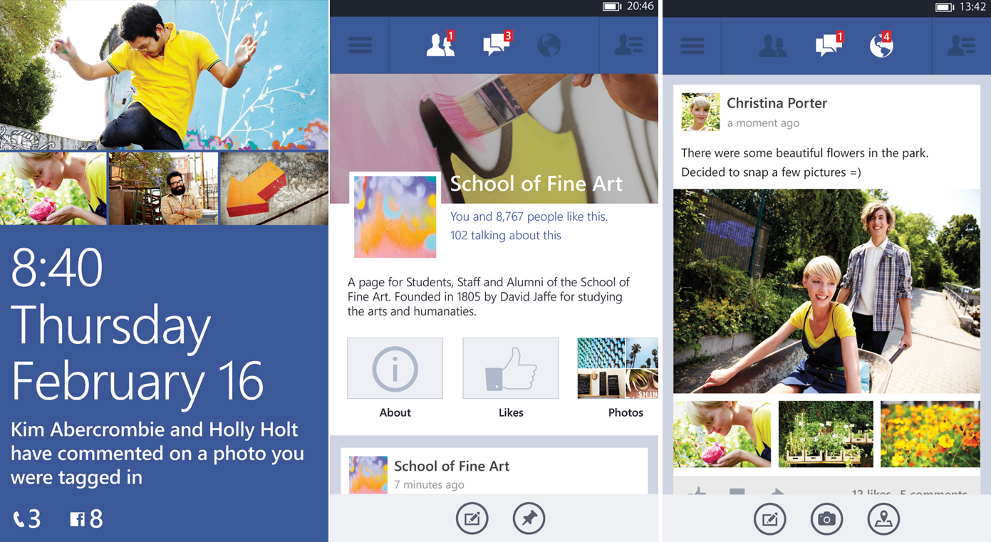
With the arrival of the new Facebook beta app for Windows Phone 8 this week, the discussion immediately focused on two aspects (1) functionality (2) design. The first one is one of those “in motion” issues that all betas face, meaning some functions may yet have been added (especially when combined with the ever changing feature set of the Facebook ecosystem). The second though ranges from personal opinion to a higher discussion of Design Principles.
More specifically, the question of whether the new Facebook app is “Metro” enough (or whatever you want to call the Modern UI Design Principles that runs through Windows Phone) has become one of the hot topics amongst commenters.
The new Facebook app: Modern or not?
Article continues belowArturo Toledo, who used to be the Senior User Experience Designer for Windows Phone, has now weighed in on the topic via Twitter and deeper on his blog. In short, he articulates that the new Facebook app is very much in line with current Windows Phone design principles, albeit veering from the traditional Panorama/Pivot options that users are familiar with.
In his detailed and fascinating article, Toledo explains just what “Modern” means (it’s not being “flat” or just having Pivots). Though he’s not necessarily saying the new Facebook app is ideally designed, it is very much in the spirit of Windows Phone and it should be celebrated:
“There couldn’t be better news for Windows Phone about seeing the Beta for the new Facebook app. Finally after 100K apps, a sign of maturity in the ecosystem. When developers and designers “feel part of” an ecosystem they push it to the next level. That’s what’s happening here and it must be celebrated by everyone who cares about the ecosystem.”
Toledo’s position is that the Facebook app not only uses a lot of the Modern principles (eschewing skeuomorphism, for instance) but the designers were so comfortable with the platform, that they’re pushing and evolving it to the next level:
"...developers and designers should not have to force their stories, their experiences to these two design patterns. If they work for your experience go ahead, use them but don’t just use them because Visual Studio has a Create New Panorama Project or Create a New Pivot Project. Who is the star of the show? Windows Phone? Or the experiences that apps provide?"
Indeed, a common complaint amongst some is that “all Windows Phone apps look alike”. While common Design Principles are to be rewarded, Toledo argues that you can have it both ways: obey common Design Principles without having everything look the same.
All the latest news, reviews, and guides for Windows and Xbox diehards.
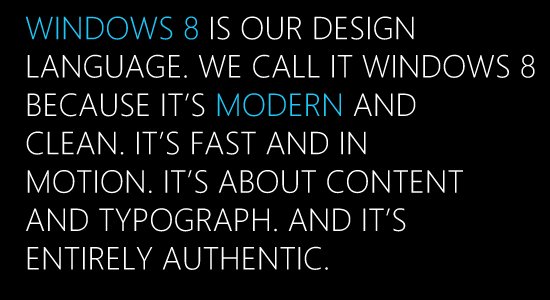
We won’t spoil all of Toledo’s observations as you should really grab a cup of coffee and read the whole piece. It’s a fascinating discussion on what makes Modern, how the UX can evolve and even some of the legacy that went into the Modern UI design.
If you care about Windows Phone’s history and future, you should definitely go read it. Also, check out his Metro Design series for more details on Modern UI.
Source: Toledo2

Daniel Rubino is the Editor-in-Chief of Windows Central. He is also the head reviewer, podcast co-host, and lead analyst. He has been covering Microsoft since 2007, when this site was called WMExperts (and later Windows Phone Central). His interests include Windows, laptops, next-gen computing, and wearable tech. He has reviewed laptops for over 10 years and is particularly fond of Qualcomm processors, new form factors, and thin-and-light PCs. Before all this tech stuff, he worked on a Ph.D. in linguistics studying brain and syntax, performed polysomnographs in NYC, and was a motion-picture operator for 17 years.

 Windows Central Insider


