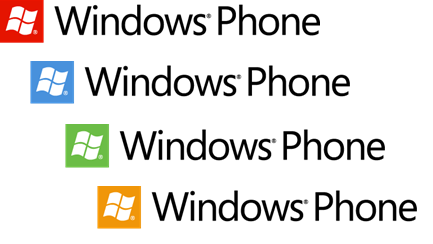
New Windows Phone Mango square logo gets official

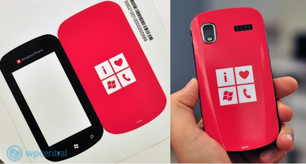
Back in May, we first saw the new flat, square (tile) look to the Windows Phone logo when we managed to get our hands on an exclusive back decal for our Focus (yeah, we're in the club). And when you boot up "Mango" from build 7710 and up, you can also see the new logo on display (see the Nokia Sea Ray video).
Therefore it should come as no surprise that Microsoft is now endorsing this as the official new look to Windows Phone going forward. It's obviously non-3D, no chrome and visually represents the "tile" system in a minimalist way. To that end, we really like it. NanaPho have done a real good job of recapitulating the continued sightings of the new logo, going back a few months.

Although we do wonder, will it change upon every new re-release or is this just a late re-adjustment? Anyways, sound off in comments on your thoughts. And should Microsoft get a logo/mascot ala Android? (Personally, we're against it).
Source: Shinobu Takahashi's MSDN blog ;via Nanapho
All the latest news, reviews, and guides for Windows and Xbox diehards.

Daniel Rubino is the Editor-in-chief of Windows Central. He is also the head reviewer, podcast co-host, and analyst. He has been covering Microsoft since 2007 when this site was called WMExperts (and later Windows Phone Central). His interests include Windows, laptops, next-gen computing, and wearable tech. He has reviewed laptops for over 10 years and is particularly fond of 2-in-1 convertibles, Arm64 processors, new form factors, and thin-and-light PCs. Before all this tech stuff, he worked on a Ph.D. in linguistics, performed polysomnographs in NYC, and was a motion-picture operator for 17 years.
