Here is why Microsoft wants hamburger menus in Windows 10 for phone

All the latest news, reviews, and guides for Windows and Xbox diehards.
You are now subscribed
Your newsletter sign-up was successful
Join the club
Get full access to premium articles, exclusive features and a growing list of member rewards.
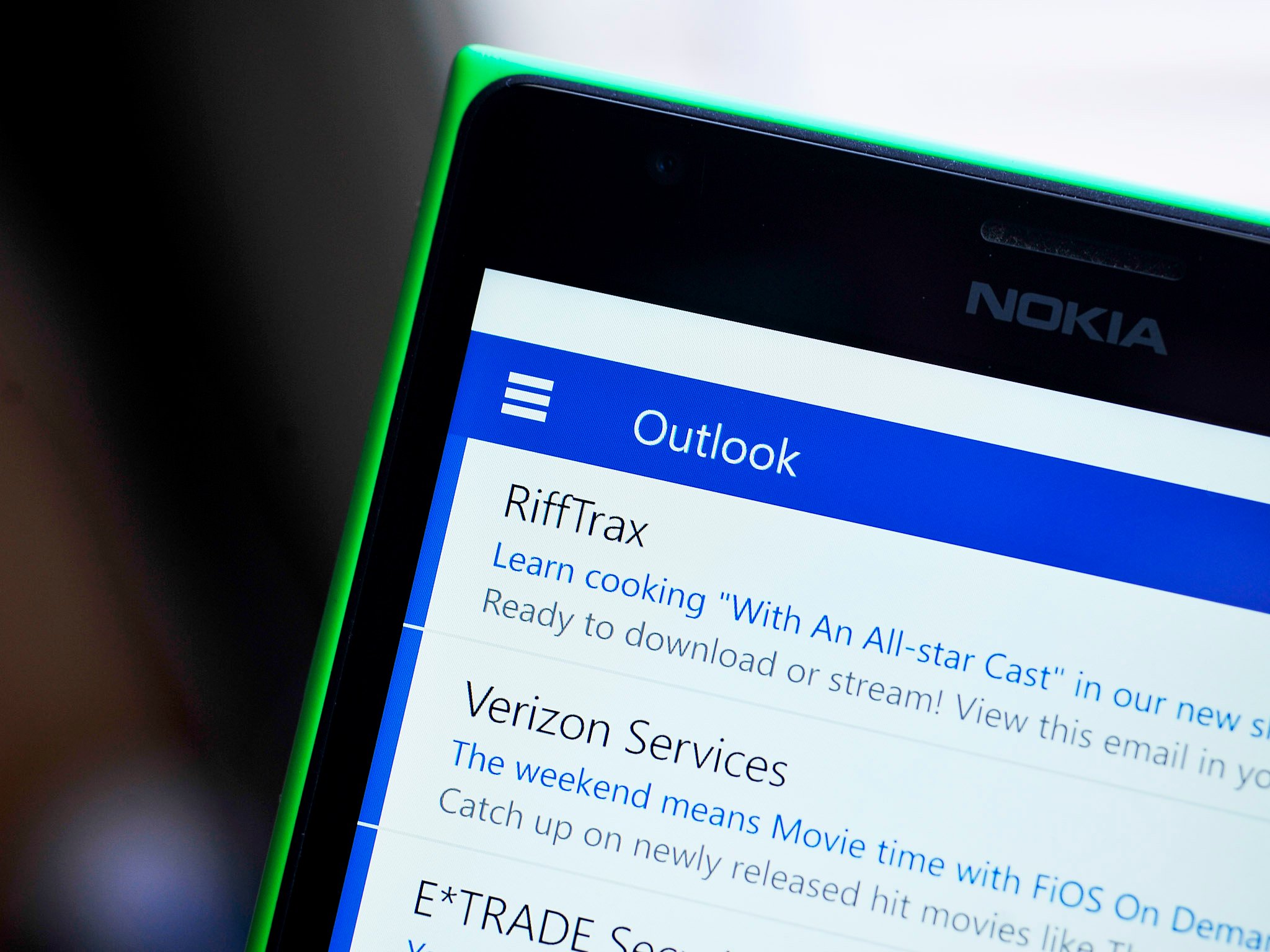
The controversial switch from the ellipsis in Windows Phone 8 to the hamburger menu in Windows 10 for phone was explained by a former, and anonymous, Microsoft employee during a verified Reddit AMA session this week.
While the employee chose not to identify himself, he has been verified by Reddit.
The employee stated he worked as a "design lead" on the new version of Office for Windows Phone but left Microsoft about a year ago. He also discussed and debated the reasons why Microsoft made the switch in a video, along with placing a navigation bar on top. Here is what he wrote during the AMA session:
"Ah yes, the hamburger. So. I've written so much about this (and even made videos) that I'll do my best to summarize.""Windows Phone's original interaction model put actions on the bottom and navigation on the sides, as swipes. That's not a great pattern for a variety of reasons.""iOS started with a lot of apps using tabs on the bottom, and over time started aligning more with Android, who put a few key actions on the top, then a "swipe back" pattern for more options. Think of Mail on iOS, how you go into a message, then you can swipe from the left to get back to your inbox.""Windows Phone was left in an interesting spot. Many of us believed that the old interaction model just wasn't going to work. You can't stick navigation in a horizontal direction. It's part carousel, part "mystery meat navigation" and it just doesn't work. So. We needed to figure out what the new model would be.""Putting a title bar on the top was the first important step. If you're in Word and you can't see the name of your document, that's not good. So, ok, put a bar across the top. And now you have a bar across the top you can provide a back arrow in the top left to get back to your documents. Awesome.""Then you put the ribbon in what I called a "palette" or "drawer" on the bottom, and on the top right you can start putting "hero actions." I argued for only one but I'm unsurprised that they ended up with more.""So there you go, right?""Top: <-- Name of document common actions""Bottom: Three dots to get the ribbon in palette form.""The problem is, there's just way too many things on the top bar. For example, you might want to print. How do you do it? Well, you could design a print icon in the top bar. But it's probably not worth it. You could hide it in the ribbon, but that sort of sucks for discoverability.""And then you notice the top left corner. And you think "Well, tons of Android apps just put everything there. Maybe we could try that?""And so it became clear, due to the massive number of features in Office apps, and the extremely tight real estate, and alignment with tablets, that a hamburger was the best overall pattern."
The rest of the Reddit AMA is really fascinating. In short, Microsoft is citing a lot of internal research that highlights two important facts about their decision making in regards to the hamburger menu:
- People do not use a phone one-handed as much as you may think, especially with large screen phones hitting the market
- They have explored alternative design models but "Being a special unique snowflake works for art but not design." In other words, alignment with Windows desktop and the rest of the world trumps being different for the sake of being different
Will this end the debate about hamburger menus and adding a top Nav bar? Likely not. However, consumers have shown that this is what they know, research data suggests this works best, and the majority of users will prefer it.
Anyway, you know the drill: Watch the video, read some of the AMA and then come back and share your thoughts!
Source: Reddit
All the latest news, reviews, and guides for Windows and Xbox diehards.

John Callaham was a former contributor for Windows Central, covering Windows Phone, Surface, gaming, and more.
 Join The Club


