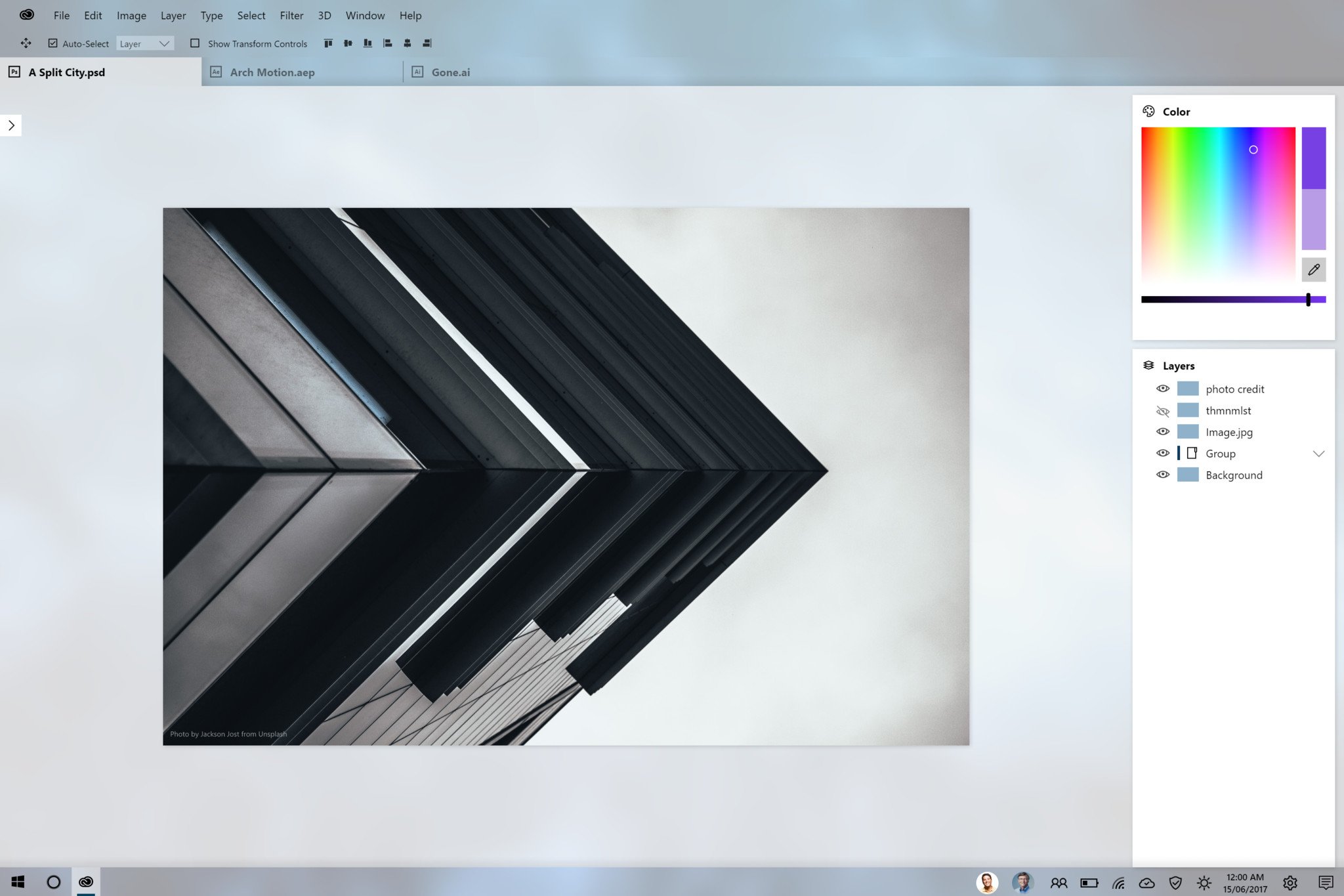
Windows Fluent Design System concepts show a futuristic Photoshop

The Fluent Design System design language brings new textures, translucency, and other animations to Windows 10 apps, making them pop in a world of cross-platform services. Fluent Design System apps bring gentle visual feedback for cursor placements as well, which is particularly useful for 3D apps found on HoloLens.

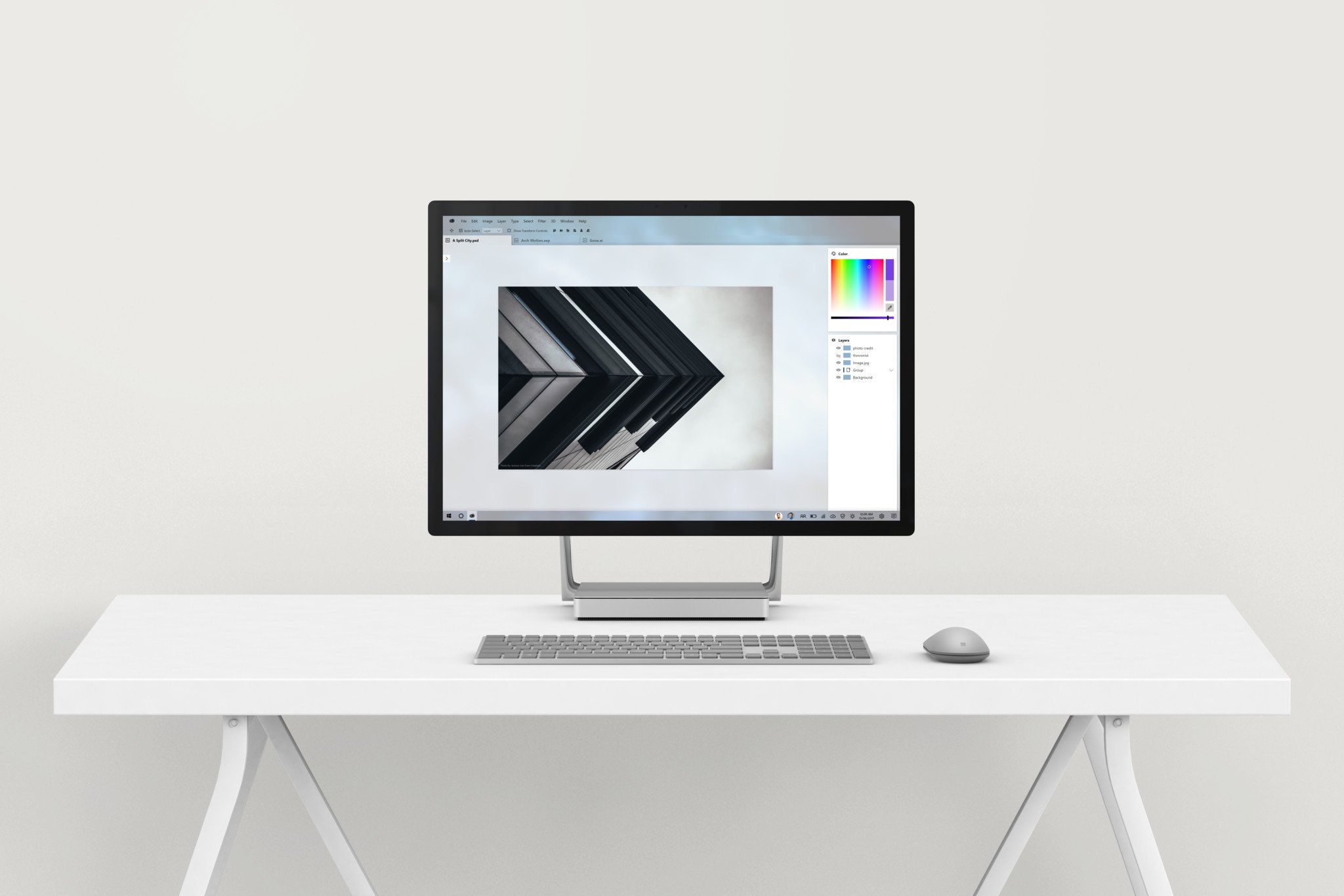
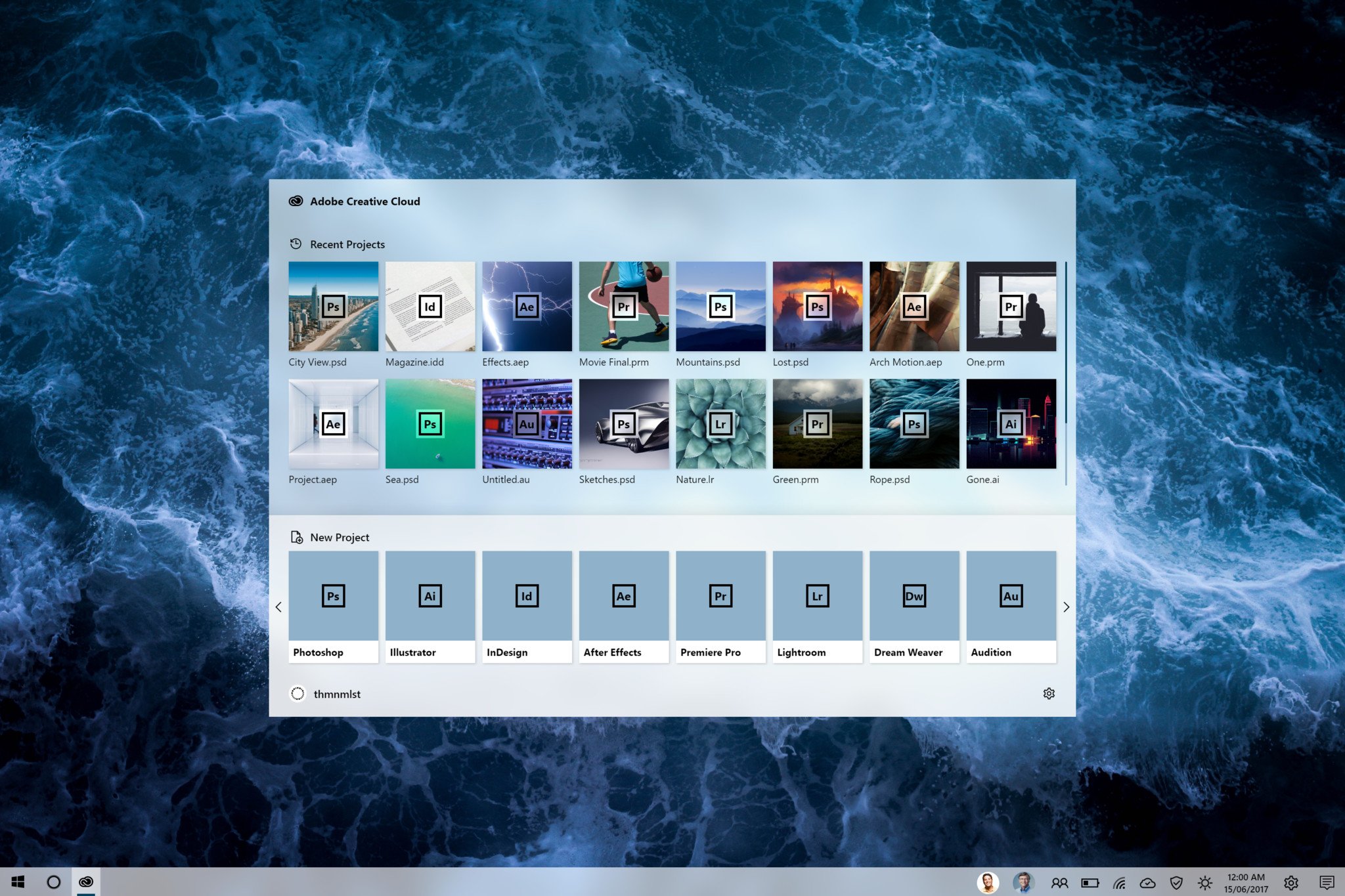
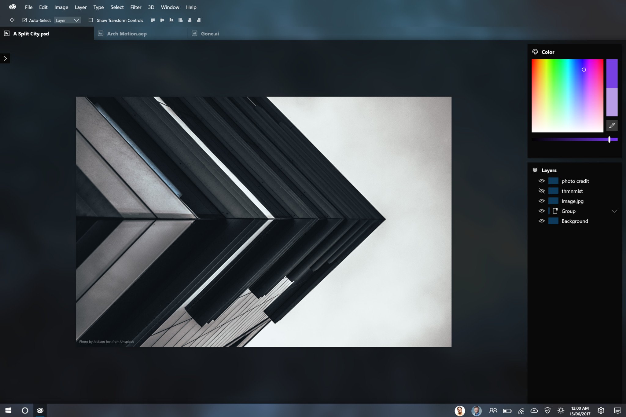
Concept artist thmnmlst (@thmnmlst_ on Twitter) created an exciting vision of a UWP future for Adobe Photoshop and Creative Cloud (CC) in general, complete with translucency and some overall design tweaks.

Again, these are just concepts. But as a heavy Adobe CC user, I'd love to see the company bring across more of its full apps and services to join Adobe XD, and if they even approach themnmlst's designs I'd be a happy camper.

Thmnmlst has recreated the Adobe CC launcher and even provided both light and dark themes for Photoshop, while retaining its tabs, functions, and various features.

More and more Windows 10 system apps are picking up Fluent Design System support, including things like the calculator and the People app. Microsoft's goal is to make Windows 10 apps more consistent and compelling to use across the entire ecosystem, whether the programs are running on Xbox, in mixed reality, or on a regular PC or tablet. Whether developers actually get on board with the program remains to be seen. But we sure hope so.

If you haven't already, take a look at Microsoft's Fluent Design System trailer below, and let us know what other apps you would like to see get the translucent treatment.

Jez Corden
Co-Managing Editor

Jez Corden a Managing Editor at Windows Central, focusing primarily on all things Xbox and gaming. Jez is known for breaking exclusive news and analysis as relates to the Microsoft ecosystem while being powered by caffeine. Follow on Twitter @JezCorden and listen to his Xbox Two podcast, all about, you guessed it, Xbox!

41 Comments
  • Not sure how I feel about it. The acrylic on the top could be distracting in such a design focussed app I kind of want the application itself to be pretty plain and put the focus on the work
  • You wouldn't even notice it after using the program several times.
  • Your work is at the centre of the screen and it's not like the pictures are constantly moving around to distract you. It's just a static, gentle, noisy blur. Pretty nice. You can always turn off the transparency.
  • Maybe he had adult ADD
  • As someone with ADHD, and someone who's career is dealing with Photoshop designing things, this is extremely distracting. You want the work to be front and center, these extra elements are not something that pure design environments would want.
  • Yes, that's why i did mention. You can turn off transparency effects completely if you want to.
    .
    Although the current implementation isn't nice. If you turn it off in settings now, it turns it off EVERYWHERE. It would be nice if Start menu, taskbar could retain transparency while individual apps could have it turned off or on. Just like the current, white, dark, system theme settings.
  • What people replying to this comment don't understand is how easily can the eye be "miscalibrated" with wrong color cues. The minimum variation towards a blue hue could mean your photograph will end up biased towards yellows more than it should. These apps are flat gray for a reason, folks.
  • Again, not a good example of what Fluent design is really going to look like.  The concept video makes it look sexy, but this does not.  I will be disabling the transparancy when it arrives.  Not reason to have it. I'm cheering for you Microsoft.
  • Looks dope but not really touch friendly
  • I think you're talking about the top bar, maybe it can show up in desktop mode and hidden in tablet mode
  • I hate looking at what a proper designer can do with MS' ideas. So much false hope. I look at all the apps with the fluent design stuff and I just wish someone would actually make the attempt to polish them up but you know that will never happen.
  • all hail mytube :)
  • *hail, but yes, they are using FDL properly
  • riddle me this: why would adobe be motivated to uglify all their apps with acrylic? To what benefit does it bring paying subscribers? Why build a gimped UWP app and waste resources on a moving target with 0% mobile share?
  • If you can create insane games in UWP that require way more than photoshop, then you can build photoshop. Tte idea that it's gimped is just a complaint because it doesn't let you take control of things that most apps don't need. Only apps cracking things or hacking things. Like the ps3 controller drivers or anything like that. Next who cares about mobile? What does adobe want with mobile? Adobe wants to be on PC/surface hub and even hololens. notice they are starting to create some 3d software too. No one cares about mobile when dealing with professional apps.
  • You're kinda right, they won't waste source on this. But the point of this concept wasn't only making Photoshop Fluent Design, it was about Adobe CC center app which allows you o open and edit all files you edit by Adobe programs.
    I mean instead of opening, Photoshop and After Effects in separate apps, you open them in tabs and it'd make it super easy to work with it. And I don't think UWP is only about mobile, it doesn't matter. There are also Xbox, HoloLens, Surface Hub and PC
    So UWP means the respect to system and getting rid of Win32 anymore
  • Wow! Windows is really getting so much more... 'futuristic(?)'... I'm suddenly at a loss of adjectives. :P
  • I am in!!!!!
  • When working in photoshop, the aim of the UI is to fade away and be useful to whever it is you're creating, not be an artwork unto itself. While the exaples shown here are used with a very subdued background (possibly because the creator knew a bolder wallpaper underneath might not work as well) but I'm uncertain this would work for me. What definitely wouldn't work is hiding all the tools. Photoshop becomes so much less useful if you don't have quick access to the actual tools and for the sake of "simplicity" they've all been hidden here. This would be fine if the mockup was designed as some kind of touch-able UWP version, but it's clearly just meant to be the desktop app through Centennial. It's a no from me this time, and I love what fluent design is doing elsewhere. ;)    
  • It only sticks out to us now because acrylic is new to us now, but I think we have to imagine that MS is planning acrylic for the whole Windows 10 UI so everything gets this look. If and when that happens, NOT having the same look as the rest of the OS suddenly sticks out and becomes more noticeable...
  • The best UI for a program is the one that is best for that programs uses, not one that fits in with the OS it's on. 😉 Fluent design could have some great uses in programs like Photoshop, but it needs to be there to help the user be more productive, not just because it fits in. Design trends are called "trends" for a reason. They all fade sooner or later no matter how much we may adore them at the time.  I'm excited to see more Fluent mock-ups from designers though, Microsoft is onto something but could probably do with the help. 😉   
  • Well, it has to be a balance. If there isn't consistency in the visual layout, it hurts UX. If you had kept the design language and conventions from Windows 3.11 in some programs, I think you might feel like that wasn't the best user experience. When Windows 8 came out, one of the things a lot of people complained about - and rightfully so - was the inconsistency between the Metro design language and the Windows 7 design that still was prevalent throughout (and still is many places in Windows 10). Of course they, rightfully, complained about a lot of other things as well, but that's beside the point in this discussion :). Design trends may change over time, but it is a definite advantage that there is consistency throughout the OS at any given point in time. That is my take, at least.
  • You can still open all tools tho, here I just added layers and color windows but there could be more
  • YES! It would be awesome if Adobe did theis with Photoshop and other products. Hopefully they'll make Dreamweaver less of a resource hog. The last decent version was CS4.
  • Concept is nice but still needs a proper example/video having all the magic of FD System in one app. Except this, MS needs to add more transitions effects. In short, FD is incomplete without transition effects.
  • The whole transparency thing just gives me flashbacks to Longhorn, am I the only one?
  • Still worried about what all these fancy effects, however nice they might look, will do to performance on older hardware. Hope they can be switched off if needed.
  • These mockups look flashy, but also quite bland. They might be something for MS Paint, but obviously not for PS.
  • I just hope people don't comment if you are not really a Photoshop user. I believe what real Photoshop users' comments, not random comments from just Windows fans. Obviously, two groups of users give totally different oppinions with this concept design.
  • One problem.
    Adobe in their history have never followed Microsoft design guidelines.
    Their apps look like and are Mac ports.
    Adobe haven't even figured out the ribbon interface, Windows 10 is just too far a bridge to cross.
  • Haha. Scrolling down to find this type of answer. If they do it to Acrobat, I don't really mind. Maybe Adobe could use Fluent Design only if they want to debut Adobe Mobile Suite in the Store.
  • That Acrylic stuff only looks good when you have one window open, you'll see the (hopefully subtle and not so obnoxious) desktop wallpaper right through it. Most people do not work like that, they have windows full of reference pictures, source material, a mediaplayer of some description and a webbrowser or two floating behind Photoshop. Those windows are seldom arranged neatly and the content of those windows usually don't look very pretty when blurred in the background.
  • Agreed, this would look horrible in my PC.
  • It's looking good
  • cool
  • In my opinion, the sidebar (plus drop down and popup menu) is more suitable to be acrylic rather than the working area and top menus. The working area should be plain because what's on the canvas is too awesome (ie the main focus).
  • I like it! But I don't think the project window is the best place to have Fluent Design effects added. The translucency and blur on the background behind the image can be a bit jarring. Looks great on the title bar and upper panes, though.
  • Thanks, it couldn't decide to use transparency on main window or not, I tested with a few wallpapers and photos, it didn't seem like a problem for me but yes plain color could be nice as well
  • As a Corel user creatively, though have Photoshop Elements for actions not found from Corel, I can see an updated look for Adobe creative products. Having said that, since Corel is firmly in the Windows camp, I expect FD elements to be incorporated in their update streams. Slightly off-topic: I can't for the life of me find a definitive answer on the difference between Fluent Design from Microsoft and Material Design from Google outside of being different companies.
  • One is acrylic and the other one is paper or quantum paper if that sounds comforting.
  • Lol I wonder if the person who made this actually uses Photoshop... That right panel is too bare bones. It looks good but functional? I don't know about that.