Microsoft focuses on design to unify separate platforms

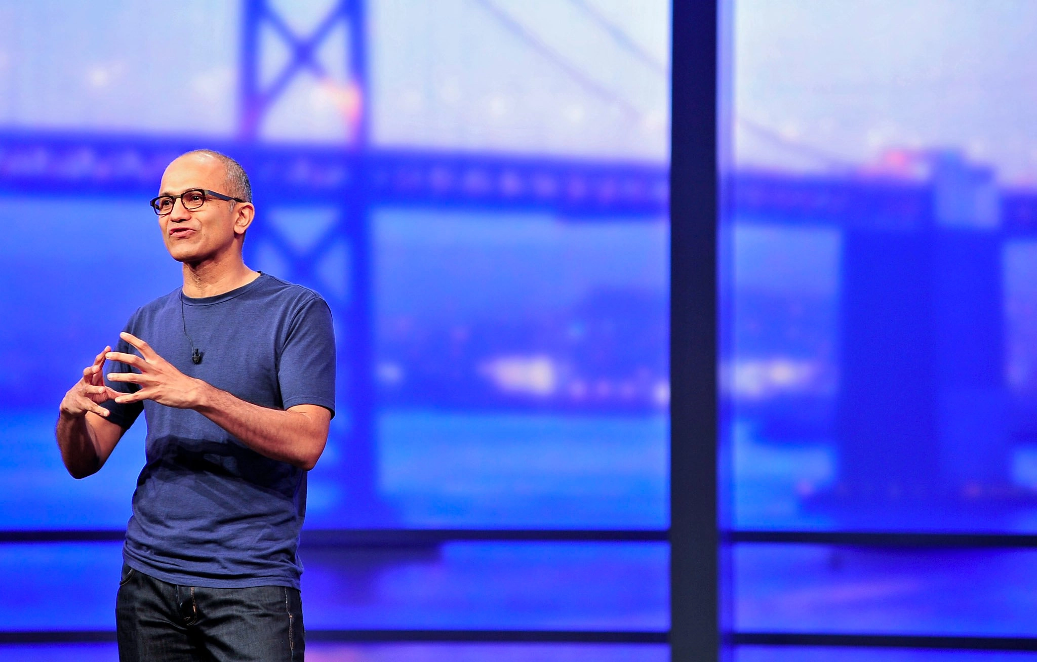
Microsoft is making design a key theme as it tries to bring Windows to more screens, spanning phones, PCs, and TVs through Xbox. Not only will deign be a big part of Microsoft's push moving forward, but it will also be instrumental on unifying the different Windows experiences on these separate devices to create a cohesive environment.

With a similar modern Tiles-based UI spanning across various different products, Microsoft's design is often compared to the Bauhaus movement where function is stressed over ornamentation. The similar design philosophy helps to make Xbox, PCs, and Windows Phone appear related. We're already seeing Microsoft inject new design philosophies into old ideas, like the new Metro-inspired Start menu that's being leaked as part of the next iteration of Windows.

Moving forward, we can expect design changes across the various platforms to have similar meanings. As an example of this, former Nike designer and current Microsoft Live Tiles designer Albert Shum says that the "hamburger icon" will undergo some changes to bring consistency across various Microsoft products.

Right now, on Windows Phone, it could represent an expanded menu where more options can be featured. On Xbox One, the same icon can mean "enter" on a virtual keyboard or it can also call up a menu with more options inside select games.

Shum wants the menu to mean the same thing across different devices, so we can probably see some changes here to make the design consistent.

Another feature that will be expanded will be Cortana, which made her debut on Windows Phone 8.1 as Microsoft's digital assistant. Cortana principal designer Kat Holmes says that she is working on expanding Cortana to PCs and Xbox.

The company is already starting this unification with Universal apps, and we can expect more to come. With designers having more leadership and Nadella open to more design ideas, what are you looking forward to seeing on the next versions of Windows and Windows Phone? Are there any design ideas that you think Microsoft should take?

Be sure to read the full design profile on Microsoft's future in the source link below.

Source: AP

Chuong Nguyen

Chuong's passion for gadgets began with the humble PDA. Since then, he has covered a range of consumer and enterprise devices, raning from smartphones to tablets, laptops to desktops and everything in between for publications like Pocketnow, Digital Trends, Wareable, Paste Magazine, and TechRadar in the past before joining the awesome team at Windows Central. Based in the San Francisco Bay Area, when not working, he likes exploring the diverse and eclectic food scene, taking short jaunts to wine country, soaking in the sun along California's coast, consuming news, and finding new hiking trails. 

133 Comments
  • I'm looking to forward to Metro, not Windows 8's inconsistent, overtiled, and hidden crap. Better use of typography, heirarchy, spacing, obvious elements, and use of the grid. More like the NYC Subway than a depthless cabinet of buttons.
  • Although very similar, I actually prefer Windows 8.x UI to the Windows Phone UI.
  • I agree.
  • Would love to get something similar to continuityfrom yosmite (maybe cloud based not via bluetooth), that would set laptop as my main device and use it even more. Satya has stated lately @fortune that they can learn from another company and benefits from their experiences.  
  • Me too. I find Windows 8.x UI more cleaner than WP8.x. App switching is so clean. Fast resume works much better on Windows 8.x (no resuming or loading). But there few things which I like about WP8.1 too such as word flow keyboard, notifications, start screen transparency etc. In short I want MS to take the best of both Windows 8.1 and WP8.1 and unify them as W9 both for tablets and phone.
  • I would like to see the wordflow swipe keyboard snap to the right or left corner in Windows 8. It would be really nice to type/swipe with just one thumb on my Surface.
  • Hey, moron. They are talking about the apps themselves, not interacting between them.
  • Really? Win8.1 is super wonkey when it comes to layout options and tile sizes, and while it makes a fine full-screen presentation, the idea of a menu that expands forever to the right on the desktop is a terrible idea that they need to re-think. I would much rather see a slightly larger top-bottom scrolling start screen similar to what we have on WP than what they are planning right now. It would be much friendlier to those with a mouse and a scroll wheel.
  • That would look prety horrible IMO with 16x9 aspect ration screens.  With 7-8" tablets, possibly, as most might use the device in Portriat layout instead of landscape.  On larger devices, I completely disagree that the WP-style of start screen layout would be better.
  • There's nothing wrong with W8... You're thinking to hard... Just relax... Lol!
  • Actually there's a lot wrong with W8. The apps (even built-in) just don't have that level of polish that you'll find in iOS for example. The UI elements are too flat. While I admire the content first design, I believe that there needs to be a bit of depth, with button shadows for example. This will help to differentiate between a label and a button. Microsoft needs to increase the number of built-in controls for developers. For example, they have this awesome UI on their alarm app, but those controls aren't built into VS. Beautiful design and fluid animation. If they get the basics right, everything else will fall into place. Also, impose stricter guidlines for developers, because a lot of 3rd party apps look horrible. If they're not following the guidlines, reject the app.
  • Not to mention the fact that everything tries to default to the Metro apps. For example, on my desktop, my wife had trouble finding programs because she was used to where they were on the Win7 Start Menu, so I showed her how you can just type the application name and it pulls it up. One day when I was gone, she typed "calculator" and it pulled up the full-screen metro app on my 24 inch monitor. She was pissed because she was trying to do calculations based off data she was looking at in another window and it went full-screen and she doesn't know how to change default programs. Same with pictures, videos, and a lot of other things that default to the Metro app version of the program. That is okay for tablets, but not desktops. Sure, once you get it changed and set up how you want then it's not a big deal. But, for people that don't always have someone around to help them, it is infuriating for them to be forced into Metro apps when all they wanted was a little calculator on the side of their screen like it has been for years. 
  • Yeah, that was a horrible design decision, and I'm glad that the guy who pushed that design has been kicked out of Microsoft. The next version of Windows will have Modern Apps running inside regular, scalable windows, so things will work much better on the desktop.
  • Yea, I love Microsoft and what they have been doing recently, but anybody that says it is perfect and acts like they can't improve it are seriously mistaken. Like I read in someone's comment earlier, Android was pretty good around Gingerbread, but after several more releases and design changes, it is much more of a joy to use than Gingerbread. As they say, hindsight is 20/20. Windows 8 and WP8 seem good now, but once they release Windows 9, they will have a lot of these kinks worked out and we will look back at Windows 8 as we do Vista; good start of a great idea, but not great yet.
  • Good points... But, rejecting apps because they don't adhere to modern?... That's no way to attract developers.. Especially when you're trying to get them to directly port their apps as easy as possible... The problem is that most developers that have made apps for iDroid don't care, or have the resources to totally redesign their app for Windows... But, you do have some good points...
  • Unlike many, I have great faith in the Windows platform. There are more Windows developers than Android and iOS developers, combined. The difference is that most of them are developing corporate applications that are either web based or legacy desktop applications. However, these developers already have the skills to develop Windows Store applications. So why haven't they done so already? Mainly because the API for Windows Runtime is very immature and lacking a lot that required to build some awesome applications. Also, the full screen apps on the desktop was implemented poorly. I know for a fact that all of this is going to be rectified with the next version of Windows. I don't think that Windows should sacrifice app quality for app quantity. Doing that will just make the OS less attractive to users. At the end of the day, a polished user experience is more important than the number off applications available for download. I know that the number will grow over the next 24 month. Universal Apps are going to make a world of difference.
  • Totally agree!!!
  • I agree. I love my Surface, but Windows 8 is ALL OVER THE PLACE! 100% agree with you.
  • Get a iPad!!!!!!.... Listen to that... "I love MS's tablet, but thier OS is on it".... You really don't like the surface.. Im just sayin....
  • I love it, just the UI needs to be polished more. Esh...
    And I own a 3rd Gen iPad, fyi.
  • Larger tiles, resizable to whatever size I want. Maybe I just want one super large one.
  • so much yes to this.
  • I love hidden UI elements! They leave more space for content. But there HAS TO BE a tutorial (animated) that tells you how everything works and where everything is that is shown on the first boot! That was the biggest mistake they made with W8 Imo!
  • I just don't see why they have to be hidden. In all previous versions of Windows you could auto-hide the taskbar, but a lot of people hated it. Some people like being able to see the interface at all times. I don't mind the auto-hiding but I hate having the interface in 3 areas. App switching is on the taskbar but then it's repeated again on the left hidden area. Before 8.1 it wasn't obvious at all that you could even switch apps as most people would be looking in the taskbar. And then we have the awful charms bar - another hidden element, with no visual indication it's there. I often forget it's there when I'm hunting for an in-app "settings" icon and realise it's been put in a hidden area. I would prefer the charms bar is fully integrated into the taskbar... A single button, or even keyword search + button, that pops up the other options. The metro switcher could also just be a button to show all the running metro apps (this is already better in 8.1). It's not natural or intuitive for someone to waggle their mouse on the sides of the screen for an option to appear. Sure, there are keyboard shortcuts but we're talking about the average user who still doesn't know about Windows+E. It's funny that the OS feels completely natural on a touch tablet/laptop, but less so with a mouse.
  • As you stated in the very last 6 words, Windows 8 was designed to be a Mobile-oriented OS first, keyboard/mouse second.  If you take that approach, the mouse movements are quite natural, as you are trying to mimic touch input.  As you also stated, the Auto-Hide Taskbar and Office Ribbon that carried over to Windows 7 was a learning curve.  It's funny how people will bitch that company A doesn't evolve with the times, lets their product go stale, yet bitches when changes do ocur.  Granted, Microsoft needed a tutorial for simple navigation paths in the OS when it first started, and they fixed that in WIndows 8.1.  Buit even the dumbest people who I have met who said 'WIndows 8 sucks, I"ll never like it", actually DO and find it intuitive after someone walks them through these changes after an hou or two.   Also, hiding elements gives a greater amount of screen space for touch input, much to the gripes of keyboard/mouse users.  There are hidden elements in iOS and Android, yet most people don't complain about them and beleive they are natural components to the OS/apps.
  • People often forget that "different" is not always "better". I think that all the auto-hiding stuff should be optional - I don't see why the charms bar and app-switcher can't remain on-screen all the time for those that need it (typically older or computer-illiterate people). Or have it entirely integrated into the taskbar as I mentioned before - which is my preference as I only want to look in one place for the UI, not in 3 different places. I really hated using W8 for months, because all the UI elements were jarring (flicking me between metro and desktop when I didn't want to) and kept getting in the way of just doing things. It always felt like two OS's badly stuck together. 8.1 is finally a joy to use - there's still a lot of improvements that can be made, such as making metro apps fully windowed / movable anywhere, or giving us more options in terms of metro app placement (such as a 2 x 2 or 4 x 4 grid) as well as rectifying the uselessness of the charms bar. As you said, it really is a mobile-first OS. The only time W8.0 "made sense" was when I used it on a touch-laptop. You're right about IOS & Android, but they're mobile OS's - I'm sure people would be outraged if they hid the row of giant app-icons or the top finder/clock bar in MacOS, by default.
  • I always use the Charm Bar.
  • I use it maybe once a month :) I asked a few people around the office and none of them use it... one guy didn't even know that it was there and said "I always wondered what kept flashing up when I moved my mouse around". Different strokes for different folks!
  • I think the Charms bar is a lot like the top menu bar in OS X. The same "buttons" for each app that contextually adjust based on what you are currently doing. I think it's a really smart implementation of this idea, but it does require user buy-in and a learning curve. I love the Charms bar! I wonder how it would be implemented into Windows Phone though..
  • Swipe up from Home button, maybe? Kinda like how Android's swipe up from home gives them their shortcuts.
  • The problem is that it's not obvious it's changing. A lot of the time you don't know what options are available until you reveal the bar... which a lot of people would only do after fruitless searching within the app itself, as that's where the options have always been. It just isn't intuitive.
  • It is! Otherwise people wouldn't hype Macs that much. But they need to tell you. Once you get it you probably like it.
  • Yeah, sure. Mouse is a different story. But I like having a gesture based OS for touch devices, including WP
  • This
  • They can alway scall it "material" and claim it is innovative and great. hey worked for google.
  • Hopefully all these apps will sync with each other. Right now, it kinda sucks having the same apps on my computer, tablet, and phone and not sharing data.
  • Well its the application problem that developer should create the cloud or use the OneDrive cloud of user.
  • Anything up to 100Kb is easy to share by storing in the roaming settings. Above that size it is not so simple as OneDrive has not been integrated into Windows Phone like it has in Windows 8. You have to request specific permissions and use a badly documented API to transfer the data. And if you want to save data to OneDrive you bascially need to ask for read/write permission to access the whole storage which is not very good from a security and privacy standpoint. It should be made as simple as storing files to any other location.
  • Yeah, MS has already addressed that issue with their own apps for WP8.1, and W8.1.... Ya boi is exactly right... It's up to developers to do their parts.
  • This should be a quick focus I agree. The environment is beginning to support it, but not even Microsoft's apps sync properly yet. That and they're still missing tons of features. We're doing good, but let's not get ahead of ourselves.
  • Metro 2.0!
  • I hate to say it, but I think Google took Metro and refined it with their Material Design. I'd like to see Microsoft take Material and improve upon that.
  • Google doesn't have the "Live" Tiles =)
  • Agreed, but I think the little touches they put into the Material Design is something lacking in Metro. One other problem I see with Metro is that you often lose context while navigating. For example, when selecting a time or date in WP, an entirely new page pops up and blocks the page you were just on. It's not a problem for me personally but I can see how the average user would take offense. I honestly feel like this lack of refinement is why the response to Metro has been so lukewarm.
  • +L
  • I see what you did there. :-)
  • ;)
  • Agreed there is a lot to like about the nice touches Google has done with Material Design.  As for Microsoft for some reason they make grand moves like Modern UI but are slow to make the needed adjustments to the design.  I must admit Modern UI can seem a little dated in certain aspects compared to how others have taken and implemented their own flat designs and interactions. But, hey at least Microsoft has updated the Windows 8 desktop (e.g. trashcan) icons from Windows XP to a more modern look.  /s
  • other's have done this: add drop shadows. that's it. nothing MSFT can't do. but will they?
  • Also agreed. Refinement is desperately necessary.
  • Really?  Losing context is easy when the date or time picker is displayed?  Seriously?  People have very short minds if that is an issue, and those people shouldn't be using technology.  They need to be weeded out of society... Just sayin...
  • Grow up.
  • Turn off your computer or phone.
  • I was merely using date/time pickers as a contrived example. In general when navigating between tasks in WP the context you were just in is lost because everything is generally full screen. Check out the video of Material Design I posted in this thread and you'll see how the continuity of maintaining context makes all the difference. Microsoft got the content over chrome concept correct as evidenced by Google and Apple inventing it from them. But it should be content + context over chrome. I think Google also +1 Microsoft on their own design principle: fast and fluid. http://msdn.microsoft.com/en-us/library/windows/apps/Hh781237.aspx
  • Well, we shall see how many of those UI transitions are present in the lower class of devices (I.e. How many CPU cores it will require to run smoothly.)
    I disagree that context is always lost because of full screen apps. I don't want UI elements crowding the data or information I want to see. It is a fine line for sure.
  • I'm not suggesting everything needs to remain on screen to maintain context. Watch the Material Design video I posted below to see how Google is maintaining context... things seem to "materialize" on screen or melt into one another. These simple animations are: 1. Fast and fluid
    2. Only present the necessary content
    3. Maintain context
  • I see 1) prerendered video 2) too much hidden ui leading to confusion like it did with windows 8. They just called it immersive 3) not sure iOS and WP don't already do this.
  • a video that is pre-rendered will always be fast and fluid. you're ready far too much into it. put it on a bloatware android and it will be the usual experience: not fast and not fluid. people judging UI based on apre-rendered video is like judging an FPS on the pre-rendered intro.
  • LMAO! Microsoft put a picture of someone getting head on their tutorial pages or whatever you want to call it! I clicked your link and was just scrolling through and noticed this a little over halfway down: Edit: In case they won't let the picture post: http://i.msdn.microsoft.com/dynimg/IC728119.png
  • Yeah... Gotta agree with you on that.
  • Refined in what manner??
  • Check out this video and tell me that's not sexy as hell: http://m.youtube.com/watch?showinfo=0&amp=&autoplay=1&v=Q8TXgCzxEnw&mode... Keep in mind, some would call me a Microsoft/WP fan boy, but I can't deny Google has nailed the original vision of Metro.
  • Oh yeah! That is definitely nice. If Microsoft messes this up again, I'll at least look forward to that. :)
  • The weather tile and the music app are so goddamn beautiful!  
  • it is pre-rendered video. looks unispired, flat and tired. nothign particularly new, only to android. nothing about it feels fresh or innovative in any way whatsoever. It was like looking at android when it cloned the iphone look. was it good looking? yes thanks apple. but on its merits no. it is typical google clone enginering.
  • They may have took ideas from Microsoft, but like you said, they refined and improved on the Metro design.
  • Copying is the most sincere form of flattery... It's time for Microsoft to return the favor... ;-)
  • They should ;)
  • I think it's almost inevitable for Google and Microsoft to become loose partners targeting different sectors but maintaining compatibility. Google is perfect for some parts of the world and Microsoft is great for the rest. Apple is somewhat comparable and capable yeah I guess, they do win the popularity contest in every day life.
  • I agree, I support them both anyways
  • Steve Jobs said "Good artists copy, great artists steal".
  • Even Steve stole wozniacs idea. Steve was very bad I maintaining his human resource department
  • Absolutely. Especially look at the smooth and delightful transitions and animations, resizing of elements in context, etc. Microsoft started this with Metro, but rather than refine or extend it, they actually got lazy and let it degrade some! We actually lost plenty of fluidity, transitions and delighters in WP8.1, and new elements have been added that don't conform to the design principles. It is disappointing and getting messy. (This is to say nothing of Meteo/modern on Windows 8 which has zero in terms of transitions/context/delighters etc).
  • most of those smooth transitions were pre-rendered video. easy to do as MSFT has done many times in their concepts. nothing about material was particularly innovative, most came from apple in fact. google's design feels dated since apple/msft arrived at this long ago. it is time to push beyond this. the "flat" boat is now too crowded.
  • I got a lot of stick for saying this in another articles comment section. I think it was mostly people who didn't see the I/O but I agree with you. They've made a beautiful UI work consistantly with all of their products. I want threshold to bring us this type of UI unification in the Microsoft family. Everything needs to be consistant. I do like the OS now but it can definietly improve. Huge fan of how the icons and 'cards' can now have depth, and also the buttery smooth animations. 
  • redefined it by doing what? adding a drop shadow like oh wait apple did?
  • Bringing Cortana to PC and Xbox, already!? Would be awesome if it would be global first. Saddens me to hear that Cortana might go onto other platforms before she even supports everyone that wants her on WP.
  • They didn't say it was coming before globalization, just that it was coming. I too would like to see it worldwide soon but I also understand it's still in beta and repairing bugs in a single language is much easier than fixing them across multiple. Once they get to some point where they think they are in killer shape, I really hope they surprise us with 100+ language support. Just count me optimistic.
  • Ha, I'm not all to optimistic, given the fact that we still don't have most of Bing's features here in Germany ...
  • Actually we don't have EVERY SINGLE BEST of Bing's features wherever else than the holy US :3
  • xD
  • Home team advantage I guess. xD
  • I'm open for design changes on Windows Phone too. I think we still need to have an option to change the background behind the livetiles too as in Windows 8.1. How awesome would be to be able to set both of the backgrounds at once ? and of course a color wheel ! :)
  • Please no. It would be a mess. But I'm sure the Modern design will evolve. Much like Android has in the past years, it looks completely different to how it was. This is only the beginning for Microsoft.
    But no mixing of images please.
  • That's why I said an option :P
    I think it's up to the skill of making the mixing awesome. I have great ideas.
  • give people a feature and stop denying them for once. if you don't like it, don't use it.
  • Something like iOS7...
  • ?! Duh! iOS feels so static imo!
  • At least more colours maybe!
  • iOS7 is way, way too white
  • iOS 7 seriously looks like it has been designed for children, something Fisher Price would glue on a wind-up My First Computer.  It took His Irrelevance, Sir Jony Ive, a team of designers and God knows how much money to spit that out. A UI as flat as an early PalmOS and icons coloured by crayons. Ha, nice one Jony, have another knighthood! Now after 14 years of a stagnant Mac OS X desktop and wow - the slow evolution from aqua widgets to brushed metal to grey gradients, the iOS 7 look is going to befoul that desktop too.  How innovative! Apple's greatness and ability to really innovate died with Jobs.
  • I'd like Cortana for UK on my 925 then for my Surface 2 then my laptop thanks.
  • microsoft should be more flexible with the TV approach, i would love to have an xbox like interface on my tv with kinect and all, but running on my main computer, not on a console, and im sure there is a lot of people who would like something like apple tv, you know, for the less nerdy guys that arent neither gamers nor pc enthusiasts
  • Get positive PR going on first... On war footing....!! Be the challenger!
  • Not necessarily for me, but I still say that microsoft should include a transparent mode on windows phone/surface, etc that would allow a traditional icon/widget base UI that immediately uses toast notification method while still maintaining the flat design queues implemented by windows 8. This might entice iphone and android users to make the switch especially if they aren't fond of the tiled UI and also get apps, apps, and more apps. while in this mode, it would allow live wallpaper to be used.
  • I feel like Microsoft hates us....
  • They just don't care.  We should return the favor.
     
  • Fix Windows 8 desktop! It looks like shit compared to Metro. Why is the right mouse menu different looking then the hold menu in Metro? They are the same thing. I'm glad they are making design and UI consistency a priority. I just hope they really follow through with it.
  •   I agree. Same goes with the old icons. Need modern UI inspired ones.
  • I don't get why you want desktop updated. you can skin it with many 3rd party utilities even making it look like OSX if you want. This ship sailed long ago..
  • Dont bring the "old" startmenu back! it is hideous from a Design perspective. How about they take the software keyboard on the SP2 as an inspiration. Why not make the startmenu a horizontal bar? popping up from the bottom when pressing the windows button. Pushing part of the Desktop up. Why not have it this way? It could benefit Touch and Mouse users. :) there could also me some small icon buttons letting you switch from a list to a live tile view, like seen in those screenshots shown off at build.
  • They have to appease their enterprise customers. Businesses don't like change.
  • Thats BS. Businesses dont like radical changes, like removing the start menu completely and hiding their apps under the start screen for no reason. My Design Idea may benefit both business customers. Those with Tablets and those with a mouse.
  • moot point as it won't be the same start menu.
  • They need to bring WordFlow keyboard to Win8.
  • I want developers to aggressively embrace Universal Apps so I can use one app everywhere. I want to be able to instantly share data or screens between devices with a tap or a gesture. I want all the wild things we have dreamed about doing in the cloud for the last twenty years to become a reality. I also want a HUD for my car that will show traffic conditions, turn by turn directions, weather, track playing, and notifications.
  • Is this rt being rolled into wp. ?. I mean I buy a Lumia tablet will it get updated later so that its the same as my phone tiles?
  • I'd like to see the roadmap/timeline for this - I'm guessing at least 2 years and the way MS works you can add another year or two before it's actually useable...
  • If it takes that long that's pathetic and just shows they deserve to die.
  • I feel like MS are clutching at straws. Head people have no idea what's required to move the company forward.
    They're too old, stale and have no exciting ideas.
    Failure to understand the market and priorities will keep on compounding the losses.
    All that software firepower --- no Youtube app, Major sports apps, the list goes on and on.
    Makes a mockery of the mobile first BS they keep spouting.
    No exciting hardware on the horizon.
    Piss poor non existent marketing and a top heavy management that cannot get with Gen X let alone Gen Y.
    We're witnessing a steady decline. Market share is stagnating and after all this time only 5% worldwide market share if that at all.
    Blackberry sponsor Merc F1. The idiots at MS can't even get their name on a budget team let alone a front runner.
    Absolutely pathetic.
    Every new announcement is more hot air for Natellas' balloon.
  • I like where Windows and WP is going to be honest, I like Microsoft’s services, the Bing stuff is great, balance of Cloud stuff is just right, OneDrive, OneNote and Office Online are great and much nicer than Google’s bland offerings. My computer works fully offline, I'm looking at those Chromeheads!  I do think WinRT is a bit pointless though, the notion sounds great but technology overtook the idea.  x86 tablets are almost as competitive as ARM tablets.  Do I have little ad-ridden Google-metric gathering apps on Android or a FULL PC?? erm, let me see.... My real gripe is Microsoft’s complete inability to promote and advertise their products. Here in the UK, I've seen 3 different current ads.   One for Windows 8, indirectly implying his old PC needed to be binned which is not good.   Another with a guy on a train advertising the Surface - he looks thoroughly miserable and shows little of the product itself as he is slowly squished by the fat bloke sat next to him.   Finally, Windows Phone is advertised by some ditsy girl who again shows little of the product, in fact, the ad makes you think Windows Phones are just for giggly ditsy little girls who likes pretty colours. Microsoft has some good products and services, it needs the testicular fortitude to shout it from the mountain tops and really get the message out there.  
  • I like where they say it's going. I've liked what they've been saying since WP7... but here we are, WP8.1 with more words. Lots of words. We're still incredibly far behind iOS and Android in terms of developer support... WP is like Jon Snow - a bastard that no one wants to interact with unless completely necessary.   We've been told promise after promise of what this OS can be and while they've made small steps toward delivering on their promises it is not enough for how long this OS has been around and the amount of resources and money that MS has at their disposal. The only reasonable explanation of why this OS isn't further along is lack of effective leadership and a system that shuns collaboration and innovation. Simply put it's feeling like too little, too late. More and more every day I get this feeling and become more excited about jumping ship to Android in the fall if I'm not wowed by what MS has in store by then. This time it has to be tangible, not just words.
  • Microsoft sponsors Lotus the problem is that Lotus forgot to develop a car for the new spec.
  • youtube is due to google anti-competitive policies rather than any problem with MSFT. ESPN has a good partnership with MSFT on xbox. Surface is very exciting and nothing on earth really approaches it. Hardware wise you're only looking at existing phones but the reduction on price to zero from WP is already picking a lot of android OEMs, and then changes to soft keys are allowing android phones to be shipped with WP with little overhead, even dual boot. MSFT profits and cloud impact are only increasing. not only are they wiping the floor with google docs, they are catching fast with amazon's cloud. office and their services are more multi-platform thanks to the fact that unlike google, they don't play favorites. They have the only ecosystem that runs x86 apps side by side mobiel apps. They have ensured chromebooks are done for with free windows on low end devices. so yeah, ONE area they have issues is mobile penetration but the rest of the company is doing fantastic. Yet again people have been saying MSFT has been going out of business since windows 95 :)
  • Not much on design but I think Microsoft should really got ahold on the whole app problem in tired of seeing things that realy interest whind up on a crappyer is like android on apple yuck I mean come on Microsoft
  • I'm ready for consistency...
  • I would prefer windows 8 minus the desktop on windows phone. Multiple screens and arrow for more options. Settings or whatever should be control panel while other features branded to match desk to equivalents
  • That is a relief! I seriously dislike that hamburger icon...
  • I welcome this, I'm quite new to Microsoft, I've tended to avoid it over the last 20 years. 4 months ago I would not have touched a Microsoft product until a friend showed me their Lumia phone, I was blown away by the design of the UI and the entire feel of the OS and the hardware, 24 hours later I bought my Lumia.  I then tried Windows 8.1 and was equally impressed, within a month, I bought a Surface Pro.  The UI on both products sold it for me. A lot of people are quick to criticise Microsoft, but I think they have been innovative in UI design, Windows 8.1 and WP8 are gorgeous to look at and really pleasant to use.  The tiled UI would not look out of place on the USS Enterprise. I think the direction Microsoft is going in is great, more focussing on design and consistency across devices is only going to be a positive for the user.  If I had any criticism about the current UI it would be the disparity between the Start screen tiles and the desktop.   The desktop needs to be more Metro, if you understand my meaning.  All those old legacy icons need replacing!  I know a lot of people want their Start menu back, I don't, I would hate to see the tiled Start screen go in favor of a hodge-podge Start menu just because some people can't adapt to something new after 20 years.  The screenshots I've seen so far look like an awkward kludge.
  • Integration and a seamless operation from one platform to the next will catapult Microsoft into a more cohesive product that will be to there benefit. Fracturing is bad for business.
  • +1020
  • Making everything uniform to me means compromises everywhere.  I'm not optimistic.
  • The future looks bleak.
  • If windows apps runs on phones, laptops and tablets and only 1 store this will be the most successful. and windows phone will become popular. And developers happy forever.
  • I feel that, windows 8ui should be infuses in wp8.1 or further.
    A metro UI where we will have new,way of interactive live ties and much more can be done without opening the app.
    Secondly windows8 and above should have the capablity to use it in,best possible manner in terms of apps and program smootly.
    On,this case, universality plays a leading role, which is missing.
    There are only handful of apps which are universal to use on windows like instapic for instagram, no Pinterest, path.
  • Who cares about design when the hardware is just full of yawns.
  • Unified design is wonderful. It can make a difference. Awesome integrated consumer oriented services that are on par or better than competing services is more wonderful.
  • Design new icons. The old Windows Vista/7 icons do not match the modern UI.
  • I like it all so...
  • I really like to have maps on the startscreen and all apps, I would like to see that one clic or tab on the livetile is opening the app or program. And that a double clic or tab on the livetile opens a map. B
    It would be nice that on a PC with a mouse there wil be livetiles on the desktop. From nokia x they can add the fastllane, it can be integrated just like windows 8 left tumb swipe to look what apps are open/ change apps. I love closing apps swiping all the way down, but I also love the action center? What to do? Intergrade notifications with the fastlane could be a option. The charmsbar would be nice on the phone, maybe it can intergrade with the settings from the action center. They need a new way to open all apps. Ok this are mine thoughts (sorry for the bad english) It will be a hell off a job to intergrade Windows with WP, even more when they add the movement control for the XBOX. We will wait and see
  • Hoping for Hubs.
  • i hope default app design would be more like windows 8.1 less like windows phone 8.1
  • less talk more doing MSFT. Less talk more doing.