Classic Windows 7 features make appearance in test builds of Windows 8.1 successor
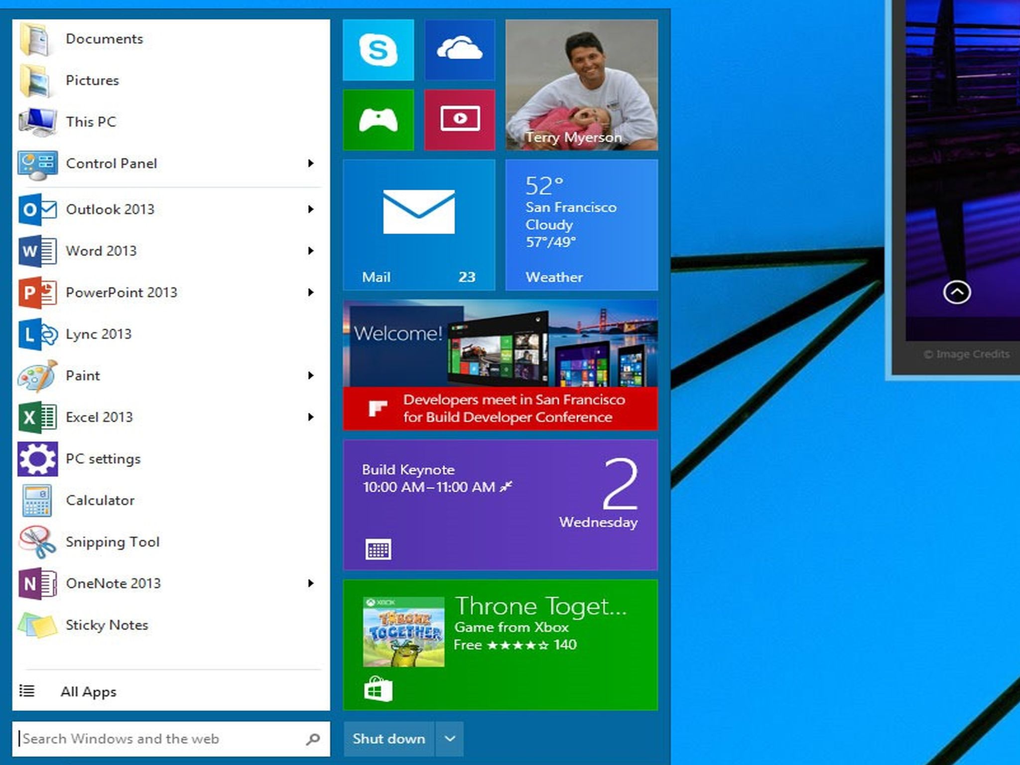
After having revealed its intentions at the Build conference earlier this year to resuscitate the Start menu, a feature that was ditched since introducing the Metro-inspired Start screen on Windows 8, it looks like Microsoft is ready to bring back the Start menu on a forthcoming version of Windows, but with a Metro twist. As it is leaked, in concept, the Start menu appears similar to the one that Windows 7 users have seen, but will be meshed together with Tiles like on Windows 8 and Windows 8.1.
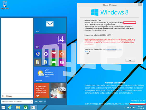
It's unclear how accurate these leaked screenshots are, but the image shows that Microsoft is testing this new Start menu idea on a version with a build listed as "Windows 8.1 Pro." This allows users to quickly launch applications and programs while at the same time have access to Live Tiles information that can be updated in the background.
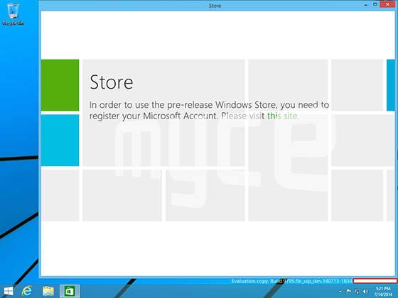
In addition to the Metro-inspired Start menu, a new feature that will be coming is the ability for new Windows 8-styled apps to be opened in a resizeable window inside the desktop. Currently, Modern UI apps on Windows 8 and Windows 8.1 are launched in full screen. The concept for this new way of using Modern UI apps was shown with the new Windows Store that is launched in the desktop pane with options on the upper right hand side to close, minimize, or make the apps go full screen.
"The second screenshot also shows how Microsoft is planning to make "Metro-style" apps run in the desktop as windowed or fullscreen," The Verge reported. "This is an essential part of Microsoft's plans for the next version of Windows, to make it a lot more mouse and keyboard friendly with a significant focus on the desktop."
Microsoft is currently testing a version of Windows known by its Threshold codename. At this point, it's unclear what the next version of Windows will be known as, but the name of Windows 9 has been tossed around for its commercial release. If these features make it to Windows 9 or whatever it will be called, it will help to appease those who use classic keyboard and mouse for interacting with their systems.
Are you excited to see these features appear for what may be known as Windows 9?
Get the Windows Central Newsletter
All the latest news, reviews, and guides for Windows and Xbox diehards.
Chuong's passion for gadgets began with the humble PDA. Since then, he has covered a range of consumer and enterprise devices, raning from smartphones to tablets, laptops to desktops and everything in between for publications like Pocketnow, Digital Trends, Wareable, Paste Magazine, and TechRadar in the past before joining the awesome team at Windows Central. Based in the San Francisco Bay Area, when not working, he likes exploring the diverse and eclectic food scene, taking short jaunts to wine country, soaking in the sun along California's coast, consuming news, and finding new hiking trails.
-
They are ruining windows 8 UI :( I will quit Microsoft if start screen removed from my desktop
-
Quit Microsoft and go to what exactly? Lol.
-
Hmm . Mac?
-
Yes because that is soo much better lol
-
Out of the frying pan and into the fire.
-
Oh yes, on a Mac-system you have 'your lovely' startscreen, isn't??
-
You compare OSs on the basis of 'lovely startscreen'??
-
If he's leaving Windows because of a lack of a startscreen, obviously he wants one.
-
They aren't killing it, its being default disabled. And I don't get that logic. I can't have the whole metro UI, so im going to completely abandon it for something wildly different...
-
LOL...that made my day. Mac LOL
-
Because Mac has a Metro-style screen? Even Apple's mobile OS doesn't have a Metro-style screen...
-
I could do that as well and use IOS 8 as my primary. Win 8 in a virtual environment.
-
I have a MBR 15"! I love it; but it there is a quite long learn curve in Mac OS. It looks quite the same as Windows 7 but you will see if you go to the Apple store and use it for like 15 minutes; it quite different in a lot of ways other then knowing the keystrokes which are different too! So it took me a good week or more to use it without going to my Apple learning book: MAC All-in-One for Dummies! LOL!
-
Trust us omer, you don't wanna do that.
-
Is there a START button or START screen in MAC? LOLzz
-
He may try Linsucks
-
Owned
-
They are ruining the Metro design style. Ever since 8.1 Update 1, it is obvious that they've lost all sense of direction. If Microsoft would have just stuck to their guns the way Apple does when they make changes to their software, people would eventually adjust to the changes and realize that it's actually better once they open their minds to change.
-
Or worse had they stuck to their guns, it may give chromebooks even more attention than they deserve. I guess a dumbed down metro is necessary in that case.
-
Fun fact, Chromebook sales for 2014 YTD total less than 900,000 units. A whopping 0.5% market share.
-
uhh... I don't think your numbers are correct there. I just read that Google sold 1 Million Chromebooks in the education market alone, and that was just in Q2. Search for "Google sells 1 million Chromebooks" and you can read the entire article yourself.
-
My numbers were from what was published by NPD. The same outfit that said Google only sold 2.1 million Chromebooks for ALL of 2013. EDIT we could both be right, NPD numbers were YTD in June, Your numbers seem to come from an editors comment on a blog - not very official, but by the later July 18th date Google may well have found an additional 100,000 suckers to put them over a million.
-
Chrome books. My goodness I've never seen a hotter piece of garbage. When ever one is sold at my work we bet on how long it will be before it gets returned lol.
-
What about update 1 ruined anything? It was a vast improvement for desktop users and did nothing to tablets.
-
The "title bar" for Metro apps is the most annoying change for mouse/keyboard users. Both, on my Surface and on my traditional non-touch laptop, I constantly accidentally close apps because that stupid bar appears whenever I move the mouse to the top of the screen and there's no way to disable it.
-
Turn off pin apps to taskbar.
-
Metro was embraced by a few, accepted by some and shunned by the majority. I'm a huge Windows supporter (Xbox 1, Win 8 PC, Lumia Icon, Surface 2). I LOVED metro on my phone but I only accepted it on a tablet and PC. Apps designed in a metro interface are cluttered and confusing (to me). An example would be the clusterfuck of an ESPN app that we have. Also side scrolling on a phone works because it is generally done in pages, the endless side scrolling on PC apps has never sat well with me.
-
You sir, hit "the nail right on the hammer". The sideways scroll it's a very "sour Apple" to bite. I'd rather have a Banana scrolling like before.
-
You nailed it. No matter if they bring back the start menu or not it won't help much. OS is cluttered and infinite scroll doesn't help. How hard is it to have like a page break where when you scroll it stops automatically at a certain point. Simple visual stuff MS is ignoring is my biggest problem. Don't know who they are calling in to test this all out before releasing
-
What are you guys on about? Page break? Like in the Sports or News apps in Windows 8.1? It jumps a full page when I scroll on articles. I just went into the Weather app and it does not do this, but that makes sense as it contains graphics rather than columns of text. It is hardly "ignoring" anything when exactly what is ignored is in use in their very own apps.
-
Wpn00b.... You are way off.. The typical WP app has a page of information where you can scroll north and south. Then to view a different "page" of the app, you swipe left to right, and new material is displayed which is displayed north and south. On windows 8/rt each page in an app scrolls east to west opposed to north and south. Then if you want a separate "page" (ex. Standings in a sports app). You generally have to pull up a menu, select the page then scroll east to west.... It goes against everything we have ever been taught. Ever.
-
It is different, but for good reasons. On a phone the majority of real estate is from N-S so scrolling goes N-S. On other devices, majority real estate is usually E-W, so scroll E-W. This is just efficient design, made to minimize "chrome". If they don't already (I'm not sure), depending on which direction you are holding the device, or if the app you are using is currently in snapped mode, i think the scrolling should match whichever is most real estate efficient at that time. Changes like these are not really that big of a deal to get used to.
-
Same here, a huge windows supporter (Xbox 1, Win8 laptop, Lumia 1020, Surface 2, X360)
-
They ruined Metro since Windows 8 came out. It isn't Metro.
-
THAT'S IT! Seriously, I'm glad Metro wasn't used, because Modern UI for Windows is NOT
"Metro". Metro wasn't about tiles or flat interfaces. It was about putting content first, being fluid in motion, and being well deigned. XBOX and Windows Phone got it, but the Windows team failed to understand, that's clear as day. One could argue that iOS7 is more Metro than Windows. I will admit the XBOX Music app is pretty good on Windows (but anything is better than XBOX Music on Windows Phone) and does seem to align with the principles set in Metro. But one app does not redeem the whole OS. -
+920. Love the Metro style, but must say this new Start Menu looks good. I guess I like the active tiles :-)
-
Metro (as in Win8 / 8.1) is terrible with mouse and keyboard. Deal with it.
-
I don't see how. The screenshots you're seeing are for desktops with no touch capabilities; aka mouse only. From what the rumors say that the Start Screen will be there but the focus is turned back to more of the desktop instead of bouncing between the two UIs. Only time will tell being "Threshold" is a little less than a year away.
-
Remember, they said that they would allow you to choose a more traditional desktop appearance on the larger screens, but that doesn't mean you can't have the option of using the full blown metro either.
-
According to this article in The Tech Report, we WON'T HAVE THE OPTION OF USING METRO ON LAPTOPS/DESKTOPS, and tablets won't have the option of using the classic desktop. So they're taking the ONE WINDOWS idea and making it absolutely schizophrenic. "Microsoft demoed the new Start menu at its Build conference earlier this year, promising to unleash it as part of a future update. Unofficial evidence suggests that Windows Threshold, the next major Windows release, will go as far as to disable Modern UI entirely on desktop PCs. On the flip side, the desktop will reportedly be off-limits to small tablets." Rumor: Windows 8.1 Update 2 coming August 12 - sans Start menu - The Tech Report
-
I believe you will have the option to load into the metro UI or desktop metro UI. It will automatically recognize the service you're using and adjust accordingly but it doesn't man you can't change it in the options.
-
Read my post above yours, in response to Pierre Blackwell.
-
I don't think Metro is going away. I believe there's going to be an option to activate a Metro-style start screen (i.e. pin apps like widgets) to the desktop screen... for those who want it.
-
Read my post 2 or 3 posts above yours, in response to Pierre Blackwell.
-
You Start Screen will still be there. It appears to me that they will of course leave the option for the Start Screen if so preferred. Clearly there are elements of it with the addition of Live Tiles to the Desktop's Start Menu. I, for one, am somewhat impressed by how they are melding old and new together and doing it quite tastefully. I can't wait to save up enough for a Surface Pro 3 and be able to use this first hand. Each computer they sell will be perfectly suited for touchscreen, desktop or tablet use. It's just up to you, which interface to use. They have been going for that all along it seems, but it is really starting to show just how well of a job they are doing at refining it.
-
It's not up to you. Read my post 3 or 4 comments above yours, in response to Pierre Blackwell.
-
Dude avg ppl employees can't work with metro UI. And the metro can be adjusted from the control panel in Windows 9
-
As much as I feel a hybrid start menu would be good for the OS, I also feel like that would in effect be saying "we were wrong" I think they should have had this from day one, or never. Pick one and stick to it. Going back and forth on things like this and DRM on Xbone games, etc. only serve to create confusion and reduce consumer confidence.
-
Exactly!
-
I'll stay on the current win8 and use the new Windows in a VM
-
Why can't MS make up their mind already! First they went ahead and removed the Start Menu, ignoring thousands of user feedback, then when everyone got used to not having it, they're bringing it back? are they serious? I've always defended the Start Screen, because I've always thought of it as an expanded Start Menu.. a full-screen Start Menu. It doesn't make sense to bring the old one back again!
-
I'm certain you'll have the option to configure how it all works. Whether you see the Start Menu or Start Screen when hitting the Windows key.
-
Read my post 7 or 8 comments above yours, in response to Pierre Blackwell. You won't have an option.
-
The first word of that headline is, "Rumor". I've also read rumors that states that you'll be able to resize the Start Menu and take it full screen. So if the rumor is true, a full screen start menu is equivalent to the current start screen.
-
Fair enough. But if it has to share real estate with an apps list, that will suck.
-
I have Macbook Pro Retina 15' and I use Windows 8.1. Because OSX sucks, you can't even do simple things that you take for granted in Windows. The only thing I like is the touch...but the OS meh....and what to say about gaming....almost nothing works there, even those that are ported in OSX don't work as good as in Windows.
-
That's an oxymoron. The start screen was never on the desktop. Be that as it may, the start screen is not going away, so put your mind at ease.
-
Ever hear that saying, "cutting off your nose to spite your face?"
-
I want aero back :(
-
Fuck aero
-
hey aero has feelings too
-
Why?
-
Aero is a resource HOG.
-
If only if they made aero metro
-
I have plenty of resources and I want use them to have great looking windows. Years ago I bought additional 2GB of ram for Vista and I was happy now I can buy 32GB but microsoft refuse to use them to show me Aero. I understand it should be disable on tablets but not on desktops.
-
Exactly. Moreover, I haven't seen a single bit of improvement with no Aero present in Windows 8.
-
My ex was a resource hog too but she was really pretty and I miss her.
-
Are you running on a 33Mhz Motorola CPU with 32K of RAM?
-
Exactly! I miss Aero more than stupid start menu.
-
Let'em come!! I mean consumers/entrepreneurs along with new features!!
-
Well...
-
This is ridiculous to me. I hate how they are dumbing down the os because of the outcry about a start button. I understand why they have to but still.
-
I could not agree more.
-
Seriously. All that is needed for most users is a more robust file manager but really, 8 is fine once you actually know how to use it.
-
I feel bad for Microsoft. It seems like no matter what they do, no one is ever satisfied.
-
Te problem is with te lack of coice. They should have given the option to enable/disable start menu right from the begning of Windows 8.
-
Very true, but i think they wanted to get some traffic in the app store so they forced it... it makes sense, and it worked to a certain extend. If there was an option to turn it off, i bet you that there woudn't be as many apps in the win store today
-
Don't feel sorry for them as they are fully responsible for this situation to begin with and has been a long time in the making.
-
That's true, but what makes me feel bad for them is they're at least "trying" to course correct and give people what they want, but no matter what they try to do to make it better, one side gets upset. Basically putting them in a no-win situation.
-
Personally, I don't even need that. That is why I love 8. I have a nice touch friendly OS for when I want to consume or create basic and the power of the desktop when I need to get something done. We even hear fans of 8 say they want the desktop gone, I don't. I want the best of both worlds in one machine. Right now I feel I have that. Not to say it can't get better, but really like (liked?) where it is (was?) going.
-
I have to agree with you 100%
-
I agree for the majority of Windows computers, however, for devices like Surface RT/2 I never understood why they have desktop mode. It doesn't run desktop software, so find a way to access all the settings and other desktop accessed things from the modern UI.
-
Unfortunately we are now in a majority rules society and MS isn't as strong anymore. Google and Apple would happily jump on any consumer discontent that befalls MS.
-
I was an early adopter of Win8 and continue to argue with those who talk down about the Modern UI. That said, what they are showing here is a wonderful blend of old and new. Infusing the static Start Menu with the dynamic Live Tiles without taking the user away from their multi-windowed environment really is the best of both worlds. I look forward to this on my desktop.
I wonder though: On my Surface Pro, will I get the Start Screen, or Start Menu? Perhaps it depends on how I am using it when I hit the Windows key. -
Just give me an option to disable a start menu and use start screen 100% of the time and I am ok. With that said, who really liked the freaking start menu? What a cumbersome POS. I use 7 on my work machine and the only reason I click it is to search. I truly despise the start menu and have well before Windows 8 was even a thought.
-
I'm the opposite. I like the new Start Screen, but the All Apps section is a cumbersome POS. Win7 Start menu had it perfected where "All Apps" reads top to bottom in a list and you can pin your favorites to the main part of the Start Menu. Win8 All Apps takes way longer to find your newly installed program to pin to the Start Screen. This new concept really is the best of both worlds, especially if they make the Metro half scroll like Windows Phones do.
-
With the sorting that came with 8.1, that fixed finding apps fast for me. Once I located, I pin to start where I want.
-
Do you know that you can organise the 'All Apps' page by newest? And then pin anything from their to the Start Page? That sounds like exactly what you want to do, and it's fully supported in Windows 8.1.
-
Thank You. I too am ok with ModernUI but I am not thrilled with the All Apps view. I liked to organize my Start Menu into functional trees according to the type of programs; like Utilities, System Devices, Video, etc. Under each category would be all the appropriate programs. Having all of this fly out into a space that covered less than a third or even a fifth of my desktop was very efficient in comparison to side scrolling what might be several screens. Yes, for the smug one's who insist on telling me how to organize my computer, I am aware of the search function.
-
Totally agree. The only time I use the Start Menu at work is to use the search, or to logoff/shutdown. Which is rare since I already have the programs I use the most pinned to the Taskbar and usually just lock my machine (Windows key + L shortcut) at the end of the day.
-
I'm with you. I was never a big fan of the start menu to begin with and I actually detest it now. I'll take the start screen any day. I feel like I'm able to navigate faster in 8 than 7 and it feels less cumbersome to me.
-
And by the time this comes out, even more people will be using a touch device as their primary device. Ah well.
-
Couldn't agree more. This concept looks ridiculous.
-
If it gets more people to upgrade and stick with Windows, it will be worth it. I like Windows 8. I own a Surface and upgraded my personal machines soon after the initial release. However, I see this working well on my non-touch AIO.
-
Yeah, MS overestimated people's brains.
"where is start? Where is it? Please, I can't breath...i can't....arrgh...here it is, just in time. I feel safe now." -
I agree...to an extent. Believe me, I am totally in favour of the Metro interface -- I loved Windows Phone 7 from the first minute I got my brand, spanking new Samsung Omnia 7 and have been a very proud owner of a Surface 2 and a SP3 since, as well as three other WP8 devices and a couple of other Windows 8/8.1 PCs. However, I can see why some people have trouble grasping the concept. It's just too big a leap in one go. I, personally, was delighted that Microsoft took such a bold step with Windows 8 and we technophiles might love this kind of revolutionary change but Joe Public typically does not. (For comparison, look at how long the computing world took to abandon DOS in favour of Windows in the first place -- I was still seeing DOS-based* PCs in commercial environments in the mid-1990s.) For that reason, this hybrid that might well become Windows 9 probably should have come between 7 and 8. (* I mean entirely DOS-based, i.e. without Windows running on top of it.)
-
As I've said before, people like what they know. Had Windows 3.1 been more stable, had there been a computer in every home running it, you'd have heard a call for Gates' head when Win95 was introduced. No matter what we have. No matter if what you're offering is better. We. prefer. what. is. familiar. People are adverse to change unless they can instantly grasp how it will make their lives easier, allow them to expend less effort immediately. i.e., the TV remote. Enough said.
-
Hope they leave us an option for Start screen at least. I use metro 95% of time
-
I also love the Start screen on my laptop, don't want to lose that. That and the apps are what make it great, a true upgrade from Windows 7.
-
Just update the damn icons!!!
-
and make them live tiles !
-
Make them animated gif
-
Yes, for the God's sake!
We need a whole revamp of the icons! -
Amen to that! The screenshots show a mix of Modern and old Win 7 icons. While these are not final, let's hope it gets changed. That mish-mash is a mess!
-
I am believing that every Windows 8.1 user will can update for free to this new Windows (9 maybe, or even Windows One), because these single changes dont compare theirselves with the changes that they made from Windows 7 to Windows 8 or from any new Windows released.
-
Anyone out there who can translate this into english? I think it ranks as the current gibberish champion regardless of what language the person speaks.
-
He said it's not that big update, comparing it with the jump from win 7 to win 8, so MS should give it for free.
-
I'm more worried about those crap folder icons than anything else...
-
+920
-
I currently like that the Windows apps are opened full screen and you can snap them and run a few side by side. The start menu, I'm sure many would like but I feel its a step backwards and partly a copy and paste from the previous Windows version. Although I do like the slight metro/Windows 8 theme it has.
-
It's a compromise for 'the slow to embrace change' to get their heads round the concept of live tiles whilst still having the familiarity of a start menu. Looks nice, but the most useful thing is modern apps on desktop.. Been using modernmix for this since 8 was released.
-
Agree... I may give modern mix a try.
-
The problem with having apps side-by-side is that they're always full screen. I went back to the desktop version of Skype because it can sit in the corner of my screen, or I can have two conversations on top of each other, instead of the app taking up the entire height of the screen. Having windowed apps is perfect and makes sense as we are using "Windows" after all.
-
I have two problems with it: 1. Modern Apps and Desktop apps are different. This is hugely obnoxious. Just like we want WP apps to look like and work similarly to other Windows Phone apps, when using a PC, it's reasonable to have all applications share a similar UI. Windows 8 has two. Yes, it's easy to go back and forth, and yes they are not entirely different. But any difference that is not inherent to the needs of the application (like Excel and Word and PhotoShop must all be slightly different because they do different things) is pure bad UI and provides a poor UX. Not judging which is better or worse here, just stating that 2 UI's is bad. 2. If you happen to have a big screen and want to run many windows at the same time, including small windows for things like Skype, RSS feeds, LogMeIn/Phone msg/other window lists, Desktop gadgets for weather, etc., you can't do that on the current Modern UI. You could argue that Live Tiles replace a lot of this, which would be fair, except you can't have the Live Tiles up at the same time as the other apps you're running, defeating the whole purpose. Live Tiles are fantastic as quick conveyers of info when they comprise your main viewing screen (i.e., the screen on your phone). They are just a novelty on an OS used almost entirely for big applications like on a typical PC. I suggest that Live Tiles be allowed to be placed on the desktop (like Windows 7 gadgets) and/or that applications run on top them, so hitting the Win button reveals the desktop with Live Tiles and maybe allows the desktop or just the Live Tiles to scroll, that all apps run on the desktop with a real effort made to standardize to single UI for mouse and touch users and that all apps be resizeable but also snappable to the sides (especially important for tablet use, which has always been possible since Win 7 with Win+arrow keys anyway), and I like the Start menu hybrid shown in the pictures -- I really miss being able to select recent documents from the Start menu by application, something I use constantly in Win 7 (but I understand that user testing shows most users don't do this). In other words, there are great features in Win 8. Keep them, but integrate them much better with the Desktop world so there is a single cohesive UI and UX, and don't destroy strengths of Windows 7, like the Start Menu with recent document selections.
-
Yeah! Make it like at the Build and I buy it!
-
I spend 100% of my time on the desktop using multiple monitors for 9 hrs a day. I don't use the start screen because I want those metro apps to run windowed on the desktop. The start menu needs to come back in the new format but resizable so more of the tiles can be seen at a glance. Sure when I'm on a tablet I don't want the desktop mode. This new development for threshold is highly significant to remove the small niggling frustrations with win 8.1. The os simply awesome over win 7. With threshold, they'll have nailed it.
-
Exact same boat as you. I run a three monitor 8.1 workstation. However I never see the start menu for more than a second because I'm not the kind of chump pseudo power user who hasn't figured out how to search with Winkey + type. I also don't flood my desktop with app shortcuts. I put immediate use documents on the desktop and folder shortcuts. I have all my development tools pinned to the start screen for I dont want to winkey + typetosearch. Anyone who continues to beg for the old start menu needs to get over it.
-
I have two Dell i7 PCs with touch screen monitor at home. Once I upgraded one of them to Win8.1 Update, I found myself hardly want to use the W7 PC anymore. W8.1 update is as good as W7, only faster to load. Then you are one click away from the Metro UI with tons of new Metro apps. You got a nice work and play machine. I have to see how good the new Start Menu works, but I have no complains about the W8.1 now the way it is. It is very mouse and keyboard friendly. With my new Linksys WRT1900AC router installed, everything works so smooth. I do hope to see that 'Interactive Live Tiles' be implemented in the W9 along with the Cortana. It will definitely make the Metro UI dynamic and shine. As long as MS provides us options to boot into either Desktop or Start Screen, it will be fine with me.
-
@khipara - completely agree. start menu > start screen
-
Right now you can boot to start menu or straight to desktop. Same will be for the next version except desktop will have a start button and you can access the apps from there. Makes sense. The only thing that doesnt is how in gods name did they allow the release of W8 without a start button when the whole of the business world that has Windows care about productivity and NOT relearning an OS. MS changed it for the sake of changing it and im glad that it bit them in the ass.
-
I hope they at least leave the choice some kind to the customer... I like my Metrostyle Fullscreen startmenu. Its perfect for consuming, even on my Desktop without touch... but I understand that a choice with startmenu has to be given to powerusers or just to those who want it.
-
I hope there is an option to keep the start screen the same as now...
-
OMG! That thang looks like a mutant child of every Windows OS ever made. It's not gawd-awful with only 11 apps in the menu, but my own apps list contains 28 columns, with only the frequently used apps on my start screen. There is no freakin way I'll go back! ICMYI: This Business Insider article features screen shots of all the previous generations of Windows... It's good for a groan and a laugh: http://www.businessinsider.com/what-windows-used-to-look-like-2014-7
-
The sooner the Start Screen is gone, the better. I don't care if they insist on the apps etc. The good thing is that those apps on the start menu will likely be unistall-able. Which means, those of us who want an end to the horrible Metro-experiment, will be able to get rid of it.
-
you can get rid of it now by booting straight to desktop as at work, I never see the start screen unless I want too. Guess it's a bit hard to configure for some folks!
-
I know that. I do that. Still, for some apps I still have to go back to the Start Screen. With them opening on desktop, one can get rid of that for good.
-
I guess you missed the news since prior to the initial release of Windows 8 that apps can be uninstalled?
-
After going around trying to figure out what the hell you were trying to say: yes, I know. But Microsoft could also fall into the temptation of building in some of them into the OS - like WP - and make them non-uninstall-able.
-
@DJCBS - agreed. Metro is fine for smaller devices, but I hate the start screen on my desktop machine.
-
As much as I also detest this idea, for the enterprise, it makes more sense. The amount of overhead required to support a company's user base on a brand new system and Start screen would be atrocious and prohibitive for this group. I do agree though with our consensus as well. As long as Microsoft allows us the option to choose our Start menu, this will be welcomed with open arms on both sides. (At least, that would make the most sense to me.) here's hoping Microsoft does that this time around.
-
Ugly... Horrid... Get rid of the useless Start Button
-
Is this really "news"?
-
Leave it to Microsoft to ruin everything. This is why we can't have nice things :-\
-
LOL. That's what my parents always said... In this case, it's the whiny children who can't spend 2 hours learning how to close an app without an X.
-
If they had provided a single new UI and existing applications, or at least all new applications intended for Windows 8+, shared the new UI, that would be one thing. That's not what MS did. They provided not even a hybrid, but a true dual UI system. They have not even released MS Office in a version that runs in the new UI. This is the problem -- not the changes, which we could separately debate on an individual basis if each is an improvement or not, but the split personality that doesn't have any clear path to being resolved into a single UI. I kind of like the new Modern UI. I love the integrated touch/mouse/keyboard control on my new convertible tablet (Fujitsu T904). But those are not justification for providing a dual UI OS. That's an attrocious violation of every major UX rule known to developers/designers.
-
I agree with everything you said WebColin. However, I loathe the thought of a "touch friendly" version of Office. I've been bending those apps to my will for 20+ years. The ribbon concept was enough of a productivity killer. From what I've seen with many Metro apps and Metro-style websites? Touch friendly = truncated features. I love the start screen becaue all my frequently-used apps are just a click or tap away. I love my desktop because I can park all kinds of docs, shortcuts, and crap on it (some of this alleviated by the Reading List app), filing and clearing away the clutter every now and then. I really like the dual personality. But I'm sure most users have extremely well-organized computers. Most users don't collect information like I do (no such thing as TMI). The UI researchers would kick me out of any testing program, even though the compromise they created is exactly what I need...
-
I confess I don't know how a touch version would work either. I'm definitely a Word and Excel power user and don't want to give up any functionality. I haven't seen the new touch versions on the iPad yet -- how are they? I LOVE touch scrolling in almost every app. After only a day or two, I found that faster and more intuitive than even a mouse with a scroll wheel (because touch scrolling has pixel level precision, mouse wheel does not even provide line-level precision). I find I'm often using to touch in place of the mouse in Outlook, but it's clumsy because the buttons are too small. I happen to much prefer the ribbon approach to text-based menus. I agree with the MS design decision and reasoning here -- now all users can easily get access to all the advanced functions, instead of having to drill through multiple menus where only true power users ever found them. Even for me, there were some rarer functions I never used until they were on the ribbon. I suspect the touch solution is similar to the ribbon and three dots approaches -- big buttons for the most common tasks, the rest hidden but just a touch away to access. I think the Modern UI is probably a fair basis for this, but it needs to be merged with the desktop API's so all applications use them automatically, just like all apps have the same red X in the upper right corner for close and call up the same File dialog, etc.
-
What scares me is that Office might look like the OneNote Win8 app with a carousel menu. If you've never seen it, download it from the Windows store and see if you like it. I think it's the funkiest, kludgiest thing I've ever seen on a computer.
-
By the way, I don't doubt that there are a significant number of users who prefer the dual options of the Win 8 interface, but that doesn't make it a good overall UI design decision. There are good reasons why the highest priority in UI design is consistency. Win 8 threw all of that out the window with its split personality UX. Even Control Panel-type items are found some in the Control Panel on the desktop and some in new Modern apps. Yikes.
-
Nice things like a useless tablet interface on a 30" screen?
-
Just my opinion, but I think the start screen works great on tablets and touch screen computers, but horrible on laptops and desktops. On my laptop I used the boot into desktop mode and stardock start button. It's just easier to work with when using a mouse I feel. That's just my opinion though.
-
+1
-
This. Desktop: Hybrid start menu and windowed apps. Tablet: Start screen and full screen apps. Convertibles: Switch on the fly.
-
I don't mind having that option as well, but I still want the start screen. Possibly let the bar expand into the start screen we have now? Either way I will get used to it
-
Will current wp8 phones will get windows 9
-
I don't know why everyone is so in love with the W8 UI. I do actual work on my computer, such as development, web site creation, editing plain text, and many other things. W8, when running tools such as Visual Studio, Adobe Dreamweaver, Chrome, and a text editor to edit raw code, is ungodly slow and painful to use. This worked fine in W7. Why? Because it didn't use two seperate enviorments which run on two seperate interfaces. Logically, this requires 2X THE PROCESSING POWER. To continue, doing common tasks such as turning off the computer becomes a hellish nightmare - especially when my computer turns itself on at midnight and freezes, which seems to happen on a daily basis since I updated. I'll stop ranting now, but I must say, I can't wait for this to come. The moment the ISOs leak i'll be on. To put it simply, the problem with W8 isn't that people can't learn to change. The problem is that an upgrade needs to be an upgrade, not a downgrade that makes your computer feel like it's constantly infected by a virus.
-
I think you must have some other issues Kevin. My pc (RIVE + i7-3970X) is quite noticeably faster on 8.1 than it was on 7. Your PC turning itself on could be many things, the freezing also. I don't have this behavior on any of my 3 pc's at home (X79, Z87, Z97). I dunno what's a "hellish nightmare" about turning off your PC, you have many ways of doing it... You are not limited to the method in the charms.
-
Do a fresh install if you upgraded from Windows 7. Freezing is your hardware going bad or bad drivers. Waking up on its own is your hardware power settings or bios settings. To shut down right click the start button. It couldn’t be anymore simpler. Windows 8 much faster than Windows 7 and uses less resources.
-
They need to pull the Pin and just seperate the things completely. It's like they're trying to connect a dual-boot system. They're set for a lifetime of compromise in that case.
-
I love the metro UI, but hate the "dual boot system", which you discribed perfectly as W8. The desktop feels like an alien world compated to the start screen, mainly due to the lack of consistent icons and lack of flatness.
-
I agree with you, but its probably the evolutionary step that should have been between 7 and 8.1 so it wasn't such a huge shock. Windowed modern apps is great for all desktop users though and combined with modern apps in the new start menu, will give some boost to their uptake
-
Why are people still in the uproar over a start button? Are you taking me that people are actually stuck on the concept that the start button is do or die for the OS? Come on people! Lets expand our mind and learn how to adapt or find another method that will work.
-
I agree, some people are so Windows 98. That's why sometimes the platform can never excel and mature. Those types of consumers. Next they'll want a start button on Windows Phone
-
I love the start screen but I won't mind the start menu... I hope users will be able to choose whichever they want :)
-
So tired of some Windows users complaining about. Old ways of Windows on a desktop. STFU.... go buy Windows 98 or something.
-
I like Windows 8.1 as it is today. I wouldn't change a thing.
-
Start Menu is totally and irrevocablu u-s-e-l-e-s-s. We need a smart interface, a good 'metronized' interface, not a useless menu. We have Start Screen.
-
If I wanted the windows 7 feel I'd of stayed in 2009.
-
People certainly seem intent on investing energy in a rumor backed up by a poor Photoshop mockup....
-
For the love of all life update those old ugly icons of folders and paint etc. Mixing flat metro gfx with those old icons makes my eyes BLEED!
-
I think the start menu concept looks fantastic. I am very happy to see the return of the seat menu. It has been sorely missed while working on the desktop. For me I can take it or leave it. I use a tablet anyway, so I prefer the start screen. I really enjoy spending time in both environments. Even when I attach a keyboard and mouse, I use the srat screen with no issues. I do recommend something like classic shell or modern-mix programs for older folks who don't understand the start screen. Its just easier that way for them. I always tell them to spend time in it to get familiar. My aunt, who is 75 and not computer literate, got to know it and likes it. I recommend Lumia 521 for her so the familiarity is there (converted from Android).
-
I like Win8.x as it is, but, I like the changes too. It is what should have been there since the start. But I also like the new search features in 8. Very robust and simple. Win 8 is a very nice OS overall, but it does need refining, and no these changes are not a step back.
-
"quickly launch applications while having access to live tiles" I can already do that with the Win 8 Start screen. Speed isn't the issue. The problem is people didn't want to learn a new way of launching apps or they thought a full screen app launcher was disorienting
-
Hope they revamp the icons. They look like a Mac wannabe.
-
This will be free on windows 7 right?
-
As a surface pro user with Windows 8 this development is getting ever more confusing. I'm experiencing with every (softly forced( update that my surface is operating ever more like a PC. The functionality of the tablet is being lost, which for the surface and windows tablet generation is a stab to the heart. From my perspective I'm noticing ever more emphasis on the PC experience because that's what the market can understand and find a familiar experience. But then I wonder why such an emphasis for windows 7 when ever more screens are becoming touch based and frankly the windows 7 and desktop UI elements are very user and touch unfriendly. I currently still stand convinced that the whole OS needs the metro modern UI, both desktop and current Startscreen. Otherwise windows 8 is still becoming more of a mess and I can just as well advice all my coworkers friends and family to dump and sell windows 8 over windows 7. I just don't see the cost-benefit and positive user experience as it is evolving now. It's a degression instead of a progression. For me windows 8.1 is the last positive evolution of the OS. Update 1 has no added benefit and is, apart from the blocked security updates linked to update 1 (cleverly mean), for me as a tablet/ surface pro user. I hope Microsoft will consider a different roadmap for their current evolutions of the windows OS.
-
As a Surface Pro user this won't change a thing, the start menu is for desktops.
-
Ugly! Why change it . . . ? Just have a toggle of sorts.
-
I don't get worked up about Metro vs. Desktop. Maybe I would be further along in my Metro conversion if the app developers all took the Metro plunge. But many apps automatically bring you back to the desktop and then you have apps that have both Metro and Desktop versions and who knows what? If Metro is superior, over time it will supplant the desktop even if there is a period of desktop window dressing overtop. If I had my druthers, it would all look and work like WP 8.1. I do think we may also be in a phase shift on display size/orientation. However this shakes out and whatever MS does, there will be those that stomp off in a huff, and those that stomp off in a huff-and-a-half.
-
All I can think of is "button classic" from 30 Rock...
-
I appreciate the Start screen and would not want it removed. BUT, having those "Win 7" features pulled back into Windows 8 would also make me very happy when I'm working in "desktop" mode. Definitely a win for people who really liked the "old" way of doing things.
-
I better not have to pay $100 to upgrade from Windows 8...
-
I'd gladly pay them if it comes wiithout the metro interface, apps on windows, new icons and DirectX 12.
-
This will definitely be better for desktop users without touchscreen. I wonder how well it will be for touchscreen users though..
-
I would think if you have a touch screen, they will give you an option to have either the start screen or Modern Start Menu. I prefer the screen, but I am sure that the touch on Start Menu will be fine. If you used a Windows 7 tablet, I am sure it wont be much different experience in using Modern Start Menu. Windows 7 start menu on a tablet was good to use but not as finger friendly.
-
There's a high probability MS will set an automatic view depending on the device, plus the manual one.
-
This is the ugliest look of Windows 8.1 successor. I really wish they don't remove the Start screen. I love it. This start menu looks stupid.
-
This is a screenshot of a product thats unfinished. Most likely going to be a option. If you want the start screen then keep it.
-
Well when it will released you will have option to keep old or this one
-
I believe this will be win 9, since win 8 is an image too "tiles starty" for the majority of people, especially for those who didn't installed it, and this update wouldn't be noticed or appreciated, but the actual win 8 users.
-
is Windows 9's new start menu WP's start screen and then will next update after Windows 9 be changed from 2 columm start menu to 3 columm start menu ? I think MS's developers and designers make easy money.
-
I'll never understand the "I want a start menu in my start menu" movement. The W8 start screen IS one big start menu. This W7 style start menu is redundant and a waste. I hope we have option to completely remove this "new/old" nested start menu...
-
This leak is nothing new. The exact same features were shown at Build, with a live demo no less.
-
Yep it was. Every tech site seems to be shouting this new information from the rooftops when it's been around since April.
-
Ew that list next to the tiles is redundant and ugly. just put more tiles there. then you click "All apps" and BAM FULL SCREEN METRO ALL APPS SCREEN WHATS UP BITCHES WE BACK UP IN DIS U HATING CUS U LUDDITES
-
God that is ugly. And I'm a keyboard and mouse desktop user.
-
User hung up over features of the past. These start menu thing should be phased out by now. This is why we cant have nice things. When microsoft remained traditional, people will complain that there is no advancement, but when Microsoft actually got it right(i really love modern/ metro ui) the same people complain about the change. These people should be put to sleep, or at least neutered to prevent further breeding.
-
Too many changes; hard to keep track of things. I like Windows 8 but everyone says its dead...just let it die and work on a Windows 9 masterpiece
-
I hope we can choose from both Modern-UI and not Modern-UI start menus.
Personally, I love Windows 8 start screen. -
Microsoft really need to push it soon and create windows new version android new version with 3D is amazing with 64 applications
-
Update the freakin' look of the desktop and get rid of the freakin' borders around the windows. Modernize your freakin' UI MS!
-
This is the first thing you should run after a fresh install: http://winaero.com/comment.php?comment.news.96
-
Nice article, though sorry to disappoint everyone, all the screens seen so far, are fakes by a well known faker
-
The very first image in this article, is actually a screenshot of the start menu from the Build conference.
-
I refer to all screens except the build conference demo, which is semi-real: it was a mockup running on rtm
-
Hmmmm....true or fake....Anyone got access to a ISO of this build ? PM me, I would love to dump it into a VM to see what they are doing and where they are going with Windows 9.... If it's true, cool, I welcome the old sytle startmenu back for keyboard and mouse based desktops.
-
This would be an amazing addition to Windows 8! But I heard they do not want to release this feature - Start menu like Windows 7 has since it would take away from the new Windows 9 which is suppose to be the "Major" marketing feature of the new Windows 9 OS! LOL! I plan on upgrading my desktop to Windows 8 in the Winter months so I can learn it and get a free upgrade to Windows 9 in the Spring. I already have Windows 8 on my two notebook computers but it not the same since I do about 80% of my computing on my desktop. I just hope they have 4K screen resolution display features by then in Windows 9!
-
No, I don't want the start menu back. Its like switching from a feature phone to a smartphone, then back to a feature phone. Don't cave MS.
-
Just please tell me that we can turn it off.
-
Why not just make a Start menu and put a maximise button somewhere which will toggle between the menu and a fullscreen tiled Start screen. It's not difficult to accomodate both preferences Microsoft, come on ffs! (Personally I prefer the Start screen)
-
That start menu will be a massive hit! Everyone I have shown it to, even windows haters thinks its brilliant.
-
I bought a Programm for exactly that feature shortly after starting to use W8. I think its called ModernMix and comes from Stardock. Wouldn't use win 8 without it, but if I'm honest with myself I'm not really using any Windows store apps on my desktop at all anymore
-
I think it would be great if they could just change the old icons and make it look Metro-ish so that there's coherence in the design/UI.
-
Making metro is good. But the corporate world and others want a simple version. They care more about their work and need a customizable and compatible operating system. Microsoft just should give option to users to switch to metro from the control panel.
-
I just want the 'icons' to be modified to give the UI a consistent look. Functionality doesn't have to change. Everything will function normally. I don't think having different icons could affect the way we work. Try comparing the old icons such as folders, my computer etc. with the icons of Microsoft office products (Word, Excel, PowerPoint). I prefer the look of the office icons because they're just flat. Sorry I did not mean to have it look like icons of the Metro apps which look like tiles such as the PC settings in the screenshot above. :) Maybe I'm just too picky when it comes to design, etc. but having a coherent and consistent look would make it look polished IMHO.
-
No, because you cannot change the whole OS to Windows 9. And for win8.1 this threshold update is perfect for bringing the mouse and keyboard brothers together.
Infact I expect win9 should have more functions, optimised capabliites, and universal apps then windows8.1 with threshold. -
I'm pretty sure Microsoft will give users the ability to use either start screen or start menu
-
How many websites do you visit that scroll east to west? None because its against what we are taught from birth. I see where they got the idea from and give them credit for trying... It just didn't catch on. Its time for them to adapt and overcome.
-
+1000. Gawd I hate side scrolling with a passion. It's the main reason I stopped using the WPC app on W8 as it scrolls sideways, instead of vertically like the website and WP app.
-
Stupid changes for stupid people.
-
Microsoft Please dont do this, its crapy design. Just add setting in control panel to allow user to select either windows 8 style start screen or windows 7 style start menu.
-
This looks perfect, but it better be an option. I can't stand the current start menu on my laptop, but this would be no good on my surface. It has to be an option. I wouldn't ever use this new start and I wouldn't use apps in a windowed state on the tablet, but I wouldn't NOT use it on the laptop. I think MS forgot that although they are very similar, the way we work with a laptop (or desktop) and a tablet is VERY different.
-
Running apps in a desktop window might be alright but I don't need a shitty windows 7 start menu. Its time to let windows 95 go. Things change for the better with new tech. I hate anything pre win 8.1. I will be pissed if i can't re-enable the start screen.
-
And because people can not keep up with the technology, technology has to slow down or even revert back to past. Majority wins, and the majority are "START button" lovers. Lollzz!
-
I really hope stay screen is still an option. I can't stand desktop mode!
-
If i wanted the start orb back i'd use linux or mac.I use metro because it's the same thing but easier to see all your pinned apps and makes even the lamest computers run smooth.