New rumors of Windows 9 'Threshold' could please desktop PC users

A new story that claims to have inside information on the next major update for Windows, code named Threshold, should please desktop PC users, who may never have to access the Modern UI interface that was first introduced in Windows 8.
The report from Neowin, which cites unnamed sources, claims that in some testing builds of Threshold, the Modern UI portion of Windows has been disabled by default. The story says that while tablet devices will still see the Modern UI Start screen, Threshold's desktop PC owners may never have to access the Modern interface unless they want to.
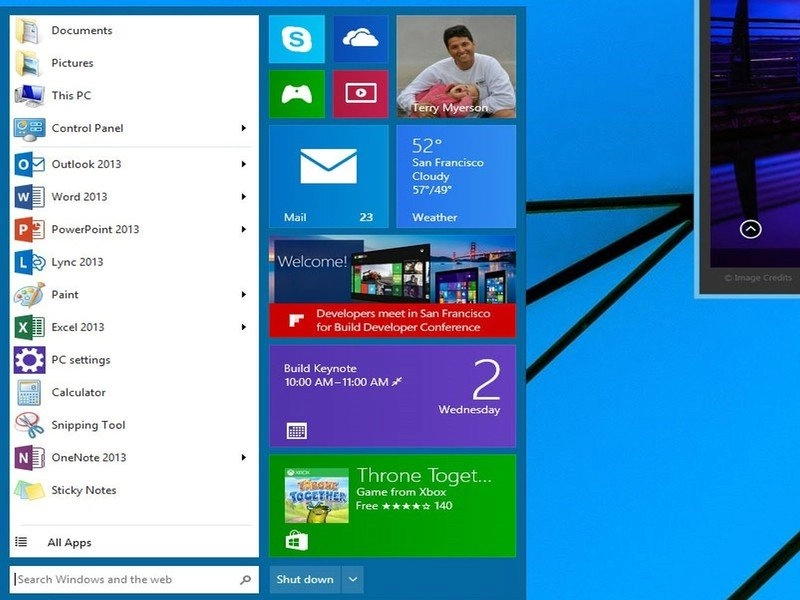
However, the story adds that features such as windowed Modern apps in the desktop environment, which Microsoft showed off briefly during BUILD 2014 are still planned for Threshold. That also goes for the new version of the desktop Start menu that was also quickly demoed during BUILD.
Neowin's article also claims that app snapping will still be around in Threshold and in fact will offer some new positioning for Modern UI apps. Finally, their report claims the UI for Threshold is "visually distinct" and will look very different than the current Windows 8.1.
Microsoft is still rumored to launch Windows 8.1 Update 2 sometime this fall and could officially announce it during its Worldwide Partner Conference this July. Threshold, which may or may not be called Windows 9 when it becomes available, is rumored to have a spring 2015 launch time frame.
As always with these kinds of stories, take this one with a gain of salt, although Neowin has a good track record on these reports. It's also possible that Microsoft could change its current plans for Threshold, as they apparently did with the cancelled release of the Surface mini tablet.
Source: Neowin
Windows Central Newsletter
Get the best of Windows Central in your inbox, every day!
-
Start Menu would be a welcome change for some but I'm okay with how it's now.
-
The start menu is a welcomed feature. I miss it
-
i don't know if its welcome..they do need a compact menu to access all the apps without having to move mouse all across the screen, but windows 8 is becoming too cluttered. there has to be a more innovative solution
-
The start screen/Modern UI was actually the solution to the labyrinth of menus we used to fight through on legacy windows. I was skeptical at first when previewing W8, but now you couldn't pay me to go back to the start menu. The start screen offers faster methods to get to common things, and the ability to snap multiple instances of apps means that Windows has finally gained a method of taking on the 'spaces' that Linux had over Windows. To those that actually understand it, it's a MUCH faster way of doing things than the start menu before it... and people who really would rather sacrifice efficiency for familiarity, they can download classic shell for free and go back to doing things the old slow way without waiting for Windows 9.
-
+920
-
@TLR... Totally agree with you,
-
i think the nature of internet comments is that people automatically assume its an argument..i actually was pro start screen and anti start menu...because start menu is outdated. so i was suggesting they add more newer UI elements for task switching etc instead of bringing back old features. so i am with u..the thing is ....i have seen all my friends and coworkers struggling to effectively use the new start screen..they dont even know u can just start typing app name and it will show up etc.
-
Excellent comment TLR, bravo!
-
I totally agree with you :)
-
+920. At first I wasn't thrilled with the corners, charms, and start screen. But after a couple of days, I got very comfortable with it all. Once I learned to group and limit the tiles, I found it was much easier to get to what I needed when I needed it. And the updating tiles made it easy for me to get a quick update or launch the AP. I can't stand the thought of returning to a start menu that for years I manipulated to avoid. That's why I never got all the hate on it.
-
+1020 By the time Windows 8 came out I hated the start menu about as much as I hated itunes ... a lot!
-
You miss being able to pin five programs to the start menus as opposed to pining to the taskbar in desktop mode. Of let me guess, right clicking to search, access control panel, etc is too hard for you? Accessing file explorer instead of my computer was even included on win 7 as well.
-
Why are you so upset about me wanting the start menu? How does that affect your experience?
If you must know, the main reason I want the start menu back is the way I was able to open documents, video files, music files... That's pretty much it. I know how to accomplish my task with windows 8.1 but I still want more.
Edit
I love Windows 8.1 and the new start screen. I never open the previous home screen unless I want to move files over to a new folder -
I miss the Start Menu. It was nice and neat way to get to your stuff provided it was well organized. While I don't see any inherent reason why this should cause problems for those that DON'T miss the Start Menu, I can understand wanting to move along with design goals for Windows x Convergence
-
Its is a valid point... There are so many ways that peopel become used to doing things in their own way and its important not to let the existing users down by giving them dead ends. The start menu changing so drastically did exactly that and the story went viral. And so now release after release, we're watching the attempt at difussing the viral story.
-
Are you referring to jump lists? I would agree that jump lists should be implemented in windows 8 start screen. However, I still don't miss searching through embedded folders that was part of the start menu. Never thought the start menu was all that great. i don't get why people miss it.
-
Everyone has their own work flow and preferences that they have become accustomed to in the Windows Environment. I personally prefer to keep a mostly clean task bar by only pinning things I used EVERYTIME I boot up --- which for me is Media Monkey, Firefox & IE. I pin all of my frequently used applications to the Start MENU, Origin, Steam, Photoshop, TeamViewer, VirtualBox, etc --- which I prefer over the Start SCREEN because it can be launched with mininal mouse movement. I'm a supporter of the way Microsoft is moving with Windows, but they have to realize that EVERY one has developed a personalized "workflow" within Windows and it's simply too late for them to try and force everyone in the same direction. Allow us to have OPTIONS, allow us to essentially CREATE our own UI experience during the setup of our systems.
-
Wouldn't you get the same result pinning those apps to the start screen? You still have to move the mouse from wherever it is to the lower left corner to get to the start menu. Unless the mouse happens to be in that corner, you aren't saving much mouse movement. Really, people have maybe a dozen app that they use regularly. If you pin them to the start screen and organize them to your liking, it will be faster than using the start menu. You can keep your task bar and desktop clean because everything is pinned to the start menu, including files you use often. I get people are used to a certain workflow, but technology changes and you have to adapted. It really doesn't take very long to adapt to windows 8. The changes aren't really as major as people make it out to be. You still have the same desktop. You just have a new start menu and a new location for frequently used setting in the charms. The rest of the setting are in the same place wherethey always were in,the control panel. Basides some improvements to under the hood stuff and some apps, like windows explorer, there is nothing else that's different. Apps that designed to run in window panes still do and apps that are designed to run full screen run in full screen. If you don't like full screen metro apps, don't install them.
-
Those legacy apps look ugly on the Windows 8.1
I keep them on the legacy side where they belong. I avoid clutter and group Windows 8 apps base on the task I'm trying to achieve. Sometimes it isn't about how quickly you can launch an app... To each his own. -
The legacy applications look flat out ridiculous & tacky on the Start Screen due to the lack of proper icons. Not to mention the awkward transition back to the desktop then the launch of the application. Besides, I prefer the tighter space of the Start Menu when working with a mouse. I only place Modern Apps on my start screen. The "All apps" screen spreads everything across the entire screen, so that's fairly inconvenient to me as well. I prefer to have both menu's co-exist, as I love the flow of the modern UI on my Surface RT. I tried to preach that the Start Screen was an innovative replacement of the well known Start Menu during the first year+ of WIndows 8, but I finally stopped lying to myself and admitted the truth ---- its really not so great for keyboard & mouse. I'm a power user and still find myself getting bothered with it on my non-touch laptop, which is why I've left my productivity desktop on Windows 7 for the time being.
-
I don't miss the start menu at all
-
I never understood why can't people make a Start Menu in seconds; create a new Toolbar and link it to C:\ProgramData\Microsoft\Windows\Start Menu\Programs and then dock it to the task bar. Quite simple, there's your Start Menu from W7, only thing it's on the right side of the Taskbar.
-
I use Tool bars at work for folders --- this is not a proper "start menu". Adding third party start menu's & tool bars is not the solution. I'm looking forward to a proper Modern-Classic Start Menu. All of the third party one's I've tried just don't seem too polished and fail to scale well.
-
What do you mean "its not a proper Start Menu"... https://onedrive.live.com/?cid=7D2E077864B84A85&id=7D2E077864B84A85%2125073&v=3 To me its like W95, W98, XP & almost identical to Vista & W7. And all I did was a New Tool Bar.
-
By proper I mean, there is a lack of Computer, Devices, Control Panel, Shut Down/Restart and lack on a "Recent" items within an application. I personally hate the awkward "right click" context menu on the start button. You also lose custimization. Visually it just doesn't make fit and is another "power user" after thought in Windows 8.
-
I understand you, W8 needs some easy solutions on the user's side. The Computer & Control Panel are achieved by Direct Accesses within my Toolbar. "Recent" or Frequent are achieved by right clicking the File Explorer Icon on the Toolbar. Devices & Shut Down are achieved by moving to the lower right corner of the screen. All these are done inside the Desktop, so I like the Startscreen for everything touch enabled, yet when working I can only use the Desktop for all things, that's why I cannot see a great big deal from this, as I did not install anything for my solutions.
-
I only wish that the modern UI part of the start menu is an exact copy of my WP, optionally. That would be epic.
-
+1
-
I would love to see something more like this: http://eiskis.net/windows9 With a few tweaks this would at least solve the whole 2-part-OS annoyance.
-
I completely agree with this! Being able to sync my homescreen across devices would be awesome. I want to be able to run my WP apps in Modern mode on my desktop. I have friends who have 1520s who say "I'd like Win8 a whole lot more if Modern mode was exactly like my phone." The ability to have the same experience across devices (PC, tablet, phone) would be something that nobody else can deliver in such a complete way.
-
Me too
-
As long as I can disable it, I don't care. I enjoy the start screen much more than the traditional menu. Still rocking W7 on mt work machine and I still despise the the start menu.
-
you should take it with a gain of salt ;P
-
Same here... Stopped using start menu with Vista... With so many things installed, it was a horrible scrolling unwieldy mess. Good for folks who like it though
-
Nah, I just hope Windows App can be run in windowed mode cause it will surely increase my productivity. As for start menu the current is great but further option to be able to change it to old style would be welcomed
-
Nothing will please users stuck in a Windows 7 mindset.
-
There's already a start menu feature since the last big update, so why are people still complaining?
-
Wish they add start menu in update 2
-
You do know that it's incredibly easy to add a start menu yourself? Just watch this: http://m.youtube.com/watch?v=acVtWAPq3Y0
-
Did you know that if you're not using the type to search feature of the start screen that you are doing it the hard way?
-
That's what I don't get...just start typing.
-
I show that to people and they freak out, it's like a light goes on in their head. Wish Microsoft had an ad campaign like "just start typing"
-
For me, the nice thing for the start menu is drilling down into some folders. That's the only thing I miss, personally.
-
Folders in folders in folders in folders, now where did I put that, which folder? Now, pin to start screen or just type....easily my choice but accept others prefer above.
-
And don't forget anyone with a serious game collection, a game never installed in the game folder, even games in a series never nested together on install. If you moved things around, then the installer would fail when you repair or uninstall a game. It was always a mess. You could pin a game to the menu but what is the point if you don't play it very often?
-
All of my Games are in my Steam or Origin "submenu" within the pinned portion of the Start Menu.....no digging around for me.
-
Just keep the live tiles. That's what made me want a WP in the first place
-
The live tiles aren't going away, they're just going to be disabled by default, meaning they can be enabled in the settings.
-
Most likely for PC users with non touch screens or for enterprise users who still haven't left xp :p
-
Yeah, but as much as I used to love the classic start menu, I absolutely love the Modern UI. I've never really cared for touchscreen laptops, but I must say, the Modern UI and the Surface and Surface Pro series were a match made in heaven.
-
Which means they're going away, like Kinect gestures in xbone titles. MS shouldn't back down. They finally have a distinct product. They are not less profitable, they're not losing market share on the desktop, but in tablets... This is stupid. If anything, they just need to make start snapable and more vertcal, and with LIVE folders.
-
Same here
-
Maybe interactive live tiles..
-
Not just live tiles! But "interactive" live tiles..!
-
Damn it. Just update 8.1
-
I absolutely hate the the update on my laptop. I had to reset everything so that it functioned as close to my tablet as possible. I was actually looking for everything to open off of the "start page". Really, why in the heck would I want to go back to searching through a start menu for anything. And the only thing the desktop does is run legacy - such as Office.
-
Nothing changed for you --- you can still boot to start screen. You only see the additional changes when using a mouse with modern apps. Other wise they're hidden
-
Good!! People crying over missing start menu, will shut up!!
-
Sadly yes. Posted via Windows Phone Central App
-
People who are crying about a missing start menu are weird, have they never heard of "google"?
-
Bing it!
-
No, they'll just move on to crying about something else, or they'll constantly remind us of how Microsoft "can't stop" doing 180s.
-
Now we need to please the people crying over not wanting a start menu.
-
Good news
-
You can turn it back on from the sittings
-
I'd rather have it set as an option during install or upgrade. The way they did the 8.1update made it difficult to undo the changes. I had to actual Bing it to figure out where to go to get the behavior back to the way it was, and I still have a stupid title bar in my ApS.
-
I'd definitely set it back to the start screen. Don't like the start menu at all.
-
+1
-
You are aware that the start menu is supposed to be very different from the one we had on W7, aren't you?
-
And I would imagine the touch screen hybrid devices would start with the Start Screen that we all know and love. I feel like this would only apply to the traditional desktop and non-touchscreen users who have been complaining. The issue is the apparent compromise that has to happen to achieve success here. That's the challenge Microsoft has to overcome.
-
Whiners. Posted via Windows Phone Central App
-
Windows One can't wait!
-
MS actually need to update the desktop so it's more metro. Right now it's a mishmash between metro and Windows 7.
-
100% AGREED
I hope that's what they mean by "visually distinct"
Things like the right mouse menu, etc. should look identical to the "hold" menu on touch. There is 0 need for those to be any different. -
Dear God, I hope you're right. I hope Threshold will finally flatten the skeuomorphic designs remnants of Windows 7. This PC, the recycle bin, and countless other icons will hopefully be refreshed for a more consistent look. I feel Microsoft purposefully left them in Windows 8 so the desktop felt completely familiar to Windows 7. Hopefully, that isn't deemed necessary anymore since the flat design language is the norm now.
-
The first updates to Windows 8, including 8.0, felt like a transitional phase. It was like, "We will doing something radically innovative in the coming years, but in the meantime, we want you to adjust to the UI we'll be using for it." Now that opinions have been formed, Microsoft has now come to the time to truly show how powerful Live Tiles can be.
-
Agreed. Windows 8 was definitely a transitional period. I mean, look at the upheaval Microsoft was going through at the time. I think now that the dust is setlling, people know the direction they're going, it's time for the next OS to really shine. Really looking forward to seeing what Metro 2.0 looks like. This is why I wouldn't be surprised if Microsoft made Threshold free for Windows 8.1 Update users. If they made it free for Windows 7, it would show just how agressively they're looking to transition to a true devices and services comapny. I hope it's, at the very least, very discounted for Windows 7 users to help adoption rates.
-
quite right..that not ms developers can see it is a riddle.
-
Current start screen does well... I don't see the need of start menu...
-
Then you'll have the choice :)
-
Why not separate the Windows operating system into two completely different systems. Windows Metro which will be the modern UI and Windows Classic which keeps all the traditions of the windows operating system.
-
Cause the rest if the world is moving to less os' not more
-
If you read Mary J's take on this, it should like you'll basically have a different experience depending on what hardware or configuration you want: http://www.zdnet.com/windows-threshold-more-on-microsofts-plan-to-win-ov... I think that's a nice halfway.
-
No I think MS is going the right direction here. I still want access to my metro apps across all my windows machines. But I like that they are making windows more contextually aware by giving different default experiences based on the device you are actually using. If they had taken this approach from the start, they might have avoided a LOT of controversy.
-
Err they already have, Windows for ARM runs nothing but store apps i.e surface 2.
-
No, it needs to be one OS with a Responsive UI. Just like Responsive Websites. Same code and functionality, but the UI is adapted to the requirements/abilities of the device. Windows should just be Windows.
-
Gosh no. I love that my surface is my laptop and my tablet. Why would I want to carry two devices again, I just stopped doing that. Don't make us go back in time!!
-
WIndows RT devices would be the talk of the web and would have sold billions if a "WIndows Metro" could truly exist by it self.
-
Now people will cry for the metro enviroment xD
-
Not going to be an issue, per the article it sounds like there will be a setting to enable and disable it.
-
Looks Great Can't wait to see more about the future of windows and windows phone....!!!
-
+1
-
Just update the goddamn icons! Seriously though.
-
This!
-
I wish they had done this in the first place. At least give an option for tablet stuff when Windows automatically detects a touch screen. If no touch screen present then at least give us the "classic" look mixed with the Modern UI makeover. Many PC users do not like change, at least so drastic. I think they did an excellent job melding the two worlds together. They just needed to keep the classic look for those who work in desktop mode exclusively. I am not arguing which is better, I do prefer ModernUI and I had no trouble navigating the start screen with keyboard and mouse. The fact is that many people do not want the start screen, but may still want access to the store and the apps they offer. They are headed in the right direction however. As far as WindowsRT OS, that should only have ModernUI, no desktop or anything like that to give users some differentiation.
-
The problem wasn't only the start screen it was the chages they made to the mouse api aswell
-
"As far as WindowsRT OS, that should only have ModernUI, no desktop or anything like that to give users some differentiation" I completely agree. And I think this is the direction Microsoft is going. If you look at the remaining holdouts that might require the desktop: 1) Office isn't touch-first 2) File Explorer 3) Some additional power-user stuff like task manager, etc. The first two items will soon join the list along with PC Settings we saw in 8.1 becoming fully usable exclusively in Metro mode. I think there may be some compromises on #3, but even that may fill out over time. My gut tells me that MS will make the switch with Threshold in early 2015, or perhaps move us in that direction early with the interrum update expected around the holidays. If they sync this with the rumored acquisition of the "Nokia by Microsoft" branding, they could cleanly seperate RT and WP as "Nokia/Lumia", and Surface/Windows 8/9 for Pro tablets/hybrids, laptops, etc. Rumors point to additional snap capabilites in Metro mode, which may alleviate the need for overlapping windows in Desktop Mode that is generally considered more productivity-friendly.
-
Gawd, I hope this is just an idle and unfounded rumor. Horrilbe idea if MS buckles.
-
Yes options we all love options
-
I don't like this about face but I have to keep in mind the vast majority of vocal PC users have not advanced beyond the power switch and the mouse click. At any rate, Microsoft is doing what Microsoft does best. Listen to the user base and respond.
-
Yep
-
Btw as someone mentioned above I think Windows One would sounds awesome rather than Windows 9 or 8.X
-
Yes and no. I like cute names but there's something to be said for sequential numbering. Even non techies will know that 8 is newer than 7 and 9 is newer than 8.
-
Judging by their one Microsoft strategy this would be great as Xbox one, OneDrive, One Note etc.
-
You might be too young to remember but we've already had a Windows One. It sat on top DOS.
-
It's about time. This is the way they should have done it in Windows 8. I remember in XP they changed the Start menu, but gave users the option to use the Classic menu if they preferred that. At first I resisted that new Start menu, but over time came to prefer it. This is how you get people to change -- not by using force, like they tried in Windows 8.
-
Bingo.
-
Pretty much, this is why the NHS (National Health Service) in the UK has had so many failed system roll outs costing millions. You cant force a person to change, the change must come from with-in and only then user habits will slowly change.
-
Yes but that was wasnt as drastic as w8 was
-
Agreed. And it's really not so much that the change was just drastic. Windows 8 was counter-intuitive and really gave no clear navigational hints. Hate to say it, but people can pick up a Android tablet or iPad and really figure it things out within minutes. Windows 8, you'll probably know how to open and app and get back to the start screen --- everything else was a HUGE guessing game. They're really going to need to add in navigational hints. People see all the swiping and "hidden" stuff and its really just overwhelming, so they instantly dimiss Windows as a tablet option --- why bother going through learning so much when this OS is third place in apps anyway.
-
While I hate the start menu, I agree with your statement 100%.
-
This would make it work I guess too
-
eww.. ugly start menu.. still prefer windows 8.1
-
Might as well rerelease Windows 8 and pretend what happened never happened... Its just kind of annoying. Doesn't signal a user on what to learn. Those familiar with the Start Screen may eventually be forces back to desktop if apps in store start trending back to mouse and keyboard. If it wasn't for Windows 8 I doubt wed see as strong of a push for touch screen and tablet hybrid like devices. This is almost like removing the Kenict from Xbox One. Moving back for the demand of stubborn users instead of moving forward.
-
Tablets and phones will still use the store regardless so I don't think you have to worry about that.
-
"doesn't signal a user on what to learn"? Consumer product success is determined by the consumer, not by Microsoft. You have to give the people what they want, not what you think they should learn.
-
I disagree. This is why we got so many android zombies out here now. Many either can't think or don't want to and android keeps them dumb as rocks. I don't want Windows to fall in that same basket. Windows and Mac for that matter is for thnking people. Android requires you bring nothing to the table.
-
Ugly ....So Ugly.
-
On my windows 8.1 hybrid tablet/laptop the modern UI is great. On my desktop I never use the start screen. I use keyboard shortcuts and pin apps to the taskbar. And use windows key and x a lot
-
I've said this since people started complaining about the new start screen. Auto detect if a you screen is installed, then simply run new setups though some visual questions about how they want windows to work.
-
This. The " throw it out there and see how loudly people complain" strategy just turns a lot of people off Microsoft products in general.
-
I personally don't care either way but I'm happy to see this just so the whiners can stop whining.
-
I can't wait for Modern 2.0!!
-
Sounds perfect! This is what they should've done in the first place.
-
I can't stand the current state of the desktop (referring to the actual desktop) to the Looking at hundreds of users desktops, all users I have ever seen have nothing more than a bunch of word docs, some apps, and shortcuts? Very rarely is the start button used more than to go to what is not pinned on the task bar, usually this is to go to most used apps or to shutdown/ reset, I personnel have found Win8.1 method far superior, just typing in what I'm looking for to be far more effective then randomly stumbling along to look for that "doc/file" I swore I put on the desktop.
-
I'm hoping Metro 2.0 is truly a major graphical overhaul. Even though you may consider Google as a follower with Material Design, it seems to have captured simpler design while keeping it flexible and professional. Windows Phone currently errs on the side of bleak, while Windows can look childish.
-
Love the new start
-
I don't like that shit
-
So that now everything goes back to the very beginning, MS has gone through a useless path until it realizes what they did was non-sense. What a good move of wasting time. Good job MS
-
Trying to take this in with " A GRAIN OF SALT " but finding it very hard to separate to a single grain. Could I take it with heaps of salt grains instead?
-
Microsoft is doing well now with Windows 8.1 os and devices, aging things like start menu would be a step back. Everyone should have gotten used to Windows 8 by now.
-
I use classic shell to get a windows7 start menu. classicshell.net
-
If anything id like to see the 3.1 ui again lol
-
Let me know when they fix the music app,that will be a threshold.
-
Lol im saying
-
I must say that's all good, but a thing I dislike is the 'desktop interface', stopped in graphic: Icons are still in 'Vista style', and so folders and other stuffs. I think it's time to 'metronize' Desktop
-
Yeah this!! They should make the icons more modern now..
-
As always with these kind of stories, take this one with a *grain of salt. :)
-
I like the "split" and always thought the out of box should ask, is this tablet or desktop or check firmware and make suggestion for users.
-
Choice is what seperates windows from mac. So this is welcome. Personally my productivity didn't change when the metro start menu was introduced as I am able to adapt to changes without moaning
-
I'm used to what it is right now :) UI improvements are welcomed including the icons on Windows Explorer/file explorer.. Make it looks like modern.. Not xp or vista days... Haha!
-
Is this the big world changing news? :P
-
I don't think that Modern apps should be disabled by default for any device other than enterprise desktops. However, disabling the start screen by default and replacing it with the hybrid start menu would make a lot of sense for non-touch machines.
-
I think that It will be awesome if they add windowed store apps in desktop, store apps have a great potential because the code runs both in PC and phone. It could change the minds of people that don't like the actual full screen style.
-
Well I still prefer personally the Start Screen now, I'm tired with the menu anyways and Start screen didn't drag my workflow slower. Windowed Metro/Modern apps (Urgh, they should have official name for this) is something I'm quite excited and I actually expecting this to come. I hope though they have to change the aesthetic of window chrome, not the flattened Windows 7 windows, it's quite ugly with bold colors and the text color doesn't adapt. Office 2013 style windows are actually better looking. They don't need complete rework but give some fresh redesign and some new UI enhancements. I would lik chromeless on Metro apps, familiar looking window style on classic desktop apps. Improve the taskbar with the functionality of desktop with visual of metro app switcher. I hope interactive Live Tiles will come to Threshold. :)
-
tweak all they want, but if they are allowed to disable the "Material" *cough matias* metro UI, there will be no incentive for app developers to target the biggest windows version since 7. meaning the win-store will never catch up to android. After all what's the point of making a modern app if a win32 app can't be disabled by the user and it will work just as well (minus the obvious security benefits and cloud sync which MSFT has done a lousy job explaining to users). I hope they keep the modern app store for win32 apps need to remain legacy while everything else moves to the new modern app API and store.
-
It won't make THIS desktop user happy. I do NOT want to boot up to the tired desktop. None of our machines are touchscreen, and I want to continue using the Start screen as my primary interface. I don't want anything on the desktop unless it absolutely has to run there.
-
What will update 2 comes with?
-
Current start menu works just fine for me. Going back to win7 feels like it's antique. Haha :)
-
Plus what's wrong with modern apps.. For example games.. When people wanted to play android games on a PC, well Voila! You got them now officially on PC. And Preview of things that matters when I log in my PC is just nice and simple.
-
Please get rid of those metro UI.
I hate it in pc -
GOOD! Any update that brings me the Start menus back and takes away the damn Start Screen from my PC is welcome. I have no problem with the Metro UI in a tablet or a phone. But on a PC? No no no no no. Take it away asap. Burn it and don't bring it back. Put the apps on desktop, window them etc, but take away the bloody cluttered tile screen. I think those few who want to use the Metro UI on a PC should be allowed though, so put the option in for them. But for me...the sooner the Metro goes away, the better.
-
People who don't wanna switch to Windows 8.1 because of start menu might be just the most stubborn people I know.
Those amazing colourful live tiles. I could hug my desktop right now!! *_* *_* -
When it will be going to be release
-
I already don't access the Start screen unless I want to on my laptop. I use the Start screen all the time on my tablet. It's so simple, but I guess it still troubles users...
-
I'm more interested in the tablet interface…
-
I never really used the start menu. I have a task bar to pin the apps I frequently use... And for the ones I rarely use, it doesn't matter if I search in the start menu or via charm bar
-
What an utter failure. Win8 OS was a clean release and was great to address the tablet world. I love it on my 920. But just another example of how utterly out of touch Microsoft leadership can be when making decisions. How did they not realize Win8 out of the box was badly lacking for desktop users. Did they do a focus group of business and ask them what mattered? Obviously not. In some ways this is worse than the Vista mess up because this was done intentionally with eyes wide open.
-
Your 920 runs WP 8....
-
Sorry, I realize that. I'm referring to the fact that I appreciate the general concept of the "modern ui" when it comes to a phone (or even a tablet). Hopefully others realized that.
-
Microsoft may have been a bit over ambitious but the truth is, Microsoft has been the driving force behind shaping Operating Systems and they tried to give people a NEW OS instead of just touching up they're old OS. personally I don't see W8 as a failure. It's actually selling well. It's sites like Neowin that have done nothing but spread fud over W8 because they don't like it. Sure, not everyone likes the whole Modern UI but alot do and the only thing Microsoft should have done is gone a little slower implementing bits which is where they're headed now, going backwards to go forward again.
-
I agree. I like the tile side on my desktop. I use it often. But what I thnk doesn't matter. Frankly the opinion of the majority on this site doesn't really matter because we don't represent the masses. That's the problem. if they were developing a product where the majority of their customers where in ther 18-24 demographics (like XBOX) they might have gotten away with this. But this is a product that has more 54 year old office secretaries using it than 22 year old technical forward thinking guys. That's what they should have realized. Maybe they did realize it. Maybe they just didn't care. After all, that is definitely Microsofts M.O. Throw crap out there that is half baked and then finish it later. It's a legitimate way to deliver products sometimes. But it has its dangers because once someone gets a certain notion in their head it's hard to change it. Now, millions of people have this idea that Win8 is bad for desktops, eventhough they've addresed much of it in 8.1. It's like Vista. Most of the ugliness of Vista was addressed in SP1, but it was too late. A whole business cycle was lost.
-
Start Menu blah blah.......
-
I feel like they are slowly making the metro screen go away. In windows 8 the metro was flawless, everything worked. Windows 8.1 came and seems to enforce using the desktop. Its a welcome addition to have the option but its the same thing with windows phone were Microsoft is slowly making it more like android and ios, to ease the change. Whoever that's what makes windows 8 unique it was a complete overhaul of the windows we all love. But now Microsoft is just reversing that change.
-
Obviously "we all" do not love it. That's the problem. They're just doing what they should have done from the beginnng; listen to your customer. I never understood how adding features that address the needs of more customers is somehow "corrupting" the product and making it less "perfect". Obviously the W8 offering was far from perfect for far too many people. They're doing the right thing as long as they don't knnw reduce productivity for the tablet and phone users
-
long as they don't knnw reduce productivity for the tablet and phone users
Agreed...I find the Modern Start sceeen quite productive and I would hate to see reduced functionality. -
I for one am used to the "Modern" interface both on the Surface Pro 3 and desktop. I do welcome changes for those who don't care for it but I do worry about them abanonding the "modern" interface for Windows.
-
Perfect. I love the Windows 8 start menu, but I like that you have the choice.
-
Does anyone know why Microsoft dont update the old ugly dekstop icons!? :( Everything else is okey.
-
Pin tiles to desktop - that'd be good.
-
I rarely go to the start screen, windows + q do a better job in my opinion.
-
Thanks but no thanks on the start menu. I actually like the start screen on my desktop and have no plans of going back on my desktop, laptop, or tablet.
-
All I can say is it will be a very sad day if and when Microsoft brings back the start menu. Admitting defeat wont bode well fo sales. You're letting all the nay sayers know their right(which I don't think they are) and are alienating The people who support the current changes by leaveing them in the dark. They might as well scrap the whole 1 philosophy. No one will buy their other products without having a similiar OS to their PCs. I blame this on Sataya Nadella, I think hes an Apple user.. Ever since Satya became CEO all hes done is make concession afer concession for short term gain, in the same token hurting the overall windows brand and Ballmer's original philosophy. The company will remain mediocre and never reach its true potential with him at the Helm. Instead of making a frankenstein version of windows 7 and windows 8. They should make the start screen more mouse and keyboard friendly, ignoring the desktop completely. There are ways to make everything super small already, giving the user a familiar desktop experience on the Start Screen. Making it so you dont have to travel your mouse at all or very little. The best part is that you can still size your tiles the way you want and not take up much screen realestate; allowing you to still get all your live tile information. They need to stop worrying about what people think if its a far superior product. Did Steve Jobs give a shit what anyone thought? Most of the nay sayers arent based on experience but on nastalgia and familiarity. Most of them never even tried or ever used it. Why should a company listen to those people? How are you giving me one experience across all my devices if you are bringing back windows 7 elements. Apple and Google are starting to intergrate their devices already. Microsoft, this was your original plan how are you letting the competition beat you to the punch. While you release something great and are wasting time fumbling to meet everyones expectations Google and Apple are steaming ahead. You need to keep moving forward or you will be left behind. .
-
Really? You think changing the strategy would be jeopardizing the OS's success. To me it's finally admitting defeat and trying to salvage it. Remember, you're view of things does not represent the world. The customer votes on what they want with their wallet. On that measure, Windows 8 is a failure. In fact, the percentage of users DROPPED last month and lost ground to Windows 7. Windows 7 is an operating system that is about to sunset at the end of this year and enter extended support. Is Windows 7 going to be the next XP with Win8 being another lost business cycle like the Vista disaster? Probably. Microsoft needs to learn they don't dictate what the user wants anymore like they did in the 90's http://wmpoweruser.com/windows-7-and-windows-xp-gains-market-share-in-june-while-windows-8-saw-a-slight-decline/
-
just found another concession new smart watch rumored to be multi platform. Good going Satya
-
Start menu for only non touch
-
Its good to have features familiar to a user base but add new ones. I'm happy with it now but more customization never hurts.
-
Looking good. Windows Phone UI in the Start Menu - Brilliant !
-
I welcome options! This is what Windows 8 needed.
-
Old start was the king..
-
They need to change the icons into metro icons.
-
The only thing that annoys me about 8.1 is that I get shoved back on the Desktop when I close a modern app. I never found a way to make it take me back to the start screen.
-
Unpin any modern apps on the taskbar
-
I think there is a setting for that. Right click on the taskbar and go to the Tab Navigation. I think there is an option.
-
Nope! Lol
Unpinning modern stuff didn't help (the store app was the only one), and I found those settings ages ago. Thanks for the suggestions anyway, folks