After 15 years, Microsoft Office has a new default font
After 15 years, Microsoft changes its default font for its Office apps. Here's what it looks like.

What you need to know
- Microsoft is changing the default font for its Office apps to Aptos.
- The implementation of this change will take place over the next few months.
- You can still change the font to your preferred choice via the settings.
After what might have seemed like an eternity, Microsoft has finally decided to switch things up across its Office apps by changing the default font. As you might recall, the company kickstarted this process in 2021 by presenting five potential options that it deemed suitable to replace the outdated Calibri as the default font.
Since then, Microsoft has been collecting feedback from its clients. Aptos turned out to be a fan-favorite amongst most of Microsoft's clients, and it'll now be the default font for its productivity apps.
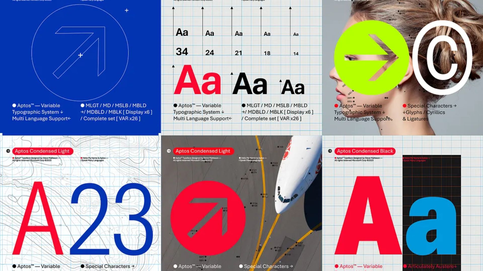
"Similar to mid-20th-century Swiss typography, Aptos is a sans serif. Also referred to as Grotesque or Gothic, sans serif often have simple letterforms, even strokes, and they’re easily readable," Microsoft's principal program manager, Si Daniels indicated in the blog post.


"Aptos, made of varying geometric shapes, is bold, well-defined, directive, and constrained. It articulates many different languages and tones. Stem ends are clean cut. Subtle circular squares within the letters’ contours allow higher legibility, especially at small sizes."
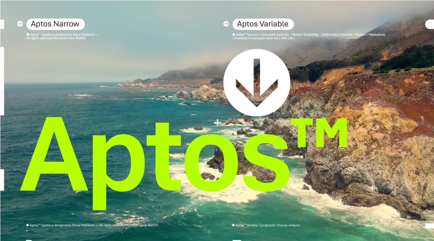
World-renowned designer, Steve Matteson, is behind Aptos. You might remember him from the original Windows TrueType core fonts. He's also the creator of Segoe, the font used by Microsoft on Windows to date. Aptos is derived from the creator's favorite unincorporated town in Santa Cruz, California.
Microsoft has indicated that this marks the final phase of this change. Aptos is now rolling out across Word, Outlook, PowerPoint, and Excel. It will ultimately replace Calibri as the new default font "over the next few months."
Notably, if you preferred Grandview, Seaford, Skeena, or Tenorite to Aptos (Bierstadt), they'll still be available in the drop-down picker. As for Calibri, it won't be gone entirely. Like its predecessors, Times Roman and Arial, Calibri will remain pre-pinned at the top of the new font menu. This will only apply to the web at first.
All the latest news, reviews, and guides for Windows and Xbox diehards.
The company has indicated that the implementation of this change is part of this broader plan that it intends to incorporate into Microsoft 365. Its goal is to make the platform "more expressive and inclusive."
"We can’t wait for Aptos to be readily available since it was crafted to embody the many aspects of the human experience," says Microsoft.

Kevin Okemwa is a seasoned tech journalist based in Nairobi, Kenya with lots of experience covering the latest trends and developments in the industry at Windows Central. With a passion for innovation and a keen eye for detail, he has written for leading publications such as OnMSFT, MakeUseOf, and Windows Report, providing insightful analysis and breaking news on everything revolving around the Microsoft ecosystem. While AFK and not busy following the ever-emerging trends in tech, you can find him exploring the world or listening to music.

 Windows Central Insider


