Start button returns in Windows 8.1, sort of
Rumors have been floating around for a while the Start button would be making its return in the Windows 8.1 (Blue) update; those rumors are now confirmed by journalists, Paul Thurrott and Mary Jo Foley.

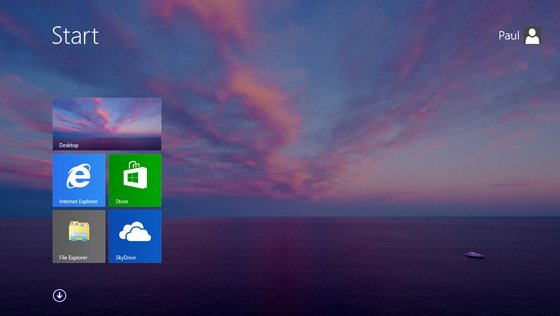
The start button will be returning to Windows 8.1, but the start menu will not. The newly designed button will instead take you to your machine’s Start screen. This sudden change seems to be an attempt to help those who have been getting lost on the desktop and weren’t yet familiar how to get back to their list of applications.

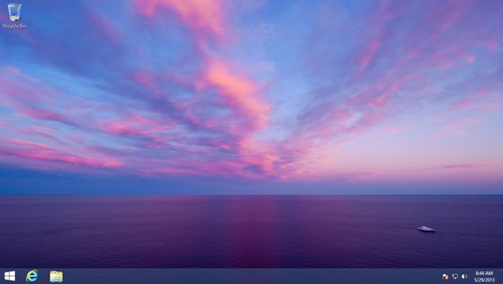
In addition, Mary Jo Foley reported that users will be able to use their desktop wallpaper as the Start screen background (although turned off by default).

What do you think about Microsoft adding a “Start” button back to Windows 8?

Source: WinSuperSite; All About Microsoft

Michael Archambault
244 Comments
  • Good move
  • The background is amazing!
    Now, if we can only get more backgrounds for WP8, as oppose to just black and white...
  • if they do it for wp8 would it have enough space?
     
  • Dumb move. It still functions identically. Just caters to people that refuse change when it was definitely time for change.
  • That's exactly what I thought. Complete waste of space since it already works that way today with W8 when you put your mouse in the lower left hand corner.
  • I really don't think so, I think having the button is useful for muscle memory. It now reminds me of the way the Office "backstages" works. This will most definetly help with enterprise roll out. 
  • Agreed.  It doesn't hurt to have the option to display it.  I won't use it personally, but in business environments it will keep the more technically challenged users from consuming as much of the IT departments limited resources.
  • As long as its an option and not on all the time without the ability to turn it off.
  • THe sad thing is that if Microsoft didn't remove it from the beginning, no one would have thought "the Start button is a waste of space". If you read between the lines of the reasons why some think it shouldn't be there, you see statements like "it was time to change..." and that's just change for the sake of change. Truth is, the space "wasted" by presence of the Start button is half of a pinned app's icon, and it provides a visual cue for users; this has been a principle in software design for years. And now those claiming to be "modern" are questioning it for no good reason.
  • After seeing and hearing so many complain, I'm glad they put it there. Hopefully it will initiate a slick transtition to the start screen that goes up, then across to mimic what Win7 users are accustomed to.
  • Is it really a waste of space? Who lives with a million programs open in the taskbar? It might be taking up space, but it is space I wouldn't use otherwise.
  • Then you are the only one, when I work on a project I have over 20 different windows open each with a different pdf or word document or IE page and I use them all as a source for the final piece of work.
  • Exactly. This is a ridiculous move to cater to an overwhelmingly small and vocal group of older consumers who fear change. A salesman actually told my mother to avoid a Windows 8 PC because websites would not function on it properly. Absolutely ridiculous.
  • Its funny you say that tho, because I have constant compatibility issues with websites. Just small things. But by no means a deal breaker
  • I dunno. It's one of those things where (personally I feel) MS took a very non-MS step back. I mean, considor the OS's before 8. Particularly XP.
    Of all the bad crud people said about XP et. al. most of it came from the fact that the OS was so "open" to modification and access. There wasn't anything forced down your throat without an option (considor the change to the control panel and the big "click here for classic view").
    MS basically tightened the OS, locked out a lot of easy changes and gave people no options. Things for them usually occur gradually, and that wasn't the case here (well, unless you consider the clunky move to all Metro the gradual move).
    So giving people a built in option to enable/disable the start button. Or run metro apps in a fullscreen or windowed mode. Or even having variations on the look of the start menu (yep, all things stardock is doing). Are options I would have fully expected from MS. It's not catering to whiners, it's departing from you're mantra.
    Now, consider the phone space. I won't lie to you, I'm on my L920 and I enjoy it. But to be perfectly honest, I thought my Windows Phone experience (also after using a Samsung BlackJack many moons ago) would be... more classical, Android esque even. But it's extremely restricted. I read the news that Apple's opening up their system API a bit more and I'm just a lil aghast that even if MS had this in the works, the rush if they do this will be aweful, and the perception will be that of a follower not a leader.
    One could then contest that "they should keep what they have, that's them leading in their own path". And while I can see that as a valid point, it's still a strong point of contention. I want the OS they've given me, but I also want to use it more like I used to use windows. Plug it in, folder hop, set a default app for an action. Admittedly some of these things are there, but only in very specific hard coded areas, and not on a system level. Click a youtube link. Does it give you an option for a browser? For an app? Can I simply go into to a "Default App" list and set certain things? Nope.
    As with W8, there are certain measures that just scream non-MS. If I wanted to, I could always control-click several windows and select "tile horizontally/vertically". While this is still around in some limited fasion, I can't budge on the metro side. It's a third this way, or a third that. Now, consider that metro apps take so much longer to load that typing in a web-site in a browser and the onlye xpected change is now... A HALF or one third, lol. And still full screen (got a message in you desktop app? Windows 8 will still flash it yellow... but good luck if you see it reading the NYT app while having the stock app snapped).
    And that use case is such a simple and essential one, one would wonder how they Missed it. Granted I also understand that the teams and dev-cycles have changed radically internally, but it's still no excuse. It's an obvious flaw and one that can't even be fixed by a pure-metro notification center.  
    So, I applaud MS for making bold changes, but we as consumers should understand it's still a butterfly process and one we eagerly accept (well, some do) from Google to forever be changing and in beta. So I wouldn't look at this as a step back, but a step in a consumer focused, but still forward facing movement. I'd very much so like to use some metro apps on my laptop/desktop, but it's not feasible. So, I contend, MS, please keep listening to your consumers, while moving forward in the leaps and bounds you have been. Because really, if we wanted another Apple, well... I don't think we did (for the most part anyway).
  • Agree and every keyboard has the windows key
  • I miss having the ability to open recent documents for pinned applications on the start button. Word, excel, visual studio. Sorry, Windows 8 is a productivity torpedo. Nevermind the complete uselessness of the Media Center bs that won't work with my Echo.
  • I agree. If you wanna change the ui experience, do it and go foward. This is a step back in my opinion.
  • LOL Fail yet again.  Even though we all know the Start Screen is really just the start button, but most people are too stupid to know it.
     
  • I agree. It just takes the invisible button and makes it appear permanent.
  • My thoughts exactly, why take a step backwards to put a button in a place where you could move the mouse a little further to the hot corner to bring up the Start Screen? Hopefully there will be an option to disable this, I like to keep the taskbar having a minimum amount of icons and this would a pointless one. Do like the background on the start screen though.
  • No, what's dumb is pushing the same interface for devices with completely different controllers. W8 is great for touch devices, sure, but for desktops with a keyboard and a mouse? Tiles are a waste of space and full screen metro apps are nothing short of an unfunny joke; there's a very good reason this operating system was named Windows in the first place.
    I have a 27" screen with a controller capable of per-pixel accuracy and I want an interface designed with those things in mind - not smartphones and tablets. Windows 8 is a major step back for non-touch-controlled computers. And unless you're some crazed fanboi or live with the false belief that, by default, every new thing is better than the old thing, I don't see how you could not agree with what I said.
    The sooner Microsoft understand and accept that, the better for them.
  • I don't agree with what you've said. I've been running Windows 8 on desktops and laptops (non-touch, mouse/keyboard) since the first public beta was released...  long before I had it on devices with touch input.  It works just fine.  Is it more natural with touch based interfaces?  Yes, it is.  It's obvious that was a focus when it was designed however you can do all the same stuff with a mouse/keyboard. Yes, I support Microsoft... but I also call them out on stuff they do wrong when it's warranted.  However, in this case...  it's not and I don't see how you could not understand that.  If my parents can figure out Windows 8, then you have no excuse because they are about as tech savvy as my cat. The sooner you accept that it's not a gimped OS for the traditional mouse/keyboard, the better for you.  Does it function differently?  Yes.  Is it easy to adapt to it?  Yes.  Get over it, get back to work.
  • Exactly my argument.  I will be looking for a way to disable the Start button (probably a registry entry).  I want to FORCE my users to start thinking in a new way.  I'm tired of catering to the lowest common denominator---which, apparently based on those who have complained about it the loudest, are so-called "power users".  Yeah.  Right.
  • What about instagram
  • HA!
  • Useless, but I guess there are always idiots that can't follow the simple on screen instructions shown when you start the PC the first time...
  • Agreed.
  • Total good move, no downside.
  • Very stupid move, I hope you will be able to turn that thing off as without a Start Menu it just waste valuable space on my ribbon.
    Damn idiots, can't do anything right, either bring back the full thing with the menu or leave it out alltogether, there is absolutely no point in having a button that does nothing, since you can alredy get the metro menu by clicking in the corner anyway.
    Many consumers were pissed off about the dissapearance of the start menu not the button itself!!!
     
  • The way that the start button has to be found in the corner currently is pretty clunky on multi monitor setups.
     
  • Good move. I used autoit to create an exe that just basically hit the windows key, and then attached the Win 8 graphic. Looked almost exactly like this, and it kept me from accidentally hitting the start popup when I was trying to click on IE.
  • I'll just be happy when all this start button debate is over.
  • Lol that makes atleast 2 of us.. :P
  • 3 of us:p
  • 4 of us! ;-)
  • 5 of us! I think MS got it right this time, the start button will be there if you like it, but if you don't you can disable it. The same thing works to boot into desktop or wallpaper on Start. Personally I never understood why Chamrs didn't replace Superbar. It'd have been the perfect solution.
  • Bingo
  • This won't end it.  This is basically what they had in the first W8 public preview beta.  A button that just led to the start screen.  So no, this wont appease the anti-metro crowed.
  • I agree. This is not going to end it at all. People are still going to find a way to complain about this.
  • There will never be a way to please the non metro crowd. Funny thing is... How many of those same people use Windows 8 and have no problem with it. They just need something to complain about.
  • Same here, LOL
  • I'm with you on this one.
  • The desktop wallpaper will be sweet. Start button never bothered me, I ain't afraid of a bit of change!
  • I agree on the desktop wallpaper.
  • thats better news than the start button and actually useful
  • I actually like my current blue themed background with the birdie as the backdrop for the metro menu.
    The desktop wallpaper would clash too much with the tiles for me.
  • Never used the startbutton, always pressed the windows-key
  • +1
  • Same here.  Although on that note, I do have one gripe.  I enjoyed the universal app/settings/file search in 7.  Now I have to remember to hit winKey + Q/W depending on what I want to find.
  • You can just search and then just click or tab to the Category instead of going to your category directly the way you mentioned.
  • I believe they are changing search in Windows 8.1 to search across multiple places at the same time, much like the old start menu did. PT and MJF talked about this on their podcast awhile back.
  • Hope its not by default, I like current arrangement. Because I need space for the pinned program
  • +1
     
  • +1. Let's find a way to remove the start button back. ;)
  • Still think it's ridiculous people can't find their way back. I know children that find it quite simple...
  • I agree. We are living in the age of idiots.
  • Lol
  • lol, so true
  • Agreed. People are dumb if the lack of a start button is hindering them from using the OS. Even in previous versions of Windows I pressed the button on my keyboard to open the start menu.
  • I don't care much either way, nut I will say that in rdp sessions its a pain to fond that corner pixel...
  • That's the only reason rdp sessions
  • Okay.. I guess it helps others. But I don't see a need for it. I like the wallpaper option though!
  • Moving your mouse to the lower left hand corner and clicking on the "Start" screen that appears does the same thing. So meh.
  • Oh, this is going to piss some people off. I can practically hear the shrieking now. Windows 8 haters are going to see this as MS thumbing their noses at them. They want the old Start menu back. So Microsoft gives them the button but it takes them to the new Start screen instead. Sort of like Lucy pulling the football away when Charlie Brown tries to kick it.
  • Learn or move out of the way. It's 2013, if you can't figure out a button so simple as the bottom left corner, you have bigger problems. People are just lazy
  • ^ THIS.
  • THIS^2
  • THIS^3
  • THIS^4
  • THIS^5
  • THAT>
  • THEM>
  • THEY>
  • Exactly, all screamed Start Button, Start Button, thinking that meant a start menu that comes along with it like in days of old. Well, they will get what they asked for but that is not what they really meant and Microsoft knows it. This will be another tragedy, remember this.
  • I hope this is an option... I don't want a button there wasting space. Personally I've grown to love the whole Windows 8 layout and start menu.
  • Me too. That'll be the first thing I turn off since it's just a waste of space.
  • It makes me laugh to know that people haven't yet noticed the windows key on the keyboard for more than 10 yrs!
  • oh thats what that is /s
  • it doesn't make sense... Windows 8 has already start button just go to left corner and there is it your start button.
  • Fine if your like us. If your not as good with technology then your lost.
  •   ooh just 15min with Windows 8 with a little help and you know everything... There is a lot of tutorials on youtube I made a few.  
  • You shouldn't need YouTube tutorials, they should be built in to windows 8 to help users
  • Everything is in F1... but people seem to forget F1 bring Windows Help, it has videos and easy words to explain how to even close a Win8 app...
     
    so its there in Win8, also if you type "search" and hit enter in start screen it will bring the same help. so IT IS THERE.  but apparently you have to remind users basic old windows F1 thing and how to type "help" bring it, or make it more visible so people will see the damn help everytime they start computer until you uncheck "show next time"
  • You don't have an F1 on a tablet, unless you connect the keyboard or touch cover, so F1 is not the best option anymore, and I know plenty of non-tech savy people who had no idea f1 gets help if they are stuck.
  • now you want to add touch to the equation? this is about start button. and its used only for desktop/mouse-keyboard users (or its the logic)
    but as i suggested search "help" and it will bring the help. and it can be done with touch as well.
     
    I dont get why you are mixing start button and now touch for the help. (note i still say there should be when you use windows first time a "dont show next time" help you can check/uncheck so people wouldnt miss some help)
    BUT its not the same buying a tablet, than buying a windows 8 upgrade! your are comparing different things.
    since every tablet must have a windows button (just like keyboard but keyboard has so many keys people dont notice the windows button) while having only one really visible button (like ipad) should make it easy! BUT tablets also come with a "Owner's Manual" (or it should...) I see Asus tablets having it for example. and it explains gestures and all.
    so you get a helping manual with a tablet, that you dont get when you buy windows online. (and Im sure buying it physically either) but thats the help you get with "help" or F1. so one thing that can be done is educate people to remember that old feature! only because not many use it in recent years it doesnt mean microsoft hasnt updated it or its not there anymore. becuase most software have that kind of help with a button or with f1 or in about or something so it has always been there in alot of places


  • I have to agree with this, some functions are obvious, but it took me some time to figure out how to swipe to select tiles and move them, that was the only thing I have to bing for, everything else was kind of intuitive, but it would definitely help many to be able to turn on help popups first time they switch to win8, that was a huge oversight by MS.
     
  • You need Help if you came from a forest and you never saw a computer :)
  • Well they should have done like apple when apple changed the scrolling they made you pass a test on first boot
  • The problem was that some people were finding it difficult to go to metro once they were in desktop ..
    MS has to cater to every dempgraphic
  • I'm more than happy with my current taskbar so I really hope that's an optional setting just like the boot-to-desktop setting.
    I'm interested in the other goodies 8.1 will bring. Nonetheless, I hope people stop moaning as if you grabbed their toys out of their hands.
  • Irrelevant to me. I'm fine with how things are. Real button or not, its pretty insignificant.
  • it's not just for the Start screen. Mary Jo revealed that you can also set the Start button to pull up the All apps menu instead of the Start screen.
    those who want the outdated Start menu can rely on one of the many 3rd party tools that exist
  • When has she said this I think that was what she was hoping do you have a link
  • Awesome. People are nagging that start isn't anymore. But with the new start screen the old start menu would be so unnecessary. But I know why they want it, they don't like the start menu and only want to use the desktop. Friends of me have that problem too. But they are so wrong. W8 is an awesome move from Microsoft.
  • I'd prefer to the desktop background that can be used as the Start Screen background, rather than the start button. Am I the only one with this statement, huh? :O
  • I hate to say "I told you so"...wait...no I don't. I told you so! Anyway, I'm glad it's back but I don't see the point of bringing it back without the start menu...
    Still, its useful. I'm glad about the background picture though.
  • How is it useful, please to enlighten me?
  • its like your favorite old ratty smelly blanket that really should go in the garbage but you just can't let it go.
  • Downside of it coming back is I use Start8 which is love. Now MS are putting a start button in, this is going to mess up my taskbar.
  • I'm sure they'll have the ability to turn it off if you want. Least they should. I personally don't want a start button anymore. Like you said it messes with my task bar setup, and its just pointless to me.
  • More features is better than nothing
  • This is also true. To shut up lazy haters Ms should simpy add a simple "show/hide start button " on settings page..
  • I wonder what will happen with the desktop background if you have dual screens with different resolutions.
  • Windows 8 works better than 7 when you have screens with different resolutions. I work at my office with a T61P with a 1920x1800 screen and an external lower-res monitor and Windows figure out the best way to show my wallpaper on each screen. It actually shows a different wallpaper for each screen if you select more than one wallpaper.
  • Start Button per se is irrelevant to me, however I would like to see a return of the user configurable Start Menu.
  • This right here is the argument were gonna constantly hear when 8.1 releases with this start button.
  • yup MattManba2012, you are right about that.
    I needed the Start Button for maybe an hour while I messed with the Win 8 Consumer Preview, since then I really haven't missed it at all.   However given all the chatter and the sales of stuff like Start8, I am clearly not alone in wanting to see a returned Start Menu.
     
    So yes, the Start Button is all but irrelevant for most people, the Start Menu though is a different story (and yes I am using Window 8 Pro with Media Center right now).
  • Why, what does the start menu do for you that the start screen does not do? Other than familiarity?
  • Because I can configure the Start Menu to show all Applications organized into functional trees.    A well organized Start Menu flies out and does not cover the entire screen, but I can quickly pick any program I wish. Given I am running Windows 8 I really don't need to hear about the Start Screen, the All Apps View, or Searching or pinning apps to the Task bar.  I know about each one of those options and find each one of them lacking.   For me having the Start Menu is just one of those things that should be configurable to user preference.  Don't like it don't use it.  Do like it, use it as one wishes....
  • To each his own, but one simple click on an application icon pinned to the taskbar is much more efficient. The Start Menu requires at least 4 clicks to open an application. What a wasteful, tiresome exercise.
  • that is your opinion.
     
    not wanting my taskbar cluttered with pinned applications is my opinion.
     
    I am uninterested in your opinion as to what a "wasteful, tiresome excercise" consists of.
  • As I stated, to each his own. But you cannot argue that the Start Menu is quicker than an application pinned to the taskbar. I have maybe 10 icons of the applications that use the most on the Taskbar. I agree, any more it can start to get cluttered. In Windows 7, I rarely use the Start Button and that would be only to use the Search or to log off my machine (which I don't do every day). There are just more efficient ways to navigate Windows than a utility that was developed almost 20 years ago. But, to each his own!
  • 1.  I never said the Start Menu was quicker, I said I prefer some features of it.
         A.  Without moving one's hand to the keyboard I question whether or not the Start Menu is slower than manuevering the Start Screen/All Apps View (ie mouse only).
     
    2.   Your sense of aethethics is much different than mine.  I have four apps pinned to the taskbar at this point.  Your sense of aethetics calls more than ten cluttered, I call more than five cluttered.
    3.  I rarely used the search feature, because most of the time the application was right there, just where I expected it to be.
    4.  I don't care how long ago something was created; if it serves it's function well, it serves it's function well.
  • Sorry, but your argument is invalid, as the previous Start Menu on Windows Vista/7 has also the search bar, which you can use to search an app and run it in just 1 click. But in my opinion, the Start Screen is more preferable than the Start Menu. ;)
  • Invalid, that's laughable.   My argument was based upon the ability to organize the old Start Menu into folders by function and how that is smaller and non-full screen.
     
    My argument was never based upon Search or the number of clicks.
     
    So invalid, not it is.
  • In what way is the new start screen not as configurable as the old one?
  • If I can create organizational folders in the old Start Menu and get everything to fly out in about a seven inch square that is a huge difference than having multiple pages of full screen material to get a particular program. I am running Windows 8, I do not need to be told that the Start Screen can be organized and Labeled. It is not the same as doing the same with the old Start Menu.
  • Move mouse to bottom left corner. Right click. This sub menu is user configurable. I honestly prefer it to the old start menu. Of course, the desktop programs I use often are all pinned to my taskbar. Sounds like you don't like that.
  • Did you not read the multiple times that I wrote "I am running Windows 8, I do not need to be told that the Start Screen can be organized and Labeled."
    Pinning multiple apps to the taskbar or having one's desktop full of icons is just plain ugly.
  • I didn't know about that right click menu on the start "button", thanks.
  • I just see this is a big pile of "WHATEVER". I didn't mine not having the Start button, but it'll make a lot of people more "comfortable", so whatever...
  • I like this, I know you can use the start button on your keyboard, but when I am remotely accessing my home computer from my surface, the start areas overlap and you can't click the start area on the remote desktop without clicking my surface's start button. (in the team viewer remote desktop application). This would fix my issue at least haha
  • I think this is stupid. The start button is there, it is just hidden. The bottom left hand corner is a hot corner to bring up the start menu.
  • Its rebuilt for the butchers and complainers.
  • +1
  • My family and I never had trouble using W8. You learn as you go and become fast at what you do. W8 itself is fast and smooth. I welcome any improvements.
  • Agreed, I can adapt very well in Windows 8, and W8 itself is so 'fast and fluid', just as the ad said.
  • Honestly I don't understand why this is such big news.  This won't appease the anti-metro crowed at all.  And its basically what they had in the first beta release for Windows 8.  I'm not sure why the dropped it after the beta.
  • Annoying when you install software and it puts 40 icons on your start screen
  • Then simply unpin.... What's so hard about that....?!?
  • I currently have 195 icons on my start screen, in a chaotic order. I can't see them all even when I zoom out on my full HD display.
    Useless. It's like those horrible desktops with hundreds of shortcuts and files. Compare that with the nice hierarchycal and nicely sorted start menu from Windows 7.
    In my opinion the start screen should be just that, a start screen, and should contain only apps with live tiles. Anything else should not go there by default.
    So, in a ideal world, I would like to have:
    - only live tiles by default on the start screen.
    - the ability to pin any app manually to the start screen, desktop, old start menu and the task bar, as needed.
    - most importantly, the old start menu with the multi-level hierarchycal view.
    - the ability to search by typing from both the start screen and the old start menu.
    - different configurable keyboard shortcuts for start screen and start menu
     
    I like the start screen, and I don't really miss the start button. But I don't like all the functionality we lost in the process of implementing it.
     
  • Disagree. Did you know that the Start Screen can be configurable by grouping the apps? Also, apps can be searchable by JUST typing in the Start Screen. The same way as you can do in Windows 7's Start Menu.
  • Yes, I do know you can group apps on the start screen. But the old start menu already grouped the shortcuts from one application automatically, and the application had the option to create sub-groups, sub-sub groups, etc. No manual grouping was needed unless you really wanted to. And I don't really want to group things manually. Even the Windows 3.0 program manager was better from this point of view. The start screen just dumps every icon from newly install at the end of the last group. Because it's really nice to have 10 uninstall icons on my Start Screen, and not knowing which app they are from. Progress. Yes, I know you can also search from the start screen by typing, but that is not as good as the start menu for two reasons: 1. It's full screen, and hides everything while you search. 2. It needlessly splits results into "apps" and "settings", so you don't find all your search results in one place, at a glance. Furthermore, they randomly puts some apps into settings, for no reason. For example the Windows Defender app is in the setting section. Because keeping things simple is boring, or something like that.
  • I think MS made the wrong call on this one and made installers place icons on the start screen, they should appear on the desktop, maybe a new install api should be used for installing software to the start screen.  Atleast give us the concept of a folder tile so we can have a hierarchy.
  • I LOVE the start screen background! 8.1 has some significance now!
  • That can't go wrong with for sure...
  • Start menu isn't the biggest problem I hear about. It's that the default programs take you from desktop to metro unless you manually switch them. I hope MS gives an easy way to let users have all their defaults target either desktop or metro. If you want to split between the two then there is always Program Defaults.
  • Waste of time, people can't move their mouse a half inch to get the hidden button, or press the button on their keyboard there just isn't anything to say. I hope that I can hide it.
  • Happy about the background support
  • I would like wallpapers for wp8 start screen.. But I guess we will have to wait "again" for said feature.
  • +1
  • who really cares about start button. Those people complaining about want it back are just lazy dumb fools. Read a book for dummies
  • I wasn't bothered with it being taken off but a lot of people were so I hope this is a good solution to those. 
  • funniest thing about this whole "no start button" thing is that if you click where the start button WOULD be, it actually still takes you to start.... but that is on Microsoft for not putting in any real tutorial with the OS.
     
    We need backgrounds on Windows Phone, that start screen looks amazing with the tiles over an actual background
  • hmm, MS did that (tutorial) when the user enters Windows 8 for the first time. But actually, I laughed when people are complaining about the absence of Start Button, as they don't realize that the real start button is on their keyboard. I agreed about the backgrounds on Windows Phone, as Windows 8.1 implemented this on its Start Screen, even when I flick to the right, the background will move too.
  • They should put the start button there but make it do absolutely nothing at all. That would be hilarious.
  • LMFAO +925,000,000
  • ^
    THIS^100.
    LOL xD
  • New wallpaper on the start screen looks sweet. I've never such outrage over a simple menu. Before windows 8 the majority of people had their desktop flooded with shortcuts and now they get butt hurt over a menu they seldom used anyway. If you get lost from the start screen to the desktop you're an idiot, plain and simple.
  • Dumbbbbbbb oh my god, people can't figure out how to move their cursor to the bottom corner of the screen ARE YOU KIDDING ME!!!!
  • Who does that? I just press the Windows key. :)
  • Same as I do when I want the Start Screen shown. Or I just go to the lower left corner of the screen to access the Start Screen. :)
  • There is so much confusion when it comes to the start button.  People need to think beyond their own personal usage situations.  There are literally hundreds of millions of people out there who use Windows.  They don't all use it for the same things you do, or in the same ways, or with the same thought processes.  Open your mind!
     
    Having a visible button on the screen that you can click on is infinitely more discoverable than a hot corner which is invisible.  A button works the same way whether you click on it with the mouse or touch it with your finger.  A button is only visible sometimes.  Only one button exists, yet there are four (or more!) corners on a Windows desktop - which invisible space does what again?  These are just a handful of the differences between button and hot corner that have real consequences.
     
    Those who suggest that the Windows key on the keyboard (or your mouse??) is a suitable replacement for the start button are even more wrong.  There is a time and place for keyboard input, and there is a time and place for mouse or other input.  Most people use a mix of input methods.  Those who care about efficiency use the most efficient input method available at the moment.  Maybe you're holding a phone or a slice of pizza in one hand and using the computer with the other.  Maybe your keyboard or mouse has stopped working because you spilled something or the baby unplugged it.  Maybe ... well, if you don't get the point by now you probably never will.
     
    P.S. Too bad the new start button looks terrible.  I picture someone at MS saying "fine you want your stupid start button, TAKE THAT!"
  • Well put. MS is catering to the voices they heard the loudest. Hopefully, they will allow it as an optional feature to keep the whining to a minimum. :)
  • Start button for dumb people...
  • I hope the change doesn't move the Start button that's on the bezel of my Surface! :P
  • The background image for Start seems to be a good idea. I know a lot of folks who may find this a good option for customization.
  • If you can't figure out how to move the cursor to either the right upper/lower or the lower left corner to get back to the start screen, then you shouldn't have a computer at all. Also, how hard is it to tap on the Windows key on your keyboard?
  • Seems like a good move, mostly for the non-techie people. For a casual user, some things in Windows 8 feel too much like finding easter eggs. This little enhancement doesn't hurt those that know how to do it today and should help those that might get tripped up. Seems like a low-risk win. 
    I think there'll still be a backlash because many might assume this is the Start Menu of old where you could pin a bajillion programs or files you "frequently" use.
  • Taskbar!!!!!!!!!!!!!!!!
  • Bad move, break up windows into touch mode and desktop mode; office 2013 suite has this option already-sort of
  • So, to please the lazy people who refuse to move to top or lower right for the charm to appear OR press the start button on the keyboard; they've done this.... But yet you'll still get the moaners. MS shouldn't give in the these idiots in my eyes....
  • Great, this good. They want a start button so we will give them a start button. I am liking the new idea of applying the desktop wallpaper to the start menu that makes it more personal. Anyone know when blue will come out?
  • You know you can pin everything from the start button to your metro desktop.....microsoft should have a predefined "start menu" group on metro.....bam! Problem solved!!!!!
  • It's the same Start used in Start8, likewise have Decor8 to use a tiled parallax image. I really wouldn't like the desktop as the Start Screen.
  • They probably trolled all the programs then interspersed the simplest one :) arghhhhhh
  • This kills me, they revolutionize an OS and people fixate on a missing button that is unnecessary. Stupid...
  • ... as they don't realize the start button on their keyboard. The same function, right?
  • //rant on... My god people, anyone that cannot use a corner instead of the start button or be shown that once then use it should be ashamed to be in the 21st century. If you see it once don't you then investigate further to see what all the corners do. See it once, maybe twice then go ohh that was easy. Wow people really just cannot deal with change ever can they!! Maybe you all should just go get iPhones too, they never change either :) //rant off.
  • As long as it gets people more invested in Windows 8, I'm totally fine with it.
  • I don't need it, but I bet that once you click it it will take you to the metro start screen and it won't be showing the computer menu with the list of programs like Windows 7 does and that people that complained are waiting for.
  • Start button for dummies.
  • ... Available in bookstores everywhere this fall...
  • hah!  U win.
  • To the wallpaper: meh. Cool, but glad its optional. To the start button; god I hope its optional
  • I prefer Windows 8 as is and if they put the button back I see myself promptly disabling it because I don't miss it. That said, MS did screw up a bit. Hidden buttons have never been a good idea when dealing with the average Joe with a mouse. It's unacceptable practice on a website and I imagine would be equally confusing on a desktop for the non-techs.
  • The hidden buttons weren't the real problem. Its that god awful excuse for a tutorial when you first set up the PC. Granted, for the basics, all you need to know is swiping your mouse in a corner, but the average joe (and over technical nerd looking at the looping image of the mouse in one corner only) dont realize this. They should of had an optional tutorial showing you how to use Windows 8, and allowed the tutorial to be replayed at any time one needs after setup. That way no one could make excuses about missing things that in reality are not missing.
  • Refreshing how open minded folks are here about change. Its totally not like that on tech blogs.
  • Are they though...really? =P
  • Waste of time, can't believe people still want a start button. I'd completely forgot about the start button until now. Lol
  • I think it's an ok compromise. It doesn't hurt to put the button back and it won't change how I'm now interfacing with Win8. It still goes to the new start screen and for MS, it will now kind of box out the new 3rd party cottage industry that popped up for restoring the button. For MS, this was pretty much the only way.
     
    I appreciate the start screen background feature. Put it's on par with the iPad now.
  • ...but now my taskbar will have less space for stuff. =(
  • If you couldn't figure out how to get back to the start screen on Windows 8 then you shouldn't own a computer
  • I like it and am very happy it did not impact the Start Menu.
  • hmm... do you mean the Start Screen?
  • PS...obviously I love the Start Menu and have no desire to go backwards.
  • Don't need it.
  • People got over not having a c:\ prompt. They'll get over not having a start button.
  • Have they though...really? =P
  • To be honest, in DOS version, there is no start menu, nor the start button, but people don't complain about it. When Windows 8 is released, there is no start menu, just same as DOS, but people complain about why it doesn't present!
  • This makes me realise technology has moved so fast and in such a inhuman way that we need to step back & agree that we have the MOST amazing technology ever, being wasted on idiots of unprecedented scale.
  • Start button is on the keyboard... :P
  • I like the start screen background feature. Add some customizability to your customized start screen. As far as the start button, I feel "meh" about it or indifferent...
  • To reduce the number of haters, I guess that it's a good move. Me? I don't give a damn. To me, Windows 8 works superbly as it is.
  • Not that I don't want upgrades! I justndon't need the start button..
  • So..... Backwards compatibility on the xbone is "backwards". But....lets move backwards by putting the start button back? For all the people who are too slow to move forward? Nice. I like how they basically said "here's your stupid button back, even though we've been trying to show you three other ways to do what it does."
  • I seriously wish that statement came with the upgrade! Users be like, "wtf, did Microsoft just call me an idiot to my face?? *hearts*"
  • Exactly!
  • I find it both funny and sad how people always want to go backward with technology. First off I am a former Apple power user, that being said I love Windows 8 and what Microsoft is doing with it. Though so many people are complaining about the start button being gone. Lets face it. There is no need for the start button anymore, that's why its not on the desktop. The mouse has died along with ancient tech. This is a new era with new user interfaces and peripherals. I think having a start button when you login to a start screen is a bit redundant. The whole point of Windows 8 and the Metro interface is to be smooth and clean. Slimmed down if you will. So no I think that bringing the start button back is a huge step backwards for the great progress that Microsoft has made.
  • Your are so right but, the mouse is not dead it is endangered.
  • well the stupid thing is there is already a button. you dont even need to see it to go to start screen. just click the same corner as fast as you can. but its there. so yeah its stupid to include a button on top of another button. because i dont want my win8 button to go away for this crappy ugly crap of start button. and Mouse is not dead, but Windows 8 added a better interface for touch which in my opinion works better with mouse and keyboard. well at least mouse because its mostly what i use, using keyboard and shortcuts is boring, i like mouse! but I didn't lose any functionality for Microsoft adding better touch to Windows! its better in fact, no more crappy all programs tiny folder structure, one miss click and you had to go through the 19083109 folders to find the program you want to run.
  • How many start buttons do you need on a computer? What is this, three..four? Keyboard, windows icon on tablet, charm menu and now one in desktop mode? To appease who? Tech bloggers? They are the only ones complaining. I've never met one person who I've let play with my desktop or surface tablets complain about a "Start button" deficiency.
  • For home use Windows 8 UI change is fine. For enterprise use the change is just silly. I work with people that barely know how to create a shortcut. They know how to use the computer as it currently is and would be hopelessly lost with the removal of the nested start menu.
  • Why do you say "would be" as though this isn't already the case...there really is no shame in just admitting not knowing/understanding something. =)
  • The desktop background will bring a more unified UI feel. Instead of that feeling i go of using two different OS's.
  • It is a silly waste of space. You can do this if put the mouse in lower left corner. Windows 8 is not hard to use and if you can't figure it out then watch a video about it. My keyboard has a start button I don't need an on screen one.
  • Will this be an option? I really would like to keep the extra space even if it's just one more slot.
  • Paul Thurrot said it can be turned off but its ON by default.
  • That Vista icon is a sore eye.
  • Goodbye Windows, hello OS X and Linux!!!
    Mr. Antisocial Guy
    The Original One Angry Man
  • Most Windows 7 and earlier version users will not be happy about this at all!  I cannot wait to see them even more confuse then they are now!  I know I try to learn it; but I have a desktop computer that has Windows 7 and now I got the start menu utility that brings it back to function like Windows 7 again.  It not bad now since I feel at home with it.  I don't even see the tile menus - ever or go to them now! 
     
    I think Windows users are like me; Microsoft is in trouble again with this minor improvement.  I guess, I don't ever want to see titles while I doing work on my computer.  Sorry Microsoft but I think you will make more enemies if you don't also bring back the Start Menu too!
  • You're alone on that one. Don't be an old dog.
  • No he isn't. I also have an app that simulates the start button and start menu. I use four computers, three with windows 7 and one with windows 8. What I want is uniformity and now I have it. What I don't understand is the hostility. If windows 8 works for you as it is great. This just gives an option to owners that wants it.
  • and still... an UGLY useless waste of spacee. and its turned on by default for some retard people who can seem to find the F button in the same F place.
    but i blame microsoft too for not making a real tutorial explaining that... but still... how is that i could find it and others dont? dont they move their stupid mouses? you click in the same corner and it bring you to start screen!
    it made sense for consistency and now this move seems to stupid. people should learn how to move the F mouse or not upgrade at all for being retard. and Microsoft should have made a tutorial and not this retard move!
     
    so again! ugly useless waste of space turned on by default for retard people, I HAVE now to turn it off!.
     
    why Xbox One dont bring cartridges?? im sure some people miss them... why they dont bring starting in DOS and type "windows.exe" or whatever i had to type when i was a kid because Im sure some people miss that. keep bring old stuff Microsoft only because people cant F move the F mouse to the F around and touch the F corner. or use the F button in the F keyboard that F everyone have it.
     
    please bring Windows mobile to windows phone 9, I miss WM so MS should bring those amazing menus and small icons from WM to windows phone like a new alternative interface :D
     
    BRING OLD STUFF FOR RETARDED PEOPLE, MORE MORE STUFF! please microsoft! I beg you keep going down again with consistency (at least the same button was in the same place in windows 8) and now i have to turn off this ugly button and have my taskbar clean and nice because of stupid people who cant try to find the 80 corners that can bring me back to start screen.
     
    :D
  • I love to see Microsoft start out in DOS command line.  I feel the most comfortable in a black background with either yellow or white text with the >
    Why don't you email Balmer on this?  It not to late to change it out to DOS!  Nobody is going to say a bad word on this move.  I bet even Google would think twice before critizing the DOS command interface!
  • Pointless
  • Let's go back to DOS! The ultimate user experience!
  • Here! Here! ">"
  • Meh...people will complain it looks different...wont make a difference
  • Although it's functionally unnecessary, in my opinion, it does look more harmonic. But, it's just my opinion 
  • I didn't miss it, actually... =/
  • Who cares - I've been using the "invisible" Start target for 6 months just fine, and I don't plan on forgetting where it is.
  • That was close; I almost bought Decor8 from Stardock so I could change that background.
  • Microsoft just doesn't get it... Its a well know fact that Windows 8 isn't selling and companies are not jumping up to move towards it because Metro is a touch UI and does not belong on non-touch devices period. Adding the start button back just so that it can take you back to the metro screen is going to fustrate those who don't like using metro even further. LOL. This will not boost sales of the OS at all just plung it deeper. They should have a version for touch devices and a version for non-touch devices; that's a no brainer.
  • 100 million is not selling? wow... i want to know when you created a product that sold that or more? have you? im sure you dont. so keep dreaming about "windows is failing and not selling" because it is.
    haha funny stupid people like  you can make my day better :)
     
    and touch UI? please... the Windows 8 UI works better with mouse, try to use your brain and move the F mouse. because its faster and better than windows 7, and touch windows 8.
  • Does what was hidden at the bottom left. Good move.
  • Will I be able to keep it disabled?
  • so if I'm using a surface I'll be able to see 4 windows logos when charm bar is shown... That's a lot of them
  • The statdock start8 app works fine for a cheap start menu alternative. I love metro but when I need to get deeper in the file system and system level stuff I prefer not to use the new start screen
  • oh yeah start screen removed all that functionality so it can only be brought by Starsuck. /s it makes perfect sense :)
  • im okay with current win8.... bt ppl r expecting button to b like win 7 .....
  • I'm happy about that. I love the way it is now. I've been having this conversation with people quite often and twice this month I showed two people how to use it. This dude at work had a windows 8 laptop and was shocked when I swiped from the sides. Lmao! He took my number for tech support lol.
  • The corporate user doesn't want metro. This is were Microsoft has dropped the ball again. They at least should of added the option for IT. Will Microsoft ever learn from their mistakes?
  • I totally agree. Full screen metro apps are a total waste in the enterprise. I don't discourage my clients from using Windows 8 in the office, but thank goodness we can still order computers with Windows 7 Pro preinstalled. When I do install a Windows 8 computer in a corporate environment, I always install Start Menu 8 from Iobit and disable the charm bars and metro start menu.  If that funcationality can be easily disabled with a free app, why can't MS make that option available in Windows 8 Pro?
    Go ahead, flame away... lol
  • There is a good chance all that is configurable in the Enterprise edition. Most larger companies make all sorts of customizations like a custom login with single sign-on, selected OS features removed or turned off, etc.
  • they can't seem to win either way
    so yay options!
  • They should allow a faded view of what you were doing (so the desktop is still visible when working there, but you see something relevant to what you're doing from any app). Then the full screen menu isn't a big transition.
  • waste of space. already used to not having it there. unnecessary icon.
  • Slow news day? - this is news from about 3 months ago.
  • Really?
  • Now the opposite goes... Can I remove the start button?
     
  • Now can I get some gamma, color, contrast controls built into the Surface tablets????
  • I love the background idea and wish we could add it to windows phone. I do hope we can disable the "start button".