What Windows Phone could have been: Windows Mobile 7 concept surfaces [Deleted]
Update 3pm ET: Video has been deleted by the user, sorry folks! We'll try to find an alternative soon.
Long Zheng, the brains behind the likes of MetroTwit and more (we interviewed the chap a while back), has come across a handful of concept videos published by UI designer Dave Brinda. It's reported that Brinda worked with Microsoft on the "Windows Mobile 7" project and currently works at HTC, responsible for designing HTC Sense on Android as well as HTC TouchFlo 3D on Windows Mobile. So what's the concept like? Well, see for yourself.
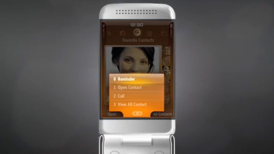
We can't help but want to get in touch with each and every engineer and designer on the Windows Phone team to give each of them a huge cuddle on behalf of the community. Now we're not ones to smash down a concept, but what we have presented here is almost alien-like compared to the Windows Phone UI. No tiles for starters. Where are the tiles?
That said, this is a concept, and an intriguing one at that. The design goes in new directions that (at the time) would have been something "new". It can prove rather difficult to look at a design that's not simplified and sports glass / chrome effects. We can say that Microsoft certainly made the right decision to cut its loss with Windows Mobile and completely refresh its mobile venture with Windows Phone.
How would Microsoft be ranking against the competition should Windows Mobile 7 went ahead (with this concept)? It's impossible to say, but the interface doesn't offer any radical reasons for a consumer to switch from Android, BlackBerry or iOS. Live Tiles, a focus on typography, panorama, these are just a few of the design elements of Windows Phone that punches through the status quo and offers a unique experience.
Check out the full video of the Windows Mobile 7 concept below:
What are your thoughts? Glad Microsoft went with Windows Phone as we know it today? Let us know in the comments.
Source: iStartedSomething, Vimeo (opens in new tab), via: @EverythingMicrosoft
Get the Windows Central Newsletter
All the latest news, reviews, and guides for Windows and Xbox diehards.
Rich Edmonds was formerly a Senior Editor of PC hardware at Windows Central, covering everything related to PC components and NAS. He's been involved in technology for more than a decade and knows a thing or two about the magic inside a PC chassis. You can follow him on Twitter at @RichEdmonds.
-
Looks terrible.
-
Still has more features than WP8
-
Less is more...
-
Less is less
-
Go get yourself a GS4 then, don't think WP can be enough for you... :/
-
someone has seen Spread.
-
" Glad Microsoft went with Windows Phone as we know it today?"
Yes. -
Oh my gawd it's horrible!
-
I am so glad I'm looking at my beautifully designed wp8 handset right now, words cannot start to describe it. Metro UI is by far the best thing that MS has come up with in the last decade IMHO.
Thanks heavens this has not made it into the real word, thanks to whoever chose Metro in favour of proposals like the one shown above! -
You're not allowed to call it 'Metro' ;)
-
Ms can't call it Metro... we can call it anything we like ;)
-
He/she's allowed to. MSFT isn't
-
damn ugly but I do like the 7 logo
-
if they had done that I would have gone Android for certain...
-
I would have gone IOS... thank you MS.
-
Didn't we already see the "photon" release many years ago... Originally, Microsoft wanted to develop windows mobile alongside windows phone. To be fair to windows mobile, it was a corporate and enterprise standard os, and yes it didn't attract the regular users, but what it did, it did well. You had plenty of overlays available to make the interface nicer, and the core os was, and still is, more reliable than wp7 or 8. You're slating an interface because you're comparing it to something totally different, as i said, Microsoft were going to launch the two alongside each other. Most corps are either still with wm or have gone to ios/bb, wp hasn't set the corp world alight, so for all its success with consumers, the real money, the corps, hasn't exactly piled in...
-
Microsoft would launch Windows Phone and Windows Mobile alongside? Oooooh, Imagine that mess. MS would have 2 completely different OS's with completely incompatible apps. It would be the worst possible solution.
-
True but it would have allowed them to keep the corporate customers until Windows Phone was ready to take up their corporate needs. Of course they would have left anyway if Microsoft had kept them waiting as long as they have now. But back in 2010 the WinMo platform stil had some appeal. If they had kept it around and replaced it with a corporate WP in 2012 then they could be sitting on a much larger marketshare.
-
I help support hundreds of windows mobile devices for my enterprise. the core os is nowhere near as reliable as wp7/8. Windows mobile is a cluster**** and I wish we didn't have core enterprise apps that required it. Just for example, I think there are 2 or three different interfaces for connecting to wifi in 6.5, and they all screw with each other... then you have to set everything manually. It is slow, frequently crashes...
We've finally got our user base accustomed to the glitches and how to deal with them, but it took years for that to happen. A lot of our devices require regular reboots. Also, if the level of technical proficiency required to operate IOS/WP is a 3 out of 10 let's say, then WM is probably an 8. Maemo is the only OS I've used that requires more technical skill. If we didn't absolutely have to have it WM, we'd switch in a heart beat to IOS/Android/WP. In fact, our management team is off of WM completely and using IOS for submitting QA forms, etc.
-
I remember the rebooting once a day with WM. I loved it and there were lots of features, but the performance and rebooting was enough to make me glad I don't use it anymore.
-
It looks like a cheap fps game menu, to me
-
Before you all shoot it down...if I had this on my WM6.5 device 4 years ago I would have LOVED it.
Much better than what they had, and nice and fluid.
But yes, very glad we are not using this now. -
This
-
Glad they chose a different path with windows phone. Designers have to experiment with a lot if not-so-good designs idea's until the right one emerges. Loving WP8 now.
-
Looks Symbian
-
i would have jumped off a bridge.
-
I like the flip phone concept. I am not a flip phone person but my wife is. She hates touch screens and still uses a flip phone. I think she would really groove on this phone as long as the screen was crisp, clear, and high res.
-
My wife said the same thing. She has a 920 now and still drooled over the flip phone. This can be a good OS for pay as you go phone.
-
Ugly as hell. And yes, I am glad they went the Metro way.
-
i actually liked the 6.5 version which was a zune UI
The side PINS tiles eventually became the windows phone 7 tiles
-
Wow. That's just bad. Good move
-
This would have made me buy an Android!
-
Most WM6.5 users switched over to Android anyway. I'd wager that very few of them have switched back to WP7/8.
-
I stayed windows since the Treo 700wx and then the Treo pro then a touch pro 2 now a focus
-
Moto MPX200 was the first for me for a long line of models up through my current Lumia 920.
-
I did switch to android but came back to an LG optimus 7 - there's no turning back now...
-
I had a Touch Pro 2 with WinMo 6.5.1 Simplicity version, but for a short period I had dual boot option with XDAndroid as a second OS on it. Thanks to WP7, I went from that to Focus Gen 1, and eventually Lumia 920.
-
Even though I have a LG Quantum and then switched to the Nokia Lumia 820 (to keep up to date with software testing), I still have my Dell Axim X50 which will occasionally use (if you were on Aximsite, you might remember me as "Steven855"). There are still some great games made for Windows Mobile (such as the Arvale series and Orions: Legends of Wizards) which still do not have Windows Phone counterparts. It is stuff like this which still keeps the older devices in use.
It also helps to prolong the life of the device if you know how to make custom roms for it (I do). -
Remind me to call Piar Ackerman. But yes, this interface by now looks gaudy. So much gloss! Glad we escaped this incarnation of WM.
-
...if this guy now works for HTC/Android, this might be a good chance for WP8 to grap more marketshare... :-)
-
I think what many people here are forgetting is that there were two different Windows Mobile platforms. There was WM6.5 Professional (for touchscreens) and WM6.5 Standard, for non touchscreen devices (formerly called WM Smartphone). This pretty clearly to me appears to be for the non-touchscreen variant, what would be in what would most likely be considered a feature phone today.
-
It looks like a suped up version of the interface MS created for the T-Mobile Shadow. I liked that phone a lot...likely would have loved WM7 too, if it had ever came to be.
-
Even more cluttered than Android and iOS.
Although, Microsoft is the king when it comes to the transitions and animations in their OSs. -
This would not have aged well.
-
I wouldn't say its horrible like others are, but more so that we now have been spoiled but what we have, thus making the concept look bad in contrast.
-
I would never have left iPhone for that. It looks like it would be hell trying to figure out the menu system. Plus, the amber color makes me nauseous.
-
I'm glad it never happened.
-
Definitely not as good as today but you can see that "touch" was not the focus of interaction unlike windows phone.
-
this concept suckss
-
Lets be honest at the time the OS was never as smooth as they advertised it to be.
-
Glad it didn't make it.
-
I don't miss all those buttons.
-
It reminds me of my old HTC imagio lol
-
Has a real feature phone look to it. I came into this article thinking I'd come away with the impression that I would have liked it and WP/WM would have been okay in that direction as well, but wow was I wrong.
Definitely like the WP style a LOT more. -
I like it and the phones with keyboards that they showed. I bet it would have VPN too!
-
Back in the day I would have said, cool, I want it. I guess some UI styles I still think are cool, but whats putting me off here is all that clicking around. Today its all about getting things done in the least amounts of clicks without losing oversight. The basis is good, but to put it into todays functionality, less is more.
-
It's okay to let go :')
-
good call on not going that route....looked too much like old Blackberry interface to me.
-
Oh my god... Thank you MSFT
-
Looks like a step up for IOS and its imitation counterpart Android over their dated Win 3.1 grid look!
-
What's wrong with Microsoft....this software is better than wp8....that's why they lose the first position in the world mobile share......in now they still doing the wrong......wakeup Microsoft.....
-
the video is deleted!
-
yep video deleted -.-" !
-
Video deleted. So bad Microsoft want it erased from history lol
-
I saw alot of SPB Shell launcher in those features.
-
It is worth to remember that WM was available in two versions: Standard and Professional.
This video portrait the former, Photon Professional was very similar to Media Center and touch centric as well. -
This is actually the best looking interface I've seen on a flip phone. If it was on flip phones years ago, it would have been revolutionary! :)
-
I had the first tilt and loved it.