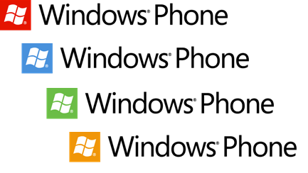
Windows Phone logo for Facebook gets a remake

All the latest news, reviews, and guides for Windows and Xbox diehards.
You are now subscribed
Your newsletter sign-up was successful
Join the club
Get full access to premium articles, exclusive features and a growing list of member rewards.
We've mentioned before that with "Mango", Microsoft is updating their logo for Windows Phone to the square version, enhanced by the various accent colors of the OS. The new logo received mixed reactions from you the last time with most agreeing it makes sense but that you still liked the old one better.

Well, now you can see it even more as Microsoft has changed the lil' icon for when you post to Facebook--you know, that tiny guy that tells you what service you posted from. While seemingly a minor detail, Facebook is a great place to spread the word about new technology and the new icon certainly has some pop to it. Clicking the link of course brings you to the Windows Phone Facebook page to learn more. Not bad.
Thanks, Loopyeyes and Nick L, for the tip
Article continues belowAll the latest news, reviews, and guides for Windows and Xbox diehards.

Daniel Rubino is the Editor-in-Chief of Windows Central. He is also the head reviewer, podcast co-host, and lead analyst. He has been covering Microsoft since 2007, when this site was called WMExperts (and later Windows Phone Central). His interests include Windows, laptops, next-gen computing, and wearable tech. He has reviewed laptops for over 10 years and is particularly fond of Qualcomm processors, new form factors, and thin-and-light PCs. Before all this tech stuff, he worked on a Ph.D. in linguistics studying brain and syntax, performed polysomnographs in NYC, and was a motion-picture operator for 17 years.

 Windows Central Insider


