Android tries to find visual identity through 'Material Design', borrowing from Microsoft

Since its inception, Windows Phone has had a bold visual design language defining the core experience of the OS. Initially called Metro, Modern design gets its influence from the work of Massimo Vignelli, who famously made the NYC Subway maps, and the school of Swiss Style started in the 1950's. At Microsoft, the lineage starts with Windows Media Center, up through the ill-fated Zune HD, finally spearheading the core design of Windows Phone 7 and Windows 8.

Android though, has never had such luck. The UI has changed significantly since Android 1.0, often evolving around a very loose, almost ad-hoc set of principles. Things began to change once ex-Palm design head Matias Duarte joined the Android team back in 2010. Since then, we have seen attempts at a new language, notably the Roboto font for Android 4.0.

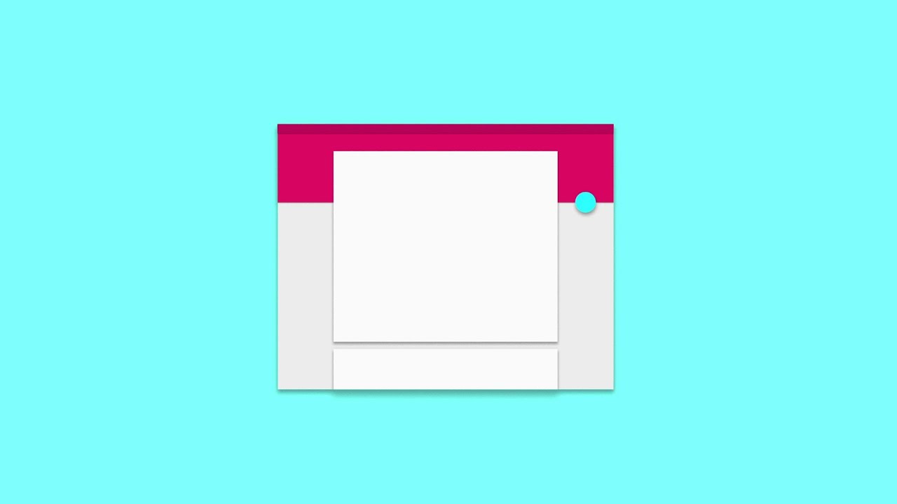
Now, in 2014, Android and Duarte are trying again to give definition to how Android looks across all its devices. Announced today during the Google I/O 2014 conference, the new UI is called 'Material Design.' And once again, it looks like its slipping down the Modern UI slope even further, despite Duarte's reproaches from 2011. Duarte famously criticized Microsoft's Modern design language calling it "airport lavatory signage" and "too starkly systematic."

The new UI is flatter looking and has all new geometric on screen buttons. In addition, app developers will be able to leverage the new UI across devices, which sounds analogous to Microsoft's Universal Apps initiative. Perhaps the one difference is the use of brighter pastel colors, but even the flat squares still look like something from Microsoft's playbook. Google is not alone, however, in this trend, as even Apple has moved towards a flatter, non-skeuomorphic look in iOS 7 and iOS 8.

Will Google and Android finally find their look in Android 'L'? It remains to be seen how well it is received by the masses, but there should be little doubt about who is leading this resurgent design trend. Watch the above video see Google's introduction to Material Design and let us know what you think below.

Source: Google Design, Android Central

Daniel Rubino
Editor-in-chief

Daniel Rubino is the Editor-in-chief of Windows Central, head reviewer, podcast co-host, and analyst. He has been covering Microsoft since 2007 when this site was called WMExperts (and later Windows Phone Central). His interests include Windows, laptops, next-gen computing, and for some reason, watches. Before all this tech stuff, he worked on a Ph.D. in linguistics, watched people sleep (for medical purposes!), and ran the projectors at movie theaters because it was fun.

419 Comments
  • I am going to have an awesome time showing this to my friends with androids
  • I would stereotype android users like that. It's not even a suitable stereotype.
  • Android friends..xD !! Hahaha
    Same here :D
  • Everybody is copying WP now....main reason we need to have stuff to make us unique and exclusive otherwise it'll just be a clone to others with nothing really to offer.
  • Hmm. That some problem. I wonder if Microsoft has it's own design copyright
  • You are correct. But I have said it a long long time ago, that mobile apps and usage can only be revolutionalized with metro LIVE tiles. You just wait until MSFT 3D gestures takes off, just hovering over a tile will be just amazing on what information can be decimated before you even lauch the app. Now iOS and Google who riduccled MSFT for their design choice are gradualling copying knwoing there is no way a STATIC BUTTON with rounded coreners can provide rich visual clues, or enriching information at a glance. The other MSFT design sale that will rock competition is the idea of all you truly need are 2 devices 1) Phone or Phablet 2) 2 in 1 PC You will not need a phone, tablet and a laptop The genius of this design is that you have an OS that runs native programs and tablet apps And you have a phone or phablet that truly sync with your light 2 in 1 (Its simply the future) What these 2 in 1 will do is make the ARM SOC non relevant for tablets because they can never have the grunt. When you see the design of surface 3 Pro with i5 and i7, It can only get better and not worse. I am betting by end of 2016 or mid 2017, an i7 hovering around 1pound weight for a 12inch 2 in 1 will be a thing of the past, I totally expect apps count argument against Windows to end by mid 2016.
  • Your post made my evening :)
  • You're not alone ;)
  • The sad part is that Google will pull it off, show it as their own..... And we will be left behind without our local apps and a low market share... :(
  • Don't worry man, now we have enough people to make sure they don't get the credit
  • Don't get your hopes up, people still think apple invented the wheel these days. Microsoft is great at developing stuff and has an amazing track record but they are absolutely the worst company I have ever seen when it comes to marketing them to the people that are actual buyers and influencers. Microsoft really needs to stop thinking like a bunch of techie nerds and start figuring out how to sell their smart and useful developments. It's not very hard even. Just translate a feature to how your target audience will see it and give it a memorable name. Like apple did with their high dpi screen they bought from LG.
  • ^this
  • Microsoft is pretty good at marketing to the corporate market, while struggling with the consumer market. Apple and Google are still struggling to with the corporate market, but are pretty good at marketing to the consumer market. All three are trying to improve on the market they are struggling with, without alienating the market they do have.
  • As long as Windows Phone is more profitable for developers than Android, they're going to keep coming over. Remember, that with less apps and lower "market share" Windows Phone Marketplace has been outselling Google Play when looking at revenue generated. Profits speak louder than market share, always will.
  • I remember when I first showed my Omnia 7 to my friends that thought iOS 5 was the pinnacle of design and they thought it was ridiculous. I knew I couldn't convince them, but I told them to just wait it out and they'd see that this was the future. Turns out I was right..   .and turns out I'm the only one that remembers..
  • Anyone else feel Google is turning into the WalMart of the tech industry?
  • Yup! I agree. Microsoft needs to improve on things like Xbox live integration with televisions cable,wearables,and keep their foot on the gas ⛽ whn it comes to new features and UI looks because apple and google are copying them while MS is still playing catch up with features
  • I feel like this is still pretty different from Metro.   Metro is all about typography and very digital graphic design.   Android's Material look is clearly based on construction paper stop motion. . 
  • +822
  • Wow man, you do not believe that, do you?
  • Sure I do.  And I'm working on a construction paper/origami inspired animation right now for another large tech company.   It's a good look, but Metro's very graphic design look and the evolving Google hand crafted look are pretty different.   It's like the difference between this:
    http://www.thisiscolossal.com/wp-content/uploads/2012/02/love-2.jpg and this: http://blenderartists.org/forum/attachment.php?attachmentid=313204&d=140... The google look is a form of Skeumorphism.  There are subtle drop shadows, things move over top of one another and the color pallete is quite pastel and 'crafty'.  It's trying to look like it's handmade and has depth.  The Metro look is very different, it's devoid of drop shadows and skeumorphism to the extreme.  As someone else pointed out "Google is South Park".   Following that Analogy "Microsoft is Strongbad". 
  • +520
  • "South Park UI"
  • +S5 Posted via the WPC App for Android!
  • I agree.
  • Yes, they have copied us... Too bad!! They are the market leader.. No one will know or care that they have copied... They will get the credit.. Same applied when Windows copied features from Mac OS.. We were the market leader and no one cared.. Too bad it happened now.. But, we need to move on and try to differentiate us further... We are the underdog now and need to work harder.. No time to waste energy on this.. Just part of the game!! Look forward...
  • What on,earth has windows copied features of mac
  • Now don't say that iPhone and Leopard OS were the original ideas of MS!!
  • You clearly didn't use Windows before Windows 95. Back when it was a different thing that didn't work just like the Macintosh Finder.
    Windows 3.x didn't even have a real desktop, bro.
  • May be I’m wrong, but this look more and more like the end of the road for us WP Fans.  I’m rocking a focus since 2010 and I’ve been reading wpcentral for about the same period. I fell in love with Metro when I got my Zune HD and loved it ever since.  I guess part of me wanted something different.  WP itself was a bit different from my Zune but the hubs IMO was a wonderful new idea.  Fast forward 2014 most of what made us unique is lost. We cave up so much.  I’m still waiting for something different that rumored 3D phone look promising. Still, after waiting so long for a phone to have everything I want and my favorite OS, well I guess I’m losing hope. I’m the one always wait no one is forcing me and I know it’s just a phone, but it’s also like rooting for your favorite soccer team. Now we have no more hubs, Office is everywhere, our xbox games well, I won’t go there, the music and video apps are a mess and now iOS and Android as a similar UI/UX. IMO 8.1 doesn’t bring enough to the table event with Cortana. Don’t want to rant, I know it’s probably just me, but I still can’t do something as simple as attach multiple word documents to an email using a “normal” process (add attach a file after I wrote my mail).  No I don’t want to go to the other two OSes but I wonder is it the beginning of the end or am I just overreacting? No one here seems to think so.
  • No... I'm with you completely. Its like owning the most beautiful car in the world... But the A/C only cranks to 80 degrees and the radio only has 5 stations. 4 years on WP and while much progress has been made, those improved features dont apply to me. I'm at the point where I have to seriously consider function over form. The other OS aren't perfect and have their issues too, but its coming down to the little things. But no rash decisions, I'll at least wait until 2015 before deciding to switch.
  • No. Trust yourself, we only lose if we want to. Don't ever want it!
  • I agree with you somewhat but I feel like the personal approach microsoft is taking to it's design decisions (actively seeking feedback and following through quite often, but not promptly)instills hope in me yet. I used to like android but I dislike it more due to buggy products (not Google's fault) and even more after Google snubbed WP users on their products and therefore refuse to use it anymore. I'm glad Microsoft is moving it's products over to the other platforms. It's almost like they are doing what Google did to them, release interesting, innovative products and slowly gain traction. Then hit your stride. Microsoft is slowly picking up steam. I honestly hope that they have not shown us everything about 8.1s final release. An even bigger update will put them in the spotlight. I'm said this before, smaller marketshare while working out the kinks is better than subjecting ALL of your users to growing pangs and turning them off permanently.    Anyways, I feel I'm rambling and should be in bed.
  • You mean 'copied' like Jobs being the original thief, and I quote his own words: “We have been ‘ShameLESS’ about stealing great ideas”. http://www.youtube.com/watch?feature=player_detailpage&v=CW0DUg63lqU Here, let me help you with a list of things copied by Apple, name and logo included. Panorama + Folders = Android Notification Bar = Maemo The name "Apple" = The Beatles Slide to Unlock = Neonode N1m Mouse GUI = Xerox Reject calls with SMS = Symbian iMaps = Google Maps (Opps) Fingerprint sensor (Cracked) = PCs (Safe) Multitasking = webOS Copy/paste = WinMobile Ping = Facebook, Twitter iPad = Samsung´s Photoframe iPad Mini = Dell Streak iPod = Creative Technology and Walkman ‘iPhone’ the name = Linksys’ iPhone® Original iPhone = Samsung’s S700 Mp3 Player iPhone 4 & 4S = LG’s Prada iPhone 5c = Lumia 620 Pinch to zoom = Samsung iMessage = BlackBerry Messenger iCloud = Dropbox + Onedrive iOS 7 = Windows Phone. Smartphone Optical Stabilization = Nokia Siri (Clippy) = Xiaoi Bot + Nuance App Store = Ubuntu Software Center Multitouch Smartphone = Bought another company Bigger Screen smartphone = Everybody else MacBook Air = HP’s Sojourn Macsafe = Asian Crockery Thunderbolt = Intel OSX, iOS = Unix Newton = Psion Series 3, HP 95LX Apple Logo = Genesis 1:6, 3:6 Aluminum = Cheapest Metal Plastic = ($$$ Reinforced Polymers) Security = Buy a new one...
  • iOS want even there name, they bought it from Cisco. It used to be internet OS (ios for short) This is the OS of all there business grade routers.
  • Are you an idiot? When the iPhone was first released, the OS was not even called iOS, it was called iPhone OS. Once Apple came out with the iPad and iPod Touch, they renamed it "iOS" since it was for various iDevices and not just a phone anymore. Seriously, either pay attention to tech or do your damn research...
  • Who cares when it changed you moron! The point is Apple did not come up with the name iOS, neither has Apple innovated really, they have always copied, bought out and sued the original creative people or companies. Even with the names, logos, etc.
  • Oh yeah! 
  • Google is so stupid. This does nothing but help adopt the Metro\ Modern UI much more quickly to the masses. Now the Metro UI isn't so different. You can only pilfer for so long Google. Do Apple and Google have any original thoughts between them?
  • Not so. This can go either way. This new design can also attract WP users to Android.
  • I think you're wrong. Once the UI issue is somewhat normalized, we still have tight integration and live tiles, XBOX Music, OneDrive, XBOX games, Zeiss Cameras, Cortana, Here Maps...
  • Tight integration with what? Name one single thing you can do better on WP than you can on Android. One.
  • Using Microsoft services.
  • One word: Skype
  • Get updates. Apply cold water directly to the burn.
  • LMAO
  • Type this message within seconds without any lag :P
     and have better security :P
  • And nobody cares :(
  • Xbox Music? You list that as if it is a good thing.
  • With a XBOX Music Pass I can find, stream, download, buy and synch all my music in one place, so yes it is a good thing.
  • You can also do that on Android with an Amazon Prime account, especially with their new Prime Music service.
  • Fantastic!
  • You can do all of that in Google Play All Access. Across 10 devices per account....
  • Kind of like Google Play Music, Google Drive, Google play Games, Google Now, Google Maps, Chrome Tab Pushing, Google Photos, Google Calendar, and Android Device Manager? Yeah, M$ is way better at integration.
  • I think the biggest problem is that Microsoft doesn't know how to advertise their awesome products. Whereas Giggle is an ad agency pitching their "me too" products just to sell ad space.
  • They Said Imitation Can Never Came Close To The Real One :v
  • They say if an imitator become better than the original they will become the real one. Thus the cycle.
  • Haha You and Me both!
  • Transparent was from Win7 (Aero?) now Metro, google stop ffs
    EDIT: but i've to say the music player at 0:34 looks sexy
    Xbox should borrow some of its UI
  • Nah, transparency started with aqua in OSX, nice try though
  • Actually Aero(transparency) started in Vista, which came before OSX.
  • The aqua design language was premiered in 2000, 2 years before XP and incorporated transparent elements.
  • Vista was the first to market, in 2005, with the transparency in a shipping OS though, OSX had it in a shipping OS with Leopard, in 2007.
  • No, vista was released in January 2007
  • I brought My Notebook With Vista 64 Homprem Preinstalled at 2006 Agust
  • OS X shipped in 2001, bro.
    Menus (not the menu bar,) inactive titlebars, dialog sheets, and the Dock were all transparent in 10.0. http://en.wikipedia.org/wiki/OS_X_10.0 You mention Leopard, that's 10.5, which was the first very major overhaul of Aqua. If anything, it reduced the amount of transparency.The menubar is about the only thing that's transparent now by default. Menus and sheets are kinda.
  • I had a 3rd party program on windows 95 which gave you new desktops, one was a 3d floating cube, and one was very much like Aero in vista, but a bit more so.
  • Aero came with Vista.
  • And vista came years after XP, did it not?
  • Just give it up
  • Why? He's right.
  • No no no may friend! Windows Vista stat with transparency. I just remember those slow beautiful moments when Windows Vista froze with no reason.
  • Lol, ok got it but thanks anyway i jumped from XP to 7 without trying Vista, so didn't know but i can't EDIT my past again
  • it just at the vista time. most hardware can't take the advantages of the software ._. still NP with my PC but it's hardware it's DAMN EXPENSIVE
  • Hey Microsoft fellas !! Lets sue Evil Google ;)
  • It's not as simple as that, I'm afraid.
  • Is your sarcastic meter off?
  • No ;)
  • Microsoft has hell lot of cash in their bag ;) so don't worry ;)
  • microsoft dont sue people for copying them, but they are happy, because someone copying them means other competitor was too afraid windows phone will rule the phone war, and start copy :)
  • If Google's not afraid of windowsphone, why have they refused to develop for it...
  • Because only idiots help the compition. 
  • Sorry mate, but you have no legal basis for that.
  • You can sue google all you want but more then likely, they will get away with the suit clean.
  • If fanboys were to be lawyers.
  • If there's a patent they can sue.
  • SkyDrive and Metro. Great names. Now OneDrive and Modern. LAAYME. So Microsoft can get sued because of 2 stupid things - names, but Microsoft can't sue cause of a design copy? Gay. Posted via Windows Phone Central App
  • Nice way to insult large numbers of people but the internet has never required a stupidity meter for use.  This assinine insistence on suing is just laughable and embarassing.   Ever here of use, licensing, and royalty agreements? Miss how much Microsoft makes off Android via its patents? Oh, to the alleged moderators and managers of this site, since when is the use of gay as an insult acceptable? Sadly no suprise given the stupidity of the post is on par with the incompetence of the managers.   
  • I'm sorry. It's just a thing I say due to the past. I remember when "gay" meant happy or silly. Being gay is not called being straight, otherwise being crooked. Maybe I was trying to say Microsoft was going in the wrong way? I never pointed out anyone and specifically tried to insult anyone. Sorry if I did. In fact, what you said was more offensive, but I don't really care. I'm laughing at this huge overreaction for 1 word, and I'm not embarrased.
  • You're gay? That's cool. Gay people are nice.
  • Yes they are.
  • As they say, imitation is the sincerest form of flattery...
  • This ^^^
  • Give this man a cookie
  • +1540
  • I thought that was mutilation....
  • I think we all owe Microsoft an apology when we said this metro UI was a shitty idea
  • who said that?...i bought a WP for the very same reason
  • I mean I love metro, but you're confused if you think it didn't get a lot of negative press.
  • Lots of people derided it when announced at MWC back in 2010. Even later, people called it 'boring' and too flat. It wasn't until about 2 years ago design trends began to change, following Microsoft's lead.
  • well, it's human to criticize the different from the norm, i guess.
  • It's a human character flaw if anything.
  • The sad part, MS will get kittle to no credit while the others receive praise for walking behind MS's footsteps.
  • A ton of people.  The metro design isnt a problem, it becomes a problem for those that use PCs for work.  Doubtful any enterprise would use win8 due to the metro design.    This is why the metro should of been for tablets/phones only.  Then the traditional desktop for productivity.  Combining the two caused confusion. 
  • true, metro doesn't work well for PCs
  • Disagree. PC version works just fine. It's knowing how to use it.
  • It's not even that, it's just shutting the hell up and using it. Stop crying because something *looks* different.
  • i use W8 on my PC too, but from the functionality point of view its not that great on a PC
  • I think you are forgeting that Metro is a design language and principal, it's not exclusive to the Start Screen. There is no reason why a flat, clean UI couldn't work on Desktop. The main reason people are gripping about it is because they took away existing UI features like the start menu. Whether it's flat, clean, typographic, etc. is not the issue.
  • a flat clean UI will work on a desktop no doubt but W8 is something optimized for touch more than a mouse, and touch on PC or even a laptop ain't that great of an experience.
    p.s. i use W8 on my PC :P
  • To some extent yes, but I think the "W8 not optimized for mouse" statement is way overstated. It's not like they completely destroyed mouse usability with Windows 8. I use Windows 8 on both my Desktop and my Laptop with no problem. I do both design and development work and I have found Windows 8 speeds up my work flow compared to when I use Windows 7 at work. I think the main issue is it was too much change too fast. It's not that it's not mouse friendly, it's that it's different and people can't handle that. BTW, my laptop is touch, and I use the touch screen for about 40-50% of my interation. It's so more intuitive and direct that it just naturally happens.
  • Same here, coming from a lenovo x200t with windows 7 to lenovo helix with windows 8, my workflow has improved and I'm touching the screen quite regularly too.  Very natural.
  • that's what, u moved from a W8 laptop with touch from W7 so u appreciate the changes in W8 but most PCs & laptops are non touch so for people like me its somewhat impractical
  • Well if you want to go way back, I started with windows using Windows 2.0.  I'm very much a natural mouse user.  By the time I was a few years into Windows XP, I knew I wanted to interface with the screen. My first tablet PC was a Toshiba Portege M200.  On Windows XP Tablet edition.  That failed for me hahaha, I had to force myself just to use the tablet part and it just wasn't any good.  I only used it to occasionally mark up documents, presenations, (of which people absolutely HATED) and screen shots.  Marking up screen shots was awesome but that was about it.  One note was too much effort at the time. Windows 7 still didn't bring enough to the table but MS was trying!   Since windows xp tablet edtion to windows 7, it was about hand writing recognition.  But honestly, I can't hand write worth anything. Windows 8, ahhhhhhh... (both RT and PRO).  It's not really about handwriting, most of us lost that art.  It's about typing on screen better.  However, I am finding stability issues while doing comined modern ui app activity with desktop activity but that's a different topic.  I like the expansion of the start menu to the start screen.  You can do the same in windows 7 start menu and more in the windows 8 start screen. So yea, I guess I wanted touch interface quite a long time ago but to me, it just made sense and I'm not lost with either touch or mouse.  The 8.1 made pretty much everything super mouse compatible.  Just a little bit of a open mind to the idea is all that's needed.
  • since I don't have a touch PC i won't say anything further:P
  • I don't understand the argument that Windows 8 is horribly suited for use with a mouse but perfect for touch. I have the easiest time using it with my mouse, but when trying to use it with a trackpad which uses "touch" mind you, it is difficult to close an application by swiping unless using another hand to hold down a button and then swiping. It is far easier to use one hand with a mouse and drag down to close the application.   Also, turn up the sensitivity on your mouse and it hardly takes a flick of the wrist to move from corner to corner. Why did everyone's mice stop working once the option for a touch based interface appeared? I think it suits both quite nicely.
  • i never said its horrible, but compared to touch it ain't so good
  • The metro UI is only applicable for some use cases so far. The application landscape will need to change drastically for it to be enjoyable to people from all walks. The most avid tech followers, who also happen to be programmers obviously do not see value in metro due to the nature of their work. For example, my company will not move to W8 simply because the metro UI is simply a hassle due to the kind of applications and work we do. On the other hand, my wife's company is plenty happy with their W8 transition. They are in the medical field and the applications they use are optimized for metro.  Simply put, Windows has a VAST application ecosystem and to allow metro to be usable by all will take a lot more time. My guess is at-least 5~8 more years before it becomes the norm for interaction for 70+% of applications.
  • yes, i agree. one big reason is the slow adoption of touch PCs / laptops
  • After using my Surface Pro, I routinely find myself instinctively reaching up to touch my monitor when I'm using my Win 8 desktop. Unfortunately, it's not a touch screen... :P
  • try to understand, im not saying it won't work with a mouse, just saying it works better with touch
  • the thing is what Microsoft added to W8 was mostly based on touch but touch PCs/Laptops don't have much market. So when W8 came out people found it hard to tell the difference between W7 & W8. hence the criticism and like u said it was too much of a change to handle
  • You know what I really hated?  Going from windows 98 to XP and that colourful crap. I don't know why but I seemed lost forever and kept the 'classic' theme forever.  Maybe that's what got me to stop resisting change so much there after.
  • lol...nostalgia :P
  • I feel old ;(
  • Same. I even imagined having a phone with merro UI since my phone still a nokia feature phone
  • I also bought the lumia for its live tile and lock screen style
  • Me three
  • Me, four.
  • Erm, that's why I got a WP? :-/
  • Well sucks for them. I knew from the moment I saw it that it will affect the design of everything else.
  • I liked the metro UI and I still do.
  • I have always felt Microsoft has been ahead of its time.
    So many things they give are AWESOME but people just get it after a while..
    Live tiles..interactive tiles..metro style. Just soo many things more..
  • and you still see web comments that "flat metro sux" then these girls pissing themselves over OMG flant android OMG. ridiculous!
  • Now go point finger at them and laugh at them, "Haha flat design sux!"
  • Yes you few who said that deserve to eat a little crow
  • Ya who said that? I went for wp because i really liked what i saw!
  • I actually came to WP from IOS, because of the modern design.
  • Someone likes to over-generalize. We do not all owe Microsoft an apology since many of us liked the conceprt from the start.  Beyond that no one owes an apology anyway since everyone is entitled to their opinion.
  • Not 'we', THEY. The fanboy haters that came in droves declaring Metro as ugly. Now what do they got to say? They'll act like they never said it because fanboys are the biggest idiots in any arena.
  • I always thought it was interesting back when I was a heavy android user and decided to take a chance on it first purchasing a L920 pre Black update, I have since moved up to the L1520 8.1 DevP.
    Most appealing UI for me hands down.
    Extremely happy I made the move.
  • As long as they don't have clicking commercials....
  • In the words of the late Steve Jobs, "Good artists copy, great artists steal".
  • This is copy not stealing lets c what can Microsoft do to sue google
  • Yeah, that won't happen.
  • +1..Haha
  • How many times Apple has sued somebody because they had rounded edges in their products? The squares are our ©
  • Once, and won
  • It was Picasso who said that. So actually Jobs stole the quote!
  • That's what he did. Just following his principles ;)
  • The irony here is that Jobs took that quote from Picasso, he even says it in the same interview where he made that statement. Course, I guess that's not really ironic, but rather him putting that phrase to good use...
  • Make a colored square and watch Microsoft bloggers go nuts. It's almost comical everytime this happens.
  • Can you show a few examples before MS? No, it's a serious question, it would be nice to see.
  • Microsoft should have pulled an Apple and patented colored squares lol.
  • The new Android home screen won't have a tile interface. This article isn't about squares, it's about flat/minimal UI.
  • Did you even watch this? http://m.youtube.com/watch?controls=2&modestbranding=1&v=Q8TXgCzxEnw&amp...
  • Pffff....
  • Hey it's all good - they copied apple, now msft. That's their don't be evil in action right there lol As long as there are material differences they can get away with it. Bless creativity - who said good artists borrow great artists steal? Lol
  • Maybe that's why they named it Material Design
  • If the video shows the "recommended" color palette, I would say it looks pretty bad still in comparison.
  • Looks great! Nice to see all the major 3 have nice design now
  • +820
  • Say... You're a nice guy! =D
  • +9000
  • agreed. it's reminiscent of wp, but with it's unique flavour. if the design language was consistent and they got rid of the performance issues i'd change in a heartbeat. not like that's gonna happen, but we as costumers can't really lose out here
  • +1 yep.
  • Its a total ripoff. Also, imagine how hard it will lag on a phone with those transitions. Call it "Material Laguage" instead.
  • You are a stupid American Posted via Windows Phone Central App
  • What's different though is their take on animation. Yes, Windows Phone has animation but Android's looks sleeker especially with transitions! Other than that, yes flat and bright colors basically.
  • Yeah, their animations looks fresh and bit sleeker. It's a big change for them. I hope Microsoft also refresh the Modern/Metro UI hopefully on Threshold. The WP animations still looks good, but I'm not fond of Windows 8.X animations though. :(
  • I think 3d touch will solve the "animation" gap...
  • those are likely director animations in a video app. they will not be like that in android :)
  • Why are we using the term "borrowed"?
  • As my opening paragraph notes, Microsoft did not invent the Modern UI design either, they simply brought it back into fashion, but digitally. It originates during the 1950's and 1960's.
  • Yay, history of design! =P
  • AOL ??? :)
  • If you mean those kids corner etc stuff, you're right.
  • Daniel can't MS get patents for it now..Seeing that they are the ones using and implementing the design in their products for so long and it might not be a problem if there isn't one already??
  • Why are you people so hellbent on Microsoft patenting it and suing people? If anything, you should champion competition and want Microsoft to compete by improving their operating system and services. That's what you should want, if you truly love the Windows Phone OS.
  • 3-5% V/S 75-80% MARKET SHARE....5 V/S 50+ OEMS....It is a very tough job for MS to compete and we are not asking for getting patents for a common thing but for a design which is a sort of identity of/for MS and many of its products..MS is the one offering services to other platforms and not like a baby which is too adamant to share its YouTube toy or even services such as google search..Google has bigger recognition and more number of users(many haven't even seen a WP)in the Mobile OS market and people are gonna think that the design is adopted/borrowed by Google first and not MS!!
    --------------------------------------
    And where have I mentioned MS should sue Oogle..You seem to be a Droid supporter as even your username has it....
  • I actually use Windows Phone, now, so you can stop using the fanboy card as a valid argument. 
    As for the rest of your comment, comparing Google to a baby is rather childish. I do think Windows Phone needs more brand identity. But, ultimately, it's Microsoft's own fault that wider adoption hasn't taken place. Patenting the UI changes nothing. They'd still have a difficult time enforcing it in court, especially since they weren't the originators of said design. And, due to recent changes in US patent law, they'd have a really fun time getting a patent in the first place.
  • Wouldn't it more appropriatly fall under trademark or trade dress law than patent law?  I think so.  
  • You're absolutely right. It would be more of a trade dress issue than a patent. I stand corrected.
  • Microsoft already has patents for live tiles. Granted in April 2011, patent #7,933,632 covers “tile space user interface for mobile devices.”
  • Regarding google, as you've pointed out, they've criticized a design they're now copying. I'm just saying the haters have now turned copy cat. Disrespectful. I see the two major OS being forced to follow the "little guy" as Verizon and Att are forced by the out of box strategy of tmobile. Haters turned copy cat.
  • Haters? Or competitors? I don't know a company in the world that hasn't attacked their competitors and then mimicked one of their strategies. Times change, and just because one company beats another to a particular design or innovation, doesn't bar said designs or innovations from being mimicked, especially if they mean a better experience for their customers, regardless of who was their first,
  • I bet a lot of people will think Google came up this, and that WP was not original. In any case, windows phone FTW!!!!
  • Technically neither Microsoft nor Google came up with this. Posted via Windows Phone Central App
  • Microsoft SUE GOOGLE NOW. This is getting ridiculous.
  • Microsoft sue google buy their u tube for 1 dollar and them see cry
  • They can't MS didn't invent Metro UI.
  • No, they invented *Modern* UI. *cheeky smile*
  • Why would they, MS make more money off Android than Google do.
  • But microsoft could do it, since even apple sued to samsung by their similarities in the Samsung phone even by things like the physical central Button by example, so technically could Microsoft sue to Google by copy their design in metro and modern UI even if they use another color palette and shape, what matters is the initial concept or where they got the idea
  • Only problem the Similarities are non existent Posted via Windows Phone Central App
  • Ahem... Look again. Does it not utterly REEK of live tiles?
  • nope, does Windows reek the Android Notification center?
  • Stupid Larry page showed his idiotism in the event. 2 protestants event abused by interrupting in the keynote
  • Well you're not watching Io for sure. Larry page isn't on stage this yearb
  • By meeting over to Sundar Pichai he dos a big blunder anyways we don't care
  • I think Microsoft should help them, after all their first priority is always Android/iOS :)
  • ;)
  • Which is why Google and Apple are better in treating their own customers better. Micro$oft just wants to get to more users, instead of helping their OWN customers...
  • Hey look a phone call from the 1990s, they tell me they want their $ symbol back!!!!
  • Lol do you realize that Microsoft listens to us and that's why we get all these great features? Posted via Windows Phone Central App
  • This is why I like Microsoft (no, I don't love them, I not out of mind yet).
  • =metro+pastels
  • Sue!
  • Mary!
  • Jane!
  • If this isn't stealing, please tell me what is
  • You can't steal a coloured square because nobody actually owns it.
  • And what about the design, there are just so many things to consider here, and I'm afraid that Android is going to be even more successful, with a stolen design
  • It's not a stolen design Posted via Windows Phone Central App
  • Microsoft makes the interface look so,personal and natural. Google gays are really animated. If they started making consoles the,it would be worser looking consoles than Nintendo
  • In a simple sentence, GOOGLE IS F******LY COPING WINDOWS PHONE UI TO TRY DEFEATING MICROSOFT. GOOGLE SHOULD GO BACK TO SEARCH ENGINE OPTIMIZATION SERVICES INSTEAD OF COPYING MICROSOFT.
  • The capitalization added great insight to your comment.
  • Lol!
  • THERE'S NO NEED TO SHOUT!!!!!!
  • What word is that supposed to be? Fsckily? Fsckingly?
    What the Hell!?
  • Microsoft should sue and and settle if google agrees to release a feature matching version of YouTube on all windows platforms the same day they release updates on Android for the next 10 years. This is a pretty blatant ape of the Metro UI.
  • Good idea. SUE SUE
  • Yeah, i gotta disagree with the premise of this article. Google is taking a very different approach by making their UI brighter and more color-splashed throughout...not just on live tiles (assuming you aren't running transparent tiles in the 8.1 Preview). Look at their notification screen. In Android L, each notification gets its own colorful "Google Now" esque card with actions available. On WP 8.1, you just get a monochromatic pull-down shade with words on it. You can tap on each notification, but you immediately launch the program to get their and have to leave whatever you are doing. WP8.1 is kinda monochromatic in general. I honestly stopped noticing or carinbg which accent color I picked once I went with transparent tiles. I barely see it on the Notification Center. Barely see that color in mail. Barely see it in the browser. White and Black predominate FAAAAR more than any of the limited accent colors.  Also, Google is moving away from STRICTLY flat textures. They are ADDING shadow and depth to their iconography and UI in Android L. Honestly, I prefer this design language. WP was super fresh when it started, but it's mostly stagnant now. Like the transparent tiles, but the abundance of pure white or pure black (depending on your theme) is a bummer compared to iOS and Google.
  • Just for the record, Android has always used shadows. They never went away.
  • I would not call it a very different approach. It's clear they are removing 'chrome' i.e. unnecessary visual elements, moving away from skeumorphism, flattening many of the icons, and sticking to quad shapes. I never implied or said, to my knowledge, that it's a 100% copy of Modern UI, as clearly they are doing their own thing, including the things you mention. But if it were a completely different design, it would not be heading down the minimalist/Modern look that is clearly evident.
  • Whatever Dan, google will still create spyware and malware in their os. Bloatware too
  • I do think it's very different functionally, if not completely visually. But the point is it seems to be way easier and quicker for them to add "flat, modern" visual design to their OS (and a superior implementation of it, I feel) than it is for Microsoft to add extensive functionality to Windows Phone (e.g. XBox Music).
  • Exactly Dan. Its a copy, or thier take on it, minus the hideous fonts and the colors that say my screen needs calibration.
  • to be honest, google's design looks like yet another rip off from apple which was a variation from MSFT's. I agree MSFT is the purest flat metro out there, but this doesn't make google any less original by basically copying apple. Not saying it is wrong, just saying, if you're goint to talk smach about the flat UI, at least do something new.
  • Apple's design is a variation on Microsoft? The history of computing must be different on Earth 405.
  • flat iOS doesn't resemble metro to you? well it does to me and a everybody who commented who apple's flat iOS was basically windows phone inspired.
  • You cannot be serious Posted via Windows Phone Central App
  • Whatever.......Android sucks!!!
  • Tell that to the billions of people that use it.
  • Bills of people use Comcast, yet will tell you it sucks...
  • I doubt you've talked to every person that uses Comcast, and I doubt that they all say that it sucks. And, opinions are like assholes, everyone has one. And, to address his comment further, that's his opinion that android sucks. The funny thing is, half of the people on this site that bash the other operating systems have never even used them. 
  • I don't use Comcast yet I'm fairly certain its awful.  There is a fine line between bashing and being critical.  On the mobile OS front WP is the one I dislike the least.
  • Fair enough, brother. But, in my opinion, "Android sucks!!!" Is hardly being critical.
  • And I doubt you have talked to the "billions" of android users. You'd be surprised at how many "use" it simply because they didn't/don't know any better, walked into a store and bought the first thing that was pushed in their face.
  • True, I haven't. But, your statement is assuming that only a small fraction of those billions of users only chose Android because that is what was pushed to them. Unless you've done some kind of research, you're only making an assumption. We can go back and forth all day, on the reasons why more people are using Android. But, at the end of the day, people are gonna use what they like and what they're comfortable using. Period. More people just happen to be comfortable using Android devices, regardless of the reason they have them. No reason for anyone to be angry at that fact. Microsoft just has to try harder to prove those people that its operating system would be more comfortable for those people to use. And, Microsoft has to try harder to be the brand that is pushed.
  • I have android and i hate it. It was only cheap. Now windows is cheaper. I can't even update the os without a pc, yet with wp i can do that, and we so far all wkndows tablet can update directly. So much for freedom. Posted via the WPC App for Android!
  • That's weird, because Android devices allow you to update the OS via the settings menu. Only some updates have ever been released that needed to be applied via a PC tool, such as Samsung's Kies. 
  • The sad thing is when you look at history in technology you'll know that every copy of an idea will have more success than its origins.
  • Now all OSs can look like toys :D
  • Good thing toys are badass. Gimme some GI Joes.
  • Borrowing from Nokia X more like... Trying to recoup from their side-stepping the Play platform with Microsoft Services. If they make it match, it becomes more apparent it's Android, but then Google always WAS a Microsoft clone! Much like Bizarro, they have that mystique of twisting things the other does in their favor... Lol =P
  • Its not exactly identical although quite inspired from the Microsoft.
  • Fuck Apple and Google! That is all.. Carry on..
  • Yep. They wouldn't exist without Microsoft. Microsoft gave money when they went against the Supreme Court to Apple, and now Apple is not outta business. If Apple failed, Google would have only 1 operating system to put their search engine on. So even though Microsoft helped them both, they are still going down the toilet. That's right. F**k them!
  • Lol Wow!
  • Google also took the idea. Google one, one Microsoft. And google wants to cover all fields of our life what Microsoft hasn't done yet.
  • Yeah bro
  • Idk what the heck you are talking about but android L looks nothing like WP.. In fact we are lagging behind and copying their features.. I have to say they are doing a way better job than msft.. With android wear.. chromcast is awesome.. Android tv now.. Microsoft needs to do something! As much as I luv WP and supported msft from day one.. WP still can't be my daily driver.. Still not good enough
  • Copying their features. We own many patents bro and Microsoft earns from android they wont give a damn their OS or even worried about android. The more it excels the more Microsoft will earn. Their intention is to grab apples market share. They are trying to play a big 10-15 year strategy and I hope they succeed in doing that
  • I can't wait to install this Android L image to my Nexus 5. 
  • However says their roles look frsh are all stupid. That open source shitty OS doesn't even look natural. Its all animated looking like a 8-bit games design. Its fugly I found wp8.1 and ios 8 to be truly better than this.
  • It would rather be appropriate to say that they improvised it.
  • Well WP has also borrowed there notification system .. So it's not a big deal ... The thing is that both company has started considering the ideas of there competitors. And that will help all the way to end users.... Great
  • THIS! and at least Google is making a HUGE work on Android + Chrome than Microsoft is doing with WP... 8.1 update looks like nothing compared to Android L and its goodies!
  • Really, you're comparing a just announced OS to one that is being released very soon?
  • Is there some kind of law saying that he can't? He's comparing Microsoft's ecosystem to the competition. I see nothing wrong with that. 
  • comparing a very stable windows phone 8.1 version vs LAGDROID doesnt even make sense I dont want a cheap plastic phone that need to be rebooted everyday. also google spies on us and the maps really sucks
  • Ok, lol. Whatever. You say that as if I'm supposed to be offended. I doubt you've ever even used Android, so your opinion would never be valid anyway.
    And, by how ignorant your comment is, I can tell that you've never used Google Maps. But, please, go ahead and continue to be ignorant. More entertainment for me, lol.
  • You clearly haven't used Android. The HTC One M8 had zero lag. Posted via Windows Phone Central App
  • Boom.
  • My Note 3 is lag-free, too. Yet, all the transitions between and within apps in WP8.1 feel an awful lot like lag to me! Silly us, trying to inject facts into a fanboy argument!
  • My 2 year old Android Tablet has almost no lag and my lumia 720 lags A LOT  compared to my Galaxy Tab... thanks! 
  • This! What lag?? My 1 year old Android tablet works fine, and I used it constantly throughout the day for work and for reading. Blind hate is scary and idiotic...
  • Dude we have the patents
  • Microsoft took a notification idea that goes back to Windows Mobile... okie dokie.
  • I wanna be like Mike! :D
  • I'm not proud of having the same last name as this Matias guy. :P
  • Since success of surface 3, wp8.1, this Android's ass got fired and its burning. Burning in like the great fire of london Lol coping windows will make no sence! Till how much years you will save your self!, you are about to end...
  • Copycats
  • The good thing about Android though is that we can get rid of these horrible flat colourful designs.   That's why I like the transparency on WP. It allows me to get rid of the colours as much as possible.
  • Wouldn't that be essentially making android resemble even more of
    Windows phone?
    So you want Nokia to make an android phone (android and Samsung have done good jobs mimicking windows phone) and then skin the colors off so it resembles more of windows phone. Lol this is funny when you think about the implication
  • I want Nokia to make phones. Period. I don't really care for the OS. Apart from iOS, I like them all. I never liked the colourful tiles on WP, for example. So first I always get my phones with Deutsche Telekom branding to get the exclusive grey accent colour (since Microsoft insists in not giving us a colour picker). And now, with transparencies, I just turned everything into tones of black and grey. The less colourfulness, the better. That said, I prefer the old Google designs that resemble more Microsoft's Windows desktop with the aeros and all those things. I don't like flat, colourful designs. Never have, never will. And that's personal taste, I extend it to my art tastes too. I love Renaissance art and I loath XX century art. Just as an example ;)
  • ::crickets::
  • Nokia Pre-Microsoft was cash strapped. Nokia's talent is now part of microsoft. They faced a huge uphill battle before, it will be even more difficult now. I highly doubt theyre coming back in the cell phone game. LG seems to finally have traction in the android world, so the survival on the android side will be even more cutthroat. The brand may stay on phones should microsoft license it. They dont have the cash in todays market let alone two years from now (approx), nor talent, and even that aside i get the feeling that just like they once reinvented themselves from rubber galoshes to phones, they now want to reinvent themselves from phones to whats next on the curve - which is probably in their best interests long term anyway. Nokia A.I. / Robotics to challenge google on that front? now that would be cool.
  • I think its good for Android to have more modern design to their UI and UX. We thank for Microsoft for this. Yes Microsoft didn't invent the flat design, but for me they're the one push it to help widely adopted in tech industry. I honestly impress also of the design they did in Android L. I hope Microsoft also planning for design refresh, since even though its still beautiful and sleek for me, it's getting stale and losing uniqueness. I remember the leaks of early prototype of Metro UI for Windows Phone, and they looks more awesome. I forgot the link though.
  • Google and Apple said the Windows Metro UI was painted with Crayon, guess who is barrowing Crayons now, yes Apple and now Google.
  • If you can't beat them, join them.
  • It's nice to be in the forefront and being copied. For once!
  • For once?! Do your homework...
  • Oh, look who's doing some #stealjobs ala #googlestyle. They're just modifying our Metro UI.
  • its more like inspired from it
  • Honestly, I think they've taken Microsoft's idea and improved on it.  This is an evolutionary step from the Modern ("Metro") UI design language and I like it. Hopefully, this will be the impetus for Microsoft to go back to the design board and make something even better. The ball's in your court, Windows design team!  Go get'em!
  • I sure hope they patented the functionality of the live tiles...
  • Microsoft go after google for copying the metro design
  • Stupid American Posted via Windows Phone Central App
  • It is definitely Windows-inspired but I have to say that it looks really good. Dare I say... Metro/Modern with an improvement.
  • That's a joke right? I mean Google doesn't Copy anyone...
  • That was a joke right?
  • Oh, my eyes! Oh, that's horrid!!! Bright, shiny pastels. Hardly any border between tiles (Nokia X series, anyone?). Childrens' books cartoon imagery. That is truly horrendous...!
  • I'd seriously consider dumping a OS, that forced me to use this UI, on that basis alone...!
  • In Android, if you don't like something, you can just change it. Be the Launcher, the icons, the Lockscreen, etc. I'm not telling that's the ideal, but you have choices.
  • google always copy from Microsoft and Apple.
  • Wrong Posted via Windows Phone Central App
  • Haha!! Too funny! And yet so ironic!
  • Funny how Android is moving towards WP, while MS & Apple towards android....OS unification seems not too far away now.... But Windows still the underdog, hurry up, release the 8.1 & start working on 8.2 / 9 already !! 
  • Microsoft really needs to start suing, Microsoft has a way stronger case than apple because the rip is off is blatant and its happening right now, if Microsoft sues wins and keeps this UI within windows more people will come to windows for this UI
  • You are stupid Posted via Windows Phone Central App
  • what do you expect. it is google. that company doesn't have an original fiber in its bones.
  • google only knows how to buy ideas
  • Wrong again bob Posted via Windows Phone Central App
  • lol
  • To be honest looks really awesome. Very smooth animations. Awesome visual effects. Our Metro design doesn't have any of these!! Microsoft needs to add some of their own.
  • again you're looking at a video, it is going to animate smooth...
  • I see what you mean :P
  • yup. remember the macromedia director demos of vista? they looked great!!!
  • Did Daniel write an article when Microsoft stole Google's notification center and Swype keyboard? I agree that Android L has a lot of flatness to its design, but it looks really good none the less. It's going to be insanely popular.
  • Swype keyboard originated on Windows Mobile I believe. I used it extensively on My old HTC TouchPro.
  • Right, Swype is a third party keyboard, not invented by Google. They had apps on WM and Android. Also, Visa Declined, I purposefully left my personal opinion out of the article, because it's not relevant to my analysis. I actually think it looks good too, but that was beside the point I was making. Regarding Notification Center/Action Center, Microsoft takes some inspiration from their own desktop OS, which has an Action Center (will be merging in Win 8.2) and yes, Google and Apple. That is but one element though, as opposed to a UI. Regardless, I'm not sure what it has to do with the analysis presented here, besides trying to call me a hypocrite.
  • You wrote an article claiming that Google ripped off Microsoft's UI, but you left your personal opinion out of it? I unjoy using my Lumia, but I hear more about Google and Android at WPC than I do actual Windows Phone stuff. Not from articles or the staff, but definately from WPC members. Articles like this will only make things worse.
  • "but I hear more about Google and Android at WPC than I do actual Windows Phone stuff."
    That's a lot of hyperbole and I 100% disagree with your opinion, meaning this won't change.
    "You wrote an article claiming that Google ripped off Microsoft's UI"
    I never said Google ripped off Microsoft, merely that they're borrowing some of the same minimalist principals that Microsoft has been using for years. The same principles that Duarte derided a few years ago. Look, I get it, you don't like the article. Fine, I'm not looking for consensus in comments. Disagree, but note that I stick by this article and will write them when I feel it's necessary.
  • Don't worry Dan, your articles are not biased.
  • +520
  • Not really. Trust me, it's VERY easy to argue that androids notification center was "borrowed" heavily from the old Windows Mobile task bar, which HTC further improved upon.
  • Aaw how android cute ^.^ kissi kissi poo pooh. NO! im sticking with the best. = Windowsphone. Its good and looks good for android users and for growing fresh phone fanboys. But I think Microsoft will reveal something new, to make that google android design feel like old again.
  • L for "Lame" lol jk. So jealous, their built in calc has the number e... We need another app just to get that. Lol.
  • Android L.  The "L" is for "LOOTING"  lol.
  • Lol.
  • Isn't design language copyright-able? I wonder if Apple thought of this they'd be suing right and left.
  • Google waits for others to invent things and then quietly adapts itself to the good ones assuming that it wont get caught.But they've started even the name with 'm' this time (Metro and Material) . It's like copying 70% of the UI and adding few tweaks and toppings to make it look like original . I have been observing that Google doesn't even have consistent design pattern since any of its past versions . It comes up with something copied each time shamelessly.
  • Just a doubt guys! Why can't MS patent their design?
  • Hahahahaha!!!! Andr....copy? I wanna hear all these Android fanboys saying "METRO RULES" HAHAHA
  • I completely agree that Apple and now Google is borrowing heavily from the design philosophy of Microsoft. Here's the problem. No one in those camps will ever credit Microsoft for creating a unique design language that wasn't a sea of stale icons.
  • Yes, nobody will credit MS for the modern UI, instead most of the people will keep whining about MS and the lack of innovation and copying the others mobile OS features... talk about irony.
  • I agreed, and it's a shame :s
  • Smh
  • i will def check out the other bloggers/tech site to see what they say of this new design and wether they will reference WP
  • I'm never gonna buy an Android now :)
  • Fine. Can't stop laughling though! Can't be helped!
  • Android is finally going to look beautiful :D
  • Okay, now we have no benefit over Android and IOS. They have all the Microsoft services we have, so what does WP have that they don't have? Seriously considering leaving...
  • I too.. And another setback, if the android apps are coming to chromebooks, Microsoft is going to loose in the Windows field also
  • I'm not going to get an Android tablet or chromebook, as I love my surface, but for phones, I might get the next Moto X. As I have two upgrades, I'll get that, and also get the 1020 successor. :)
  • I don't think so. I choose to use Windows Phone because it's different. The UI and experience are a lot smoother than Android, in my opinion.  As for Chromebooks, I've used a few of them, and I can honestly say that they don't/won't compare to laptops or the Surface series, even with the inclusion of Android app functionality. Android apps on the desktop!= Windows.
  • Now, though, it seems Android has beaten WP in terms of being smooth.
  • I can understand why you'd think that way, brother. For me, I chose Windows Phone, because it's exciting to use an operating system that hasn't matured yet. It can only get better. Not that Android can't get any better, as we've seen from watching Google IO; but it is rapidly reaching a point of maturity, hence the copying of design elements from the Modern UI.
  • True. But since you own all devices, would you think getting the next Moto X is good? I like stock, and the next Moto X seems to be cool. But why will it have a S800, versus the newer ones? Should I just wait for the next Nexus?
  • I'd wait for the final Nexus device, if I were you. At least, wait for both the Nexus and Moto X +1 to be released, and compare before jumping the gun. I honestly think you're gonna like the final Nexus device more, though, especially if it follows the LG design language. If you don't mind the 5.5 inch screen of the G3, then I'd spring for the next Nexus device. On the other hand, if you want something slightly more pocketable, then I'd spring for the Moto, especially if they improve on the already amazing design and features of the current Moto X.  Whatever you choose, good luck! And, have fun!!
  • Metro 2.0?
  • If you actually watched Google I/O you would see that the similarities are more with the colors, flatness and simplicity than anything. I think this is a reaction to iOS more so than WP. "L" looks like its going to be beautiful, EVIL Google or not.
  • THIS!!
  • That! Haha
  • Microsoft needs to sue right now
  • Personally, I think that's a terrible idea. 
  • new android home buttoms are like my concept home buttoms which I designed before https://windowsphone.uservoice.com/forums/101801-feature-suggestions/suggestions/5767408-change-3-home-buttons-icons-to-minimal-icons
  • Why Bing for Windows is a lot better than WP? And, gorgeus. 
  • This video makes me really sad 'cause almost nobody it's gonna recognise Microsoft's effort :/ , but I'm also kinda happy of being part of the right way design movement :P
  • Airport Lavatory Signage? Fuck that guy. What the hell does he know the beauty of Metro UI. I really hate it when bastards speak this way. And Google finally has copied another concept from Microsoft. Great going Google... Keep copying..
  • What can I say... Was and is, proud Windows phone 8 owner. And third, sure they might say Microsoft's live tile interface blah blah, THEY took..oh I meant, stole the concept. Even Nokia said something which you forgot...
    "We will deliver the update WP 8.1 to the whole line of lumias including the 520. SOMETHING WHICH ANDROID DOESN'T OFFER"
    So lets see how many are going to enjoy this on their old devices!
    *cough*cough* GALAXY S3 *cough*cough*
    My Lumia 920 still and will rock..... PERIOD!
  • It's hard for me to admit this but both iOS7 and, with this redesign, Android are more aestetically pleasing platforms compared to Windows Phone. This is sad, to be honest, since Microsoft was the first with a flat-syled OS which means it had the time to evolve it into something both beatufiul and functional. In my opinion, it hasn't, and now both Apple and Google are overtaking it in the design area. Instead of closing the gap, MS i letting it's competitiors extend it.
  • If T-Mobile can sue AT&T over AIO's use of magenta surely Microsoft could pursue this in the courts.
  • I won't say it's a direct copy but they definitely borrowed very heavily from Microsoft's metro and blended it with the HTC One's screen layout. Silly to praise Google for improving it as you can always improve a design when you borrow it. Whatever the case, I expect MS to bring their A-game as they continue to grow.
  • it all boils down to what the manufacturers do. it looks nice, but it Samsung wants to barf all over it with more skuemorphic clocks and weather widgets, it will still look like a mess.
  • lol MS has copyrighted the form Square now.   Really, wake up. Look at the video. Do you really think this is like WP interface, because it has rounded edges?
  • Rest in peace, Massimo Vignelli. He passed away a month ago tomorrow, survived by his wife Lella who was the other (mostly unsung) half of the design duo.
  • I have stated this sometimes back that everyone is copying Microsoft in all ramification.
  • Is windows phone ever going to be officially released? Or is it just going to remain this mythical entity?
  • Stealing from those who are the true groundbreakers. That's fine, but it's accepting that MS was right from the beginning. Ah, well, there's those who are trendsetters and those who just follow trends.
  • webOS had so much borrowed from it.
  • Metro was also inspired by the Bauhaus school, which dates back to the 1920s. This is per the BUILD 2011(?) keynote where Jensen Harris, et al announced Windows 8.
  • Looks like Metro meets Fisher Price. Then there's the new logo that looks totally alien to the childlike 'material design'. Absolutely horrible.
  • So basically the gap between tiles have been reduced and different colors.
  • At the risk of sounding petty, I hate this crap. I really can't stand these companies who tout their abilities to inovative, yet can't seem to actually inovate much of anything. It's all about copying...
  • I like it. But then I like windows phone so its logical that I should
  • Fandroids already saying they didn't copy, its a brand new design, yes google took some inspirations but that's all. I say screw Google copycat!
  • Even if this article was written by a designer I would consider it wrong. Better luck next time WPcentral!
  • Looks alot like what they've been working toward in chromebooks. At least they've managed to make it decent looking.  Most of the previous iterations have been fugly beyond reason.
  • The design is inspired by Modern which is extremely flattering. This is Google conceding that Microsoft made a beautiful interface, and is giving their own take on it. This is a long time coming as Androids UI looks like a mixing pot of designs. I'd use a Nexus with "L" running on it as a secondary device for sure.
  • Errbody want to copy MS
  • Good for Android. I've always found their UI to be cluttered and unattractive. Some Android enthusiates like how customizable Android is but I have always found it to look piecemeal. I don't want to customize everything on my phone myself, I want a professional who knows about design to do it for me. That is one big reason why I like Windows Phone-- it is organized, consistent, intuitive and attractive.
  • stupid google
  • These Android f***ers will never learn.
  • When the Metro UI came out everyone was like "Oh f*** this design it suxxxx" then Google copies it and everyone's like (comments from the video) "heavy breathing" "I'm so excited" "new original design from android"
  • I like it. I actually like it a little better than Metro/Modern. Matias' words were spot-on in my opinion-- Metro is a bit too stark and systematic. "Material Design" looks like "soft metro", which I think would be friendlier and more inviting to the average person. MS would do well to take some notes.
  • They make fun of WP design at first but they are now copying it. Whheeew!!! Copydroid.. And CopyiOS.
  • When I see the Google Glass or Android Wear UI, all I think is, "They look so pretty, but it also looks so... Metro." Microsoft started an awesome design trend, shame it'll be largely forgotten by the masses.
  • I know imitation is the sincerest form of flattery, but something definetely went wrong here.
  • Yay.. Nokia should now fire their twitter bombs on Google like they did on Apple. "Imitation is the best form of flattery"
  • There's so much bitterness in this thread.. Sorry Daniel, sometimes human nature gets the best of us (trying to protect what's ours) I hope everyone has a nice day. :-)
  • We just got Scroogled! That’s a total rip off Windows 8 design. Fandroids will be screaming “wow beautiful” while Windows always had it, they called it ugly.
  • So much bad-mouthing towards WP from Android fans, this is just brilliant!
  • I like the way android L looks and its capabilities.  Seems like they are developing and changing at a faster pace than Windows.  Microsoft needs to add functionality faster than android is.  I know 8.1 was a big step BUT coming from 7 to 8 to 8.1 was still big baby steps. Apps are one thing.  People want features too
  • Android users used to call WP design boring. LOL
  • >____>
  • DONT WORRY GUYS!! Only like 1% of current android phones are getting this, ironically!!! HAHAHAHAHAHAHHAHA.
  • Wrong again bob Posted via Windows Phone Central App
  • This Is basically windows phone metro with shadows. :\
  • I heard a conversation at work with guys deciding what to replace their "shyt" phones with. Constant problems since day one for a year. They talked about each OS option and when it came to WP he said, "I don't like blue and white its too jarring" that was it. That was his critique of "giving it a try". I had to call him on it and say that he obviously had no clue what he was talking about and that the interface certainly wasn't blue and white by default. Furthermore, with 8.1 a lot more customizable. Reply? "Really? Still not my thing, too much clutter and information. I'd rather my gadgets." ?????? And now iOS and Android are borrowing from WP and people don't have a clue. Its quite amazing, really. Lunches with him will not be the same.
  • I'll be honest I dont see much of the resemblance here. If I throw a windows phone next to that interface they are quite different, with wp8 being a lot more interesting at this point. I like the way android looks currently on nexus devices and this really looks like an over simplification. Almost like everything is on a mobile website.
  • copycat!!! gross. no class android. what do you expect? lol msft, don't let this pass so easily. act on it!
  • When your whole company is based around finding ways to rip-off Microsoft, why not?
  • With its roots in International Typographic Design,  Modern Design (as in WP and W8)  is about - Content not chrome, being authentically digital, typography, flow, and being sharp. Content not chrome: Minimal | design-less design | Information is centerstage | no drop shadow | no false depth Authentically Digital - No skeuomorphic objects | no faux-patterns | 2D surface - 2D objects | Targeted to digital generation Typography - Clean, Sans, Bold, and modern typeface | Large magazine like text styling in app  Flow - Smooth transitions | swift motions | subtle movements Sharp - No blur | Solid Colors | Edges and corners It's remained to be seen how far other OSes follow these principles. [You use apps, not OS. Apps use OS.]
  • I really liked the new design. The flatter surfaces and the overall design seen to be very clean.
    I'm very interested in what will come from that. If it was available to consumers now, probably I would buy a Nexus 5 to enjoy all that. :)
  • Windroid !!!!!
  • I like it; it's a refinement of the current Metro UI, sort of a next gen version, which Microsoft should have created themselves. Redmond really doesn't seem all that commited to mobile, honestly.  The Lumia 1020 I own is nice, but far too many things on the platform are a backwards mobile experience, that I find myself often putting my SIM back in my SGS3.
  • This should benefit windows adoption rate in a way. Because now the system wont be so alienated
  • well if Android copy the metro or modern UI  of wp     i doubt Samsung touchwiz let   still with the   copied interface and probably be uglier, like always android is not consistent in  each  phone. in Android the updates can be applicated via FOTA but    still stuck  by the phone companies the upgrade
  • sue their asses!
  • Well that wasn't an innovation.. It is copy. IOS copied flat design of windows phone OS and now Google.. I think Microsoft have also their own plans and ideas to make live tiles more usable. See the development in Microsoft research centre. I think we need not to worry about this.. But still I am not feeling good.. My those Android friends will now get that cool, clean, and smooth UI which I've on my Lumia. I was convincing them to switch to Lumia but now there is no hope...
  • I think the touch UI on laptops is still at its initial phase as compared to mouse. They may be working fine, but I think that the Metro UI is the evolution phase of. Windows. One has to get used to it. I jumped directly from XP to Windows 8.1. I still think I am getting used to the Metro UI on my HP Pavilion i-5 core. Although on my WP (L920) the Metro UI was always far more appealing to me that the Android or IOS look.
  • Even if they copy it, google will certainly take the full advantage if it as usual, windows phone is sleeping.
  • Original will always be 1up than the duplicate. At least that's what all of us Windows phone users as well as Windows users think at the bottom of their hearts.
    But then Google came into being by copying Apple. So they are doing what they have been doing all their life. Microsoft has to be a bit more innovative to counter that by allowing small things to happen. Of many things Microsoft should very soon come up with a comprehensive file manager where you have the privilege to move any kind of file including video files to be moved and even password protect it. Allow apps like truecaller to trace incoming caller id. Make .flv files to play without the third party software's. Allow .gif files to be saved in phone. Make .mp3 files to be shared through social media apps like What's app etc. Last but not the meat keep up the good work of bringing in updates far more frequently than iOS and Android.
  • They are trying to take inspiration ;) possibly from eveything Windows have. They didn't even leave IE11, copied the "other" option in the recent tab which shows the Tabs from your Windows desktop and tablets.
  • It's funny that the Calendar they were showing looks similar to a Windows 8.1 app I recently created, for a MSFT competition in Australia. LOL. I promise that I didn't copy from theirs!! It was published last week! :P http://apps.microsoft.com/windows/app/timesheet/de1a2ac4-4f7f-4f5c-a411-6ee452f227a7
  • I watched the keynote and I have to say, I really like their new flat design and animations. For the same reason I like the Windows Phone/ Modern UI design.  I have to admit, I'm thinking about buying an android phone (nexus 5). Not because only the new design, but also because of all the features and apps which aren't avaiable on windows phone, (yet). When I look at the current flagship, the Nokia 930, there is absolutely no new feature, which isn't/won't be avaiable on my Nokia 920. In my opinion, there is still a big gap between windows phone and android. Don't understand me wrong, I'm still a windows phone fanboy <3
  • Yea...kind of makes me consider switching to Android...
  • There is nothing wrong when one company gets inspired by another company's design, just take it as a flattery.  Its just trendy to use a flat design right now, and since they think people are receptive to the flat design, so that's why its there, not just simply because someone wants to steal or borrow someone else's idea. I notice Samsung has borrowed WP ideas of using black background to save battery consumption, when in power saving mode. Anyway, the new android design looks pretty cool, and colourful.   I am using both WP 8.1 and Android at the moment, WP is ok for a daily communicator, but not my choice of platform when consuming media, as its apps store is still quite lacking, and functionality of some of the same apps that are available for all 3 platforms, WP version sometime felt weak. No matter how pretty and smooth the UI is, if a a whole, it is not useful to the user, its just not sustainable, come on MS.  
  • MS already makes $1b annually on android licensing. Looks like that figure will go even higher now. I wonder if these two OS's will converge eventually.
  • What if microsoft copies apple and android, on large scale, we will be criticise and become braking controvertual news! But now if apple and android are following microsoft like twitter, what is that??? Fu android!
  • I agree with this article.  That said, I think Android L is directly trying to rip off iOS8 which ripped of Metro/WP.  This ought to make Apple really happy, as is litigate happy when L phones start coming out.
  • Typical Google -.-
  • Good artists copy great artists steal.
  • The devs of Android are cowards. Too afraid of WP so they first stopped making apps for WP ecosystem and then copy WP's design.
  • I haven't read all the comment, but I am a Android and Windows phone 8.1 user and let me tell you that Material design is a Mile apart from Modern UI. I have tried the Android L preview and I have seen none similarities with my Nokia Lumia 1020. it's flatter, that's it, that the only property that was taken from Modern UI. Apps doesn't react the same way, animation doesn't react the same way. I like both system and they both have their quality and flaw, but saying that Google have been greatly inspired by Modern Design is a stretch.
  • Unfortunately, Windows Phone sees only Black or White. No colors. This may work with enterprise users and network engineers, but common users, mainly young generation and users who enjoy using mobile phones for fun see colors. This is one thing that is common that I can see with both Android and iOS.