A first look at the new Microsoft News app for Windows 10
Microsoft News had seen better days. Now, a recent refresh brings it more in line with a more modern Windows 10.
All the latest news, reviews, and guides for Windows and Xbox diehards.
You are now subscribed
Your newsletter sign-up was successful
Join the club
Get full access to premium articles, exclusive features and a growing list of member rewards.
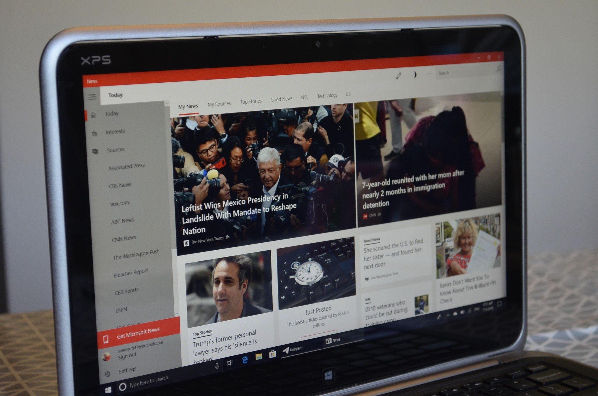
While the News app on Windows 10 didn't look terrible, it was looking dated. A newer version has rolled out to Windows Insiders which brings it more in line with Windows 10's Fluent Design.
This comes shortly after the rebranding and refresh of Microsoft News on iOS and Android, which is a great sign that Microsoft is keeping the app up-to-date across all platforms.
The app is only available to Windows Insiders, but I was able to get the latest version by electing to receive app updates without having to upgrade my PC to a new build.
Article continues belowAs I usually do with preview software, I won't be reviewing it but will break down the changes that have already happened and list what I'd like to see changed before the app's public release.
Modern news
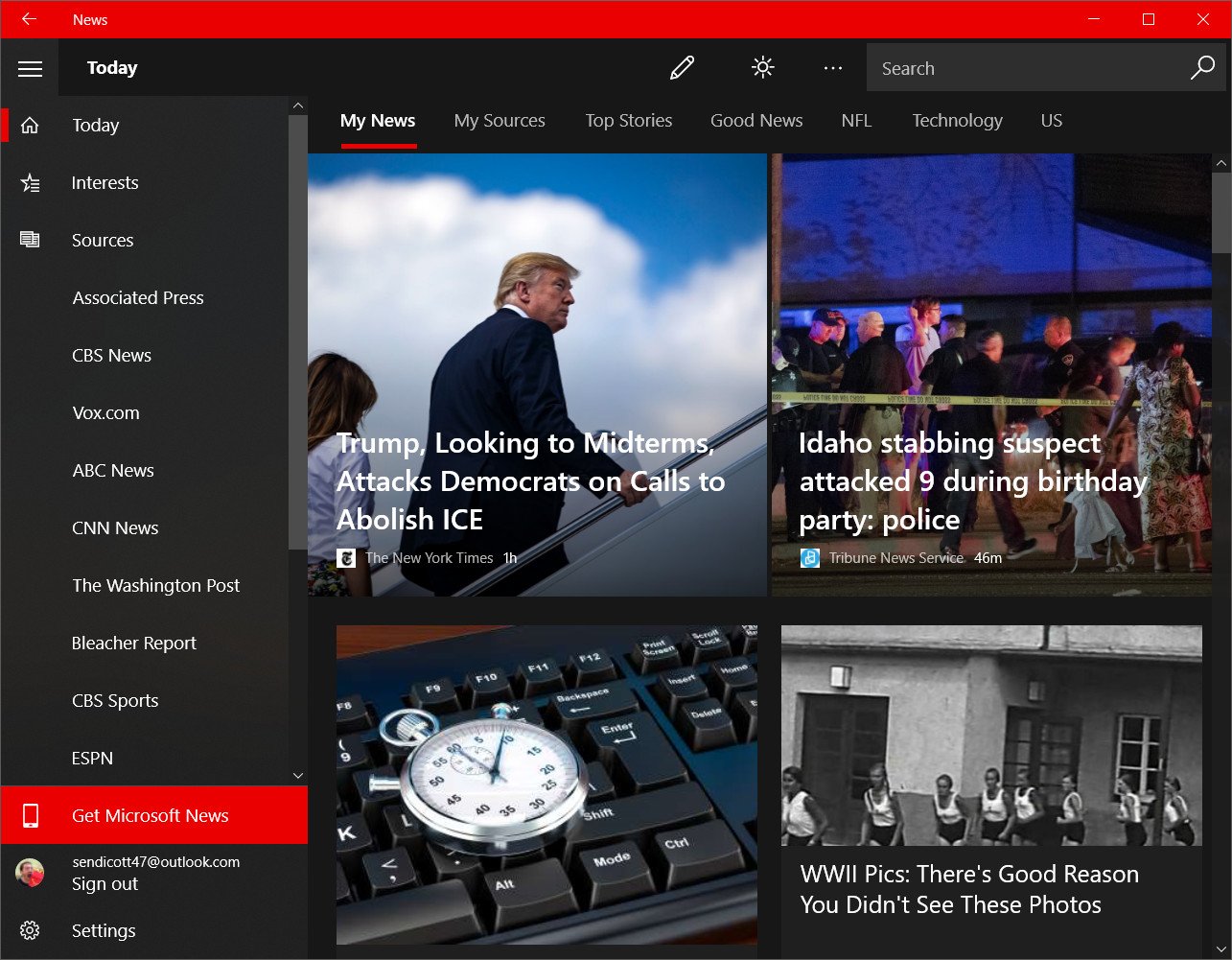
The core feature set of Microsoft News hasn't changed. You can personalize your feed by entering your interests, browse content by category, or view specific sources. Microsoft uses a combination of AI and hundreds of editors to curate the news that populates your feed.
News has always earned high marks from us because of its clean layout and ability to view news from multiple sources. You can also get breaking news alerts to keep you in the loop.
A more visual change that comes with the new version is the introduction of Fluent Design and a name change to Microsoft News. While there isn't much of a difference between News, MSN News, and Microsoft News in my eyes, it keeps the branding in line with the app's iOS and Android counterparts.
All the latest news, reviews, and guides for Windows and Xbox diehards.
The Fluent Design makes a visual change for the better and moves it further away from the metro designs of the past. That being said, the transformation isn't complete.
Lots of little gaps
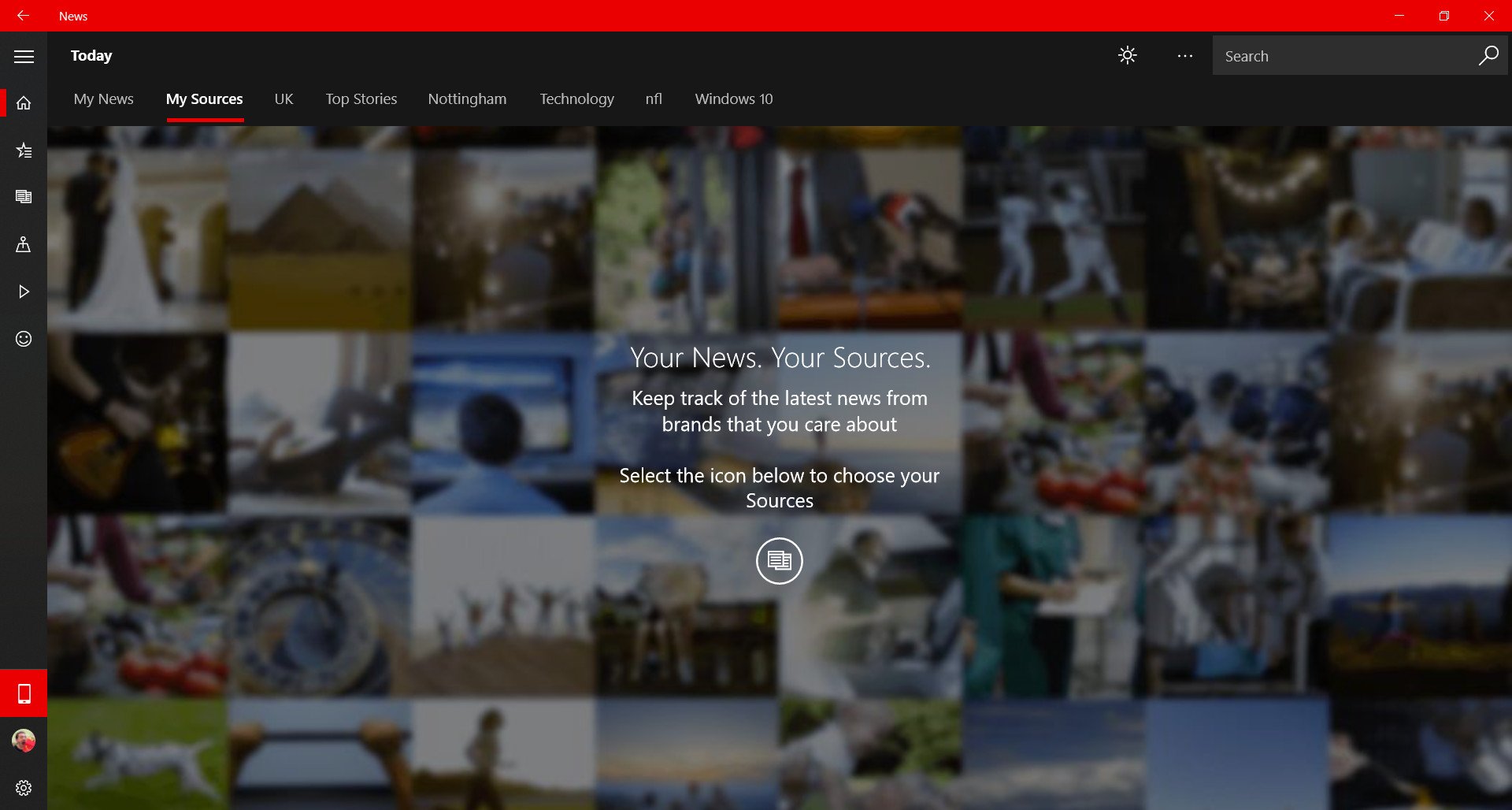
While transparency is nice, it takes more than that to make a Fluent Designed application. These requests might come off as nit-picks, but Microsoft is the one pushing the design language so they should be fully committed.
The app currently lacks reveal effects that change depending on where your mouse is over an icon. It also has a back button in a location that goes directly against Microsoft guidelines.
Apart from the design, I'd also like to see an option to continue reading an article on another device. I'd love this to work in both directions as well to create a seamless reading experience.
Some of these might be changed before the app is publicly released. Redstone 5 is still off in the distance, and a few of these features are simple fixes or utilize features that Microsoft has worked out within other applications.
Overall thoughts
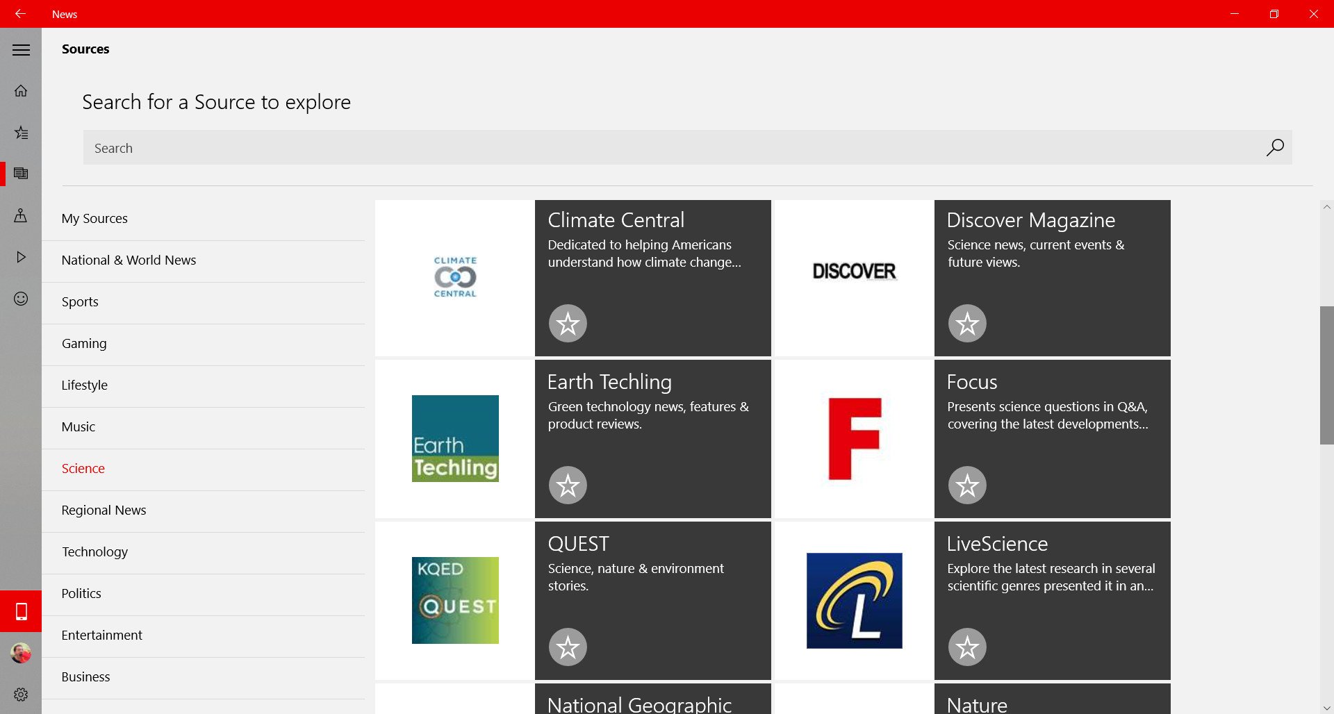
Microsoft News is one of the better first-party apps available on Windows 10. It presents news from a variety of sources in an attractive layout. That's only gotten better with the addition of transparency and gives me hope that the app will continue to be updated over time.
There are some gaps with the app at the moment, but that's understandable given this is a preview version of Microsoft News. Hopefully, these are improved upon and fixed before its public release.

Sean Endicott is a news writer and apps editor for Windows Central with 11+ years of experience. A Nottingham Trent journalism graduate, Sean has covered the industry’s arc from the Lumia era to the launch of Windows 11 and generative AI. Having started at Thrifter, he uses his expertise in price tracking to help readers find genuine hardware value.
Beyond tech news, Sean is a UK sports media pioneer. In 2017, he became one of the first to stream via smartphone and is an expert in AP Capture systems. A tech-forward coach, he was named 2024 BAFA Youth Coach of the Year. He is focused on using technology—from AI to Clipchamp—to gain a practical edge.
 Windows Central Insider


