Microsoft Edge Canary now has better font rendering, contrast and gamma improvements
Fonts are now crisp and clean, no caffeine.

All the latest news, reviews, and guides for Windows and Xbox diehards.
You are now subscribed
Your newsletter sign-up was successful
Join the club
Get full access to premium articles, exclusive features and a growing list of member rewards.
What you need to know
- Microsoft has improved font rendering in Edge.
- Improvements include enhanced contrast, gamma correction, and respect for user ClearType Tuner settings.
- This update is available in Edge Canary's latest builds and will come to normal Edge later.
If you are one of the people who has been dying to see Microsoft Edge get improved font rendering, your time is now. Microsoft has heard your cries for better contrast and gamma correction. The best font experience is now yours, as long as you're on Edge Canary.
Here's an excerpt from Microsoft's official announcement of its rendering revolution:
"In the latest Canary builds, we now have support for applying the system settings for contrast enhancement and gamma correction of text. You can enable this with the edge://flags#edge-enhance-text-contrast flag."
Article continues belowIn short, all jokes aside, it's a tiny announcement for an improvement that's easy to enable. Just remember that you can't have it in normal Edge yet, though the plan is for it to arrive there soon enough. For now, if you want all the benefits of enhanced rendering, hop on Edge Canary and manually enable your superior font experience.
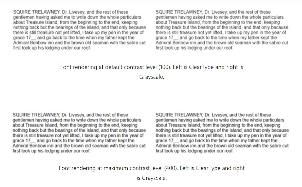
The image below shows what you can expect via the new settings and adjustments to font rendering.

This isn't the only font news to come from Microsoft in recent memory. It's also replacing its default font (type "F" in the comments to pay respects to Calibri), though it hasn't settled on a replacement just yet.
All the latest news, reviews, and guides for Windows and Xbox diehards.

Robert Carnevale was formerly a News Editor for Windows Central. He's a big fan of Kinect (it lives on in his heart), Sonic the Hedgehog, and the legendary intersection of those two titans, Sonic Free Riders. He is the author of Cold War 2395.
 Windows Central Insider


