Microsoft Research shows off awesome interactive live tiles for Windows

Update: Microsoft has now pulled the page and videos
While there's a lot to love about live tiles in Windows and Windows Phone, there's one element that's been missing: interactivity. Sure, they'll refresh with your latest notifications, but all you can do is tap on them to open the respective app. Microsoft Research is aware of this limitation, and is working actively to supercharge live tiles with interactive elements.
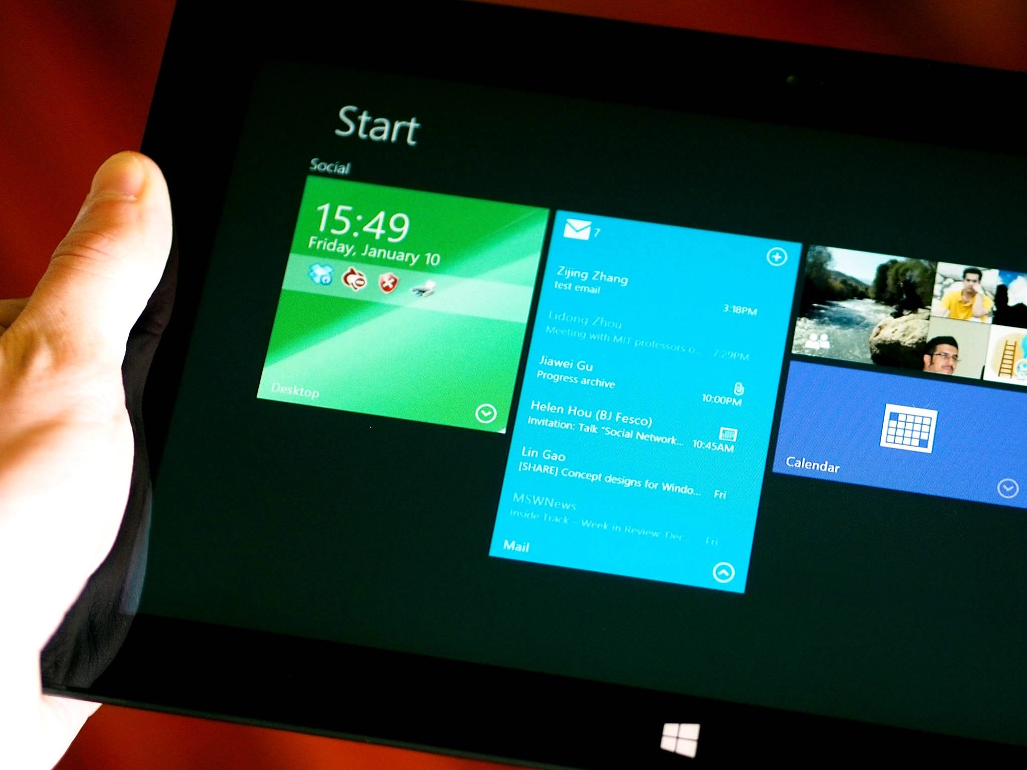
The gist of Microsoft Research's interactive tiles concept is that you can tap on the tile to expand its height into a miniature window in the start screen. For email, for example, it displays a list of your emails, and tapping one will open that specific email in the email app. There's an interactive live tile for the calculator as well, letting you perform quick calculations right from the start screen. Interactive live tiles can even live in the multitasking sidebar, letting you, for example, browse your OneDrive files and drag an item straight from that into your working app.
Thanks to Travis for the video!
The potential applications for these interactive live tiles are many, though there's no time frame for when we might see them actually hit Windows and Windows Phone (certainly it will be a substantial update to both the OS and SDKs).
It's a really cool concept, but we want to know: what do you want to see from interactive live tiles?
Source: Microsoft Research (1) (opens in new tab), (2) (opens in new tab) Via: Microsoft-News.com, Thanks to Jagar for the tip!
Windows Central Newsletter
Get the best of Windows Central in your inbox, every day!
Derek Kessler is Special Projects Manager for Mobile Nations. He's been writing about tech since 2009, has far more phones than is considered humane, still carries a torch for Palm, and got a Tesla because it was the biggest gadget he could find. You can follow him on Twitter at @derekakessler.
-
-
What about swipe right to clear notifications in WP 8.1?
-
Is that still happening? I don't remember any of the official articles pointing it out.
-
> The jist of Microsoft Research's interactive tiles concept is that you can ... Shouldn't it be "gist"?
-
Yes, it should.
-
When playing or not? Mine is live with the artist image when playing music
-
did you even read the comment ?
-
That should be on WP 8.1, supposedly. I guess we'll have to wait and see.
-
+1 (to the version mentioned in your comment)
-
I think it's going to be that you wipe the notification out of the Action Center and it clears the tile. I saw it demoed in a video I can't currently locate. I don't think it would make sense on the Start Screen.
-
This is AWESOME! We need it NOW!
-
Seems faster.. Even before we thought..! ;O)
-
Doesn't this then make live tiles more akin to widgets?
-
True that
-
Yes. Widgets which dont take up a monster amount of battery.
Besides, live tiles are native, widgets are not that native to an os and are clunky. I'd live to see this thing come to windows ! (not sure it would work for wp but who knows ?) -
A whole lot of 'talking out of your ass' in your post.
-
what are you talking about. Widgets are a native feature in android. it's just that the MSFT SDK lacks flexibility because, you know, it would be a tragedy of developers could be given control in MSFT eyes. and while some are worried this will cut down battery life, let reviews and darwinism do its job as it has for ages in windows where bloated apps get bad rep and good citizen apps get good rep.
-
That's not how darwinism works unfortunately.
-
It has done a fine job in android where power sucking widgets get bad reviews overall while good citizen widgets get good reviews overall. It also worked in the days where MSFT believed in empowering developers to create any experience they desired, you know, the desktop. You had bloated apps which everybody knew to avoid (real player), and great apps that would build a rep. Where is real player today? darwinism at work.
-
thats a poor example,. as the Real Player itself was actually OK at its core, it was all the extra revnue generating junk they threw in. unforunately you cannot risk ruining the solid (and best / most conistent) UI and battery experience which is what makes WP so wonderful by just unlocking your OS. MS has done a great, slow, methodical job of opening up the APIs in WP whilst still retainign control of the end to end experience. what you are suggesting would spell disaster for WP. (glad you're not working at MS ;) )
-
Believe this is totally correct. This being an awesome progression, at this time, is good enough
-
I completely endorse your views ! :)
+520 -
well, that is your opinion. BTW I'm not the one originally suggesting this, it is MSFT research and a MSFT employee who is actually doing this so, are you glad about that too? off course is MSFT was doing such a fine job, well maybe they'd have the user adoption to prove their stance is correct. Judging from the overall reaction that is quite positive across the boards to this news, it seems your stance is being challenged by the market.
-
Yes, the overall reaction to having this available soon is overwhelming. Just like I said.
-
Yup. But the greater point which is not really addressing your comment: the original strategy of restrictions was challenged by the market and this and other "180s" redmond has done as of late signal basically they are starting to listen. the demonstrator of the video even makes it obvious by being a bit critical of the fundamental flaws in the windows 8 design and how their concept fixes it. Off course this is just like with windows 8.1 update 1 and the preview of the mini start in win 9. Not really a progression as much an admission of bad ideas :)
-
As always, this will be seen in different ways, from too little too late comments, to wow and awesome comments. Can accept your view differs to mine. I came from Apple to Sony on Android, then to Windows on Surface. So this is an awesome progression for me. Always been WP since Windows Mobile though.
-
I personally hole heartily agree with your statement. Give Microsoft some time to see how such things fit into the OS. Making Windows Phone inconsistent and even unreliable battery wise wouldn't be a great move.
-
Ah the futility of hope
-
then again, they are brigning back the start menu, they are no longer charging for xbl apps, they made office for iOS before windows, and they didn't kill the nokia android set. this isn't your dad's MSFT clearly.
-
Widgets existed on Windows Vista before they did on Android.
-
That's not how it works. Some app will drain the battery and Microsoft will get the blame. Just how poorly written oem drivers would cause the PC to crash and people blamed Microsoft until Microsoft took control and started to certify the drivers.
-
Sure. And that's great - the interactivity of widgets is one of the things that makes them super useful.
-
Similar to the gadgets they had back in the Vista days
-
This seems more functional than widgets and less screen space demanding.
-
Yes, they wouldn't technically be widgets, they would be alternative views on the application they represent, just like the developer is able to alter the view when the app is displayed on half the screen, or is invoked from the Share charm (if it is coded as an app that can be shared to); they can present this small view for the tile. There would probably be a template page for it in Visual Studio.
-
well, techincally nobody except the team for the feature knows what they are, and even if they do, may change. But I would indeed prefer it to be a view just so as long as it is an un-restricted view meaning it doesn't have any limits on what it can run and for how long. I'm affraid from the "old" microsoft thinking where they would cripple it somehow to be less than what you can do with the share or settings view.
-
Would be awesome imho, to have this example fully working for next update...... but yes, lets see what Microsoft do....
-
Doubtful: in the longest video the guy specifically says " Windows Next" which was rumored to be the name for the next OS iteration .
-
Exactly.. and look how Microsoft pulled the page and video ;) I was surprised at how far in production they showed this new material. This will definitely be ready for e.g.; "windows 8.5" type of update, or if they wait until Spring 2015 for "windows 9"
-
This on a Surface 3 maybe. Would certainly buy :D
-
You're right, nobody knows how they would do it. I think I'm just saying how they should do it . I'm sure they know better though.
-
Yes. And this should have been in 7.0 right out of the gate. Live Tiles offer so little compared to what they could do. They are a perfect example of a promise gone unfulfilled, which is pretty much the metaphor for Windows Phone. Hopefully 8.1 will be a worthy upgrade and will be just the first of a rapid cadence of updates that will make Windows Phone actually competitive. Right now, it simply isn't. C'mon MS, move your butt!
-
But the original Metro style was aesthetically pleasing with a simple OS. That's what a lot of people wanted. Android for its great functional variety is difficult to use, as iPhone is simpler but more static icons. Now, Metro/Modern on WP can maintain that simplicity but also gain in functionality. Maybe WP 7 could have been this, but as the OS has been built recently, this for me is an awesome progression but maintains the unique simplicity of the original. Yes, others are impatient, others not so. This being an awesome progression, at this time, is good enough. Just saying....
-
Yes buy unlike widgets in android there would be a smooth progression from icon/small tile, medium/ live tile and large/ interactive tile. The entire interface would feel like a cohesive whole. I've always hoped they were heading here. Plz make this happen Microsoft.
-
A lot of people said that live tiles were akin to widgets before this video. Truth be told, the difference between widgets and tiles is that tiles aim to be the center point for everything: open app, view information (live tile), and with this video: interactive. In addition, it's a consistent experience across the board for users. It usually plays nice with your theme, battery life is controlled by the OS, etc. Widgets on Android is the Wild, Wild West. They require interaction from the user to even place them on the screen. Android doesn't do a solid job of getting them available front and center (or even how to get them there). And it also doesn't do a solid job of battery life. It also creates a disjointed and inconsistent experience for the user. In Android you have: The installed icon in your app drawer The icon on your desktop The widget And the thing is..aside from the icons, the widget doesn't guarantee that it'll launch the app. On Windows Phone you have: The installed icon in your app list The live tile (interactive, live information) Yes, it's close to widgets, but better, IMHO.
-
Huh? "Widgets on Android is the Wild, Wild West. They require interaction from the user to even place them on the screen. " Don't you need to pin tiles yourself too? IMO, what MS doing here is trying to make tiles working like widgets, which is going against from what initially MS wants, simple and glance. In other words, MS is catching up what Android has been doing all these years, just like with its new action center. I don't see how disjointed Android is. App drawer is like All Programs in Windows, while icons on the home screens are those apps which you used frequently. Just like how you pin apps from the app list on Windows Phone. Wdigets on Android allows refreshing on demand while tiles refresh only in intervals. Tiles are much more crippled as of now. Tiles will be more interactive, yes. But all these interactive tiles are making them looking weird and ugly. Because if it ain't a wdiget, don't try to work like one.
-
Yes, except you can fit more that a couple to a page because the home page scrolls in WP and W8. Plus they auto hide. I think this makes it better than the android widgets.
-
WHAT! this would be amazing.
-
Same thing should come on WP!!!!!
-
Yeah I hate waiting for tiles to flip, should just be able to swipe right
-
To be honest if this actually hits then it'll be amazing... Replying to messages, calculating, opening... Wow... You could pretty much have a whole OS of tiles!
-
Very function
So work
Wow -
much interact
-
No English well
-
Main screen is new app But the best feature that I am waiting is drag and drop from one winrt app to another, while i'm in split screen mode
-
+520
-
It's windows phone. Knowing Microsoft what they're doing is good enough. They won't give us more. Anyways awesome idea! Would love to see this.
-
And this is how the waiting starts again... WP 9?
-
+720
-
Where is the video link in WPCentral App?? Guys this is getting frustrating! I am all in for Newsroom thing and getting authors from everywhere but please don't break the routine. People pay for WPC app for its functionality Jay has worked hard for. No video in app, no app links is becoming a norm now sadly! :(
-
Absolutely, I thought it was by mistake when I did not find app download link in another article. Then did I realise this Newsroom stuff..
-
My thoughts exactly.
-
+820
-
And when are we getting it?? 2020??
-
Whaaat? There was one comment then I typed the one before this and now there's 6.
-
it happens some times when you start typing there is a certain number of comments and by the time you're finished typing many others have already commented. and i guess the wpcentral website remains static mostly (you need to refresh pages to view new content, unlike facebook). so that's what. :)
-
You must type faster :D
-
This is what it's all about. Bring this ASAP. Even if you don't bring it to 8...please make it why I want to upgrade to 9 next year.
-
Woooow...
-
Seems like the natural progression of things. Calculator seems good,and previews of pinned items would be awesome. Pausing and playing playlists maybe. How about pinned websites that refresh occasionally, and you could scroll through them, that'd be useful for visual blogs and such.
-
At least it looks too well put together to never see the light of day. to never see the light of day. Encouraging.
-
Worth mentioning.... Hello there is a clock on the Desktop tile. NICE
-
I still can't believe Microsoft hasn't addressed this sooner. That should have been from day one
-
Great work..hoping to see this with Windows9 and WP9 "Threshold" or whatever it is called,by the way,14th doesn`t seem to be coming quickly enough ;)
-
What exactly are they doing? Just bring it on. I would love to play/pause music from the tile instead of jumping into the app every time.
-
I think we have the volume controls.. ;) and play pause on tiles means that it takes up valuable space and you dont get to see the artist image. I dont think that much cluttered look would suit wp. It sounds good for windows though.
-
I have a question. Does the artist image still show on the Xbox Music tile in WP8.1? Or is it just the static tile like the current Xbox Music app we have for WP8?
-
Iit should have it. I'd hate it if it doesn't, i really dont like the Xbox music app, so I'm already feeling like I'd be losing a pretty good app when 8.1 comes.
-
Do you have the 8.1 update? The taskbar now has pause for Xbox Music. Plus, if your keyboard has any music controls, they should work.
-
It becomes widget not Live tiles
-
Not exactly.. Widgets aren't native, so they're clunky.
-
Also another difference is that these would be tiles when closed, and 'widgets' when open. So the app would only be running while the tile's open, and not all the time. Conversely, with standard widgets the app is always open in the background to keep it up to date.
-
This would definitely be a game changer that the IOS/Android users would envy. Anybody who has doubts about Modern UI will finally see the light of it. It is time to say goodbye to W7. Hopefully, the Cortana and more gesture controls will be married into the Interactive Modern UI. Will Windows 9 and WP9 to include those new features and capabilities? I sure hope so.
-
Would be nice to see this in Windows 9 (and by proxy WP9). This on a Surface Mini would be fabulous for me.
-
Too much focus on tiles. I don't know if that would be a good idea.
-
It's just a demo from one design team.
-
It is not only a great idea but also advance the Modern UI to the next level. It would leave IOS/OSX/Android/Chrome in the dust. It makes Live Tiles alive, dynamic and useful. I also see its potential to merge Desktop and Modern UI into One someday. It would be a sweet integration.
-
Want it now!
-
Lets just hope they make this happen.
-
YouTube on live tile. Watch multiple Tv's on each tile
-
Brightness control , volume control all in live tiles . Nokia Folder like apps should open directly at start screen and much more features
-
oh, so many interesting ideas!
-
Not a fan.
-
Of course not. You're a human, not a fan.
-
Its nice but i don't like how the interactive tile just move the other tiles to the side. Looks so amateurish. Just polish the UI more. But it somehow reminds me of just having resized windows in desktop.
-
errr, if you resize a tile, it does this. That is wha windows 8 does by default.
-
What if you needed two of these "expanded" tiles which are on top of the other? You wouldn't be able to touch the bottom one.
-
If you are ever at a point where you need to multi-task on the start menu then you already have a workflow issue. The start menu is a glorified launcher and makes a poor productivity platform. I tend to agree, if they are going to do this then they really need to get the active tile to 'float' above the other tiles, and then go back to the normal size when the expansion carrot is pressed again, or if focus is taken off of the tile. For things like media players they can simply affix widgit-like buttons on the larger tile settings, entirely removing the need for expansion.
-
Metro menu turns into modern desktop
-
When has the desktop ever had these features. It did have widgets for a while, but they where resource hogs and never really took off.
-
Yeah, once you make tiles interactive, they become widgets. And widgets are just apps with a very small feature set. I've been working on some mockups for a redesign of the Windows Phone Music+Videos player and I've wondered if its tile should be interactive, with buttons to skip, play, pause, etc. But I don't think you'd want this kind of interaction which is very prone to errors — accidental touches, confusing contexts — in a big scroll view like the start screen.
-
This is where a good swipe control would come in. Touch the top of the tile and swipe down(or swiping from left to right on WP). This could open up the buttons for a quick access. That way the buttons don't get touched unless you're meaning to touch them. I'd like this for music reasons. Being able to hit play all from my home screen without having to launch the music app would make things easier for when I'm in the car. Or even used as a way to force a tile refresh if people wanted to save battery by setting the tile to refresh manually. However, the one downside to my idea would be that it just gives more complication to the UI for new people. Much in the same way people get all worked up about Win8 and the charms.
-
This is an obvious next step for Live Tiles. I would be surprised if we don't see it in Windows Phone 9 or at least Windows 9.
-
Plus games
-
I am so looking forward to this
-
I would love this function on my lumia 520 also a button to be able to stop my music without having to restart my phone
-
Quick settings, download it -> pin "stop music" -> enjoy!
-
I already have the app but it would be nice to have it included in the music player controls
-
Oh.. I really cant believe someone does something like that !! (restart to end music)
-
Pause it. It is then stopped ... Or if you really want it gone launch a game that has background music and then close it.
-
This is amazing.
-
I like the idea of being able to more closely tie-in WP with windows apps. No idea how that's supposed to work... does it recognize the app using the camera and sync everything via cloud so you can continue typing? Would be cool.
-
Yeah, i was wondering how they will do what they said.
-
Could be nice, but could also quickly turn into total chaos! (ok, a little overdramatic) I hope they find a way to make it interactive while still not destroying the metro style. Of they could make it interactive without adding extra buttons it's be nice, because if all the live tiles on my start screen had a little circle with an arrow it could quickly become pretty ugly...
-
would love to see this on my Earthquake app instead of having to open it just click on the largest one to see more detail
-
Loving it•
-
This could be a game changer. One of my frustrations with live tiles is the lack of deep linking in W8.1. I also see something interesting on the Flipbook live tile but when I click on it I'm just taken to the frontpage and I have to search for that story. I am blown away by this solution. It can't come soon enough.
-
I guess this is another way to do multitasking. Alternateively just let us do what the old windows do, resize windows and open as many of them as memory allows.
-
I would be very surprised if Jolla doesn't have a patent on this.
-
Patents can be licensed.
-
So long as it's done in a way that looks and feels elegant, and isn't just a blatant copy of widgets from Android. It needs to be unique and modern, in needs to be Metro.
-
Awesome. Bring it to windows 9
-
I love it. Would like to tap an email and see the live tile expand to the right to see the contents of that email. Kind of like how the Azure portal expands to the right as you progress.
-
That's a cool feature... I saw the video on another website...
-
well i guess it's ok to put a little bit of ad to my own design back in 2013.. http://reformforce.tumblr.com/post/74277086604/12-windows-concept-part-1-start-and-tiles-has they do need to focus more on ui!
-
Very nice concept artwork. I love the use of radial context menus, it works OK for mouse users, but really opens up better possibilities for touch, gesture, and controller inputs. The issue of a context menu popping up out of the side of a screen is that it is easy to loose track of what you are interacting with... which kinda defeats the point of a menu that relies on context.
-
I want this now
-
"Concept"? That looks like its ready to ship. Unusually polished and stable for a concept.
-
Indeed, it's not a concept, it's a working thing. And the prove is right here: http://www.winbeta.org/news/interactive-windows-live-tiles-shown-could-it-be-part-windows-9. In the video, he doesn't say concept, but Windows.next.
-
I would love this. Hope it'll happen with W9 and WP9. That would make crapdroid and iCrap users soo jealous :P
-
Brilliant. The first thing I imagined was selecting the interactive function and watching the tile expand while all the others shrink down. That would enable more use cases over embedding interactive features into a fixed tile size. It would also look really cool. :)
-
Description sounds cool, all the videos are down here and at the source link.
-
I hope they come back. I just see an error message where I assume videos should be: The resource cannot be found. Description: HTTP 404. The resource you are looking for (or one of its dependencies) could have been removed, had its name changed, or is temporarily unavailable. Please review the following URL and make sure that it is spelled correctly. Requested URL: /apps/video/ifVideo.aspx
-
lol the site crushed :P
-
I very much like the idea, at least for Windows 8. These "widget-ish live tiles" do take some space and screen real estate. But I see this working on Windows 8 and Windows Phone too. For example, if I need to replay quickly to a friend I just got the message from, it could be easy. Or if You use FB messages a lot, then You could have conversation pinned to the Start screen. In my imagination but it is possible. We could have like "small apps" pinned to a Start screen. It would use a lot of RAM I suppose... But this is the future.
-
The entire Microsoft Reasearch site is down for maintenance it says. Can't believe I missed seeing the video by less than 16 seonds. Hopefully it will still be there when the site comes back.
-
http://www.zdnet.com/microsoft-experiments-with-making-windows-live-tiles-interactive-7000028348/ the link there still works.
-
They need to revise Windows Media Center. Interactive tiles are not urgent although they can be cool.
Media Center is long overdue -
THIS!!!! Absolutely THIS!!! It's EXACTLY what I've been saying since WP7 and when Windows 8 came out and everyone started whining about needing to stay stuck on the old desktop! The potential of the live tile, in my opinion, has always been about virtually removing the need to have a bunch of windows open on a desktop. Half the windows people have open on the desktop are doing what? Feeding information. That's it. That's what live tiles currently do well, more or less, depending on the developer. The piece that has been missing is the ability to interact. I don't keep ANYTHING on my desktop anymore. It's completely empty. If something on my Start screen RUNS on the desktop, so be it. But for those who insist that they really need 15 windows open on their desktop, my point has always been that if Microsoft would push live tile capability you could eliminate a LOT of that legacy. The Xbox One sort of gives you an example of this. When you are at your home screen your "active" app occupies a larger "tile" on your screen but doesn't obscure the other tiles. And you can interact with it, to some degree, depending on the app. Then you can ZOOM into it so that it takes over the screen. Seriously, Microsoft Research needs to make this the central effort moving to Windows 9.
-
basically android widgets, what everybody has been asking them to do for years and many have dismissed as bad. I'd love to see this. Give power to developers instead of limiting them to the bizantine and restritive tile service model.
-
No, these aren't widgets. And these are much more organized than the widgets. This is more of an subset access to the app itself. I've been pushing for this since the beginning. Tiles would just be "levels" of app interface. Dead tiles, as they are already when you pin old desktop programs to the Start screen, simply execute the program. The next level just feeds you output from the app--as they do now. The level after that would be just like in the Microsoft Research video, with interaction. Finally, you open the app altogether. It makes sense that not all apps need to have the interactive level and benefit best with purely streaming, and it makes sense that I, as a user, may WANT a specific level of interaction. So, hopefully, what we will see in the future is developers writing the apps to accommodate a choice of interactivity level.
-
dont like it, it turns into widget. widget = sucks.
-
I would see this as being more functional than a widget as well as taking up less screen space.
-
Totally agree. This is a Widget on demand! Very nice idea.
-
&%#@. Microsoft Research is back but the videos ain't.
-
It got taken down, I was watching it before :(
-
http://msrvideo.vo.msecnd.net/rmcvideos/212286/dl/212286.mp4
-
I have been wondering if I was the only one wanting interactive live tiles. Its a great idea and needs to become reality.
-
Ah the good ol' days of Vista gadgets are coming back (which android ripped off by calling widgets)!
-
What I want to see are hub tiles... Folders that flip to cycle through the tile content of each app inside.
-
Potential, its abput,that
-
Potential, its about that
-
The videos are broken and saying that there is a server error. Does anyone know where to find another link?
-
A nice idea, and an essential feature I'm glad they're at least looking into. However, I really don't like how you have to expand them for the app to become interactive. That'll mess up your carefully organised Start Screen for sure. I'd prefer just having them locked as large/wide tiles you can interact with. It also defeats the point of the tile since if you have to tap it to view the extra information, you might as well just load the whole app. I also wonder how it will handle the up/down scrolling on Windows Phones. Somehow the OS has to distinguish whether you're scrolling the tile or scrolling the Start Screen... though I guess that's what the expanding of the tile is supposed to help distingiush. Can't win, eh.
-
I agree about them needing to do something to fix the tile organization aspect (my idea would be to have focused tiles hover above the others), but the launch time on apps are annoyingly long, especially on lower end devices. Being able to glean more information from the tile itself without having to open the app can be a real lifesaver for many low end users.
-
Looks very cool.
-
I want wp8.1 with interactive tiles if possible with the upcoming one of the gdr updates out of all 3
-
A music player tile with active buttons would be amazing..
-
My name ain't 'jagar'! xD
Gotta love what MS is going to do with windows next! -
None of the links work on my phone...
-
Dont like it. It turns the tiles into widgets, and widgets are old-school. It would also confuse users A LOT.
-
Video pulled out source:twitter
-
Like to see this for Xbox Music. Volume, play and pause controls and track and album info.
-
I want to see it in... Windows and Windows Phone 9.
-
Reminds me of longhorn's sidebar!
-
This would be awesome. Microsoft has tried several avenues in the widget arena, from the early days of Windows Vista and 7 providing desktop gadgets and sidebar gadgets, to the live tile system in Windows 8, and now hopefully, a nice hybrid approach for interactive live tiles in a controlled manner. In the Android world, I never got good vibes with using widgets since everyone had their own design philosophies (or lack thereof). Microsoft is putting in lots of thought in how they would work now. Can't wait to see what the research team produces.
-
Good thing I got to see them before they got pulled. Didn't anyone download it?
-
http://tinypic.com/player.php?v=2mzcpqe&s=8#.U0gz1YdOWpp
-
I'd rather them focus on better windowing or screen splitting schemes. Like instead of widgetizing the live tiles, let me run IE on the left 2/3rds, Skype on the upper right 1/6th, and a calculator on the bottom right 1/6th---and on a Surface too! I'm tired of getting less live tile and split screen configurations because I'm on a 10" screen since it is fully capable at 1080p
-
About time someone inside Microsoft figured this out... Maybe on 8.2 or 9.0?
-
Do they really need to keep the word "Start" on the start screen? Come on, its in the way and does nothing.
-
At least patent this idea before competitors use it and claim it to be theirs.
-
I like the idea in general, but they need to make it so that the tiles do not move around. The speed and efficiency of any start menu or launcher is in the muscle memory of knowing where things are. If things move around then it can get rather annoying very quickly. Perhaps make the tiles 'normal' sized, but when focus is put on them (or the expansion carrot is pressed) then they can hover slightly above the other tiles to expand and have more options? Then when focus is taken off the tiles go back to their normal size. Is it just me, or is it ironic that pretty much every improvement to the Metro UI essentially focuses on lessening the use of full-screen metro style applications? I mean, my favorite part about the current start screen is that I don't have to open the apps for weather/stocks/news/etc.
-
Awesome))) wanna use it. And for win. phone)
-
Asian design with those literally DANCING tiles on the Start screen = EEEWWWW.
I know it's raw, but looks like Korean Android smartphone nightmare: chaotic, dirty, overloaded UI. Minimalism is still trendy and rich. Chose the other way, MS -
What are you, an alien? What a dumbass. Siberian fox eh?
-
Looks pretty nice. I wonder if this will ever make it to Windows. Would be useful for things like the calculator.
-
This is an amazing concept!! Hope it makes its way in win9. Beautiful and efficient
-
Google and apple will implement ms idea first.... Coming to windows 9.5 in 2017
-
Don't want to be a Debbie downer but I'd rather have more output freedom and no input on live tiles. Contextual tiles are good enough- just work on making apps start faster, and allow tiles to update faster with smaller text. Input would have limited uses and benefits, probably. I mean, live tiles are about seeing information at a glance. A good concept. Input on tiles sounds like a possible clusterfuck if not handled carefully, as well as not having much value besides toggling WiFi. Which it probably won't be able to do.
-
I like the idea, but I don't like how they implemented it in the video... IMO, it looks nothing like W8 or Modern UI but a mess of rectangle widgets. I hope there'd be another way to make the tiles interactable rather than this one, a new layout at least.
-
THIS... IS... AMAZING!!!!!!!!!!!
And the intriguing thing is this looks legit, like it's using the actual existing apps and platform and it's ready working and ready to go alive! I'm sure there's still a lot of testing and polishing but this is EPIC!!!! I can't wait to see this + bringing this to WP + Cortana.... oh my goodness, make it happen sooner than later! :D -
These 'windows' are the future of windows. Just don't forget to stay true to the modern UI design language.
-
All that can be done?? I mean, these are icons after all. Don't get me wrong, I appreciate innovation and that would be kind of neat for some content. But next thing will be widgets and other borrowed features.
-
I love this concept. Natural evolution of tiles. Should work awesome on desktop, too (presuming that MS will allow tiles on classic desktop).
-
I love that kind of Sideshow bar with Tiles on the left of the desktop.
-
Widgets don't follow an organized layout. They move everywhere. Not to mention the clutter they cause. The dissimilarity in appearance of two different widgets is vast as they don't share a design language.
Tiles on the other hand are 'tiles'! You need to remind yourself of those tiles you see on the walls, perfectly measured as they are, in an organized layout and uniform appearance. Widgets and tiles are different, people! -
You know I'm not really that impressed with the video... its nothing special. Now maybe if the tiles where cubes and could be swiped up, down, left, right then you could expand them into email calculator etc but I'm sorry that's not impressive at all. Now I remember Microsoft bought a company that had a UI with 3D tiles where's that tech....
-
Yeah, this needs to happen ASAP.
-
What I am afraid is, others company will copycat this one and make it like they reinvented them.
-
I need this in my life.
-
I've had a slightly different idea, but I like this one a lot. I really hope they do this, and give programmers the ability to customize their live tile functionality. My idea is very simple, but powerful. You may be aware that while typing on Windows Phone, if you hold down on the "." button, it has a flyout menu with other available punctuation marks. I would like for this type of menu to flyout when long-pressing any live tile. Currently, this action will unlock the tile to allow you to rearrange your start screen. This functionality could be retained by requiring a long-press with two fingers to move tiles. Picture this: you long-press on the phone tile and are given options for the keypad, favorites, contacts, and to redial the last few callers. You simply drag your finger to one of those options without lifting, and in one action you are already where you want to go. For email: new message, refresh, and a list of folders. Games: a list of your recently played games. Brightness tile: a list of brightness levels with an "Auto" setting at the end. The possibilities are endless.
-
Love this and don't care what anyone says about how its like widgets. These look cleaner than widgets and I always thought live tiles were supposed to become something like this WAYYYY earlier. But to be honest for windows phone, simply the ability to update the tiles on cue by maybe swiping right or even individually by tapping a small icon on the tile would be enough for me for now. As it stands live tiles aren't useful enough. But I love the concept FULLY Posted via the WPC App for Android!
-
TBH, MS is playing catching up again. Interactive tiles? Acting like widgets on Android? All these are making the tiles looking even mroe cluttering and ugly. Seriously MS?!
-
love it.
-
Maybe part of windows 9??
-
okay this would be awesome!!!! but.. it'd be limited to begin with though. like you saw in the video he was ony able to do it with certain tiles (microsoft apps mostly).
-
Best idea thus far. This sure speeds things up instead of waiting for an app to load. The ease of access is amazing. This should have been the original idea
-
This is awesome, takes full advantage of the live tiles
-
Would be useful if executed properly. The left-most tile however, looks damn ugly. Almost Android-like.
-
Are you kidding me? This is THE single best thing ever in the world of live tiles\modern start screen!! This is what the live tiles should have been from day one. Imho this makes the modern start screen A LOT more productive. It's an entirely different beast now. I sure hope they get this out SOON. By the looks of it, they are pretty far along in development! Can't wait for this! For me, THIS is magical! :P Edit: check out 2 more videos here: http://www.neowin.net/news/microsoft-posts-then-pulls-videos-showing-interactive-windows-8-live-tiles
-
Agreed. I'm just thinking about how this would be used by people in the resort business. Signing people up for shows, skiing trips, restaurants etc. All touch, all Microsoft. The name you know.
-
Yeah!! Leave that boring icons-in-grid design bites the dust.
-
i envision folders working in the same way
-
I anticipated this 3 years ago. The TILES will eventually function as "mini programs" such that when you right click or hover on an app's tile it will allow you to interact with it quickly and minimally, but when you left click on it the full blown program/app is launched so you can take advantage of the program/app's full functionality. This is one of the reasons why I decided to switch back to Windows-- from being a primary Linux user back to a primary Windows user and from being a primary Android phone/tablet user to a primary Windows phone/tablet user. The elegant concept behind the TILES (it's still evolving) is only one reason. There are other reasons and the ones that are on top of my head right now are: (1) Office suite: I'm a heavy user of OneNote, Powerpoint, Word, and you won't believe this-- Paint, (2) years of experience and skills acquired tinkering with PCs, configuring Windows settings, and using Windows-based programs (other than Office, e.g. Photoshop, Illustrator, etc), (3) Choice: this is obvious with desktops since we always custom-build our desktop PCs but even when it comes to win8.1 touchscreen devices-- plenty of choice in terms of price points, form factors (laptop/tablet hybrid is my favorite), and sizes (waiting for the huge 20" tablet PCs to get cheaper), (4) Schizophrenia: ironically many people hate Win8 because it is schizophrenic (rapid switching between desktop and touch-screen mode) but this is a feature that I personally like, (5) Grand unification of all Windows devices, i.e. consistent user-interface in all types of devices (this is still evolving). That said, I still use non-Windows devices (e.g. homebuilt Ubuntu PCs, Android tablets) but only for occasional browsing and downloading of crapware.
-
Let me First GET WP 8.1................... NOW I Gotta Wait for THIS
-
I suggest folks get in touch with Joe Belfiore via Twitter and use UserVoice, I would *really* *really* *really* like to see Interactive Live Tiles on my Windows Phone and Surface!
-
Daymnnn, this will be amazing, imagine having this on windows phone,you can scroll on a tile?? WHOA
-
In msg it can directly replying on the tile itself