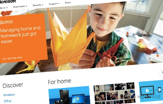
Microsoft testing a more Metro influenced website design
By Rich Edmonds last updated

Microsoft has published a sneak peek (opens in new tab) at what a potential redesign could look like for the software giant's online property. With Windows 8, Xbox and Windows Phone all making use of the new Metro design language, it only makes sense that they further improve other products and properties.
We see this as a superb move. Microsoft appears to be improving all aspects of the company to match upcoming product releases. It's also essential to have an aesthetically pleasing website design to attract potential customers, as well as increasing the number of returning visitors.
Let's just hope the company actually rolls out the new design across the entire network of websites for consistency. What do you guys make of the direction Microsoft is heading with the design?
via: LiveSide
Rich Edmonds is Senior Editor of PC hardware at Windows Central, covering everything related to PC components and NAS. He's been involved in technology for more than a decade and knows a thing or two about the magic inside a PC chassis. You can follow him over on Twitter at @RichEdmonds.
-
I love it
-
I tried to put five hearts there but they just erased whatever came after... =(
-
I have to agree with you completely. The design is much more pleasing on the eye than previous versions.
-
The website is awesome. It is laid out well, clean, loads on th phone quickly and all the moving parts work.
-
Love the site in my Lumia 800... :D
-
I like the concept. It needs more refinement though, specifically with whitespace and text sizes. It all feels a little too loose.
-
im going to be honest for the first time i enjoyed visiting Microsoft main site
-
+1 I have to agree. I can actually find things easier, compared to the way it looked before, it felt like I had to read through everything to find what o was looking for.
-
Looks f-n great.
-
The site also reflows pretty dramatically based on your browser size. Try shrinking your browser window and you'll notice that the page has 3 or 4 different layouts to best suit the current size. Pretty nice.
-
The need to do this with SkyDrive and live.com. Those sites are terrible as far as UI goes.
Get the best of Windows Central in in your inbox, every day!
Thank you for signing up to Windows Central. You will receive a verification email shortly.
There was a problem. Please refresh the page and try again.