OneDrive for Windows Phone updated with promised UI changes
By Sam Sabri
last updated 
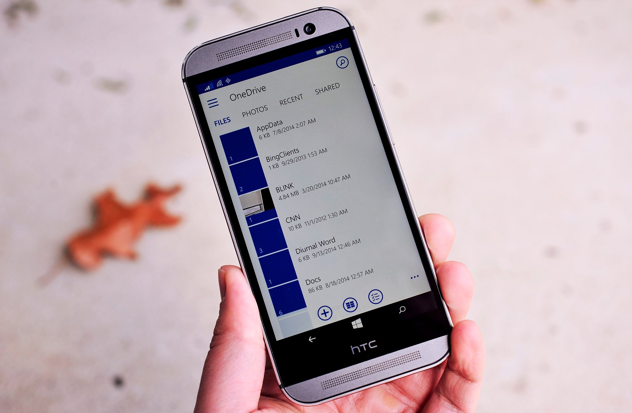
OneDrive for Windows Phone has received a big update today. Head to the Windows Phone Store and you'll see version 4.5 of OneDrive sitting there. This is the promised update that hopes to correct earlier (and polarizing) UI changes made to OneDrive on Windows Phone.
Here's the full changelog for version 4.5 of OneDrive:
- UX updates and improvements
- All Photos view
- Search updates for personal and work accounts
- Shared with Me and Recent views for work accounts
- Access to your recycle bin, so you can view and restore personal and work items
- A new page for viewing the properties of personal files
- Easy access to app ratings from the settings menu
- Bug fixes and performance improvements
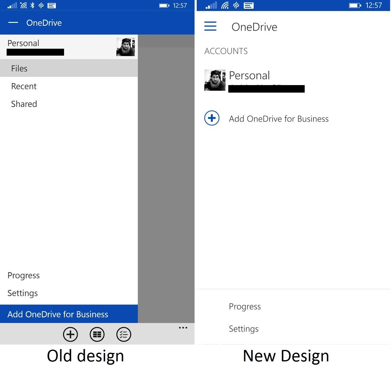
After updating and playing around, you start to notice the new UI improvements in this update. For example, the top bar was removed and the OneDrive team redid the entire upper section of the app. Buttons have been re-added to the lower app bar as well.
Grab today's new update to OneDrive and let us know what you think of the UI changes!
Thanks for the tip Jose A!

Windows Central Newsletter
Get the best of Windows Central in your inbox, every day!
208 Comments
-
Yay
-
Yay
-
No more androish style
-
looks very material to me...
-
In terms of design: 'Flat' was before 'Material'.
-
Material looks very flat to WP7 users
-
yeah down vote him cause he speaks the truth, also down vote my comment for having common sense, since you don't have anything smarter to do. LOL!
-
I said this when they first showed off KitKat and stand by it today. Had they not mentioned the OS in those videos, people would have thought it was Windows. Material design looks a lot like Metro. It seems that all of the tech companies are heading in that direction so there's sure to be a lot of similarity, but, regardless of what name they give it Google didn't do it first.
-
Yes but both MS and Google have their own 'Minimalistic' look. Microsoft started with Modern, Google started with Material. MS is getting rid of Modern and taking some elements of the Material. So his comment is valid.
-
This is incorrect. When "Metro"/Modern and flat design was introduced by Microsoft in early 2012 (or late 2011), Google was till pushing the "Holo" design for Android 4.0 Jellybean. Material design is their new approach in 5.0 Lollipop, which just came out; so it's quite obvious who took idea from whom. Modern is certainly not going away, but it's evolving after two years. His comment is invalid because it makes no sense in saying that an existing and fully developed design concept is the result of copying a much newer design ideas.
-
Of course it's new but it doesn't look like Modern look from MS, only thing they "copied" is flatness but not the position of elements and such, where MS is now copying current Material design. No one of them invented flat design.
-
I think it looks a lot like the original modern design from MS. Not so much the panorama and pivots that WP7 had. But if you look at the more enterprise apps that MS produced back then like Office, Dynamics and to some extent visual studio. The modern UI look that they had with those is very similar to this. Tabs/menu items just being words in capitol letters. It does have the swipy feel of WP7 for navigating. Icons all have square corners. If you read the stuff the designers at ms were putting out to describe modern ui they were often saying it wasn't about panaramas etc and more about making things functional without excess chrome. Hamburger menu's and search being on the right also comes from the web more than anywhere else. Websites were doing that long before any os.
-
No matter what, all will say MS copied.
-
They copy from each other. :)
-
Search button and hamburger icon still not in place search should be down below and hamburger top right corner just like what Cortana has ... Imo I am sad an sorry...i miss true metro...hope 10 will be an evolution for better in design
-
Agree with you, search is always in the down bar and hamburger in top right, I also think Configurations and Progress could be easily added to the down dots menu, still don't understand why to have 2 menus.
-
+W2
-
I'd argue against always. Hamburger style menus can appear on either side on mobile sites and apps sitting at the top and to the left. Example mobile sites/apps with menu on the TOP LEFT: American Express, Best Buy, Home Depot, Fidelity NetBenefits. TOP RIGHT: Geico. I don't like them. It's confusing to the WP platform where the panaramic menus and "..." usually provide the same functionality. I get app continuity across platforms, but I don't fancy WP conforming to other platforms. For a MS app, it certainly doesn't seem necessary but I may have missed something. Just IMHO.
-
After seeing the CNN, Facebook,Foursquare, Swarm and One Drive updates, they all have something similar...top part logo, burger etc remains static while bottom part of page is metro-ish (swipe). If it isnt coincidental and this format is here to stay, i think it would be to make life easier for developers to produce/port apps to Windows, which i dont think is a bad thing.
-
Yup, terrible location. I've submitted feedback.
-
material design u will like more intially but will get bored i. the future. metro is forever design. ine will love even after 100 years.
-
I agree. Metro simply doesn't age and it does not tire your eyes. I'm always so exhausted after looking at an android or iPhone, too much noise!
-
Moron, spell out your words. itard.
-
More Androidsih style
-
Yay
-
Phew. Goodbye hamburger style. Welcome back modern style.
-
The hamburger button is still there
-
as it should :) MS is no longer a UI leader. it needs to follow google and apple standards
-
You must be fun at parties.
-
Wtf
-
I don't really mind about it as long as they make it look modern-ish. Even Cortana has it.
-
Not really. If people were interested in the Android/Apple UI they'd have bought those phones. It's not like the live tiles aren't a clue that the UI is going to be different from the get-go.
-
Then care to explain why Google chose material design?
-
What are you talking about?! Apple and android's UI are boring and identical. Windows' UI is different, interesting, enticing, and unique in most ways. Get a clue
-
The standards from apple and google are garbage. For one thing, Apple puts core UI controls at the top of the screen, which is horrible for one handed use on anything bigger than a 4" phone, so it doesn't scale well. They were forced to implement the cludgy "reachability" thing to get around it. That's poor design that shouldn't be followed.
-
The moment Google and Apple abandoned their design language and chose what resembled Windows Phone 7 UI was the moment Microsoft became the leader in UI design.
-
True.
-
Are you retarded?
-
INDEED
-
Yayyyyy
-
That's a pretty sexy design
-
Yay
-
Cotcha ..
-
Relieved to see that old "Androidish" ui gone now :) I don't mean to say Android ui is bad. Android ui on wp looks bad.
-
Android UI is ugly compared to WP
-
amazing how the less windows phone and windows 8 it looks liek, the better. I still freaking hate the square things though.
-
Then go buy yourself android and apple products
-
Why are you using a WP if you don't like tiles?
-
i don't think he using windows phone at all
-
This is much more pleasing to the eye. Less white space and better use of spacing on the screen. I also like the addition of the "photo" view; I don't always keep all photos in the same folder. Thank you One Drive team!
-
You said what I was thinking.
-
after seeing this, I want WP Facebook app to look like that....
-
I would like to see the metro design again
-
And hubs.....
-
Plzzzz give password protection as in Android version...
-
This is definitely the right place to request features for the android onderive app.
-
He was asking for a feature that is (apparently) already in the android app. But I agree. Wrong place to request it
-
Maybe I should send a post card to Microsoft bout it...
-
Put your request in the OneDrive Uservoice, the reason this UI got updated was because people requested it over there. http://onedrive.uservoice.com/forums/262982-onedrive/category/86085-windows-phone They listen there and make changes. Requesting things on unrelated comment sections is like shouting into a barrel, nobody will hear you.
-
Lol, love it when I see these kind of condescending fails!
-
You're password is your Microsoft account. Lock your phone when you put it down and OneDrive is locked. The only reason Android has a password is because it's not tied to you're phone account.
-
Couldn't have said it better, we could as well password the email app too!
-
Wow! That is way better. Love it
-
Sam Sabri.. Lots of mistakes while typing .. I'm giving you 10 times composition :p
-
It's the adrenaline!!!
New update!! -
Ok Yasar Harafath. I'll go in and fix it now :p
-
:D good boy ;)
-
Sam :') u r so obedient, proud of u
-
It looks awesome, but I really can't feel the favor of WP in this new UI
-
I just want to log out of my account at some point. What ever happened to that option?
-
+1
-
The Android version is way MUCH BETTER with the possibility to add a four-digit password!! Safety first ... Wake up, Microsoft!
-
They've made it abundantly clear that they also prefer Android and iOS over Windows, shouldn't be a surprise anymore. This is Satya slowplaying what he's wanted to do from day one. Drop Windows Phone, Bing, and Xbox. Although with Microsoft's current direction Xbox would probably be better off if they weren't a part of Microsoft.
-
Wow, you don't actually know what happens at Microsoft do you? They have explicitly stated that they are never dropping Bing ever. They are integrating it into just about every product that they design. That's not something you can just get rid of. I also don't really see Xbox going away and don't see how it would do better by itself. In its current state Xbox can be bolstered up because Microsoft can do things for Xbox that a little company couldn't do such as exclusives or timed exclusives. That is a large draw for many people as they want the content first.
-
Yeah, you don't know what you're talking about. If he wanted to drop Windows Phone, he would have never approved the Nokia acquisition (he was opposed at first, but later reversed his opinion). They're not going to get rid of Bing when they're mostly done building the infrastructure and when it's integrated into many devices and services. Cortana is solely reliable on Bing.
-
You're not a smart person...
-
Password support next please.
-
+920, Sure. Make us choose whether to connect automatically or password first
-
Put in a feature request at Uservoice and it'll probably get done. Leaving feature requests at a new website comment section accomplishes nothing. http://onedrive.uservoice.com/forums/262982-onedrive/category/86085-windows-phone
-
Good but still lacking PIN protection.
-
Not good enough
-
Yep the app is looking is so good
-
Way better than the previous.
-
This shows that Microsoft puts our words in action.
-
Some of our words...
-
IKR, I feel like one half of Microsoft is committed to make WP a better and a more demanding OS while the other half doesn't care at all.
-
And what should they do? Abandon any and all plans to actually build and improve on their OS to sit and listen and cater to the ever-changing, and painfully unoriginal opinions of the hive mind that can't seem to quit looking at other OS's for "inspiration"...? Should they push out updates on a weekly, or even daily basis to keep up with whatever people are crying about today? I mean... yeah man, that'll surely improve progress.
-
I'd say very little..
-
:D !!
-
so nice I use it every day... one drive is amazing! i love it!
-
Better, but still meh.
-
What does "meh" actually mean. I ser this quite often and its meaningless. Can you not be more descriptive of what you like/don't like?
-
No they can't, because they don't know. They just want what other OS's have... be it "better" or not.
-
still nothing exciting
-
Better than the previous version but still no transparent tile
-
When do we get group folders for OneDrive. I recall hearing they were working on it.
-
Still ugly lol
-
Are we still behind ios/androis in functionality?
-
Yes. And always will be.
-
Nope. OneDrive is fully integrated in WP, in Android and iOS it's a glued on patch job.
-
Looks awesome now! But they still need to fix the Music function. 1. it should have a menu on top like pics and 2. when playing music you cannot exit the OneDrive music without turning the music off... That really unuseful :P
-
Is it me that the time on each screenshot is misleading. It could have been that the OLD UI screenshot maybe from previous article did not verified, but it seems that Old UI screenshot was taken after the New UI screenshot... it's strange to notice! And also Daniel's account info in last screenshot with Old and New Design having same timestamp...
-
Umm...different phones, maybe?
-
Yay
-
I quite liked the old design, but this is even better. Move the recycling bin to the hamburger menu and I am golden.
-
Same here
-
Yes!! Edit. Then remove the burger menu. All that's required is ...
-
Thank you, One Drive Team
-
I like it a lot better. :)
-
much better!
-
I actually like this one better! I thought that they would just make it worse.. Nice!
-
It's better than before but I still hope they'll redesign it and make a unique version of the app with a consistent UI across Windows 10, Windows 10 for phone and Xbox One.
-
Thank you, OneDrive team
-
Sigh at having the m8 be the phone of choice for this though. Like the newish design though
-
What's wrong with showcasing the phone? It seems odd that someone would actually make that comment unless they cared.
Edit: Nevermind, you changed your comment. Now it just sound petty. -
Eh, would rather seen a different phone of choice. Besides given that many people dislike the design still, it almost seems ironic that they chose a phone that shares an android counterpart to display the windows version which still looks androidish more than modern :D Oh wells I guess :P
-
They meaning the Windows Central team who posted this story, or...?
-
Watching you cry like a little baby every time the M8 is shown or mentioned is hilarious.
-
The fact you follow my comments regularly just to reply is just as hilarious :)
-
Oh well.
-
Yet still, the settings are places in the idiotic hamburger menu instead of in the bottom ellipsis menu, where they belong.
-
UI change was a waste of time. Open a contract from your people hub, that is the Windows Phone look and feel. In OneDrive they only changed the icons for words in a size and color that is completely different, and they also left the hamburger menu. Still don't understand why we need two menus.
-
Yes that is better :)
-
Sam uses Daniels account? :P
-
Let's hope it's more stable. Trying to move files around today it kept lagging and crashing.
-
i miss the "metro" days, everything looked so consistent and cool
-
I miss the hub / panoramic views we had on WP8 in Photos in particular.
-
This. I miss the photo hub more than anything. Now it's a boring, bland, black screen with thumbnails. Lame.
-
Oh to have the photo hub back. That was a unique and beautiful experience......
-
Totally agree. That made WP so appealing. Posted via the Windows Phone Central App for Android
-
I agree, please bring it back! Loved it back then in wp8
-
Ugh...
-
Much better now!!!
I seldom found myself using OneDrive on phone when having that Androidy UI a while back. -
Windows phone apps needs fluidity and soft UI
-
Looks awesome. Good work Microsoft.
-
Still can't pin protect it. Maybe someday it will have all the features of the android version.
-
I just don't understand why WP users throw so much hate at Apple and Android. All three platforms (iOS, Android, WP) have strengths and weaknesses. I use android and windows phones, but I personally would never use a iPhone. I don't hate it, its just not for me. Why do some WP users feel its "us against them."?
-
Usually in response to dumb ass we are better type comments from the others.
-
It's massive fanboyism, plain and simple.
-
meh. the [3-line menu + OneDrive] on the top is still not necessary, should be included in the slide-up as before. Search should also move to the slide-up as well. the Text (Files Photos Recent Shared) should be much bigger. Metro is loosing its distinctive flavor. What a mess.
-
Weren't they suppose to remove that android Menu button??
-
Burgers are just soool inconvénient. Even on a 4 inch screen it's a pain in the ass.
-
It's good, thank you
-
Much better...
-
Hm, I certainly like some elements of the old style better. Like some elements from the new style too... I guess it's just hard to please everyone! :-D
-
Nice step in the right direction. The top and pivots look much better. I'm still not in love with the hamburger and it's placement, but at least not all it does is allow you to pivot between accounts which downplays it's awkwardness. Search is fine at the top, but why not have it in the command bar at the bottom? What is accomplished? One ongoing problem with the hamburger tray is that side swipes and left swipes (pivot) are hard to separate, making it either cumbersome to reach or error prone to swipe to. Curious to see if these changes are WP only or if they make it over to Android. Posted via the Windows Phone Central App for Android
-
The hamburger menu is unnecessary, that menu needs to be relocated to the 3 dot menu. Everything that is in the 3 dot menu can be moved or removed. Refresh option isn't necessary, add pull down to refresh. Add a circular button on app bar for new folder, as well as a circular funnel button there for sort. Then move the recycle bin as a trash can icon next to search at top. Then they can relocate the entire hamburger menu to the 3 dot menu as a full screen popup. That makes sense! For one, the UC Browser developers have proven the power of the 3 dot menu over the hamburger menu for Windows Phone. Hamburger menus need to stay in Android where they belong & Microsoft needs to return to the Modern design language.
-
Awesome
-
I have a icon no update for me aaaahhhh!!!!!! Verizon!!!!!!
-
Why Sam always post Daniel's Screenshot¿
-
I hate the new interface over the old one!!!
-
Now just get rid of that hamburger atrocity!
-
Here here, was going to say the same thing. I hate the whole hamburger menu thing period. I really and genuinely hope MS doesn't start going crazy with those as Windows 10 continues to grow.
-
Kill the hamburger button!
-
Still takes for ever to play 25second videos...always resuming on a 25 second videos
-
A problem with your connection?
-
Thank you OneDrive team! We apprecite your work, bring back the logout option to OneDrive and Skype, put an option to clear recently played song on Xbox music app for wp, add photo hub like I was in wp8, add new games into the games hub rather than showing them separately in the menu..
-
You can logout from Skype since last update. Agree on other points.
-
Oh I didn't know logout option in Skype was back, then I must download it on my phone, it was always bugging me before:P
-
Looks more wp, me like it
-
Impossible! This would mean that the WP team listens to people.. and the insternet says that just doesn't happen.
-
So, should we expect to start seeing hamburger menus popping up all over Windows 10 apps?
-
I was just waiting for this update. After reading about last update I never updated Onedrive. Now I'm heading to the store. But that the line hamburger menu :| Microsoft should think out of the box for a replacement of that.. Like they invented live tiles for replacing icons. Pass this to your design team Microsoft.
-
I just noticed I made a typo... *That three line hamburger menu
-
Those three horizontal lines are also there on Cortana, I don't think its a big deal..they have done away with the Hamburger bar menu which will suffice on my opinion
-
I didn't mind the last design, but love this even better very nice.
-
Looks better. But i still have to sign in to my OneDrive for Business (Office 365) account mulitple times. It keeps forgetting me.
-
I still don't like it we need to start a trend #killthehamburgerbutton and bring search back down as a pivot
-
What's the point with keeping the hamburger? Why not put a settings entry at the buttom menu?
-
Yes! So much about this app seems like it's just barely taped together. The fact that there's both the bottom menu PLUS a 'hamburger' menu. Also hard to believe that being a 'baked in' MICROSOFT app, it doesn't have transparent tiles! The app works and is ok, but there is so much more they could do.
-
I just hate that I can't uninstall the app. I don't use it/want it.
-
Like it better
-
Ahhhh much better. The old update had this messy inconsistent look to it. Like trying to combine two different things together but not actually combining it but just filling holes of one element with pieces of another. Ended up lacking any kind of cohesion.
-
Oh thank god
-
Why can't I log out and log into another OneDrive account? This was possible before.
-
New design is better. That's update for one app down, only ten or fifteen more apps to go.
-
Still no transparent live tile. =/
-
My words.
-
#ripMETRO
-
The one before the "android" update still looked better. (!)
-
I guess having password protection would make too much sense. Its the obvious failures that keeps WP second rate.
-
It's a positive step in the right direction and shows that the OneDrive team are listening to us and taking on board constructive criticism. My original complaint is addressed with the pivot menu being returned and updated. Still not happy with the hamburger which now competes for usefulness against the 3-dot menu bar. It adds unnecessary confusion when trying to navigate what is a straightforward cloud-based storage app.
-
<p>I have the latest update (3.6.3) and it doesn't look like any of these two versions (before or after), it looks very old (like the previews on the app page)!</p>
-
Glad to see they changed the UI, this looks much better now.
I don't know, I think the Search-Button would have been better placed on the AppBar and the Hamburger-Button, well... But as already said, I'm glad they changed the UI to a better Windows Phone fitting one, the other one they introduced was ugly as hell.
Btw, why doesn't write MS the changes they made in the app in the "what's new?" section? They introduced it and I've never seen them using it... -
A really half-assed effort. Hamburger button is still there and search is in the wrong spot. The only thing they really changed is the headers instead of the dumb icons (new Disqus app has them). Still not as nice as what we had before they decided to Androidize it up.
-
Android material design is way better than this.
-
Yeah, sure it is. Your Google money is on its way.
-
I guess this is the way app will look in windows 10 , they're just watching our responses to the design , as in TechEd the very same design was used for OneNote on the video of the phone
-
Love the new update with the user interface the way it now is. Kudos to MS for listening to the public and fixing it. Now if only Skype....
-
So what was that ugly giant grey bar for anyway? Either way, an improvement. Still far from what it could be, but oh well, better than a poke in the eye with a hot stick.
-
Better. It is time I will express my differences with Hamburger Buttons. Please Microsoft and Microsoft owned services(I'm looking at you Cortana and One Drive), stick to ellipsis(three dot) menu at the bottom. Thank you!
-
Amazing update....just want the search button at downside though
-
Oh and this update is just crap , the design is so ugly and immature , it's completely trash , I HATE IT
-
This looks much better than before. Thanks Microsoft for listening to the users.
-
Humburrgerr... Hambarhgarr.... Haaammbaarrgurrr.
-
First thought, it looks a lot like the Facebook app style for windows phone. I don't recognize this style as modern UI anymore. All the styling reminds me of Android. Only the app bar and the square tiles reveal metro/modern UI. I actually like it on my Nokia 1520. Okay font size, typography and spacing. Yes Ai might prefer this. But on a lumia 520 this is awful. Font is too small, too roomy. On cheaper and smaller lumia devices, things need to get a bit bigger. This is a smartphone, not a oc size screen. Less may be the new more, but for heavens sake, please keep tekst at a legible format and organized.
-
where is the transparent tile
-
No log out button..
-
Where have i seen this before? That's right iOS. Smh
-
Still Android style
-
There is bug now... I cant upload photos :( lumia 920
-
Yeah it still has the hamburger but faaaaaar out you guys just bitch
-
The onedrive app in ios is way better than this. No option for camera roll backup. Fucking useless. In the ios app i can do that in one tap.
-
I know this is usually a tongue and cheek comment but it really does seem faster!!!
-
I go to the Windows store and the version is still at 3.6.3, so, I don't know what the "update" is all about, but it sure does not say version 4.5. Even when I use the QR code above. Did somthing happen between the time this story was posted and I loged in to read it? Did I go to the wrong windows store?
-
Has anyone been able to longon to a OneDrive for Business account with this app if their company has enabled ADFS?
-
WP UI already has a hamburger button.. it's the ellipsis (...) , stupid! why not use that?!
-
What about introducing the possibility of offline files? An internet connection is not always available (or is expensive when abroad in roaming)