What do you think of Bing's new, curvy logo? (poll)
Do you like the new Bing logo better than the old one?

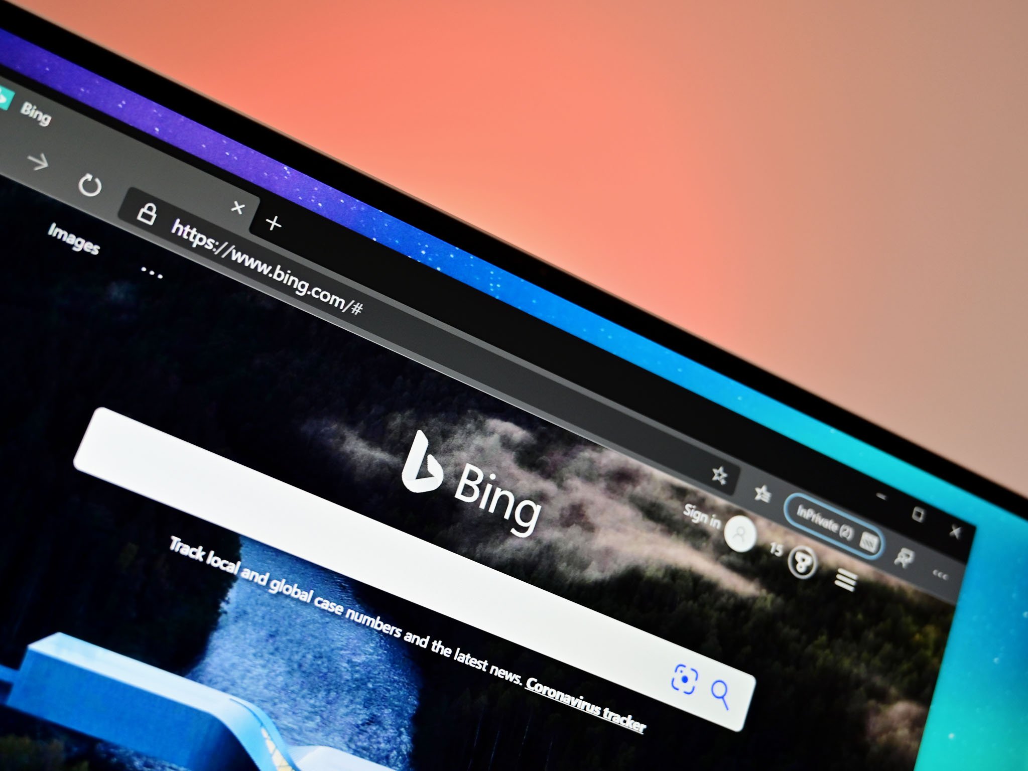
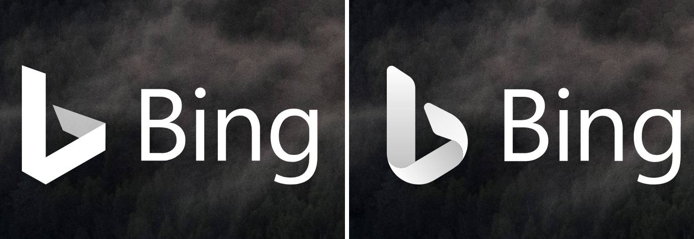
There's a new logo on the block, and it belongs to Bing. The updated look started rolling out to some Bing users this week on the web, though it hasn't arrived for everyone just yet. Whether it's a test, or it'll eventually make its way to everyone, it definitely fits in with Microsoft's broader Fluent Design vision that's circulating to all of their icons and logos these days.

The most apparent change with the new logo is that it's much curvier than the older one. There's a nice hint of shading and depth to it as well, but it otherwise sticks very close to Bing's signature lowercase "b" branding.
With any updated design, however, there are going to be those who love it, those who prefer the older look, and some of us who just don't care either way. What camp are you in? Let us know in our poll below.
Article continues belowBing isn't the only place Microsoft is flexing some design muscles, of course. The company has detailed a huge range of updated icons that are headed out to its apps across Windows, Android, and iOS. According to the last poll we did on that icon revamp, a large number of you prefer the direction Microsoft is going.
All the latest news, reviews, and guides for Windows and Xbox diehards.

Dan Thorp-Lancaster is the former Editor-in-Chief of Windows Central. He began working with Windows Central, Android Central, and iMore as a news writer in 2014 and is obsessed with tech of all sorts. You can follow Dan on Twitter @DthorpL and Instagram @heyitsdtl.

 Windows Central Insider


