91% of Windows Phone clicks were only for Camera Roll, urging Photos Hub redesign in 8.1
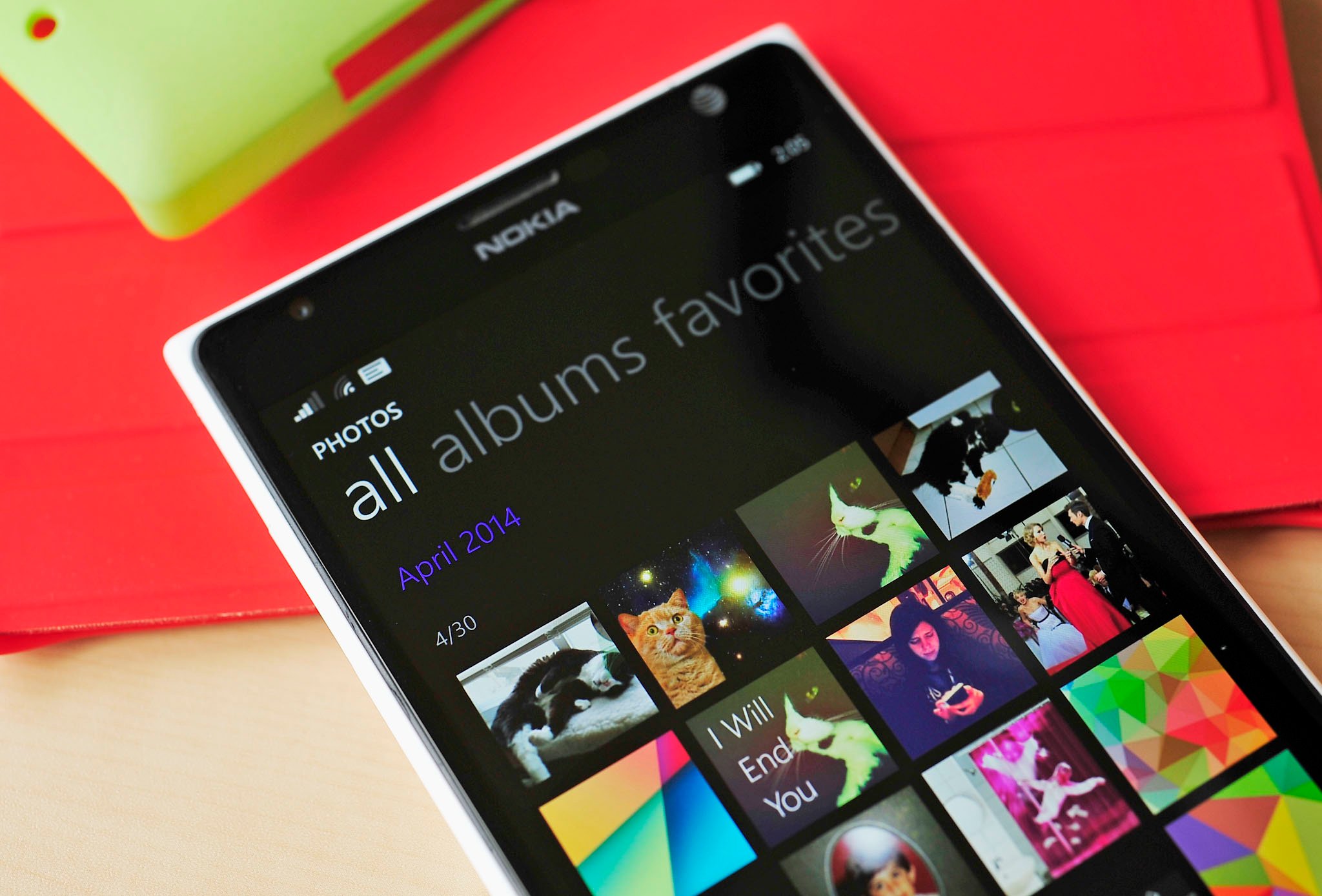
Microsoft’s Joe Belfiore shared today why they gave the Photos Hub a drastic makeover in Windows Phone 8.1. For instance, opening the app now takes you directly to your Camera Roll, organized by date instead of the old menu system. This change reflects how iOS also organizes photos, though it deviates significantly from how the old Photos Hub did things.
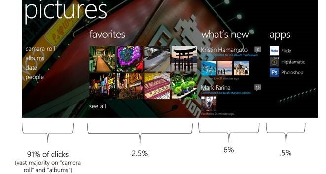
Telemetry data, which is collected from how users interact with their phones, was collected and revealed today by Belfiore during his Reddit AMA. The most interesting aspect was that a massive 91% of users only opened the Photos Hub to go to their Camera Roll, with just 0.5% using the ‘apps’ integration. That’s a stunning number, but reflects how many of used Photos Hub in the past. In that regard, it makes total sense to put the crowd favorite Camera Roll front and center, leaving Albums and Favorites to the side and omitting the Apps section.
While we’re sure some of you really like the old Photos Hub layout, we’re with Joe on this one. But what say you? Does the telemetry data reflect your usage? Has it changed your mind?
Source: Reddit
Get the Windows Central Newsletter
All the latest news, reviews, and guides for Windows and Xbox diehards.
Daniel Rubino is the Editor-in-chief of Windows Central, head reviewer, podcast co-host, and analyst. He has been covering Microsoft since 2007 when this site was called WMExperts (and later Windows Phone Central). His interests include Windows, laptops, next-gen computing, and for some reason, watches. Before all this tech stuff, he worked on a Ph.D. in linguistics, watched people sleep (for medical purposes!), and ran the projectors at movie theaters because it was fun.
-
exactly shows my usage...it didn't work
-
I used more the 'Albums' button than the Camera Roll button, so now I always need to swipe to the right to see my albums....
-
Why can't it just be set by the user?
-
My thoughts exactly - they could have kept both, and telemetry data would tell them which one people liked best. Even if the new style was preferred, no reason to kill the old one.
-
The only problem with adding 100s of Customization options is the size of the OS. each option would be adding more and more to the size of the OS and there's always complaints at how little storage is left....
-
They should have had user option to set the default page at least. So each tine you open the Photos Hub, you get to choose whether you want to open to Camera Roll or Albums.
-
God forbid a person has you use the thumb one extra swipe. I to used to use album but just to find cameras roll 8 times out of 10 the other time was tho see my saved pictures.
-
This new lay out is so hot it got me laid
-
Same here!
-
You used to press the 'album' button and now you have to swipe to it. Doesn't seem like anything that effects the usability. If anything it becomes slighty faster and more accurate because swiping is easier ans faster than pressing a specific part of the screen. Having said that, its sad to see the uniqueness of WP disappear. Although its understandable seeing how little of it is used. Still I feel its important to keep the default picture, music, documents apps all 'hubs' that integrate content from services (OneDrive) and other apps. For example the picture app on Windows 8 was massively dumbed down by removing facebook integration.
-
They could have still kept the background though.
-
I kind of agree but also think it could be distracting.
-
It would totally distract People. I'm actually preferring this version of Photo Hub, it's completely more user friendly, I was using storyteller on my 1520 but not anymore.
-
I agree with the Daniels.
-
Distracting in what sense? It's not like you need to focus on a super complex task, or trying to view a Live Tile; that's right, if it's so distracting, then the Start Screen background and 3 column Start screen needs to go! It's one thing to want minimalism, but it's also another thing to completely strip an app of any beauty and User Experience.
-
It was so unspeakably beautiful that all I did was flick through the panorama and eventually forget why I opened the app in the first place :P No, but I mean when your were looking at the photos in the albums there was no background. That view has essentially just been brought forward to make using it, and getting to the pictures you want to see (which may have been very pretty) faster.
-
+1020
-
Distracting? How? Lol. Why remove something just coz ppl don't use? I still like the old UI.
-
Where are you going to put a background at if you're directed straight to your photos? Behind all of the photos themselves? That's obviously horrible design... They did the right thing with photos.
-
You obviously have no design sense. I can easily make this new photo design something beautiful of the sort. You put the picture behind all other photos while the background is darkened. It's so simple and not distracting whatsoever. Just like what people said about background tiles or what ever, Microsoft had the right design and so can this if implemented correctly. I hate seeing comments like this cause they can't think of other design aspects besides putting a full, bright picture as the background behind other photos. . .
-
Obviously you could make it look okay if you really tried, but the general user will not. More options, contrary to popular belief, is not always better. Sometimes they lead to a lesser quality experience overall, regardless of how they do so. As a side note, you act like Microsoft already did this for Windows Phone 8.0 and took it away in 8.1. They did not, and this is because they understand design and how their customers will utilize it. When you clicked on any section of the photos hub, the background disappeared and went to solid black. Nothing has changed; they only removed an unnecessary step in going to look at your photos, and that step happened to include a background. Not to mention that it would completely destroy the logical, simplistic design language of Windows Phone.
-
Well the background photos are pulled from My favorites and in my case always make an interesting and surprising layout. So not having this anymore makes for a less personal and dynamic experience. WP7.5 really rocked design wise to bad the new versions aren't as bold and interesting.
-
I'm with App Dev. There was a reason Windows Phone used these backgrounds and it was because they made the apps bold, interesting and engaging. That design sense differentiated WP from iOS/Android in a good way, and in a way pretty much everyone was proud of.
-
I liked how the picture app was defined by my own pictures. They could have added pictures from my favorites to the background. Just lower the light of the pictures so that it doesnt distract. RudyHuyn does this as well with his TVSHOW app. Pictures from my favorite shows are on the background even when I scroll through a (picture-tiled) interface of my shows. It doesnt distract me at all. In fact I like it when a show I havent thought about in a while pops up in the background and brings back some good memories.
-
Putting a picture behind a grid of pictures is how you make something beautiful? That's your design sense?
-
Same as putting makeup on your face to better your appearance.
-
Yeah, you make no sense.
-
Bad analogy.
-
You only need to look at the Wp8 hub to see that they had beautiful text headings as links to Camera Roll , Albums etc. The latest 8.1 app is just ugly and utilitarian. It's just an app full of endless tiled thumbnails!!! The wp8 hub, sensibly mixed it up.
-
If basically 91% of all clicks ended up taking people to their photos, that means that 91% of the time they would be adding an extra, unnecessary step to get to where people want to go just for the benefit of seeing a cool picture for .5 seconds. I don't see the logic.
-
Uh, you can keep the "cool picture" but still rearrange the layout. There are many ways of achieving beautiful, engaging design and those can be executed to match whatever your new app goals are. What they did, though, was just decide to "chuck it" when it comes to design. The new apps are not only boring, in some cases they are ugly. Check out the "update" number icon in the Store app. Man, somebody said "just slap it on there."
-
Where would you put the picture? Having a non-solid color background in a situation where the background takes up less than 40% of the screen makes no sense. It's the same reason why they gave us tile backgrounds on the start screen and not actual backgrounds - because actual backgrounds make no sense if there isn't a substantial amount of the screen available to show off said backgrounds.
-
I disagree. Even if you can´t see much of the picture it still heavily influences the overall appearance of the screen. For example the white or black background on WP heavily effects the overall appearance. Having multiple colors or a picture behind it would totally change it. As can be seen here: https://www.youtube.com/watch?v=M6P-uXwG-18 True enough you cant see a lot of the picture itself so if that is your goal then it doesnt work. However in the picture app there is still plenty of room left. Above and below the picture tiles there is a lot of room left. And you only have to look at RudyHuyn's TVSHOW app to see that it doesnt distract. It's the iconic WP look and its a shame to see it disappear.
-
Ugly and utilitarian, like in fact all the new built-in apps. Whoever was responsible for beautiful design in Windows Phone clearly isn't there anymore.
-
Ugly? It's how majority of Windows Phone looks like, it's how it always looked if you used the Photos hub like 91% of people and actually looked at your photos. Utilitarian? Oh boo, clearly a photo viewer needs to be as inefficient as possible just so it suits your narrow, stubborn view of beauty.
-
AngryNil summed it up. If you don't like the photos design, you don't like Windows Phone design.
-
I would advise understanding exactly what you just wrote...
-
I would advise understanding that monotonous pivot layouts have been used system-wide since 2010 and they are currently pervasive throughout the OS. Battery Saver, Calendar, Data Sense, Email, Me, Messaging, OneDrive, Phone, Photos, Settings and Store. If you think it looks bad, using Windows Phone must be absolutely painful for you.
-
Please tell me how inefficient the original hub was, because I'm absolutely dying to know. How has this been improved? Seems more inefficient actually. How many steps does it take to get there?
-
How about you ask any of the 91% of users who were using the hub to access their images? This isn't even a point of contention anymore, Belfiore has just publicly stated that they optimised around efficiency of the most common use case. Here, I'll drive the point home for you: Smoked by Windows Phone 8.1: how do I delete an image I recently saved from an image search? 8.0: tap tile (includes terribly slow transition animation), tap albums (includes another slow transition), tap Saved Images album, tap image, tap on app bar to expand it (includes another animation), tap delete, confirm. 8.1: tap tile, tap image, tap delete, confirm.
-
"Why remove something just coz ppl don't use?" I think you answered your own question there...
-
No. Lol.
-
I totally agree with you. This version is just boring as hell. They should have built in feature that you can turn off. Shit starting to look like boring ass Android,IOS
-
True..
-
Yes it was distracting. But a blurred background ? I'm hating that they took the background out, otherwise this one is fine. But the backgrounds were a beauty !
-
Yeah right.... Posted via the WPC App for Android!
-
I have almost nothing against the new Photos app, but it would be good if, when i open it, it show me the folders and not ALL my photos. I have to be careful with what kind of images a save or receive on my phone now
-
Put a black background if you get distracted by your favorite pictures
o.O -
I also agree but let us (the user) diced that. with th option to have a background or not.
-
Indeed.
-
I like new.
-
I don't miss the background at all. It seams more clean and better without it. And at the end of the day, its a feature that means and does nothing. You go to the hub to see your photos, not a background.
-
I can see PHOTOSHOP app in pic.....;-)
-
Kind of makes you wonder.. Although, being a Photoshop CC user, the phone/tablet versions are usually terrible.
-
I like the new layout. But since Microsoft is on top of all the customizations why not let the user choose which menu to open up to, via settings.
-
Agreed, the background feature looks unique. Posted via the WPC App for Android!
-
Honestly, I just liked seeing a cool background and than pressing camera roll.
-
Even though this is off topic, brings to a discussion on 'Rooms' I love chatting with my friends on it because we have a cool background...if only we can do backgrounds in the messaging hub. We just love backgrounds.
-
A background should make it more attractive...
-
+820
-
Makes a lot of sense to me know. They can do this to tell us why stuff got removed. That will calm people down a lot...But the background image is innocent on this.
-
I disagree. There would be times when I was going to show people pictures and so they're looking at my phone. I would open the pictures hub and a picture might be shown that I don't want this person to see. It never happened to me, but I could see the risk.
-
Good point.
-
The Photos Hub background only cycled through the pictures you manually selected as a favorite. Same for the Photos Live Tile in WP8. If you didn't want someone seeing the picture in the background or on the tile, just don't favorite it. It's actually more likely to accidently show someone a picture by being in your camera roll.
-
The way it works is, you have an option for it to cycle through your camera roll, favorites, or select a static image. If you do nothing, the default is to cycle your camera roll. If you start to favorite stuff, which I've noticed most people don't until I tell them this, then it will cycle those. It hasn't happened to me, but some of my friends have told me about inappropriate photos surfacing.
-
Yea but only photos you favorited are used as the background, so just favorite safe photos. I haven't updated to 8.1 but isn't is still the same thing for the photo tile?
-
In 8.1 you can choose between all, favourites or 1 photo :)
-
The photo tile in 8.1 has three options. Shows all photo on the tile, only favorites, or just a single photo.
-
Glad that they still kept the favorites option ! I hate that windows 8.1 (on laptop) cycles through my camera roll photos, most of which are photos of copies/books, text.. That's why i dont keep any images in my photos library, just 5-10 photos i want to be displayed on the live tile.
-
But the backgrounds :(
-
+1020
-
New layout is crap that's a nice way of putting it
-
+100
-
yep... new UI / UX is utter crap!
-
I actually think it's better. One major reason is, app developers will be able to have your albums within in an app integrate into the hub. It's not limited to integrated services, which there are none of anymore. When I went to the Photos Hub, it was either to go directly to the camera roll or screenshots, now both of which are much faster to get to,
-
Yeah, and now MS is basically destroying the entire concept of Hubs. The beautiful, elegant Hubs that makes WP unique. I mean, go ahead and improve the functionality and usability, but don't destroy the elegance of the Hubs.
-
Bring back the photo hub!! It was a beautiful, elegant way to view photos. It just needed more improvements is all! It was original. Hubs are being destroyed :(
-
Agree
-
Yes, the beautiful, functional Hubs are being destroyed and MS is showing once again they are stupid and might as well clone Apple while Apple is stealing anything of value from them they can.
-
Fact: no one used this magnificent 'hub' as intended. That's the opposite of "functional". Whether it was "beautiful" is 100% besides the point as almost no one took advantage of it.
-
Does its intended use actually matter? I think most businesses would give customers what they want, rather than telling them want they want.
-
I won't argue with their numbers but don't care for their reasoning as I know how I used it and it was very functional for me. I understand why they took out the FB extensions but I still liked and used the quick access to all of my pictures/folders and as with all the hubs loved having quick access to all the apps that pertained to that hub. It was very unique to WP and I believe it to be shortsighted for MS to do away with it. It's not unique, very bland, stark and ugly and is not as functional for me and it is without a doubt harder to find and use apps that pertain to that hub compared to before.
-
I just thought I'd add, does this take in to account people who have turned off the sending of data to Microsoft? If not then these statistics are absolutely useless as they are not representative of the true behaviour.
-
Yea, makes me wonder because I can see some liking the new better but its sure seems like it wouldn't be as one sided as those numbers say. Just the comments here dispel that.
-
No one? Sorry man, that is so not true. If people were fine with what they had, including the ones who click on camera roll only, then why change it. This way the 70% camera roll tappers and the 30% album/other folder tappers, were all treated equally. You had equal opportunity to go to any folder you wished. It's like saying 60-70% people use Android, so the rest should also try Android first.
-
Based on "telemetry"..... Sinofsky favorite argument.
-
They trying to make the OS more familar to new users who will likely came from another platform. Like it or not, this is todays reality and the OS needs to work as people expect a modern OS to work. Messaging Hub was nice, but it was often broken and worked inconsistently, not a good experience. Music and Video Hub was nice and I hope they revisit the idea, but the aspects of it need to be able to be individually updated through the Store for bug fixes and new features; pre-8.1 this was not possible without a update to the OS. The OS, specifically the People and Photos Hubs are way more extensiable. No, you can't reply to a Facebook comment or retweet a tweet without being thrown into the app, but your feed will no longer be limited to Facebook, Twitter, and LinkedIn. You'll eventually be able to see your feeds from Instagram, Google+, Tumblr, etc; again, not possible pre-8.1.
-
By that logic, we might as well abandon live tiles and switch to the standard app grid layout of Android and iOS.
-
It can have its unique aspects, while still having familiarity with other platforms. It's not all black and white.
-
Agreed,I miss the old photohub.It was much precise way to browse through photos.As far as privacy is concerned,many people have already said it Don't favorite the photos which you don't want the live tile or the background to show up. Moreover you are just a touch away from the albums you want to view.The photo hub on WP8 was really unique.Hope to see it back on the final 8.1 update.I also miss the old music and videos hub :(
-
This way for me is much better
-
The new way is quicker to me.
-
This doesn't surprise me at all. I never looked at anything else either. I actually enjoy the new layout it's much easier to find certain things now.
-
I m missing the panaroma view..nothing else
-
oh cmon at least keep the background image, i cant believe they are sticking with this horrible design
-
It's not the camera roll though. It's "all". So any crap you've been sent on Whatsapp or things of that ilk appears among your photos. If it went to camera roll, that would be much more preferential. Or perhaps offer the option to filter what photos initially show there.
-
+1
-
THIS!
-
It's nice for when you save a photo or take a screenshot, they're more quickly availale, i like that. The individual folders are a swipe and tap away.
-
+822
-
Keep it the way it is
-
Fine by me.
-
could make it optional but hey, there are lots of apps that can kinda replace photo hub such as HD Photo viewer, Nokia Story Teller (except it doesn't allow edit for some reason...)
-
So this telemetry data was also used in the decision of removing the history and new section in the music hub...
-
I rarely go into the photos hub, but the old one looked better...
-
Just one more more step in the evolution away from the "Hub" concept introduced in wp7. Fine with me, I'm one who never saw hubs as useful as Microsoft apparently envisioned.
-
I prefered opening up to the albums page by default. I actually didn't even notice the backgroud image was missing until I just read here that it was removed. Shows how much I miss that!
-
I loved the big panorama background pic when opened the picture hub. . At least they should bring that back. From the aesthetic point of view, the new picture hub is less beautiful....
-
I think the only thing hubs ever worked well for was games. I wish they would bring out an Xbox games hub for Windows 8. It would be a big help in getting the all apps and start screen more organized to put all of your games inside of the Xbox app. The all apps list on WP8.1 now seems too cluttered with every game showing up on there. At least give us some filtering options so we can manage things more easily.
-
Switched SD-cards, imported images from PC, images don't show up. Not sure if it's because of the new app, 8.1 in general, or something else, but pissed/s me off.
-
I feel like my workflow is a lot faster with the new hub. Still, I miss the "what's new" section.
-
I'd l like to have the background photo back, though
-
+1
-
+2
-
I miss the panorama view too. As well as in the store. 8.1 is amazing, but I think some of the design elements that have been changed just make it look boring and unattractive. That's just me tho.
-
I totally agree
-
It's not just you?
-
It's not just you.
-
Exactly what I did :) I think I'm the only one, but I like new photos hub in wp 8.1
-
I was not one of the 91%. The new layout is annoying to me.
I would suggest allowing the photo him to either always open to camera roll, or to the last opened category, or to a specified category. -
But this isn't Camera Roll but every album mixed together! I don't like this...
Show only Camera Roll would be fine... -
Bring back the old one please!
-
I must be a minority. I like the 8.0 hub better. I must be the .5% that used apps. Saved me from pinning them to my start screen.
-
THIS^. I hate that the related apps are no longer assessable through the hubs. It's one of the things that maybe WP so unique and smart. MS is maddening! Just Stupid on their part, like bragging about the status bar auto hiding to keep the metro look sleek and not utilize real estate then changing it for some idiotic reasoning probably related to wanting to look like some other OS or some bs. IDK, but the force behind the uniqueness of WP seems to be slowly fading and makes me wonder what really happened with Zune and why they are allowing these changes so as to be more familiar to new users. Are they that desperate because some of these changes will have the opposite effect just like killing Zune did. If they become the same them they will be less relevant :/
-
I like the new photo hub. I don't see miss the app links. I like the new Facebook and OneDrive tiles within the hub. Previous implementation was confusing.
-
And having to click through other apps from within an app isn't?
-
Previously, it was harder to tell which album was local or online. It was just a bunch of tiles, some of them like camera roll was shown twice - local one and Skydrive one. It was confusing. Now it's well organized to their online sources. What do you mean "clicking through other apps"? You are still not launching other apps. Albums from other apps are integrated into the hub.
-
Previous implementation was confusing?! I guess they should have added an instructions manual.
-
If you have too many to keep up with then organize them. I loved having access to them all and it was not the least bit confusing because I knew exactly what each one was. Photo hubs is a simpleton's view now and I don't mean that in a good way. So really They just need to get rid of all the hubs and just copy Apple, yea, that's the ticket...
-
Now, all porn that i get from WhatsApp get shown on the first page of photos... Please get the old photo hub back. Or at least let us choose the initial page.
-
Thats more an issue with Whatsapp automatically saving all your received photos. I hate that!
-
I love the fact that whatsapp automatically saves pics. In fact, a family member (ios user) was pretty impressed that it does that when I showed him ;)
-
There should be an option, because I don't particularly like it. I'm sure there are others who do.
-
I totally agree mate with you mate
-
I'm in that 9%. I used the entire photo hub. Especially looking at photos from facebook.
It not just about the utility of something. It's also about the immersive feeling you get when you use said app.
I would love to hear about the data from the Music Video hub because new, history are the most used feature. -
I'm in that 91% I never add a picture to favorites or look at the apps.
-
The main page ("all") scans the whole SD card, which takes forever. And it keeps doing it in the background when you switch to a different page, which often causes the app to crash (out of memory?)
-
Ok, I need help to fix this shananigan statistics. Could someone just tell how many clicks per day do I need on Favorite, people and apps to tinker with their stats. The earlier I get started the quicker I get needed number of click to make MSFT change their mind and bring back the old Camera Hub.
-
I'm right there with you
-
Nope doesn't change how I feel one bit. New design is ugly without the banner image and I really loved seeing all my friends Twitter and Facebook pictures in one place. Bring back the old. It was much better no matter how much people used/didn't use it. Thanks.
-
91% of my time, I clicked albums, which is also the vast majority too. :)
-
Me Too and I even use the cameras all the time so I don't know who they were getting Data on?
-
I liked: the background panorama, I liked having Favorites there because a) I like pics of my kids, and b) it reminded me to add more pics to the faves, I liked having to choose camera roll or albums (the horror of a tap!). Not only that not, but you now longer get the cover-flow like pinch out zoom thing with your photos anymore! *rabble rabble rabble*
-
User friendly companies would just implement an option: "After start take me to the desktop eh... Camera roll".
-
Adding a billion options to please everyone is NOT "user friendly", sorry. That's Google.
-
No. It's 70% market share.
-
Exactly.
-
Go zacman!! Btw, are you a relative to pacman?
-
Bring all the hubs back...period....its what makes 'windows phone ' a windows phone.... just another gallery now....and of course 91% of people only clicked in the camera roll....it is the primary freakin storage place when you take a darn picture! Usages of the apps is purely a lack of knowledge think I would bet....i used them all the time....blah....oh and the background is what makes it look amazing as well!
-
Spot on mate -- this is why these stats are total BS...
-
I wouldn't care so much about the apps section, if the share contracts had more photo apps. I struggled to edit a picture the other day because of this. Had to do it the iOS way and open the app, pick the photo, and edit it there. I miss some old stuff terrible. Sucks being in the 10%
-
Oh man....after my Lumia 822 (& future 1520) dies, I'll be looking for another ecosystem.... This company is retarded and don't believe in themselves. They just killed their own UI / UX concept....RIP HUBs And this is icing on the cake:
On PHOTO HUB … we changed the design because we got actual telemetry data on what people ACTUALLY CLICKED. By far, the most clicks when people opened Photo Hub were to go to the camera roll — and only .5% of clicks were to a 3rd party app. The re-design in WP8.1 addresses this, putting the FREQUENT task right up front and making the other tasks generally available but in a different place.
How you go to calling click to touch events on touchscreen devices? -
Mate I know that I have disagreed with many things you have said on here, but you're right -- "totally retarded and don't believe in themselves"....... What is the point in me having WP8, if it's going to end up being generic and boring like the competition, with less capabilities. I might as well go with the competition -- shite
-
Wow, have a hard time believing that. I'd go there all the time for photo app, because... well HUBS! Sometimes if the name of the app would escape me I'd go there and look for it. Made (some) things way easier.
And removing the background was not a good idea. -
THIS^. Sometimes I would actuary find shops that would work better than the one I had in mind. I have so many that I use I couldn't possibly keep up with them without the hubs :(
-
Their telemetry data didn't take in account how many people liked the look of the photo hub. Hence the dumbed down hub we have in 8.1. SMH
-
I really like the new layout. But I have to admit that I miss the integration of the photo apps....
-
my fav. is old one..
-
I personally love the new design. Only complaint is lack of a background image. The new photos app is great!!!
-
It still doesn't justify the removal of the background.
I say I hate it, it looks horrible and I want the old photos hub back. As 91% of idiots don't use the organizational potential of the photos hub, I think they should at least give an option on WHERE to open the photos hub to the rest of us. You can make the current stupid way default but allow the 9% of is to avoid it. Otherwise we don't need file managing capabilities at all. -
I agree with all that, but I wish it jumped to the actual camera roll, not to ALL. I hate seeing my saved pictures( which include background images used for start screen, with all of the photos I've taken with my camera
-
Sure....91%. I don't believe that for a moment. Maybe 91% of the WinPhone team at MS. The same that feels music works fine, and that syncing or putting music on the phone works fine as is.
-
Exactly Right, probably all use iPhones and iTunes and don't even know their music app doesn't work. Looks like they don't use Hubs either. Hubs is gonna be just like Zune, put on an ashpile.
-
For me, the usabilty from the telemetry data, is spot on. BUT....Damn do I miss the random panoramic background. I was a perfect example of the User Experience Guidelines that Microsoft publishes for WP Apps.
-
That's not what 91% of clicks means. That means out of all the clicks 100% of users made, 91% of those were on the first section of the panorama, not that 91% of users only clicked camera. Misleading title.
-
Yep, very! It says that the vast majority were on Albums and Camera Roll, so those two can't differ too much from each other when it comes to click percentage. In fact, the new Hub shows all photos by date, exactly what the Date setting did in the old app. The thing that wasn't clicked on often. Dumb design idea, feels like they're slowly removing the design style that made WP awesome imo.
-
Ya..i like this version way better than the previous one... But I kinda miss the peoples option
-
Bit it doesn't go straight to Camera Roll, it goes to All, a mix of Roll, Screenshots and everything else.
-
I just wish we had the option to keep the old Photos hub. I liked the background, and I don't go to my Camera Roll much anyway, and even if, I go to it from the Albums page because I like looking at all the cover pictures of all my albums. Oh well.
-
They could keep the new layout but change wat comes first.
-
Don't mind as long as they put the images back into the background!
-
Now I get it!! The idea is to make a copy of iOS.
Besides, I might be missing something but when I open the app it takes me to the ALL page, not the camera roll. -
lol I am a WP enthusiast and a dev too but now I realized that Photos design is changed. wow I didn't for a second miss the old layout. It is true. I always went for camera roll or albmus and swiping left-right was occasionally done. But not is the case with music ap. I miss the old one there. :(
-
I also think this new version is better, but i don't like that they removed 'what's new' section, i used it alot..
-
And yet, no one asked why they didn't provide a Quick Setting toggle for Data Connection? Now, don't gimme your elitist bs about how people don't need Data Connection when wi-fi is all around. I ask obviously because I stay in a country where we predominantly use Data Connection and free wi-fi hotspots are few and far between.
-
I don't think I pivoted once in the pictures hub, ever. And I've been on Windows Phone since launch
-
Imagine if you will the above photo of what people clicked on layed out like that for a tablet.....windows phone needs to be on tablets and pcs. Anyway nice redesign.
-
I still prefer the older photo hub. The new one is just so uninspiring. I don't see why they couldn't kept the beautiful panoramic layout and just bring the frequently used features to the front.
-
And how exactly is the Photos app taking me directly to the 'Camera Roll' when all it does is make me land on 'All' which is an amalgamation of all pictures from all folders and leaves it prone for some of the sensitive pictures sent by my WhatsApp friends to be exposed?
-
Could that be because people, like me, used the camera button to open the Photo Hub, thus having to go to the camera roll first? I like the new photo hub, it's faster to access the most recent pictures easily. Slap a background in it, and it's done.
-
Maybe something like that mate. Just like everytime I take a pic, I press the back button to look at the pic I have taken. Therefore, this suggests the reason why the camera roll is used the most -- the stats are total crap!
-
The new UI is more convenient, no need to tap again just to access what you really intended to look for. The "Picture you took" xD
-
I like the new photos app.
-
It almost feels like they looked at Windows Phone and said it's pretty but people are accustomed to Android and iOS so we are going to move in that direction. It makes sense what they are doing, but they are sacrificing the core people that love the UI as it stands today. The music hub is the most glaring example. But there was genuine anger towards those changes because the app wasn't really functional. Because I have an HTC ONE and a Lumia 1020, it pretty clear what they are doing. It's just kind of sad honestly. Windows Phone was once different and unique. People didn't care for that so it failed from a sales stand point. So now it's not different or unique. But why get a loosely related clone of Android and iOS instead of the real thing? See that's the problem they're going to run into now. The HUBs are dead. We might as well get over it.
-
I hate to say it, but the hubs were largely useless, IMO. I rarely ever used the hub to access an app. Half the apps listed in there were nonsense anyway. Hubs were a nice idea that don't really line up with the way peoples actually use their phones.
-
I agree wholeheartedly.
-
Y'all can keep your hub, and your background. All I want back is the pinch-and-zoom-out carousel view where you could flick through your photos instead of swiping one. by one. by one.
-
Most definitely!
-
I've found the new one more convenient..
-
I am on the fence on this one. While I miss the way the old hub worked (the background image, the way fb, twitter pics of my contacts were at one place etc.) the new app has the ease of use specially for people coming from other OS. I would want it to be more refined though with users having control on how it looks and what content it shows when a user clicks to open the app.
-
Can't argue with the facts. It also makes finding and sending screenshots so much easier
-
Agreed
-
It makes sense & all ... But I love the old hub ... The backgrounds & the App section gave it a special flavor ... While the new one looks like Symbian .... Ugh
-
The old hub was a hot mess
-
The only thing I like about the old layout was the panoramic photo in the background. That was very unique, indeed!
-
It's not just Microsoft, but they're a big offender in this department...If you don't ask the right questions, you're liable to get the wrong answers. I would ask these questions. What does 91% of users using the camera roll really tell you? Is it that they're only interested in Camera Roll or that they're simply unaware of the other features? Why do users really use one feature over another. Sometimes it's obvious, but other times it's just a matter of not having built the functionality effectively the first time. For example, I use the screenshot folder a bunch, but how many people know they can actually capture screenshots with their phone? I wouldn't be surprised if the stats show this feature to be grossly underutilized. Teach people how to use it (I've found) and you'll notice their use of the feature skyrockets. Why? Because they actually know it exists, but also because it's a useful feature. Now I'm not saying the camera roll is not justifiably a well worn function, but a complete overhaul of the hub isn't necessarily the right answer. Don't fix what ain't broke.
-
Thank you belfiore for finally understanding what it means to make a small update that would change the look of people towards the whole OS . Like I said before , its these little details that makes the final different in the end
-
Why fix something that is not broken? These telemetry data are correct but you can't draw the conclusion from them that people want to organize things differently. I probably belong to these 91% but still prefer to be able to organize things. Usage statistics alone don't mean much. I also used these hubs and the lenses as a kind of app folders...pity they loose that functionality. Now I'll have to start using app folders and my start screen will get messier. Anyway I probably know better after having updated from 8.0 to 8.1. Maybe there are advantages to this new setup as well.
-
Old photo hub gave a quick access to show fb friend's photo. It's amazing feature missed by new one.
-
I prefer the old way. The new way is acceptable, but when I want to go straight into my camera roll I'm already in the habit of just holding down the camera button and then swiping to the left.
-
So if most people went straight to camera roll, why did they make the new hub open with ALL photos? If a large majority opened camera roll and had no complaints doing so, there was no need to change it.
-
What I miss most is that you now cant see your friends facebook and SkyDrive albums in the hub. That was great, I'm an ex soldier and it was a really quick way to see my friends photos from our army days.
-
No !!!!!! I miss the old photo hub.Especially the background photos.It was just a different experience with the old photo hub.
-
yes
-
It doesn't take me "directly to the Camera Roll," it shows ALL my photos, including Saved Photos from websites, background images created thru apps, etc. Sort of annoying, TBH.
-
Yes Posted via the WPC App for Android!
-
What the stats counter couldn't count was the smile on my face when I entered the old pictures hub and saw one of my favourites... now there is no smiling, bring it back!! Plus you don't go directly to the Camera Roll... you go directly to "all photos" arranged by date added to the phone. Not good if you added a load of boring photos to your Saved Pictures section for work, cos that's what you'll see first.
-
agree
-
Spot on mate -- I think it's a backward move!
-
the old photos hub was the best as it was unique and mixed twiter and fb with it not like this stupid new hub, at least they should let the users to choose which designe they want...
-
At least the option of a background would be nice, but perhaps a more dimmed version than is currently used in 8.0.
-
This version is much better, people need to stop complaining. Things change, and in this case I think Microsoft has done a great job at adapting to the large marjority and respecting user patterns.
-
Yes you are right, things change. However, that's your opinion mate -- what may be good for you, may not be good for others... This is why there should be an option for the user ;)
-
It's not just an opinion! They made these changes based on statistical data from user testing with an extremely high percentage going straight to the camera role. And less than a percent actually pursuing different albums. Any company that flat out ignores that strong a user pattern, shouldn't be in the business of creating software. An option? For what? It's not like they removed the albums feature. They just switched it from being the main entry point. All you have to do is one swipe to the left, and you're back where you were before.
-
Them stats are BS mate, because every time I take a pic I visit the camera role to see if the pic came out okay -- so obviously the camera role is going to be the most used...
-
You clearly don't understand user tracking. They said 91% of users that opened the Photo Hub, went to the camera roll. That does not include users that went to the camera roll from the camera app. They specifically measured/tracked what users did when they opened the Photo Hub. Besides, a list of all photos sorted by date/month is far more logical and probably what other OSes do. In fact, I'm pretty sure that's exactly what iOS does. If the user wants to "drill down" then they toggle to albums, favorites, etc.
-
Spaulagain -- thank you for your expert opinion. You clearly know everything... Thanks again mate ;)
-
I don't know everything, but I know the difference between reading what they stated, and making assumptions/statements that conflict with what they stated. User tracking is not rocket science.
-
Actually the 91% was attributed to both Camera Roll AND Albums. Not Camera Roll by itself. Look at the nice image MS made. Besides the new Hub takes you to all your photos by date order, which is what Date did in the old hub. The thing that wasn't one of the "vast majority" options.
-
RoboLoftie -- thanks for clearing that up for me, as I thought it was only the Camera Roll because spaulagain said so. The 91% makes sense now that albums were included ;)
-
Correct, WPCentral misquoted their findings. From that 91% we don't know how many clicked on albums vs camera roll. It could have been that they found even more clicked on camera roll vs albums. I know from my user flow, that it was almost always on camera roll. And the date range it was taken was always missing from the view. If they found that that was the common user pattern across the board, then what they did makes even more sense. What they did is combine the albums and apps (online) into one group which I think makes sense because each app is like an album. Then made the camera roll just a feed of your images listed in order of most recent. I believe this is how iOS does it as well. What they could do is remember what view you were on last time and keep it there. Basically train the app to follow the flow you use.
-
No! Don't change it!
-
I just wish you could create new albums on the phone. Then publish the album you Facebook.
-
Oh dear, they've entirely missed the point about design and aesthetics
-
How? The new Photo Hub abides by the Metro language 100%. Making design changes based on user testing is EXACTLY what design is all about.
-
I agree, redisign was necessary, but not in that way. Wp pictures hub was beautiful... And it is not anymore
-
Wow such kind words mate ;)
-
I agree. I'm amazed by how many people are complaining about a logical change based straight from user testing. Its not like they removed the social albums, just moved them one swipe away!!
-
Love the new photos hub. Definitely reflects my usage better.
-
What the heck.. This present Hu is far more distracting and boring... It irritates me everytime I had to open the photos hub...
hey msft, if you target pure businessmen and accountants I can understand but we need also for entertainment and need to have a personal touch too... -
Don't need app integration. This is clean but when opening picture hub page should land on Albums and not on All section
-
I was a little shocked with the change. I liked the panaramic picture background. But making decisions based on data shows that this wasn't just done for the heck of it. 91% is not anywhere near a simple majority of clicks; so, the vast majority of those people whose clicks were captured in telemetry have had their quality of life improved. I do agree, however, that there should be an option to set the "starting" tab for the hub and also whether or not the background is enabled. I'm sure they'll consider this path. Microsoft has proven its ability to consider feedback. Thanks for the info.
-
Their first order of business should have been to make the hub more usable before scraping it. There should have been early on the ability within the phone to create picture folders as well as move pictures, otherwise yes, there ends up being one primary destination people go to in the hub.
-
its the most hated redesign for me it turned to ugly
-
But it doesn't go to "camera roll", it goes to "all photos". Camera roll and saved pictures AND screenshots.
-
Its fine they did that but that panoramic photos scrolling in the background was just so beautiful. That was what made three photos hub on wounded phone unique and different from ask the other platforms. I would suggest that Microsoft keep the current layout bio problem just add the panoramic photos back to the background! Please please please!
-
I love the new photo hub:D
-
What I feel lost is the ability to browse various images from Twitter and Facebook... I like getting unique anime images that way..
-
the photo hub is way much better than previous one. The only problem, where is the random background image?
-
The problem with those telemetry data is that they only reflect the usage pattern of the novice user. I don't think that any advanced user leaves it on. I always opt out of such data gathering programs, whenever I am given the option (and I can do nothing else than hope that my decision will be respected). I think that anyone would do so if they knew what that "help us improve our product" means. So the data that are gathered reflect only the usage of those who don't know or don't care.
-
But it looks awful... At least we need an option for that
-
Wouldn't the best way to please both parties is to keep the old layout, but allow the users to pin the sections Camera Roll, Ablums, Date, and People to the start screen? It would be smiliar to how you can pin people and groups to the start screen.
I'm still on WP 7.8, so I'm not sure if this is an option in WP 8 or 8.1 photohub. -
this hub totally fyn fr me ! just need performance improvement , slidshow and if possible 1 room fr 3rd party apps " new style is awesome " so freaking fast
-
I love the way it is on 8.1
-
I like the new layout in terms of how I use it but I miss how nice the old photos hub looked!
-
Older design of photo hub looks more beatiful than this 8.1 version. bring that design back.
-
please bring back the random background photo design MS.
-
I think, the favorites and apps should go away. I use whats new for my social contacts new photos instead of going through a see of updates in the whats new page on people hub..
-
That's a huge parity...but I would agree that it is correct. Put the "Favorites" into the settings menu and do away with the rest to leave only the camera roll.
-
I like the new layout, it's also more practical
-
In Nokia story teller we have option to group photos' it also shows where it was taken and we can also add captions to photos... Why can't Microsoft integrate storyteller feature and slide shows into photos hub...? rather than downloading various apps for various features, we want everything at one place...
-
I missed my old photos hub in windows phone 8.1 that's the reason below 1.Missed my lovely favorites photos in background look nice when i open photos hub which captured my dslr camera or my lumia's camera. 2.It look boring not looking unique from other.In windows phone my favorite feature is photos hub that look lovely.I show my friend who have Lumia 925 does not want to update 8.1 because of photos hub.Plz need old photos hub. 3.My all whats app private photos are shown any one who open my photos hub.Any body send me photos they are download automatically with my data connection & shown in photos hub plz check this .that's the reason we need old photos hub.
-
so why Daniel the article still says Camera Roll while in effect the app now shows a mix of everything? also, it's curious how the Telemetry detected users don't look at the background pic.. :-)
-
I liked the old one. And the apps option was the one that I used the most.
-
I like old albums style
-
I've been using WP since 7.5 and I miss the hubs. The photo hub was one feature that made people notice the phone. No one else had (have) anything like it.
It feels dynamic and "alive". Always fresh when you open it up and see a nice background image. I am into photography with a few DSLRs etc
I thought they were pushing the photo features of WP? Taking away the beauty of the Photo Hub is not the way to do it.
I would say to please everyone, it should be configurable when you open the new Photo Hub if it drops you to albums or All.
Personally I hate the All option. Guess I might be in the minority on this one?
The pivots are nice, maybe they needed to educate users more about the Pivots. I don't understand Microsoft, they push Metro and pivots then abandon it themselves.
It's nice to be able to go to photos and then pivot to the "What's new" and see new photos from your friends etc.
Dont get me started about Music and the Me tile. They are taking away the best and unique things about the OS. I had the Developer Preview but went back to Black because I couldn't stand the changes. -
Now its just too open to show all Photos!And damn the no autosave feature on whatsapp which means more private photos just show when i open Photos hub.The old one was much better.
-
I wonder if the 'click' took into account scrolling on the "What's New" part? Or if it only counted as a click if you went into it. I generally always check "What's New" to see, well, what's new, but rarely comment on anything there.
-
the problem with using this kind of analysis is... sometimes how a system is designed will drive people in a certain direction. in other words, if a design is poor, people will migrate away from the bad design. it doesn't mean that people don't want those features. they just don't want them with that implementation. I've seen this with a number of programs/applications, including Microsoft's. They take away a feature and show "proof" that people didn't want it but it was more because some features are poorly implemented or "half-a$$sed" which led people to not use the feature.
-
I miss the filmstrip (semantic zoom) view when looking at individual pictures. All this talk about efficiency of swipes and placement within the hub is silly to me: The camera button will always be faster to get to the roll imho..
-
The background in WP8 looks more attractive than the the photo hub in WP8.1 Posted via the WPC App for Android!
-
I want the previous photo hub app back Posted via the WPC App for Android!
-
91% of Windows Phone clicks were only for Camera Roll, urging Photos Hub redesign in 8.1: This may be True. REDISIGN PHOTOS HUB IN WP 8.1 LOST ALL THE MAGIC AND STYLE: IS 100% TRUTH
-
Why was it considered so important to streamline access to the camera roll when you could always just pin any of the albums, including camera roll, to the start screen and make access even faster yet. ???
Most Popular
By Jez Corden