Microsoft’s Bing has been part of Windows Phone since the beginning. But it’s more than just a search engine. Earlier this summer we learned how Microsoft planned to turn Bing into a platform, one where developers and users can tap into a vast array of data to get things done. Last summer, Microsoft introduced a new corporate logo. Now, Bing is getting a logo makeover as it brings in a bunch of new features online. Let’s check it out.
New Bing Logo
The first thing you’ll notice is the new Bing logo. There’s an entire blog post dedicated to what went into the new look, but we’ll just summarize a few of the highlights. Why a new logo? As Bing goes through a year of reinvention, a new logo was needed. According to Microsoft, the new Bing logo is clean, simple and direct. If you understand how color can communicate and what Segoe is, you’ll probably want to read about the design process behind the new logo. Link is down below.
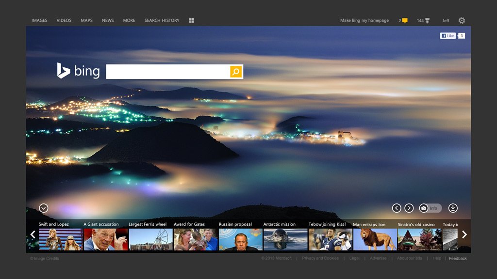
New modern redesign and features for Bing.com
Bing isn’t just getting a new logo. The website is getting a new redesign that’s a little more modern. In addition to that, you’ll be seeing a few new features throughout Bing.com as you use the service. Here’s what is new and improved with Bing.com:
Article continues belowSnapshots: Helpful information at a glance
Last year Bing introduced a feature that showed you what your friends on Facebook knew about a particular search query. You would see results from Bing on the left and your friends on the right. The new redesign of Bing.com integrates the two in a more seamless manner.
Page Zero: Finding without Searching
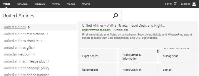
Here’s a pretty cool feature. Most modern search engines like Bing and Google will give suggest for the search query you’re typing. But Bing is taking that idea one step further with a new feature called Page Zero. As you’re typing, Page Zero will bring in relevant results on the right. This feature can be as superficial as typing in Jon Stewart and seeing either the person or show populate on the right. It can also be really advanced by deep linking. For example, type in United Airlines and you can get deep links to their service to either check in or get the flight status.
Pole Position: High confidence results
Another interesting feature is called Pole Position. When you type in a search query, Bing will put some results up top in the Pole Position. This feature works best with ambiguous terms or those that have multiple intents. Bing is using a combination of the Snapshot feature above and their own metrics for determining the intent of the user. For example, if you type in Temple you might be looking for the religious structure, the university in Pennsylvania, or a subway station in London with the same name. Bing places the one it’s confident you want in the pole position section.
The Right Search Experience for the Right Device
Bing is also committed to delivering the best search experience for a given device. From Windows Phone to your Xbox, Bing wants to dial in the experience. The new Bing layout will work and reflow to fit and fill the screen regardless of size. We saw some changes to Bing on Windows Phone earlier this summer.
All the latest news, reviews, and guides for Windows and Xbox diehards.
What do you guys and gals think of the new Bing logo, redesign, and features? Don’t worry if you don’t see the new features yet. As they don’t appear live yet and could be rolling out slowly.
Source: Bing Blog Next Phase, Bing Blog Logo Bonus: Explore New Bing

Sam Sabri was formerly the Managing Editor for Windows Central, covering Windows Phone, Microsoft Build, and many more topics.

 Windows Central Insider


