First look at the new universal MSN apps for Windows 10 Mobile
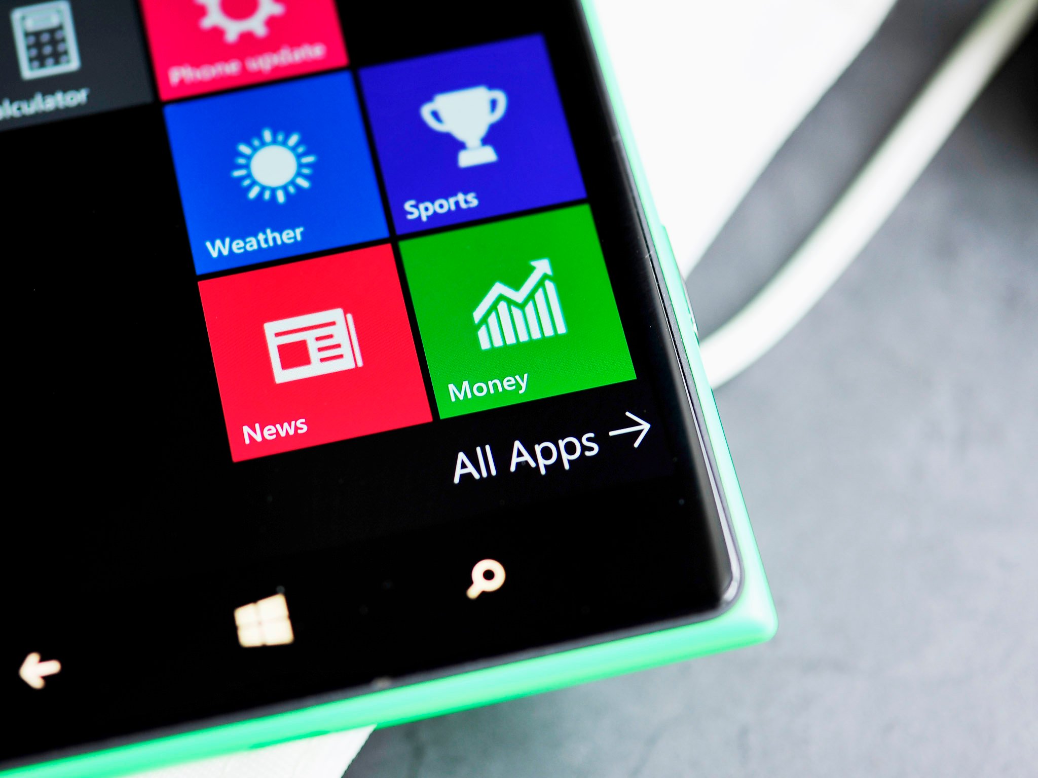
Microsoft's new universal Windows MSN apps have been out for Windows 10 PC for a few weeks now, but we are now seeing them arrive for phones as well.

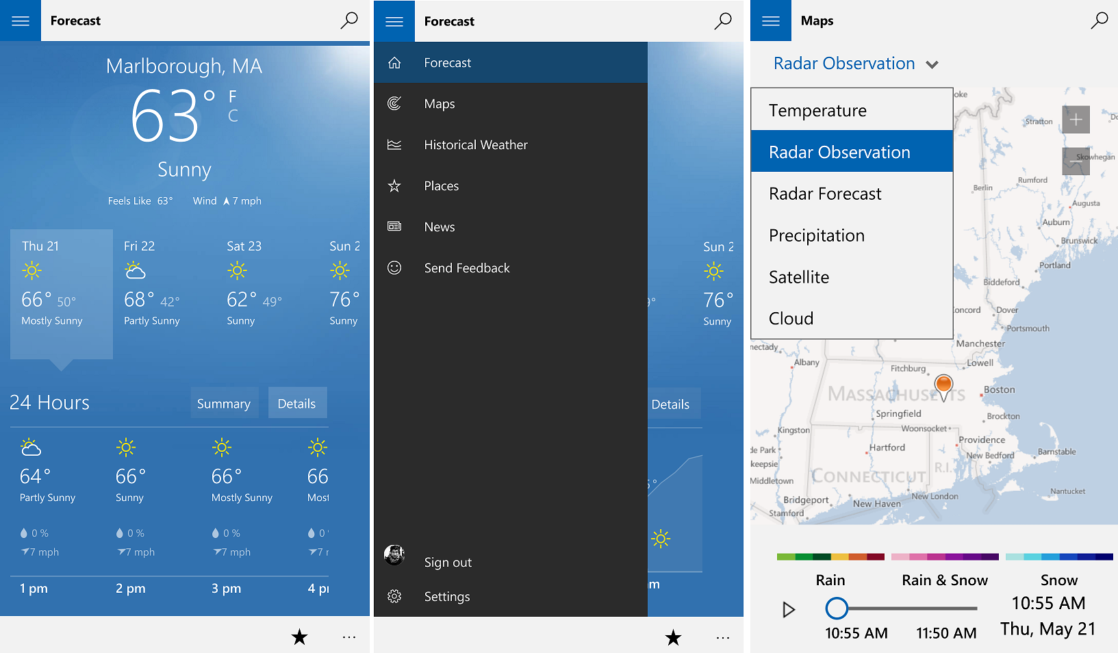
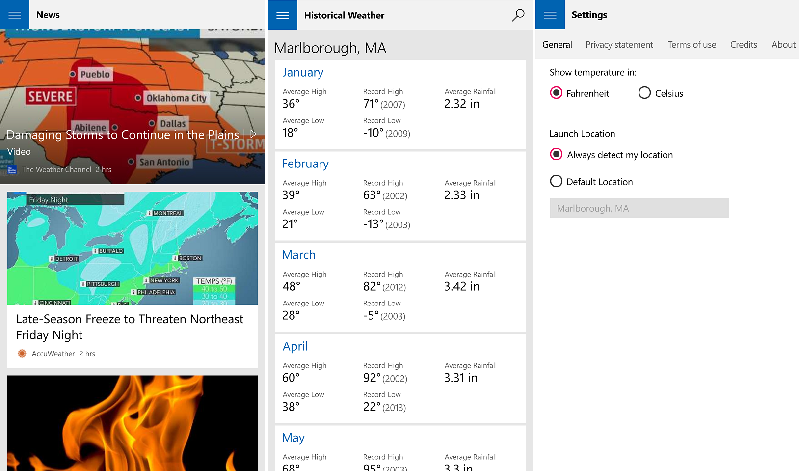
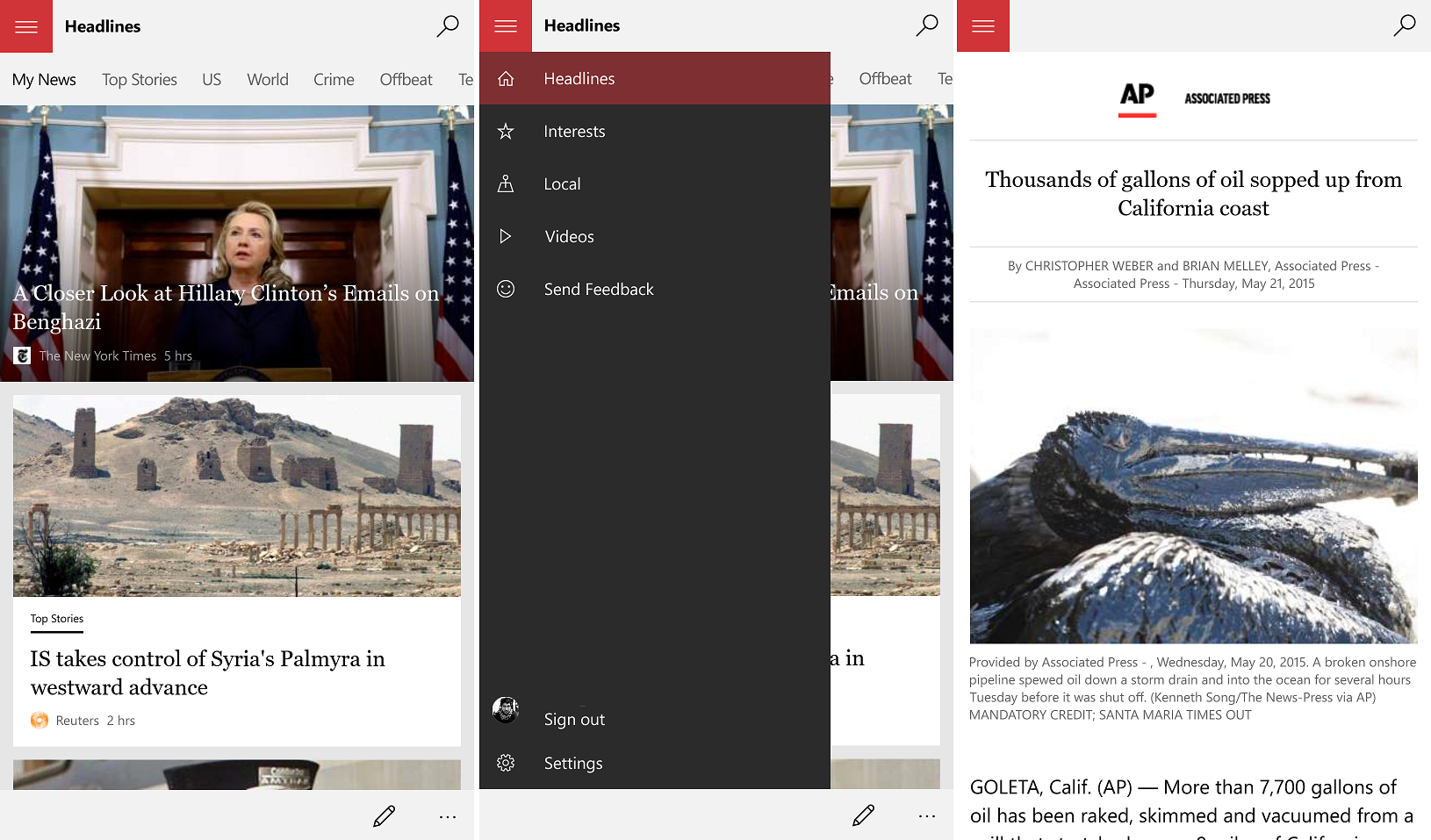
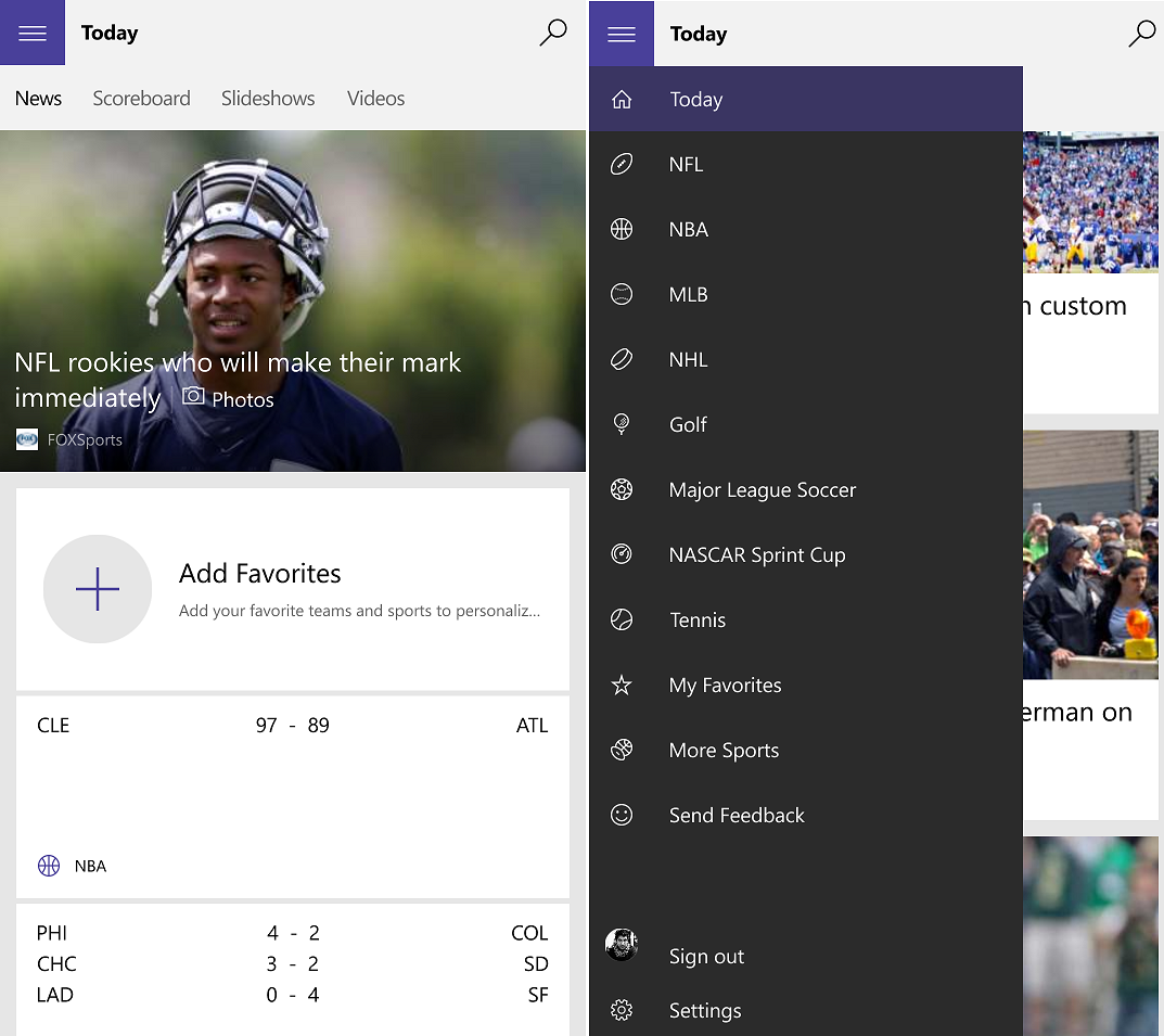
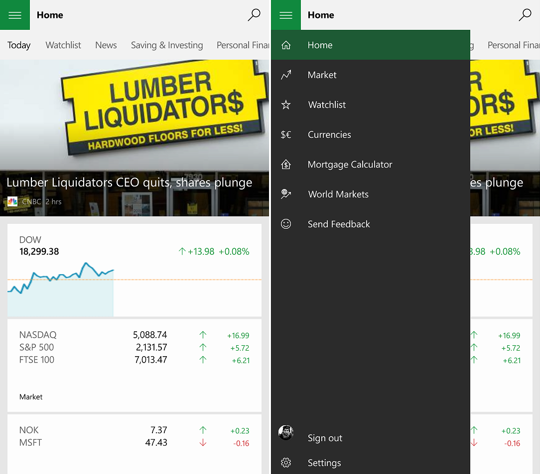
MSN Weather, News, Sports and Money all have the new design that ditches pivots for split-view menus. Indeed, all the new Microsoft apps do feel very coherent in that their design elements are all reused for each app. This experience gives an enjoyable familiarity when using Windows 10 Mobile, something we are sure to see more of in the future.

For now, we will just leave the new screenshots below to give you an idea of the new design for mobile. We will say they do feel quite fast and fluid when in use, which is a impressive sign.

MSN Weather

MSN News

MSN Sports

MSN Money

Shout out in comments on what you think and if you are finally coming around to the new design language found in Windows 10 and universal apps.

Thanks, Aakash S., for the tip

Daniel Rubino
Editor-in-chief

Daniel Rubino is the Editor-in-chief of Windows Central, head reviewer, podcast co-host, and analyst. He has been covering Microsoft since 2007 when this site was called WMExperts (and later Windows Phone Central). His interests include Windows, laptops, next-gen computing, and for some reason, watches. Before all this tech stuff, he worked on a Ph.D. in linguistics, watched people sleep (for medical purposes!), and ran the projectors at movie theaters because it was fun.

190 Comments
  • Beautiful except those stupid hamburger menus.
  • Man plz stop criticizing on hamburger topic -.- there was an article why they chose these menus .!! And m ought to say they actually suit pretty well and look good too !!! Too many options when you have and u opening 3 dots and scrolling down to get to it -.- .! Hey man think a little wise :)
  • Why should we stop criticizing them? We had a superior interface and MS is deprecating it.
    Literally the /only/ good thing about Windows Phone was its refreshing and different interface.
    Now there is nothing...not one single thing...to recommend WP over the competition.
  • Not one single thing? Cue the drama queens at Windows Central. Have you actually used Android or iOS? Cause I can name quite a few. Here are some: Typing is terrible on iOS and Android; Notifications and Action center are terrible on iOS and Android; Android gets sluggish even with 3GB of RAM; Android is still buggy, with first-tier apps crashing; iOS has limited hardware; Battery life on Android is hilarious Seriously, you folks need to grow up a bit.
  • Microsoft wants to eradicate the phone users who use their phone with only one hand. That's it.
  • This argument is as old as Dvorak. Considering iOS and Android are not one-hand friendly and we all sport giant phones, this is a ludicrous statement. But hey, I hear BlackBerry is a good option.
  • Blackberry! Are you nuts?? Leave wp and go to a dying platform? I'll cling to my Lumias till end.
  • do you even sarcasm bruh? xD
  • Exactly XD
  • " I'll cling to my Lumias till end."  Me too.  Even if it takes both hands.
  • Great opening line Daniel!
  • while I agree with most of what you said I'll have to disagree about ios not being one hand friendly.  It allows a swipe back in most apps.  It also has much better support for swiping from the edge to access menus.  A swipe up gives you the play controls and the shortcuts.  What more would you want? Frankly I would be happy is MS just implemented a swipe from the edge to access the hamburger menu.
  • @Tanyet:
    Frankly I would be happy is MS just implemented a swipe from the edge to access the hamburger menu.
    Spotify does exactly that. So apps can swipe to bring up the "hamburger" menu.
  • Yep and it seems like the right way to go.  I use it daily. I guess MS disagrees though.
  • I don't think there is anything stopping developers from doing that.
  • Why does iPhone have a one-handed mode where you  tap the home button to shrink down the screen  if nobody uses their phone one-handed? The argument isn't old. Android is terrible, you've mentioned numerous ways yourself that the OS sucks. People buy Android because it's cheap, it's everywhere, every OEM supports it and it has all the apps they want. People have never said Android was fast and smooth and well designed. It was the cheap and plentiful alternative to iPhone that Windows could have been. Windows instead pursued quality and design and the people who cared about that became it's community, much like with the Mac community for Apple. Now Microsoft is chucking that away in a desperate last ditch attempt at acceptance and easy of coding to Android/iOS.
  • @cool8man: I think you can boil it down to this (an oversimplification sure but I think it resinates). "If you can't beat 'em, join 'em." The fact is, the money is where the 'many' are. You said, "Windows instead pursued quality and design and the people who cared about that became it's community, much like with the Mac community for Apple. Now Microsoft is chucking that away in a desperate last ditch attempt at acceptance and easy of coding to Android/iOS." Bottom line, Microsoft is in it to make money. Because they are so far behind, it's either adapt to the masses or stop making windows phones altogether. You can still have quality and feel free to quivel about design until the end of time.
  • That "reachability" feature is a hack job kludge. Extremely inelegant, and even then I still cant always "reach" to the upper left that was pulled down
  • Yes Daniel, but we shouldn't be saying "If Android and iOs have <insert negative feature>, then windows 10 mobile can have that too". The point is not to lower yourself to the competition, it's to fly over it. About the burgers, I don't actually mind it when they stuff not very used features in it (About, settings, log out, etc...) but I find that if it'sl like Xbox Music (artists, albums, etc, in the drawer), it does become really a pain. I find these apps are ok with their use of the burger, except possibly MSN weather. I don't like the fact that Places, Maps, and News are hidden... Side note: I've got to admit, those apps are sexy...
  • The difference between iOS and Android (at least Samsung, cause theirs are the only phablets worth getting on that platform, IMHO) is that they at least make an attempt to reconcile the size of the device with some arguably useful usability improvements.  Microsoft don't. The rest of what you wrote (what he responded to) were just talking points.  You almost sound mad, but your job is stressful (given what is written here often) so I guess it's understandable. Never had an issue with Android performance degredation.  The only major issue I have with that platform IRT performance is that if you do not reset after a major FW update, apps can go haywire.  Which is why I always tell people to reset especially with big Android version updates (i.e. from KK to Lollipop). Battery Life is on par with Windows Phones and iPhones in same size class.  The Galaxy Note 3 had great battery life and so did the S5.  Yes, the S6 suffers from a smaller battery and a denser display (which taxes the GPU more), but that has more to do with the obsession with thinness than with the platform itself.  I do concede that the nature of Android's multi-tasking gives the Standby edge to iOS (which is magnificent in that regard) and Windows Phone by default - however it has its advantages (which come at a price, obviously) and can enable usage scenarios which are impossible on both iOS and Windows Phone. All OSes have bugs.  Even Windows Phone. On Verizon the only thing considered a "Flagship" is an M8 rehash with a horrible camera (I have an M8, so I don't feel the need to go light on that component of that phone).  I would not be criticising the lack of iOS "Options" as a Windows Phone user, considering Microsoft has taken the Samsung route to phone releases: Saturating the Low/Mid-Range with tons of largely identical devices with different numbers in their names, using largely the same components.
  • I gave a 1520 and I can use it one handed that's what Cortana is for
  • You don't see the panoramic design still available..
    You can still use it single handed.
    Your chouce
  • Yeah, definitely miss that MS keyboard. Yes there's a lot of options on android, but I still prefer Microsoft keyboard. There's also a lot more uniformity on WP. Everything seems to be fragmented on android. Lollipop has brought some uniformity, at least as far as the S6 is concerned. And yes, you have to watch that battery. That's one of the main things people complain about in the comments on android central. The only sure way to close running apps seems to be by turning off your phone if you feel your phone is hogging battery. Or else you may have 15 percent left the next time you go to use your phone, down from 85%. The apps are greener on this side, but I feel the experience is greater at WP.
  • About a week ago you were chastizing Windows Central readers for pointing out that Android is sluggish compared to similarly spec'd Windows Phones. Glad to see you've been disillusioned now!  Jesting aside, while it is true that x I'm tc was being hyperbolic, it does get at a larger point that, while WP8.1 brought some nice improvements (and that while Windows 10 mobile) will bring some more, it has been at the expense of some of the niceties and unique features of WP7 and WP8.0. Tradeoffs are tough sometimes.
  • It was Google Maps. Really shocked at how that can slow things down.
  • I like hamburgers anyway ;)
  • Give them a stress ball. Those guys will shut up. No reason to explain over and over.
  • Can you elaborate on the things you mention as being terrible? Thats quite a blanket statement and lets be honest, WP has issues in the same areas you claim are so bad on ios and android.
  • I'll likely be doing an editorial soon. Text prediction is so much better on WP. Almost everyone agrees with this too, btw. Also, our notification center is just cleaner, easier to manage. I hate the way Android handles it. Sure, you can change the lock screen, but geez, can that cause some odd issues too.
  • Agreed, to get Android to work the way I wanted. I had to ROM it. Put a new launcher on it. The launcher crashes, and as its a ROM, I am too scared to put a banking app on it. Android is most defintely not as clean or safe as WP. Im happer on the MS side of the fence.
  • Too bad it took them 4+ years to get a Notification Center - year if you take that long I hope you can look at the alternatives and improve on them.  I think before Microsoft added it most people in the forums were saying Live Tiles were good enough, while trashing those of us who said they weren't a substitute and that a Notification Cache was practically a no-brainer in a smartphone OS to properly triage Important (potentially) Urgent Notifications which may be missed unless you were constantly jumping in and out of apps on your phone (due to the random nature of Live Tiles Cycling). It was the biggest issue that drove me from the platform, and at this point I am too invested elsewhere to bother considering it (which I was willing to do, until the Icon got discontinued - I have an M8 and no way am I paying flagship price for a Camera that's not much better than what I got on a 2010/2011 flagship). And I don't really feel any of these are really superior.  Windows Phone's is similar to iOS' and they're both perfectly usable.  Not sure how you can get much cleaner than iOS, since it removes all the toggles and just puts all your Notifications in one Tab By themselves.  iOS' is superior in that the typography allows it to display more information than Windows Phone (Microsoft has a knack for wasting screen real estate in their design language, but they're actually improving in Windows 10 in that regards, fortunately). I really feel like Windows Phone's Action Center is similar to the iOS Notification Tab (completely with App-Grouping and the inability to manage notifications on a more granular level like Android) with Quick Toggles at the top (iOS puts  its toggles in Control Center). I've never Rooted or ROM'd an Android phone.  I just bought the one I felt offered me the best user experience.  That's typically what I suggest others do when they ask me about these things.
  • Text prediction is way better on my dad's Xperia. I can Swipe the letters to write in English and Spanish simoultaneously without errors. WordFlow is Great but it has a lot of room for improvement. Even the colored trail that follows your finger is stabilized on Xperia while on windows phone you see a trembled line.
  • I concur with everything you've said about Android. Have had my note 3 since last year and it has just been a disappointment everyday
  • Got a Note 3. Had to mess around so much just to improve the battery life. However, still has a major lag. My dad's Blu Win JR works more smoothly.
  • Not at all criticising Hamburger Menus. They are good. Only issue, they are hard to reach. Would be better if they place them at the bottom right corner. Feels odd, but would be a welcomed addition.
  • Yes. Or an option in settings to move hamburger menus to bottom left or Right.
  • So why do they own the market. They do most things better than wp
  • +1 xD
  • You actually commented for him ha ha nice explanation. That guy really didn't know how Windows is better than Android... :)
  • Amen! Thanks Daniel.
  • I love Windows Phone, and i agree that iOS Action center is tirrable but how Android notifications are tirrable too?
  • Exactly wht Daniel said .!, just u got hamburger menus u get nothing to recommend Wp over anything m! Hey man every1 has like and dislikes of things .!! U saying we had a superior interface .!, then why didn't we grew out to a maximum share in market with that interface .! Basically the metri surface didn't blew the market as expected ! And microsoft moving in right direction for wht people like and there is feedback app to recommend them things to ad and improve .!! Seriously that opinion that you got nothing to recommend -.- that's weird use an apple its restricitive .! Use android it lags.! Sigh....
  • Zzzzz. Get a life.
  • Zzzzzz have it already XD
  • Not aimed at you :¬)
  • Srry XD
  • That's been explained ad nauseam. You can't have scaling apps from phone to Surface Hub using WP7 design language. Enough already!
  • Yes, hamburger menus do look good, at least to me, but in term of usability, it's garbage. One of the few things I have to hate about Windows 10.
  • Funny, no one seems to complain about them on Android and iOS, yet last I checked they both control like 97% of the market and the "superior" design is like 3%. Can't keep beating a dead horse.
  • How funny, may be it's just me, but I haven't see anyone praised that menu, either. And even more funny, you think that a menu design has such a big thing to do about the market share. Yes I do hate it, because I've used those ellipsis menus, unlike that "everyone" on iOS and Android. Sorry for speaking my opinion.
  • Let microsoft use the hamburger menus there way and lets see the result and the ellipsis hasn't got anywhere in W10 even ....!!!
  • Careful Toan!  Keep your opinions to yourself.  Daniel likes to wag his finger at the people who made this website what it is  :P
  • Also he makes such a false argument because neither good nor bad design will make or break market share. Market share comes from price and availability. Mac has always been more thoughtful about design quality than Windows, but Windows dominated because Windows machines were cheaper, better supported by hardware and software. There is no design that will make or break Windows phone market share. He keeps bludgeoning us with this 3% share thing like there's some magic design language that changes Windows fate. The market share depends on much more important factors to consumers (market saturation, price, availability, hardware/app choice, marketing). The design is for us the users to like or dislike. In this case we don't like this change. It's for laziness, to make porting to PC/Android/iOS easier. It makes the experience worse for Windows phone consumers.
  • @JustinSalvato
    Careful Toan!  Keep your opinions to yourself.  Daniel likes to wag his finger at the people who made this website what it is  :P
    Whiners did not make this website what it is, the content creators - and us sane people in the comments did.
  • Onedrive runs with hamburger menu for quite while and never heard anyone complaining it. Cant understand these people.
  • people complained a lot, they just got tired of it.
  • This horse is far from dead and not going away. You don't give people paradise, take it away and expect them to forget and not complain. It doesn't work like that. Microsoft should never have pursued design quality in the first place if they didn't want their community to focus on it. And lets be honest Android has been dogged for years about the poor quality of it's experience and design. Google has gone to great lethens to try to turn around negative perception of Android with Project Butter, Roboto design font, and Material Design. They hired Matias Duarte to try to fix the horrible look and feel of Android. Maybe great design doesn't win you market share, but it is recognized by those who depend upon it and impossible to ignore when it is absent.
  • Daniel, I think maybe for users that don't like the Hamburger, they should have an option to turn it sideways and raise the middle bar just a little bit from the other 2. :) I"m getting an error on Lumia 1520 when trying to get these new apps. Stuck on "acquring license". Bummer I really want to see the weather app. Any fixes you know of appreciated. Wating on forum response.  
  • Android and iOS don't control 97% of the market because of hamburger menus, that's a false argument.  You don't perpetuate a bad idea just because everybody else is doing it, that's how progress stops. 
  • Funny, no one seems to complain about them on Android and iOS
    I used Android for three years and it was only when I bought a phone with a screen larger than 4" that they became a problem. So I voted with my wallet and bought a Nokia.  
  • Do the hamburger menus activate on an edge swipe like in Android (including Microsoft's MSN apps on Android)? That really solves the reachability problem for me.
  • No, at least not for now. Hopefully it will be added though. Except for the reach problem, I have nothing to hate about it.
  • Spotify does however has swipe from edge, so it is possible.
  • I've pleaded with them to add this as I agree, it's a halfway point. They seem more stuck on design principles (technically, this is a bad design because it introduces two mechanisms) than utilitiy.
  • It doesn't really fit in with the universal app concept. Even if the left edge swipe wasn't being used for task switching on tablets it still wouldn't work because universal apps aren't always against the left edge of the screen. Anyway, I always wanted a left edge swipe on Phone to do what it does on Windows 8, i.e. switch to the previous app.
  • Then what about losing swipe feature..
  • Ditching Pivots... ​Said with so much relish....
  • Sad to see the death of the only nice thing about Windows Phone.
  • Lol, said to read such bullshit over and over.
  • Yeah, the pivotal menu in wp was a breath of fresh air for me. But the stupid looking hamburgers are destroying it. I prefer to use my phone single handed but the hamburgers won't allow it.
  • Yet somehow, I think you'll manage to go on with life.
  • Yup! Don't worry about me! But hey the 4.5-4.7" is the perfect size for me. I hate phablets.
  • Blah blah blah blah blah
  • Hey pallav .!! My man use W10 when it arrive full fledged and then we will have a little opinion on the day how it feels to use the changed style to ham menus :)
  • I think they didnt complain about it is because they were fed hamburgers in the design since the beginning and didnt know any better. We did have it pretty sweet with pano and it was different and the windows phone fans were rebels/defiant and different and thats what made them fans. Thats been taken away. I agree the changes are for greater good so I am ok with it and I think others should look at Microsofts perpective too. Its about marketshare and its business to MS. Some of it makes sense logically too if you add menu/settings item there since it will be less frequently used. I think appeal for Universal app/design is greater at this point than trying to seggrigate small screen design vs big screen design. Now I'm just blabbering, but seriously I could go on.
  • Agreed cruiszero .!!
  • It was impossible to stay with the pivots because some apps needs the swipe gestures to work properly. What they did was basically make "inconsistency" part of Windows Phone's design language as some apps had to ignore them but still had a "tabbed" interface while others didn't. I find it hard to believe that a consistent design methos is superior to an inconsistent one. I don't actually think most people think what Microsoft did before was superior.  I think they just liked it because it was "different" and the only justification for this platform given how poorly it's been performing was that you were at least thinking differently and following the sheep by getting what's "popular." Being different for the sake of being different isn't always superior.  It's why they've been in a constant "transition treadmill" where they've had to revamp major systems of their OSes for the last 3-4 years. Sometimes going with what works it the superior user experience.  There are other areas in which to innovate. People are crying more about a Hamburger Menu than about Microsoft removing the Camera Shutter Button from their requirements. Civilization surprises me.
  • You must not have been around because a lot of people were disappointed when they dropped the camera button requirement. We were given the "don't worry, it's so more OEMs can build WP devices and keep costs low". Same thing with hamburger buttons and inferior design. "Don't worry it's because of universal apps". Watered down OS is the result.
  • Pallav da shoboi bhalo to?
  • If you mean 'pivots', they are not a menu system - they are a page navigation system. If you mean the 'app bar' at the bottom, then yes this ís a menu system, but is not a pivot. :-)
  • Androidish!!
  • The hamburgers aren't going away. Get over it already..
  • I used to hate hamburger menus. But maybe that was because I saw them only in android and mobile websites. There, they are inconsistent, mostly hidden/at different positions, and useless. But looking at how Microsoft is using them, they are A LOT better than what I was expecting. They are TOTALLY consistent, clean, and useful. It seems to me that they are redefining this control. So my dislike for them has been gone.
  • tell your reson not your hates i like ham menu because give me fresh clean paper and let me to hide many things this is my reason why i love ham anyway haters gonna hate
  • Haters gonna hate hate.. Shake it off. !! XD exactly ham menus are better in some cases .!,when too many options are there better to have easy access to them
  • you should be designer to undrestand clearly just look how this little bar can manage page it is better to compare with win 8.1 apps you will find it at last try to get use to use them you can't change them :)
  • I don't mind the hamburger menus, but it would be nice if a swipe gesture could open it also.
  • exactly this is great idea you are better than people always nag
  • Get over hamburger menus already! They're here to stay, get used to it or move on. iOS and Android already use these too, and control the market. WP does need something to distinguish itself from the competition, agreed. I'm banking on continuum and the mobile and desktop synergy with Windows 10 across the board.
  • One star review for any app that has a hamburger menu. Try riding the train every morning and using one of these apps. People use their phones one handed and the hamburger is designed to kill one handed use. It is unacceptable. They are going to all get one star reviews.
  • I think that they're doing quite a good job unifying hamburgers, ellipsis' and pivots!
  • Let it go, dude
  • In all seriousness, what is the big deal about them?
  • Microsoft is finally waking up. Android's UI is about perfect. But now Windows 10 Mobile is starting to look like something I could actually enjoy using.
  • I think people are getting ok with humbugs.
  • It doesn't bother me...
  • Hamburgers are yummy
  • I second that
  • Cheeseburgers are better.
  • Waiting to get hands on .! On these apps look pretty good and the interface is good too m! ;)
  • I need to be able to use them a little before making judgement. One of the things about Windows 10 for mobile that has me nervous is the lack of live tiles. Hopefully this is due to being early I development but along with the people feed these are main reasons I have chosen this platform and if it gets too far away from what it is now.....they may have lost me. So far I absolutely hate the new outlook app and calendar app.
  • Aww I really liked the metronapp design esp the food one. It was gorgeous
  • Im ok with Hamburger menu, but one thing I think it needs is a edge swipe from left to right to reveal the menu.
  • No live tiles.....
  • Now get over everyone with those hamburger whines...pivot was good but in no way the best form of navigation...
  • Pivot is the best form of navigation, that's why Android has switched to it for navigation. The absolute worst way to navigate an app is through the hamburger menu. It is almost hard to imagine a worse way to navigate an app. And to be fair many of these MSN apps do allow you to navigate via pivot swipes, the section titles are a little too small, the animation effect kind of sucks, but it is somewhat acceptable if still a downgrade from the apps we already had.
  • Yuck
  • Move the hamburger menu to the bottom simply!, the same UI but different location
  • You do realize this undercuts the universal Windows apps model, right? You just changed a core aspect of design, something that is supposed to be unified for developers and consumers. I mean, I get it, it is easy for you type things. I'm just saying it is harder to make it happen and keep the universal Windows apps model. Can't have both, so which is it?
  • Sorry but, PCs are thing and phones are another thing, they're different!
  • Not anymore. Continuum for Phones is the best example of how that statement is soon to be incorrect.
  • "Sorry but, PCs are thing and phones are another thing, they're different!"
    Then I suggest you jump to Android or iOS as this is not the Windows 10 way.
  • The percentage of people who want a phone and PC to function identical is so infinitesimally small that if you tell all the people who hate it to leave for Android the 3% market share for Windows Phone will seem like the old glory days.
  • You're missing the point. It's not about the devices functioning the same. It's about the apps functioning the same. The same app, not a port, not something that looks alike, but the actual same app. With an experience that changes only slightly to make use of changes in hardware e.g. screen size. Pick up a device, open an app with the same icon as on another device, have exactly the same experience. It's a nice aim. But if even the people currently using Windows Phone don't get it, then there's no hope.  
  • Good advice.
  • Not really. The apps can be made to behave differently on phone even with the same code(universal).
  • The Ribbon is now at the bottom. Look at the universal office apps. It really is more of an issue with being on a desktop and shrinking the space for the app. Also with how you could define when to put it on the bottom. When you shrink it on the desktop you don't want it to flip. Of course, if you allow it for phones then you have to draw the line and say that it goes on the bottom for these special conditions. I would prefer bottom but that just leads to more questions design wise *sigh*
  • Funny how the other day you were praising the new Discovery News app. No hamburgers, lots of pivot design, Universal app. That's the way to go. Not this substandard web wrapper garbage.
  • i like it a lot it looks super clean and beautiful
  • With panoramic app designs completely vanishing, I wonder when Windows Central app ditches the current design for the hamburger menus!
  • I'm likely going to require this to happen just so I can relish in all the juvenile complaints :P
  • I know right... People almost started revolting at you for backing the hamburger menus!
    They'll understand the benefits as time goes by.
  • There is no benefit other than to exercise your thumb.
  • But seriously mate. When do you think the universal WC app for W10 will be available? Because I'm thinking of making a client that excels overall over this app.
  • Planned is by end of August at the lastest.
  • Alright. Let's see what Jay Bennet has got in for us. Or maybe Mobile Nations would launch universal apps? The apps they have on Android and iOS, I mean. What d'ya reckon?
  • no hamburger please.,
    what is it use here?
    what was the problem of previous version?
    I wish it's just alpha design.
  • Hope they bring swype from left edge of screen to bring : hamburger menu ( instead of pressing hamburger on Large devices
  • Even better swipe from the bottom to bring up standard Windows Phone menu and get rid of the hamburger entirely. Then we can have side swipes to navigate the app left and right. The hamburger is worthless. It is located in the hardest to reach position. Windows has a menu bar at the bottom of the screen that is very easy to access and already works with the swipe up gesture, put stuff in there.
  • Why not use the app color theme in the whole header??? I like apps that use it... And, you know, Material Design is fully of these... :)
  • Labels, everybody loves labels.
  • Love the universal app design. I have reached out to a few developers and they are looking forward to using it. And if you winPhans would quit whining for a minute, you will see it too. I love how Microsoft integrated pivotal menus with the hamburger menu. So it's not like what we loved form WP8 is completely gone. This will also help those coming from Android and iOS to feel right at home and no need to learn a whole new interface, but instead jump onto a new OS that is more fluid, responsive, stable, more secure and yet still have a little bit of the UI they are used to.   So guys, seriously, shut up and buy Windows 10 Mobile  
  • Buy it from where exactly?  
  • Whenever the time comes *smartass
  • Does the new weather app still has the lockscreen feature which allows the weather info to be shown on glance??
  • be-auti-ful! :D launch soon, that's all i want! :D 
  • I gotta say I really like the new design language, especially the hamburger menu
  • I can deal with the glitches in this build the only thing that bothers me is putting the store beta in default. It has way to many glitches. Posted via the Windows Central App for Android
  • I don't think they look that bad. Kind of boring looking but at least they have a clean consistent design. Fast and fluid is good. Are these going to be backwards compatible with Windows 8.1, RT 8.1, and WP 8.1 or only available for Windows 10? Too many people complaining over nothing. I'd rather complain about why it's almost end of May 2015 and still no DENIM update for the Lumia 830 n the U.S. Wake up MS!!!!
  • Can you log into News (or any MS app on WP) with anything but the defualt primary id used on the phone?
  • So now any dissenting opinion is now forbidden and ferociously attacked by writers as well? Now the argument is ios and android are selling better because they have out of reach menus? Users unconvinced about their new UI approach should just shut up and follow the Microsoft yes men? Yet almost universally on this site ios users are called "isheep", think we've pretty much reached the point of the pot calling the kettle black on that one.....
  • "So now any dissenting opinion is now forbidden..."
    More drama. Nothing is forbidden, we have not deleted any posts.
    "and ferociously attacked by writers as well?"
    Can't take the heat, get out of the kitchen. I'm entitled to my thoughts and opinions too. Deal with it. It has been this way since 2007, where have you been? If you don't want your opinions challenged, do not post them in an open forum. Welcome to the internet. You are not babies, so grow some skin. How pretentious. "I can post my thoughts but how DARE others question my sentiment!". Please.
    "Now the argument is ios and android are selling better because they have out of reach menus? "
    No, the argument is they are selling in spite of those menus. It doesn't matter. People know the design.
    "Users unconvinced about their new UI approach should just shut up and follow the Microsoft yes men? "
    Straw man. No one is telling people to "shut up". However, it is clear that hamburger menus are here to stay, it's too late to change them. As such, the complaints are getting very, very old already.
    "Yet almost universally on this site ios users are called "isheep", think we've pretty much reached the point of the pot calling the kettle black on that one....."
    More faux drama.
  • Nothing is here to stay. The only consistent is change.
  • the version number for this apps is the same of the desktop? I'm not complaining I know it's a preview and this probably will change after the launch.. just curious.. if this is an "universal" app why it was released before for desktop and today for phones... 
  • Universal in the sense they share the same codebase, but for now they are behind in terms of development. Honestly though, I have yet to compare the numbers.
  • Pardon my ignorance, but are apps already available in Store Beta? The article seems a bit ambiguous about that. I can still ser the old versions in store beta.
  • Yes. Sorry, search for 'MSN' in the Store (Beta) and you can just download them.
  • I'm of the opinion (and I don't recall ever seeing this), Microsoft should replace the hamburger icon with the app's logo. I think it would look much nicer. It even looks good for desktop apps. The only problem I see with it is that "stupid" people will have no idea that is what the icon is for. I'm reminded of Microsoft adding the "rubix cube" icon to Outlook.com, etc. and also the outcry when they implemented the Office orb icon in Office 2007. Somehow people didn't realize these things were, for lack of a better word, "clickable". I will, however, miss pivots. Hopefully some blend of the two can be acheived.
  • It looks so much more refined now.  Well done.
  • They look awesome.
  • I actually like the design of the new MSN Apps with the exception of the white space.  It needs more color.  It stil have pivots, but the specifics are in the hamburger menu.  If it's used like this, then I have absolutely no problem.  Combining both the menu and pivots like this makes the apps clean and intuitive.  I may be one of the few, but I like the direction these apps are going if utilized right like the MSN apps.  
  • Ah, I see they ported the Android version of these apps over to Windows 10 Mobile.
  • can we swipe between those news sections?
  • Yes you can.  The hamburger menu is there to go to specific chosen sports and settings.
  • Windows Phone lost its personality: aka panorama controls... and that ugly hamburger menu
  • Hamburger menu is only a very small compremise windows phone users have to make.. In return microsoft is giving us the most amazing CONTINUM
  • The humburger is a result of compromise for compatibility with iOS/Android. MS gave up WP. They are investing in iOS/Android. Maybe MS will make Android phones.
  • I really like the new style but seriously we can't just accept this layout without having a meaninful discussion. There is no reason: to put the search icon up when there is an (empty!) app bar on the bottom. To search you would have to move your thumbs up and down to the keyboard (one hand or not doesnt matter here) and when the search icon would be in the app bar, there would be enough room for a smaller pivot control That means there is no reason for the hamburger menu at all! I know some people here hate it to death and others are fighting for it (because Android blabla). The layout and interaction model is a clear step back. Objective and obvious arguments show that. Now is the time to complain and search for better solutions. Later this summer it's too late. The interface needs to be better than Android and iOS or Windows 10 Mobile will not make a difference.
  • I agree the layout and design philosophy is just.....blergh.   It seems like the design job was outsourced and slapped together by an outfit that doesn't really have good taste in design aesthetics.   Those look like web wrappers from the old Nokia Symbian touch browser that made you want to stab your eyes out every time you used it.
  • These apps have been reduced to glorified web wrappers for articles. They used to display the content in a touch centric way with large graphics and images, but now they have been reduced to just displaying webpages as is. And yeah the hamburger sucks. I thought Microsoft said they were going to start getting rid of the hamburgers because of all the negative feedback?
  • Even android copied live tiles of windows in the form of widgets....than wats the big deal if hamburger menu is being developed for win10....
  • Btw...MSN NEWS APP is looking fantastic
  • Dark theme please
  • No, apps get to control their styling.  Gone are the days of system wide themes that apps support.
  • It needs to be said, again, that Microsoft is not using metro style apps anymore, because they are DONE with Windows Phone.  It isn't that Windows Phone is evolving; it is being killed off and replace with Windows 10 Mobile.  Microsoft has done this before: they killed Windows Mobile for Windows Phone.  Now they're killing Windows Phone for Windows 10 Mobile.  So while I and MOST people who came to Windows Phone willingly, prefer the metro-style UI, that UI is not evolving.  It is being shredded, burned and buried.   
  • Other than the live tiles, yeah, that's what it looks like.   And really, live tiles are glorified live widgets anyway.
  • Hamburger menus are fine expect their position at the top. I hope that the new Outlook design with a heavier focus on bot to navigation is a hint of what is coming for all apps.
  • Nice!!!it is everything for 535?
  • is everything ready for the 535;
  • Wow
  • I have nothing against the hamburger menu but i would appreciate it if Microsoft found a different designed button for the 3 lines...
  • bring on the hamburger menus! I'm okay with pivots on a phone, but side scrolling on a windows 8 app is about as unintuitive as it gets.​
  • Animations/speed and the general look&feel of the MSN apps is already GREAT and they give me the feeling they are the final versions!  I can't even thing how those apps will look when W10m will release :D   And I see great use of pivots for the places that you need them and minimal use of the hamburger button as navigational place!! I'm gonna say it again I really like what I'm seeing, they look fresh and clean!
  • Better use of space than in 8.1 apps. I like it.
  • Was going to cry about the lack of pivots and swyps but seems its already addressed, now all I can do is hope that a 3rd party Modder community like cyanogen for WP emerges from this terrible failure Microsoft is going through, that way I could buy a high end phone when I want like a s6 edge or z3, install windows on it and get rid of disastrous UX implementations
  • Does anyone else have blurry icons on 1520 screen? Daniel's seem to be as crisp as chips
  • Came here for the Hamburger drama .... I wasn't disappointed lol
  • Exactly. This is why goldfish now have longer attention spans than smartphone users. Keep on track people.
  • Come for the burger, stay for the atmosphere!
  • Hamburgers are fine but move it to the bottom
  • The news app looks amazing. Weather has always been awesome, don't really use the others so I can't say.
  • I'm loving the new design language! Great job Microsoft! :D
  • The Finance App doesn't seem right to me..I can't figure out why I dislike it.
  • Maybe that the graph for the stock market is too small and non colorful? Hmm...
  • Pretty but with a couple of fundamental flaws, firstly thumbstrain and rsi, having the buttons at the top causes both, especially with the screens becoming larger. I have large hands and a 4.7" device...it causes pain.
    Putting them at the bottom would solve this, keeping things more natural as the lower is where the keyboard is.
    That also solves the second problem, the three dots...pointless. Keep to a single context like were used to with windows. More than usable. Dont try and copy apple so much in design, just cos they have buttons at the top, doesn't mean we need the same..improve on it, provide a better experience.
    It kinda works on iPhone as the screen is small enough, same on my cowon pmp.
    It does not work well on devices over 4" But apart from that, its good to see the clean layout given function with a taste of style.
  • The UI in those screenshots is only temporary, and most of it is changing, including the font, right? ....Right??? Because they way it looks to me right now, it reminds me of the dying days of Symbian (Belle), in terms of design, which was dreadful.
  • SHUT UP WITH THE HAMBURGERS! YOU'LL GET USED TO IT!
  • i hope my carrier never releases windows 10 mobile update with hamburger menus windows phone platform lost their unique look
  • "We can use a hamburger icon without pivots on a PC version of the app for better keyboard and mouse navigation and then customize the same app to have pivots with swipe control for better one-hand-use on mobile. We're making it possible for an app to have both hamburger and pivot controls—but to display the right control at the right time on the right device." - Operating Systems Group Design lead Albert Shum Looks like they forgot to take their own advice.   In Developer's Guide to Windows 10 Preview: (05) SplitView Control video at 12:00, Jerry Nixon has this to say about the hamburger menu:
    You might be using the phone. I like to hold my phone with my right hand, in just one hand, and so my thumb is down at the bottom. That hamburger menu is all the way up the top. That may make it really difficult or frustrating. There are certainty other platforms that put their menus at the top, and they still seem to be successful, so it's not necessarily a recipe for failure, but it might make it so that your application isn't as easy to use as maybe it was. Nothing is stopping you from putting the hamburger button at the bottom.
       
  • MSN news now appear lot more majestic. But it will be a good, if MS can provide a dark theme option.