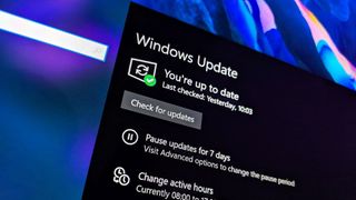
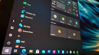
Gallery: Windows 10 technical preview build 10041

The latest, 10041 build of the Windows 10 technical preview hasn't been in hand long, but already there's a few things that stand out. There are some nice new features present in the build and visually the UI is beginning to come together.
There's still a lot of work to be done on it before that summer launch timeframe, but from the new look login screen through to the translucent start menu and everything in between, it's starting to get somewhere.
While we're picking through everything, check out a whole bunch of images below.
Windows Central Newsletter
Get the best of Windows Central in your inbox, every day!
Richard Devine is a Managing Editor at Windows Central with over a decade of experience. A former Project Manager and long-term tech addict, he joined Mobile Nations in 2011 and has been found on Android Central and iMore as well as Windows Central. Currently, you'll find him steering the site's coverage of all manner of PC hardware and reviews. Find him on Mastodon at mstdn.social/@richdevine
-
Apple esk looking lol
-
How the hell do you figure? It looks like what Windows has looked like for the last few years. The matte look was in Windows long before Jobs was pushing up daisies.
-
I agree is apple esk but ours looks more modern now that its in shape
-
Remember, for some people Apple invents everything, no matter for how long it has already existed.
-
I actually hate apple so im not one of those guys
-
Apple's really lucky to have such an oblivious userbase believing that they actually lead instead of following.
-
Im all about windows bobsentell. I recently just started using macs at work and looking at these screenshots gave me that impression.... Its my opinion dont get offended
-
So what, you cant deny apple sure knows how to design. I have no issue with Microsoft borrowing/stealing some design cue's from them. But still this new design is cool and its isn't stoke apple ish.
-
To me i saw just a tad tad bit of apple things. Like that circle with the picture on the logon screen. Also have that grey bar at the top.. I didnt say its a mac copy.
-
Oh yeah, the circle and the wheel and the color grey, all inventions of apple /S.
-
That circle UI is from xbox avatar if you havent had one. It seems that you don't even know anything about MS products.
-
No i dont have an xbox. I guess your right with that one but thats not what came to my head when i saw that. Squares are usually what ms does for desktop
-
I don't like this shift to circles and roundness in menus ..., ah the squares ... That were one of the stark differentiating design features.
-
I agree. I wouldn't say that makes it apple ish but it does make it less "modern ui ish"
-
The circle at the login kind of creeps me out. Photos were not meant to be round.
-
It's kinda crap. I don't like how everybody seems to be migrating to circle contact photos. Square UI elements make sense for square displays...
-
"Square UI elements make sense for square displays..."
This is probably the dumbest thing I've read all month. -
If you want to maximise usage of the screen, then it makes perfect sense. Circular elements = wasted space.
-
Generally yes, but here it is moot as it barely takes up any space at all and plus there only a handful of elements on the login screen... I guess people like yourselves want to use your passport photo as the login photo? lol
-
The elements that are circles out rounded aren't pricing any useful information. It outspent like we have live "circles" on the start screen.
-
Agree with this completely, the roundness on the images and UI elements like sliders makes me feel like Windows is losing it's visual identity a bit. Maybe this is intentional to try and make it feel further away from Windows 8, I personally am a fan of 8, and especially after the improvements in 8.1, but not everyone is/was.
-
I love 10 a lot, but right now i'm missing the 8 start screen like crazy. This new system in this build is AWFUL. If you have windows open you can see them behind the start menu. If those windows have lots of text, than you see text on top of text. The whole thing looks like a disaster zone.
-
I am a hug Microsoft supporter and am very much looking forward to Windows 10 being released but I too absolutely hate the new start screen (and have submitted my feedback about that). I so wish they would actually give us the option for this because I really liked the Windows 8.1 start screen (for all devices from tablets to desktops, touch and non-touch, at home and at work). It was clean and worked very well. This new frankenstein version is just a hot mess. Microsoft should give the user the option on how we want the UI to look. For those that want the new start menu, they can use it. For those that want the Windows 8.1 start screen, let them use that. For those that want to use both, by all means, let them. As has been displayed time and time again, users want choice.
-
I totally agree with you on that, I also have expressed that the new Windows needs way more flexibility in one form or another with the options regarding UI with the feedback app as well, the biggest thing that has always bugged me about Microsoft is they always seem to be telling you what you want with only one design choice rather than giving you the option to choose how you prefer to use a UI as an individual. If Microsoft really wants to draw the customers they need to ditch that mentality, maybe even by utilizing the currently feeble marketplace for their apps by adding downloads to tweak or change the interface to each users own personal tastes and styles, that way they could kill two birds with one stone by expanding on the marketplace and encouraging more customers to want to purchase and/or use Windows 10.
-
Not even close, dude. Have you ever actually SEEN an Apple computer? Jesus.
-
Yes i have. I am a huge ms fan i love there stuff. And i just started using macs at work i see some VERY VERY MINOR similarities. Jeez you would of think i said ms should start getting ready for a law suit. -_- jeez people learn to read
-
*their
-
It's nothing like Apple. I have apple and I do not see how it's the same. It is actually a little bit more like KDE/openSuse configuration. A lot of the Apple look is even more so like existing linux environment. But if colour is the only determining factor for you, then I must look like Channing Tatum because we are both white.
-
Those placeholders look better thou...
-
I wonder if this update fixed the wifi issue.
-
What WIfi issue? I've been using since the first build and I'm using an Intel wireless card in both laptops it's installed on.
-
Icons are still ugly as hell!!
-
Quite subjective I think. I like them. Except the Recycle bin.
-
Do people actually leave the recycle bin on their desktop? I make it a point to remove all icons from my desktop the minute I set up a new OS for myself.
-
My desktop looks like my actual desk top... Full of shit
-
Most people do, I remove the icon too. Desktop is useful keeping unfinished project files. Afterwards I move them to my mapped NAS
-
Recycle bin is the ONLY icon I have on my desktop. I like my desktop looking clean and pretty.
-
You have to add the Recycle bin if you want it. It doesn't come by default but thats the first thing I add on a new system is My PC, Control Panel and recycle bin.
-
I also love the recycle bin
-
Rendering of your ideas for icons please
-
I was wondering who would be the first fool to look at all those pictures and only notice the icons, most of which are made be third parties. If icons bug you that much, I guarantee that some third party developer will have a theme pack that will change all the icons for you.
-
I wonder who approves these designs. Everything looks great except for the damn icons. Just hope it doesn't make it to the final build.
-
I,wouldn't mind seeing our Xbox avatars being used as our avatars on windows sign on screen as default
-
They uses your MS photo account, more obvious I think.
-
Which can be your Facebook profile, which is mine.
-
You can change your MS account photo to your Xbox avatar photo quite easily.
-
You mean that boring apple look?
-
Why is it raining inside your computer?
-
I think it looks awesome. Question... Is there a way to make the start screen (menu) in windows 10 sync to always match your Lumia?
-
Yes that functionality is still there, but in 9926 it sometimes wouldn't work if you manually changed the theme color. Not sure if that's been fixed now.
-
Colors yes but what about your Live Tile setup? So if Im on the desktop and I press the start menu you basically see your Lumia.
-
Unless you're using all universal apps there would be empty spaces missing between the two start screens if an app is only avaialble on one platform but not the other.
-
Can't wait to upgrade when I get home...... All they need to make it perfect, would be ability to house recent/all app list, fully transparent start menu, and live folders like on WP 8.1 update.... All the IOS and Android users out there that haven't experienced it are missing out, best UI. (period)
-
Where can I get that green wallpaper? Looks good.
-
Was wondering too, now I have it. Just save the picture that shows the most part of the background, then google tineye reverse image search, upload that image and voilà......the wonders tineye can do.
-
Here is the link: https://awesomewallpaper.files.wordpress.com/2013/03/through_the_rain_by_manoluv-d5yacka.jpg
-
Thanks!
-
Make the Tiles and Notifications Interactive too!!
-
It looks pretty cool, ill install it now
-
I really like that transparent start menu.
-
Looks nice, I sure wish the update actually worked. My computer doesn't even see it :(
-
I still wonder how will you see battery percentage in tablet mode?
-
I'm still stuck 30% - downloading.... Lol
-
So battery icon stood up again :D.
-
That your car Richard? Damn you guys get paid well! Lol :)
-
Can you give us that cool looking wallpaper.
-
Super
Great advancement........... -
Not impressed at all.
-
Why you were not impressed @theefman
-
That is an awesome Aston Martin.
-
Interactive tiles, interactive screen and interactive notification..
Not a complaint but a necessity these days when android got thhose increasing no. Of widgets and even Microsoft showed interactivity nearly an year before.. -
I love it!!! amazing build...
-
Digging the new pin and ... icons, looks much cleaner
-
Do you like Aston Martins by any chance Rich?
-
Hell yes. If I could afford the new Vanquish I'd be in heaven!
-
Recycle bin look too old
-
Nice expanded menu!
-
Wouldn't install for me. Got to 50%, crashed, reset to previous OS, and now it doesn't even show an update being available.
-
My computer behaves like that, but when I sign in I get a popup telling me it was unable to update, I close it, a few minutes later the computer just restarts and tries to update again. Been doing like that for 5 hours now. No clue on what to do. :(
-
Good god that taskbar looks too cluttered. That search box could easily be integrated into the start screen/menu or at least made shorter.
-
You can make the search box just an icon, or remove it altogether.
-
You can remove icons from the taskbar that you don't want, just because it looks this way in the pictures it doesn't mean that you HAVE to have it set up this way.
-
a video would be better
-
Come to me my PRECIOUS!!!!
-
I have an issue that I am hoping can be solved without having to roll back the update. The update was installed just fine and I was in the middle of the "Installing your apps" phase when the computer crashed. Everything is running fine but half of the built in modern apps dont work and half of them do. Is there any way to fix this? The only apps that dont seem to work are Calendar, Mail and People...
-
All the apps you mentioned are available at the store just search or if would like a clean install for you're apps I recommend you open a new local account and delete the old one and then sign in to your Microsoft account and there you go again clean and nice
-
Is there a direct link. I've had an error message saying "we were unable to uninstal updates but will try again later" ever since build 9926 was loaded.
-
So it's still recent on the start menu side? Can't I got back to the first tp and pub what I want? Ie, PC, files, steam, have no need to be on the start screen side.
-
Personally not liking the rounded/oval toggle switches; Very apple-esque. It seems they made windows 8 all squares and rectangles and now they are trying to follow everybody else and make things rounded...not sure how I feel about that.
-
New Recycle Bin!!!!
-
Han can I update , I'm running in 9926
-
is Workgroup back in this build ? or any DNLA option? it was not possible to streem Video to my Xbox one in 9926 I hope for bether DNLA option in Windows 10 than 8.1...
-
I think you better head to www.plex.tv there you'll find the answer
-
How can I update from 9926 to 10041??? Please
-
Make sure you're set to Fast ring and check windows update
-
That doesn't work for me.
-
Help
-
Sound drivers went tits up
-
(drat..wanted to delete)
-
Those folder icons look so ugly! What the hell... I hope they will change.
-
Those ugly right click menus need some work. At least for Windows 8.1, Microsoft was smart enough to go back to using use the older style menus if a mouse was detected.
-
I think they're working on a way where it will change size depending on what input you use. I noticed that in build 9926 with some of the drop down menus in certain websites. If you access the menu with a mouse or pen it is spaced closer together like the traditional menus are. But if you use a finger or other capacitive input it is spaced out much larger to be accessed easier with fingers, and it looks nice too
-
Is there any chance w10 will have better battery life than previous version?
-
Icons are still not "modern". They should change that.
-
You can PIN pages from Settings App to Start Menu
-
Here's my gallery of trying to update w10. if this happens during the nex build ill just rollback andwait.not worth the aggravation.
-
The desktop icons shortcuts arrow are ugly..
-
Wallpapers for desktop i found here. https://www.windowscentral.com/e?link=https2F%2Fclick.linksynergy.co...
-
Why do people want a trans start menu? It goes against metro if you ask me.
-
Say hello to Zune for me once you realize how wrong you are.
-
It doesn't go against it, it improves it. It's not like they're dumping it for that resource hogging feature known as Aero. It doesn't have that glassy shiny look that attracts flies, but it still has that modern flat UI, just with fades colors. How does that go against it?
-
9 hours?! What are you running on?! Good god. Love the explorer icons
-
I was at the Fast ring Update Dan Harris
-
Come on MSFT, we're all hoping for Windows 10 to be great because we love windows and support it. But the icons still look ugly as if there are no more UI Designers around. WTF!!!
-
you're yelling like they quit building that windows
-
But I strongly believe they'll keep the icons. It's Microsoft.
-
Never knew dudes cared like that. Ugly icons. lol. wow.
-
Xd so sad. There are more things in life haha.
-
We want a polished OS so, yeah.
-
This is too stupid for words. I guess you shower after you get dressed. smh at this generation.
-
Ugh, the bitching on here just doesn't stop. Metro has been basically identical for nearly 5 years. That's almost as long as iOS went without a redesign. Jesus people, a) it's not even beta software, it's like alpha software, b) the internal concepts showing what it will look like look awesome, so shut up.
-
That's the spirit
-
I hear ya. All of this whining by these fools just makes me want to switch to iOS. If Microsoft wishes to develop Windows 10 using feedback from these people then they're gonna have a bad time. Half of them want change, half of them don't, and people wonder why Microsoft seems to be going in a directionless path. They're trying to figure out what's best for everyone but nobody is ever happy in the end. Dont get me wrong I love Windows, but in a way I'd rather be in an ecosystem such as Apple where most of the fans are gullible teenagers instead of a bunch of whiny so called "tech experts" and "professionals" that can never agree with anything Microsoft does. That's why all of these constant changes keep coming to Windows, which always ends up making people unhappy.
-
Agreed. People talk like this is a finished product even though in full text on the right side of the screen is says, "Technical Preview". I hope that when it finally drops that these whiners keep running XP and never bother with Windows X.
-
@Jazmac oh you know they will lol. They're never satisfied with anything that Microsoft tried to do. I've noticed different behaviors from fanbases of Microsoft and Apple. Most Microsoft fans are the most vocal and ignorant bunch out there that are never satisfied with their products, but will either continue to use them and complain or just switch to a different platform entirely. Like you said, they'll act like whatever preview that Microsoft gives them that its supposed to be the final build and will complain and hate it. Not to say that all of them are like that, some embrace the changes that Microsoft is making and support them like they should. Most Apple fans on the other hand are extremely gullible and will buy anything that Apple has to throw in their face, and will act like its something that is completely reinvented to the world. (I.e. The "new" MacBook). Again, not all fans are like this, but a lot of them are. Im personally a fan of both Microsoft and Apple, but when it comes to Apple I dont need the newest products they have to offer. I'd be perfectly happy with a Macbook from like 2011 that can still upgrade to Yosemite. Its a couple hundred bucks cheaper, but I get more or less the same performance as the newer ones if I were to upgrade it over time.
-
I know it. They vote against they're own interests all the time. This is beta but they rant as if they used the rent money to get it.lol. I can't agree OSX fans are gullible when it comes to what comes out of apple. They tend to expect that things that doesn't work right that Apple will make it right. Apple usually does and Apple's base has come to expect this. Granted their base is much smaller than Windows base but as small as the OSX base is, they learn how to solve problems and they share it freely. Windows has a wing who are very vocal but not well equipped beyond the on/off switch.
-
Lol right? Its sad that you can't really pity them either because they'll just continue to bark like seals. Well as far as with improvements to OSX that's understandable, I was referring more to how most apple fans (or some depending how you view it) think they need to have the newest hardware that Apple has to offer, even when their current hardware works just fine. Like they feel they HAVE to get the newest iPhone that comes out, when in all reality that shouldn't be the case. Now Im not like that. I just ordered an iPad Mini 2 that's still upgradeable. Do I care that its a couple years old? Absolutely not. Its cheaper, works fine, and I expect it to run perfectly for a couple more years. Some people will run out and buy a MacBook for $1200, then turn around in a year and buy a new one for $1500 just because the display is a tad better. Now to me that's not a compelling enough reason for me to get a new device, but somehow Apple has always done a good job at convincing people that they need their newest hardware, when the simple fact is that they don't.
-
Super-cool..Waiting for a final build to download everythng!!
-
Can't seem to get it to show up on my Lenovo Y510p
-
I thought Photo Gallery app got password protected by reading and seeing that screenshot and headline. Meh.
-
But even if the app was password protected you'd still need a way to secure the files on disk If you didn't want people to be able to access them,they aren't in isolated storage or anything.
-
:'( :'( alarm app look lot like samsung 's clock app.. some icons nd top bar is exact match.. -_- I wish they could have designed better X (
-
Over saturated colours on those icons.
-
lol you had to finish by bragging about your 10h battery
-
I don't like those ON/OFF switches.
-
All people ever do in the Windows ecosystem is complain, complain, complain.....especially for the stupidest reasons *cough icons cough*. You know what else they do? Complain. I like Windows, and the direction that Microsoft is trying to head with it, but when you try to create a feedback system based on user input you're going to get people that like the changes and people that want it to look like XP, and they'll constantly argue back and forth with one another, and Microsoft has to try and compensate for both of them, which never ends up in a positive way. I really hope that Microsoft gets this right with Windows 10, but I already purchased an iPad as a scapegoat in case they botch it. They absolutely NEED to get devs on board with Windows and get them to support it as much as they do other platforms. Windows does NOT have that big of an app gap that people seem to overhype, but their main problem is app SUPPORT. Yeah you'll get the major apps like instagram, facebook, etc., but most of those are updated like every other year or so compared to their iOS/Android counterparts which are almost once a month, or even just ignored overall. Again, I like windows and windows phone, but Microsoft needs to get it right this time, and get up to par or further with their competitors instead of release features that are already available on other platforms. Windows 10 is make it or break it for me, I really hope that Microsoft can pull through this time. They've spent countless years being behind, its time for them to go beyond.
-
Those new folder icons look sweeeeet. I love the new design overall as well.
-
After trying to update Ish to 10041 for hours, I got an error code and am still on 9926 without any chance to update to 10041. Anybody any clues what to do now?
-
Can you still do a restore? Try that if you haven't. Go to settings and click update and recovery. You may need option 2.
-
Thx for the answer Jaz. The point is after not having update the OS to 10041 it restored itself back 9926 which means there is no way to restore it back myself. And starting from the scratch just to have the newest version is something i try to avoid.
-
Is this update available? Because I updated my surface and don't see these things. Or maybe I'm updating wrong somehow? Anyone know?
-
I like the translucent start menu, but I DONT want to see the desktop icons and taskbar when in tablet mode. Kills the look.
-
Wallpaper please?
-
Wow. The transparent full screen start menu looks so awesome. And I like how they removed the black bar that was there when Task View was opened, it's more neat now.
-
Why is everything so massive? My poor 15 inch laptop has to scroll just to access Update & Recovery
-
In some ways it looks better than 8.1 but a few things stick out as sloppy and badly done. The expanded Start screen is pathetic compared to the real Start screen in 8.1. The photo app looks like junk. The smaller Windows logo for the Start menu is weak. The icons are obnoxious but they're being worked on. What really kills it for me though are the really tacky circle contact pictures and the iOS on/off toggles... Just no. MS should be above that garbage.
-
I don't like the rounded toggle switches in general, but the worst thing about them is that they aren't even nice looking rounded toggle switches..
-
I find nothing in Windows 10 that I like better than Windows 8. Nothing.
-
I still can't love those icons, metro appbar icons, and the toggle buttons. Just change it or roll back to what we have now.
-
As small a detail as it is, I am happy to see the battery back in its upright position.
-
That's a screenshot from 8.1 by the looks of it. Look at the sound icon, it's not the W10 version
-
What's with the battery screenshot from 8.1 at the end? :-)
-
It's still just Windows 7. How unbelievably lame. I hate Microsoft.
-
This is not modern at all. Please bring back the modern design of Win8 and WP8.
-
Is there already fix for the start menu?
-
I wish the time was in military time ROFL Just kidding.
-
i am sorry but the icons are... so ugly its like for kids and not for seriouse user... i hate material designer... with this icons the windows is like toy... for children 13 years please... BACK THE ORIGINAL ICONS ..!!11
-
think different new MEtro designed icons in US ARMY... on win 10 lol ../1
-
Gosh, if they plan to release in a couple of months, I hope the UX people are on top of their game the next couple of weeks--I still see some pretty big UI elements that need polishing.
-
How can i downgrade to win 7?
-
there is also enhanced and polished new lock screen and enhanced task view feature avilable at Windows 10 build 10041
-
Here's what I think the new folder icons should look like... https://onedrive.live.com/?cid=A46295AB38EE9ADC&id=A46295AB38EE9ADC%2127601&v=3
-
Hi,
I need your help.My dvd Toshiba satellite, doesn't work with windows 10 tech.prev. I think is missing drivers(?).If so where I can get them? Thanks