Xbox One and Windows 10 brings new UI, Cortana this fall

Earlier today, Xbox's Larry Hyrb went over some features of the new Xbox One dashboard, including the addition of Cortana to the console. In a new blog post, Microsoft has detailed a bit more on what we can expect when the dashboard update comes this fall.

Here's the item-by-item breakdown of some of the new features coming to the Xbox One dashboard this fall:

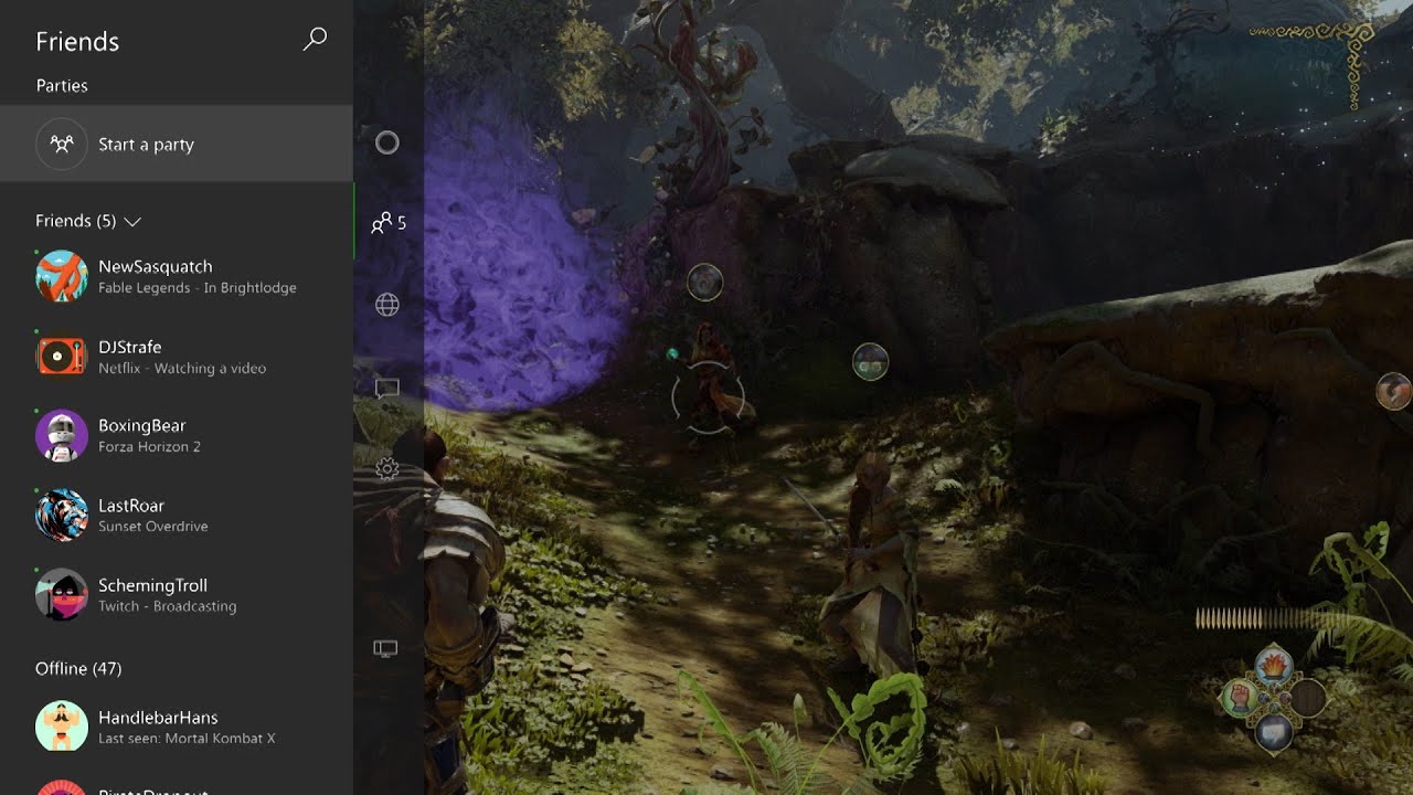
A redesigned Home: We've redesigned Home to surface your most-used Xbox content. You can scroll vertically to see your recently played games with deeper information about the content and games you are using. You can see game DVR clips, achievements and add-ons for your games and can also quickly discover new content.A new guide: Gaming must-haves like friends, party invites and messages can be accessed directly from Home or while in a game. Scroll left from Home or double-tap the Xbox button while in a game and the guide will slide over on the left side of the screen. From here you can access gaming must-haves like your friends list, party invites, messages, and notifications.Community section: We've expanded upon the current Friends section so gamers can more quickly and easily access all their social activities. This includes the Activity Feed to see the latest updates from friends and game developers as well as What's Trending on Xbox Live to interact with the most popular games and content currently on Xbox Live. Scroll right from Home to see what games your friends have been playing, interact with their posts and see the top things happening on Xbox Live right now.Xbox Avatars: We saw the passion from the community toward Xbox Avatars and are excited to bring them back in a more prominent way on Xbox One. We are modernizing the look of avatars with better image quality, keeping all the familiar customizations fans loved on Xbox 360.Cortana comes to Xbox One: On Xbox One, Cortana becomes your personal gaming assistant. Cortana helps you elevate your game, gets smarter over time, and works across all your Windows 10 PCs, tablets and phones (Cortana will also soon be available on iPhone and Android phones). Through voice commands on Xbox One, Cortana will assist you to more quickly find great games, new challengers and friends on Xbox Live, or accomplish common tasks. Cortana can also help you get achievements by surfacing videos and information to help you succeed. Working across Windows 10 PCs, tablets, phones, Xbox One, and iPhone and Android phones, Cortana can assist you wherever are you are – like setting an important reminder from your phone to receive on your Xbox One when you log on at home. Cortana will launch first in the U.S. and the U.K. on Xbox One this fall.

Overall, this looks like a massive update to the Xbox One dashboard, and we can't wait to get our hands on it (and the avatars!) this fall. To see the new dashboard in action, be sure to check out the video walkthrough below.

Source: Xbox Wire (opens in new tab)

Dan Thorp-Lancaster

Dan Thorp-Lancaster is the former Editor-in-Chief of Windows Central. He began working with Windows Central, Android Central, and iMore as a news writer in 2014 and is obsessed with tech of all sorts. You can follow Dan on Twitter @DthorpL and Instagram @heyitsdtl

127 Comments
  • Charming. Can't wait. I watched the video twice.
  • Cortana coming is exciting but I don't really like the rest of the redesign. I like having my pins right there. And I really like the 'main window' on the current UI that keeps running even when you say "Xbox, go home". Is that still there? It doesn't look like it anymore. It also looks like it will be harder to navigate with gesture controls. Right now it's very Kinect friendly and I mostly use Kinect (most nights I don't even power up a controller). If that changes I'll be peeved.
  • Agree with everything you said except gesture controls (I don't use them). The new UI looks like windows 10, bizarre and impractical for a console imo. I want it to look like windows 8 with pins front and center. The only things I liked was Cortana and it looks like they got rid of snap which I only ever activated by accident.
  • It doesn't even feel like Windows 10 since the Home doesn't look like a Start screen and more like a social network feed (or PS4).
    Cortana, left-hand menu, Avatars and overall faster menu animation are only welcoming change here.
  • The new Dashboard layout sure looks like the PS4 style... With cortana on Xbox, could we finally see voice commands via phone/smartglass not needing Kinect??
  • I hate hand gestures, in fact, I wish you could turn them off. I like the new UI. If you can tell Cortana what to do, then I don't need pins.
  • I love gesture navigation. I cancelled my Netflix subscription when they nerfed the app and removed gesture navigation. You can already say, "Xbox, go to".
  • I dont agree with the pins being at the bottom of the list.. Who thought of this..
  • Agree. Pins should be their own pivot. Plenty of screen real estate to add that in.
  • Totally agree. The new UI looks like a mess and  why have they moved "my pins" to somewhere at a bottom of a list ??    The current design is fast and easy to use, only load time could be better. THis UI does not fix this at all, just makes it harder to reach what you want and makes Pins useless   anyone know if there is a xbox uservoice thread about this already, i could not find one
  • Yeah, the current UI still superior and well thought out than this upcoming new one. New one looks refreshing, seems cleaner and aligns to Windows 10 new design, but its like a 3 steps back compared to current one. My Pins should have still dedicated pivot on the left of Home and Collections should be just on the right of Home, not buried down at the bottom of PS4-like Recent list. Honestly, this feels like a copy from PS4 UI and not like Xbox and Windows 10 at all. It should be Start screen like UI with Live Tiles but designed for 10-foot UI. New UI isn't that bad overall, especially the quick access at the left and the Community page is looks good. Cortana is the greatest feature for new Xbox software but the UI sits too cornered and it looks rushed. Text and Icons should be aligned left, not centered because its not on the center. Other than that functionality wise is great and hope it can do more than the current one.
  • Its Windows 10 so they are screwing the user experience across a number of platforms. The W10 UI is sh!t on PCs, Tablets Phones and now Xbox. One universal sh!t experience across them all is the way Microsoft wants to go.
  • You don't have to use, you know right? Buy a Chromebook, an Android phone, and a PS4 and be happy. I luv how kids around here complaint how bad things are until its released and actually used by them.
  • They probably already own one or were really keen on getting one. Go find something better to do
  • No kidding, really? Fan boy comments like yours provide nothing. His comments, while not super useful either, at least provide feedback on the redesign. Microsoft does listen to their users and they do watch these forums. Just because he doesn't like a UI, doesn't mean we want him to leave.
  • I don't think "sh!t" it's a constructive feedback. All I read was complaining and not a single one real feedback. So ...
  • He/she actually provided no feedback at all, just a general statement that they don't like Windows 10. Feedback requires specifically identifying the purported disagreement or problem and then offering a solution that would satisfy the person giving the feedback.
  • Most of us complaining already own an Xbox One, bought it under the current UI, and will have the new UI forced upon us.
  • The new UI looks great on Desktop. I am not sure about it on tablet yet, but on desktop it looks great!
  • I can't get on board with this! All the updates we got to existing os and ui tweaks all gone. Metro gone! Pins hidden. Game paused behind the menus, I HATE it! Don't roll this out. Its garbage. This looks like a rejected design before we got what we have now. Really really annoyed at this.
  • The current interface isn't great, people have just gotten used to it. It's sort have been confusing since day one, especially if you had a 360. It seems they went out of the way to hide your games and apps, but gave you pins as a way to find them again. The original UI was designed to be controlled through Kinect. I have to watch more videos on the new UI before I judge.
  • I thought it would run on Windows 10 later this year? Really cool/awesome news for Xbox today. Tempted to switch but will wait and see how this new windows 10 ecosystem works out first
  • Widows 10 core/kernel I think.
  • "When the new user experience launches on Xbox One through a simple and free system update, Xbox One will take some of the best parts of Windows 10 and optimize them for gaming. Windows 10 will enable faster and more intelligent experiences on Xbox One."
    It is Windows 10.
  • To a certain extent. Not in the way we hoped.
    At least not in the way I did.
  • Then you were confused from the beginning. Xbox is built on three OSs, the windows part is mostly UI and apps, but everything else is custom.
  • @ eddie I hope you wasn't expecting a desktop! LOL
  • LoL I think he was. Like a Start Menu and a Taskbar.
  • Can't wait!!!! Looks awesome!!!!
  • The Home sounds very similar to the Ps4s.Next thing you know the Ps4 start too look like the Xbox One home screen .Lol
  • I was never a lover of Metro, but on the Xbox One the tiles WORK. This new UI, on the other hand, is just horrible. It just looks like a poor knock-off of the PS4 UI. Guess what, Microsoft? If I want the PS4 UI, I'll just buy a PS4. What's the point on this? Apart from being a bad UI, that is...   Now the question: can I and if so, how can I, refuse this update? Normally the Xbox prompts me to install the updates. Can I just refuse it interminably?
  • Im with ya I can see them loading wide ad tiles(or should it be called a panel) all over the screen
  • I agree. The current Xbox UI with the large tiles and horizontal scrolling (both of which are great for Kinect gesture navigation) is much superior. This new UI looks awful. I also wonder if I can refuse this update. I'm guessing not, though.
  • I felt like refusing the update too. This is basically PS4 with some Windows 10 facelift on Xbox One, too "Me Too" approach instead of improving the current one. Xbox home supposed to be look more like Windows (Live Tiles) and not look like a Facebook feed. Though new UI isn't overall bad, its faster and feels cleaner with welcoming features like Cortana, and easy to access left-pane menu, but that just it. Everything else is 5 steps back. Pins and Collections are at the bottom of list. Snap and multiple user photos at the top is now visually missing. TV Guide looks missing.  
  • Cortana is the best part of this so far
  • Cortana is the only good part about this so far. Not unlike Windows 10.
  • In the 7 countries that'll actually get it.....
  • And only 1 language supported.
  • Not 7 at launch... that would be late 2016... This year only US/UK ... And rest of the world will never get to experience Cortana... 
  • Can we just keep the same dashboard layout with Cortana. Just when I get accustomed to this Dashboard they change it again. I still miss the old 360 dashboard.
  • Totally agree. It is way too early in console generation to completely redesign the OS like this. This will be very confusing, hard to learn where everything is and teach family members how to use this completely new UI. Total pain in the butt. MS is driving my family crazy with constantly changing everything as soon as you get used to it.
  • Just tell them to use Cortana, make her do everything :D
  • I disagree.  A lot of Microsoft's products haven't changed drastically in terms of drastic UI change.  Office still looks the same it has in years with just some minor UI and colour tweaks;  Windows still looks the same over the years, and now it looks more polish.  Everytime they try to change the UI drastically (i.e. like Vista and 8) they get backlash from people who are not good with change.  People didn't seem to like the original Xbox One dash that much, and as they said in the video, the changes are based on people's feedback.. they aren't just pulling a random new UI out of their butt.   This UI definitely looks more organized, sleaker and user-friendly.  People will welcome it.
  • seems the new UI looks very unorganized I would say ..  The current one is fast and organized The new one even moves PIns (that are intended to be able to start things faster) at the bottom of a long list making them useless!   what are they thinking? Adding cortana is the only good thing, rest looks like a mess Looking at user feedback people have voted on, they want ability to customize the Dashboard more, this new UI does nothing like that And they want ability to remove "whats on"    the new UI forces it on you even more. Seeems they have looked at uservoices, and the votes and ignored it all, and are trying to rip-off PS4's bad UI instead
  • To be fair, the new UI looks cleaner to look at but unfortunately its more resemble to PS4 UI than being a Windows 10 or evolution of current UI. But yeah, this new UI seems make some things harder to access like the Pins are now at the bottom of the Home list, why??? Pins are personalized shortcuts for your favorite apps and games and it should be one of the easiest and quickest to access, because that's the point of it. It should be just on the left or right of the Home pivot and not this buried down somewhere. Same with Collections, it should have its own Pivot on the main screen and not just submenu at the bottom of Home list.
    I'm also quite concerned about the multiple user detection feature, since now it doesn't show users at the top beside the current user. Its just a single circular avatar photo. Also speaking of avatar photo, it needs spacing, its too close to each other. Well things indeed improved with this new UI is the animations and general is faster than before. They bring back the Avatar and improved it a bit which is a great, I hope we still have nice profile page from current Xbox One UI though (please not a giant circle!). Cortana is very welcome addition but the UI needs redesigning and it lacks animation (why its all centered when its on the left side). Quick access from the menu from the left (Hamburger-like). And very minor but quite cruicial, the clock is always visible now.
     
  • Cortana's reminder function is the best thing about it. Remembering to do anything while gaming is always trouble...
  • I didn't think about that, but that's a good point, the reminders, particularly when you're 12 hours into a gaming marathon and you realize you have to go to work in an hour. :-)
  • Personally I like it, it looks cleaner. I agree it does resemble the PS4 UI. The metro UI had too much clutter for the dashboard and adding your own background pic was a waste because it was always hidden.
  • It's not hidden on my dashboard: transparent tiles for the win.
  • True. My Xbox, surface, PC, and phone have the same pic of our beach vacation. I like the current dashboard but I like the new look also. And if it really works that fast and fluid I'm going to really love it.
  • I know they're transparent tiles but alot of them aren't.
  • I really wish they would allow me to pick the mode of my xbox.  This looks to be soley geared towards gamers.  I bought my xbox mainly as a media center that can play games on as well.  So I would love to have my dashboard be more media centric. I couldn't care less about all of the community and friends stuff.  I will never record a clip to share.  So it would be nice to be able to hide all of that stuff.  I mainly watch tv and movies and play solo games. I agree with others... I think this UI is a step back.
  • Same here. Hopefully they'll allow us to reorder this. Pins on top and game related things at the bottom. Otherwise this looks OK
  • Yes!! A mode setting is a great idea!
  • Agree completely. Modes is a great idea. When I ordered my Xbox it was to give my folks my old blu-ray player, have quick easy access to TV & channels, Netflix, Xbox Video, Music, etc. with voice commands, gestures, smartglass, and remote. I understand that some gamers were upset at the move to the Xbox all-in-ONE, but that doesn't mean they have to scale everything back and only cater to one demographic without allowing customization. Sometimes we like to control our TV & stereo with the One and sometimes we like to game. Have one mode for gamers, one for media entertainment, and one for those who want a nice balance between the two and give people the option to place pins on or near the top or off to the side with horizontal scrolling if they find that useful. Some people find game parties and social sharing of game clips, etc. useful but make the display of some of those menus on the left optional.
  • My question is: Will this interface work good with Kinect? Or Kinect is not important anymore?
  • All depends on how cortana will accept voice input
  • Xbox video on YouTube says in small writing at the end that Kinect is required for Cortana.
  • Yes yes yes. Make the Kinect worth something again so that it'll be adopted and have games use it. It's tech worth having.
  • I don't think want Kinect to be as successful.... All of the bundles that they release are  Kinect-less  Also tying Voice commands to Kinect was a big mistake... They should have allowed voice input via headset linked with the controller... May be that would come...
  • It's the gesture navigation that I'm worried about, not the voice commands. The current UI is very conducive to gesture navigation with Kinect. The new UI doesn't look like it will be as Kinect friendly.
  • Sorry Sony
  • Guys really, this looks nothing like the ps4 interface!
  • Sure it does, its just vertical instead of horizontal. I re-setup my PS4 2 days ago and when I saw the screenshots of this new Xbox UI I just groaned. I hated the PS4 UI immediately, and new UI for the xbox this pressed exactly the same mental buttons as the PS4 did.
  • Good question. Surprised they didn't say anything about that.
  • Yes. If you notice on the left side, below cortona at the bottom is the snap icon. And I'm pretty sure you can still "Xbox snap" whatever you like.
  • Awesome!
  • Wow I love it, and the only reason it resembles ps4 even in the slightest is because it has vertical menus. Thats it.. I love it keep up the good work
  • Needs moar hamburger menu
  • It's basically a Playstation 4 OS.... Don't like it at all:/
  • Actually it's basically windows 10 OS...
  • Guessing Cortana only works with Kinect?
  • Unless your non kinect xbox (not the controller/headset) has a microphone??
  • Actually, the option to use the headset mic for voice input would be awesome. I suspect my xbox' tendency to misunderstand me has a lot to do with using a microphone sitting on top of my TV instead of one right in front of my mouth. Their voice recognition can't possibly be that much worse than Google's.
  • Love it
  • Really awesome. I had ps4 for 5 months and this new ui has nothing to do with sony console. This ui is much faster, organized and more practical. Ps4 ui is just a mess, a clunky mess and Win8 UI is better but is too much heavy and really not practical.
  • How is it the PS4 UI?  If ANYTHING, it's the Windows 10 start screen/menu, which has vertical scrolling, and the WP 10 UI, which has vertical scrolling.  It's the exact same design language as windows 10.
  • WOW!! I love it!    I love how they are putting Cortana as the digital assitant in all their products.  Office needs to replace TellMe with Cortana as well. I LOVE the new Xbox Dashboard!  And those sleek animations needs to come to Windows 10!!!!
  • Definitely! We need those animations for Windows 10. Current ones for the Start screen is too conservative and not as good from Windows 8.X animations.
    I'm still concerned about the lack of animation for Universal Apps in Windows 10.
  • I don't understand why they moved away from the current design. They've been working to make the OS be visiually and functionally similar across Mobile and PC, but now they're taking it away on Xbox? There's no cohesiveness in this preview between how Windows 10 looks on a PC or phone and how it looks here: Tiles or pins aren't front and center (in fact, they seem to have moved even farther out of the way and become even more useless than they already are on Xbox), icons are't similar (e.g. the notifications icon looks like the "Project Spartan" icon instead of the little speech bubble one they put on phone and PC), all of the flyout panes which come from the right in the PC version and current Xbox One (like notifications and double-tap-Xbox-Button things) now come from the left in this preview? they've even got what looks like a charms menu here after they scrapped it on PC. If Microsoft is trying to make an OS that's "familiar" across devices, why do they insist on differentiating the visual aspencts and interaction methods so much. Maybe it's just that I'm uing my Xbox more as a media center than just as a game console, or maybe I'm just obsessing over the visual part, but this update, if it continues down this path, is really stripping away a lot of the things that made me choose to buy an Xbox One. I mean if they're trying to make a unified OS, shouldn't there be at least some analogous elements to it that are visually similar, and accessed in a similar fashion? If it doesn't have that, what makes it one OS to the casual user?
  • Listen to all the cry babies...i for one love it... With my favorite part being the responsiveness... But hey I'm a "techy" and haven't met a UI that has ever been able to confuse me... Lol to each his own I suppose...e3 has been fantastic for me so far!
  • Its not that its confusing, its not.  Its because it makes everyhting a gaming console is used for harder and requiring more interaction than should (and currently is) necessary.
  • Seems kinda complex. Simple is better.
  • Xbox UI has done nothing but upgrade and change for the better. However this... Is gonna take some getting used to. I loved the whole Windows 8 look Xbox has been rocking. I'll give this a shot though, it wouldn't hurt to give us the option to switch back and forth though.
  • I have to see more before I can assess but I'd like to know if non gaming apps & one guide can be placed in a more front and center location.
  • My biggest "concern" really is.... If im sitting there.. And I say "hey Cortana"
    .. Is my Xbox and phone and possibly computer or whatever other device can hear me, all try and respond to me? Seems like that might be an issue.. But it also might not.
  • Lol, I bet they didn't. I typically have my Surface and phone within earshot of me. The only reason its not a problem today is that my 920 and the Xbox don't currently support that, but my Surface does. I guess I don't think it will be a problem for me, I will probably disable that feature, but for some, this will be a problem.
  • So Xbox One gets Cortana in the background while you're doing something else, but on PC you have to stop what you're doing...
  • What?
  • Like before, people will bitch and moan about the new UI, only to get used to it until the Xbox team changes it again. Posted via the Windows Central App for Android
  • Really interested in the Cortana integration. Wonder if that will kill my current Kinect voice woes such as my Kinect never seems to hear me over game audio (unless I yell lol). And I've calibrated it at least a dozen times. And I find I will say something like "Xbox, go home", it goes to the home screen, then I'll "Go to FIFA '15" and it does nothing. I can repeat it 5 times and it hears me say it because it shows my words on the screen but it doesn't launch it. I have to wait till the listening times out then repeat the command and then it will work. Really looking forward to all these updates!
  • Cool
  • Seems like a mouthful... Instead of saying "Xbox go to app" I'm guessing now it'll be "Hey Cortana go to app." In a way it should be better I suppose... maybe she'll listen after just one time and will also be smarter. Currently only use it for turning on the Xbox and going to an app. Anything else seems to be a chore.
  • The new UI is horrible for people using the box for their tv. Menu superimposes over the tv screen and you need to scroll off the screen to much. I hate this.
  • So if I have my phone next to me while I'm using my xbox and I say, "Hey Cortana", wont my phone think I'm talking to it? I'm wondering if that's going to be a problem.
  • I hope they add some Easter eggs to Cortana that only shows up while you're playing Halo
  • Like some were saying, gotta get definitely use to this upcoming ui but two things are for sure, they better put them pins in an extra category than below all of that issue and, they should better not kill of that snap-mode than even make it possible to optional streching/pulling it wider. all in all the new ui looks sleeker so far
  • For every one complaining about snap look at the icon under settings...it's the snap icon 
  • They didn't ditch snap, they just made friends and party console level functions so that they don't need apps anymore. Everything else that could be snapped still can be.
  • When will preview members get this?
  • as usual forget about CANADA.  I want cortana here on my xbox. I speak enlish. my xbox talks to me today well listens and my phone and pc do even when I dont want them too. I will be dissapointed if they countries are not open up to all cortana countries ..  as a preview tester I hope it is here for me. lol forget the rest lol.
  • Have to be patient, dontcha know.
  • Current UI is clunky and Pins are highly underutilized.
  • Wonder if it'll play music without having to snap the music app...
  • I really don't like this new UI...Honestly looks like a mess. Getting down to see my pins??? What's the point of that? Circles, squares, icons, words...all over the screen can lose your focus. It doesn't look clean. Hope this change at the end.
  • Looks great. Although, I don't really care for the "everything-recently" that is so popular these days. Recently games and apps on Xbox, recently photos in windows 10, etc. Just because it was recently doesn't mean I'm gonna do it again.... And, I always favor the same icons in the same place so I could lunch them blindfolded if I wanted to, instead of them moving around adjusted to what I've done recently. But, it might just be me though. Posted via the Windows Central App for Android
  • Looky looky. Everything was laid out nice...and what do you know? Microsoft HAS to come in and tear it all to shit. STOP CHANGING CRAP FOR THE SAKE OF CHANGING IT.
  • I never liked the Xbox One UI. I think thats one of two that turns me off the most. I played xb360 heavily. Xbox One, hardly. Thank goodness they're revamping it. Second, games! Where's RE4 and 5, and FF10!
  • Oh, I can't wait! I like the new design, its amazing, but putting the pins right at the bottom, why?
  • So I watch this video and look at the comments on youtube, and everyone on there really likes the new design and the faster speed, and I liked it Tbh, and then I come here to windows central comments and surprise surprise, everyone is complaining...
  • Don't be surprised, a lot of kids here.
  • Agreed
  • Not arsed about pins, very, very rarely use them, guess most people don't, seeing as they've been moved in 10.
  • Huh? You must not use many apps/games. It's a pain to get to apps/games without the pins.
  • This is true, but it looks like the new interface helps with that at least.
  • A good UI shouldn't need to 'help' with that.  It should just make doing the things you want fast and easy, and this new UI does the opposite.
  • so with cortana coming we can bascally say like .. 'hey cortana turn xbox off or on' coool then .. :D :D
  • Microsoft, you still have a season before pushing this out, DON'T. Don,t put this crap on my Xbox. One of the reasons I bought an Xbox because I liked the UI, not the mees that you are showcasing now.
  • Am i the only one that thinks this reminds me of the PS3/4?
  • I like the design quite a bit. You can look at your friends list on the fly again...rather than having to wait for it to load...achievements as well. Who cares if pins are one click left or two clicks down? If they cut down on the "app" load times or erase them completely for messages, friends, achievements, music etc...I will be a happy camper. It is the worst thing about the current UI. The ability to increase the amount and customize the location of said oins would be great too! MS is killing it at E3 this year!
  • Cortana is just the new name for Bing Search right ? That is all she does on W10 PCs.
  • Have you watched the video?
  • She better sound like Jen Taylor. None of this localisation crap.
  • A lot of the articles are showing mark up code while using windows app.
  • My first issue and question: Is there a way to disable the Recent section?  I don't care about Recent.  I have disabled this on Windows 10 Preview, and I'll want to disable this on Xbox, too.  It's a useless feature to me.
  • I wonder when preview members get this? Posted via the Windows Central App for Android
  • I think Edge my have actually started on Xbox. It's roots might begin with the browser on the 360. Just a theory with no evidence.