Internal Windows 10 builds get new UI animations and icon designs
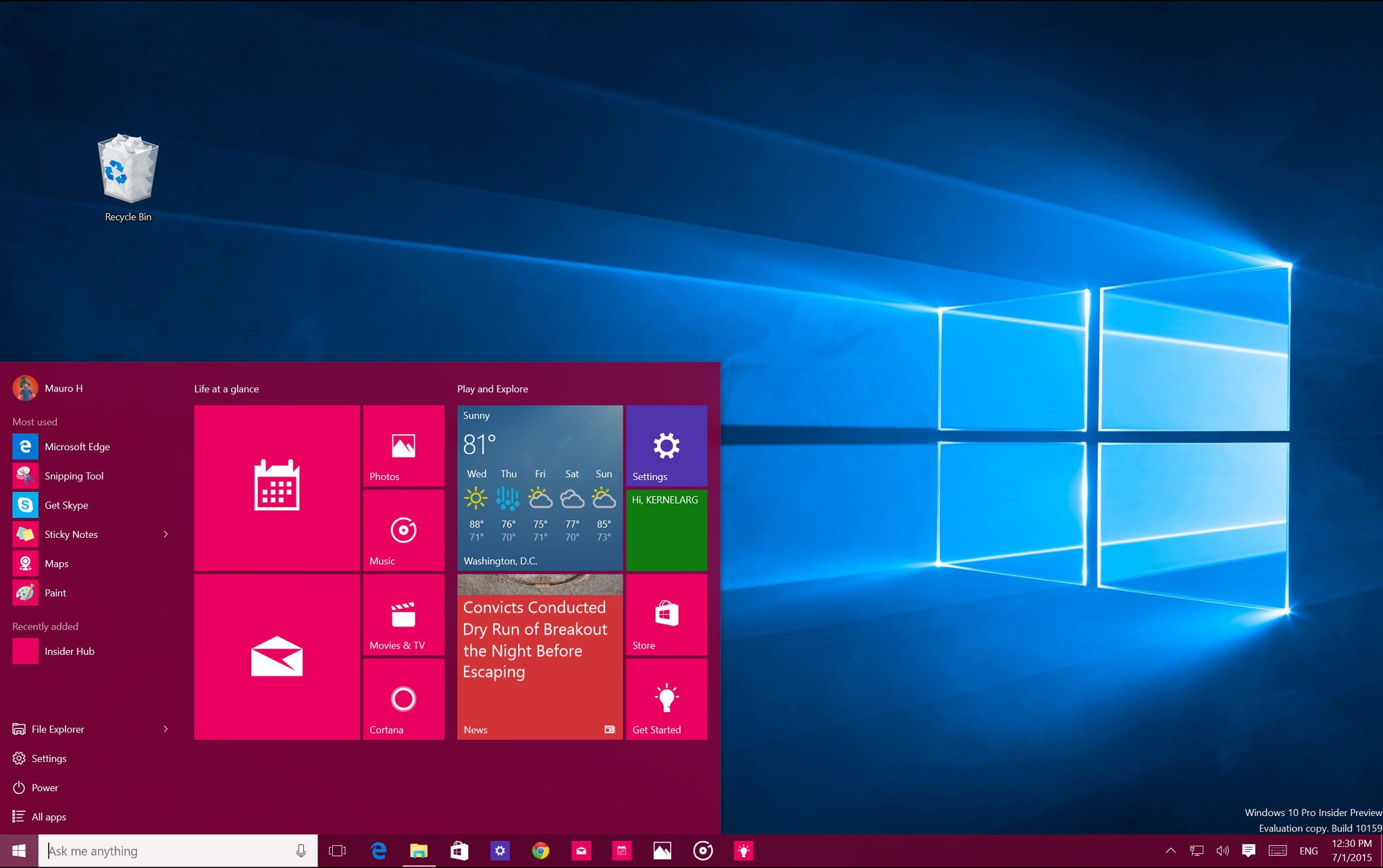
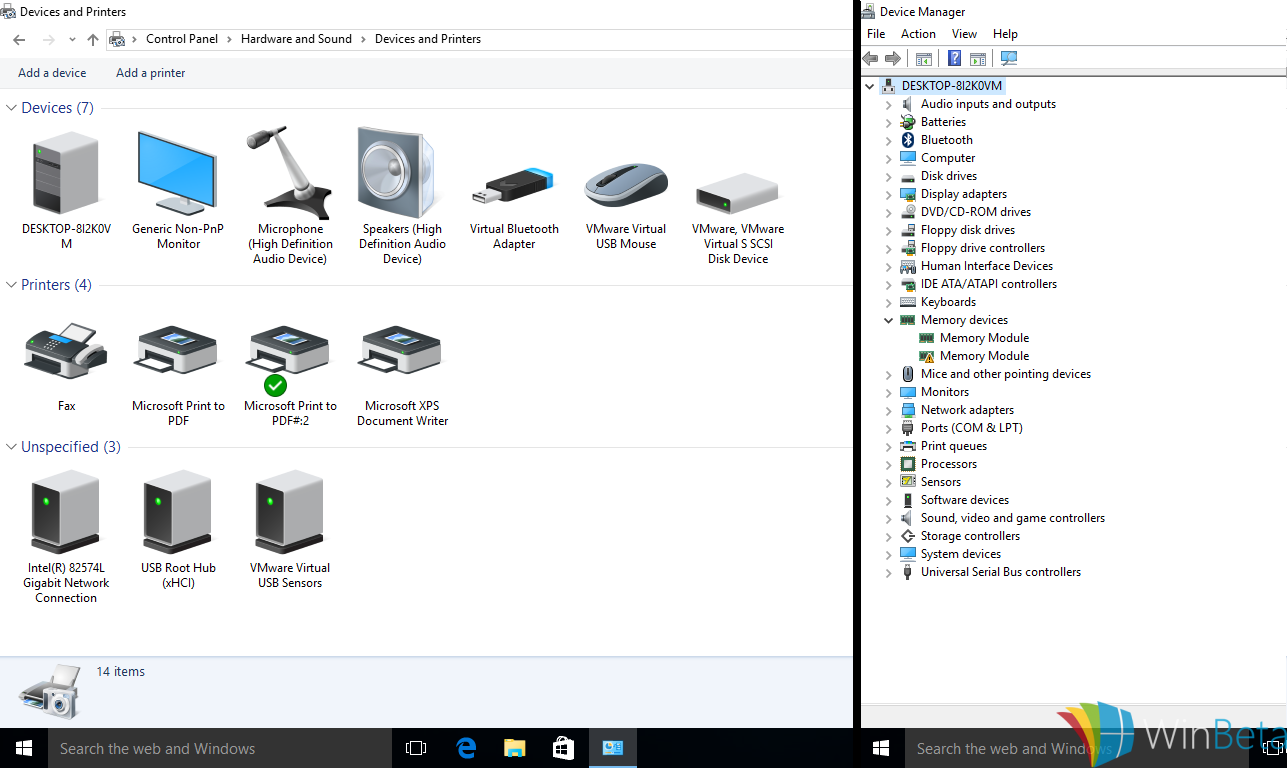
Windows 10 has been out for several weeks now, but the Windows team at Microsoft is reportedly still working on small but noticeable changes to its user interface. Newly leaked images show that the company has been working on some new menu animations for Windows 10, along with many changes in icon designs.

WinBeta reports that Windows 10 apps from the Windows Store now show open and close animations in their menus in recent internal builds, which are the same as users seen on regular desktop apps. Also, the context menus, instead of the pure white, now have a slight grey tint to them.
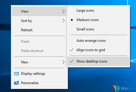
context menus

In addition, new icons for a variety of items in Windows 10 have also been put in recent internal builds, ditching the old ones that have been around even as long as Windows 95

Windows 10 new icos

The most recent release of Windows 10 for members of the Windows Insider program was 10532, which was made available on August 27. It's possible that those members will see these UI changes in future builds before they are released to the public.

Source: WinBeta

John Callaham
78 Comments
  • I hope they will not, over do, it.
  • The icon changes in Devive Manager and Devices and printers have been around since the last build.
  • I​ was going to comment just that. 10532 has already all these improvements.
  • http://i.imgur.com/PM1cM18.png
  • Actually I read somewhere they're making the context menus more grey/off-white to make it easier on the eyes (apparently people have been complaining).
  • Yeah....code geass? zero? Li beritannia? Ha ha!!! Nice username
  • Thanks, didnt know theres some1 here that knows code geass
  • Wow, code geass, It is the best anime I've ever watched
  • ALL HAIL LELOUCH!
  • You're not alone~
  • I love the new icons as it gives a refreshed look
  • That's a nice & subtle change, some icons looks dated on Win 10. Will look forward with the change. Posted via the Windows Central App for Android
  • Am I the only one who thinks the cursor icon (CD) that displays for 2-3 seconds on insertion of a CD/DVD has been the same since Windows 98?
  • Noone has opened the CD drive since 98
  •  seriously havent opened my RW since I rebuilt my PC...or wait...maybe it was the time before last that I rebuilt my PC.
  • Yeah the CD and DVD drives have old icons looking like from the days of Windows 2000
  • I hope this makes it as a real update for Windows 10. I don't like the current and much preferred the ones they showed off in November of 2014.
  • Need some love for mobile. Aero effects for action centre with accent colour tint. And while they're at it, shouldn't forget a toggle for both of these options.
  • +525
  • Yes.. Need this
  • Got to see a new build first.. Kinda anemic lol. Hopefully we will see a huge improvement this coming update lol. Hopefully...
  • Nope. According to someone, although not that much credible, thus build will be just bug fixes.
  • Have to wait and see DarkRyd lol. I'll be happy to see it whatever improvements have been made..
  • I want that badly man.. Hate the ugly black action centre
  • *&#&#&(@&#$^&*@#&
  • You sound like a spoiled rotten child who thinks they're entitled to everything. Be patient
  • I would prefer the glass method used on current windows desktop start than outdated aero that looks horrible. But seriously, if you thought you had "loading" and "resuming" before... you will be in for a surprise if they did something like that.  Even turning off transparency and background images improves the speed of any phone substantially.   
  • Well only on some phones. I have a Lumia 930 and Lumia 640 and I cannot see any difference with transparency ON or OFF
  • This stuff really should have been done prior to RTM.
  • There is no real RTM now. There is only constant refinements punctuated by larger updates bringing larger updates.
  • RTM is done already and there is an RTM technically, that's part of software lifecycle. Now we indeed gonna have constant OS major updates. There is no RTM in a sense since its still Windows 10 anyways with tiny versioning difference (not publicized).
  • There was a RTM becuase there has to be a release date.... but it's obvious the point was to release a stable thing with most features Microsoft wanted and polish from there. but they would keep updating... Well this person said "prior RTM" of course many things could have been done on a magical world before RTM, but this person doesn't know about software development especially an operating system so of course in his mind "prior to RTM" may sound nice. but no... I am glad Microsoft released the Windows 10 and polish from now. SO of course there was RTM... but it's obvious it was only about being stable enough, not about having all the features WIndows 10 can have because now it's a service and it has to be updated to bring many features and refine others.
  • So tell me how it is that every other version if Windows had a polished UI upon RTM? Microsoft should be embarrassed releasing an operating system in such a state and you are a fool for giving them a pass on it.
  • Again, it is a service. The point of releasing when they did was to get the product out there. Now that the product is out refinements will come in waves. This will never be a finished OS in the way previous versions were. It is more akin to how Arch Linux and other rolling release distros work than the standard release cycle. Posted via the Windows Central App for Android
  • Indeed. Oh well RTM is being released and TH2 will try to fix what RTM should really be. I hope we get all UI inconsistencies fixed, some enhancements, more complete animations everywhere, options, and features.
  • Those icons looks almost like modern BeOS clone.
  • only the perspective
  • Nice profile pic :)) Posted via the Windows Central App for Android
  • They finish the mobile first. Yeah!
  • A CONCEPT FOR THE CONTEXT MENU Windows-Feedback:?contextid=59&feedbackid=2ebf9504-39fa-46e7-a587-88bc91e3eef5&form=1&src=1  
  • Link doesn't work.
  • Link not working
  • Hmm...you seem to be missing the http://www. And the .com part Posted via the Windows Central App for Android
  • The Link open the feedback app on your windows 10 pc (i'm on 10532).... however, the windows stays blank and nothing loads :( EDIT: I left the window open in the background and it eventually loaded :) Grrrhmmm... had to manually transcribe the onedrive link, here it is for the interested onedrive.live.com/redir?page=view&resid=545A4C79C9B8896D!322340&authkey=!AEclxUC87KemnDk
  • The new icon for DVD drive is nice. But on my other laptop it has a blu-ray drive, it still uses the 3D icon from windows vista and 7. Not every icon has been changed (yet).
  • Every thing for windows 10 , nothing windows mobile, why Microsoft entered mobile world with nothing specific features to it's platform, g
  • Simple, bugfixes. Windows 10 on phones honestly doesn't run well at all. What's the point of new features if no one can use them? Certain phones run it fine, but the htc one m8 can't run it well without constant reboots, and most of the apps still crash for it (the messaging one for example). On the Lumia 822 it runs, but it's beyond laggy. These issues are harder to work out than changing icons and menu colors. Remember that it is two different teams, which means Microsoft is not favoring one over the other. Posted via the Windows Central App for Android
  • W10 house is rather dark place. That shining light is coming from W8.1 house next door?
  • I need a light theme for my House.
  • I like the dark theme, actually I wish they would finish making the dark themes for the apps so that you don't need a reg hack. It's better for your eyes. Posted via the Windows Central App for Android
  • Finally some more icon updates that re left behind for a long time already. Window animations are long overdue too which should've have been there since early Insider Preview. Its head scratching not to have window animation since its baked on the OS since Vista, yet somehow isn't available on Modern/Universal apps. Context menu unfortunately is still essentially inconsistent. What they just have done is make it bigger and change colors, nothing special and its a fake consistency because its not consistent still. Example animations are different too. Consistency of menus have to be pixel perfect across the OS (except some 3rd-party apps of course). Current ones still have different seperators, highlight sizes, highlight colors, icons, and alignment. Also shadows really needs update to same shadows used in Taskbar flyouts. We still use same XP shadows and menu animations. Tooltips are also left unchanged.
  • I still can't stand that context menu size. But the other changes seem sleek!
  • It is good as they keep update the OS for free.
  • Cool
  • I wish Microsoft put as much passion in Windows 10 mobile as they do on UI and customization in full windows 10.
  • Windows 10 is not finished, and never will be, but more importantly, it wasn't ready when released, it is really still too buggy to have been on general release. Gone stock worth it on my home pc, but at work I had to go back to Windows 7... at least for now.
  • My apologies - I'm not sure why the image I tried to post isn't displaying... http://i.imgur.com/PM1cM18.png
  • http://i.imgur.com/PM1cM18.png
  • It's not allowed unless you work here.
  • I also don't understand why the mail app is called "Ouklook Mail" on Windows Mobile 10 and have a different icon from the mail app on Windows 10 Desktop .. And same thing for the People Live Tile. It looks so good on Mobile, and so fucking bad on Desktop version
  • They really need to update those other applications like device manager to make them as modern apps
  • why?
  • I've always said this os would do well with more animations. Good job Microsoft.
  • Noooo I already like these icons
  • You want it to look good even when it freezes and crashes ;)
  • It'd be cool if the transitions looks like WP10 (Switching Task ETC)
  • YES! UPDATE ALL THE ICONS! Regedit, you too!
  • Wish they'd simply give a GUI to support personalization with icon packs...Windows 7 was the best looking Windows ever.
  • Icon Pack's are great. I've made a few at Wincustomize.
  • Win 10 desktop icons worst I've ever seen. Flat is good to keep size of icons down, but these were just made amateurishly. The This PC icon's perspective is way off.
  • Still hopping for tabs in explorer
  • Good job MS, working on the unimportant features first. While everyone using Windows 10 on tablets are unhappy.
  • Icons changes? Really? Posted via the Windows Central App for Android
  • Really hoping for some nice UI polish in the next few builds and this seems to be checking the boxes. Context menu consistency was a big one as was clearing out legacy elements. Now if only we could get some interface guidelines so we designers could go crazy.
     
  • I wonder when they're gonna make the start button's windows logo a bit larger. It looks just too small and with no empashis when compared to the rest of the UI. IMO.
  • It was a good size in 8.1. Change for no reason.
  • Yeah, I agree with you on that. The size in 8.1 is pretty good. The UI as a whole looks much more harmonic with a logo of that size. :)
  • lol yeah its actually smaller than app taskbar icons when pinned. Windows, Cortana, Taskview are all smaller than the rest of then app icons for some reason