


Microsoft's emojigate popped up in the news again after lying dormant for a few months. It looks like Microsoft may bring 3D emoji to Windows 11 after all. The perplexing saga of emojigate includes blog posts, marketing materials, and project leaders from Microsoft contradicting each other. It's drawn a surprising amount of passion and criticism. The latest chapter serves as a reminder of Microsoft's track record of mixed messages and poor communication. It also illustrates that the company struggles to deliver a unified vision across multiple teams, and that fact has me worried about Windows 11.
This saga isn't about emoji, at least not to me. I'm sure there are people that are upset about Windows 11 having 3D or 2D emoji, but I think emojigate illustrates a larger problem within Microsoft's design process. If Microsoft can't deliver a clear message about what it plans to do with emoji, how can we expect the company to enact a unified design strategy across Windows 11? And if the company can't design emoji and then ship them to an OS, how can we expect Microsoft to unify the look of all of Windows 11, which is tremendously more complex?
No, they didn't scam you. You're exaggerating this a bit. They simply used the wrong graphics. Sorry about that. Will make sure they use the right ones going forward.No, they didn't scam you. You're exaggerating this a bit. They simply used the wrong graphics. Sorry about that. Will make sure they use the right ones going forward.— Brandon LeBlanc (@brandonleblanc) October 15, 2021October 15, 2021
Mixed messages still haven't stopped
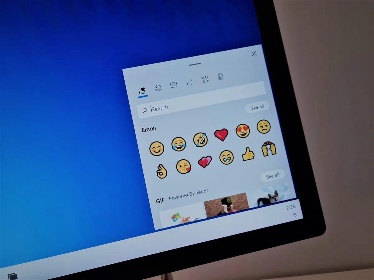
Emojigate is a needlessly complex saga that I've spent far too much time on. I can't imagine how the people designing the emoji feel. There's probably some sort of icon that'd illustrate how the designers feel... if only it was available in 3D. In any event, the entire saga is just odd. It includes Microsoft having blog posts and tweets highlighting 3D emoji coming to Windows 11 and the senior program manager of the Windows Insider team claiming that the posts used the wrong graphics.

Despite Brandon LeBlanc claiming that Microsoft's posts used the wrong graphics, the tweets in question have not been removed. Microsoft didn't update the Medium post on emoji until November 22, 2021, which was more than a full month after emojigate kicked off.
On top of posts being updated late or being left untouched, Microsoft continues to send out mixed messages. Nando Costa, a distinguished designer at Microsoft, says that the company is working to make the Windows 11 emoji 3D.
Thank you and agreed! We're working on that. 😅Thank you and agreed! We're working on that. 😅— Nando Costa (@nandocosta_art) January 28, 2022January 28, 2022
How has a higher-up from Microsoft not sent out a memo about this?
Maybe Microsoft has changed its plans regarding 3D emoji on Windows 11, but why would those changes be announced by a designer on Twitter instead of an official blog post? Why has Microsoft's design team been silent on this for months?
It doesn't seem that difficult. Either 3D emoji are coming to Windows 11, or they are not. Microsoft could clarify its plans, send out word to its employees and contractors, and clear it all up. Instead, we're left to piece together tweets, new blog posts, and posts that occasionally get updated with new information.
Looping it back to Windows, if Microsoft can't get on the same page about whether its emoji are 3D or 2D, how can we expect the company to piece together decades of Windows code into a consistent design?
Microsoft's design is consistently inconsistent

Windows 11 includes elements from several versions of Windows. It also has apps, windows, menus, and other components developed by different teams. As a result, there's an incredibly long list of inconsistencies within the OS. For example, a Reddit post recently noted how the dark and light modes of Windows 11 differ, such as how one utilizes rounded corners on highlight boxes and one doesn't. The point of this post isn't to highlight every inconsistency within Windows 11 since I don't think our CMS would allow an article that long. If you head on over to the Windows 11 subreddit, it's easy to find examples of mismatching menus and inconsistent designs.
Of course, this isn't anything new for Microsoft. The company has been tremendously slow when it comes to upgrading the look of legacy components. Microsoft only started testing a new volume UI this year. The one currently available on Windows has been around since Windows 8.
When it comes to design, you can say one thing about Microsoft: It's consistently inconsistent. Even when the company has a design framework, new or refreshed apps don't always end up looking the same. What we get as users is an OS and set of apps from Microsoft that look half-baked.
Mismatching menus are probably here to stay

Microsoft has come a long way when it comes to the look of Windows, but I fear that the company will never truly unify the look of its OS. Separate teams implement design languages differently. Microsoft's first-party apps wildly vary when it comes to fitting in on Windows.
Even if unifying the look of Windows and Microsoft's own apps was a priority, I question Microsoft's ability to execute a unified design strategy. After all, the company can't even figure out which emoji it's shipping.

