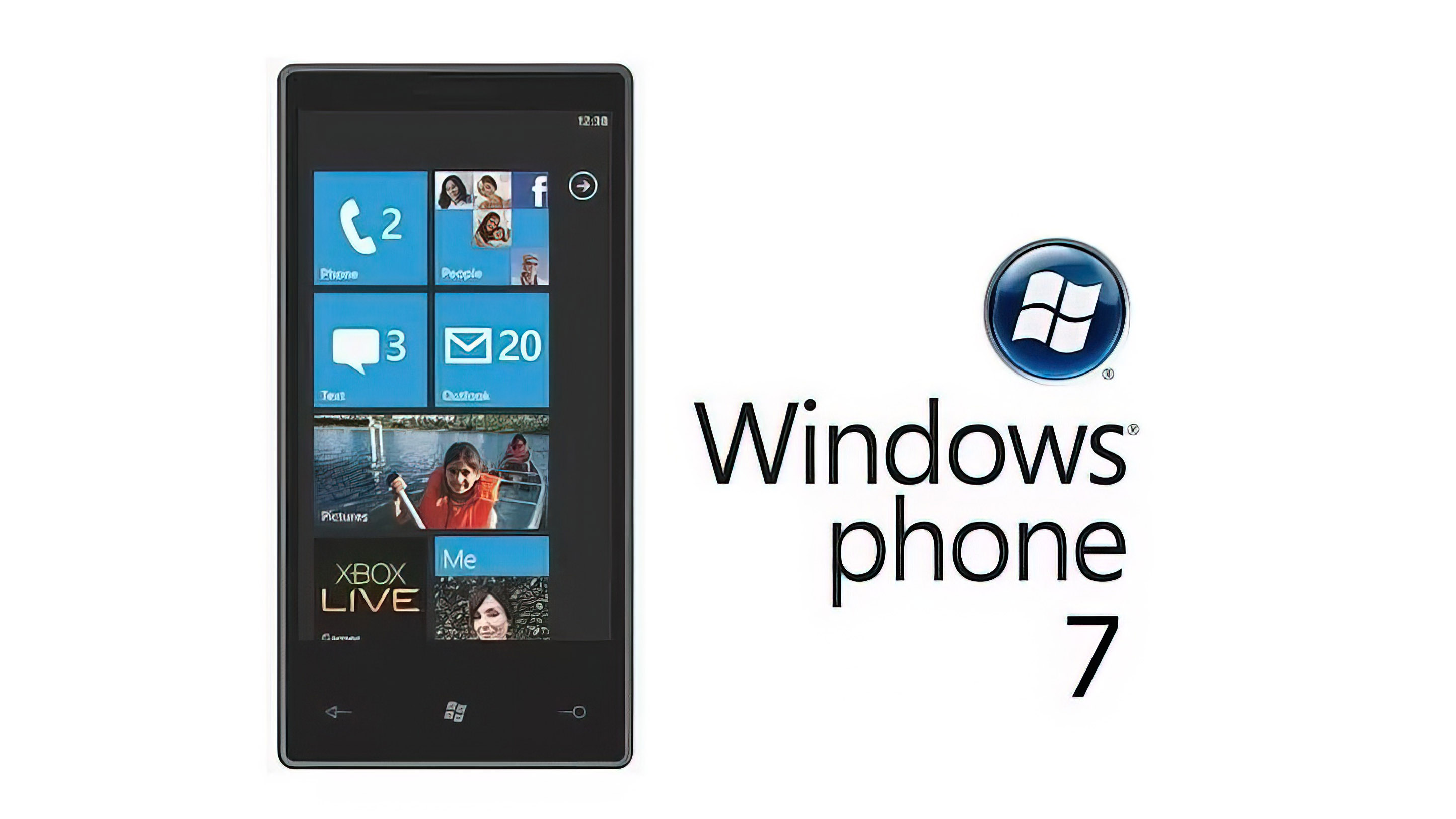
12 years ago, Microsoft launched Windows Phone 7 and won a cult following
With its flat typography UI and unique hardware, Microsoft’s reboot of its mobile OS was both a success and a failure.
All the latest news, reviews, and guides for Windows and Xbox diehards.
You are now subscribed
Your newsletter sign-up was successful
Join the club
Get full access to premium articles, exclusive features and a growing list of member rewards.
What you need to know
- On October 21, 2010, Microsoft launched Windows Phone 7 globally
- The official US launch was a few weeks later, on November 8
- Windows Phone 7 borrowed a lot from the Zune media player and stood out from the crowd
Windows Phone 7 goes down as one of the iconic moments for Microsoft’s mobile ambitions. Until then, the company was riding on fumes with Windows Mobile 6.5 with previous rumors of a ‘Photon OS,’ aka Windows Mobile 7, to replace it.
But instead of continuing with a new era of Windows Mobile design, the company chose the very bold path of Windows Phone 7 Series (Microsoft, thankfully, later dropped ‘Series’ from the name).
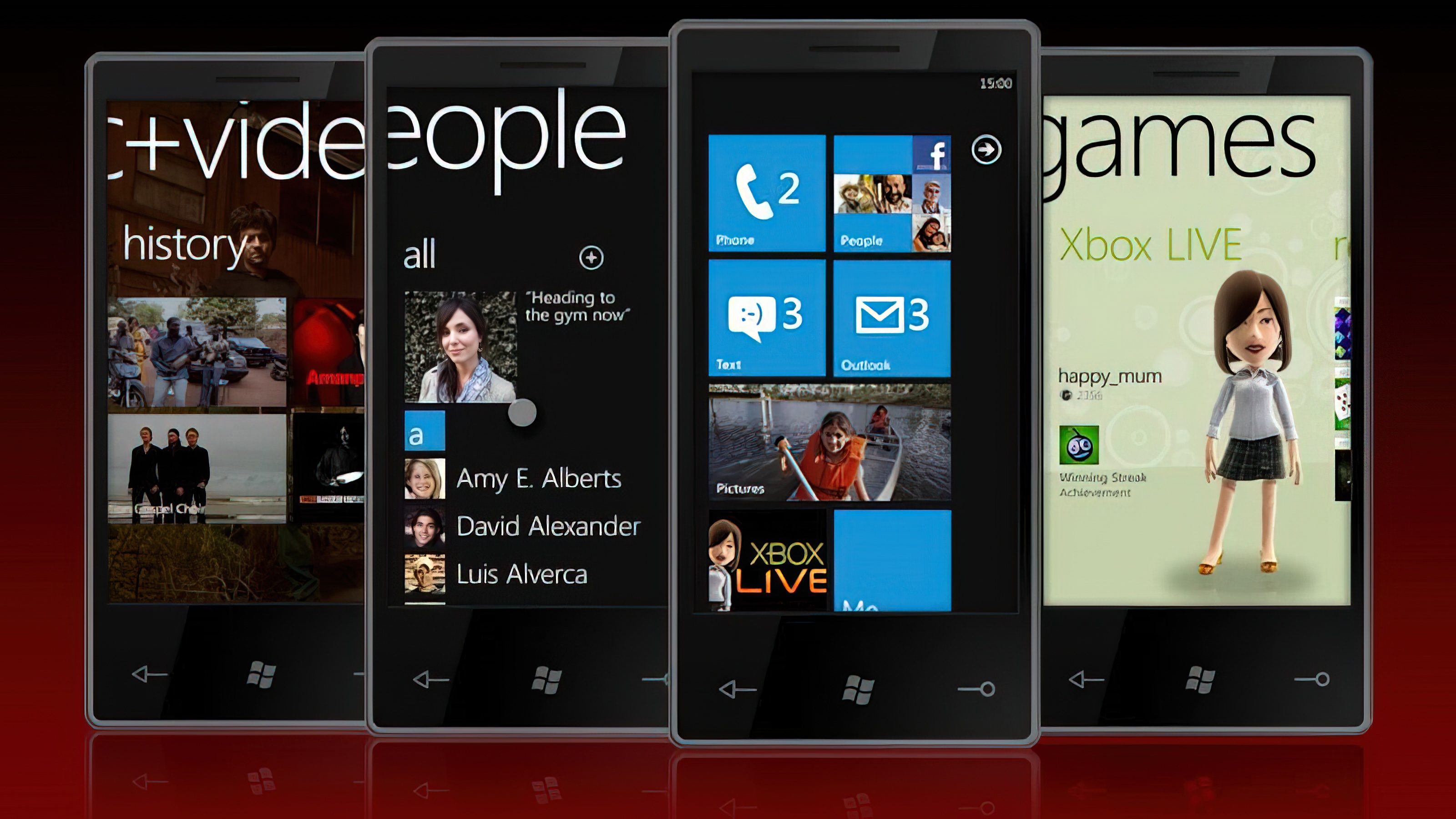
Windows Phone 7 was an entirely new way of thinking about an operating system. The UI borrowed a lot from the Zune series of music players, which borrowed from Windows Media Center, and found inspiration from the Swiss Movement in the 1960′s. Steeped in fonts like Helvetica and later Segoe WP, Microsoft’s “modern and clean” design language had a philosophy behind it and even a clever name – Metro UI – as the layout was like road signs: Clear, iconic, and text-driven.
Article continues belowMetro UI later evolved to a generic “Windows 8 user interface” due to a trademark claim by German multinational corp Metro AG. That didn’t stop many apps, like MetroTube, from embracing the philosophy, which Windows Phone fans embraced as a badge of honor.
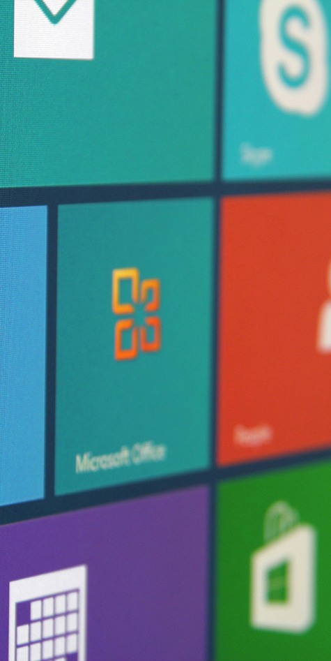
Of course, what made Windows Phone 7 so fun at the time was how unique it was compared to iOS and Android. Microsoft’s design relied on a pure white or black “theme,” with no wallpaper and bold Live Tiles that showcased photos, app updates, and whatever developers came up with.
Live Tiles evolved to Windows 8, which, regrettably, was rejected by the public as too radical of a change from the classic desktop. Xbox also embraced a Tile-like design for many years as the company sought to align its design philosophy across brands.
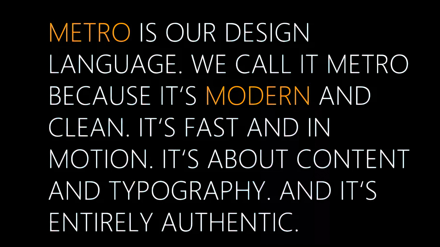
Despite Microsoft’s very forward-looking and radical reconceptualization of what a modern UI should look like, many people found the phone OS too stark or even confusing from afar versus the more familiar app icons on a desktop approach of iOS and Android.
All the latest news, reviews, and guides for Windows and Xbox diehards.
Basically, you either “got” Metro UI, or you didn’t.
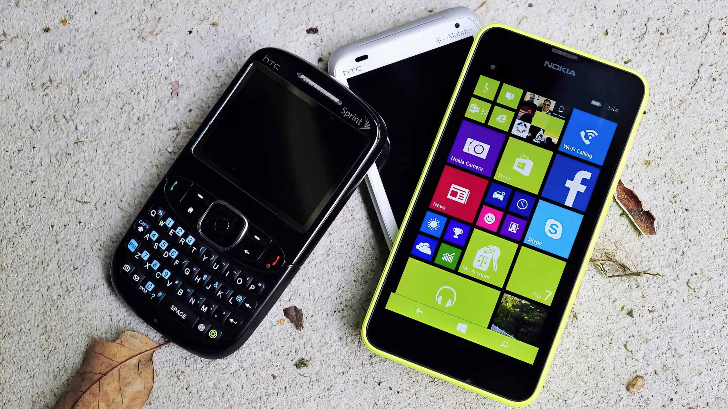
But let’s face it, Microsoft’s Metro UI flat design language, which rejected skeuomorphism, was practically art. Its look still resonates with people who grabbed Windows Phone 7 launch devices like Samsung Focus, HTC HD7, Dell Venue Pro, LG Quantum, HTC Surround, and LG Optimus 7 daily.
Was Microsoft ahead of its time, or simply too late to the party?
The answer is both, of course. Windows Phone 7 came too late to the market, having to play catchup since its inception. But Microsoft, and the talented people behind the Windows Phone 7 OS, deserve all the credit for making the bold choice to create an OS that is still fondly discussed 12 years later.

Daniel Rubino is the Editor-in-Chief of Windows Central. He is also the head reviewer, podcast co-host, and lead analyst. He has been covering Microsoft since 2007, when this site was called WMExperts (and later Windows Phone Central). His interests include Windows, laptops, next-gen computing, and wearable tech. He has reviewed laptops for over 10 years and is particularly fond of Qualcomm processors, new form factors, and thin-and-light PCs. Before all this tech stuff, he worked on a Ph.D. in linguistics studying brain and syntax, performed polysomnographs in NYC, and was a motion-picture operator for 17 years.

 Windows Central Insider


