


What do you need to know about Windows Phone 7 Series? It's not Windows Mobile as you know it - the re-branding from Windows Mobile to Windows Phone Series 7 is completely appropriate. Here's the big changes and some (very very early) impressions.
Read on for our early take of this early build of Windows Phone 7 Series
First, as we mentioned, the hardware Microsoft has to show so far is not anything like what the final build of the hardware will be. Instead we have development devices for a development build. We saw some hang-ups throughout - but for an OS that's not set to launch until just before the Holidays at the end of this year, it was remarkably polished.

User Experience

Windows Phone 7 Series is a lot like the Zune. We're not calling this the Zune phone, neither is Microsoft, and neither should you. That said, what we have here is a very dynamic feeling OS with lots of nice animations between screens. Content flips open and closed like a page in a book.
Similar to Zune, there's a heavy emphasis on typography instead of 'chrome.' In fact, one of the mantras here is "Content, not Chrome." It sounds a little boring, but in fact the large, clean type looks and feels incredibly elegant.
The lack of "chrome" persists throughout the entire OS. Instead of menu bars, gradients, and garish colors you have a dark black slate, white or gray type, and your content filling the entire screen. Despite that, the visual cues that Microsoft provides throughout the entire OS really does help maintain your sense of 'place.'
OEM manufacturers cannot change this user experience. They're free to add panels and apps, of course, but Windows Phone is bringing a consistent experience to all devices.
Some apps get the distinction of becoming "hubs," which have the ability to swipe left and right between different options. For example, within Bing search you can swipe left and right to search the web and search locally. Calendar lets you swipe left and right between different calendar views. Within email, you can swipe between you inbox, unread messages, and urgent messages.
For more options, there is a small button bar at the bottom of some apps with certain features like sending and attaching. In some of those apps you can tap near the buttons to pull up another menu with still more options. It's not as clear or consistent as a dedicated menu button, however, so you just sort of have to check to see if there are more options there. It definitely seems a bit confusing, but if nothing else it's a sign that we're looking at a different kind of aesthetic from Microsoft. Their dedication to the UI principles behind Windows Phone 7 Series won't be shaken.
Start
Everything with Windows Phone 7 starts and stops with the Start screen experience. There are two sides to the Start Screen - tiles on the left, a straightforward app menu on the right. You're going to be hitting the Start button a lot, as pretty much everything requires you jump back to that screen to switch between apps. Speaking of buttons, there are only going to be three of them: Start, Search, and Back.
Let's start with the App menu, which is the simplest part. It's just an alphabetical list of apps. You can "pin" any app to the tiles side by long-pressing on the item.
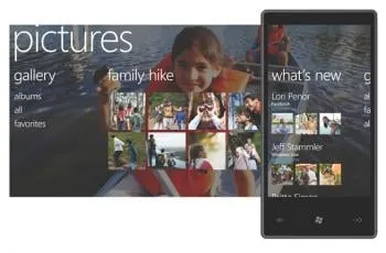
When your app becomes promoted to live tile, Windows Phone will dynamically set the tile to include whatever content the tile makes available. For example, you most recent photo, how many missed calls you have, a tiny thumbnail of the map of your most recent location, etc.
You can have plenty of tiles, though Microsoft wasn't sure exactly how many it stops at - roughly three screens worth was their current thinking. Default tiles include phone, SMS, email, Internet Explorer, music, etc.
In all, the tile interface gives you information at a glance, like the traditional today screen but in a format that's not only much prettier but also much easier to configure.
Music and Games

Beyond the new UI, the big new features everybody will be talking about are Zune and Xbox integration.
Zune integration is simple and straightforward - it's a Zune inside a Windows Phone, basically. That means you'll be using the Zune desktop client to sync -- and that includes sync over WiFi -- but it also appears to mean that Windows Phone 7 Series won't be the enterprise powerhouse at launch that Windows Mobile currently is.
Still - Zune in a phone: this is a big deal. Additionally, the Zune hub on Windows Phone is also extensible for third parties. Microsoft explicitly mentioned that there would be a Pandora app within the music hub.
The other big feature is Xbox Live integration. Games on 7 Series will be integrated with Xbox Live - updating your gamer score and achievements. You can also view live announcements, play social games, and see your own gamer tag/avatar.
Search and Contacts
Bing and Bing Maps are in Windows Phone 7 and they look and work great. The maps app is especially impressive - with pinch-to-zoom and dynamic maps that 'blur' as you change zoom levels and even automatically switch to satellite view when you zoom in close enough.
Bing is also able to 'guess' what kind of search you want - "sushi" goes to local, "definition of sushi" is more likely to go to web.
Unfortunately, what you don't have here is any sort of universal search. Search is completely contextual - to search emails (assuming one can?), you go into emails. To search contacts, you need to drop into the contacts panel. Hopefully Microsoft makes quickly finding and calling/texting people a priority between now and launch, because the idea of droping to start, hitting contacts, and then searching doesn't appeal to us. Then again, you are free to add specific contacts to the tiles screen.
Contacts does have plenty of social networking integration. You can pull in contacts from (that we saw) Facebook, Exchange, and Windows Live. Each contact panel has the ability to wipe left and right as well, one screen showing contact info, another their most recent status messages.
Productivity

We didn't get a deep look at office, but it's here and OneNote is front and center. There is full compatibility with SharePoint and you can access those documents offline.
Email looks great, though - there's a lot of white space so you won't get a ton of emails in one screen, but scrolling is fast enough to hopefully not make that a problem. You can also select multiple messages from within your inbox to delete or move them for faster triaging.
Contrary to previous rumors, there doesn't appear to be a 'business edition' of Windows Phone, although we suspect that both Microsoft and their OEM partners will continue to invest in Windows Mobile 6.5.3 as the device that's good for people who need to heavily manage devices in a corporate exchange environment.Beyond that, it does look like Windows Phone 7 Series takes one step forward and two steps backward when it comes to multitasking. The step forward: everything is faster and smoother and better looking and of course you can do stuff like listen to your Zune music in the background. The step backward is that it doesn't look like we have 'true' multitasking just yet - but we'll see if that's really the case.
Wrapping up
We will obviously have plenty more to talk about and plenty we haven't covered here - we've had some face time but not nearly as much as we'd like.
That said, Windows Phone 7 Series is some good looking stuff and it looks like it's great for people who love Zune or Xbox, but whether or not traditional Windows Mobile super users will be interested may depend on the application and multitasking story.
Stay tuned - Windows Phone 7 Series is a game changer.

