


SPB has released the much anticipated updated version of Mobile Shell 2.0. It's hard to say that Mobile Shell 3.0 is an update to the previous versions of this popular utility because of the dramatic changes present with 3.0. Just looking at the home page of both versions, the casual observer would think they are looking at two unique applications.
We received an advance copy of Mobile Shell 3.0 about a week ago and found it to be very feature rich and more customizable than its predecessor. You know the drill, to find out more about Mobile Shell 3.0 plus plenty of screen shots, simply follow the break.

A Brand New Look

It was tough to find a starting point for this review simply because Mobile Shell 3.0 has so much to it. It builds upon 2.x very nicely but in the process SPB ends up with almost a completely different application. The transformation reminds me of when Windows 3.1 was updated to Windows 95. You still had a Windows operating system but the look and feel was noticeably different.
Where Mobile Shell 2.x placed a tabbed plug-in on the traditional Today Screen, Mobile Shell 3.0 takes over the Today Screen. You can still access the traditional Today Screen but Mobile Shell becomes your new "home" page and that's probably a good place to start with the nuts and bolts of the review.
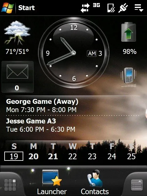
Home Page
Mobile Shell has two home page layouts to choose between. You have the Professional Layout that is rather conservative in appearance and is almost a mirror image of Mobile Shell 2.x's "Now Screen". SPB added a second home screen layout, the Lifestyle Layout that is more casual and is highly customizable through the use of widgets.

The Professional Layout has the date/time, weather icon, messaging center, and calendar displayed. Customization of the Professional Layout is limited to a few options with the calendar display. The Professional Layout is designed to give you a snapshot of your day.

Where the Professional Layout is a single screen, the Lifestyle Layout has two pages to either side of the main screen. These side panels (swipe navigable)can hold widgets ranging from media player to contacts to application launchers. Switching between layouts is as easy as a up/down swipe or you can use the menu tab (lower right corner of the screen) to change layouts. One nice feature of the Lifestyle Layout is that you can use a larger landscape image and as you pan across the three pages, you pan the image. Below is a flow chart of the Mobile Shell 3.0 home pages.

On either home page layout, you can launch applications by tapping on the icons. The weather application can be accessed by tapping the weather icon, the agenda app by tapping the calendar display, etc. Depending on your phone, the End Key as well as the Home Key will return you to the last Home Page you viewed. If you were on a widget page of the Lifestyle Layout, that is where you will return to.
I ended up parking my AT&T Fuze on the Professional Layout to take advantage of the snapshot view it offers and, just a swipe away, built the LifeStyle Layout with widgets to send me to my more commonly used applications and contacts.
Traveling Beyond the Home Page
At the bottom of either home page layout you'll find a Launcher and Contact icon as well as a menu and carousel tab that sits in the left and right corner respectively.

The Launcher icon takes you to equivalent of your Programs Window in Mobile Shell 2.0. The Launcher has two layout styles as well that can be navigated between by tapping the icons at the bottom or swipe the screen.


The first layout contains customizable favorites and recently used applications. The second layout has applications sorted by category in various folders (Internet, Tools, Programs, etc.) Tap on one of the icons and you can select from various applications from that category. Unlike version 2, the programs are scrollable from top to bottom as opposed to page to page.


The Contact Icon, as you would guess, takes you to the phones contacts. By default, you are taken to the Favorite Contacts page. This is the "speed dial" icons/avatars that take you directly to a specific contact where you can choose to dial one of the numbers, send SMS messages or email the contact.
The other icons at the bottom of this window include your call log and full contact listing. The full contact listing can be navigated by scrolling up/down the list or by dialing the first five letters of the contacts name. This will narrow the field, making finding the desired contact easier. I would have liked to have seen alphabetical tabs on this screen but the keypad search works.

The Menu Tab (located at the bottom right) will pull up the menu options for each screen. Instead of a "pop-up" menu for your options, you have a "pop-up" window with icons representing the various options. The options will vary from screen to screen.
Where's the Kitchen Sink?
I had my hands on the review copy for a few days before the documentation caught up with me so learning Mobile Shell 3.0 was somewhat of an adventure into the unknown. Every finger swipe revealed a new window or feature that it wouldn't have surprised me if I stumbled upon a kitchen sink. And it all starts with the Carousel Tab.


The Carousel tab (to the bottom left) pulls up a carousel view of the various SPB pages as well as the home pages and pages accessible via the home page icons (contacts and launcher). Essentially it is a one stop shop for the various panels/windows of Mobile Shell 3.0. The carousel is touch navigable and once you find your page, tap on it for it to go full screen.
You can also switch to a tile/panel view. This view reminds me of the panels Sony uses on the Xperia. One can only hope that SPB opens Mobile Shell up for additional panels just as Sony did with the Xperia.

The Weather panel can be set to a specific city and displays the current conditions and four day forecast. The city selection includes a strong representation of U.S. and International locations. I would be shocked if someone couldn't find a location close to their house.

The Agenda Page will display up to four weeks of appointments as well as a calendar of that period. You can customize the agenda appearance to show open dates as well. The calendar view is collapsible and, as with most of the windows in Mobile Shell 3.0, the agenda is touch navigable.

The Phone Profile is where you can set the ringer volume, system sounds volume, the ring tone and type. The Time panel has your alarm function as well as displays for two additional time zones/cities.

The Contact Carousel panel is a quick way to customize your favorite contacts (those you create widgets of). Here you have a touch navigable carousel which will allow you to set ring tones for an individual contact and manage the contact picture.
Facebook Integration

One of the many new features to Mobile Shell 3.0 is the ability to integrate Facebook Profile pictures to your contacts. You have the ability to choose a camera from a file or take one with the camera but now if your contact is a Facebook friend, you can import one of their Facebook portrait pictures.
Settings
The one thing that was nice about Mobile Shell 2.0 is the amount of settings you could tweak. The settings pages were all under one roof, a one-stop shop if you will.

With 3.0, settings are scattered about a little more. Instead of having the core settings tabbed and under one roof, they are more categorized under separate icons. Additionally, as mentioned, each page will have some menu options to allow for customization. Color themes are now a separate application and not located under the Mobile Shell settings window.

There are two settings that jumped off the screen at me. The "Override Start" option sends you to the Launcher window when you tap the "Start" menu of Windows Mobile on a Home Page. This option appears to only affect the Home Pages because the drop down "Start Menu" continues to appear with the interior pages.
You also have a 3D accelerator option but if your phone has not been tested, you get a nice warning saying that using the accelerator may cause performance issues. On the Fuze, a phone that hasn't been tested, I get the warning but didn't notice any performance changes. In using the accelerator or override start options, a soft reset is required for the system to accept the changes.
Overall Impression

It's somewhat unfair to compare Mobile Shell 3.0 to Mobile Shell 2.x because they are so vastly different. Mobile Shell 2.x really dealt with life beyond the Today Screen while Mobile Shell 3.0 steps to the forefront. I'm a big fan of Mobile Shell 2.0 and quickly becoming a big fan of Mobile Shell 3.0. There were a few hiccups along the way but nothing terminal. For the most part, Mobile Shell 3.0 was stable and ran smoothly save two experiences. Touch navigation was smooth and responsive as well.
For some reason during my initial installation of Mobile Shell 3.0 I lost the ability to close programs by tapping the "x" and lost the drop down Task Manager icon that sits on the upper right corner of the screen. After uninstalling Mobile Shell 3.0, soft resetting and re-installing Mobile Shell 3.0 everything functioned properly with regards to closing programs.
Screen rotation was noticeably slower with Mobile Shell 3.0. In testing it on the AT&T Fuze, it took approximately four seconds for the screen to rotate when I extended the keyboard or turned the Fuze horizontally.

Another glitch in screen rotation is that with the Lifestyle Layout, the widgets have a tendency to get bunched up with the horizontal view because they can't adjust to the narrower view. I found that the smaller widgets and contact sizes work better but if you put a larger widget (e.g. calendar) it has a hard time adjusting to the rotated layout. This problem was not present with the Professional Layout and while it can be annoying, I don't think it's a deal breaker.

I really liked the widgets and the ease in which they are created and customized (you can change the size, position, and add labeling to most widgets) but customization is not universal. For example, while you can create a widget for individual email accounts you can't label them. Sorta defeats the purpose of having separate widgets.

Another short coming with the widgets is that can't create a widget for your Outlook email. You can choose a widget for all incoming messages that will cover email, SMS, and missed calls but it would be nice to separate all your email accounts much like the traditional Today Screen does.
SPB points out in their release documentation that Mobile Shell 2.x was a tremendous success and it was challenging to design 3.0 since customer expectations are quite high. Just as Microsoft took the windows concept of 3.1 and developed a successful update in Windows 95, I think SPB has done the same with Mobile Shell 3.0. SPB has taken the concept and functionality of Mobile Shell 2.0 and added a tremendous amount of functionality to it. Additionally, SPB developed Mobile Shell 3.0 to be compatible with Windows Mobile 6.5 so when the WM 6.5 phones becomes available, Mobile Shell 3.0 should still compliment Windows Mobile without any (expected?)conflicts.

We have always considered the Mobile Shell line-up as a "must have" application for Windows Mobile and version 3.0 isn't any different. If you are a loyal Mobile Shell 2.0 user, version 3.0 does have a fifteen day trial period. It's definitely worth a look but give the trial version a few days to sink in. There is so much to Mobile Shell 3.0 that it can be a little overwhelming and may take a day or so before you can make a proper evaluation. It does have a few issues but nothing I think will send you screaming back to the checkout counter for a refund.
Mobile Shell 2.x or 3.0? I don't think you can loose either way but it's hard to ignore the features and customization that 3.0 offers.
Overall: 4.75/5


| ProsWidgetsFacebook IntegrationTouch NavigableHigh level of customizationWindows Mobile 6.5 CompatibleConsLabels not available for all widgetsOutlook email not able to be a lone widgetScreen Rotation noticeably slowerLifestyle Layout jumbled up in Horizontal ViewSettings not under one roof |

