


What you need to know
- Slack has a major UI redesign rolling out to users on the web and the desktop apps.
- The new design has cleaned up menus, settings, and more, while also adding some new features, such as sidebar sections to group together channels, DMs, and apps.
- There is also a new mobile app redesign in the works, but there is no word on when it will be released.
Due to the recent outbreak of the novel coronavirus, people all over the world are being asked to work from home. As a result, many are adjusting to a new work environment and tools to make collaborating with others easier outside of the office. What could be a better time to launch a new and improved design for one of the best workplace communication apps?
Slack is used by millions worldwide by major corporations to help them work together and stay productive. However, it has drawn some criticism over features being hard to find and an overall clunky interface. Fortunately, the main focus of the update was simplifying the layout and making it easier to use. Speaking on the update, vice president of design Ethan Eismann said, "the design of Slack was more complicated than we really felt like it should be."
We want to make sure it's easy for anyone to use Slack. It's important that Slack is adaptable to the way people work.We've taken a lot of the historical features and reorganized them in a way that makes them much more apparent in the right way and simple to use. That was very much the goal of this process.
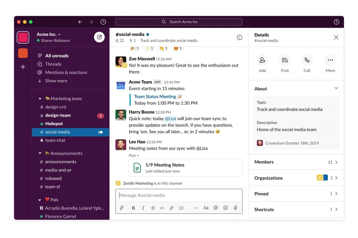
The sidebar is where some of the most significant changes were made—starting with sidebar sections, which allows you to drag and drop messages, channels, and apps into collapsible groups to better organize your workspace when working on a project. The only downside is that this new feature is not available for free Slack users, only those who use a paid plan.


The next biggest change you're likely to notice is the new large compose button in the sidebar. Using this button, you'll be able to quickly start drafting a message for a DM or specific Slack channel from anywhere in Slack. Before you press send, it will even load the corresponding message history within the draft view.

Speaking of sending a DM, Slack is now making it easier to find who you want to message with a new section at the top titled "People." There is also a section dedicated to mentions and reactions, making it easier to keep up with all the interactions from your team involving you. Previously, these were all tucked away in the UI, but now, you can access them more quickly and keep up with everything more easily.

Navigation should also be significantly improved since the app has cleaned up most of the menus, preferences, and added more space to make it feel less cluttered. The top bar has also gotten a refresh, adding shortcuts to switch between channels and DMs with support for keyboard shortcuts. There is even a new larger search bar.
The changes will begin rolling out today on the desktop and web versions of Slack. It will begin with new users and show up for everyone else in the coming weeks.
While speaking to The Verge, it was also confirmed that a new mobile version of the app is in the works. It will include buttons for home, DMs, and mentions at the bottom to improve navigation in the app. However, there is not yet a timetable on when we might see it launch, only that it will be within the coming weeks.

