Microsoft's new Windows OS installation UI is actually 10 years old
Windows 11 is getting a new default installation UI with the next release, but the UI itself isn't new at all.
What you need to know
- Last week, Microsoft rolled out a new Windows 11 preview build with a brand new default installation UI, something that hasn't been touched in over a decade.
- However, keen eyed testers noticed that the new interface isn't actually new at all.
- In fact, it's been shipping as part of Windows for over 10 years, it just wasn't enabled by default until now.
It's been a very long time since Microsoft made any meaningful changes to the Windows installation UI. The last time it was seriously updated was with Windows 8, and before that was Windows Vista. With that in mind, just last week Microsoft unveiled a brand new installation UI for the next Windows OS update, expected to ship later this year.
Microsoft describes the new UI as "refreshing [the] Windows OS Media Setup with a much cleaner and more modern design. All of the same features will continue to be supported in the bare-metal (clean) OS Iinstallation experience, including unattended support, but will now be consistent with the current upgrade and installation experience available for the devices already running the Windows OS."
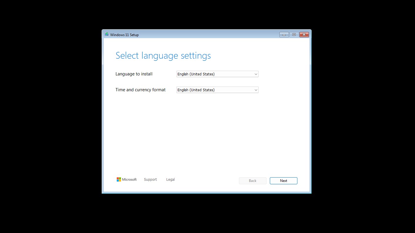
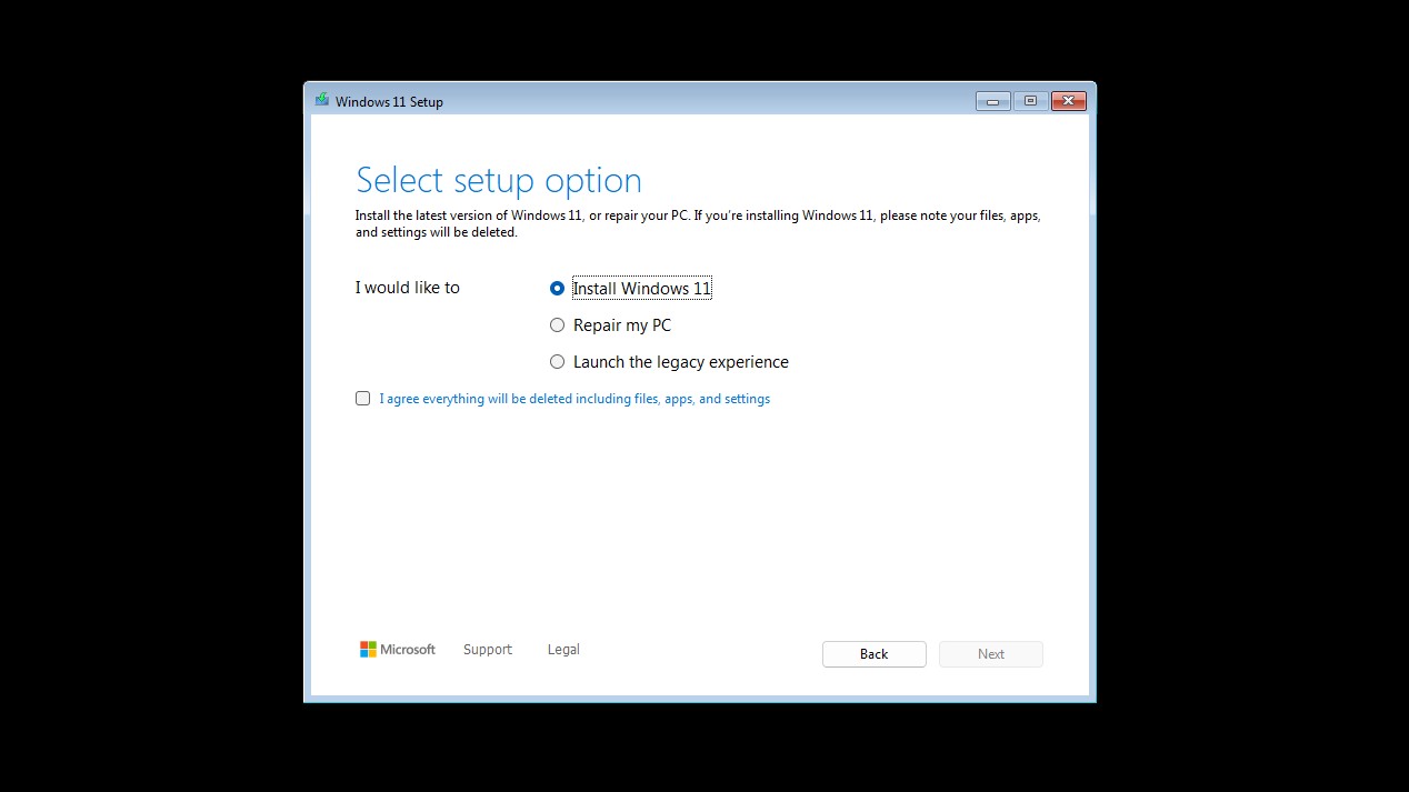
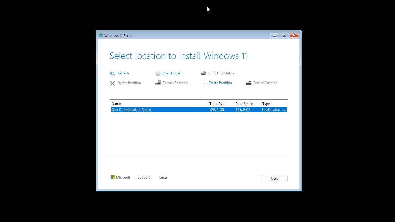
However, keen eyed testers have noticed that the new interface doesn't really align with Windows 11's design aesthetic. It has a Windows Vista-era basic window theme, and the actual contents of the window look like they are from the Windows 8 era.
Turns out, that's because this UI isn't actually new. You can enable it on early Windows 11 builds from 2021, as was discovered by XenoPanther on X. In fact, you can go as far back as Windows 10 Technical Preview builds from 2014, 10 years ago, which ship with this same UI!
For whatever reason, this "new" UI has been shipping in Windows for a decade, but was never switched on to be the default offline setup experience until now.
Unfortunately, this does mean the new UI isn't consistent with Windows 11 at all. While not a huge deal, it is a little disappointing that after all these years, the best Microsoft could come up with is a UI that was actually completed a decade ago.
All the latest news, reviews, and guides for Windows and Xbox diehards.


 Windows Central Insider


