Microsoft is building out brand new experiences for both the Start menu and taskbar on Windows 10X. The new variations of interfaces we've been using for over 20 years give us an interesting look into how Microsoft is adapting Windows for future devices and form factors. With fluidity and minimalism front and center, Windows 10X is all about making the Windows experience simpler, stripping back unnecessary legacy bloat in favor of a streamlined user experience.
Today, we're taking a closer look at the new Start and taskbar experiences found in the first public preview build of Windows 10X. Now, this is all pre-release content, so it's likely that these features will have more capabilities and improved interfaces by the time it launches later this year. So keep that in mind.
Everything you need to know about Windows 10X

The new Start menu
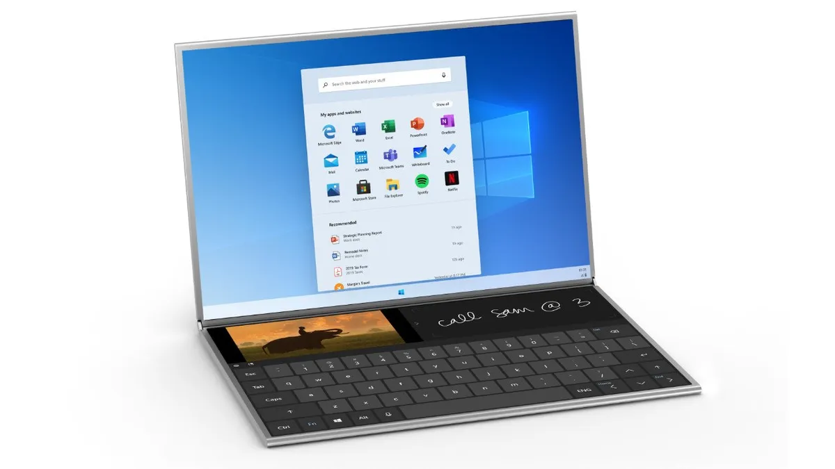
Microsoft has completely redesigned the Start menu experience on Windows 10X with a focus on enhanced productivity and minimalism. Gone are the noisy, colorful live tiles of yesteryear, and it's a static grid of icons that has proven popular and functional on other platforms with a GUI. To compensate for the removal of live tiles, Microsoft is updating all in-box app icons with new colorful designs, which look great with Windows 10X's modern aesthetic.
The Start menu on Windows 10X combines three core system functions; search, apps, and recent activities. On Windows 10, these functions are split into different areas, so it's nice to see Microsoft consolidating these on Windows 10X. Along the top is an inconspicuous search bar that allows you to search your apps, files, and the web. In the current public build, this search UI is a little barebone, but I understand that this isn't the final design, and a more feature-complete search UI is on the way.

There's also a microphone icon inside the search bar, but it doesn't work just yet. I think it's fair to assume that this will let you search using your voice instead of typing on a keyboard. I don't believe it's a Cortana-driven experience, but I could be wrong.
Users can drag icons to re-arrange apps in the apps list.
Below the search bar is your list of apps. This is a customizable list, similar to a smartphone home screen, in that you can reorganize the icons to your heart's content by clicking and dragging. The default view is three rows of five icons, and if you want to see more, you can press the "show all" button in the top right. Right now, Start menu customization is very barebones, but I understand that features like app folders and notification badges are on the way.
Interestingly, the Start menu makes mention of websites in addition to apps. The integration isn't fully baked just yet, but in the final product, Windows 10X will treat web apps as if they were native Windows apps. Users will be able to install websites as apps, and they'll show up in the Start menu and taskbar as if they were a regular app.

Below the apps list is your recent activities area. This is similar to Timeline and the "Recent activities" area in Search on Windows 10, except without visited websites. The recent area in the Start menu on Windows 10X only appears to show Office documents, and installed apps. This can and likely will grow to support more content at launch, but for now, it's a quick way to find your most recent Office documents.
The new taskbar

The taskbar on Windows 10X is also brand new. It has been rebuilt using modern code and is a more streamlined and fluid experience over what we have on Windows 10. Firstly, the experience is now centered by default. The Start and Task View buttons are aligned in the middle, with open and pinned apps showing up between them, pushing each system button further apart the more apps you open.
I've seen some people show dislike towards this design, as it means the Start and Task View buttons are continually shifting. I see why some might consider this a problem, but in practice, it really isn't. Visually, you can always see where the Start and Task View buttons are, as they are distinctly at either end of your pinned and running apps.
Beyond foldables: Where Microsoft is headed with Windows 10X
Still, if users can't handle this design, I believe there will be configurable options in the Settings app to change this behavior. If you prefer the old-school taskbar with its left-aligning design, you can re-enable that if you want. You will also be able to change the size of the taskbar with three options; small, medium, and large.

One significant change to the taskbar on Windows 10X is the removal of the system tray as we know it. There's still an area on the far right for the time and system icons, but it's more of a single button that opens the Action Center now. We'll be taking a closer look at the Action Center itself in an upcoming article.
The system tray has changed, for the better.
The tray icons that do appear on the taskbar won't be from apps minimizing to the system tray. Apps that are designed to minimize to the system tray won't show up there anymore. The only tray icons you'll see on the taskbar are status icons such as battery status, internet connectivity, a notification icon, as well as miscellaneous system notifications. I really like this change, as I've always found the old system tray to be noisy and unnecessary. I don't want apps minimizing to the system tray, and now they won't on Windows 10X.
I mentioned above that the new taskbar experience is more fluid, and that's thanks to several subtle animations included with this new design. For example, when you minimize an app, the icon on the taskbar will bounce a little to match the minimize animation, which makes the whole experience feel a bit more connected.

There are also new fluid animations for when you hover over an open app to see a thumbnail preview. When you open an app, the icon will fluidly push the other app icons out the way to make room for itself.
Also new with the Windows 10X taskbar is a visual separator that divides your pinned apps from your running apps. For example, in our screenshot above, we have Edge, File Explorer, and Mail pinned, with the other apps being running apps that aren't pinned to the taskbar. This is a small change, but one I think really helps with organizing the taskbar. Your pinned icons are always on the left.
What do you think?
So that's a closer look at the new Start menu and taskbar experience on Windows 10X. Of course, this is pre-release code, and therefore is not representative of the final product. These features will likely be enhanced and improved with new additions before launch. For now, what are your thoughts on this early look at the fresh new Start and taskbar interfaces? Let us know in the comments.