Windows 11: This is the new centered Start menu and Taskbar UI
Get a closer look at the new Start menu and Taskbar UI coming in Windows 11

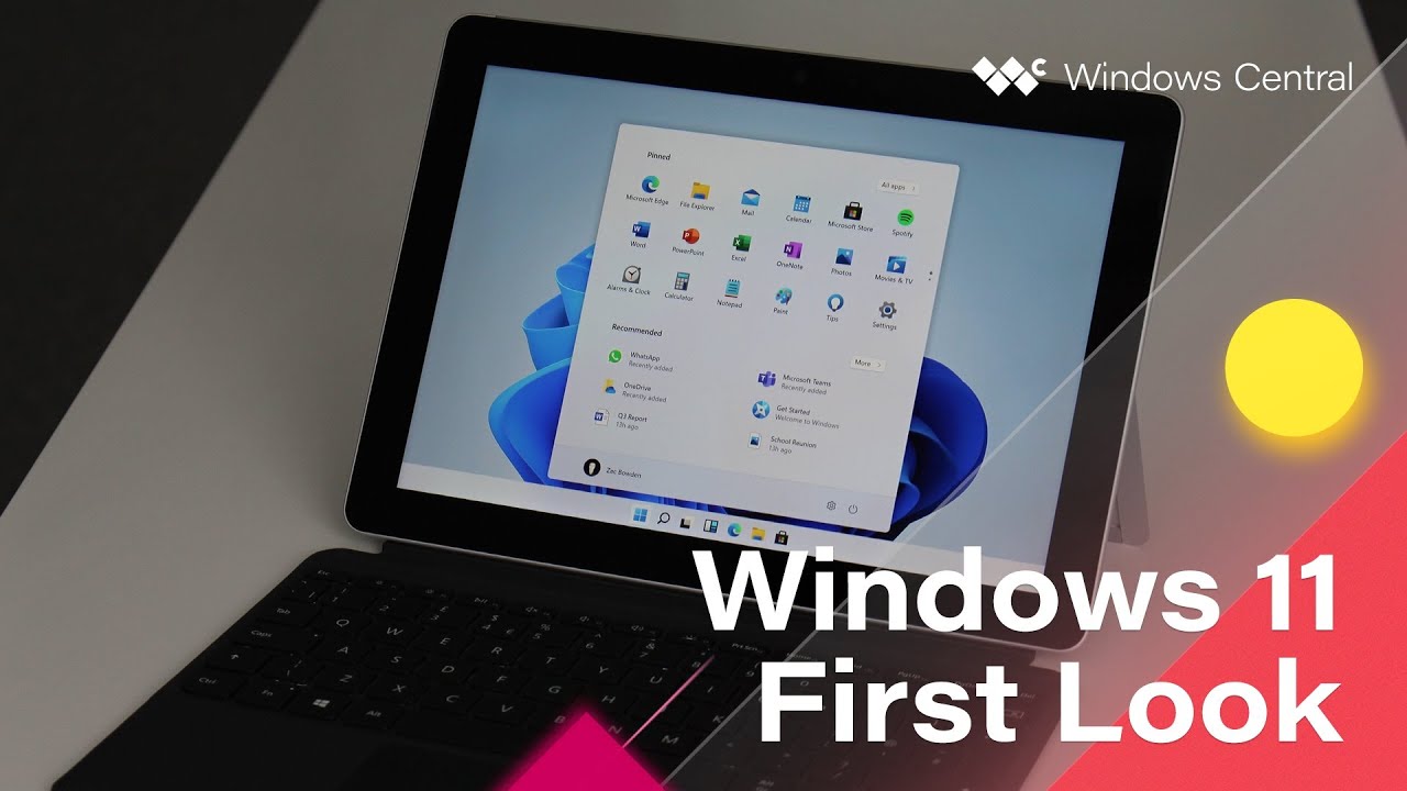
An internal build of Windows 11 has just leaked, and we've had a chance to go hands-on with the new Start menu and Taskbar interfaces that headline some of the new user experiences changes coming with Microsoft's new OS.
Starting with them most obvious change; the Start and Taskbar interfaces have moved! By default, Windows 11 features a centered Taskbar and Start menu experience, meaning the Start button itself has moved from the left-hand corner after 26 long years. Those who prefer having the Taskbar and Start menu aligned to the left can choose to do so via a toggle in the Windows Settings app.
The new Taskbar is a lot more "fluid" than the old one, featuring subtle animations when clicking on app icons or the Start button. The Start button itself has been changed from the classic Windows flag to a shape that more resembles the Microsoft logo, which aligns Windows with other products at Microsoft that have slowly been adopting the Microsoft squares as their facing identity. The Taskbar itself is a little taller than the old one too, which gives the Taskbar a more modern look.
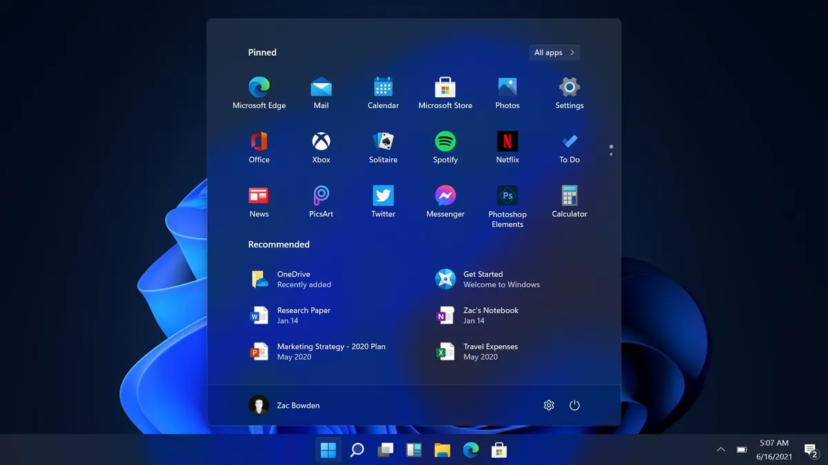
The Start menu itself has a brand-new layout that replaces the aging Live Tile interface with a customizable grid of icons. This area is called "Pinned" and features all the pinned apps that a user has decided should show up at the very top of the Start menu. You can pin as many icons as you want, but only 18 can be displayed at once. For apps that you've not pinned to the main Start page, you can find them in the dedicated "All apps" list which takes you to a familiar looking list of all your installed apps.
Below the Pinned area is a new "Recommended" area that displays your most recently opened Office documents and installed apps. This area makes it easy to jump back in to a Word document you were working on yesterday or pin a newly installed app to the top of your Start menu. This new Recommended area is a replacement for the old Timeline feature that's no longer present on Windows 11. The Recommended area will show 6 items, with a "More" button that will take you to a list of even more recent activities.
At the very bottom of the Start menu is your profile picture, name, and power controls. You can customize this bottom area with File Explorer shortcuts such as Downloads, Pictures, or even the Settings app. Search works just like it does on Windows 10, even though there isn't a visual search bar on the Taskbar anymore. Just hit Start, and begin typing, and Windows will automatically switch you to the improved Search UI.
Overall, the new Start menu is more like a launcher for your most used apps instead of a home screen. The old Live Tile interface was something that you could truly customize and make your own, but Microsoft has decided to go with a more simple, easier to manage grid of icons on Windows 11 and I think it works. I know many will miss the Live Tile interface, but I prefer the "launcher" nature of the new Windows 11 Start menu more.
Check out our hands-on video
Screenshots not doing it justice? We have a 12-minute hands-on with this build of Windows 11, showing off all the new UI!
Windows Central Newsletter
Get the best of Windows Central in your inbox, every day!
Zac Bowden is a Senior Editor at Windows Central. Bringing you exclusive coverage into the world of Windows on PCs, tablets, phones, and more. Also an avid collector of rare Microsoft prototype devices! Keep in touch on Twitter: @zacbowden.
-
I just hope that Windows 11 doesn't get dumbed down to a tablet OS. Who really cares about rounded icon corners?
-
"I just hope that Windows 11 doesn't get dumbed down to a tablet OS."
That is what Windows 10X, basically, was. That project has been shelved. -
A lot of people do apparently
-
I like the centre option. I can live with the start menu, save for the limitation to 18. For a company focused on productivity, it doesn't seem like a change conducive to it. Veering off, I despise the animation that plays when opening outlook.com. I hope they don't make such things for anything else.
-
Beauty is in the eyes of the beholder …
-
If I don't have an option for a Home Screen-esque Start Menu, even if sans Live Tiles, then I officially hate it. I was one of the few who really customized it.
-
We will see if there will be more changes to June 24. But for now, yeah definitely a simplified probably too much. No more groups, folders, and Jump List. Well Live Tiles as well if you are into that. The replacement is Windows Widgets that has a pane on the left, but it is nothing but an MSN NEws and Interest for now. No 3rd-party support and limited. Not really replacement to Live Tiles or even Windows Gadgets of Vista and 7.
-
Glad I can algin left. My whole setup is designed around that and as low vision user throwing my mouse cursor into the lower corner to find it visually is a pretty old practice and it's conve ient to have the start button there.
-
I don't understand what MS try to do with this new windows. There are few changes and improvement from windows 10. It had better canel the upcoming event and take more time how to improve current windows.
-
There's quite a lot of changes
-
Hardly loads of changes. The rounded corners, and moving the start menu from the left to the middle are hardly revolutionary. The snapping Windows tool is useful but there is no reason that cannot be part of an annual Win 10 update. The only significant change is that they have significantly altered the start menu (to its detriment IMO) Is this even an update to the underlying system or is this just a resting of Win10?
-
Lots of updates to the os especially tablet side. This is what Windows needs going forward imo. It looks lighter less cluttered than 10 too. It's just an os update and if they drop the bombshell it's a free upgrade then why not.
-
I hated it first but after trying it on Virtual Machine myself
It looks gorgeous and felt refreshing
Also remember that this leak was not the final or finished product by any means WAIT FOR THE EVENT -
I wonder how much time it will take me to figure out how to change the settings/interface back to what I have now which is fine.
-
Quick search for the registry key that lets you show legacy interface should do it.
-
I do find it funny that you call live tiles aging and yet they are switching to a basic icon view, that's existed for as long as Windows itself (and it's the go to for literally any device). Either way, no biggie. I never use the start menu anyway.
-
"Either way, no biggie. I never use the start menu anyway."
That, my friend, is precisely the problem. No one was using the Start Menu. At least, not as its intended purpose. With Windows 11, there is a bit more going with it. See how even iPad OS 15 now has, ahem, a Start menu. I mean launcher. -
I can understand that, I've pretty much just always used the desktop or search though I do miss the Windows 8 search function because I find Windows 10 is kinda trash in that regard and seems to look online before local, but for the most part it works fine for me. But yeah, my most used applications are on the desktop, so basically I have the icons without having to select a menu to get to them. Feels like extra steps for no real reason in my opinion but I guess people like keeping their desktop clear maybe.
-
I definitely prefer a 100% clean desktop--using a combination of apps pinned to the taskbar, Win key + the first few letters of an app name and the Start menu instead. For me, a desktop covered in icons is like having a junk yard as the view outside your window every day. But to each their own. It's good to have options.
-
I think they could add 3 features, all of which already exist in MS launcher, and I'd be happy:
1) app folders
2) app badges
3) customizable widgets (including opening to developers) in the widgets screen -
Or in other words, live tiles.
All this (and more) are available right now with live tiles. Not in a far future update to a static grid of icons. -
While I theoretically agree, Android widgets have long had much better functionality than lives tiles. The Todoist widget, for example, is excellent. Getting that on Windows would be a win.
-
Big difference between Windows Phone Tiles and Android Widgets was the app density I could get with WP. That density did come at the expense of information density, but you did have the option of different sized tiles, so you could adjust to suit. Why am I talking about WP? Because that's what the Win10 Live Tiles were inspired by. I say inspired by, because Win 10 never had the capabilities or features of those on the phone. Seemed like the Windows group looked at a Windows Phone, but never talked to the Windows Phone developers. That was typical of MS at the time.
-
Live tiles on WP were an amazing interface.
-
They were an amazing idea for an interface. But they never really did anything more than just static icons. If they had been actually live (and there were some demos showed of this that never came to fruition) they really could've been great. Imagine if you could do things like pause your music or scroll through your calendar or...oh wait, that's Android and iOS.
-
Android Widgets is indeed superior to Live Tiles in terms of functionality and flexibility. Only thing I don't like the Android Widgets is the lack of visual consistency, even with widgets with same rounded rectangle, there is always difference between app developers. There just no visual standard unlike on iOS, iPadOS and macOS that pretty much like a rounded corners Live Tiles. Issue with Windows 11 for what we seen, Windows Widgets is inferior and nowhere near a replacement to Live Tiles, Windows Gadgets or any widget system from another platform. It is just an MSN dashboard for now.
-
App folders, YES PLEASE.
-
YES, LIVE TILE LOVERS : You can still re-enabled them on Windows 11 ! :) :) :) https://www.windowslatest.com/2021/06/16/live-tiles-can-be-re-enabled-in...
-
I'm guessing the Widgets menu will change from being Windows 10's News & Interest to being a customizable widgets hub for apps that supported live tiles, and the live tiles can be pinned there instead. Kinda like how macOS does it...
-
Dream on. Live Tiles already had lackluster support. This seems like pulling life support.
-
They could do more with it too, like fully interactive widgets if they bring the capability of those features to the table
-
I hope they will, since currently it is not useful for me. Yeah there is clock, weather, news and stocks. Well, that's it really. No 3rd-party support. We throw all the efforts that any current apps supporting Live Tiles into the bin. No more myTube latest recommended YouTube videos, emails, newly taken photos, To Do list, RSS feed from Nextgen Reader, etc.
-
Beautiful?
You need to see your optometrist, Zac.
This is the opposite of beautiful :P -
You can only see 18 items at a time on your start menu? What happened to groups? My current start menu has 48 different things pinned in 6 different groups (i'm a developer, lots of tools and other goodies). How are you supposed to organize your stuff? One step forward, 10 steps back I guess.
-
I can see the appeal of this for the average simple pc user that uses email and a web browser. But people like me that actually use a lot of different apps are going to hate this, unless there is something we don't know about.
-
I like the look of it so far clean minimalistic and smooth. That said, I still want all the options in the world to do whatever I like. Keep it clean on the outside and jam-packed full of options underneath. And for the love of god move Cortana on and optimise everything!
-
Spot the difference between this and Windows 10X
-
The centred design, as standard, is staggeringly dumb. It's ignoring the basic idea that the corners are infinite targets you don't need find with the pointer. You just throw the mouse into the corner and click. With it in the centre you have to actually pay attention and 'find' the icon to click it. (See Jensen Harris's excellent video on this very thing.)
-
I like the idea of it centered for tablets, but for the desktop, I agree that left aligned is best. Especially as long as the tray exists, right aligned.
-
Maybe if you detach the keyboard for 2 in 1 devices, it will go to centered mode, then reattach the keyboard to make it left aligned, if you turned the option on that is. Makes sense.
-
Ugly. Just static icons? It's kind of like a tall taskbar.
-
I absolutely love the new design.
-
unfortunately start menu just on one screen
-
This update seems in keeping with the industry as a whole. Chrome and OSX both have center icons now. Unlike others I think it's time to ditch live tiles. They had their time in the sun, but are not an industry standard