The WPCentral website may look a little different today

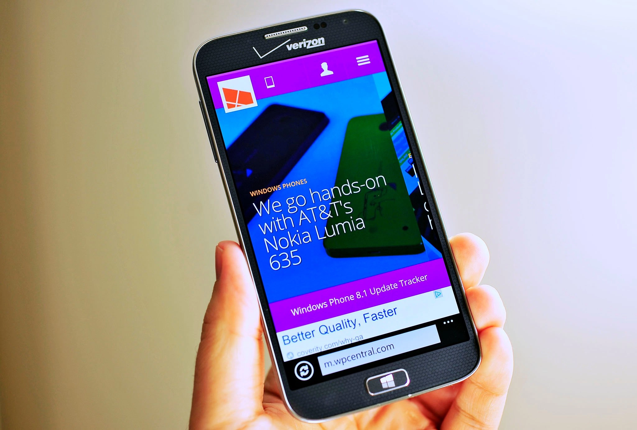
It was nearly three years ago that WPCentral.com had a site redesign and in 2014, we figured it is time for another update. Part of the changes you now see on www.wpcentral.com and m.wpcentral.com reflect our goal of bringing the Mobile Nations sites (WPCentral, iMore, Android Central, Connectedly, CrackBerry) more in line in terms of design. Another aspect reflects ongoing changes in how people view websites and what many consider "in" for design these days.

I should point out that we have a long way to go with this redesign. In other words, we are not doing it all at once, because from experience that can cause many headaches for our developers, writers, and you, our loyal readers. Instead, we are introducing our new header and some new design elements. There is still plenty of tweaking to ahead, so please be patient (many of you use our apps, anyway, which are unaffected by the site change).

In case you are wondering about the colors, personally I am not a huge fan of them though it is refreshing at the same time. The good news is other colors are coming, in fact, I would like registered user to be able to configure their own colors based on the Windows Phone accent choices; this is something I am pushing hard for so fingers crossed.

At any rate, like all changes, it takes time to get used to and there are many adjustments down the road. If you do find issues, feel free to use our forums to let us know or, please leave a (preferably) polite comment notifying us. Mobile Nations has a very competent team of developers and as someone who watches them work, I can say this stuff is much more complicated than you would think, so stick by us until we sort it out!

Thanks,

Daniel Rubino, Editor in Chief, WPCentral

Daniel Rubino
Editor-in-chief

Daniel Rubino is the Editor-in-chief of Windows Central, head reviewer, podcast co-host, and analyst. He has been covering Microsoft since 2007 when this site was called WMExperts (and later Windows Phone Central). His interests include Windows, laptops, next-gen computing, and for some reason, watches. Before all this tech stuff, he worked on a Ph.D. in linguistics, watched people sleep (for medical purposes!), and ran the projectors at movie theaters because it was fun.

281 Comments
  • ...and now I sleep. Or nap.
  • Night Daniel! Posted via Windows Phone Central App
  • Bring back the pink WPCentral icon!!!
  • I also miss the pink color
  • Exactly!
  • So.... this is why I can't access to m.wpcentral.com instead of PC version these days eh? :p
  • U updated ur cyan on our 1520 right?
  • Good night Daniel :) sleep tight and don't let the bed bugs bite .
  • Don't mention bed bugs. Caught them 2 years ago in a filthy apartment complex. Eventually got them to break lease and we moved but we had to have truly nolen spray the new place about 4 times before they finally went away.
  • Ouch ! Sorry
  • How do you get bedbugs to break their lease?
  • I was wondering the same thing. This would be good information to have in case I ever get bed bugs.
  • Wife went in and argued with the manager since we had to leave the apt for 3days and they weren't going to pay for it and we couldn't afford it since I was working temp jobs. After we came back the bugs were still there and they had to spray again, but we refused since we would have to leave for another 3 days with no compensation for a hotel. Talked him into letting us out of lease and moved. The pest people also took a week to even tell us that we had bedbugs after they did their inspection, the guy that did it went on vacation and no one came to tell us. After we moved, we called truly nolen. Even though they sprayed 4x, we only had to be out 2 hours.
  • That's a horrible situation to be in and all, but I think they were kidding with you. They asked how do you get BEDBUGS to break THEIR lease, based on the wording you used initially. But yeah, good job by your wife to get the management to budge.
  • Looks really good! Just wondering the reasoning behind the arrangement of the "tabs" or site sections? Think "News" "Editorials" "Devices" "Games" "Help & How To" "Forums" "Shop" would be better
  • Ahhh u Stole My thoughts.... My though was about Colours only....U should provide a OPTION to change colours as personally i dint like this that much but ya other than colours...ahhh i guess WPCENTRAL upgraded to WPCENTRAL8.1 Officially :P
  • The new layout looks cool Dan! (Except the site logo color... I mean it may be that I used to, too familiar with the old one or.. I don't know) but its good to know "The good news is other colors are coming"
  • I think it looks terrible....the mobile site....the old one was easy to navigate for me
  • Kinda agree about the mobile version (now its slower than before) but I use WPCentral app in my phone which is really fast, so no big deal for me though it'll be great if the mobile site is optimized :) Only things I disliked about the change are the logo color (but new colors are coming Dan says) and I felt the text on the tiles at the top of the site are a bit messy on the pictures...  otherwise I loved the new layout, sidebar scrolling menus, sliding search and everything. ...And congrats on your first comment! ;)
  • Personally, I like the new menu but dislike the image filmstrip thingy! I would have preferred the images maintain sort of like the Tile effect of at least a filmstrip with padding between the images or a thin (micro) black stroke. Yes, and do something about the logo color, PLEASE! I hope you'll make this a completely "Responsive Website Design" by completition ofthe new redesign..!
  • Yeah, it looks very purple :/
  • That's an understatement. A little purple goes a long way. When asked, how many people would say purple is their favorite color? Right. 
  • wpcentral got a new look and it's cool! 
  • Daniel sorry to bother you but I sent you a question last night regarding the 8.1 preview for dev & 8.1cyan & taking phone back to factory state with recovery tool to reinstall cyan update
  • The banner at the top does not scroll smoothly when using touch.
  • I guess it's okay, but what's up with that too much purple and an orange icon? The color selection must be relaxing to the eyes to make it work for long time use. http://www.windowsphone.com/en-gb This is a perfect example of the right colours
  • Love the new layout (which is odd because I typically hate new layouts), but the colors are absolutely horrible! I hope it works out where we can pick our own... or just go back to the blue/pink branding that has sort of been your thing for a while now.
  • In case you are wondering about the colors, personally I am not a huge fan of them though it is refreshing at the same time.
      And thats the kind of honest writing that will keep people like me coming back here.  *salutes*
  • Daniel, i love the site and what you guys do. But purple with that red/orange windows logo hurts my eyes..   The dark purple looks great but that light purple and orange subtext has got to go..
  • Thanks Daniel! Purely academic question, what language is wpcentral written in?
  • This website still looks awful and cheap. It has so many adds, I don't know if I'm shopping for chinese knock offs or reading a tech blog. The content is pretty good though.
  • Why is it so slow on all my computers. Scrolling is jumpy. Old design did the same.
  • I like the new header, but I find the purple tint on the images looks weird.. maybe if they had a neutral dark overlay.. The way they are now, they make my LCD monitor look like it's broken, or when the cable is not properly connected :)
  • Well done team :)
  • Nice! :D Hope it all goes without a hitch!
  • I like the new design. It looks pretty cool.
  • +920
  • The previous colour blue looked great, even my phone accent colour has always been that...
  • Its time to change your phone accent colour
  • I agree. The overall design of new header is great. But I could do without magenta. Daniel says the colors might be changed and a customizable palette may get released soon. So that's that. Till then, I'll recolor this page with some extension.
  • Very nice and clean   Good design WPC
  • hope the option to change colors comes soon...the color seems too bright/glaring
  • I know. i visited android central and i envy the header color! I wish WPcentral will be more subtle with the colors. And the typography is a bit unpleasant on the eyes with that color. Im not complaining about the design... just the color :)
  • Like
  • It is worse in performance esp on IE. Those massive headers scroll with extra efforts. Navigation is jerky.
  • Give it time. It's been live for about 90 minutes. We have lots of tweaking and optimizing to do now that it's live in the real world.
  • Is Jay Bennett is also (largely) responsible for the site as well?
  • Actually, not involved at all. Jay has another full-time job.
  • Yep, speaking to me about the site will be about as useful as a chocolate teapot (which any of my British friends will tell you is quite useless). No there is a separate team of very hard working and very talented people who look after the website
  • Akin to selling ice cubes to eskimos?
  • You had me at chocolate teapot
  • It sounds delicious.
  • Hello Jay can you make some changes in the WP app so it shows our own comments on top and then the comments of other users should be kept down?
  • Oh..thanks for the info...and great work if i may say...but the team has lot of things to do about the site....its no where near the awesomeness of the app...well i am sure it will happen soon ....thanks again...
  • Seems faster! :D
  • Yeah, purple is not that good. Just like Windows, the website needs a redesign every three years. And while I understand it's easier for the team in charge of the websites to have only one design to manage, the main layout could be unique to each community: tiles for here, widgets for AndroidCentral, geometric shapes for Connectedly, etc.
  • Don't let the Joker hear you say that... O_O
  • Nice.
  • I love the new design... keep working on that accent color match up thing
  • Love wpcentral. Glad you have taken the gradual change approach rather than the big bang one. Wpcentral has a great community and that can be lost so easily. Trusted reviews in the UK took the big bang approach a few years ago and lost their active community.
  • The color is already pretty much in line with my Windows 8.1 preferences, good work! :D
  • cool !!
  • it's nice you know.
  • Nice! :)
  • Looks cool :) saw the same format\layout earlier tonight over at iMore :)
  • I'll stick with the app for now. Change is good though.
  • Just when I liked the blue background with the tiles, you guys changed the website. And I wanted to ask you if you could make that blue background as a background for WP8.1 for the transparent tiles. BTW the mobile version of this website does not come right on my windows phone. You cannot make it smaller to show full page. Very weird
  • I agree. Its a little banged up on my 4.5 in screen.
  • ... but is it faster?? (takes coat, leave through the side door!!)
  • New look is great!!!
  • Wpcentral has a website?! I never knew!
  • LOL really??
  • Wow. You, sir, are truly awesome.
  • Same exactly my thoughts unless he's being sarcastic :P
  • Lets just think he isn't. :P
  • LOL!!! In that case, I dare he might not be the only one. There may be others but they won't show up just yet :P
  • Oh yeah! So true! :P
  • Great, but the old colors might be a much better idea, this is ugly as hell.
  • well it would be much better if that it will be the accent color as the tile background on the logo, while the header nav and its inner logo (exactly, the WPCentral logo) use the white color, it will be essentially representing the flat design of Windows Phone. ;)
  • Nicely done
  • It is live now. Really it is cool & classy.
  • Is it possible to bring your Windows 8 app more in line with your mobile app where you can quickly access everything as far as placing the categories go?
  • Yeah, Jay is re-writing the WP app as a universal one, which will allow him to share the same code/designs between both. It'll be a big update though, few months down the road, but that is the goal.
  • Lovely. I can wait. If i can wait for Cortana & Xbox I can wait for anything! Thanks
  • *looks forward to being able to access the forums with the WPCentral app on his Surface 2*
  • Love the new design! Very refreshing! Much cleaner than before, only few tweaks to make it more "metro", though currently it's already nice and fits well.
    Good job, cheers WPC! :D
  • Ok
  • i knew something was beting updated on site cause when i was trying during past few hours ,it was acting strange, seems neater and more professional a bit, we'll let ya'll know if any bugs or links not working
  • ThaNX!!!
  • Nice design!!
  • Even though the current purple and orange colors burn my eyes, I'm sure you guys are hard at work making the website work and I can't wait for the finished site. I know exactly how long a website redesign can take. There is no "fast way" to make it happen.
  • Hah, I don't disagree and thanks for your patience.
  • Good things are always worth waiting for. :-)
  • Though it was really ae looking site
  • i do like the look but i don't like color choice i hate pink
  • Its purple. More colors are coming though! :)
  • Mobile Nations version of Threshold hahaha
  • lol, it kind of is!
  • Daniel, you seriously need a nap! You are still replying to the comments brother...lol
  • Cyan seems to be the WP flag ship colour, it'll be missed here.
  • Nice
    +520
  • Very clean
  • Nice design
  • Its very "The Vergeish
  • Hovering my mouse over the tiles at the top gives me a resize arrow cursor. Might want to look into that!
  • Now you should also redesign the app
  • i hate it. I cannot get rid of the big banner at the top, even using AdBlock, Ghostery and Request Policy. I also like to visit the forums of other sites, but I have little interest in any of the blogs on any of the sites. Navigating from one forum to another used to be easy by just selecting other site and clicking "hot in forums". Now I need to take an extra step on going to blog page of another site, followed by mouse click to select forums.
  • I came to comment about this also.  Just like when AndroidCentral changed their design, gone was the ability to go to the top bar and look at other sites within MobileNations and see the headlines and links to forums.  I am hoping they will add a way back to see other news from those sites from within the current site. 
  • Add me to the list of people who miss the top bar as well.  I liked the drop-down panels where you could quickly get a look at all the new articles on each site.
  • Hear, hear! I always wondered why I could quickly get to Android Central from WP Central, but not the other way around.
  • Agreed.  I liked the quick navigation to the other MobileNations sites.  Also, I wish there was a way for users to inhibit the appearance of the bar at the top every time one scrolls up, even just a little bit.  It's particularly annoying when the colors are as in-your-face as they are right now.  Maybe it's just my old eyes...
  • The purple looks like Yahoo's website.
  • I hate change :-(
  • Too bad. You should be living in the stone age.
  • The NEWS button is now located at the farthest right side of the header. Very nice as I can easily tap it with my right thumb. Thanks for this!!!!
  • its time for a new look for WPcentral app maybe ?
  • I'm assuming that coming in a few months as Jay is rewriting the entire app so its WP8/W8 compatible
  • Looks nice but menus seem to be terribly slow. 920.
    Of well, I always use the app.
  • After the recent changes loading time has increased alot!!!
    website feels heavy now
  • Ooh no.. No like (there's always one, eh?). Header is far too big and clunky and takes up too much screen and the colours are a design nightmare.
  • Love it
  • Its looking great. :D
  • Aww, thank you! It's my favorite color, how did you know? :-D
  • There's a link to the games category but not for the apps category?
  • It's certainly more Metro Modern. It'll take some time getting used to but I like it!
     
  • The performance is terrible and so is the loading speed. Design is nice although I agree about the colors.
  • Any plans for bringing the changes to the app?!
  • Love the design
  • I prefer when things are done a step at a time to get feed back for better input. It's also good to see I'm not the only nite owl
  • Posted at 4pm for me -_-
  • It's great.
    (wish it had an Eminem music player)
  • Nice job lads!!
  • This is a new refreshing look. I'm glad its done. I like changes its more pleasing to the the eye than the same old look. I also think the old look was good. Change is good.
  • Great effort n experiencing good time here
  • I don't like the space between WP and Central in the upper left corner :-(
    Everywhere it's WPCentral, please use that one also in the corner :)
  • Hi Daniel,
    Difference is seen. Good to see that. I like the idea that registered user can change color. But still the current unregistered color can be changed to something even better to look. Since i am a web page developer, i can understand the pain you are speaking about. Congrats for this new look. Pass my regards to your team including your development team. Thank you. S.Rajthilak
  • The mobile site used to be optimised for Lumia 1520 which I really appreciate. But now with the new version, it really looks awful on Lumia 1520
  • Nice! But from a usability standpoint, I hope the designers add an arrow or something on the ends of the header, to make it easy to scroll back and forth instead of having to use my mouse...
  • Looks awesome
  • The new site is cool, easy navigation and pleasant looking
  • Looks like WPcentral finally caught up to AndroidCentral and copied it's design.
    Quite aptly sums up what's happening to WP in general.
    </sarcasm> Seriously though, good work you guys and love the new unified design.
  • where's my sunglasses....
  • Is the logo color will change too? Or it changes with the accent color? Because this red-white logo looks really strange for me.
  • I love violet and WPCentral
  • that color... hurts my eyes...
  • Awesome! Can't wait to see the changes
  • Yeah good
  • amazing interface! new color options will sure be cool to have although this one is not too bad either! looking forward for more changes! gud luck:)  
  • Dan, this isn't an issue as such, but can you suggest to all the other members of Mobile Nations that to the right side of the Mobile Nations icon in the top bar, you put an M and N in the Mobile Nations logo typeface. It's currently too easy to miss.
  • What the hell?
  • owww I like it.
  • I'll stick to the WP app on mobile.
  • Choosing the color option would be epic!
  • I wonder what that phone is
  • Samsung ATIV SE or Odyssey.
  • This new design is ugly :C
  • First of all, I'm not trying to be rude I'm just noting my response to the website. I know it's just been up and I'm looking forward to the final version. Here it goes, these is my first reaction. Not a huge fan of the colour but I might get used to it. The colour scheme is all over the place really.The links up top could do with some spacers (lines in between each other. Like you;ve done with the banner on the home page.. with the Lumia cyan coverage and 8.1 stuff etc). WPC logo looks nice but I thought it was pink/red? Just find the spacing of things a little weird. Since you've done icons for Forums and Shop you might want to keep it consistant with the other links. Loving the drop down hamburger menu! Actually, liking all the drop down things. Also the scrolling headlines is neat!
  • it looks cool, but a little bit lagging for me
  • Two things: 1) What happened to landscaping typing in the WPC app? 2) Would be nice to have a better notification system on the app and website for comments. Email is sooooo.... 2002
  • It was removed in order to suit in for 1080p support, I mean that's what the article told.
  • Nah purple is the business Dan
  • I'm loving it :)
  • Not bad guys. I'm not a fan of purple but the rest looks great, although I'm not a fan of that menu bar coming up whenever I scroll up. Great job guys.
  • Yeah, that menu bar coming up every time I scroll up even just a tiny bit is super annoying.  Other than that the redesign seems alright, although as usual there was nothing wrong with the old design...
  • Awesome guys!!  Very nice!! I visit pretty often throughout each and every day so it's nice to see the facelift!!! Rensul
  • We want Emerald Colour!!!!
  • Very nice design !!
  • Great! I like jumpining in and out of the sister sites to see whats happening on other platforms, would be great to have a uniform layout with each site a different colour.  Hope its done in time when WP merges all its platforms :)
  • Omg, too purple :(
  • I love changes..but this redesign just doesn't fit on my Q10. I can only see half of my screen.. :-( I think I love the old layout.
  • Off topic: Please make the font size in the phone app adjustable. Too small for me.
  • They are adjustable. It can be adjusted the same way you use pinch zoom.
  • Yep, that's been available for years. You can also toggle it to large font through the main app settings on the first screen
  • Looks good...but needs more Metro Magic !!
    But that's a pretty poor choice of colour...almost puked when i saw the screen 1st time....good thing i use the app more than browser. Adopting the WP themes would be a nice idea
  • Hate it! Those girls colors! It looks like a teen party.
  • Have they updated the app detection
  • Who loves purple so much at wpcentral? :P I already hate the purple colour in that 512MB supported banner(although it is pretty helpful) and now the website also in purple?
  • Nice to see a new design of the website, was on my recomendation list back when WPCentral did a survey. Still there are plenty of ads that are placed right in the midle ruining the modern/premium look. I've added block lists to IE so I don't see the ads, I know this hurts the website revenue but if the ads were placed more carefully I wouldn't have to block them. (or for those who use chrome the Adblock extension is a must)
  • I just wanna say that the new look is amazing, there is definately a Windows Phone feel about the and the colour of the header bar is great and makes everything 'pop'. Obviously there are little niggles here and there but of course it's a work in progress and i'm looking forward to seeing what's coming next. Keep up the good work guys!! :)
  • I like not having to scroll (as far) to get to the first story. I see a color change in the logo (don't do that - you have equity in the current one) and, WOW, that is not a color pallette that reflects the sophistication of the site's editorial content or - me thinks - its readers. Change is change, Daniel. Change does not necessarily always work, nor - certainly - is it always good. But it doesn't make itself, so...
  • I agree with the scrolling part. I don't like the tendency of some websites recently to place giant images at the top making the user scroll for what really matters.
  • Looking awesome
  • Congratulations!!!
  • My first thought when I loaded the page was "Crap, what's wrong with the internet? WPCentral is not loading correctly." Nice and refreshing. The purple is fine.
  • Definitely seems faster.
  • Wow, it looks awesome. The app should look like that :O
  • It's fresh and new, it looks good :)
  • No more pink! yaay!
  • So that explains why it's all messes up on my iPad now. Page doesn't load any CSS for the articles page.
  • Throw away your ipad, it s not serious from you...
  • OneMobileNations like OneMicrosoft :)
  • Nice and Clear, Thanks :)
  • Looks great, keep up the good work guys
  • Nice.
  • I LOVE ❤ the newer, bigger font! I always browse in portrait mode.
  • Looks 'broken' to me. No logo and menu items across 2 lines even thoughthere's plenty of room for a single line menu. Probably a browser incompatibility issue.
  • Hmmmm.... needs more cowbell
  • Good to see the pink gone, but that purple clashes a bit with the brownish-orange. It might look better as a brighter orange. Possibly with grey or blue instead of purple. Also some issues with the icons in IE9 mobile (WP7)
  • Very nice changes, I have some recommendations of some errors, there are very simple: 1. In the bottom you have a white space with 18px of height, actually that white space is for Google iframe, you can set height:0 and if you have troubles perhaps a position:absolute can be help, I try to fix it in developers panel but I cant check because I cant refresh the website without lose the changes. 2. The "#mbnf .mbnf_community" is small, you can set height:35px and fix it. 3. "#mbnf .mbnf_top_back" is small, you have to change the height or you can set to "#mbnf .mbnf_quote, #mbnf .mbnf_quote a" a font-size of 12px and fix it. Another possible change, thats a recommendation, Facebook Beta has the same but I think is not user-friendly: the header pins to top when you scroll up, I think thats better pin it all the time when you scroll down, not only in the scroll up. Great work, love WPCentral and sorry for my bad english.
  • why is it that sites which are critics of windows 8 forcing a tablet friendly interface on a desktop go and do the same. this thing is freakign awful on my desktop. can you guys not see you're making the same bone headed mistake as windows 8?
  • Someone needs to change the cursor styling when hovering over the main images at the top, apart from that no complaints!
  • Yup, that will be fixed soon and is a known issue, thanks!
  • Hmm
  • Hey bring back the pink color please
  • Noooooooooo anything but that horrid pink!
  • Not digging the large "tiles" across the top on the home screen, they take up a lot of space.  The smaller versions which are on the articles are not terrible though, so my suggestion would be to go with the smaller tile size on the homepage.
  • Colors and design looks nice. Like it.
  • Looks great on my 1020. No glitches so far. Keep up the good work!
  • Looks real nice.......
  • Good change in top ui but it should be in pink
  • Looks to fem with the purple
  • Just don't make your website layout like the Verge. Their desktop site is the most confusing and frustrating site I've tried which is a shame as I don't mind their articles so I only view then on the mobile site that flows and makes sense.
  • Aww, man. That color... *shudders* Hopefully, like you said, we will be able to select custom colors for the banner up top at least.
  • The new layout is very CNET-esche. Not bad.  My only comments: 1 - Can we change the purple heading.  Yuk. 2 - It would be great if the news article headings at the top also had the comment count. Seeing the comment count bump gives an idea of what's trending with members here.
  • This is MUCH better than last stuff, but the header is still too tall. If you could cut the size of that header in half from top to bottom it would be great. Its a very awkward look to have that much header hit you in the face when you first navigate to the page. We should be able to see the first article headline without being assaulted by that header. IMHO.
  • I think that is on the list of things to adjust, it's just not a simple tweak. But it's been discussed and I don't disagree.
  • Website looks incredible! Good work.
  • I like the new page .it looked more powerful
  • Small header (logo header) should be fixed when user scroll, that would be look more proffesional and trendy ?
    i mean even scroll down too not only scroll up.
  • i like the new layout but can you bring back the PINK
  • Purple is my fave color, just ask Cortana(LOL), so no complaints there... But the blue hue doesn't seem to help with reading or viewing photos... Don't mind the red logo, but I always aligned wpcentral with the pink logo and the other colors just for show... Looking forward to the upcoming changes
  • Absolutely gorgeous. 
  • I think you should coordinate the color scheme with the latest Nokia firmware (Amber, Black, Cyan, etc.). Also, +icon on the pink logo. I liked it.
  • unusable on IE...jumpy...looks too much like the CNET...colors...ahhhh, no.
  • I don't like it.  Format is fine but the header is too big and well purple, yech!  Used to have purple as a main color on a site I manage and we ditched it after many complaints.  Like I said, format is fine but it's too in your face.  The site is not about the header, its about the content.  Even the single purple nav bar is distracting to the eye and makes concentration more difficult.  Should have gone more minimalistic.  The stories shown in the header of the News home page seem random.  They should reflect the latest stories. I do like when you go to a story that the header stories seem to be related.  Load times suck. But I think that has more to do with the over use of interactive ads than with the design itself.  You really need to scale back the interactive ad usage a bit, three is way too much.  If you must show ads, show them but limit the video ads that screw with load time.
  • Looks good to me. The old pink was a tad too "delightful" IMHO but I pushed past it to get to the content. What I'm hoping for is that the site be more touch friendly especially in the forums and I don't know that it is yet. But so far so good.
  • Please change the colour...
  • My 1020 shows the desktop version.
  • Seems faster
  • I like it. Can you guys please give some help to the guys at WMPoweruser.
  • MOAR PURPLE required. Love it. Looking sharp guys, as sharp as AC now ;-)
  • You are right about the colors Daniel. I though that wxactly when I entered the webpage. MAybe you shoulkd go with cyan or a lighter purple.
  • Now we just need to update webOSnation.com!
  • Much to the point than previous. Thanks for hard work! Good job!
  • It would be great to pick an accent colour to fit our devices ;) beautiful design, glad to see wpcentral getting similar design to android central webpage
  • Sorry but I prefer the prevous wpcentral version.  Just sayin'
  • I just opened the site in IE, looks good, but the top older articles "scrollable banner" looks "highlighted" by default, it's not very clear with dark background and white texts. Otherwise, LIKED!
  • I really like the new design of this site. its much faster and beautiful than before. Great work ! :D
  • The Featured Scroll Section needs to be Scrollable via mouse ( You CAN do by dragging currently ) but would be nice to have a "<"  ">" OR scroll wheel detect included.
  • Dope
  • WOW!! Really nice and modern design!!! Great job!
  • Kinda fly looking website. Very sleek, and modern.
  • I don't like it at all. I want the old one back.
  • Looks awesome :) Posted via Windows Phone Central App
  • I like the concept is kind of unique. Nice.
  • Seems faster now
  • the blue tint on the pictures is not good
  • LOVE!
  • I like the layout and the horizontal scrolling images. I don't think the new colours are an improvement. Pink was your brand. You don't throw out a good brand for the sake of change. It's as logical as Coke switching to a green can. I might like it better if the logo wasn't orange and your shades of purple were more harmonious. One bold color is enough. I especially don't like that all the images have been tinted dark blue to make the text readable. The text is still hard to read and it makes all the images look dark and muddy. They should be in full color and fade to black underneath the text. And use a tighter bold font with a stronger dark outline.
  • Looks like Android central lol
  • I like the changes. Very Metroish. :)
  • Change the purple to red and #profit. =)
  • I liked it. It looks more modern! Very well done :) But I agrre with those ones who didn't like the orange logo.
  • When is the name change coming?
  • I downloaded the app so I didn't have to look at the new design. So if that was your goal well played ;)
    If not, Its horrible looking
  • I loves the pink colour but do like the purple too. I like the new layout better, it looks tidier and clearer (and it does seem faster). I think the lower bar has more relevance for listing articles that are helpful and topical than previous big pictures only. The central column with pics that scroll I like as less space is taken up and being blued out makes it easier to read the text but the scroll is very slow on Surface RT. Like the too bar with dropdown menu, seems more metro and again tidy and clean. Overall I like, thanks :-)
  • I like the new banner up top.  Takes up much less space than the previous layout. Color selection is up to the whims of the site owner, so I've rarely been put off by the site's decision.  But I really do like your suggestion of using WP accent colors and making them user choice. Wouldn't it be a trip, though, if you figured out how to make the dead space (outside the main body of text) be transparent like WP8.1 tiles?  With paralax?  Check out some of the articles on Polygon (?) and observe how they use windows to display images that sit behind the text and use paralax as you scroll through the article.  Cool beans.
  • See now why couldn't Microsoft or any company say stuff like that. Thanks Daniel
  • The side menus on in the upper right corner don't seem to function correctly if you are using chrome. Anyone else experiencing this? I opened up my IE browser and it works as designed. For those who are confused, I click on my profile image and it does nothing, and I also click on the three line menu (to the right of your profile image) and it does nothing. Any input @Daniel ?
  • I like that the font size is bigger so I can read articles better in my Nokia 925.
  • Love It, now remake the app so it looks and works like that!
  • I was wondering why it kept forcing me to view the mobile version of the site vs desktop. I actually like the new look.
  • The previous design is great but this is the worst
  • I like new design 
     
  • Font is tooo big on my 1520 on this website. i hate it. Please fix it.
    Will be using the wpcentral app only now
  • The website is better looking than the app
  • So is Visual Browsing the new web standard? Because I don't like it.
  • Awesome! But the colors can be better TBH...
  • Trying hard to like this.  Not sure about it yet...
  • I'm used to this design on Android Central so I'm glad it crossed over...HOWEVER...that viollet and orange combination has to go. It's horrible.   I fully support your push for the ability to personalize the colours.
  • Looks great !
  • So far, I'm liking the redesign, though you need to make the orange icon brighter and switch the purple for Oxford blue.
  • Too much white like Engadget and no grides. Time to edit the CSS using Stylish.
  • The new website layout is good, but I kinda liked the original pink color more than the purple one.
  • Not really feeling the Amazing Disappearing/Reappearing NavBar up at the top. I mind don't that it collapses. I've seen it on other sites and it's convenient. I do mind that it disappears and reappears. It's rather distracting for this BIG PURPLE THING to appear at the top of the page suddenly when I scroll up. I find myself scrolling down just a bit to get rid of it. I think it would mind it less if it was always there and a bit less brightly colored.  Also, I'm sure you're aware but the three buttons on the right don't work in Chrome...
  • Thanks for the effort of the update. Btw, the fonts look,a little too big on my Lumia 1520. I have to scroll much more then before just to see the same amount of data as I would have on the previous design of the website.
  • Meus aplicativos não estão atualizando e nem consigo baixar, o erro 8032000f, tem alguma dica? Me ajuda!
  • I said it and am saying again fix the coding for the next news headlines.After two or three pages of clicking next 10 news the current and the next news are the same.
  • Awesome!
  • It looks great! 
    Good job! :)
  • I would like to see it pink also