Xbox One dashboard is getting a Fluent Design overhaul — here's what's new
Windows 10's Fluent Design System is influencing every app, feature, and menu across Microsoft's entire device family like a Halo Flood infection ... but in a good way.

For those who are unfamiliar with the Fluent Design System, Microsoft has designed it with platform agnosticism in mind. Fluent Design incorporates translucency, material textures, and shiny cursor feedback animations in preparation for future paradigms, such as 3D holograms found in Windows Mixed Reality and HoloLens. The Fluent Design System is all about motion and usability, without sacrificing style. And now, it's coming to Xbox One (along with a load of other new features).
This week, Xbox Insider Program testers in the Alpha Ring will get the first taste of what's on the horizon for the Xbox One, which not only brings new features, but a new design to the dashboard itself as part of the Windows 10 Fall Creators Update.
In a blog post on Xbox Wire, Xbox platform Corporate Vice President Mike Ybarra outlined what features Alpha Ring testers will get their hands on this week. We also got some exclusive images of the latest build, to go with the animated gifs provided by Microsoft.
This week's update will contain updates to the Home dashboard screen, the Xbox Guide menu, and changes to the Community section. Future updates will contain Avatars V3, updates to Game Hubs, player profiles and "more" coming this fall. On the Windows 10 side of things, the Xbox settings menu is getting another update, and the Game Bar for recording PC game clips is also getting some new features.
Ybarra said the philosophy behind this update is driven by personalization, fun, and socializing, citing fan feedback. Microsoft certainly isn't kidding about the "personalization" part.
Updates to Home screen
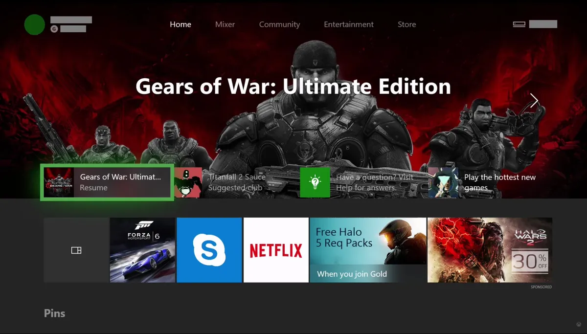
The biggest change by far in this update is the overhaul of the Home screen, which revolves around customization and the Fluent Design System.
Using the new Home screen, you can "pin" entire sections to your dashboard, creating a tailor-made experience suited to your habits. You can now add games and friends as entire sections, as well as a sections dedicated to pins. You can move the sections up and down as you see fit, in a vertical list with a heavy dose of Fluent Design futurism.
The top of the dashboard will display a large banner with art from the game or app currently active. Below that is a couple of recently used items, as well as a couple of ads. The element highlight will utilize your accent color with a slight glow, in a world where item backgrounds have been replaced by Fluent Design translucent textures. When you flip down on the joystick, you'll go to your next section. In the example shown here, we have pins, and both a new welcome center to explain how the new dashboard works. The green background you're seeing can be customized with a personal background or accent color.
To add sections to Home, it's as simple as pinning. You simply hit the Menu button on your Xbox controller and select "Add to Home" to create a new section.
Ybarra notes that content blocks will also evolve and react to the latest news and information. For example, if you created a section for your favorite game, it will dynamically display information to show when your friends are online, what Achievements might be worth hunting, or when the developer has posted an update in the associated title's Game Hub.
Microsoft has plans for more types of content blocks in the coming months, too. It wouldn't be hugely surprising if these content blocks evolve into some form of rich "Live Tile" for developers building apps for the Universal Windows Platform (UWP), allowing them to show off their latest content front and center at a glance.
By consolidating Home, social features, and your games into one dashboard experience, Microsoft says this update will make the Xbox experience even faster.
New Guide
The Xbox Guide also gets a major overhaul in this build, ditching the vertical tabs for a more familiar horizontal configuration. This takes design cues from the classic Xbox 360 guide, which sported horizontal tabs.
The new Guide shows its tabs across the top. This includes the regular "Home" section, featuring shortcuts for the dashboard, store, and pins, as well as a list of most recently used apps. It also includes a new "Communication" tab, which has separate sections for messages from Xbox members, and Xbox Live itself. The new "Broadcast & Capture" section allows you to configure your Mixer streams, as well as set up "Cameras," which we presume is a preliminary option for when Xbox picks up generic USB device support in the future.
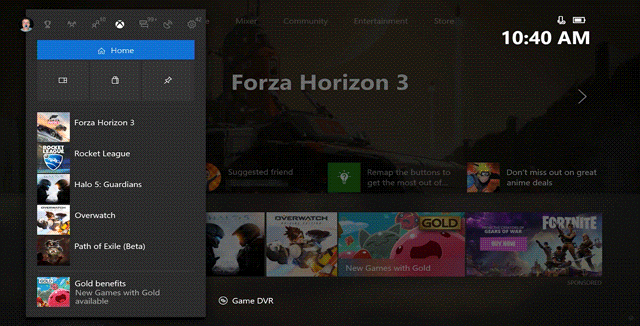
The new "Action Center" comprises all notifications, while providing access to settings and power controls. The new "People" section provides friends list access, including access to Clubs, Recent Players, and search. "Multiplayer" is the new party section, which also includes "Looking For Group and Tournaments." And finally, there's an "Achievement" section.
The new Guide is incredibly fast and can be navigated using the thumbstick, d-pad, or bumpers.
New Community section
Microsoft has completely revamped the Community section, creating a rich Activity Feed that condenses way more information than was previously possible.
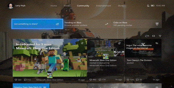
Dropping the unwieldy column interface, the new Activity Feed more closely resembles Office 365 Delve, which offers a feed of activity cards from users in your organization. The concept is similar, but we're trading docs for Achievements and spreadsheets for game captures.
When you open a feed item, it is presented in full screen, allowing you to view the content at the intended resolution. Presumably, this is also to help 4K game captures really shine when the Xbox One X comes around. The new items will also display more comments than previous versions, allowing you to see more of the conversation at once.
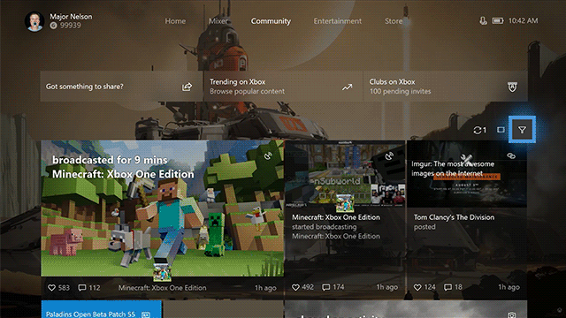
Microsoft is making improvements to Clubs and their discoverability, noting that new games are coming to Arena in the next few months to join Killer Instinct.
Other improvements
The Windows 10 Game Bar is getting a couple of new features. You will now be able to enable or disable Game Mode per game using a switch on the Bar itself. Streaming to Mixer via the Game Bar will also let you configure more audio options, allowing you to choose between broadcasting game-only audio, or system-wide audio, for those using party chat.
The Windows 10 Xbox Settings page will get an Xbox Live connectivity troubleshooter, just like on the Xbox One, allowing you to see whether or not Xbox Live is down or not.
Just the beginning
This is just the first wave of updates that will form the Xbox branch of the Windows 10 Fall Creators Update, and it will also include new Avatars, updates to profiles, and much more.
Microsoft is steaming ahead adding new features to Xbox One all the time, and it is showing no signs of slowing down. Some of the features on the horizon include USB devices (such as webcams), digital game gifting, and original Xbox backward compatibility, bringing games from the first generation of Xbox into the modern era.
If you have suggestions for Microsoft, as always, send it over to the company's UserVoice page. Until then, hit the comments and let us know what you think of the changes.
Windows Central Newsletter
Get the best of Windows Central in your inbox, every day!
Jez Corden a Managing Editor at Windows Central, focusing primarily on all things Xbox and gaming. Jez is known for breaking exclusive news and analysis as relates to the Microsoft ecosystem while being powered by caffeine. Follow on Twitter @JezCorden and listen to his Xbox Two podcast, all about, you guessed it, Xbox!
-
:o
-
No, no, no, no, no, no, nooooooooooooooooooooooo. This looks awful
-
I think it looks great but will reserve more judgment once I use it/see it in action; I advise the same.
-
it looks nice... even im PS4 fan
-
It is cluttered and still shows nothing of value. In the main screen, there are 2 suggestions and 3 ads. Where are all my games? He says, they put the app "My Apps" on the home screen "because its the app most users like to use to access their games". YEAH, YOU DONT SAY. They force their users to use that app to access their games. It looks nice, the experience is not nice. Like all the other UI refinements you have hyped and now it takes seconds to open a menu (even if they were for "speed") .
-
Completely Agree with you, i just want my games easy to access, good performance... But i only see lot of ads, suggestions, social crap, etc.... I liked when they accidentally enabled a feature to hide some dashboard tabs, i was rocking with only Main and Store tabs, thats all i want... but they removed it later...
-
I'm all for getting this as close to the 360 dash as possible. It was super intuitive. I just REALLY wish they would separate the Store tab back out into a page for Games, a page for Movies/TV, a page for Apps, and a page for Music. I hate having them all clumped together. The single splash page for the store is trying to show way too much to be useful. And now we have the Entertainment tab which is basically the old TV/Movies tab so that is essentially redundant. I'm on my Xbox to play and potentially buy games. Make those easier to access. I liked being to able to see on the dash what was out now, what was coming soon, what was on sale, etc. Jez, do you know if the new USB peripheral capability will support across-the-room voice commands via microphone like the current Kinect? My kinect constantly disconnects, and I hate the thought of having to buy a $40 octopus adapter to use it on the new X1X I plan on buying. I already miss my voice commands!
-
The sections should be: Home, Games, Apps, Mixer, Community, and Store.
-
This is looking awesome. I can't wait to get the update.
-
I've thoroughly enjoyed the pop-out guide -- I almost never have to use the home screen anymore. This new iteration looks even better than the current one to me. I'm excited for the update.
-
I like the guide, i don't like the hubs of the home screen itself.
-
it's user customizable though so you dont have to put any there if you don't want. just home or home plus pins like i am doing(just got the update a little bit ago). I might stick the hub in there for whatever game i am currently focusing on from time to time
-
too much elements in your face to the point you don't want to look at it, its a huge mess
-
This looks terrible. Like really really bad. So much clutter and space devoted to ads!
-
The pin sections reminds me a lot of Windows 8/10, and that's a good thing. The lack of work on Pins and customization of them in the past has been sad. Overall, this looks like improvements. Especially the multi-column Community feed.
-
Remember Zune and the Windows Media devices that came before it? That's what it reminds me of. A lot of the App design is going back to that, of which they left behind and everyone complained about.
-
I really don't like these changes, I don't think they can make it look uglier... and it seems harder to navigate :o
-
I want the original Xbox One dashboard back, along with full Kinect gesture support.
-
Yep. Day One version with Kinect gestures was the best. Everything since NXOE has been atrocious. And I love how they've been saying for four years now that "this next update" will be the one that finally makes it not a sluggish mess, yet none of them were as fast as the Day One version, despite all of the features they forcibly removed.
-
I really wonder why they dont get sued for taking the kinect support. I bought it because of that and now I cant even navigate using Kinect.
-
If you don't like this version of the home screen, just wait a few more months.
-
i hate it how they keep having pins on a separate screen. Just let the items you pin show up on the main screen already!
-
"Below that is a couple of recently used items, as well as a couple of ads" Again with the f*cking ads! People like to slander Google but at least on the Google devices I PAY FOR I don't have to put up with f*cking ads. Yet on the Xbox there they are, spamming me and cluttering the UI. (And I'm not even going to mention the PlayStation where you only see ads if you specifically fo to their section). As for the rest of the update, well, it's a step in the right direction at least. Granted, it's hard to make a worst UI than the current one. Still. Progress is progress. And if Ybarra is REALLY serious about customisation (I doubt it), then I'm sure I'll be able to get rid of the "recents & ads section" altogether. I'll remain skeptically optimistic on this one. I'll pass judgement when I get a clear idea about HOW MUCH can we actually customise. If I can get rid of all the social tabs and leave only Home & Store, as well as get rid of the "recent & ads" (or at least throw them to the bottm of the screen, and put my pins, for example, in their place...THEN I'll be considerably more happy. As for the Guide...I hope we can decide what does "press the Xbox button" do. Because to me the guide is absolutely f*cking useless. I'd rather be able to click the Xbox button to return to the Home screen again. Let's see.
-
Amazing ... love FDL
-
Oh no...the community section looks like the cluster f that the PS4 social section looks like. I really, really don't like it. I want my feed to be streamlined. I want my pins to be compressed on a screen to maximize space, but I want my feeds to be in a single line to help with readability. This redesign isn't good.
-
It looks much better. They just need to improve tiles and make a new iteration of them. Removing ads is a must. Have an option that gives you rewards for displaying ads which will allow you to buy stuff from the store.
-
Are those GIFs real-time? if so, then the speed and responsiveness look pretty good.
-
Man, I wish they would just make a decision and stick with it. The Xbox might be the least consistent UI system I've ever dealt with. It has too many major changestoo frequently. It always feels "different," never "better," like they're just changing ti to say it changed to keep developer jobs secure.
-
i sort of agree. but i understand a new system is comming soon they want to improve things for the launch of the xbox one x
-
Hello again Windows 8.
-
I really had it with the adds. I love my Xbox but it is the only piece of hardware I own for which I am paying to see ads with no option to get rid of them. And somehow this is just normal.
-
I like the animations.
-
Jesus Christ. Can Microosft just leave anything? If they aren't cancelling or dumping it, they are tearing it apart and making you become accustom to it all over again.
-
i just got it on mine :D
-
spin this off into a Windows 10 TV mode and you'd own Apple TV, Android TV, Roku and Amazon Fire TV. $100 smart TV box running this would be amazing
-
Wow. Woke up to a completely different dashboard this morning. I thought something was wrong with my XBox. This will take a few days of using before I have an opinion I can trust, because my first impression was one of horror. So we will see. Guide seems much faster and useful though
-
Also, get over yourselves with the ads. They are minimal and more often than not, relevant to my interests. Grow up, people.
-
It's fine that you like them. Not everyone does and it should be up to the user. Perhaps you need to grow up and realize not everyone thinks the way you do? From what I can tell most people are not saying they should not exist at all. But there should be an option for the user to decide if they want to see them. For example you do. Some of us, do not.
-
So I should grow up like the people that are losing their **** over a few small adds? You mean an option to turn off ads like on web sites? I don't LIKE ads, but they don't bother me unless they are numerous, irrelevant, and obtrusive (you know, like on Windows Central, which I have resorted to using an adblocker again because the site is nigh impossible to load), which isn't the case on XBox. As far as I have seen, there is only ever one ad on a page, and they are small. Hardly worth the outrage by the majority of people (across various articles, not just this one article)
-
I'm very intrigued as to how this will turn out to be. Cant wait until it is released :D though, judging by the amount of feedback I give, I am surely not in the alpha ring :(