Microsoft's Fluent Design System is easily one of Windows 10's more exciting new projects. It's an entirely new vision for Windows, rethinking its design in almost every single way. Microsoft revealed Fluent Design in 2017, and it announced that implementing its new design language across all its products will take time. It's a journey that will evolve and improve — which is what we're taking a look at today.
We're months into the development of Redstone 5, so I wanted to see how Fluent Design is coming along so far. There's still plenty to do, but things have improved a lot since we last checked in on the progress of Fluent Design.
Microsoft outlined five different areas of design for its first wave of Fluent Design: material, light, scale, depth, and motion. More of these elements showed up throughout the development of April 2018 Update, or Redstone 4, with continued improvements expected throughout the development of the upcoming Redstone 5 release.

Material (Acrylic)
Acrylic is the most common Fluent Design element that's showing up across apps and the OS itself. It is densely translucent, letting the background and windows behind the current focus blur through. In the latest releases, we can see Acrylic in several locations, including the Start menu, Taskbar, Action Center and My People.
You can also find Acrylic blue effects in the title bar of apps when Sets is enabled now as well, which is something many Insiders have been asking for.
Acrylic is more commonly used within apps, and Microsoft has been painting several of its first-party apps in Acrylic. The Settings app features Acrylic in the sidebar, and Microsoft Edge features Acrylic in its title bar. You can also find Acrylic in Paint 3D and the Skype UWP app.

Calculator, Photos, and Maps are also apps where you can find Acrylic elements. The Maps app has the Acrylic style applied to the top of the window, where the title bar and navigation menus are. Photos has it at the top as well, whereas previous it was featured dominantly in the background of the app.
The Calculator app is easily the best-looking app with Acrylic on Windows 10 right now. Acrylic can also be found in pop-up notifications that appear on the desktop. You can now also find Acrylic and Reveal effects in the Microsoft Edge address bar, which look excellent.

Timeline now features a blurred background when opened in the latest Redstone 5 builds, which differs from the non-blurred background found in Redstone 4.
Light (Reveal)
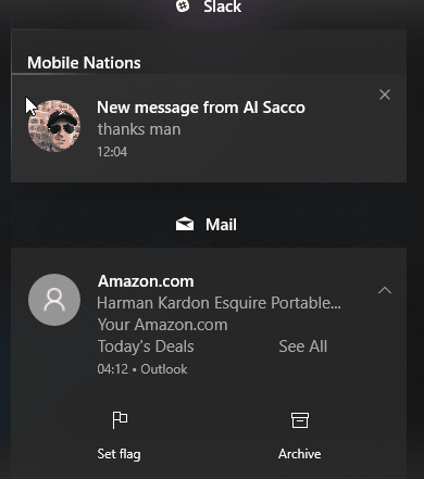
Reveal is another new design element being introduced with Fluent Design, which follows the cursor when hovering over certain elements within the OS and apps. As of right now, you can find Reveal in the Action Center, Start menu and My People hub, and in XAML based lists and menus.
Microsoft plans to bring Reveal to the Taskbar eventually, but it doesn't look like that'll be for quite some time. Right now, the implementations of Reveal are very inconsistent throughout the OS, with some menus having it, and others not.
Unfortunately, it seems the consistency of the Reveal effect is a little all over the place. In some areas, the Reveal effects bounce light off of surrounding buttons and UI elements, and in other areas they don't. This is incredibly jarring and is something I hope Microsoft gets around to rectifying soon.
You can also find Reveal in some parts of Microsoft Edge, including the address bar, tabs, drop-down Settings menu, and even the Edge Hub. Reveal effects are present in Groove Music, Calculator, People, and Settings. Reveal is also enabled on pop-up notifications but is less noticeable due to the alerts having such a thin border.
The use of Reveal is slowly becoming more consistent with each new Insider build. Redstone 4 is the first Windows 10 update where Reveal is used consistently throughout inbox apps and the Shell. This should improve with Redstone 5.
Depth, Parallax and Motion
Depth, Parallax and Motion are the rarest new design elements being implemented right now. As far as I can tell, there are no known instances where motion has been applied to the OS. I've only found it sparsely in a couple of Microsoft's first-party apps. Motion is the element of Fluent Design that's supposed to give Windows 10 some wow factor when jumping between different areas of an app or the system.

I've found Depth and Parallax effects in the Store app, where some of the bigger images will scroll slower than the rest of the page. It's a cool effect that gives the page some much-needed motion. I've also noticed some minor motion effects in Groove Music and the Movies & TV apps.
The Photos app with Story Remix is where you can find the most of Microsoft's new Motion design. It animates in and out of areas of the app beautifully and fluidly. Microsoft has a lot of work to do getting Motion implemented throughout the OS and in the rest of its apps, but progress so far appears to be good.
Dark and Light modes
Dark and light modes within Windows 10 aren't strictly part of the Fluent Design System, however, they are big enough design choices that it's worth mentioning here. By default, Microsoft sets "light" as the default mode for Windows 10, which is interesting because Microsoft's light mode for Windows 10 is inconsistent. Light mode still features a dark Start, Taskbar and Action Center, which look out of place in light mode.
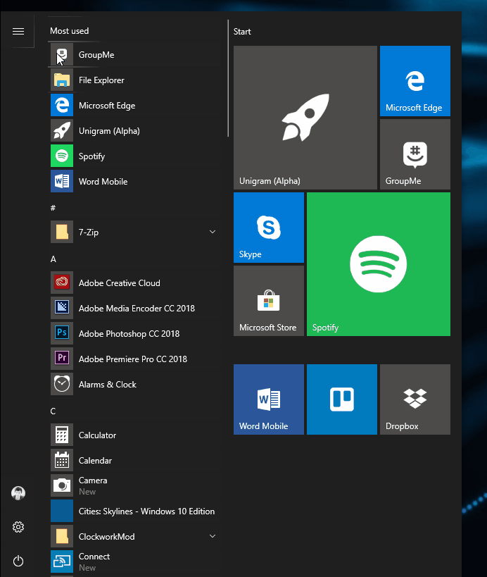
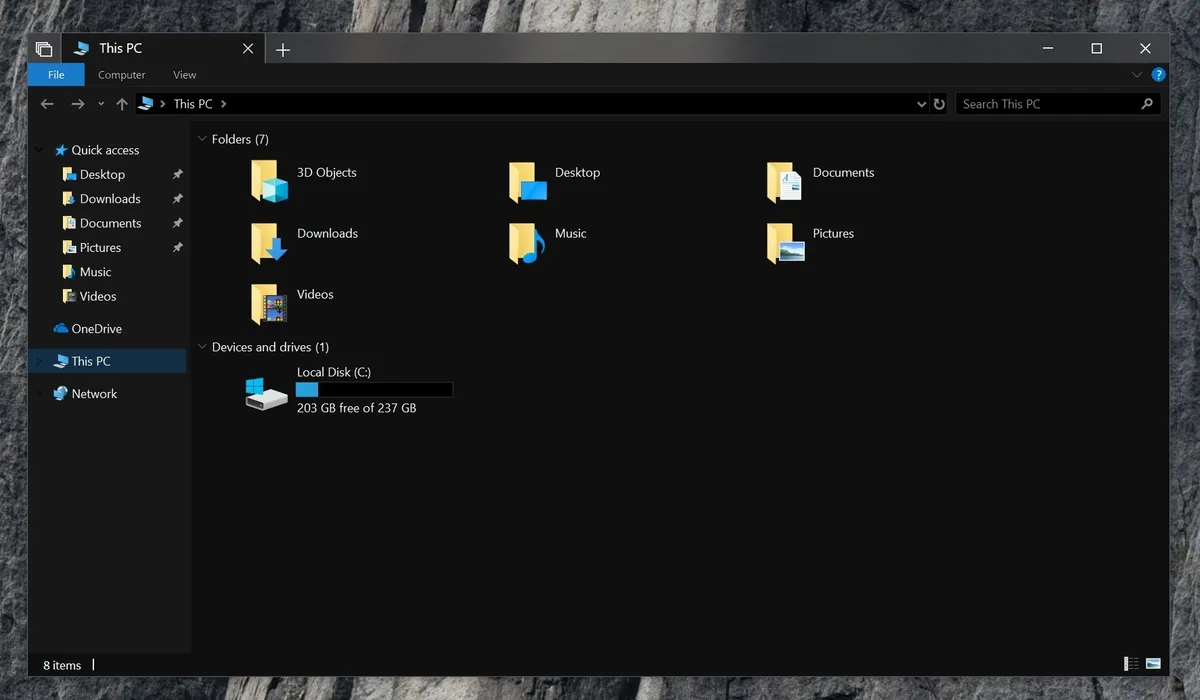
In regards to dark mode, Microsoft is finally getting around to adding a dark mode to the File Explore and context menus, meaning dark mode is finally a lot more consistent when enabled. It's still not perfect, with lots of inbox apps using their own shades of dark, making things feel inconsistent. Hopefully Microsoft can get around to unifying the shades of dark soon.
Fluent Design is an ongoing journey
The implementations of Fluent Design began with the Fall Creators Update, but we're far from it being complete. Microsoft was very clear that its new design language is a journey that will take several releases to fully realize. The Fall Creators Update is technically the second step in that journey, with the first step being the Creators Update that was released in early 2017. This means Redstone 4 and Redstone 5 will continue to see Fluent Design improvements.
One of Windows 10's weak points is definitely its design language, but with Fluent Design that's starting to change. There's a lot to Windows, and Fluent Design is being slowly implemented across the OS. If there's something you've noticed that I missed, please let me know. So far, the work Microsoft has done with the latest Redstone 4 preview builds is fantastic, and I can't wait to see it continue to evolve.
Updated June 11 2018: We updated this post to detail Microsoft's recent progress in bringing Fluent Design to Windows 10.