I'm a huge fan of beautiful, consistent user interfaces, and love it when something looks good in software. I'm pretty good, maybe too goo, at spotting things that don't look so good in software, and was recently challenged to list five subtle UI issues found in Windows 10 today. These are design things that you might not have ever noticed or don't care about which are out of place, broken, or outright wrong when compared to the rest of the Windows 10 aesthetic.
I have a keen eye for UI, which is a blessing and a curse. When using Windows 10, it's more of a curse, because it's probably the most inconsistent an operating system's UI can be. Thanks to Microsoft's insistence on supporting legacy software, Windows today is still jam-packed with icons, programs, and other UI things from over a decade ago.
We're not looking at those things today, however. We're looking at (mostly) smaller, subtle UI issues that for the most part have been introducing during Windows 10 tenure. So, let's dig in.
Music Control UI

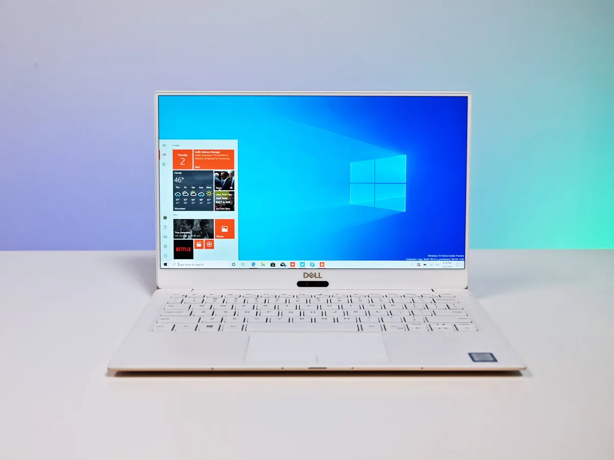
Let's start with an obvious one, the music control interface in Windows 10. This one isn't subtle, but it's something most people aren't aware is out of place. If you're ever listening to audio of any kind and want to change the track or adjust the volume, a UI from about seven years ago will greet you at the very top left of the screen. It's using Microsoft's Metro design language, and was first introduced with Windows 8 back in 2012.
It just doesn't fit with the rest of the Windows 10 aesthetic, which is slowly but surely moving over to the Fluent design language. Interestingly, Microsoft had started work on a new music control flyout last year that does follow the new design language, but it's nowhere to be seen in the latest preview builds. I hope Microsoft is still planning to deliver it at some point.
This ugly colored line in Chromium browsers

This is an issue that bugs me every single day. Along the top of Chromium-based browsers such as the new Microsoft Edge and Google Chrome is this colored line. It shouldn't be there if you don't have "show colored borders around windows" enabled in Windows 10 settings. As far as I'm aware, it's a bug with the Windows Shell, meaning it's Microsoft that needs to deal with it, not Google/Chromium.
Either way, it's ugly and stands out if you're using dark mode with a light accent color and dark background like I do. No other windows have it, and other windows look much cleaner as a result. A workaround, for now, is to either use a dark accent color or always use Chrome or Edge maximized. I just want it fixed.
Acrylic effect pops in after animation

This is another UI glitch that drives me crazy every time I see it. Whenever you open the Action Center (and in some cases the Start menu too,) the acrylic blur effect that's supposed to be behind it pops in after the animation is complete. So if you've got a keen eye, you'll see your background through the Action Center or Start menu before the blur effect kicks in.
It just makes using the Action Center and Start menu feel janky and laggy, even though your PC is fine. This is an issue Microsoft actually fixed a few months back, but then reintroduced in another patch a few weeks later by accident, and it hasn't been fixed since.
Broken reveal effects in light mode
If you're a light mode user, you may have noticed that in many areas of the Windows Shell, the reveal effect no longer appears around some buttons and live tiles. It actually does appear, but since the shell is using bright colors, the reveal effects which are also bright clash with the UI and are challenging to see. This is odd, because Microsoft has a version of reveal that doesn't clash with light interfaces, yet it hasn't updated some shell areas to support it when light mode is enabled.
When light mode is on, reveal effects in the Windows Shell should use a dark accented version of the reveal effect. You can see this in use in the Settings app or Action Center when light mode is enabled. It's in there, but it isn't being used in places like the Start menu. Another small thing, but something I've noticed nonetheless.
Wrong blur effect in the System Tray overflow menu

Last, but certainly not least, is a thing that I'm almost certain few have noticed and fewer still will care about, but the System Tray overflow menu uses the wrong blur effect behind it. That's right, this tiny menu popup on the taskbar is using a blur effect from before Fluent Design was a thing, and as such, doesn't match the rest of the acrylic blur surfaces found elsewhere in the Windows Shell.
Essentially, the overflow menu's blur effect isn't as strong as it is elsewhere, meaning elements that appear behind it show up more fine than areas that have the correct blur strength. Like I said, this is a totally small thing, and something I bet most people haven't ever noticed. But it's there. And now that you've seen it you'll never be able to stop seeing it.
Share your subtle UI annoyances
So those are five subtle UI annoyances that I notice in my everyday usage of Windows 10. Microsoft, if you're reading, all of these small UI issues should be top priority and fixed immediately. For real, though, at least consider updating the Music Control UI and fixing the reveal effects in light mode. And the colored line in Chromium browsers, that one really gets to me.
Our favorite Surface accessories from Microsoft
Every one of these valuable Surface accessories is Windows Central Approved and guaranteed to please.

Surface Precision Mouse ($77 at Amazon)
The Surface Precision Mouse is not only one of favorite Surface accessories, it's one of our favorite mice for any PC. It's packed with valuable features and customizable buttons. Its scrolling and tracking are seamless and spot-on. And it's rechargeable so you never have to buy new batteries for it.

Surface Pen (From $72 at Amazon)
Every Surface owner needs this Pen. Period. It supports 4,096 levels of pressure sensitivity, tilt support for shading density, and enjoys supremely low latency. When paired with a Surface PC, the potential is endless. And it comes in a bunch of cool colors.

Surface Dock ($136 at Amazon)
With two Mini DisplayPorts, four USB-A 3.0 ports, an Ethernet port, and a 3.5mm audio jack, this dock gives you the ports you need to stay connected to all your favorite devices. Plus, it easily turns your Surface into a desktop power hub. We highly recommend it.