Microsoft To-Do for iOS review: One step forward and two steps back
Microsoft's new To-Do tasks app, formerly known as "Project Cheshire," has not been out for long, and it shows. The app is a buggy mess compared to similar task management options.

All the latest news, reviews, and guides for Windows and Xbox diehards.
You are now subscribed
Your newsletter sign-up was successful
Join the club
Get full access to premium articles, exclusive features and a growing list of member rewards.
Microsoft has had many task management offerings, such as Wunderlist and OneNote, and while both were fairly popular, the former has been replaced by Microsoft's new service called To-Do. The app is available for all three major platforms, Windows 10, Android and iOS, which means you can easily sync content between devices on these platforms.
We put the iOS version through some tests. Here's what we found.
Getting started with Microsoft To-Do
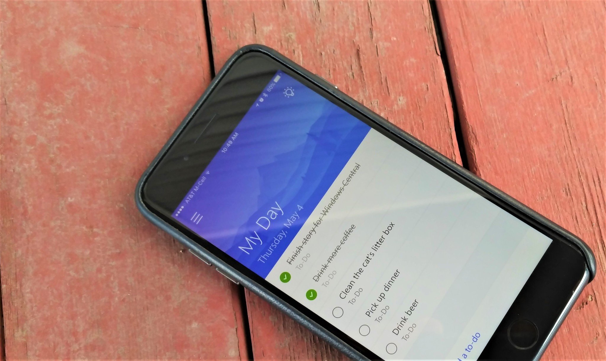
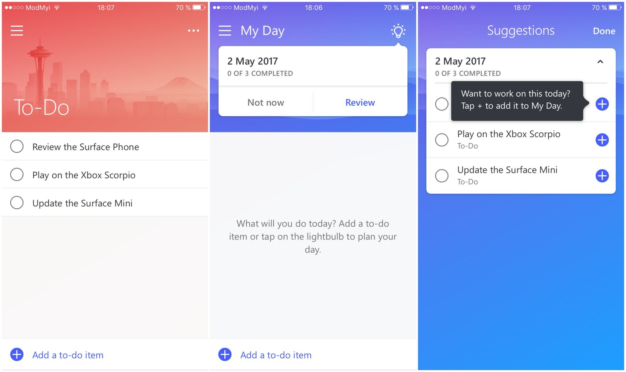
Microsoft To-Do is a beautiful application, and you feel it right from the beginning. A lot of effort was put into the look of the app, and that is something we rarely see from Microsoft. The whole design language reminds me a little of Google's "Material Design" style, more so than Microsoft's own "Modern Design Language 2," which is obviously ironic.
Article continues below 
The app syncs with your Outlook Tasks content, too. So adding an Outlook task on one device instantly syncs it over to your other devices.
Complaints
Unfortunately, To-Do is missing other features that are present in Microsoft's Wunderlist.
Microsoft To-Do lacks the ability to color-flag tasks, in order to sort their priority, as well as basic stuff like moving a task from one list to another. You can add notes and reminders to tasks, thankfully, but the lack of basic functionality is disappointing. And the complaints don't stop there.
The iOS client lacks features like being able to share links, text or any other form of content to the app. This is something I used on a daily basis with Wunderlist and I really hope that an update will add this functionality.
All the latest news, reviews, and guides for Windows and Xbox diehards.
The whole app is weirdly designed, and navigating through it is confusing and tiresome. Most of the time I have no idea what is happening on screen or where I am going. The app lacks labels to describe the functions of different elements, which is odd because Windows 10's design language is primarily focused on describing every part of the interface so you know what every button does when you press it. Microsoft didn't follow its own guidelines, and the result is a pretty but unintuitive app.
The app proved to be very unstable and it likes to crash, not only when it's open it but also when running in the background. I was forced to reboot a couple of times because the app got stuck in a crash loop, which resulted in my notification center getting spammed with crash reports.
On the subject of notifications, my reminders failed to initiate multiple times. They sometimes went off a few hours late or not at all. In fact, the majority of my reminders had some issue, which is unforgivable for a service that is supposed to organize your workflow or daily life.
The whole app feels like a poorly-made Microsoft Garage project and not a flagship service, which is how Microsoft advertises it. Project Cheshire had been in testing for many months, yet this is the result? The app follows a sad pattern of Microsoft releasing unfinished and not polished products to the masses, while not labeling them as "alpha" nor "beta."
The competition
Microsoft To-Do falls short not only when compared to its predecessor, Wunderlist, but also when compared to current alternatives from other companies. Google's note-taking and list-managing app, Keep, does a way better job delivering what it promises, and the popular Todoist app has controlled the market for a good reason.
Compared to Google Keep, Microsoft To-Do lacks many features, is less user-friendly, and the only advantage it has is that it looks better, which really depends on user taste. This is quite sad, because Microsoft products usually keep a good position when compared to Google's offerings.
Todoist, on the other hand, seems to have fewer advantages over To-Do, but there are some. Todoist is less practical, and the interface and its hoard of features feel overwhelming and result in poor navigation and user experience. The app is also less attractive than Microsoft's competitor. Its stability, however, has been excellent, and it hasn't crashed or hung up on me at all.
Conclusion
Microsoft To-Do is a good-looking but flawed app. The iOS variant is beyond underwhelming. The app crashes all the time, doesn't push reminders on time, and is generally unpleasant to us. And that's all very unfortunate ... and disappointing.
There are many better alternatives out there. One of them is Microsoft's Wunderlist, which To-Do is supposed to replace at some point in the near future. That does not sound like good news, because this successor to Wunderlist is far from delivering a consistently and good experience.
I say avoid To-Do and stick to Wunderlist for as long as you can, or at least until Microsoft makes some much-needed improvements.
You can find Microsoft To-Do for iOS on the App Store.
Pros:
- Attractive looks.
- Fast and fluid.
Cons:
- Extremely unstable.
- Confusing navigation.
- Lack of standard features.
- Doesn't push reminders on time.

Dennis Bednarz is a former writer for Windows Central and the guy behind ModMy. He has been a recognised member of the Microsoft community for years and owns everything from Lumia phones to Surface PCs. He occasionally likes to rant about Windows Phone and drink tea. You can go ahead and follow him on Twitter at @DennisBednarz

 Windows Central Insider


